天气预报系统中的可视化
最近上了python这门课老师叫我们组队完成一个爬虫项目我和我的伙伴对天气预报进行了爬取,其中我负责对爬到的天气可视化的部分。下面是一些代码:
未来十四天高低温变化曲线图

可以看出高温平均在10.8度左右,低温在4.3度左右而且可以看出高低温都变化在第四条后变化都比较大。注意防止感冒
def tem_curve14(data,city_name):
    date = list(data['日期'])
    tem_low = list(data['最低气温'])
    tem_high = list(data['最高气温'])
    for i in range(0, 14):
        if math.isnan(tem_low[i]):
            tem_low[i] = tem_low[i - 1]
        if math.isnan(tem_high[i]):
            tem_high[i] = tem_high[i - 1]

    tem_high_ave = sum(tem_high) / 14  # 求平均高温
    tem_low_ave = sum(tem_low) / 14  # 求平均低温

    tem_max = max(tem_high)
    tem_max_date = tem_high.index(tem_max)  # 求最高温度
    tem_min = min(tem_low)
    tem_min_date = tem_low.index(tem_min)  # 求最低温度

    x = range(1, 15)
    plt.figure(1)
    plt.plot(x, tem_high, color='red', label='高温')  # 画出高温度曲线
    plt.scatter(x, tem_high, color='red')  # 点出每个时刻的温度点
    plt.plot(x, tem_low, color='blue', label='低温')  # 画出低温度曲线
    plt.scatter(x, tem_low, color='blue')  # 点出每个时刻的温度点

    plt.plot([1, 15], [tem_high_ave, tem_high_ave], c='black', linestyle='--')  # 画出平均温度虚线
    plt.plot([1, 15], [tem_low_ave, tem_low_ave], c='black', linestyle='--')  # 画出平均温度虚线
    plt.legend()
    plt.text(tem_max_date + 0.15, tem_max + 0.15, str(tem_max), ha='center', va='bottom', fontsize=10.5)  # 标出最高温度
    plt.text(tem_min_date + 0.15, tem_min + 0.15, str(tem_min), ha='center', va='bottom', fontsize=10.5)  # 标出最低温度
    plt.xticks(x)#输出图形,防止不显示
    plt.title('未来14天高温低温变化曲线图')
    plt.xlabel('未来天数/天')
    plt.ylabel('摄氏度/℃')
    plt.savefig('image/{}15天温度曲线.png'.format(city_name), bbox_inches='tight')
    plt.show()
一天温度变化曲线图
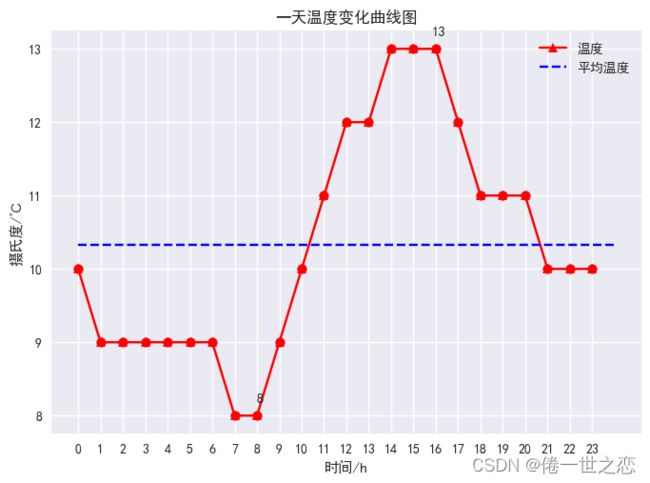
可以看出平均温度在10.3度左右,在8点的时候温度一直上升到14点在16点后开始下降。
def tem_curve(data,city_name):
    """温度曲线绘制"""
    # plt.style.use('seaborn')
    hour = list(data['小时'])
    # print(hour)
    tem = list(data['温度'])
    for i in range(0, 24):
        if math.isnan(tem[i]):
            tem[i] = tem[i - 1]
    tem_ave = sum(tem) / 24  # 求平均温度
    tem_max = max(tem)
    tem_max_hour = hour[tem.index(tem_max)]  # 求最高温度
    tem_min = min(tem)
    tem_min_hour = hour[tem.index(tem_min)]  # 求最低温度
    x = []
    y = []
    for i in range(0, 24):
        x.append(i)
        y.append(tem[hour.index(i)])
    plt.style.use('seaborn')
    matplotlib.rcParams['font.sans-serif'] = ['SimHei']
    matplotlib.rcParams['axes.unicode_minus'] = False#防止中文报错
    plt.figure(1)
    plt.plot(x, y, color='red', label='温度')  # 画出温度曲线
    plt.scatter(x, y, color='red')  # 点出每个时刻的温度点
    plt.plot([0, 24], [tem_ave, tem_ave], c='blue', linestyle='--', label='平均温度')  # 画出平均温度虚线
    plt.text(tem_max_hour + 0.15, tem_max + 0.15, str(tem_max), ha='center', va='bottom', fontsize=10.5)  # 标出最高温度
    plt.text(tem_min_hour + 0.15, tem_min + 0.15, str(tem_min), ha='center', va='bottom', fontsize=10.5)  # 标出最低温度
    plt.xticks(x)
    plt.legend()
    plt.title('一天温度变化曲线图')
    plt.xlabel('时间/h')
    plt.ylabel('摄氏度/℃')
    plt.savefig('image/{}24小时温度曲线.png'.format(city_name), bbox_inches='tight')
    plt.show()
未来十四天风级图

可以看出东风最多,其他空白地方没有风。
def wind_radar(data,city_name):
    wind1 = list(data['风向1'])
    wind2 = list(data['风向2'])
    wind_speed = list(data['风级'])
    wind1 = change_wind(wind1)
    wind2 = change_wind(wind2)

    degs = np.arange(45, 361, 45)
    temp = []
    for deg in degs:
        speed = []
        # 获取 wind_deg 在指定范围的风速平均值数据
        for i in range(0, 14):
            if wind1[i] == deg:
                speed.append(wind_speed[i])
            if wind2[i] == deg:
                speed.append(wind_speed[i])
        if len(speed) == 0:
            temp.append(0)
        else:
            temp.append(sum(speed) / len(speed))
    # print(temp)
    N = 8
    theta = np.arange(0. + np.pi / 8, 2 * np.pi + np.pi / 8, 2 * np.pi / 8)
    # 数据极径
    radii = np.array(temp)
    # 绘制极区图坐标系
    plt.axes(polar=True)
    # 定义每个扇区的RGB值(R,G,B),x越大,对应的颜色越接近蓝色
    colors = [(1 - x / max(temp), 1 - x / max(temp), 0.6) for x in radii]
    plt.bar(theta, radii, width=(2 * np.pi / N), bottom=0.0, color=colors)
    plt.title('未来14天风级图', x=0.2, fontsize=20)
    plt.savefig('image/{}风向曲线.png'.format(city_name), bbox_inches='tight')
    plt.show()
空气质量曲线图
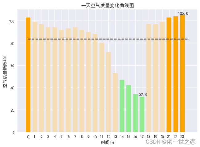
可以看出一天中大部分时间空气质量都很好,在13-17点的时候空气质量下降的很大
def air_curve(data,city_name):
    """空气质量曲线绘制"""
    hour = list(data['小时'])
    air = list(data['空气质量'])
    # print(type(air[0]))
    for i in range(0, 24):
        if math.isnan(air[i]) == True:
            air[i] = air[i - 1]
    air_ave = sum(air) / 24  # 求平均空气质量
    air_max = max(air)
    air_max_hour = hour[air.index(air_max)]  # 求最高空气质量
    air_min = min(air)
    air_min_hour = hour[air.index(air_min)]  # 求最低空气质量
    x = []
    y = []#传值
    for i in range(0, 24):
        x.append(i)
        y.append(air[hour.index(i)])
    plt.figure(3)

    for i in range(0, 24):
        if y[i] <= 50:
            plt.bar(x[i], y[i], color='lightgreen', width=0.7)  # 1等级
        elif y[i] <= 100:
            plt.bar(x[i], y[i], color='wheat', width=0.7)  # 2等级
        elif y[i] <= 150:
            plt.bar(x[i], y[i], color='orange', width=0.7)  # 3等级
        elif y[i] <= 200:
            plt.bar(x[i], y[i], color='orangered', width=0.7)  # 4等级
        elif y[i] <= 300:
            plt.bar(x[i], y[i], color='darkviolet', width=0.7)  # 5等级
        elif y[i] > 300:
            plt.bar(x[i], y[i], color='maroon', width=0.7)  # 6等级
    plt.plot([0, 24], [air_ave, air_ave], c='black', linestyle='--')  # 画出平均空气质量虚线
    plt.text(air_max_hour + 0.15, air_max + 0.15, str(air_max), ha='center', va='bottom', fontsize=10.5)  # 标出最高空气质量
    plt.text(air_min_hour + 0.15, air_min + 0.15, str(air_min), ha='center', va='bottom', fontsize=10.5)  # 标出最低空气质量
    plt.xticks(x)
    plt.title('一天空气质量变化曲线图')
    plt.xlabel('时间/h')
    plt.ylabel('空气质量指数AQI')
    plt.savefig('image/{}空气质量曲线.png'.format(city_name), bbox_inches='tight')
    plt.show()
未来十四天天气饼图

饼状图可以很清楚的看出14天中不同天气所占的比重
def weather_pie(data,city_name):
    weather = list(data['天气'])
    dic_wea = {}
    for i in range(0, 14):
        if weather[i] in dic_wea.keys():
            dic_wea[weather[i]] += 1
        else:
            dic_wea[weather[i]] = 1
    # print(dic_wea)
    explode = [0.01] * len(dic_wea.keys())
    color = ['lightskyblue', 'silver', 'yellow', 'salmon', 'grey', 'lime', 'gold', 'red', 'green', 'pink']
    plt.pie(dic_wea.values(), explode=explode, labels=dic_wea.keys(), autopct='%1.1f%%', colors=color)
    plt.title('未来14天气候分布饼图')
    plt.savefig('image/{}天气饼图.png'.format(city_name), bbox_inches='tight')
    plt.show()
一天相对湿度变化曲线图
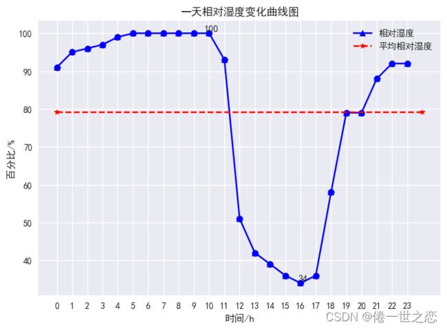
一天最高相对湿度为100%,最低相对湿度为34%,并且平均相对湿度在79%左右,通过对时间分析,清晨的湿度比较大,而下午至黄昏湿度较小。
def hum_curve(data,city_name):
    """相对湿度曲线绘制"""
    hour = list(data['小时'])
    hum = list(data['相对湿度'])
    for i in range(0, 24):
        if math.isnan(hum[i]) == True:
            hum[i] = hum[i - 1]
    hum_ave = sum(hum) / 24  # 求平均相对湿度
    hum_max = max(hum)
    hum_max_hour = hour[hum.index(hum_max)]  # 求最高相对湿度
    hum_min = min(hum)
    hum_min_hour = hour[hum.index(hum_min)]  # 求最低相对湿度
    x = []
    y = []
    for i in range(0, 24):
        x.append(i)
        y.append(hum[hour.index(i)])
    plt.figure(2)
    plt.plot(x, y, color='blue', label='相对湿度')  # 画出相对湿度曲线
    plt.scatter(x, y, color='blue')  # 点出每个时刻的相对湿度
    plt.plot([0, 24], [hum_ave, hum_ave], c='red', linestyle='--', label='平均相对湿度')  # 画出平均相对湿度虚线
    plt.text(hum_max_hour + 0.15, hum_max + 0.15, str(hum_max), ha='center', va='bottom', fontsize=10.5)  # 标出最高相对湿度
    plt.text(hum_min_hour + 0.15, hum_min + 0.15, str(hum_min), ha='center', va='bottom', fontsize=10.5)  # 标出最低相对湿度
    plt.xticks(x)#偏移量
    plt.legend()
    plt.title('一天相对湿度变化曲线图')
    plt.xlabel('时间/h')
    plt.ylabel('百分比/%')
    plt.savefig('image/{}相对湿度曲线.png'.format(city_name), bbox_inches='tight')#按照图形的尺寸保存
    plt.show()
每个图片对应相应的代码,其实每个都是类似的多次使用了matplotlib中的函数对图形进行设计。