ts9_annot_arrow_hvplot PyViz interacti_bokeh_STL_seasonal_decomp_HodrickP_KPSS_F-stati_Box-Cox_Ljung
So far, we have covered techniques to extract data from various sources. Tis was covered in Chapter 2, Reading Time Series Data from Files, and Chapter 3, Reading Time Series Data from Databases. Chapter 6, Working with Date and Time in Python, and Chapter 7, Handling Missing Data, covered several techniques to help prepare, clean, and adjust data.
You will continue to explore additional techniques to better understand the time series process behind the data. Before modeling the data or doing any further analysis, an important step is to inspect the data at hand. More specifcally, there are specifc time series characteristics that you need to check for, such as stationarity, effects of trend and seasonality, and autocorrelation, to name a few. These characteristics that describe the time series process you are working with need to be combined with domain knowledge behind the process itself.
Tis chapter will build on what you have learned from previous chapters to prepare you for creating and evaluating forecasting models starting from Chapter 10, Building Univariate Time Series Models Using Statistical Methods.
In this chapter, you will learn how to visualize time series data, decompose a time series into its components (trend, seasonality, and residuals), test for different assumptions that your models may rely on (such as stationarity, normality, and homoscedasticity/ ˈhoʊməsɪdæsˈtɪsəti /同方差性,[数] 方差齐性), and explore techniques to transform the data to satisfy some of these assumptions.
Te recipes that you will encounter in this chapter are as follows:
- • Plotting time series data using pandas
- • Plotting time series data with interactive visualizations using hvPlot
- • Decomposing time series data
- • Detecting time series stationarity
- • Applying power transformations
- • Testing for autocorrelation in time series data
Troughout this chapter, you will be using three datasets (Closing Price Stock Data, CO2, and Air Passengers). The CO2 and Air Passengers datasets are provided with the statsmodels library. Thee Air Passengers dataset contains monthly airline passenger numbers from 1949 to 1960. Te CO2 dataset contains weekly atmospheric/ˌætməsˈfɪrɪk /大气(层)的 carbon/ˈkɑːrbən/碳 dioxide/daɪˈɑːksaɪd/二氧化物 levels on Mauna Loa. The Closing Price Stock Data dataset includes Microsoft, Apple, and IBM stock prices from November 2019 to November 2021.
Plotting time series data using pandas
The pandas library ofers built-in plotting capabilities for visualizing data stored in a DataFrame or Series data structure. In the backend, these visualizations are powered by the Matplotlib library, which is also the default option.
The pandas library offers many convenient methods to plot data. Simply calling DataFrame. plot() or Series.plot() will generate a line plot by default. You can change the type of the plot in two ways:
- • Using the .plot(kind="
") parameter to specify the type of plot by replacing with a chart type. For example, - .plot(kind="hist") will plot a histogram
- while .plot(kind="bar") will produce a bar plot.
- • Alternatively, you can extend .plot() . Tips can be achieved by chaining a specifc plot function, such as .hist() or .scatter() , for example, using .plot.hist() or .plot.line()
Tips recipe will use the standard pandas .plot() method with Matplotlib backend support.
You will be using the stock data for Microsoft, Apple, and IBM, which you can find in the closing_price.csv fle.
import yfinance as yf

df = yf.download('AAPL MSFT IBM',
                 start='2019-01-01')
df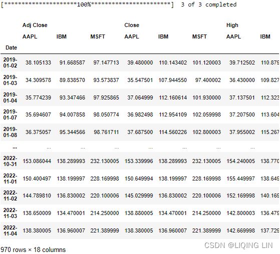
![]()
![]()
import matplotlib.pyplot as plt
fig, ax = plt.subplots( 1,1, figsize=(10,8) )
# df['Adj Close'].plot(kind='line', ax=ax)
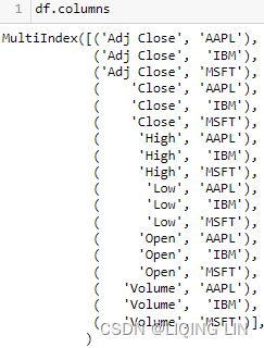
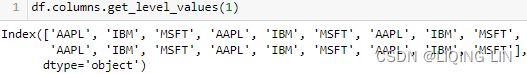
symbols = list( set( df.columns.get_level_values(1) ) )
color_list=['b','g','k']
for idx, tick in enumerate(symbols):
ax.plot( df.index,
df['Adj Close'][tick],
label=tick,
color=color_list[idx],
)
ax.set_xlabel('Date', fontsize=14)
ax.set_ylabel('Adj Close Price', fontsize=14)
plt.setp( ax.get_xticklabels(), rotation=45,
horizontalalignment='right', fontsize=12 )
plt.setp( ax.get_yticklabels(), #rotation=45,
horizontalalignment='right', fontsize=12 )
plt.legend( loc='best', fontsize=14)
plt.show()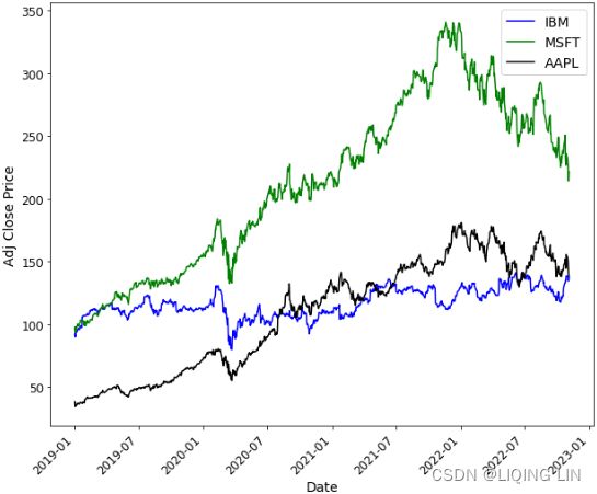
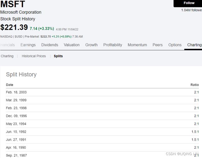
https://seekingalpha.com/symbol/GOOG/splits
Apple Inc. (AAPL) Stock Split History | Seeking Alpha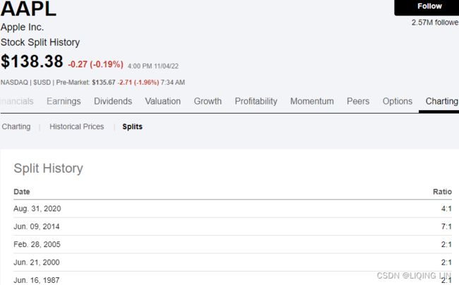

import matplotlib.pyplot as plt
fig, ax = plt.subplots( 1,1, figsize=(18,10) )
# df['Adj Close'].plot(kind='line', ax=ax)
symbols = list( set( df.columns.get_level_values(1) ) )
color_list=['b','g','k']
aapl_event={"2020-08-31": "4:1 split",
"2022-09-16" : "iphone 14",
"2021-09-14" : "iphone 13",
"2020-10-23" : "iphone 12",
"2019-09-20" : "iphone 11",
}
for idx, tick in enumerate(symbols):
ax.plot( df.index,
df['Adj Close'][tick],
label=tick,
color=color_list[idx],
)
from datetime import datetime, timedelta
for date, label in aapl_event.items():
ax.annotate(label,
ha='center',
va='top',
# String to date object
xytext=( datetime.strptime(date, '%Y-%m-%d') -timedelta(days=7) ,
df['Adj Close']['AAPL'].loc[date] +50), #The xytext parameter specifies the text position
xy=( datetime.strptime(date, '%Y-%m-%d'),
df['Adj Close']['AAPL'].loc[date]+10), #The xy parameter specifies the arrow's destination
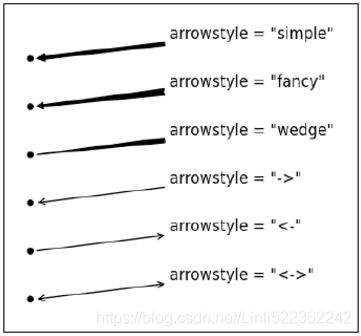
arrowprops=dict( arrowstyle="-|>,head_width=0.5, head_length=1",
facecolor='r',
linewidth=2, edgecolor='k' ),
#arrowprops={'facecolor':'blue', 'headwidth':10, 'headlength':4, 'width':2} #OR
fontsize=12
)
ax.set_xlabel('Date', fontsize=14)
ax.set_ylabel('Adj Close Price', fontsize=14)
plt.setp( ax.get_xticklabels(), rotation=45,
horizontalalignment='right', fontsize=12 )
plt.setp( ax.get_yticklabels(), #rotation=45,
horizontalalignment='right', fontsize=12 )
ax.autoscale(enable=True, axis='x', tight=True) # move all curves to left(touch y-axis)
plt.legend( loc='best', fontsize=14)
plt.show()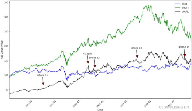
Apple stock price rises for a short period before Apple releases a new phone, then falls after the phone is released, then rises; similar to stock splits.


import matplotlib.pyplot as plt
fig, ax = plt.subplots( 1,1, figsize=(18,10) )
# df['Adj Close'].plot(kind='line', ax=ax)
symbols = list( set( df.columns.get_level_values(1) ) )
color_list=['b','g','k']
aapl_event={"2020-08-31": "4:1 split",
"2022-09-16" : "iphone 14",
"2021-09-14" : "iphone 13",
"2020-10-23" : "iphone 12",
"2019-09-20" : "iphone 11",
}
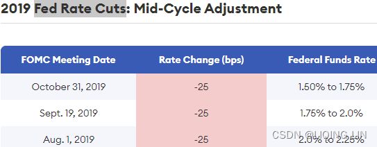
hike_dates=['2022-11-2', '2022-09-21', '2022-07-27', '2022-06-16', '2022-05-05', '2022-03-17']
cuts_dates=['2019-10-31', '2019-09-19', '2019-08-01',
'2020-03-16', '2020-03-13']
for idx, tick in enumerate(symbols):
ax.plot( df.index,
df['Adj Close'][tick],
label=tick,
color=color_list[idx],
)
from datetime import datetime, timedelta
for date, label in aapl_event.items():
ax.annotate(label,
ha='center',
va='top',
# String to date object
xytext=( datetime.strptime(date, '%Y-%m-%d') -timedelta(days=7) ,
df['Adj Close']['AAPL'].loc[date] +50), #The xytext parameter specifies the text position
xy=( datetime.strptime(date, '%Y-%m-%d'),
df['Adj Close']['AAPL'].loc[date]+10), #The xy parameter specifies the arrow's destination
arrowprops=dict(facecolor='k', headwidth=5, headlength=5, width=1 ),
#arrowprops={'facecolor':'blue', 'headwidth':10, 'headlength':4, 'width':2} #OR
fontsize=14
)
for date in hike_dates:
ax.axvline( datetime.strptime(date, '%Y-%m-%d'),
ls=':',
color='r')
for date in cuts_dates:
ax.axvline( datetime.strptime(date, '%Y-%m-%d'),
ls='--',
lw=0.9,
color='y')
ax.set_xlabel('Date', fontsize=14)
ax.set_ylabel('Adj Close Price', fontsize=14)
plt.setp( ax.get_xticklabels(), rotation=45,
horizontalalignment='right', fontsize=12 )
plt.setp( ax.get_yticklabels(), #rotation=45,
horizontalalignment='right', fontsize=12 )
ax.autoscale(enable=True, axis='x', tight=True) # move all curves to left(touch y-axis)
plt.legend( loc='best', fontsize=14)
plt.show()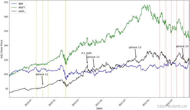
The Fed's rate cuts and rate hikes have a certain impact on stock prices
2. If you want to see how the prices fluctuate (up or down) in comparison to each other, one easy approach is to normalize the data. To accomplish this, just divide the stock prices by the first-day price (first row) for each stock. Tis will make all the stocks have the same starting point:
closing_price_n=df['Adj Close'].div(df['Adj Close'].iloc[0])

import matplotlib.pyplot as plt

fig, ax = plt.subplots( 1,1, figsize=(18,10) )

# df['Adj Close'].plot(kind='line', ax=ax)

symbols = list( set( df.columns.get_level_values(1) ) )
color_list=['b','g','k']

aapl_event={"2020-08-31": "4:1 split",
            "2022-09-16" : "iphone 14",
            "2021-09-14" : "iphone 13",
            "2020-10-23" : "iphone 12",
            "2019-09-20" : "iphone 11",
           }

for idx, tick in enumerate(symbols):
    ax.plot( df.index,
             closing_price_n[tick],
             label=tick,
             color=color_list[idx],
           )

from datetime import datetime, timedelta
for date, label in aapl_event.items():
    ax.annotate(label,

                ha='center',

                va='top',
                         # String to date object
                xytext=( datetime.strptime(date, '%Y-%m-%d') -timedelta(days=7) ,
                         closing_price_n['AAPL'].loc[date] +0.9), #The xytext parameter specifies the text position

                xy=( datetime.strptime(date, '%Y-%m-%d'),
                     closing_price_n['AAPL'].loc[date]+0.35),     #The xy parameter specifies the arrow's destination

#                 arrowprops=dict( arrowstyle="-|>,head_width=1, head_length=1",
#                                  facecolor='b',
#                                  linewidth=4,  edgecolor='k' ),
                arrowprops=dict(arrowstyle='->', connectionstyle='arc3,rad=0.2',
                                color='b',),
                bbox=dict(boxstyle='round,pad=0.2', fc='yellow', alpha=0.95),

                fontsize=12
               )

ax.set_xlabel('Date', fontsize=14)
ax.set_ylabel('Adj Close Price', fontsize=14)

plt.setp( ax.get_xticklabels(), rotation=45,
          horizontalalignment='right', fontsize=12 )
plt.setp( ax.get_yticklabels(), #rotation=45,
          horizontalalignment='right', fontsize=12 )

ax.autoscale(enable=True, axis='x', tight=True) # move all curves to left(touch y-axis)

plt.legend( loc='best', fontsize=14)
plt.show()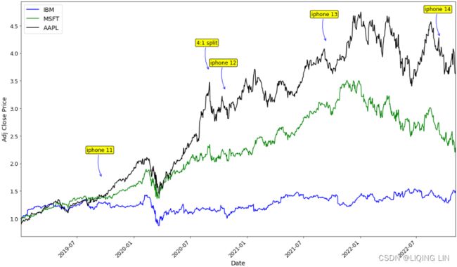
From the normalization output, you can observe that the lines now have the same starting point (origin), set to 1. Te plot shows how the prices in the time series plot deviate from each other:
closing_price_n 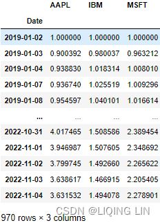 Figure 9.3 – Output of normalized time series with a common starting point at 1
3. Additionally, Matplotlib allows you to change the style of the plots. To do that, you can use the style. use function. You can specify a style name from an existing template or use a custom style. For example, the following code shows how you can change from the default style to the ggplot style:
You can explore other attractive styles: fivethirtyeight , which is inspired by https://fivethirtyeight.com/, dark_background, seaborn-dark, and tableau-colorblind10. For a comprehensive list of available style sheets, you can reference the Matplotlib documentation here: https://matplotlib.org/stable/gallery/style_sheets/style_sheets_reference.html
If you want to revert to the original theme, you specify
plt.style.use("default")https://blog.csdn.net/Linli522362242/article/details/121045744 (Adjusting the resolution: dpi)
You can customize the plot further by adding a title, updating the axes labels, and customizing the x ticks and y ticks, to name a few.
Add a title and a label to the y axis, then save it as a .jpg fle:
start_date = '2019'
end_date = '2022'
plt.style.use('ggplot' )

plot = closing_price_n.plot( figsize=(10,8),
                             title=f'Stock Prices from {start_date} - {end_date}',
                             ylabel='Norm. Price'
                           )
# plot.get_figure().savefig('plot_1.jpg')![]()

There is good collaboration between pandas and Matplotlib, with an ambition to integrate and add more plotting capabilities within pandas.
There are many plotting styles that you can use within pandas simply by providing a value to the kind argument. For example, you can specify the following:
- • line for line charts commonly used to display time series
- • bar or barh (horizontal) for bar plots
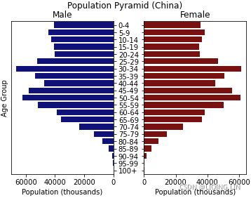 constrictive populations have a lower proportion of young people, so the pyramid base appears to be constrictedhttps://blog.csdn.net/Linli522362242/article/details/93617948
3D bar chart

https://blog.csdn.net/Linli522362242/article/details/111307026 - • hist for histogram plots
https://blog.csdn.net/Linli522362242/article/details/87891370tips['tip_pct'] = tips['tip'] / (tips['total_bill'] - tips['tip']) tips.head()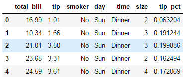
sns.factorplot(x='day', y='tip_pct', hue='time', col='smoker', kind='bar', data=tips[tips.tip_pct <1])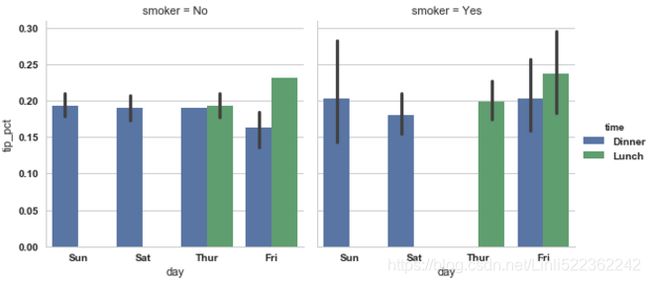 sns.factorplot(x='day', y='tip_pct', row='time', col='smoker', kind='bar', data=tips[tips.tip_pct <1])
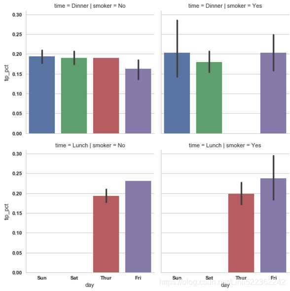
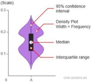
- • box for boxplots violin plot
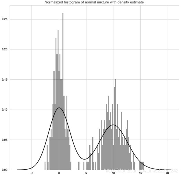
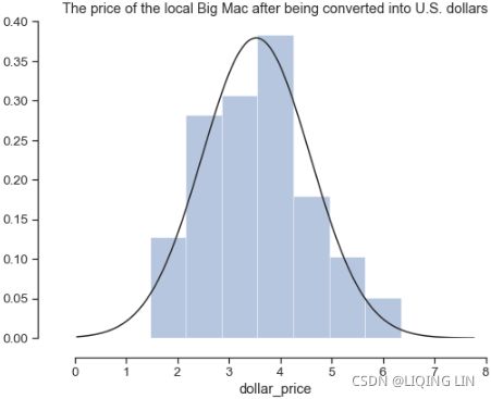
- • kde or density for kernel density estimation plots(which is formed by computing an estimate of a continuous probability distribution that might have generated the observed data. The usual procedure is to approximate this distribution as a mixture of “kernels”. KDE is a non-parametric method used to estimate the distribution of a variable. We can also supply a parametric distribution, such as beta, gamma, or normal distribution, to the fit argument.) https://blog.csdn.net/Linli522362242/article/details/121172551
fits(curve) a kernel density estimate (KDE) over the histogram vs normal distribution
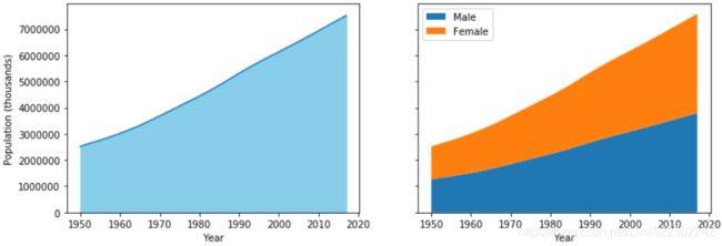
- • area for area plots
- • pie for pie plots

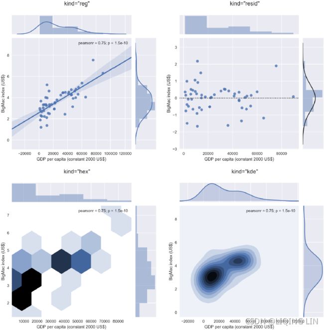
- • scatter for scatter plots
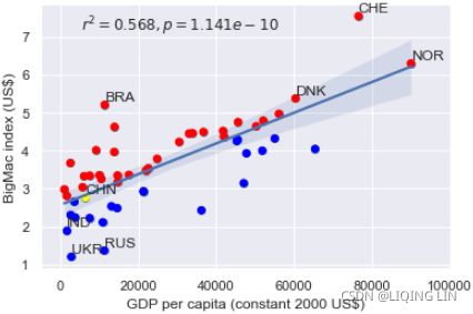 Contrary to popular belief, it looks like China's currency was not significantly under-valued in 2015 since its marker lies well within the 95% confidence interval of the regression line.
3D scatter plot
- • hexbin for hexagonal bin plots
As observed in the previous section, we plotted all three columns in the time series in one plot (three line charts in the same plot). What if you want each symbol (column) plotted separately?
The preceding code will generate a subplot for each column in the DataFrame. For the closing_price DataFrame, this will generate three subplots.
fig, axes = plt.subplots( 3,1, figsize=(12,8) )

symbols = list( set( df.columns.get_level_values(1) ) )
color_list=['b','g','k']

for idx in range( len(axes) ):
    axes[idx].plot( df.index, df['Adj Close'][df['Adj Close'].columns[idx]],
                    label=df['Adj Close'].columns[idx],
                    color=color_list[idx]
            )

    plt.setp( axes[idx].get_yticklabels(), fontsize=12 )
    axes[idx].set_xticks([])
    axes[idx].legend(fontsize=12)

from matplotlib.dates import DateFormatter
import matplotlib.ticker as ticker

axes[-1].set_xticks(closing_price_n.index)
axes[-1].xaxis.set_major_locator(ticker.MaxNLocator(12))
axes[-1].xaxis.set_major_formatter( DateFormatter('%Y-%m') )

axes[0].set_title(f'Stock Prices from {start_date} - {end_date}')
plt.setp( axes[-1].get_xticklabels(), rotation=45, horizontalalignment='right', fontsize=12 )
plt.show() 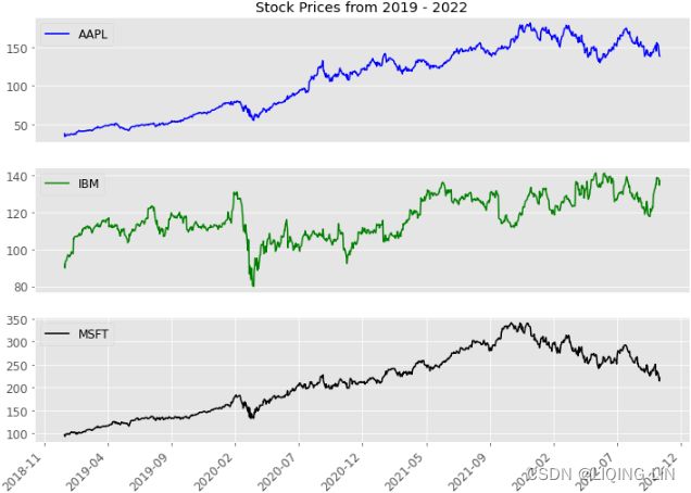
To learn more about pandas charting and plotting capabilities, please visit the ofcial
documentation here: Chart visualization — pandas 1.5.1 documentation .
Plotting time series data with interactive visualizations using hvPlot
In this recipe, you will explore the hvPlot library to create interactive visualizations. hvPlot works well with pandas DataFrames to render interactive visualizations with minimal effort. You will be using the same closing_price.csv dataset to explore the library.
hvplot and PyViz
conda install -c pyviz hvplot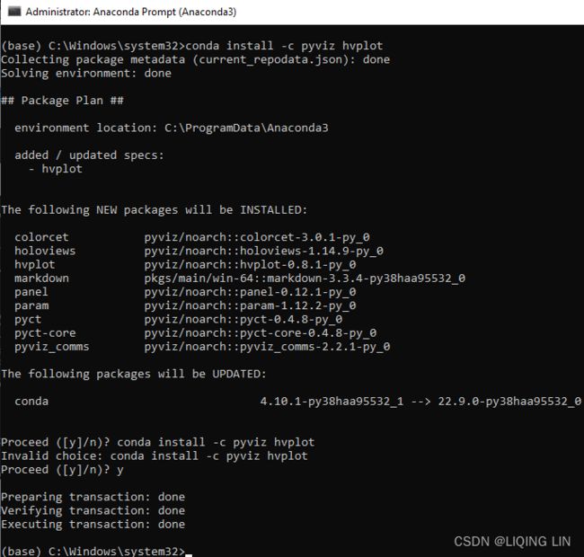
OR in jupyter notebook:
!pip install hvplot
1. Start by importing the libraries needed. Notice that hvPlot has a pandas extension, which makes it more convenient. Tis will allow you to use the same syntax as in the previous recipe:
import hvplot.pandas
# normalize the data :
# divide the stock prices by the first-day price (first row)
# closing_price_n=df['Adj Close'].div( df['Adj Close'].iloc[0] )
closing_price_n.hvplot( title='Time Series plot using hvplot',
width=800, height=400 )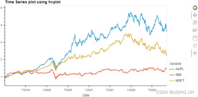 Figure 9.6 – hvPlot interactive visualization
The same result could be accomplished simply by switching the pandas plotting backend. Te default backend is matplotlib . To switch it to hvPlot, you can just update backend=' hvplot' :
closing_price_n.plot( backend='hvplot',
                      title='Time Series plot using hvplot', width=800, height=400
                    )
Notice the widget bar to the right, which has a set of modes for interaction, including pan平移, box zoom框缩放, wheel zoom滚轮缩放, save, reset, and hover. Figure 9.7 – Widget bar with six modes of interaction
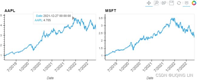
2. You can split each time series into separate plots per symbol (column). For example, to split into three columns one for each symbol (or ticker): MSFT, AAPL, and IBM. Subplotting can be done by specifying subplots=True
You can use the .cols() method for more control over the layout. The method allows you to control the number of plots per row. For example, .cols(1) means one plot per row, whereas . cols(2) indicates two plots per line:
# fontsize={
#     'title': '200%',
#     'labels': '200%',
#     'ticks': '200%',
# }

closing_price_n.hvplot( width=300, height=400,
                        subplots=True,
                        rot=45,
                        fontsize={ 'title': 14,
                                   'labels': 14,
                                   'xticks': 12,
                                   'yticks': 10,
                                 }
                      ).cols(2)
Keep in mind that the .cols() method only works if the subplots parameter is set to True. Otherwise, you will get an error.

hvPlot ofers convenient options for plotting your DataFrame: switching the backend, extending pandas with DataFrame.hvplot(), or using hvPlot's native API.
hvPlot allows you to use two arithmetic operators, + and * , to confgure the layout of the plots.
The plus sign ( + ) allows you to add two charts side by side, while multiply ( * ) will enable you to combine charts (merge one graph with another). In the following example, we will add two plots, so they are aligned side by side on the same row:
( closing_price_n['AAPL'].hvplot( width=400, rot=45, fontsize={'xticks': 12} ) +
  closing_price_n['MSFT'].hvplot( width=400, rot=45, fontsize={'xticks': 12} )
)
Notice that the two plots will share the same widget bar. If you fllter or zoom into one of the charts, the other chart will have the same action applied.
Now, let's see how multiplication will combine the two plots into one:
( closing_price_n['AAPL'].hvplot( width=800, height=400, rot=45, fontsize={'xticks': 12} ) *
  closing_price_n['MSFT'].hvplot()
)
Figure 9.11 – Two plots combined into one using the multiplication operator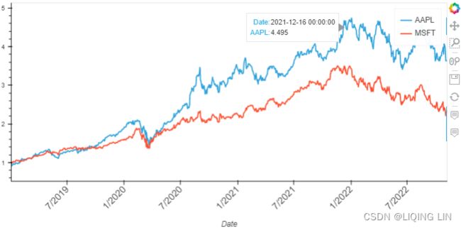
For more information on hvPlot, please visit their ofcial page here: hvPlot — hvPlot 0.8.1 documentation
Decomposing time series data
When performing time series analysis, one of your objectives may be forecasting, where you build a model to make a future prediction. Before starting the modeling process, you will need to extract the components of the time series process for analysis. Tis will help you make informed decisions during the modeling process. In addition, there are three major components for any time series process: trend, seasonality, and residual.
- Trend gives a sense of the long-term direction of the time series and can be either upward, downward, or horizontal. For example, a time series of sales data can show an upward (increasing) trend. Sometimes we will refer to a trend as “changing direction”, when it might go from an increasing trend to a decreasing trend.

- Seasonality is repeated patterns over time. For example, a time series of sales data might show an increase in sales around Christmas time. Tips phenomenon can be observed every year (annually) as we approach Christmas.
 (A seasonal pattern occurs when a time series is affected by seasonal factors such as the time of the year or the day of the week. Seasonality is always of a fixed and known frequency. The monthly sales of antidiabetic drugs above shows seasonality which is induced partly by the change in the cost of the drugs at the end of the calendar year.
- The residual is simply the remaining or unexplained portion once we extract trend and seasonality.
- A stationary time series is one whose statistical properties, such as mean, variance, and autocorrelation, are constant over time.
 The daily change in the Google closing stock price has no trend, seasonality or cyclic behaviour(In general, the average length of cycles is longer than the length of a seasonal pattern, and the magnitudes of cycles tend to be more variable than the magnitudes of seasonal patterns.). There are random fluctuations which do not appear to be very predictable, and no strong patterns that would help with developing a forecasting model.
The decomposition of a time series is the process of extracting the three components and representing them as their models. The modeling of the decomposed components can be either additive or multiplicative.
- You have an additive model when the original time series can be reconstructed by adding all three components:
 OR Y[t] = T[t] + S[t] + e[t]
The additive decomposition is the most appropriate if the magnitude of the seasonal fluctuations季节性波动的幅度, or the variation around the trend-cycle,围绕趋势周期的变化 does not vary with the level of the time series. - On the other hand, if the time series can be reconstructed by multiplying all three components, you have a multiplicative model:
 OR Y[t] = T[t] * S[t] * e[t]
A multiplicative model is suitable when the seasonal variation fuctuates over time.When the variation in the seasonal pattern, or the variation around the trend-cycle, appears to be proportional to the level of the time series与时间序列的水平成正比时, then a multiplicative decomposition is more appropriate.
Furthermore, you can group these into predictable versus non-predictable components.
- Predictable components are consistent, repeating patterns that can be captured and modeled. Seasonality and trend are examples.
- On the other hand, every time series has an unpredictable component that shows irregularity, often called noise, though it is referred to as residual in the context of decomposition.
In this recipe, you will explore different techniques for decomposing your time series using the seasonal_decompose, Seasonal-Trend decomposition with LOESS (STL), and hp_filter methods available in the statsmodels library.
seasonal_decompose
You will start with statsmodels' seasonal_decompose approach:
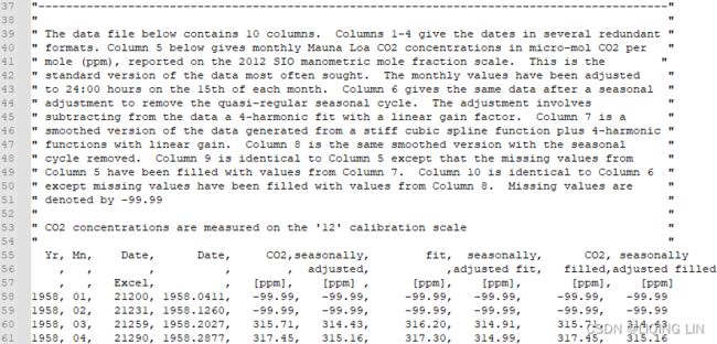
https://scrippsco2.ucsd.edu/data/atmospheric_co2/primary_mlo_co2_record.html
"The data file below contains 10 columns. Columns 1-4 give the dates in several redundant formats.
- Column 5(CO2_[ppm]) below gives monthly Mauna Loa CO2 concentrations in micro-mol CO2 per mole (ppm), reported on the 2012 SIO manometric mole fraction scale. This is the standard version of the data most often sought. The monthly values have been adjusted to 24:00 hours on the 15th of each month.
- Column 6(seasonally_adjusted_[ppm]) gives the same data after a seasonal adjustment to remove the quasi-regular seasonal cycle. 给出了相同的数据季节性调整以消除准规则的季节性周期。The adjustment involves subtracting from the data a 4-harmonic fit with a linear gain factor.调整涉及从数据中减去具有线性增益因子的 4 次谐波拟合
- Column 7(fit_[ppm]) is a smoothed version of the data generated from a stiff cubic spline function plus 4-harmonic functions with linear gain. 第 7 列是从刚性三次样条函数加上4次谐波生成的数据的平滑版本具有线性增益的函数。
- Column 8(seasonally_adjusted_fit_[ppm]) is the same smoothed version with the seasonal cycle removed.
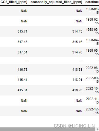
- Column 9(CO2_filled_[ppm]) is identical to Column 5 except that the missing values from Column 5 have been filled with values from Column 7.
- Column 10(seasonally_adjusted_filled_[ppm]) is identical to Column 6 except missing values have been filled with values from Column 8.
- Missing values are denoted by -99.99
import numpy as np
import pandas as pd

source='https://scrippsco2.ucsd.edu/assets/data/atmospheric/stations/in_situ_co2/monthly/monthly_in_situ_co2_mlo.csv'

co2_ds = pd.read_csv( source,
                      comment='"',
                      header=[0,1,2],
                      sep=',',
                      na_values='-99.99'
                    )
co2_ds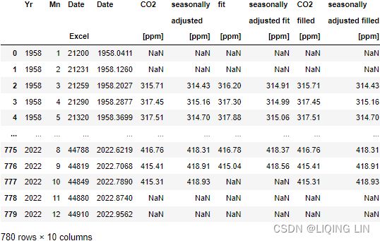
co2_ds.columns 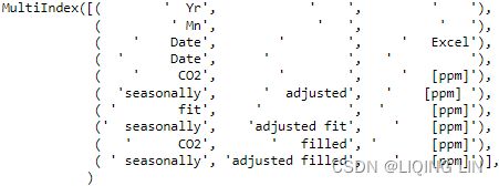
cols = [ '_'.join( ' '.join(col).strip().split() )
         for col in co2_ds.columns.values
       ]
co2_ds.set_axis(cols, axis = 1, inplace = True)
co2_ds
co2_ds.columns 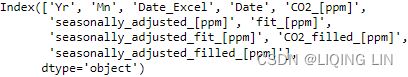
The monthly values have been adjusted to 24:00 hours on the 15th of each month
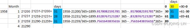
# Converting Excel date format to datetime
# 1958-21200/365=1899.9178082191781
# 365-.9178082191781*365 = 29.99999999999352 = 30
co2_ds['datetime'] = pd.to_datetime( co2_ds['Date_Excel'], # 1958-21200/365=1899.9178082191781
origin = pd.Timestamp('1899-12-30'), # before 1890
unit = 'D'
)
co2_ds 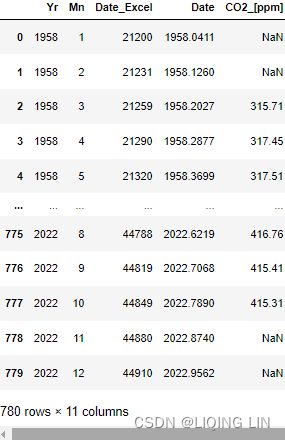 ...
...
# and setting as dataframe index
co2_ds.set_index('datetime', inplace = True)
co2_ds 
Column 5(CO2_[ppm]) below gives monthly Mauna Loa CO2 concentrations in micro-mol CO2 per mole (ppm), reported on the 2012 SIO manometric mole fraction scale. This is the standard version of the data most often sought. The monthly values have been adjusted to 24:00 hours on the 15th of each month.
Column 9(CO2_filled_[ppm]) is identical to Column 5 except that the missing values from Column 5 have been filled with values from Column 7.
co2_df = pd.DataFrame( co2_ds[ 'CO2_filled_[ppm]' ] )

co2_df.rename( columns={'CO2_filled_[ppm]':'CO2'},
               inplace=True
             )
co2_df.dropna( inplace=True )
co2_df = co2_df.resample('M').sum()
co2_df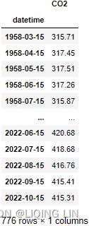
##############
why resample('M').sum() ?
because we are going to use seasonal_decompose() , which requires the "x must be a pandas object with a PeriodIndex or a DatetimeIndex with a freq not set to None"

co2_df = co2_df.resample('M').sum()
co2_df.index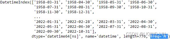
##############
hvplot.extension("bokeh")

co2_df.hvplot( title='Mauna Loa Weekly Atmospheric CO2 Data',
                width=600, height=400,
                rot=45, fontsize={'xticks':12, 'yticks':12, 'xlabel':14}
) 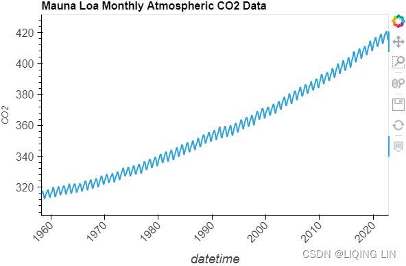
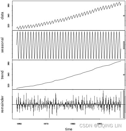
Figure 9.12 – Te CO2 dataset showing an upward trend and constant seasonal variation
The co2_df data shows a long-term linear (upward) trend, with a repeated seasonal pattern at a constant rate (seasonal variation).


This indicates that the CO2 dataset is an additive model( The additive decomposition is the most appropriate if the magnitude of the seasonal fluctuations季节性波动的幅度, or the variation around the trend-cycle,围绕趋势周期的变化 does not vary with the level of the time series.).
Similarly, you can explore the airp_df DataFrame for the Air Passengers dataset to observe whether the seasonality shows multiplicative or additive behavior:
airp_df = pd.read_csv('air_passenger.csv')
# and setting as dataframe index
airp_df.set_index('date', inplace = True)
airp_df 
airp_df.index
airp_df.index = pd.to_datetime( airp_df.index )
airp_df = airp_df.resample('M').sum()
airp_df.index 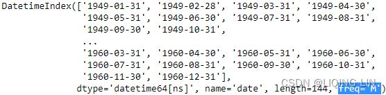
why resample('M').sum() ?
because we are going to use seasonal_decompose() , which requires the "x must be a pandas object with a PeriodIndex or a DatetimeIndex with a freq not set to None"
hvplot.extension('plotly') # 'matplotlib' # 'bokeh' # holoviews

start = pd.DatetimeIndex( airp_df.index ).year[0]
end = pd.DatetimeIndex( airp_df.index ).year[-1]

airp_df.plot( backend='hvplot',
              title=f'Monthly Airline Passenger Numbers {start}-{end}',
              xlabel='Date',
              width=800, height=400,
            )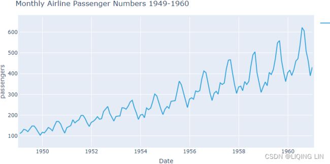
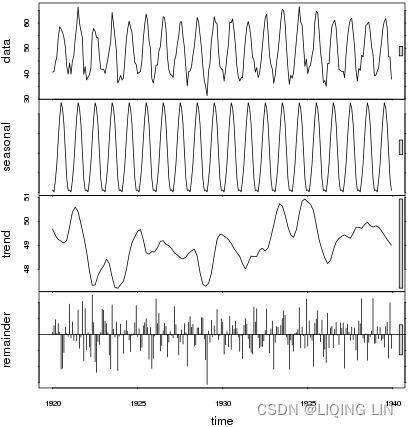
Figure 9.13 – The Air Passengers dataset showing trend and increasing seasonal variation
The airp_df data shows a long-term linear (upward) trend and seasonality. However, the seasonality fuctuations seem to be increasing as well, indicating a multiplicative model(A multiplicative model is suitable when the seasonal variation fuctuates over time. OR When the variation in the seasonal pattern, or the variation around the trend-cycle, appears to be proportional to the level of the time series与时间序列的水平成正比时, then a multiplicative decomposition is more appropriate. ). ==>
==>
3. Use seasonal_decompose on the two datasets. For the CO2 data, use an additive model and a multiplicative model for the air passenger data:
from statsmodels.tsa.seasonal import seasonal_decompose

co2_decomposed = seasonal_decompose( co2_df['CO2'], model='additive' )
air_decomposed = seasonal_decompose( airp_df, model='multiplicative' )
Both co2_decomposed and air_decomposed have access to several methods, including
- .trend, : co2_trend=co2_decomposed.trend
- .seasonal, and
- .resid.
air_dec_df = airp_df
air_dec_df['trend']=air_decomposed.trend
air_dec_df['seasonal']=air_decomposed.seasonal
air_dec_df['resid']=air_decomposed.resid
air_dec_df 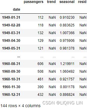
You can plot all three components by using the .plot() method:
plt.rcParams['figure.figsize'] = (10,10)
#https://matplotlib.org/stable/tutorials/introductory/customizing.html
plt.style.use('seaborn-dark')

air_decomposed.plot()

plt.show()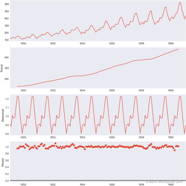
hvplot.extension("bokeh")

air_dec_df.hvplot( width=350, height=350,
                   xlabel='Date',
                   subplots=True, shared_axes=False
                 ).cols(2)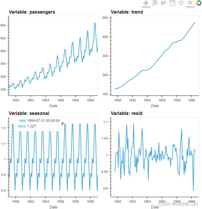
Figure 9.14 – Air Passengers multiplicative decomposed into trend, seasonality, and residual
Let's break down the resulting plot into four parts:
- 1. This is the original observed data that we are decomposing.
- 2. The trend component shows an upward direction. The trend indicates whether there is
- positive (increasing or upward),
- negative (decreasing or downward), or
- constant (no trend or horizontal) long-term movement.
- 3. The seasonal component shows the seasonality effect and the repeating pattern of highs and lows.
- 4. Finally, the residual (noise) component shows the random variation in the data after applying the model. In this case, a multiplicative model was used.
Similarly, you can plot the decomposition of the CO2 dataset:
plt.rcParams['figure.figsize'] = (10,10)

# https://matplotlib.org/stable/tutorials/introductory/customizing.html
plt.style.use('seaborn-white')

fig=co2_decomposed.plot()

axs = fig.get_axes()
axs[3].clear()
axs[3].plot(co2_decomposed.resid)
axs[3].axhline(y=0, color='k', linestyle='--')
axs[3].set_ylabel('Resid')
plt.show()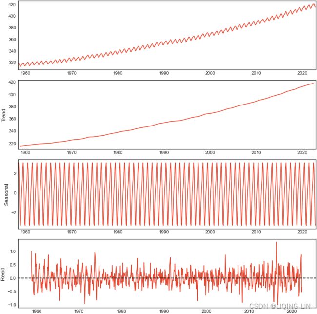
co2_dec_df = co2_df.copy(deep=True)
co2_dec_df['trend']=co2_decomposed.trend
co2_dec_df['seasonal']=co2_decomposed.seasonal
co2_dec_df['resid']=co2_decomposed.resid
co2_dec_df 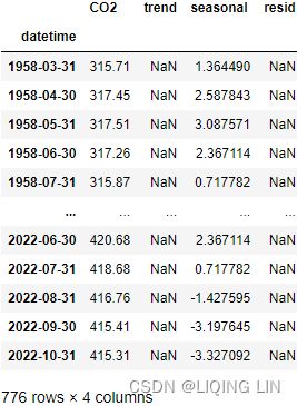
hvplot.extension("bokeh")

co2_dec_df.hvplot(width=800, height=240,
                  xlabel='Date',
                  subplots=True, shared_axes=False
            ).cols(1)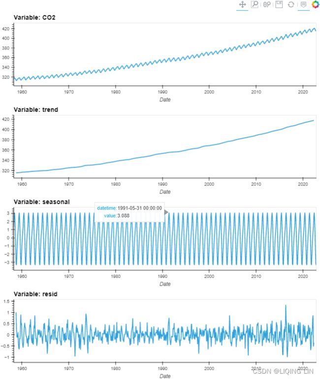

Creating layouts — Bokeh 2.4.3 Documentation
from bokeh.layouts import column # row,
from bokeh.plotting import figure, show
from bokeh.models import ColumnDataSource, HoverTool
# bokeh.__version__ : '2.4.3'

source = ColumnDataSource(data={ 'date': co2_decomposed.observed.index,
                                 'co2' : co2_decomposed.observed,
                                 'trend': co2_decomposed.trend,
                                 'seasonl': co2_decomposed.seasonal,
                                 'residual': co2_decomposed.resid
                               }
                         )


def datetime(x):
    return np.array(x, dtype=np.datetime64)

ps = []
# source.data.keys() : dict_keys(['date', 'co2', 'trend', 'seasonl', 'residual'])
for col in list( source.data.keys() )[1:]:
    p = figure( width=800, height=230, #background_fill_color="#fafafa"
                x_axis_type="datetime",
                # x_axis_label='Date',
                y_axis_label=col,
               )
    p.line( x='date', y=col, source=source, line_width=2, color='blue'
            # legend_label=col
          )
    p.add_tools( HoverTool(     # key
                    tooltips=[ ( 'Date', '@date{%F}'),
                               (  col,   '@%s{0.000}' % col ), # use @{ } for field names with spaces
                             ],

                    formatters={ '@date' : "datetime", # use 'datetime' formatter for 'date' field
                                 '@%s{0.000}' % col : 'numeral',   # use default 'numeral' formatter
                               },
                    # display a tooltip whenever the cursor is vertically in line with a glyph
                    mode='vline'
                )
               )
    ps.append(p)

show(column(ps))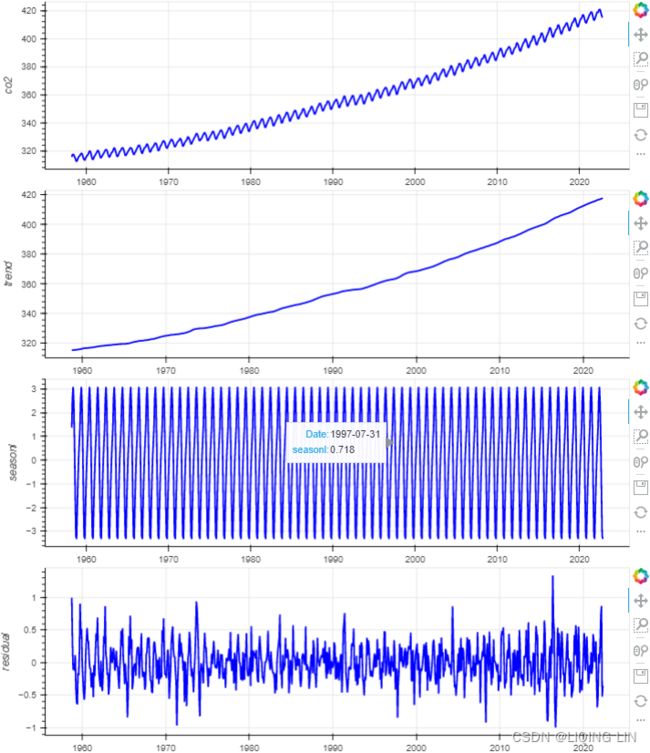
from bokeh.layouts import column # row,
from bokeh.plotting import figure, show
from bokeh.models import ColumnDataSource, HoverTool
# bokeh.__version__ : '2.4.3'

source = ColumnDataSource(data={ 'date': co2_decomposed.observed.index,
                                 'co2' : co2_decomposed.observed,
                                 'trend': co2_decomposed.trend,
                                 'seasonl': co2_decomposed.seasonal,
                                 'residual': co2_decomposed.resid
                               }
                         )


def datetime(x):
    return np.array(x, dtype=np.datetime64)

ps = []
# source.data.keys() : dict_keys(['date', 'co2', 'trend', 'seasonl', 'residual'])
for col in list( source.data.keys() )[1:]:
    p = figure( width=800, height=230, #background_fill_color="#fafafa"
                x_axis_type="datetime",
                # x_axis_label='Date',
                y_axis_label=col,
               )
    p.line( x='date', y=col, source=source, line_width=2, color='blue'
            # legend_label=col
          )
    p.add_tools( HoverTool(     # key
                    tooltips=[ ( 'Date', '@date{%F}' ),
                               ( 'co2',  '@co2{0.000}' ), # use @{ } for field names with spaces
                               ( 'trend', '@trend{0.000}' ),
                               ( 'seasonl', '@seasonl{0.000}' ),
                               ( 'residual', '@residual{0.000}'),
                             ],

                    formatters={ '@date' : "datetime", # use 'datetime' formatter for 'date' field
                                 '@co2{0.000}': 'numeral',   # use default 'numeral' formatter
                               },
                    # display a tooltip whenever the cursor is vertically in line with a glyph
                    mode='vline'
                )
               )
    ps.append(p)
# https://docs.bokeh.org/en/2.4.2/docs/reference/models/tools.html
# https://docs.bokeh.org/en/latest/docs/reference/colors.html
from bokeh.models import CrosshairTool
def addLinkedCrosshairs(plots):
    crosshair = CrosshairTool(dimensions="height", line_color='green')
    for p in plots:
        p.add_tools(crosshair)

addLinkedCrosshairs(ps)

show(column(ps))
Figure 9.15 – CO2 additive decomposed into trend, seasonality, and residual
5. When reconstructing the time series, for example, in a multiplicative model(![]() ), you will be multiplying the three components. To demonstrate this concept, use air_decomposed, an instance of the DecomposeResult class. The class provides the seasonal, trend, and resid attributes as well as the .plot() method.
), you will be multiplying the three components. To demonstrate this concept, use air_decomposed, an instance of the DecomposeResult class. The class provides the seasonal, trend, and resid attributes as well as the .plot() method.
from bokeh.plotting import figure, show
from bokeh.models import ColumnDataSource, HoverTool
import numpy as np

rec_model=air_decomposed.trend * air_decomposed.seasonal * air_decomposed.resid

source = ColumnDataSource(data={ 'date': air_decomposed.observed.index,
                                 'origin': air_decomposed.observed,
                                 'refactored': rec_model,
                               }
                         )

def datetime(x):
    return np.array(x, dtype=np.datetime64)

p = figure( width=800, height=500,
            title='Refactored VS Original models',
            x_axis_type='datetime',
            x_axis_label='Date',
            y_axis_label='Passengers',
          )
p.title.align = "center"
p.xaxis.major_label_orientation=np.pi/4 # rotation

p.line( x='date',  y='origin', source=source, legend_label='Origin',
        line_width=2, color='blue'
      )
p.circle( x='date', y='refactored', source=source, legend_label='Refactored',
          fill_color='white', size=5
        )
p.legend.location = "top_left"
p.add_tools( HoverTool(
                        tooltips=[ ('Date',   '@date{%F}'),
                                   ('Origin', '@origin{0.0}'),
                                   ('Refactored', '@refactored{0.0}' ),
                                 ],
                        formatters={'@date':'datetime',},
                        #model='vline'
                      )
           )

show(p)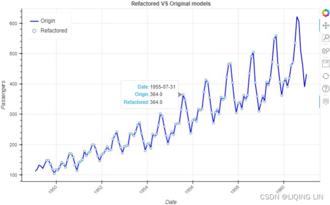
Note : There are missing points in some locations
STL decomposition
STL is a versatile/ ˈvɜːrsət(ə)l /多功能的 and robust method for decomposing time series. STL is an acronym/ ˈækrənɪm /首字母缩略词 for “Seasonal and Trend decomposition using Loess”, while Loess is a method for estimating nonlinear relationships. The STL method was developed by R. B. Cleveland, Cleveland, McRae, & Terpenning (1990).
The STL class uses the LOESS seasonal smoother, which stands for Locally Estimated Scatterplot Smoothing. STL is more robust than seasonal_decompose for measuring non-linear relationships. On the other hand, STL assumes additive composition, so you do not need to indicate a model, unlike with seasonal_decompose.
STL has several advantages over the classical, SEATS and X11 decomposition methods:
-
Unlike SEATS and X11, STL will handle any type of seasonality, not only monthly and quarterly data.
-
The seasonal component is allowed to change over time, and the rate of change can be controlled by the user.
-
The smoothness of the trend-cycle can also be controlled by the user.
-
It can be robust to outliers对异常值具有鲁棒性 (i.e., the user can specify a robust decomposition, Setting robust=True helps remove the impact of outliers on seasonal and trend components when calculated), so that occasional unusual observations will not affect the estimates of the trend-cycle and seasonal components偶尔的异常观测值不会影响趋势周期和季节性分量的估计. They will, however, affect the remainder component会影响其余组成分.
On the other hand, STL has some disadvantages. In particular,
- it does not handle trading day or calendar variation automatically,
- and it only provides facilities for additive decompositions只提供用于加法分解的工具.
It is possible to obtain a multiplicative decomposition by
- first taking logs of the data,
- then back-transforming the components. Decompositions between additive and multiplicative can be obtained using a Box-Cox transformation of the data with 0<λ<1.
- A value of λ=0 corresponds to the multiplicative decomposition
- while λ=1 is equivalent to an additive decomposition.
We will look at several methods for obtaining the components  ,
,  and
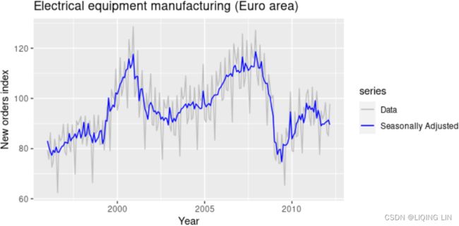
and  later in this chapter, but first, it is helpful to see an example. We will decompose the new orders index for electrical equipment shown in Figure 6.1. The data show the number of new orders for electrical equipment (computer, electronic and optical products) in the Euro area (16 countries). The data have been adjusted by working days and normalised so that a value of 100 corresponds to 2005.
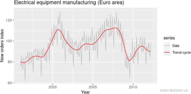
Figure 6.1 shows the trend-cycle component, , in red and the original data,  , in grey. The trend-cycle shows the overall movement in the series, ignoring the seasonality and any small random fluctuations.
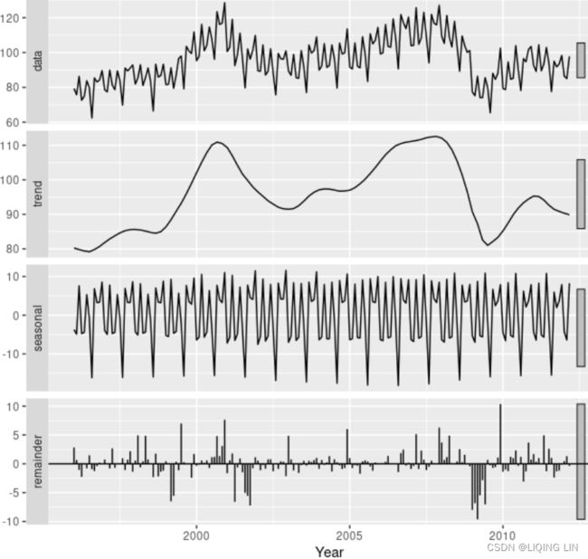 Figure 6.2 shows an additive decomposition of these data. The method used for estimating components in this example is STL.
The electrical equipment orders (top). The three additive components are shown separately in the bottom three panels of Figure 6.2. These components can be added together to reconstruct the data shown in the top panel. Notice that the seasonal component changes slowly over time, vs
vs so that any two consecutive years have similar patterns, but years far apart may have different seasonal patterns. The remainder component shown in the bottom panel is what is left over when the seasonal and trend-cycle components have been subtracted from the data.
The grey bars to the right of each panel show the relative scales of the components组件的相对比例. Each grey bar represents the same length but because the plots are on different scales, the bars vary in length. The longest grey bar in the bottom panel shows that the variation in the remainder component is small compared to the variation in the data, which has a bar about one quarter the size. If we shrunk the bottom three panels until their bars became the same size as that in the data panel, then all the panels would be on the same scale.
########## So on the upper panel, we might consider the bar as 1 unit of variation.
- The bar on the seasonal panel is only slightly longer than that on the data panel, indicating that the seasonal signal is large relative to the variation in the data.
- In other words, if we shrunk the seasonal panel such that the box became the same size as that in the data panel(ytick_labels are same), the range of variation on the shrunk seasonal panel would be similar to but slightly smaller than that on the data panel.
Now consider the trend panel;
- the grey bar is now much longer than either of the ones on the data or seasonal panel, indicating the variation attributed to the trend is much smaller than the seasonal component and consequently only a small part of the variation in the data series.
- The variation attributed to the trend is considerably smaller than the stochastic component (the remainders).
- As such, we can deduce that these data do not exhibit a trend.我们可以推断这些数据没有表现出趋势。
 If we look at the relative sizes of the bars on this plot,
- we note that the trend dominates the data series and consequently the grey bars are of similar length(both of them are very short).
- Of next greatest importance is variation at the seasonal scale, although variation at this scale is a much smaller component of the variation exhibited in the original data.
- The residuals (remainder) represent only small stochastic fluctuations as the grey bar is very long relative to the other panels.
So the general idea is that if you scaled all the panels such that the grey bars were all the same length, you would be able to determine the relative magnitude of the variations in each of the components and how much of the variation in the original data they contained.您将能够确定每个组件中变化的相对幅度以及原始数据中有多少变化 他们包含 But because the plot draws each component on it's own scale, we need the bars to give us a relative scale for comparison.
##########
Seasonally adjusted data
If the seasonal component is removed from the original data, the resulting values are the “seasonally adjusted” data. For an additive decomposition, the seasonally adjusted data are given by ![]() , and for multiplicative data, the seasonally adjusted values are obtained using
, and for multiplicative data, the seasonally adjusted values are obtained using ![]() .
.
 If the variation due to seasonality is not of primary interest(longer grey bar), the seasonally adjusted series can be useful. For example, monthly unemployment data are usually seasonally adjusted(the seasonal component is removed from the original data) in order to highlight variation due to the underlying state of the economy rather than the seasonal variation每月失业数据通常会进行季节性调整,以突出由于潜在经济状况而不是季节性变化引起的变化.
- An increase in unemployment due to school leavers seeking work is seasonal variation,
- while an increase in unemployment due to an economic recession is non-seasonal.
- Most economic analysts who study unemployment data are more interested in the non-seasonal variation. Consequently, employment data (and many other economic series) are usually seasonally adjusted.
Seasonally adjusted series contain the remainder component as well as the trend-cycle. Therefore, they are not “smooth”(不“平稳” or Non-stationary), and “downturns” or “upturns” can be misleading. If the purpose is to look for turning points in a series, and interpret any changes in direction, then it is better to use the trend-cycle component rather than the seasonally adjusted data.
Figure 6.2 shows an additive decomposition of these data. The method used for estimating components in this example is STL. Notice that the seasonal component changes slowly over time, vsso that any two consecutive years have similar patterns, but years far apart may have different seasonal patterns.
The best way to begin learning how to use STL is to see some examples and experiment with the settings. Figure 6.2 showed an example of STL applied to the electrical equipment orders data. Figure 6.13 shows an alternative STL decomposition where the trend-cycle is more flexible, the seasonal component does not change over time, and the robust option has been used. Here, it is more obvious that there has been a down-turn at the end of the series, and that the orders in 2009 were unusually low (corresponding to some large negative values(e.g. : -10) in the remainder component). 在这里,更明显的是,系列末期出现了下滑,2009年的订单异常低(对应于剩余部分的一些较大的负值)。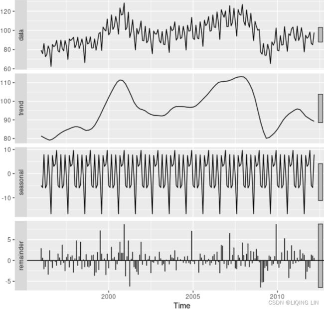
Figure 6.13: The electrical equipment orders (top) and its three additive components obtained from a robust STL decomposition with flexible trend-cycle and fixed seasonality.
The two main parameters to be chosen when using STL are
- the trend-cycle window (
t.window)
t.windowis the number of consecutive observations to be used when estimating the trend-cycle- Specifying
t.windowis optional, and a default value will be used if it is omitted.
- the seasonal window (
s.window).
s.windowis the number of consecutive years to be used in estimating each value in the seasonal component- The user must specify
s.windowas there is no default. Setting it to be infinite is equivalent to forcing the seasonal component to be periodic (i.e., identical across years).
- These control how rapidly the trend-cycle and seasonal components can change. Smaller values allow for more rapid changes. Both
t.windowands.windowshould be odd numbers;
The mstl()function provides a convenient automated STL decomposition using s.window=13, and t.window also chosen automatically. This usually gives a good balance between overfitting the seasonality and allowing it to slowly change over time. But, as with any automated procedure, the default settings will need adjusting for some time series.
As with the other decomposition methods discussed in this book, to obtain the separate components plotted in Figure 6.8, use the seasonal() function for the seasonal component, the trendcycle() function for trend-cycle component, and the remainder() function for the remainder component. The seasadj() function can be used to compute the seasonally adjusted series.
6. Another decomposition option within statsmodels is STL, which is a more advanced decomposition technique. In statsmodels, the STL class requires additional parameters than the seasonal_decompose function. Thee two other parameters you will use are seasonal and robust.
- The seasonal parameter is for the seasonal smoother and can only take odd integer values greater than or equal to 7. Similarly, the STL function has a trend smoother (the trend parameter).
- The second parameter is robust, which takes a Boolean value ( True or False ). Setting robust=True helps remove the impact of outliers on seasonal and trend components when calculated.
You will use STL to decompose the co2_df DataFrame:
https://docs.bokeh.org/en/2.4.2/docs/reference/models/glyphs/scatter.html
Linking behavior — Bokeh 2.4.3 Documentation
It’s often desired to link pan or zooming actions across many plots. All that is needed to enable this feature is to share range objects between figure() calls.
When you used STL , you provided seasonal=13 because the data has an annual seasonal effect.
from statsmodels.tsa.seasonal import STL
plt.style.use('seaborn-white')
#plt.style.use('ggplot' )
# robust : Flag indicating whether to use a weighted version that
# is robust to some forms of outliers.
co2_stl = STL( co2_df, seasonal=13, robust=True ).fit()
# co2_stl.plot()
# plt.show()
from bokeh.layouts import column # row,
from bokeh.plotting import figure, show
from bokeh.models import ColumnDataSource, HoverTool
# bokeh.__version__ : '2.4.3'
source = ColumnDataSource(data={ 'date': co2_stl.observed.index,
'co2' : co2_stl.observed['CO2'], # co2_stl.observed is a dataframe
'trend': co2_stl.trend,
'seasonl': co2_stl.seasonal,
'residual': co2_stl.resid
}
)
def datetime(x):
return np.array(x, dtype=np.datetime64)
ps = []
# source.data.keys() : dict_keys(['date', 'co2', 'trend', 'seasonl', 'residual'])
for col in list( source.data.keys() )[1:]:
p = figure( width=800, height=220, #background_fill_color="#fafafa"
x_axis_type="datetime",
# x_axis_label='Date',
y_axis_label=col,
x_range=ps[0].x_range if len(ps)>0 else None, ###########
y_range=ps[0].y_range if len(ps)==1 else None, ###########
)
# if col != 'residual':
p.line( x='date', y=col, source=source, line_width=2, color='blue'
# legend_label=col
)
# else:
# p.scatter( x='date', y=col, source=source, line_width=2, color='blue',
# marker='circle'
# # legend_label=col
# )
p.add_tools( HoverTool( # key
tooltips=[ ( 'Date', '@date{%F}' ),
( 'co2', '@co2{0.000}' ), # use @{ } for field names with spaces
( 'trend', '@trend{0.000}' ),
( 'seasonl', '@seasonl{0.000}' ),
( 'residual', '@residual{0.000}'),
],
formatters={ '@date' : "datetime", # use 'datetime' formatter for 'date' field
'@co2{0.000}': 'numeral', # use default 'numeral' formatter
},
# display a tooltip whenever the cursor is vertically in line with a glyph
mode='vline'
)
)
ps.append(p)
ps[3].xaxis.major_label_orientation=np.pi/4 # rotation
# https://docs.bokeh.org/en/2.4.2/docs/reference/models/tools.html
# https://docs.bokeh.org/en/latest/docs/reference/colors.html
from bokeh.models import CrosshairTool
def addLinkedCrosshairs(plots):
crosshair = CrosshairTool(dimensions="height", line_color='green', line_alpha=1)
for p in plots:
p.add_tools(crosshair)
addLinkedCrosshairs(ps)
show(column(ps))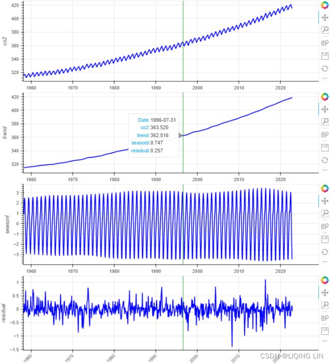 Figure 9.17 – Decomposing the CO2 dataset with STL
Figure 9.15 residual 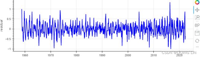
Compare the output in Figure 9.16 to that in Figure 9.15. You will notice that the residual plots look diferent, indicating that both methods capture similar information using distinct mechanisms. When you used STL , you provided seasonal=13 because the data has an annual seasonal effect.
You used two diferent approaches for time series decomposition. Both methods decompose a time series into trend, seasonal, and residual components.
The STL class uses the LOESS seasonal smoother, which stands for Locally Estimated Scatterplot Smoothing. STL is more robust than seasonal_decompose for measuring non-linear relationships. On the other hand, STL assumes additive composition, so you do not need to indicate a model, unlike with seasonal_decompose.
Both approaches can extract seasonality from time series to better observe the overall trend in the data.
########### STL is more robust than seasonal_decompose for measuring non-linear relationships Proved!
from bokeh.plotting import figure, show
from bokeh.models import ColumnDataSource, HoverTool
import numpy as np

rec_co2_stl=co2_stl.trend + co2_stl.seasonal + co2_stl.resid

source = ColumnDataSource(data={ 'date': co2_stl.observed.index,
                                 'origin': co2_stl.observed['CO2'],
                                 'reconstructed': rec_co2_stl,
                               }
                         )

def datetime(x):
    return np.array(x, dtype=np.datetime64)

p = figure( width=800, height=500,
            title='Refactored(STL) VS Original models',
            x_axis_type='datetime',
            x_axis_label='Date',
          )
# https://docs.bokeh.org/en/1.1.0/docs/user_guide/annotations.html
p.title.align = "center"
p.xaxis.major_label_orientation=np.pi/4 # rotation

p.line( x='date',  y='origin', source=source, legend_label='Origin',
        line_width=2, color='blue'
      )
p.circle( x='date', y='reconstructed', source=source, legend_label='Reconstructed',
          fill_color='white', size=3
        )
p.legend.location = "top_left"
p.add_tools( HoverTool(
                        tooltips=[ ('Date',   '@date{%F}'),
                                   ('Origin', '@origin{0.0}'),
                                   ('Refactored', '@refactored{0.0}' ),
                                 ],
                        formatters={'@date':'datetime',},
                        #model='vline'
                      )
           )

show(p)
from bokeh.plotting import figure, show
from bokeh.models import ColumnDataSource, HoverTool
import numpy as np

rec_co2_dec=co2_decomposed.trend + co2_decomposed.seasonal + co2_stl.resid

source = ColumnDataSource(data={ 'date': co2_decomposed.observed.index,
                                 'origin': co2_decomposed.observed,
                                 'reconstructed': rec_co2_dec,
                               }
                         )

def datetime(x):
    return np.array(x, dtype=np.datetime64)

p = figure( width=800, height=500,
            title='Refactored(seasonal_decompose) VS Original models',
            x_axis_type='datetime',
            x_axis_label='Date',
          )
# https://docs.bokeh.org/en/1.1.0/docs/user_guide/annotations.html
p.title.align = "center"
p.xaxis.major_label_orientation=np.pi/4 # rotation

p.line( x='date',  y='origin', source=source, legend_label='Origin',
        line_width=2, color='blue'
      )
p.circle( x='date', y='reconstructed', source=source, legend_label='Reconstructed',
          fill_color='white', size=3
        )
p.legend.location = "top_left"
p.add_tools( HoverTool(
                        tooltips=[ ('Date',   '@date{%F}'),
                                   ('Origin', '@origin{0.0}'),
                                   ('Refactored', '@refactored{0.0}' ),
                                 ],
                        formatters={'@date':'datetime',},
                        #model='vline'
                      )
           )

show(p)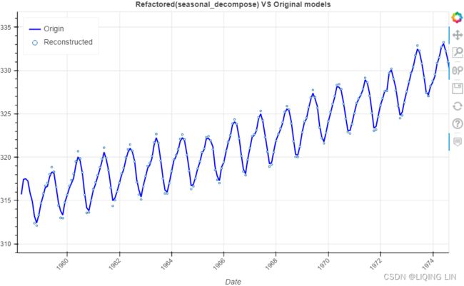
Note : There are missing points in some locations
###########
6.7 Measuring strength of trend and seasonality
A time series decomposition can be used to measure the strength of trend and seasonality in a time series (Wang, Smith, & Hyndman, 2006). Recall that the decomposition is written as![]()
where is the smoothed trend component, is the seasonal component and is a remainder component.
- For strongly trended data, the seasonally adjusted data
( If the seasonal component is removed from the original data, the resulting values are the “seasonally adjusted” data
) should have much more variation than the remainder component. Therefore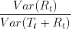 should be relatively small.
- But for data with little or no trend, the two variances should be approximately the same. So we define the strength of trend as:
 This will give a measure of the strength of the trend between 0 and 1. Because the variance of the remainder might occasionally be even larger than the variance of the seasonally adjusted data, we set the minimal possible value of
  equal to zero.
- But for data with little or no trend, the two variances should be approximately the same. So we define the strength of trend as:
- The strength of seasonality is defined similarly, but with respect to the detrended data rather than the seasonally adjusted data:
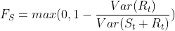
- A series with seasonal strength
 close to 0 exhibits almost no seasonality,
 - while a series with strong seasonality will have close to 1 because
 will be much smaller than
 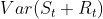 .
.
- A series with seasonal strength
Hodrick-Prescott filter
The Hodrick-Prescott filter is a smoothing filter that can be used to separate short-term
fuctuations (cyclic variations周期性变化) from long-term trends. This is implemented as hp_filter in the statsmodels library.
Recall that STL and seasonal_decompose returned three components (trend, seasonal, and residual). On the other hand, hp_filter returns two components:
- a cyclical component and
- a trend component.
Start by importing the hpfilter function from the statsmodels library:
lamb : float
The Hodrick-Prescott smoothing parameter. A value of 1600 is suggested for quarterly data. Ravn and Uhlig suggest using a value of 6.25 (1600/4**4) for annual data and 129600 (1600*3**4) for monthly data.
The reasoning for the methodology uses ideas related to the decomposition of time series. Let for ![]() denote the logarithms of a time series variable. The series
denote the logarithms of a time series variable. The series  is made up of a trend component , a cyclical component
  , and an error component such that
 ![]() Given an adequately chosen, positive value of
Given an adequately chosen, positive value of  , there is a trend component that will solve(The HP filter removes a smooth trend,
  , from the data
  by solving)
![\large \underset{T_t}{min} (\sum_{t=1}^{T}(Y_t - T_t)^2 + \lambda\sum_{t=2}^{T-1}[(T_{t+1}-T_t)-(T_t - T_{t-1})]^2)](http://img.e-com-net.com/image/info8/4588450fb8814ae198c553fa1d6da3d3.gif)
- The first term of the equation is the sum of the squared deviations
 , which penalizes the cyclical component.
 - The second term is a multiple of the sum of the squares of the trend component's second differences. This second term penalizes variations in the growth rate of the trend component.
- The larger the value of , the higher is the penalty.
- Hodrick and Prescott suggest 1600 as a value for for quarterly data.
- Ravn and Uhlig (2002) state that should vary by the fourth power of the frequency observation ratio; thus, should equal 6.25 (
 ) for annual data and 129,600 (
 ) for monthly data;[4]
 - in practice,
 for yearly data and
  for monthly data are commonly used, however.
- The larger the value of
Here we implemented the HP filter as a ridge-regression rule using scipy.sparse.statsmodels.tsa.filters.hp_filter — statsmodels In this sense, the solution can be written as ![]()
![]() : the number of observations
: the number of observations
where  is a
is a ![]() identity matrix, and K is a
identity matrix, and K is a ![]() ) matrix such that
) matrix such that
K[i,j] = 1 if i == j or i == j + 2
K[i,j] = -2 if i == j + 1
K[i,j] = 0 otherwise
The Hodrick–Prescott filter is explicitly given by![]()
where  denotes the lag operator, as can seen from the first-order condition for the minimization problem.
from statsmodels.tsa.filters.hp_filter import hpfilter

plt.rcParams["figure.figsize"] = (20, 3)
plt.rcParams['font.size']=12
# co2_df = pd.DataFrame( co2_ds[ 'CO2_filled_[ppm]' ] )

# co2_df.rename( columns={'CO2_filled_[ppm]':'CO2'},
#                inplace=True
#              )
# co2_df.dropna( inplace=True )
# co2_df = co2_df.resample('M').sum()
co2_cyclic, co2_trend = hpfilter(co2_df)
The hpfilter function returns two pandas Series: the first Series is for the cycle and the second Series is for the trend. Plot co2_cyclic and co2_trend side by side to gain a better idea of what information the Hodrick-Prescott filter was able to extract from the data:
fig, ax = plt.subplots(2, 1, figsize=(10,8))

co2_cyclic.plot( ax=ax[0], title='CO2 Cyclic Component' )
co2_trend.plot( ax=ax[1] , title='CO2 Trend Component' )
ax[0].title.set_size(20)
ax[1].title.set_size(20)

plt.subplots_adjust(hspace = 0.3)
Note that the two components from hp_filter are additive. In other words, to reconstruct the original time series, you would add co2_cyclic and co2_trend.
from bokeh.plotting import figure, show
from bokeh.models import ColumnDataSource, HoverTool
import numpy as np

rec_co2_hp= co2_trend + co2_cyclic

source = ColumnDataSource(data={ 'date': co2_df.index,
                                 'origin': co2_df['CO2'],
                                 'reconstructed': rec_co2_hp,
                               }
                         )

def datetime(x):
    return np.array(x, dtype=np.datetime64)

p = figure( width=800, height=500,
            title='Refactored(hp) VS Original models',
            x_axis_type='datetime',
            x_axis_label='Date',
          )
# https://docs.bokeh.org/en/1.1.0/docs/user_guide/annotations.html
p.title.align = "center"
p.xaxis.major_label_orientation=np.pi/4 # rotation

p.line( x='date',  y='origin', source=source, legend_label='Origin',
        line_width=2, color='blue'
      )
p.circle( x='date', y='reconstructed', source=source, legend_label='Reconstructed',
          fill_color='white', size=3
        )
p.legend.location = "top_left"
p.add_tools( HoverTool(
                        tooltips=[ ('Date',   '@date{%F}'),
                                   ('Origin', '@origin{0.0}'),
                                   ('Refactored', '@refactored{0.0}' ),
                                 ],
                        formatters={'@date':'datetime',},
                        #model='vline'
                      )
           )

show(p)
To learn more about hpfilter(), please visit the ofcial documentation page here: https://www.statsmodels.org/0.8.0/generated/statsmodels.tsa.filters.hp_filter.hpfilter.htmlstatsmodels.tsa.filters.hp_filter.hpfilter — statsmodelshttps://www.statsmodels.org/0.8.0/generated/statsmodels.tsa.filters.hp_filter.hpfilter.html
Detecting time series stationarity
Several time series forecasting techniques assume stationarity. Tips makes it essential to understand whether the time series you are working with is stationary or non-stationary.
- A stationary time series implies that specifc statistical properties do not vary over time and remain steady, making the processes easier to model and predict.
- On the other hand, a non-stationary process is more complex to model due to the dynamic nature and variations over time (for example, in the presence of trend or seasonality).
There are diferent approaches for defning stationarity; some are strict and may not be possible to observe in real-world data, referred to as strong stationarity. In contrast, other defnitions are more modest in their criteria and can be observed in (or transformed into) real-world data, known as weak stationarity.
Stationarity is an essential concept in time series forecasting, and more relevant when working with financial or economic data. The mean is considered stable and constant if the time series is stationary. In other words, there is an equilibrium存在一个平衡 as values may deviate from the mean (above or below), but eventually, it always returns to the mean. Some trading strategies rely on this core assumption, formally called a mean reversion strategyhttps://blog.csdn.net/Linli522362242/article/details/121896073https://blog.csdn.net/Linli522362242/article/details/126353102.
Types of stationary processes
These are a number of definitions of stationarity that you may come across in time series studies:
- Stationary process: A process that generates a stationary series of observations.
- Trend stationary: A process that does not exhibit a trend.
- Seasonal stationary: A process that does not exhibit seasonality.
- Strictly stationary: Also known as strongly stationary. A process whose unconditional joint probability distribution of random variables does not change when shifted in time (or along the x axis).
- Weakly stationary: Also known as covariance-stationary, or second-order stationary. A process whose mean, variance, and correlation of random variables doesn't change when shifted in time.
In this recipe, and for practical reasons, a stationary time series is defned as a time series with a constant mean(μ), a constant variance(![]() ), and a consistent covariance (or autocorrelation) between identical distanced periods (lags). Having the mean and variance as constants simplifes modeling since you are not solving for them as functions of time.
), and a consistent covariance (or autocorrelation) between identical distanced periods (lags). Having the mean and variance as constants simplifes modeling since you are not solving for them as functions of time.
Generally, a time series with trend or seasonality can be considered non-stationary. Usually, spotting trends or seasonality visually in a plot can help you determine whether the time series is stationary or not. In such cases, a simple line plot would suffice. But in this recipe, you will explore statistical tests to help you identify a stationary or non-stationary time series numerically. You will explore testing for stationarity and techniques for making a time series stationary.
The statsmodels library ofers stationarity tests, such as the adfuller and kpss functions. Both are considered unit root tests and are used to determine whether differencing or other transformations are needed to make the time series stationary.
You will explore two statistical tests, the Augmented Dickey-Fuller (ADF) test and the Kwiatkowski-Phillips-Schmidt-Shin (KPSS) test, using the statsmodels library. Both ADF and KPSS test for unit roots in a univariate time series process. Note that unit roots are just one cause for a time series to be non-stationary, but generally, the presence of unit roots indicates non-stationarity.
Both ADF and KPSS are based on linear regression and are a type of statistical hypothesis test. For example,
- the null hypothesis
 for ADF states that there is a unit root in the time series, and thus, it is non-stationary.
 - On the other hand, KPSS has the opposite null hypothesis, which assumes the time series is stationary.
Therefore, you will need to interpret the test results to determine whether you can reject or fail to reject the null hypothesis. Generally, you can rely on the p-values returned to decide whether you reject or fail to reject the null hypothesis. Remember, the interpretation for ADF and KPSS results is different given their opposite null hypotheses.
In this recipe, you will be using the CO2 dataset, which was previously loaded as a pandas DataFrame under the Technical requirements section of this chapter.
In addition to the visual interpretation of a time series plot to determine stationarity, a more concrete method would be to use one of the unit root tests, such as the ADF KPSS test.
In Figure 9.13, you can spot an upward trend and a reoccurring seasonal pattern (annual). However, when trend or seasonality exists (in this case, both), it makes the time series non-stationary. It's not always this easy to identify stationarity or lack of it visually, and therefore, you will rely on statistical tests.
You will use both the adfuller and KPSS tests from the statsmodels library and interpret their results knowing they have opposite null hypotheses:
from datetime import datetime
source='https://scrippsco2.ucsd.edu/assets/data/atmospheric/stations/in_situ_co2/weekly/weekly_in_situ_co2_mlo.csv'
co2_df = pd.read_csv(  source,
                      comment='"',
                      sep=',',
                      names=['co2'],# as second column name
                      index_col=0, # use first column as index
                      parse_dates=True ,
                      na_values='-99.99'
                    )
#co2_df.set_index('Date', inplace=True,)
#co2_df.index.name=None

co2_df.dropna( inplace=True )
co2_df=co2_df.asfreq('W-SAT', 'ffill')#ffill()
#co2_df=co2_df.loc['1958-03-29':'2001-12-30']
co2_df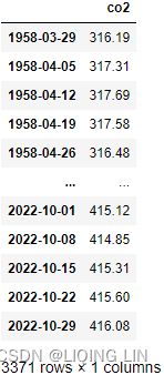
co2_df.plot(kind='hist', figsize=(10,8))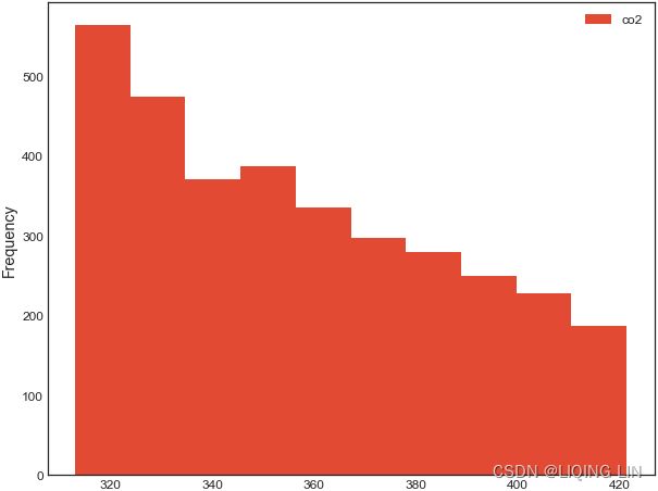
Run both the kpss and adfuller tests. Use the default parameter values for both functions:
from statsmodels.tsa.stattools import adfuller, kpss

adf_output = adfuller( co2_df )
kpss_output = kpss( co2_df)
adf_output| 1.2234524495363004, | The test statistic. |
| 0.9961439788365943, | MacKinnon’s approximate p-value based on MacKinnon |
| 29, | The number of lags used. |
| 3341, | The number of observations used for the ADF regression and calculation of the critical values. |
| {'1%': -3.4323087941815134, | Critical values for the test statistic at the 1 % |
| '5%': -2.8624054806561885, | Critical values for the test statistic at the 5 % |
| '10%': -2.5672307125909124}, | Critical values for the test statistic at the 10 % |
| 4511.855869092864) | The maximized information criterion if autolag is not None.(default autolag='AIC', ) |
kpss_output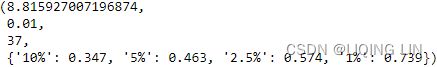
To simplify the interpretation of the test results, create a function that outputs the results in a user-friendly way. Let's call the function print_results :
def print_results( output, test='adf' ):
    test_score = output[0]
    pval = output[1]
    lags = output[2]

    decision = 'Non-Stationary'
    if test == 'adf':
        critical = output[4]
        if pval < 0.05:
            decision = 'Stationary'
    elif test =='kpss':
        critical = output[3]
        if pval >= 0.05:
            decision='Stationary'

    output_dict = { 'Test Statistic': test_score,
                    'p-value': pval,
                    'Numbers of lags': lags,
                    'decision': decision
                  }

    for key, value in critical.items():
        output_dict['Critical Value (%s)' % key] = value

    return pd.Series(output_dict, name=test)
Pass both outputs to the print_results function and concatenate them into a pandas DataFrame for easier comparison:
pd.concat([ print_results(adf_output, 'adf'),
            print_results(kpss_output, 'kpss')
          ],
          axis=1
         )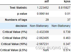
- For ADF, the p-value is at 0.996144, which is greater than 0.05, so you cannot reject the null hypothesis(: there is a unit root in the time series, and thus, it is non-stationary), and therefore, the time series is non-stationary.
- p-value > 0.05: We fail to reject the null hypothesis
 and conclude that the data has a unit root and is non-stationary
 - p-value ≤ 0.05: We reject the null hypothesis and conclude that the data does not contain a unit root and is stationary
- p-value > 0.05: We fail to reject the null hypothesis
- For KPSS, the p-value is at 0.01, which is less than 0.05, so you reject the null hypothesis( : assumes the time series is stationary), and therefore, the time series is non-stationary.
- The Test Statistic value is 1.223452 for ADF(which are above the 1% critical value threshold) and 8.815927 for KPSS(which are above the 1% critical value threshold) . This indicates that the time series is non-stationary. It confirms that you cannot reject the null hypothesis of ADF and can reject the null hypothesis of KPSS. The critical values for ADF come from a Dickey-Fuller table. Luckily, you do not have to reference the Dickey-Fuller table since all statistical sofware/libraries that offer the ADF test use the table internally. The same applies to KPSS.
- Number of lags represents the number of lags used in the autoregressive process in the test (ADF and KPSS). In our tests, 29 lags were used for ADF and 37 lags were used for KPSS. Since our CO2 data is weekly, a lag represents 1 week back. So, 29 lags represent 29 weeks and 37 lags represent 37 weeks in our data.
- The number of observations used is the number of data points, excluding the number of lags.
- The maximized info criteria are based on the autolag parameter. The default is autolag="aic" for the Akaike information criterion. Other acceptable autolag parameter values are bic for the Bayesian information criterion and t-stat .
You will explore six techniques for making the time series stationary, such as transformations and differencing. The techniques covered are
- first-order differencing(detrending),
- second-order differencing,
- subtracting moving average,
- log transformation(to stabilize the variance in a time series and sometimes enough to make the time series stationary),
- decomposition, and
- Hodrick-Prescott filter.
Essentially, stationarity can be achieved by removing trend (detrending) and seasonality effects. For each transformation, you will run the stationarity tests and compare the results between the different techniques. To simplify the interpretation and comparison, you will create two functions:
- check_stationarity takes a DataFrame, performs both KPSS and ADF tests, and returns the outcome.
- plot_comparison takes a list of methods and compares their plots. The function takes plot_type , so you can explore a line chart and a histogram. The function calls the check_stationarity function to capture the results for the subplot titles.
Create the check_stationarity function, which is a simplifed rewrite of the print_results function used earlier:
def check_stationarity( df ):
    kps = kpss(df)
    adf = adfuller(df)

    kpss_pv, adf_pv = kps[1], adf[1]
    kpss_h0, adf_h0 = 'Stationary', 'Non-stationary'

    if adf_pv < 0.05:
        # Reject ADF Null Hypothesis
        adf_h0 = 'Stationary'
    if kpss_pv < 0.05:
        kpss_h0 = 'Non Stationary'
    return (kpss_h0, adf_h0)
#plt.rc('text', usetex=False)
def plot_comparison( methods, plot_type='line' ):
n = len(methods) // 2
fig, ax = plt.subplots( n,2, sharex=True, figsize=(20,16) )
for i, method in enumerate(methods):
method.dropna( inplace=True )
name = [n for n in globals()
if globals()[n] is method
]
row_idx, col_idx = i//2, i%2
kpss_decision, adf_decision = check_stationarity(method)
method.plot( kind=plot_type,
ax=ax[row_idx, col_idx],
legend=False,
title=f'{name[0].upper()}: KPSS={kpss_decision}, ADF={adf_decision}'
)
ax[row_idx, col_idx].title.set_size(14)
method.rolling(52).mean().plot( ax=ax[row_idx, col_idx],color='blue',
legend=False
)Notice the center line(color='blue') representing the time series average (moving average). The mean should be constant for a stationary time series and look more like a straight line.
Let's implement some of the methods for making the time series stationary or extracting a stationary component. Then, combine the methods into a Python list:
- 1. First-order differencing: Also known as detrending, which is calculated by subtracting an observation at time t from the previous observation at time t-1 (
 ). In pandas this can be done using the .diff() function, which defaults to period=1 . Note that the diferenced data will contain one less data point (row) than the original data, hence the use of the . dropna() method:
 # using first order differencing (detrending) first_order_diff = co2_df.diff(periods=1).dropna() - 2. Second-order differencing: This is useful if seasonality exists or if the first-order differencing was insufficient. This is essentially differencing twice – differencing to remove seasonality followed by diferencing to remove trend:
# using second order differencing # note diff(periods=1 default) second_order_diff = co2_df.diff(52).diff().dropna() - 3. Subtracting moving average (rolling window) from the time series using DataFrame. rolling(window=52).mean() since it is weekly data:
# subtracting moving average ma = co2_df.rolling( window=52 ).mean() subtract_ma = co2_df - ma - 4. Log transformation using np.log() is a common technique to stabilize the variance in a time series and sometimes enough to make the time series stationary. Simply, all it does is replace each observation with its log value:
# log transformation, log_transform = np.log( co2_df ) - 5. Using time series decomposition to remove the trend component, such as seasonal_decompose. From Figure 9.12, it seems the process is additive. This is the default parameter in seasonal_decompose, so you do not need to make any changes here:(detrend)
# using seasonal_decompose to remove trend decomp = seasonal_decompose( co2_df, model='additive' ) detrend_sd = (decomp.observed - decomp.trend) - 6. Using the Hodrick-Prescott filter to remove the trend component, for example, using hp_filter :
# using Hodrick-Prescott filter(additive) cyclic_extract, trend = hpfilter( co2_df )Now, let's combine the methods into a Python list, then pass the list to the plot_comparison function:
# using first order differencing (detrending) first_order_diff = co2_df.diff(periods=1).dropna() # using second order differencing # note diff(periods=1 default) second_order_diff = co2_df.diff(52).diff().dropna() # differencing to remove seasonality disseasonalize = co2_df.diff(52).dropna() # subtracting moving average ma = co2_df.rolling( window=52 ).mean() subtract_ma = co2_df - ma # log transformation, log_transform = np.log( co2_df ) # Square root transform square_root = np.sqrt(co2_df) # using seasonal_decompose to remove trend decomp = seasonal_decompose( co2_df, model='additive' ) detrend_sd = (decomp.observed - decomp.trend) # using Hodrick-Prescott filter(additive) cyclic_extract, trend = hpfilter( co2_df ) # combine the methods into a list methods = [ first_order_diff, second_order_diff, disseasonalize, subtract_ma, log_transform, square_root, detrend_sd, cyclic_extract ]This should display 4 x 2 subplots, which defaults to line charts:
import warnings warnings.filterwarnings('ignore') ###### configurations for image quality####### plt.rcParams["figure.figsize"] = [12, 6] ## # plt.rcParams['figure.dpi'] = 300 ## 300 for printing # plt.rc('font', size=8) ## # plt.rc('axes', titlesize=10) ## # plt.rc('axes', labelsize=12) ## # plt.rc('xtick', labelsize=10) ## # plt.rc('ytick', labelsize=10) ## # plt.rc('legend', fontsize=10) ## # plt.rc('figure', titlesize=10) ## ############################################# plot = plot_comparison(methods) warnings.simplefilter(action='ignore')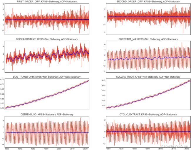 Figure 9.20 – Plotting the different methods to make the CO2 time series stationary
Generally, you do not want to over-difference your time series as some studies have shown that models based on over-differenced data are less accurate. For example, first_order_diff already made the time series stationary, and thus there was no need to difference it any further. In other words, second_order_diff = co2_df.diff(52).diff().dropna() was not needed. Additionally, notice how log_transform is still non-stationary.
Notice the center line(color='blue') representing the time series average (moving average). The mean should be constant for a stationary time series and look more like a straight line.
When you decide to detrend your data, you are essentially removing an element of distraction so you can focus on hidden patterns that are not as obvious. Hence, you can build a model to capture these hidden patterns and not be overshadowed by the long-term trend (upward or downward movement).
An example was the first differencing approach. However, in the presence of seasonal patterns you will need to remove the seasonal effect as well, which can be done through seasonal differencing. This is done in addition to the first-order differencing for detrending; hence it can be called second-order differencing, twice-diferencing, or differencing twice as you use differencing to remove seasonality effect first and again to remove the trend(co2_df.diff(52).diff().dropna()). This assumes the seasonal differencing was insufcient to make the time series stationary and thus, you need derend. Your goal is to use the minimal amount of differencing needed and avoid over-differencing. You will rarely need to go beyond differencing twice.
Ordinary Least Squares (OLS)
In the introduction section of this recipe, we mentioned that both ADF and KPSS use Ordinary Least Squares (OLS) regression. More specifcally, OLS regression is used to compute the model's coeffcients. To view the OLS results for ADF, you use the store parameter and set it to True :
# using first order differencing (detrending)
# first_order_diff = co2_df.diff(periods=1).dropna()

adf_result = adfuller( first_order_diff, store=True)
adf_result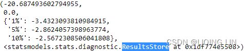
The preceding code will return a tuple that contains the test results. The regression summary will be appended as the last item. There should be four items in the tuple:
- the first item, adf_result[0], contains the t-statistic < any critical value, we can consider the detrending time series is stationary),
- the second item, adf_result[1] , includes the p-value(p-value ≤ 0.05: We reject the null hypothesis and conclude that the data does not contain a unit root and is stationary ), and
- the third item, adf_result[2] , contains the critical values for 1%, 5%, and 10% intervals.
- The last item, adf_result[3] , includes a ResultStore object. You can access the last item by using adf_result[-1] , as shown in the following code:
adf_result[-1].resols.summary()The ResultStore object gives you access to .resols , which contains the .summary() method. This should produce the following output:
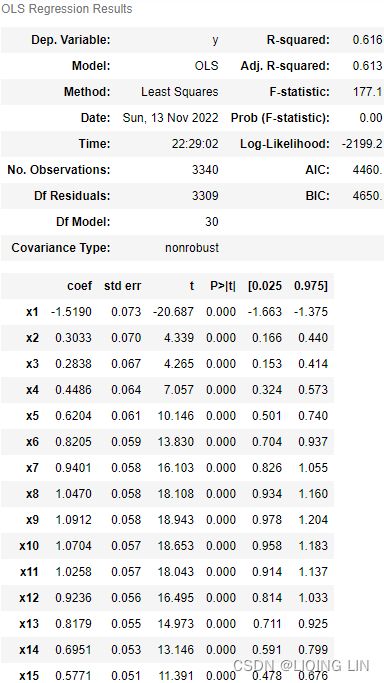
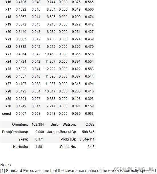 Figure 9.21 – ADF OLS regression summary and the first 30 lags and their coefficients
Applying power transformations
Time series data can be complex, and embedded within the data is critical information that you will need to understand and peek into to determine the best approach for building a model. For example, you have explored time series decomposition, understood the impact of trend and seasonality, and tested for stationarity. In the previous recipe, Detecting time series stationarity, you examined the technique to transform data from non-stationary to stationary. This includes the idea of detrending, which attempts to stabilize the mean over time.
Depending on the model and analysis you are pursuing, you may need to test for additional assumptions against the observed dataset or the model's residuals. For example, testing for
- homoskedasticity (also spelled homoscedasticity/ˌhəʊməʊskɪdæsˈtɪsɪti /同方差是随着样本观察点的变化,线性模型中随机误差项的方差并不改变,保持为常数) and normality. Homoskedasticity means that the variance is stable over time. More specifcally, it is the variance of the residuals.
- When the variance is not constant, changing over time, we call it heteroskedasticity异方差性 (also spelled heteroscedasticity).
- Another assumption you will need to test for is normality; does the specifc observation come from a normal (Gaussian) distribution? Sometimes, you may want to check the normality of the residuals as well, which can be part of the model diagnostics stage.
Therefore, it is important to be aware of the assumptions made by specifc models or techniques so you can determine which test to use and against which dataset. If you do not do this, you may end up with a flawed/ flɔːd /有瑕疵的,有缺陷的 model or an outcome that may be overly optimistic or overly pessimistic/ ˌpesɪˈmɪstɪk /悲观的.
Additionally, in this recipe, you will learn about Box-Cox transformation, which you can use to transform the data to satisfy normality and homoskedasticity. Box-Cox transformation takes the following form: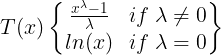 Figure 9.22 – Box-Cox transformation
The Box-Cox transformation relies on just one parameter, lambda ( λ ), and covers both logarithm and power transformations.
- If λ is 0, then you get a natural log transformation;
- otherwise, it's a power transformation.
The approach is to try different values of and then test for normality and homoskedasticity. For example, the SciPy library has the boxcox function, and you can specify different λ values using the lambda parameter (interestingly, this is how it is spelled in the implementation since lambda is a reserved Python keyword). If the lambda parameter is set to None , the function will find the optimal lambda ( λ ) value for you.
In this recipe, you will extend what you learned from the previous recipe, Detecting time series stationarity, and test for two additional assumptions: normality and homoskedasticity.
Usually, stationarity is the most crucial assumption you will need to worry about but being familiar with additional diagnostic techniques will serve you well.
Sometimes, you can determine normality and homoskedasticity from plots, for example, a histogram or a Q-Q plot. This recipe aims to teach you how to perform these diagnostic tests programmatically in Python. In addition, you will be introduced to the White test and the Breusch-Pagan Lagrange statistical test for homoskedactisity.
For normality diagnostics, you will explore the Shapiro-Wilk, D'Agostino-Pearson, and Kolmogorov-Smirnov statistical tests. Overall, Shapiro-Wilk tends to perform best and handles a broader set of cases.
Testing normality
The statsmodels library and the SciPy library have overlapping implementations. For example, the Kolmogorov-Smirnov test is implemented as ktest in SciPy and ktest_normal in statsmodels. In SciPy, the D'Agostino-Pearson test is implemented as normaltest and the Shapiro-Wilk test as shapiro.
The normality diagnostic is a statistical test based on a null hypothesis that you need to determine whether you can accept or reject. Conveniently, the following tests that you will implement have the same null hypothesis. The null hypothesis states that the data is normally distributed; for example, you would reject the null hypothesis if the p-value is less than 0.05, making the time series not normally distributed. Let's create a simple function, is_normal() , that will return either Normal or Not Normal based on the p-value:
from scipy.stats import shapiro, kstest, normaltest
from statsmodels.stats.diagnostic import kstest_normal, normal_ad

def is_normal( test, p_level=0.05, name='' ):
    stat, pvalue = test
    print( name + ' test')
    print( 'statistic: ', stat )
    print( 'p-value:', pvalue)
    return 'Normal' if pvalue>0.05 else 'Not Normal'
normal_args = ( np.mean(co2_df), np.std(co2_df) )
# The Shapiro-Wilk test tests the null hypothesis that
# the data was drawn from a normal distribution.
print( is_normal( shapiro(co2_df), name='Shapiro-Wilk' ) )
# Test whether a sample differs from a normal distribution.
# statistic: z-score = (x-mean)/std
# s^2 + k^2, where s is the z-score returned by skewtest
# and k is the z-score returned by kurtosistest.
print( is_normal( normaltest(co2_df), name='normaltest' ) )
# Anderson-Darling test for normal distribution unknown mean and variance.
print( is_normal( normal_ad(co2_df), name='Anderson-Darling' ) )
# Test assumed normal or exponential distribution using Lilliefors’ test.
# Kolmogorov-Smirnov test statistic with estimated mean and variance.
print( is_normal( kstest_normal(co2_df), name='Kolmogorov-Smirnov') )
# The one-sample test compares the underlying distribution F(x) of
# a sample against a given distribution G(x).
# The two-sample test compares the underlying distributions of
# two independent samples.
# Both tests are valid only for continuous distributions.
print( is_normal( kstest(co2_df, cdf='norm', args=normal_args), name='KS' ))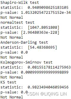 The output from the tests confirms the data does not come from a normal distribution. You do not need to run that many tests. The shapiro test, for example, is a very common and popular test that you can rely on. Generally, as with any statistical test, you need to read the documentation regarding the implementation to gain an understanding of the test. More specifcally, you will need to understand the null hypothesis behind the test to determine whether you can reject or fail to reject the null hypothesis.
###########################
kstest :Kolmogorov-Smirnov test
scipy.stats.kstest(rvs, cdf, args=(), N=20, alternative='two-sided', method='auto')
The one-sample test compares the underlying distribution F(x) of a sample against a given distribution G(x). The two-sample test compares the underlying distributions of two independent samples. Both tests are valid only for continuous distributions.
There are three options for the null and corresponding alternative hypothesis that can be selected using the alternative parameter.
-
two-sided:
-
The null hypothesis is that the two distributions are identical, F(x)=G(x) for all x;
-
the alternative is that they are not identical.
-
-
less:
-
The null hypothesis is that F(x) >= G(x) for all x;
-
the alternative is that F(x) < G(x) for at least one x.
-
-
greater:
-
The null hypothesis is that F(x) <= G(x) for all x;
-
the alternative is that F(x) > G(x) for at least one x.
-
Note that the alternative hypotheses describe the CDFs of the underlying distributions, not the observed values. For example, suppose x1 ~ F and x2 ~ G. If F(x) > G(x) for all x, the values in x1 tend to be less than those in x2.
Suppose we wish to test the null hypothesis that a sample is distributed according to the standard normal. We choose a confidence level of 95%; that is, we will reject the null hypothesis in favor of the alternative if the p-value is less than 0.05.
When testing uniformly distributed data, we would expect the null hypothesis to be rejected.
from scipy import stats
rng = np.random.default_rng()
stats.kstest(stats.uniform.rvs(size=100, random_state=rng),
stats.norm.cdf)![]() Indeed, the p-value is lower than our threshold of 0.05, so we reject the null hypothesis in favor of the default “two-sided” alternative: the data are not distributed according to the standard normal.
Indeed, the p-value is lower than our threshold of 0.05, so we reject the null hypothesis in favor of the default “two-sided” alternative: the data are not distributed according to the standard normal.
When testing random variates from the standard normal distribution, we expect the data to be consistent with the null hypothesis most of the time.
x = stats.norm.rvs(size=100, random_state=rng)
stats.kstest(x, stats.norm.cdf) ![]() As expected, the p-value of 0.75 is not below our threshold of 0.05, so we cannot reject the null hypothesis.
As expected, the p-value of 0.75 is not below our threshold of 0.05, so we cannot reject the null hypothesis.
 Note that the alternative hypotheses describe the CDFs of the underlying distributions, not the observed values. For example, suppose x1 ~ F and x2 ~ G. If F(x) > G(x) for all x, the values in x1 tend to be less than those in x2.
Suppose, however, that the random variates are distributed according to a normal distribution that is shifted toward greater values. In this case, the cumulative density function (CDF) of the underlying distribution tends to be less than the CDF of the standard normal. Therefore, we would expect the null hypothesis to be rejected with alternative='less':
-
less:
-
The null hypothesis is that F(x) >= G(x) for all x;
-
the alternative is that F(x) < G(x) for at least one x.
-
x = stats.norm.rvs(size=100, loc=0.5, random_state=rng)
stats.kstest(x, stats.norm.cdf, # or "norm"
alternative='less')![]() and indeed, with p-value smaller than our threshold, we reject the null hypothesis in favor of the alternative.
and indeed, with p-value smaller than our threshold, we reject the null hypothesis in favor of the alternative.
The examples above have all been one-sample tests identical to those performed by ks_1samp. Note that kstest can also perform two-sample tests identical to those performed by ks_2samp. For example, when two samples are drawn from the same distribution, we expect the data to be consistent with the null hypothesis most of the time.
sample1 = stats.laplace.rvs(size=105, random_state=rng)
sample2 = stats.laplace.rvs(size=95, random_state=rng)
stats.kstest(sample1, sample2) ![]()
As expected, the p-value of 0.45 is not below our threshold of 0.05, so we cannot reject the null hypothesis.
###########################
Sometimes, you may need to test normality as part of model evaluation and diagnostics. For example, you would evaluate the residuals (defined as the difference between actual and predicted values) if they follow a normal distribution. In Chapter 10, Building Univariate Time Series Models Using Statistical Methods, you will explore building forecasting models using autoregressive and moving average models. For now, you will run a simple autoregressive (AR(1)) model to demonstrate how you can use a normality test against the residuals of a model:
import statsmodels.tsa.api as smt

fig, ax = plt.subplots(figsize = (12,8))

smt.graphics.plot_pacf( co2_df,
                        lags=26,
                        ax = ax,
                        auto_ylims=True,
                        zero=True # Flag indicating whether to include the 0-lag autocorrelation.
                      )

plt.show()
from statsmodels.tsa.ar_model import AutoReg

model = AutoReg( co2_df.dropna(),
                 lags=1, # AR(1) # ‘t’-Time trend only. ‘ct’-Constant and time trend.
                 #trend='n',     # ‘n’-No trend. ‘c’-Constant only.
               ).fit()
model.summary() 
You can run the shapiro test against the residuals. To access the residuals, you would use the . resid property as in model.resid . Tis is common in many models you will build in Chapter 10, Building Univariate Time Series Models Using Statistical Methods:
print( is_normal( shapiro(model.resid) ) ) 
model = AutoReg( co2_df.diff(periods=1).dropna(),
                 lags=1, # AR(1) # ‘t’-Time trend only. ‘ct’-Constant and time trend.
                 trend='n',     # ‘n’-No trend. ‘c’-Constant only.
               ).fit()
model.summary() 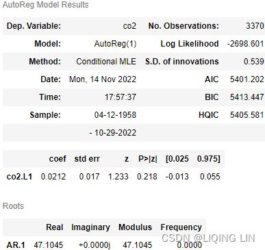
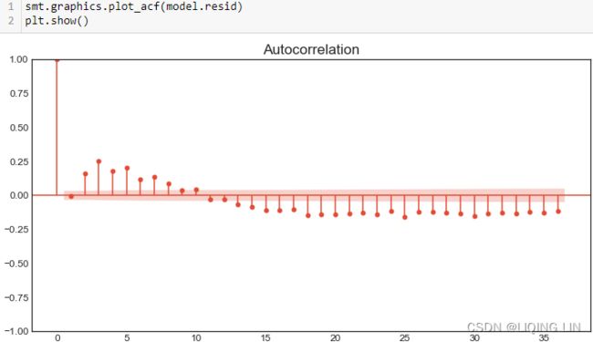
print( is_normal( shapiro(model.resid) ) ) 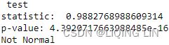
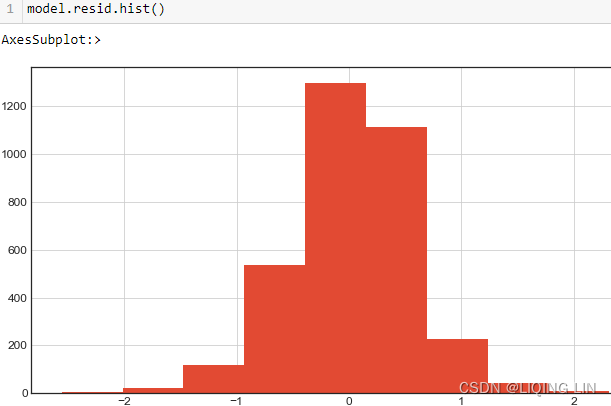
###### detrending + seasonalize
co2_decomposed = seasonal_decompose( co2_df, period=13, #seasonal=13 because the data has an annual seasonal effect.
                                     model='additive' )
print( is_normal( shapiro(co2_decomposed.resid.dropna()) ) )

smt.graphics.plot_acf(co2_decomposed.resid.dropna())
plt.show()
smt.graphics.plot_pacf(co2_decomposed.resid.dropna())
plt.show()
model = AutoReg( co2_decomposed.resid.dropna(),
                 lags=1, # AR(1) # ‘t’-Time trend only. ‘ct’-Constant and time trend.
                 trend='n',     # ‘n’-No trend. ‘c’-Constant only.
               ).fit()
print( is_normal( shapiro(model.resid.dropna()) ) )

smt.graphics.plot_acf(model.resid.dropna())
plt.show()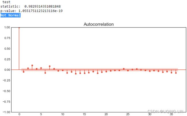
####
# co2_decomposed = seasonal_decompose( co2_df, model='additive' )
co2_stl = STL( co2_df, seasonal=13, #seasonal=13 because the data has an annual seasonal effect.
               robust=True ).fit()

print( is_normal( shapiro(co2_stl.resid.dropna()) ) )

smt.graphics.plot_acf(co2_stl.resid.dropna())
plt.show()
smt.graphics.plot_pacf(co2_stl.resid.dropna())
plt.show()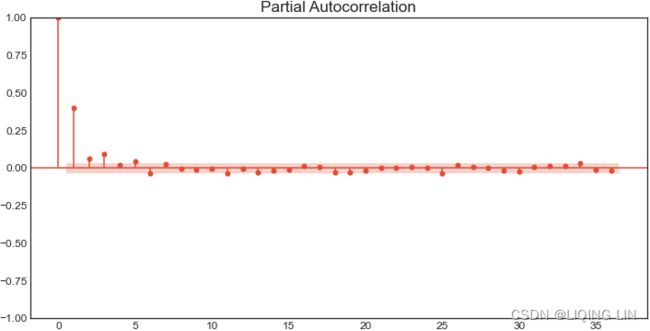
model = AutoReg( co2_stl.resid.dropna(),
                 lags=1, # AR(1) # ‘t’-Time trend only. ‘ct’-Constant and time trend.
                 trend='n',     # ‘n’-No trend. ‘c’-Constant only.
               ).fit()
print( is_normal( shapiro(model.resid.dropna()) ) )

smt.graphics.plot_acf(model.resid.dropna())
plt.show()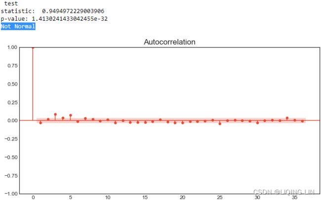
The output indicates the residuals are not normally distributed. This fact, residuals not being normally distributed, is not enough to determine the model's validity or potential improvements. But taken into context with the other tests, it should help you determine how good your model is. This is a topic you will explore further in the next chapter.
model.plot_diagnostics()
plt.show()
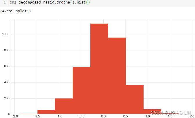

Testing homoskedactisity同方差
Depending on the model and analysis you are pursuing, you may need to test for additional assumptions against the observed dataset or the model's residuals. For example, testing for
- homoskedasticity (also spelled homoscedasticity/ˌhəʊməʊskɪdæsˈtɪsɪti /同方差是随着样本观察点的变化,线性模型中随机误差项的方差并不改变,保持为常数) and normality. Homoskedasticity means that the variance is stable over time. More specifcally, it is the variance of the residuals.
 , 与解释变量观测值
 无关
无关


- When the variance is not constant, changing over time, we call it heteroskedasticity异方差性 (also spelled heteroscedasticity). When heteroscedasticity is present in a regression analysis, the results of the analysis become hard to trust.
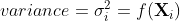 , 与解释变量观测值有关
- 单调递增型:
 随 的增大而增大


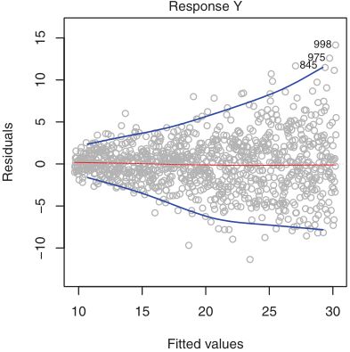 the magnitude of the residuals tends to increase with the fitted values. When faced with this problem, one possible solution is to transform the response Y using a concave function such as logY or
 . Such
a transformation results in a greater amount of shrinkage of the larger responses, leading to a reduction in heteroscedasticity降低了异方差性. the residual plot after transforming the response using logY. The residuals now appear to have constant variance似乎有恒定的方差, though there is some evidence of a slight non-linear relationship有轻微的非线性关系 in the data.
 - 单调递减型:随 的增大而减小
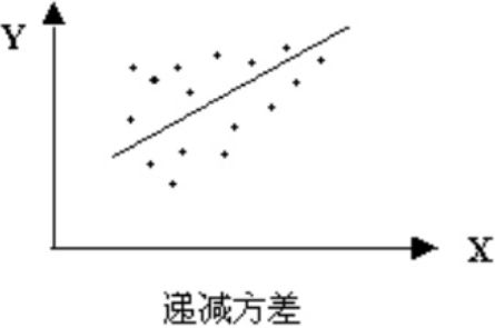

- 复杂型: 与X的变化呈复杂形式
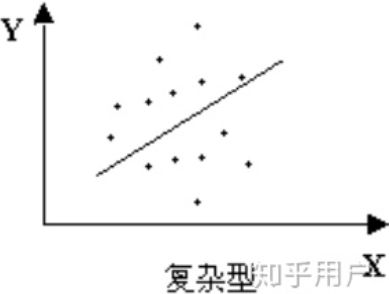
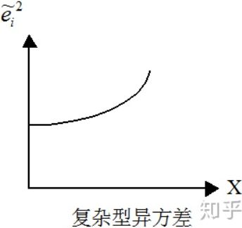
- 单调递增型:
- Another assumption you will need to test for is normality; does the specifc observation come from a normal (Gaussian) distribution? Sometimes, you may want to check the normality of the residuals as well, which can be part of the model diagnostics stage.
You will be testing for the stability of the variance against the model's residuals. This will be the same AR(1) model used in the previous normality test:
You will perform a homoskedasticity test on the model's residuals. As stated earlier regarding statistical tests, it is vital to understand the hypothesis behind these tests. The null hypothesis states that the data is homoskedastic for the two tests. For example, you would reject the null hypothesis if the p-value is less than 0.05, making the time series heteroskedastic.
statsmodels.stats.diagnostic.het_breuschpagan(resid, exog_het, robust=True):
Breusch-Pagan Lagrange Multiplier test for heteroscedasticity
The tests the hypothesis that the residual variance does not depend on the variables in x in the form
Homoscedasticity implies that α=0.
Notes
Assumes x contains constant (for counting dof自由度 and calculation of  vs
vs
Here, SSE is the Sum of Squared Errors(OR the Sum of Squared of Residuals)
This yields a list of errors squared, which is then summed and equals the unexplained variance.
and SST is the Total Sum of Squares(total variance):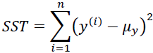
 the average actual value y.
 is indeed just a rescaled version of the MSE

n is the number of cases(samples) used to fit the model and k is the number predictor variables(features) in the modelhttps://blog.csdn.net/Linli522362242/article/details/121551663
). In the general description of LinearModel test, Greene mentions that this test exaggerates夸大了 the significance of results in small or moderately large samples. In this case the F-statistic((3.23)) is preferable.
p: The number of predictor variables (features) used to fit the model
In the multiple regression setting with p predictors, we need to ask whether all of the regression coefficients are zero, i.e. whether ![]() . As in the simple linear regression
. As in the simple linear regression
setting, we use a hypothesis test to answer this question. We test the null hypothesis,

 : at least one
  is non-zero
If the linear model assumptions are correct, one can know that ![]() and that, provided is true,then
and that, provided is true,then ![]()
Hence, when there is no relationship between the response and predictors(features), one would expect the F-statistic to take on a value close to 1. On the other hand, if ![]() is true, then
is true, then ![]() , so we expect F to be greater than 1.
, so we expect F to be greater than 1.
####################
Cochran's theorem:若samples ![]() 独立且服从均值为μ,方差为
独立且服从均值为μ,方差为![]() 的正态分布,则有
的正态分布,则有 ![]() degrees of freedom:n-1
degrees of freedom:n-1
我们假设误差项  是独立同分布的,且
 ![]()
当假定的线性模型正确时,真模型和预测模型的误差: 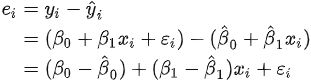
那么,显然(conditional on  )
) 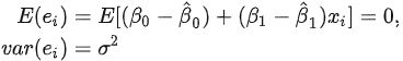
即 ![]() 因此
因此 
故有 ![]()
又当![]() 成立时,
成立时, ![]() (否则的
(否则的 方差还与
方差还与 有关)
有关) ==>
==>
则![]()
(3.23
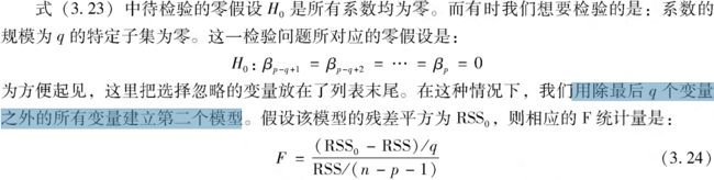
 Notice that in Table 3.4, for each individual predictor a t-statistic and a p-value were reported. These provide information about whether each individual predictor is related to the response, after adjusting for the other predictors. It turns out that each of these are exactly equivalent to the F-test that omits that single variable from the model, leaving all the others in—i.e. q=1 in (3.24). So it reports the partial effect of adding that variable to the model. For instance, as we discussed earlier, these p-values(<0.05) indicate that TV and radio are related to sales , but that there is no evidence that newspaper is associated with sales , in the presence of these two.
####################
Verification
Chisquare test statistic is exactly (<1e-13) the same result as bptest in R-stats with defaults (studentize=True).
Let's create a small function, calling it het_test(model, test) , that takes in a model and the test function and returns either Heteroskedastic or Homoskedastic based on the p-value to determine whether the null hypothesis is accepted or rejected:
from statsmodels.datasets import co2

co2_df = co2.load_pandas().data
co2_df = co2_df.ffill()
co2_df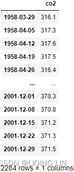
from statsmodels.datasets import co2

co2_df = co2.load_pandas().data
co2_df = co2_df.ffill()

# from statsmodels.tsa.ar_model import AR
from statsmodels.tsa.ar_model import AutoReg

model = AutoReg(co2_df.dropna(), lags=1, trend='n').fit()
model.summary()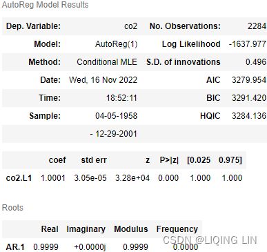
print( is_normal(shapiro(model.resid)) )
print( is_normal(normaltest(model.resid)) )
print( is_normal(normal_ad(model.resid)) )
print( is_normal(kstest_normal(model.resid)) )
print( is_normal( kstest( model.resid,
                          cdf='norm',
                          args=( np.mean(model.resid),
                                 np.std(model.resid)
                               )
                        )
                )
) 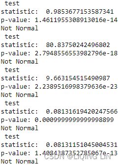
plt.hist(model.resid) 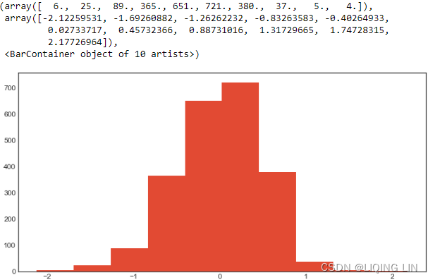
from statsmodels.graphics.gofplots import qqplot

qqplot(model.resid, line='q')
plt.show() 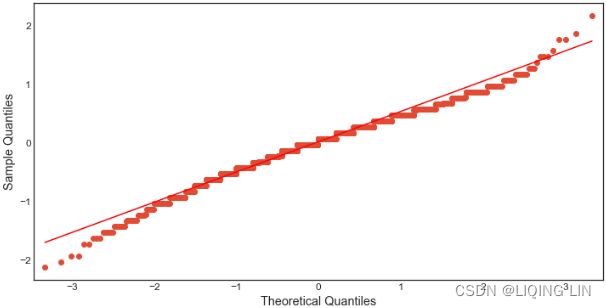
smt.graphics.plot_acf(model.resid)
plt.show() 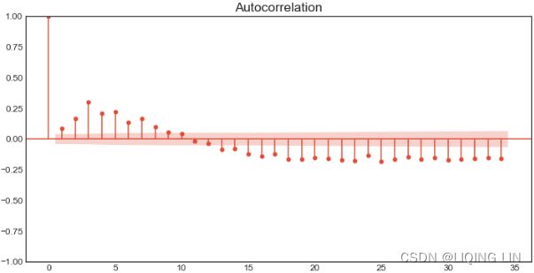
model.plot_diagnostics()
plt.show()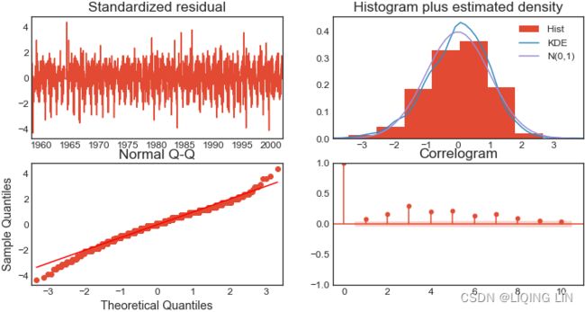
from statsmodels.stats.api import( het_breuschpagan,
                                   het_goldfeldquandt,
                                   het_white
                                 )
from statsmodels.tools.tools import add_constant

def het_test( model, test=het_breuschpagan ):
    #lm: lagrange multiplier statistic
    #lm_pvalue: p-value of lagrange multiplier test
    #fvalue: f-statistic of the hypothesis that the error variance does not depend on x
    #f_pvalue: p-value for the f-statistic
    lm, lm_pvalue, fvalue, f_pvalue = het_breuschpagan( model.resid,
                                                        add_constant(model.fittedvalues)
                                                      )
    return 'Heteroskedastic' if f_pvalue < 0.05 else "Homoskedastic"
Start with the Breusch-Pagan Lagrange multiplier test to diagnose the residuals. In statsmodels, you will use the het_breuschpagan function, which takes resid, the model's residual, and exog_het , where you provide the original data (explanatory variables) related to the heteroskedasticity in the residual:
het_test( model, test=het_breuschpagan)![]() Consistent with the results shown in Figure Standardized residual.
Consistent with the results shown in Figure Standardized residual.
This result indicates that the residual is homoskedastic, with a constant variance (stable).
A very similar test is White's Lagrange multiplier test. In statsmodels, you will use the het_white function, which has the same two parameters that you used with het_breuschpagan
het_test( model, test=het_white )![]()
plt.scatter(co2_df['co2'].values[1:],model.resid)
Both tests indicate that the residuals of the autoregressive model have constant variance (homoskedastic). Both tests estimate the auxiliary/ɔːɡˈzɪliəri/辅助的 regression against the squared residuals and all the explanatory variables.
Keep in mind that both normality and homoskedasticity are some of the tests you may need to conduct on the residuals as you diagnose your model. Another essential test is testing for autocorrelation, which is discussed in the following recipe, Testing for autocorrelation in time series data.
from datetime import datetime
source='https://scrippsco2.ucsd.edu/assets/data/atmospheric/stations/in_situ_co2/weekly/weekly_in_situ_co2_mlo.csv'
co2_df = pd.read_csv(  source,
                      comment='"',
                      sep=',',
                      names=['co2'],# as second column name
                      index_col=0, # use first column as index
                      parse_dates=True ,
                      na_values='-99.99'
                    )
#co2_df.set_index('Date', inplace=True,)
#co2_df.index.name=None

co2_df.dropna( inplace=True )
co2_df=co2_df.asfreq('W-SAT', 'ffill')#ffill()
#co2_df=co2_df.loc['1958-03-29':'2001-12-30']
co2_df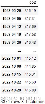
# from statsmodels.tsa.ar_model import AR
from statsmodels.tsa.ar_model import AutoReg

model = AutoReg(co2_df.dropna(), lags=1, trend='n').fit()
model.summary() 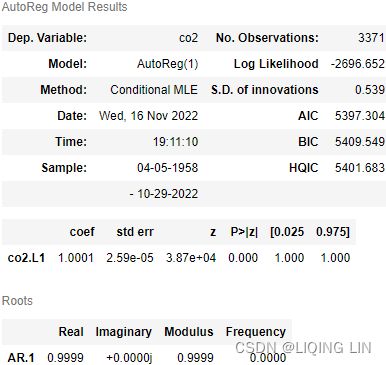
print( is_normal(shapiro(model.resid)) )
print( is_normal(normaltest(model.resid)) )
print( is_normal(normal_ad(model.resid)) )
print( is_normal(kstest_normal(model.resid)) )
print( is_normal( kstest( model.resid,
                          cdf='norm',
                          args=( np.mean(model.resid),
                                 np.std(model.resid)
                               )
                        )
                )
) 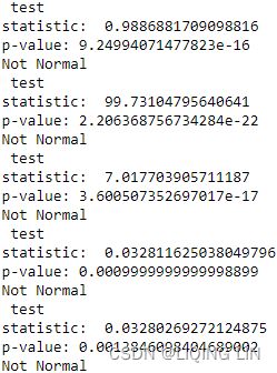
smt.graphics.plot_acf(model.resid)
plt.show()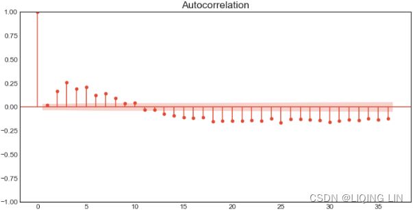
model.plot_diagnostics()
plt.show() 
het_test( model, test=het_test )![]() Consistent with the results shown in Figure Standardized residual.
Consistent with the results shown in Figure Standardized residual.
het_test( model, test=het_breuschpagan) ![]()
het_test( model, test=het_white )![]()
plt.scatter(co2_df['co2'].values[1:],model.resid) 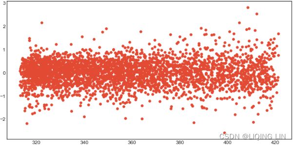
Applying Box-Cox transform
Box-Cox transformation can be a useful tool, and it's good to be familiar with. Box-Cox transforms a non-normally distributed dataset into a normally distributed one. At the same time, it stabilizes the variance, making the data homoskedastic. To gain a better understanding of the efect of Box-Cox transformation, you will use the Air Passengers dataset, which contains both trend and seasonality:
from scipy.stats import boxcox

airp_df = pd.read_csv('air_passenger.csv',date_parser=True)
# and setting as dataframe index
airp_df.set_index('date', inplace = True)
airp_df.index = pd.to_datetime( airp_df.index )
airp_df = airp_df.resample('M').sum()
airp_df
 The airp_df data shows a long-term linear (upward) trend and seasonality. However, the seasonality fuctuations seem to be increasing as well, indicating a multiplicative model(A multiplicative model is suitable when the seasonal variation fuctuates over time. OR When the variation in the seasonal pattern, or the variation around the trend-cycle, appears to be proportional to the level of the time series与时间序列的水平成正比时, then a multiplicative decomposition is more appropriate. ).==>
Additionally, in this recipe, you will learn about Box-Cox transformation, which you can use to transform the data to satisfy normality and homoskedasticity. Box-Cox transformation takes the following form:Figure 9.22 – Box-Cox transformation
The Box-Cox transformation relies on just one parameter, lambda ( λ ), and covers both logarithm and power transformations.
- If λ is 0, then you get a natural log transformation;
- otherwise, it's a power transformation.
The approach is to try different values of and then test for normality and homoskedasticity. For example, the SciPy library has the boxcox function, and you can specify different λ values using the lambda parameter (interestingly, this is how it is spelled in the implementation since lambda is a reserved Python keyword). If the lambda parameter is set to None , the function will find the optimal lambda ( λ ) value for you.
Box-Cox allows us to make the data both normal and homoskedastic and is part of a family of power transforms that includes log transform and square root transform. Box-Cox is a powerful transform because it supports both root and log transforms, and others are made possible by changing the lambda values.
Note
One thing to point out is that the boxcox function requires the data to be positive Sometimes a Box-Cox transformation provides a shift parameter to achieve this; boxcox does not. Such a shift parameter is equivalent to adding a positive constant to x before calling boxcox.
However, Box and Cox did propose a second formula that can be used for negative y-values: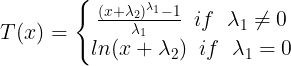
The confidence limits returned when alpha is provided give the interval where: 自由度为1的
![]() 平方分布的1-
平方分布的1- 的分位数, is confidence level
with llf the log-likelihood function and χ2 the chi-squared function.
##############
The BUPA liver data set[12] contains data on liver enzymes肝酶 ALT and γGT. Suppose we are interested in using log(γGT) to predict ALT. A plot of the data appears in panel (a) of the figure. There appears to be non-constant variance, and a Box–Cox transformation might help.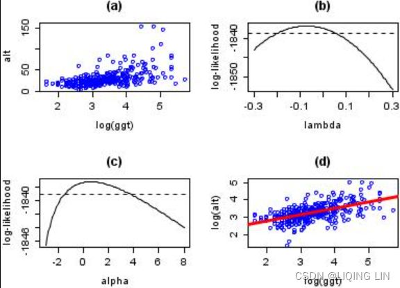
- Given a statistical model with some parameters λ, the word “probability” is used to describe how plausible可信度 a future outcome x(alt) is (knowing the parameter values λ),
- while the word “likelihood” is used to describe how plausible a particular set of parameter values λ are, after the outcome x(alt) is known.
- To estimate the probability distribution of a future outcome x(alt), you need to set the model parameter λ. For example, if you set θ to 1.3 (the horizontal line
 A model’s parametric function ), you get the probability density function f(x; θ=1.3) shown in the lower-left plot
 (some derived functions: a PDF). Say you want to estimate the probability that x will fall between –2 and +2. You must calculate the integral of the PDF on this range (i.e., the surface of the shaded region).https://blog.csdn.net/Linli522362242/article/details/105973507
The log-likelihood of the power parameter appears in panel (b). The horizontal reference line is at a distance of ![]() from the maximum and can be used to read off an approximate 95%(1-=0.95) confidence interval for λ. It appears as though a value close to zero would be good
from the maximum and can be used to read off an approximate 95%(1-=0.95) confidence interval for λ. It appears as though a value close to zero would be good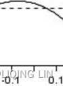 看起来接近于零的值会很好, so we take logs.
Possibly, the transformation could be improved by adding a shift parameter to the log transformation. Panel (c) of the figure shows the log-likelihood. In this case, the maximum of the likelihood is close to zero suggesting that a shift parameter is not needed.
The final panel shows the transformed data with a superimposed regression line带有叠加回归线的转换数据.
Note that although Box–Cox transformations can make big improvements in model fit, there are some issues that the transformation cannot help with. In the current example, the data are rather heavy-tailed so that the assumption of normality is not realistic and a robust regression approach leads to a more precise model.
##############
Recall, from the introduction section of this recipe and Figure 9.22, there is a lambda parameter used to determine which transformation to apply (logarithm or power transform). Use the boxcox function with the default parameter value for lambda , which is None . Just provide the dataset to satisfy the required x parameter:
# xt: Box-Cox power transformed array.
# maxlog : If the lmbda parameter is None, the second returned argument
#          is the lmbda that maximizes the log-likelihood function.
xt, lmbda = boxcox( airp_df['passengers'], lmbda=None )
print('lambda:', lmbda) ![]()
xts = pd.Series(xt, index=airp_df.index)
xts 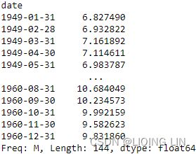 By not providing a value to lambda and keeping it at None , the function will find the optimal lambda ( λ ) value. From the introduction of this recipe, you'll remember lambda is spelled lambda in the boxcox implementation. The function returns two values captured by xt for the transformed data and lamda for the optimal lambda value found.
A histogram can visually show the impact of the transformation:
fig, ax = plt.subplots( 1,2 )

airp_df.hist( ax=ax[0] )
xts.hist( ax=ax[1] )
ax[1].set_title('Box-Cox Transformed')

plt.show() 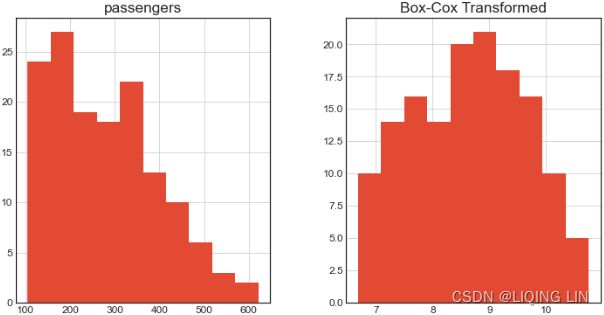
The second histogram shows that the data was transformed, and the overall distribution changed. It would be interesting to examine the dataset as a time series plot.
from scipy import stats
fig, ax = plt.subplots( 1,2 )

stats.probplot(airp_df['passengers'].values, dist=stats.norm, plot=ax[0])
prob = stats.probplot(xts, dist=stats.norm, plot=ax[1])
ax[1].set_title('Box-Cox Transformed')
plt.show()
- The histogram in the upper left-hand corner shows a data set (first column) that has significant right skewness (and so does not follow a normal distribution).
- The histogram of the data after applying the Box-Cox transformation with λ = 0.148 shows a data set for which the normality assumption is reasonable. This is verified with a normal probability plot of the transformed data
 .
.
Note, just reasonable, the transformed dataset distribution is not a perfect normal distribution
Plot both datasets to compare before and after the transformation:
fig, ax = plt.subplots(1,2, figsize=(14,8))

airp_df.plot( ax=ax[0] )
ax[0].set_title( 'Original Time Series' )

xts.plot( ax=ax[1] )
ax[1].set_title( 'Box-Cox Transformed' )

plt.show()
Figure 9.24 – Box-Cox transformation and overall effect on time series data
Notice how the seasonal effect on the transformed dataset looks more stable than before.
Finally, build two simple autoregressive models to compare the effect on the residuals before and after the transformation:
model_airp = AutoReg( airp_df, lags=1, trend='n' ).fit()
model_box = AutoReg( xts, lags=1, trend='n' ).fit()

fig, ax = plt.subplots( 1,2, figsize=(16,8) )

model_airp.resid.plot( ax=ax[0] )
ax[0].set_title('Residuals Plot - Regular Time Series')

model_box.resid.plot( ax=ax[1] )
ax[1].set_title('Residuals Plot - Box-cox Transformed')

plt.show()
The AutoReg model comes with two useful methods: diagnostic_summary() and plot_diagnostics() . They will save you time from having to write additional code to test the model's residuals for normality, homoskedasticity, and autocorrelation.
print( model_box.diagnostic_summary() )This should display the results from the Ljung-Box test for autocorrelation, the normality test. and the homoskedasticity test against the model's residuals这应该显示自相关的 Ljung-Box 检验和针对模型残差的同方差检验的结果.
Box-Pierce test VS Ljung-Box test
In addition to looking at the ACF plot, we can also do a more formal test for autocorrelation by considering a whole set of  values as a group, rather than treating each one separately.
Recall that is the autocorrelation for lag k. When we look at the ACF plot to see whether each spike is within the required limits(Approximate (1−α)×100% significance bounds are given by
  Values lying outside of either of these bounds are indicative of an autoregressive process位于这些界限之外的值表示自回归过程. ORThis blue area(here is the shaded area) depicts the 95% confidence interval and is an indicator of the significance threshold. That means, anything within the blue area(here is the shaded area) is statistically close to zero and anything outside the blue area is statistically non-zero(statistically significant).), we are implicitly carrying out multiple hypothesis tests, each one with a small probability of giving a false positive(
FP: the non-target(  the residuals don't exist autocorrelation) was wrongly classified as the target class(P is the target class or :the residuals exist autocorrelation). When enough of these tests are done, it is likely that at least one will give a false positive, and so we may conclude that the residuals have some remaining autocorrelation, when in fact they do not.
In order to overcome this problem, we test whether the first h autocorrelations are significantly different from what would be expected from a white noise process. A test for a group of autocorrelations is called a portmanteau test, from a French word describing a suitcase or coat rack carrying several items of clothing.
 Box-Pierce test
- h is the maximum lag being considered
- We suggest using h=10 for non-seasonal data and
- h=2m for seasonal data, where m is the period of seasonality.
- T is the number of observations
- is the autocorrelation for lag k.
- If each is close to zero, then Q will be small.
- If some values are large (positive or negative), then Q will be large.
- If each
However, the test is not good when h is large, so if these values are larger than T/5, then use h=T/5
 (more accurate) Ljung-Box test
- The null hypothesis for the Ljung-Box test states that the previous lags are not correlated with the current period. In other words, you are testing for the absence of autocorrelation.
large values of Q∗ suggest that the autocorrelations do not come from a white noise series(there is autocorrelation.).
How large is too large? If the autocorrelations did come from a white noise series, then both Q and Q∗ would have a χ2 distribution with (h−K) degrees of freedom, where K is the number of parameters in the model. If they are calculated from raw data原数据 (rather than the residuals from a model), then set K=0.
From the following Ljung-Box results, the p-values are less than 0.05, so you reject the null hypothesis, and there is autocorrelation.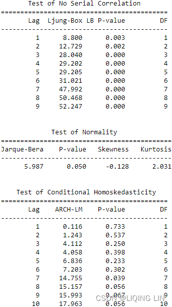 The Jarque-Bera test tests whether the sample data has the skewness and kurtosis matching a normal distribution.
first fact![]() but P-value=0.05 At 5% significant level(α = 0.05), we reject the null hypothesis that the log-return is normally distributed(OR
but P-value=0.05 At 5% significant level(α = 0.05), we reject the null hypothesis that the log-return is normally distributed(OR ).
).
- the skewness=-0.128<0 :more weight in the left tail of the distribution.
print( is_normal(shapiro(model_box.resid)) )
print( is_normal(normaltest(model_box.resid)) )
print( is_normal(normal_ad(model_box.resid)) )
print( is_normal(kstest_normal(model_box.resid)) )
print( is_normal( kstest( model_box.resid,
                          cdf='norm',
                          args=( np.mean(model_box.resid),
                                 np.std(model_box.resid)
                               )
                        )
                )
     )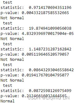
By looking at the metrics such as the mean, standard deviation, skewness, and kurtosis we can infer that they deviate from what we would expect under normality. Additionally, the Jarque-Bera normality test gives us reason to reject the null hypothesis stating that the distribution is normal at the 95% confidence level(α = 0.05).
pff1_whylog return Nominal Inflation_CPI_Realized Volati_outlier_distplot_Jarque–Bera_pAcf_sARIMAx_LIQING LIN的博客-CSDN博客
model_box.plot_diagnostics(figsize=(12,10))

plt.show()
Diagnostic plots for standardized residuals
-
Standardized residuals over time
-
Histogram plus estimated density of standardized residuals, along with a Normal(0,1) density plotted and KDE for reference.
-
Normal Q-Q plot, with Normal reference line.
-
Correlogram

The Box-Cox normality plot(Q-Q plot) shows that the maximum value of the correlation coefficient is at λ =0.148![]() . The .plot_diagnostics() function will show four plots so you can examine the model's residuals. Mainly, the plots will show whether the residuals are normally distributed from the Q-Q plot and histogram(No). Additionally, the autocorrelation function plot (ACF) will allow you to examine for autocorrelation. You will examine ACF plots in more detail in the Plotting ACF and PACF recipe in Chapter 10, Building Univariate Time Series Models Using Statistical Methods.
. The .plot_diagnostics() function will show four plots so you can examine the model's residuals. Mainly, the plots will show whether the residuals are normally distributed from the Q-Q plot and histogram(No). Additionally, the autocorrelation function plot (ACF) will allow you to examine for autocorrelation. You will examine ACF plots in more detail in the Plotting ACF and PACF recipe in Chapter 10, Building Univariate Time Series Models Using Statistical Methods.
Testing for autocorrelation in time series data
Autocorrelation is like statistical correlation (think Pearson correlation from high school https://blog.csdn.net/Linli522362242/article/details/121721868), which measures the strength of a linear relationship between two variables, except that we measure the linear relationship between time series values separated by a lag. In other words, we are comparing a variable with its lagged version of itself.
In this recipe, you will perform a Ljung-Box test to check for
- autocorrelations up to a specifed lag and
- whether they are significantly far of from 0.
- The null hypothesis for the Ljung-Box test states that the previous lags are not correlated with the current period. In other words, you are testing for the absence of autocorrelation.
When running the test using acorr_ljungbox from statsmodels, you need to provide a lag value. The test will run for all lags up to the specified lag (maximum lag).
The autocorrelation test is another helpful test for model diagnostics. As discussed in the previous recipe, Applying power transformations, there are assumptions that you need to test against the model's residuals. For example, when testing for autocorrelation on the residuals, the expectation is that
- there should be no autocorrelation between the residuals.
- This ensures that the model has captured all the necessary information.
- The presence of autocorrelation in the residuals can indicate that the model missed an opportunity to capture critical information and will need to be evaluated.
from statsmodels.datasets import co2

co2_df = co2.load_pandas().data
co2_df = co2_df.ffill()
co2_df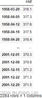
Since the data is not stationary (review the Detecting time series stationarity recipe), you will perform a log transform this time (log differencing):
Run the Ljung-Box test. Start with lags=10:
from statsmodels.stats.diagnostic import acorr_ljungbox

co2_diff = np.log(co2_df).diff().dropna()
acorr_ljungbox( co2_diff, lags=10, return_df=True )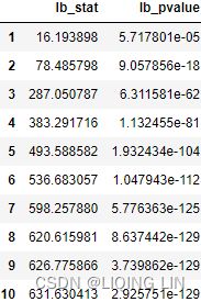
-
lb_stat - The Ljung-Box test statistic.
-
lb_pvalue - The p-value based on chi-square distribution. The p-value is computed as 1 - chi2.cdf(lb_stat, dof) (cumulative distribution function)where dof is lag - model_df. If lag - model_df <= 0, then NaN is returned for the pvalue.(model_df: Number of degrees of freedom consumed by the model. In an ARMA model, this value is usually p+q where p is the AR order and q is the MA order. This value is subtracted from the degrees-of-freedom used in the test so that the adjusted dof for the statistics are lags - model_df. If lags - model_df <= 0, then NaN is returned.)
-
bp_stat - The Box-Pierce test statistic.
-
bp_pvalue - The p-value based for Box-Pierce test on chi-square distribution. The p-value is computed as 1 - chi2.cdf(bp_stat, dof) where dof is lag - model_df. If lag - model_df <= 0, then NaN is returned for the pvalue.
This shows that the test statistic for all lags up to lag 10 are signifcant (p-value < 0.05), so you can reject the null hypothesis(the previous lags are not correlated with the current period . Rejecting the null hypothesis means you reject the claim that there is no autocorrelation.
acorr_ljungbox is a function that accumulates autocorrelation up until the lag specifed. Therefore, it is helpful to determine whether the structure is worth modeling in the first place.
Let's use the Ljung-Box test against the residual from model_box that was created in the Applying power transformations recipe:
acorr_ljungbox( model_box.resid, return_df=True, lags=10 )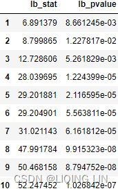 From the preceding example, the p-values are less than 0.05, so you reject the null hypothesis(the previous lags are not correlated with the current period), and there is autocorrelation.
(more accurate) Ljung-Box test
large values of Q∗ suggest that the autocorrelations do not come from a white noise series(there is autocorrelation.).
How large is too large? If the autocorrelations did come from a white noise series, then both Q and Q∗ would have a χ2 distribution with (h−K) degrees of freedom, where K is the number of parameters in the model. If they are calculated from raw data原数据 (rather than the residuals from a model), then set K=0.
- h is the maximum lag being considered
- We suggest using h=10 for non-seasonal data and
- h=2m for seasonal data, where m is the period of seasonality.
- T is the number of observations
- is the autocorrelation for lag k.
- If each is close to zero, then Q will be small.
- If some values are large (positive or negative), then Q will be large.
- If each