ts10_Univariate TS模型_circle mark pAcf_ETS_unpack product_darts_bokeh band interval_ljungbox_AIC_BIC
In https://blog.csdn.net/Linli522362242/article/details/127737895, Exploratory Data Analysis and Diagnosis, you were introduced to several concepts to help you understand the time series process. Such recipes included Decomposing time series data, Detecting time series stationarity, Applying power transformations, and Testing for autocorrelation in time series data. These techniques will come in handy in the statistical modeling approach that will be discussed in this chapter.
When working with time series data, different methods and models can be used, depending on whether the time series is
- univariate or multivariate,
- seasonal or non-seasonal,
- stationary or non-stationary,
- and linear or nonlinear.
If you list the assumptions you need to consider and examine – for example, stationarity and autocorrelation – it will become apparent why time series data is deemed to be complex and challenging. Thus, to model such a complex system, your goal is to get a good enough approximation that captures the critical factors of interest. These factors will vary by industry domain and the study's objective, such as forecasting, analyzing a process, or detecting abnormalities.
Some popular statistical modeling methods include exponential smoothing, non-seasonal AutoRegressive Integrated Moving Average (ARIMA), Seasonal ARIMA (SARIMA), Vector AutoRegressive (VAR), and other variants of these models. Many practitioners, such as economists and data scientists, have used these models. Additionally, these models can be found in popular software packages such as EViews, MATLAB, Orange, and Alteryx, as well as libraries in Python and R.
In this chapter, you will learn how to build these statistical models in Python. In other words, I will provide a brief introduction to the theory and math since the focus is on the implementation. I will provide references where it makes sense if you are interested in diving deeper into the math and theory of such models.
In this chapter, we will cover the following recipes:
- • Plotting ACF and PACF
- • Forecasting univariate time series data with exponential smoothing
- • Forecasting univariate time series data with non-seasonal ARIMA
- • Forecasting univariate time series data with seasonal ARIMA
You will be working with two datasets throughout this chapter: Life Expectancy from Birth and Monthly Milk Production. Import these datasets, which are stored in CSV format ( life_expectancy_birth.csv , and milk_production.csv ), into pandas DataFrames. Each dataset comes from a diferent time series process, so they will contain a diferent trend or seasonality. Once you've imported the datasets, you will have two DataFrames called life and milk:
import pandas as pd

life_file='https://raw.githubusercontent.com/PacktPublishing/Time-Series-Analysis-with-Python-Cookbook/main/datasets/Ch10/life_expectancy_birth.csv'
milk_file='https://raw.githubusercontent.com/PacktPublishing/Time-Series-Analysis-with-Python-Cookbook/main/datasets/Ch10/milk_production.csv'

life = pd.read_csv( life_file,
                    index_col='year',
                    parse_dates=True,
                  )
life.head()
life.index 
freq : Time series / date functionality — pandas 1.5.1 documentation
# https://pandas.pydata.org/pandas-docs/stable/user_guide/timeseries.html#anchored-offsets
# freq : (B)A(S)-JAN
life = life.asfreq('AS-JAN')
life.index
milk = pd.read_csv( milk_file,
                    index_col='month',
                    parse_dates=True,
                  )
milk.head() 
# https://pandas.pydata.org/pandas-docs/stable/user_guide/timeseries.html#anchored-offsets
milk=milk.asfreq('MS')
milk.index 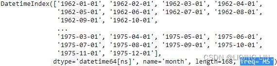
Inspect the data visually and observe if the time series contains any trend or seasonality. You can always come back to the plots shown in this section for reference:
from bokeh.plotting import figure, show
from bokeh.models import ColumnDataSource, HoverTool
from bokeh.layouts import column
import numpy as np

import hvplot.pandas
hvplot.extension("bokeh")

source = ColumnDataSource( data={'yearOfBirth':life.index,#.year,
                                 'Expectancy':life['value'].values,
                                })


p1 = figure( width=800, height=400,
             title='Annual Life Expectancy',
             x_axis_type='datetime',
             x_axis_label='Year of Birth', y_axis_label='Life Expectancy'
           )
# https://docs.bokeh.org/en/test/docs/user_guide/styling.html
p1.xaxis.axis_label_text_font_style='normal'
p1.yaxis.axis_label_text_font_style='bold'
p1.xaxis.major_label_orientation=np.pi/4 # rotation
p1.title.align='center'
p1.title.text_font_size = '1.5em' #'16px'

# p1.circle https://docs.bokeh.org/en/test/docs/user_guide/annotations.html
p1.line( x='yearOfBirth', y='Expectancy', source=source,
         line_width=2, color='blue',
         legend_label='Life_Expectancy'
       )
p1.legend.location = "top_left"
p1.legend.label_text_font = "times"

p1.add_tools( HoverTool( tooltips=[('Year of Birth', '@yearOfBirth{%Y}'),
                                   ('Life Expectancy', '@Expectancy{0.000}')
                                  ],
                         formatters={'@yearOfBirth':'datetime',
                                     '@Expectancy':'numeral'
                                    },
                         mode='vline'
                       )
            )

source = ColumnDataSource( data={'productionMonth':milk.index,
                                 'production':milk['production'].values,
                                })

# def datetime(x):
#     return np.array(x, dtype=datetime64)

p2 = figure( width=800, height=400,
             title='Monthly Milk Production',
             x_axis_type='datetime',
             x_axis_label='Month', y_axis_label='Milk Production'
           )
p2.xaxis.axis_label_text_font_style='normal'
p2.yaxis.axis_label_text_font_style='bold'
p2.xaxis.major_label_orientation=np.pi/4 # rotation
p2.title.align='center'
p2.title.text_font_size = '1.5em'

p2.line( x='productionMonth', y='production', source=source,
         line_width=2, color='blue',
         legend_label='Milk Production'
       )
# https://docs.bokeh.org/en/latest/docs/first_steps/first_steps_3.html
p2.legend.location = "top_left"
p2.legend.label_text_font = "times"
p2.legend.label_text_font_style = "italic"

p2.add_tools( HoverTool( tooltips=[('Production Month', '@productionMonth{%Y-%m}'),
                                   ('Production', '@production{0}')
                                  ],
                         formatters={'@productionMonth':'datetime',
                                     '@production':'numeral'
                                    },
                         mode='vline'
                       )
            )
show(column([p1,p2]))
Figure 10.1 – Time series plots for Annual Life Expectancy and Monthly Milk Production

- The preceding figure shows a time series plot for the life DataFrame showing a positive (upward) trend and no seasonality. The life expectancy预期寿命 data contains annual life expectancy records at birth from 1960 to 2019 (60 years). The original dataset contained records for each country, but you will be working with world records in this chapter.
- The time series plot for the milk DataFrame shows a positive (upward) trend and a repeating seasonality (every summer). The milk production data is recorded monthly from January 1962 to December 1975 (168 months). The seasonal magnitudes and variations over time seem to be steady, indicating an additive nature. Having a seasonal decomposition that specifes the level, trend, and season of an additive model will reflect this as well. For more insight on seasonal decomposition, please review the Decomposing time series data recipe in https://blog.csdn.net/Linli522362242/article/details/127737895, Exploratory Data Analysis and Diagnosis.
You will need to split the data into test and train datasets. Then, you must train the models (fitting) on the training dataset and use the test dataset to evaluate the model and compare your predictions. A forecast that's created for the data that will be used in training is called an in-sample forecast, while forecasting for unseen data such as a test set is called an out-of-sample forecast. When you're evaluating the different models, you will be using the out-of-sample or test sets.
Create a generalized function, split_data , which splits the data based on a test split factor. This way, you can experiment on different splits as well. We will be referencing this function throughout this chapter:
def split_data(data, test_split):
    length = len(data)
    t_idx = round( length*(1-test_split) )
    train, test = data[:t_idx], data[t_idx:]
    print( f'train: {len(train)}, test: {len(test)}' )

    return train,test
Call the split_data function to split the two DataFrames into test and train datasets (start with 15% test and 85% train). You can always experiment with diferent split factors:
test_split = 0.15
milk_train, milk_test = split_data( milk, test_split )
life_train, life_test = split_data( life, test_split )![]()
You will be checking for stationarity often since it is an essential assumption for many of the models you will build.
import matplotlib.pyplot as plt

fig, ax = plt.subplots( 2,1, figsize=(10,8) )

life.plot( ax=ax[0], title='Annual Life Expectancy' )
ax[0].set_xlabel('Year of Birth')
ax[0].set_ylabel('Life Expectancy')
ax[0].legend()

# using first order differencing (detrending)
life_diff = life.diff().dropna()
life_diff.plot( ax=ax[1], title='First Order Differencing' )
ax[1].set_xlabel('Year of Birth')

plt.subplots_adjust(hspace = 0.3)
plt.show()
adfuller(life_diff)-8.510099757338308, The test statistic.
1.1737760312328758e-13, MacKinnon’s approximate p-value based on MacKinnon
1, The number of lags used.
57, The number of observations used for the ADF regression and calculation of the critical values.
{'1%': -3.5506699942762414, Critical values for the test statistic at the 1 %
'5%': -2.913766394626147, Critical values for the test statistic at the 5 %
'10%': -2.5946240473991997}, Critical values for the test statistic at the 10 %
-5.12107228858611) The maximized information criterion if autolag is not None.(default autolag='AIC', )
from statsmodels.tsa.api import adfuller
def check_stationary( df ):
results = adfuller(df)[1:3] #
s = 'Non-Stationary'
if results[0] < 0.05: # p-value < 0.05
s = 'Stationary'
print( f"{s}\t p-value:{results[0]} \t lags:{results[1]}" )
return (s, results[0])
adfuller(life_diff)![]()
AR(P) OR
OR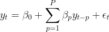
An autoregressive model or AR(p) is a linear model that uses observations from previous time steps as inputs into a regression equation to determine the predicted value of the next step. Hence, the auto part in autoregression indicates self and can be described as the regression of a variable on a past version of itself. A typical linear regression model will have this equation: 
Here,
 or
or  is the predicted variable,
 or
or  is the intercept,
  are the features or independent variables, and
 or
or  are the coefficients for each of the independent variables.
In regression, your goal is to solve these coefficients, including the intercept (think of them as weights), since they are later used to make predictions. The error term, ![]() , denotes the residual or noise (the unexplained portion of the model).
, denotes the residual or noise (the unexplained portion of the model).
Compare that with the autoregressive equation and you will see the similarities:![]()
This is an AR model of order p written as AR(p) . The main difference between an autoregressive and regression model is that the predicted variable is , which is at the
current time,  , and that the
 ![]() variables are lagged (previous) versions
variables are lagged (previous) versions
of . In this recipe, you used an ARIMA(0,1,1), which translates into an AR(0), indicating
no autoregressive model being used.
Unlike an autoregressive model that uses past values, the moving average or MA(q) uses past errors (from past estimates) to make a prediction:![]()
Combining the AR(p) and MA(q) models would produce an ARMA(p,q) model (autoregressive moving average). Both the AR and ARMA processes assume a stationary time series. However, suppose the time series is not stationary due to the presence of a trend. In that case, you cannot use the AR or ARMA models on non-stationary data, unless you perform some transformations, such as differencing. This was the case with the life data.
In the first recipe, you will be introduced to the ACF Corr(, ,
, ,...,
,...,![]() ,
,![]() ) and PACF: Corr(,
) and PACF: Corr(, ![]() )plots, which are used to determine the orders (parameters) for some of the models that will be used in this chapter, such as the ARIMA model.
)plots, which are used to determine the orders (parameters) for some of the models that will be used in this chapter, such as the ARIMA model.
One of the reasons ARIMA is popular is because it generalizes to other simpler models, as follows:
- • ARIMA(1, 0, 0) is a first-order autoregressive or AR(1) model
- • ARIMA(1, 1, 0) is a differenced first-order autoregressive model
- • ARIMA(0, 0, 1) is a first-order moving average or MA(1) model
- • ARIMA(1, 0, 1) is an ARMA (1,1) model
- • ARIMA(0, 1, 1) is a simple exponential smoothing model. This method is suitable for forecasting data with no clear trend or seasonal pattern
Plotting ACF and PACF
When building statistical forecasting models such as AR, MA, ARMA, ARIMA, or SARIMA, you will need to determine the type of time series model that is most suitable for your data and the values for some of the required parameters, called orders. More specifcally, these are called the lag orders for the autoregressive (AR ) or moving average (MA
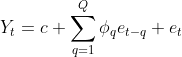 ) components. This will be explored further in the Forecasting univariate time series data with non-seasonal ARIMA recipe of this chapter.
To demonstrate this, for example, an AutoRegressive Moving Average (ARMA) model can be written as ARMA(p, q), where p is the autoregressive order or AR(p) component, and q is the moving average order or MA(q) component. Hence, an ARMA model combines an AR(p) and an MA(q) model.
The core idea behind these models is built on the assumption that the current value of a particular variable,  , can be estimated from past values of itself. For example, in an autoregressive model of order p or AR(p) , we assume that the current value,
  , at time
  can be estimated from its past values
![]() up to p, where p determines how many lags (steps back) we need to go. If p = 2 , this means we must use two previous periods
up to p, where p determines how many lags (steps back) we need to go. If p = 2 , this means we must use two previous periods ![]() to predict
to predict  . Depending on the granularity of your time series data, p=2 can be 2 hours, 2 days, 2 months, or 2 quarters.
To build an ARMA model, you will need to provide values for the p and q orders (known as lags). These are considered hyperparameters since they are supplied by you to influence the model.
The terms parameters and hyperparameters are sometimes used interchangeably. However, they have different interpretations and you need to understand the distinction.
The ACF and PACF plots can help you understand the strength of the linear relationship between past observations and their significance at different lags.
The ACF and PACF plots show significant autocorrelation or partial autocorrelation above the confidence interval. The shaded portion represents the confidence interval, which is controlled by the alpha parameter in both pacf_plot and acf_plot functions. The default value for alpha in statsmodels is 0.05 (or a 95% confidence interval). Being significant could be in either direction; strongly positive the closer to 1 (above) or strongly negative the closer to -1 (below).
If there is a strong correlation between past observations at lags 1, 2, 3, and 4, this means that the correlation measure at lag 1 is influenced by the correlation with lag 2, lag 2 is infuenced by the correlation with lag 3, and so on.ACF (,,,...,![]() ,
,![]() )
)
The ACF measure at lag 1 will include these influences of prior lags if they are correlated. In contrast, a PACF at lag 1 will remove these influences to measure the pure relationship at lag 1 with the current observation. PACF(,![]() )
)
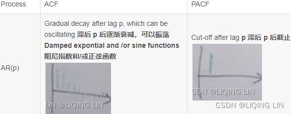
The following table shows an example guide for identifying the stationary AR and MA orders from PACF and ACF plots:
Table 10.1 – Identifying the AR, MA, and ARMA models using ACF and PACF plots
| Process | ACF | PACF |
| AR(p) | Gradual decay after lag p, which can be oscillating 滞后 p 后逐渐衰减,可以振荡 Damped expontial and /or sine functions阻尼指数和/或正弦函数(There is a gradual decay with oscillation after lag p)  |
Cut-off after lag p 滞后 p 后截止 |
| MA(q) | Cut-off at lag q |
Gradual decay after lag q, which can be oscillating Dominated expontial and /or sine functions(There is a gradual decay with oscillation after lag q)  |
| ARMA(p,q) | Gradual decay after lag p, which can be oscillating Damped expontial and /or sine functions after lag max(0,q-p) 滞后 max(0,q-p) 后的阻尼指数和/或正弦函数 |
Gradual decay after lag q, which can be oscillating Dominated expontial and /or sine functions after lag max(0,p-q) 滞后 max(0,p-q) 后的主导指数函数和/或正弦函数  |
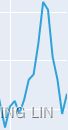
Example1 White noise :
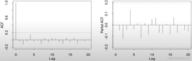
Ans: White noise : no spike or nothing is above or below the shaded area
Example2 AR(1):
 Ans: AR(1) : Cut-off after lag p=1(Partial ACF), and ACF Gradual decay after lag p, which can be oscillating
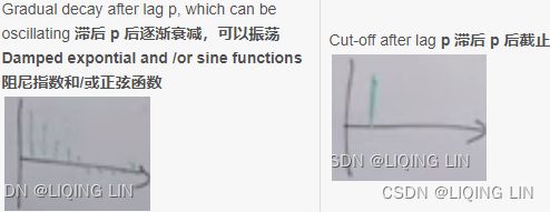
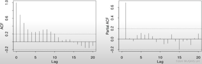
Example3 AR(2):
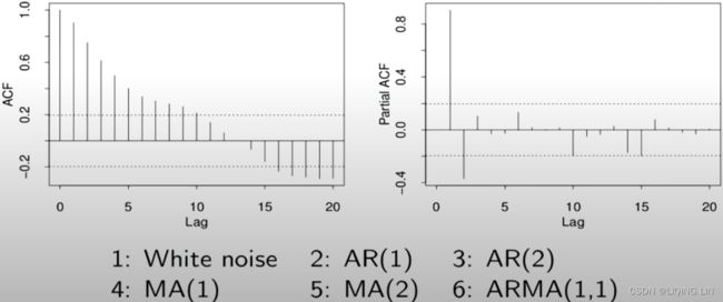
Ans: AR(2) : Cut-off after lag p=2(Partial ACF)
Example4 Seasonal AR(1) S=5:
 Ans: Seasonal AR(1) S=5 : (Partial ACF:p=5/S=1) and (ACF:5,10,...==> S=5, and ACF Gradual decay after lag p=5, which can be oscillating)
Example5 MA(2):
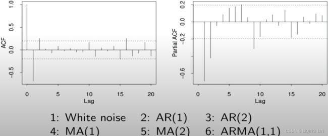 Ans: it hard to say AR(2) or MA(2), but the Partial ACF looks like expontial decay(oscillating, after lag q=2) when ACF: signal lag at 2(q=2), so MA(2)
Example6 ARMA(2,2) and there exists seasonal:
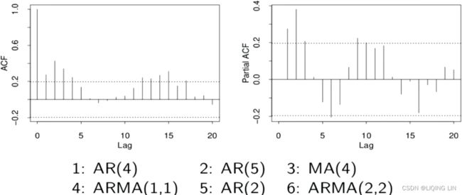 Ans: ARMA(2,2) : (Partial ACF: p=2, and ACF Gradual decay after lag p, which can be oscillating) , (ACF:q=2, and Partial ACF Gradual decay after lag q, which can be oscillating) and there exists seasonal, it is best go back to improve your model one step by step
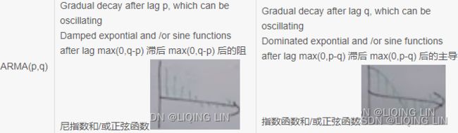
Example7 ARIMA(2,1,0):
 Ans: ?==> solution
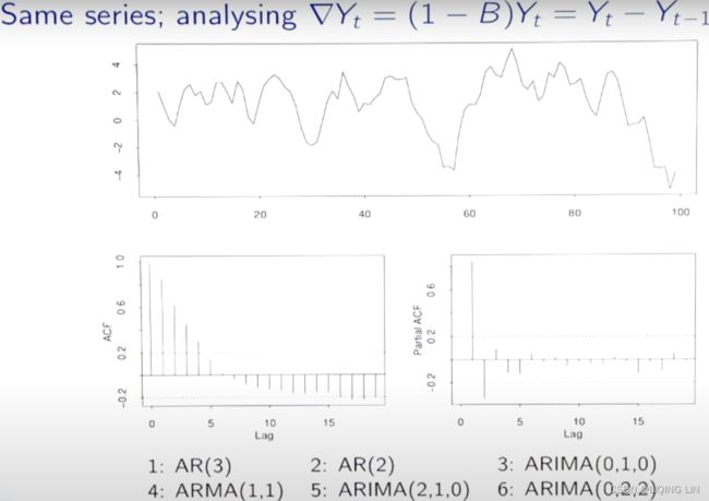 PACF ==> AR(2) since signal lag at p=2 ACF :looks like expontial decay ==> MA(0)
ANS: ARIMA(p, d, q) = ARIMA(2,1,0) <==![]() first order differencing
first order differencing
First-order difference(detrend): ![]()
Second-order differences:![]()
a dth-order difference can be written as : ![]()
a seasonal difference followed by a first difference: ![]()
Example8 AR(3):
ANS: AR(3):Cut-off after lag p=3(Partial ACF), and ACF Gradual decay after lag p, which can be oscillating
Example10 MA(1) :
 ANS: MA(1) <=Cut-off after lag q=1(ACF) and partial ACF looks like expontial decay(oscillating)
Example11: SARIMA (0, 1, 1) (0, 1, 1, 12)

the plot is based on milk_diff_12_1 = milk.diff(12).diff(1).dropna() ==> S=12, d=1
- Starting with the ACF plot,
- there is a signifcant spike at lag 1, which represents the non-seasonal order for the MA process as q=1 .
- The spike at lag 12 represents the seasonal order for the MA process as Q=1=12/S.
- Notice that there is a cut-off right after lag 1, then a spike at lag 12, followed by a cut-off (no other signifcant lags afterward) + exponential decay in the PACF plot==> MA
- These indicate a moving average model: an MA(1) for the non-seasonal component and an MA(1) for the seasonal component.
- The PACF plot : an exponential decay at lags 12, 24, and 36 indicates an MA model. So, the SARIMA model would be ARIMA (0, 1, 1) (0, 1, 1, 12) .
- SARIMA(p, d, q) (P, D, Q, S)

a seasonal difference followed by a first difference: ![]()
Parameters versus Hyperparameters
When training an ARIMA(AutoRegressive Integrated Moving Average) model, the outcome will produce a set of parameters called coeffcients – for example, a coeffcient value for AR Lag 1 or sigma –that are estimated by the algorithm during the model training process and are used for making predictions. They are referred to as the model's parameters.
On the other hand, the (p, d, q) parameters are the ARIMA(p, q, d) orders for AR, differencing, and MA, respectively. These are called hyperparameters. They are set manually and influence the model parameters that are produced (for example, the coefcients). These hyperparameters, as we have seen previously can be tuned using grid search, for example, to find the best set of values that produce the best model.
Now, you might be asking yourself, how do I find the significant lag values for AR and MA models?
This is where the AutoCorrelation Function (ACF) and the Partial AutoCorrelation Function (PACF) and their plots come into play. The ACF and PACF can be plotted to help you identify if the time series process is an AR, MA, or an ARMA process (if both are present) and the signifcant lag values (for p and q ). Both ACF and PACF plots are referred to as correlograms since the plots represent the correlation statistics.
The difference between an ARMA and ARIMA, written as ARIMA(p, d, q) , is in the stationarity assumption. The d parameter in ARIMA is for the differencing order. An ARMA model assumes a stationary process, while an ARIMA model does not since it handles differencing. An ARIMA model is a more generalized model since it can satisfy an ARMA model by making the differencing factor d=0 . Hence, ARIMA(1, 0, 1) is ARMA(1, 1) .
AR Order versus MA Order
You will use the PACF plot to estimate the AR order and the ACF plot to estimate the MA order. Both the ACF and PACF plots show values that range from -1 to 1 on the vertical axis (y-axis), while the horizontal axis (x-axis) indicates the size of the lag. A signifcant lag is any lag that goes outside the shaded confidence interval, as you shall see from the plots.
The statsmodels library provides two functions: acf_plot(for ma(q)) and pacf_plot(for ar(p)) . The correlation (for both ACF and PACF) at lag zero is always one (since it represents autocorrelation of the first observation on itself). Hence, both functions provide the zero parameter, which takes a Boolean. Therefore, to exclude the zero lag in the visualization, you can pass zero=False instead.
In https://blog.csdn.net/Linli522362242/article/details/127737895, Exploratory Data Analysis and Diagnosis, in the Testing autocorrelation in time series data recipe, you used the Ljung-Box test to evaluate autocorrelation on the residuals. In this recipe, you will learn how to use the ACF plot to examine residual autocorrelation visually as well.
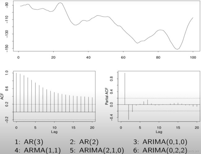
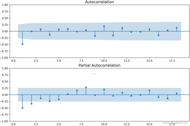
You will use the life expectancy data in this recipe. As shown in Figure 10.1, the data is not stationary due to the presence of a long-term trend. In such a case, you will need to difference (detrend) the time series to make it stationary before applying the ACF and PACF plots.
import statsmodels.tsa.api as smt
fig, ax = plt.subplots( 2,1, figsize=(12,8) )
# using first order differencing (detrending)
# life_diff = life.diff().dropna()
smt.graphics.plot_acf( life_diff, zero=False, ax=ax[0], auto_ylims=True, )
smt.graphics.plot_pacf( life_diff, zero=False, ax=ax[1], auto_ylims=True,)
plt.show()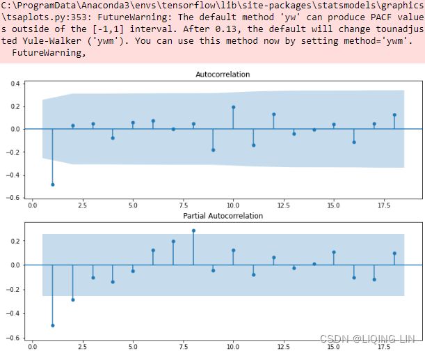 Figure 10.2 – The ACF and PACF plots for the life expectancy data after differencing(d=1)
The ACF plot shows a signifIcant spike at lag (order) 1. Signifcance is represented when a lag (vertical line) goes above or below the shaded area. The shaded area represents the confidence interval, which is set to 95% by default. In the ACF plot, only the first lag is significant, which is below the lower confidence interval, and then cuts off right after. All the remaining lags are not significant. This indicates a moving average of order one or MA(1).
The PACF plot shows a gradual decay with oscillation逐渐衰减和振荡. Generally, if PACF shows a gradual decay(with oscillation), it indicates a moving average model.
For example, if you are using an ARMA or ARIMA model, it would be represented as ARMA(0, 1) once the data has been differenced to make it stationary, or ARIMA(p, d, q)=ARIMA(0, 1, 1) , indicating a first-order differencing with d=1 . In both ARMA and ARIMA, the AR order is p=0 , and the MA order is q=1.
Now, let's see how PACF and ACF can be used with a more complex dataset containing strong trends and seasonality. In Figure 10.1, the Monthly Milk Production plot shows an annual seasonal effect and a positive upward trend indicating a non-stationary time series. It is more suitable with a SARIMA model. In a SARIMA model, you have two components: a non-seasonal and a seasonal component. For example, in addition to the AR and MA processes for the non-seasonal components represented by lower case p and q , which you saw earlier, you will have AR and MA orders for the seasonal component, which are represented by upper case P and Q , respectively. Tis can be written as SARIMA(p, d, q) (P, D, Q, S) . You will learn more about the SARIMA model in the Forecasting univariate time series data with seasonal ARIMA recipe.
import statsmodels.tsa.api as smt

fig, ax = plt.subplots( 2,1, figsize=(12,8) )
# using first order differencing (detrending)
# life_diff = life.diff().dropna()

smt.graphics.plot_acf( milk, zero=False, ax=ax[0], auto_ylims=True, )
smt.graphics.plot_pacf( milk, zero=False, ax=ax[1], auto_ylims=True,)

plt.show()
seasonal s=12
To make such time series stationary, you must start with seasonal differencing to remove the seasonal effect. Since the observations are taken monthly, the seasonal effects are observed annually (every 12 months or period):
# disseasonalize : differencing to remove seasonality
milk_diff_12 = milk.diff(12).dropna()

import statsmodels.tsa.api as smt

fig, ax = plt.subplots( 2,1, figsize=(12,8) )
# using first order differencing (detrending)
# life_diff = life.diff().dropna()

smt.graphics.plot_acf( milk_diff_12, zero=False, ax=ax[0], auto_ylims=True, )
smt.graphics.plot_pacf( milk_diff_12, zero=False, ax=ax[1], auto_ylims=True,)

plt.show()
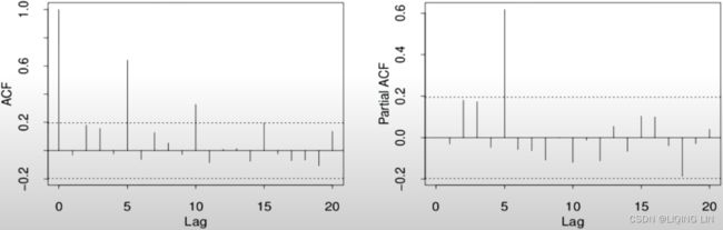
AR(p=1) and with seasonal s=12 P=(13-1)/s =1
Use the check_stationarity function that you created earlier in this chapter to perform an Augmented Dickey-Fuller test to check for stationarity:
check_stationary( milk_diff_12 )![]()
The differenced time series is still not stationary, so you still need to perform a second differencing. This time, you must perform first-order differencing (detrend). When the time series data contains seasonality and trend, you may need to difference it twice to make it stationary. Store the resulting DataFrame in the milk_diff_12_1 variable and run check_stationarity again:
milk_diff_12_1 = milk.diff(12).diff(1).dropna()
check_stationary( milk_diff_12_1 )![]()
Great – now, you have a stationary process.
Plot ADF and PACF for the stationary time series in milk_diff_12_1 :
import statsmodels.tsa.api as smt
from statsmodels.tsa.stattools import acf, pacf
from matplotlib.collections import PolyCollection

fig, ax = plt.subplots( 2,1, figsize=(12,8) )
# using first order differencing (detrending)
# life_diff = life.diff().dropna()
lags=np.array(range(37))
acf_x=acf( milk_diff_12_1, nlags=36,alpha=0.05,
           fft=False, qstat=False,
           bartlett_confint=True,
           adjusted=False,
           missing='none',
         )
acf_x, confint =acf_x[:2]

pacf_x=pacf( milk_diff_12_1, nlags=36,alpha=0.05,

           )
pacf_x, pconfint =pacf_x[:2]

smt.graphics.plot_acf( milk_diff_12_1, zero=False, ax=ax[0], auto_ylims=False, lags=36 )
for lag in [1,12]:
    ax[0].scatter( lag,  acf_x[lag] , s=500 ,  facecolors='none', edgecolors='red' )
    ax[0].text( lag-1.3, acf_x[lag]-0.3, 'Lag '+str(lag), color='red', fontsize='x-large')

smt.graphics.plot_pacf( milk_diff_12_1, zero=False, ax=ax[1], auto_ylims=False, lags=36)
for lag in [1,12,24,36]:
    ax[1].scatter( lag,  pacf_x[lag] , s=500 ,  facecolors='none', edgecolors='red' )
    ax[1].text( lag-1.3, pacf_x[lag]-0.3, 'Lag '+str(lag), color='red', fontsize='x-large')

plt.show()
Figure 10.3 – PACF and ACF for Monthly Milk Production after differencing twice
For the seasonal orders, P and Q , you should diagnose spikes or behaviors at lags 1s , 2s , 3s , and so on, where s is the number of periods in a season. For example, in the milk production data, s=12 (since there are 12 monthly periods in a season). Then, we observe for significance at 12 (s), 24 (2s), 36 (3s), and so on.
- Starting with the ACF plot,
- there is a signifcant spike at lag 1, which represents the non-seasonal order for the MA process as q=1 .
- The spike at lag 12 represents the seasonal order for the MA process as Q=1=12/S.
- Notice that there is a cut-off right after lag 1, then a spike at lag 12, followed by a cut-off (no other signifcant lags afterward) + exponential decay in the PACF plot==> MA
- These indicate a moving average model: an MA(1) for the non-seasonal component and an MA(1) for the seasonal component.
- The PACF plot : an exponential decay at lags 12, 24, and 36 indicates an MA model. So, the SARIMA model would be ARIMA (0, 1, 1) (0, 1, 1, 12) .
- SARIMA(p, d, q) (P, D, Q, S)
In this recipe, you used ACF and PACF plots to understand what order values (lags) to use for the seasonal and non-seasonal ARIMA models. Let's see how ACF plots can be used to diagnose the model's residuals. Let's
- build the seasonal ARIMA model we identifed earlier in this recipe as SARIMA(0, 1, 1) (0, 1, 1, 12) ,
- then use the ACF to diagnose the residuals.
- If the model captured all the information that's been embedded within the time series, you would expect the residuals to have no autocorrelation:
from statsmodels.tsa.statespace.sarimax import SARIMAX

model = SARIMAX( milk, order = (0,1,1),
                 seasonal_order=(0,1,1,12)
               ).fit(disp=False)# Set to True to print convergence messages.

fig, ax = plt.subplots( 1,1, figsize=(12,4) )

smt.graphics.plot_acf( model.resid[1:], ax=ax, zero=False, auto_ylims=True )
plt.show() 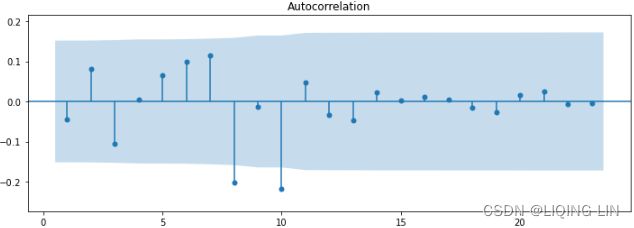
Overall, there are a couple of slightly significant lags, indicating the existence of some autocorrelation in the residuals. When the residuals show autocorrelation, this can mean that the model did not capture all the information, and there is potential for further improvement.
You can further tune the model and experiment with other values for the seasonal and non-seasonal orders. In this chapter and later recipes, you will explore a grid search method for selecting the best hyperparameters to find the best model.
Chapter 8 Exponential smoothing https://otexts.com/fpp3/expsmooth.html
Exponential smoothing was proposed in the late 1950s (Brown, 1959; Holt, 1957; Winters, 1960), and has motivated some of the most successful forecasting methods. Forecasts produced using exponential smoothing methods are weighted averages of past observations, with the weights decaying exponentially as the observations get older. In other words, the more recent the observation the higher the associated weight. This framework generates reliable forecasts quickly and for a wide range of time series, which is a great advantage and of major importance to applications in industry.
This chapter is divided into two parts. In the first part (Sections 8.1–8.4) we present the mechanics of the most important exponential smoothing methods, and their application in forecasting time series with various characteristics. This helps us develop an intuition to how these methods work. In this setting, selecting and using a forecasting method may appear to be somewhat ad hoc. The selection of the method is generally based on recognising/ˈrekəɡnaɪz/识别 key components of the time series (trend and seasonal) and the way in which these enter the smoothing method (e.g., in an additive, damped or multiplicative manner). 方法的选择通常基于识别时间序列的关键组成部分(趋势和季节性)以及这些组成部分进入平滑方法的方式(例如,以加法、阻尼或乘法方式)。
In the second part of the chapter (Sections 8.5–8.7) we present the statistical models that underlie exponential smoothing methods. These models generate identical point forecasts to the methods discussed in the first part of the chapter, but also generate prediction intervals. Furthermore, this statistical framework allows for genuine model selection between competing models.
8.1 Simple exponential smoothing
The simplest of the exponentially smoothing methods is naturally called simple exponential smoothing (SES)13. This method is suitable for forecasting data with no clear trend or seasonal pattern. For example, the data in Figure 8.1 Exports of goods and services from Algeria from 1960 to 2017.8.1 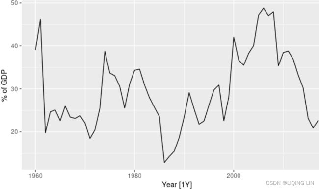 do not display any clear trending behaviour or any seasonality. (There is a decline in the last few years, which might suggest a trend. We will consider whether a trended method would be better for this series later in this chapter.) We have already considered the naïve and the average as possible methods for forecasting such data (Section 5.2).
For example, the data in Figure 7.1 : Oil production in Saudi Arabia from 1996 to 2013.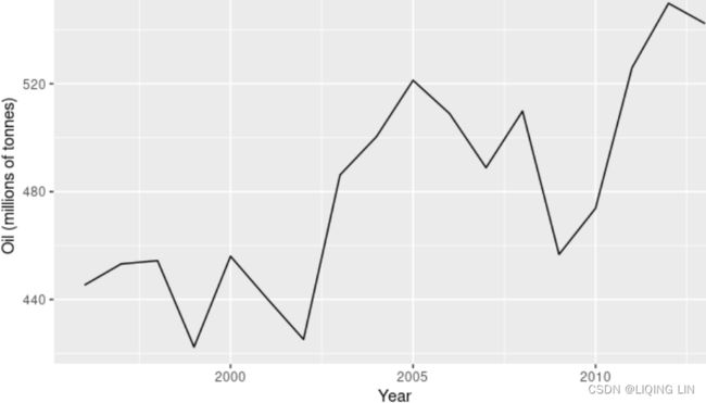 do not display any clear trending behaviour or any seasonality. (There is a rise in the last few years, which might suggest a trend. We will consider whether a trended method would be better for this series later in this chapter.)
Using the naïve method, all forecasts for the future![]() at time
at time  are equal to the last observed value
![]() of the series对未来的所有预测都等于序列的最后一个观察值,
of the series对未来的所有预测都等于序列的最后一个观察值,![]()
for h=1,2,… Hence, the naïve method assumes that the most recent observation is the only important one, and all previous observations provide no information for the future. This can be thought of as a weighted average where all of the weight is given to the last observation.
Using the average method, all future forecasts are equal to a simple average of the observed data,
for h=1,2,… Hence, the average method assumes that all observations are of equal importance, and gives them equal weights when generating forecasts.
We often want something between these two extremes. For example, it may be sensible to attach larger weights to more recent observations than to observations from the distant past. This is exactly the concept behind simple exponential smoothing. Forecasts are calculated using weighted averages, where the weights decrease exponentially as observations come from further in the past — the smallest weights are associated with the oldest observations:
 (8.1)
(8.1)
OR![]()

where 0≤α≤1 is the smoothing parameter. The one-step-ahead forecast for time T+1 is a weighted average of all of the observations in the series ![]() ,…,
,…,![]() . The rate at which the weights decrease is controlled by the parameter α.
. The rate at which the weights decrease is controlled by the parameter α.
The table below shows the weights attached to observations for four different values of α when forecasting using simple exponential smoothing. Note that the sum of the weights even for a small value of α will be approximately one for any reasonable sample size.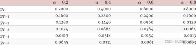
A higher![]() discounts older observations faster.
discounts older observations faster.
For any α between 0 and 1, the weights attached to the observations decrease exponentially as we go back in time, hence the name “exponential smoothing”.
- If α is small (i.e., close to 0), more weight is given to observations from the more distant past.
- If α is large (i.e., close to 1), more weight is given to the more recent observations.
- For the extreme case where α=1,
 , and the forecasts are equal to the naïve forecasts(all forecasts for the future
 at time are equal to the last observed value
 of the series: all of the weight is given to the last observation).
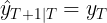
We present two equivalent forms of simple exponential smoothing, each of which leads to the forecast Equation().
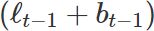
Weighted average form
The forecast at time T+1 is equal to a weighted average between the most recent observation ![]() and the previous forecast
and the previous forecast ![]() :
:
![]()
where 0≤α≤1 is the smoothing parameter. Similarly, we can write the fitted values as ![]()
for t=1,…,T. (Recall that fitted values are simply one-step forecasts of the training data.)
The process has to start somewhere, so we let the first fitted value at time 1 be denoted by ![]() (which we will have to estimate). Then
(which we will have to estimate). Then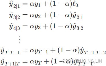
Substituting each equation into the following equation, we obtain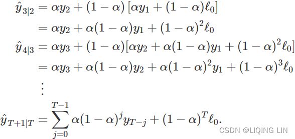
The last term![]() becomes tiny for large T. So, the weighted average form leads to the same forecast Equation (8.1) .
becomes tiny for large T. So, the weighted average form leads to the same forecast Equation (8.1) .
#######
The EMA for a series![]() may be calculated recursively
may be calculated recursively![]()

#######
Component form
An alternative representation is the component form. For simple exponential smoothing, the only component included is the level, ![]() . (Other methods which are considered later in this chapter may also include a trend
. (Other methods which are considered later in this chapter may also include a trend ![]() and a seasonal component
and a seasonal component ![]() .) Component form representations of exponential smoothing methods comprise a forecast equation and a smoothing equation for each of the components included in the method. The component form of simple exponential smoothing is given by:
.) Component form representations of exponential smoothing methods comprise a forecast equation and a smoothing equation for each of the components included in the method. The component form of simple exponential smoothing is given by: 
where ![]() is the level (or the smoothed value) of the series at time t. Setting h=1 gives the fitted values, while setting t=T gives the true forecasts beyond the training data. Te ExponentialSmoothing class is finding the optimal value for alpha ( α )
is the level (or the smoothed value) of the series at time t. Setting h=1 gives the fitted values, while setting t=T gives the true forecasts beyond the training data. Te ExponentialSmoothing class is finding the optimal value for alpha ( α )
- The forecast equation shows that the forecast value at time t+1=t+h is the estimated level at time t.
- The smoothing equation for the level (usually referred to as the level equation) gives the estimated level of the series at each period t. OR
 is the expected (smoothed) level at the current time, t,
  is the previous smoothed level value at time t−1 ,
 is the observed value at the current time, t.
If we replace ![]() with
with ![]() and
and ![]() with
with ![]() in the smoothing equation, we will recover the weighted average form of simple exponential smoothing
in the smoothing equation, we will recover the weighted average form of simple exponential smoothing![]() .
.
The alpha (α) parameter is the level smoothing parameter and plays a vital role in determining whether the model should trust the past or ![]() versus the present or . Hence,
versus the present or . Hence,
- as α gets closer to zero, the first term,
 , gets closer to zero, and more weight is put on the past or .
 - And as α gets closer to one, then the
 term gets closer to zero and more emphasis or weight is put on the present or .
Some of the influencing factors depend on how much randomness is in the system. The output value for the coefficient, α , is the weight to determine how the model uses current and past observations to forecast future events or ![]() .
.
The component form of simple exponential smoothing is not particularly useful on its own, but it will be the easiest form to use when we start adding other components.
Flat forecasts
Simple exponential smoothing has a “flat” forecast function(vs naïve method ![]() ):
): ![]()
That is, all forecasts take the same value, equal to the last level component. Remember that these forecasts will only be suitable if the time series has no trend or seasonal component.
Optimisation优化
The application of every exponential smoothing method requires the smoothing parameters and the initial values to be chosen. In particular, for simple exponential smoothing, we need to select the values of α and ![]() . All forecasts can be computed from the data once we know those values. For the methods that follow there is usually more than one smoothing parameter and more than one initial component to be chosen.
. All forecasts can be computed from the data once we know those values. For the methods that follow there is usually more than one smoothing parameter and more than one initial component to be chosen.
In some cases, the smoothing parameters may be chosen in a subjective manner — the forecaster specifies the value of the smoothing parameters based on previous experience. However, a more reliable and objective way to obtain values for the unknown parameters is to estimate them from the observed data.
In Section 7.2, we estimated the coefficients of a regression model by minimizing the sum of the squared residuals (usually known as SSE or “sum of squared errors”). Similarly, the unknown parameters and the initial values for any exponential smoothing method can be estimated by minimizing the SSE. The residuals are specified as ![]() for t=1,…,T. Hence, we find the values of the unknown parameters and the initial values that minimize
for t=1,…,T. Hence, we find the values of the unknown parameters and the initial values that minimize 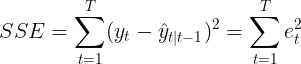
Unlike the regression case (where we have formulas which return the values of the regression coefficients that minimise the SSE), this involves a non-linear minimization problem, and we need to use an optimization tool to solve it.
Example: Algerian exports
In this example, simple exponential smoothing is applied to forecast exports of goods and services from Algeria.
# Estimate parameters
fit <- algeria_economy %>%
model(ETS(Exports ~ error("A") + trend("N") + season("N")))
fc <- fit %>%
forecast(h = 5)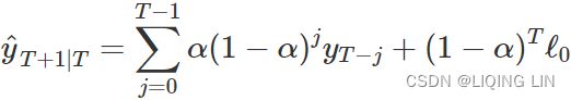 This gives parameter estimates
 ![]() =0.84 and
=0.84 and ![]() =39.54, obtained by minimizing SSE over periods t=1,2,…,58, subject to the restriction that 0≤α≤1.
=39.54, obtained by minimizing SSE over periods t=1,2,…,58, subject to the restriction that 0≤α≤1.
In Table 8.1 we demonstrate the calculation using these parameters.
- The second last column shows the estimated level for times t=0 to t=58;
- the last few rows of the last column show the forecasts for h=1 to 5-steps ahead.

Table 8.1: Forecasting goods and services exports from Algeria using simple exponential smoothing.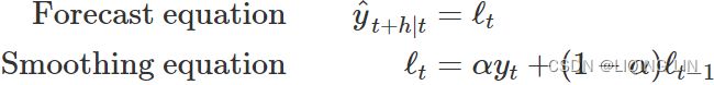
![]() ==>
==> ![]()
![]()

The black line in Figure 8.2 shows the data, which has a changing level over time.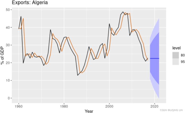
Figure 8.2: Simple exponential smoothing applied to exports from Algeria (1960–2017). The orange curve shows the one-step-ahead fitted values.
The forecasts for the period 2018–2022 are plotted in Figure 8.2. Also plotted are one-step-ahead fitted values alongside the data over the period 1960–2017.
- The large value of α in this example is reflected in the large adjustment that takes place in the estimated level
 at each time.
 - A smaller value of α would lead to smaller changes over time, and so the series of fitted values would be smoother.
The prediction intervals shown here are calculated using the methods described in Section 8.7. The prediction intervals show that there is considerable uncertainty相当大的不确定性 in the future exports over the five-year forecast period. So interpreting the point forecasts without accounting for the large uncertainty can be very misleading在不考虑较大不确定性的情况下解释点预测可能会产生误导.
Simple Exponential Smoothing: Component form
8.2 Methods with trend
Holt’s linear trend method
Holt (1957) extended simple exponential smoothing to allow the forecasting of data with a trend. This method involves a forecast equation and two(double) smoothing equations (one for the level and one for the trend):
The formula for Holt's exponential smoothing (double) incorporates the addition of the
trend (b) and its smoothing parameter, beta (![]() ). Hence, once a trend is included, the model will output the values for both coefficients – that is, alpha and beta ( α,
). Hence, once a trend is included, the model will output the values for both coefficients – that is, alpha and beta ( α,![]() ), Setting h=1 gives the fitted values:
), Setting h=1 gives the fitted values: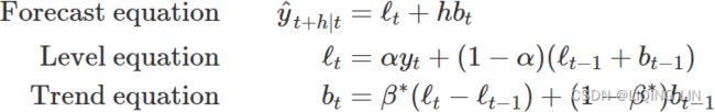 where
where
- denotes an estimate of the level of the series at time t,
 denotes an estimate of the trend (slope) of the series at time t,
 - α is the smoothing parameter for the estimated level, 0≤α≤1, and
 is the smoothing parameter for the trend, 0≤≤1. (We denote this as instead of β for reasons that will be explained in Section 8.5.)
As with simple exponential smoothing,
- the level equation here shows that
- is a weighted average of observation and
- the one-step-ahead training forecast for time t, here given by
 .
.
- The trend equation shows that
- is a weighted average of the estimated trend at time t
- based on
 and
and  , the previous estimate of the trend.
-
- The forecast equation is no longer flat("flat" forecast:
 ) but trending. The h-step-ahead(t+h) forecast is equal to the last estimated level plus h times the last estimated trend value. Hence the forecasts are a linear function of h.
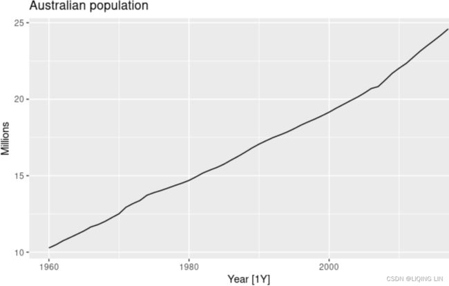 Figure 8.3: Australia’s population, 1960-2017.
Figure 8.3 shows Australia’s annual population from 1960 to 2017. We will apply Holt’s method to this series. The smoothing parameters, α and ![]() , and the initial values
, and the initial values ![]() and
and ![]() are estimated by minimizing the SSE for the one-step training errors as in Section 8.1.
are estimated by minimizing the SSE for the one-step training errors as in Section 8.1.
fit <- aus_economy %>%
  model(
    AAN = ETS(Pop ~ error("A") + trend("A") + season("N"))
  )
fc <- fit %>% forecast(h = 10)- The estimated smoothing coefficient for the level is
 =0.9999. The very high value shows that the level changes rapidly in order to capture the highly trended series.
 - The estimated smoothing coefficient for the slope is
 =0.3267. This is relatively large suggesting that the trend also changes often (even if the changes are slight).
- if
 : The very small value of means that the slope hardly changes over time意味着斜率几乎不随时间变化.
- if
In Table 8.2 we use these values to demonstrate the application of Holt’s method.
0.9999*10.28 + (1-0.9999)*(10.05+0.22)=10.28
0.3267*(10.28-10.05) + (1-0.3267)*0.22 =0.2233 ==> 0.22
10.28 + 1*0.22 = 10.50
0.9999*10.48 + (1-0.9999)*(10.28+0.2233)=10.48
0.3267*(10.48-10.28) + (1-0.3267)*0.2233 =0.2157 ==> 0.22
10.48 + 1*0.22 = 10.70
Damped trend methods
The forecasts generated by Holt’s linear method display a constant trend (increasing or decreasing) indefinitely into the future. Empirical evidence indicates that these methods tend to over-forecast过度预测, especially for longer forecast horizons. Motivated by this observation, Gardner & McKenzie (1985) introduced a parameter that “dampens” the trend to a flat line将趋势“抑制”成一条平坦的线 some time in the future. Methods that include a damped trend have proven to be very successful, and are arguably the most popular individual methods when forecasts are required automatically for many series.
In conjunction with the smoothing parameters α and ![]() (with values between 0 and 1 as in Holt’s method), this method also includes a damping parameter 0<
(with values between 0 and 1 as in Holt’s method), this method also includes a damping parameter 0< <1:
<1: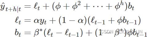
If ϕ=1, the method is identical to Holt’s linear method. For values between 0 and 1, ϕ dampens the trend so that it approaches a constant some time in the future. In fact, the forecasts converge to ![]() as h→∞ for any value 0<ϕ<1. This means that short-run forecasts are trended while long-run forecasts are constant.
as h→∞ for any value 0<ϕ<1. This means that short-run forecasts are trended while long-run forecasts are constant.
In practice,
- ϕ is rarely less than 0.8 as the damping has a very strong effect for smaller values.
- Values of ϕ close to 1 will mean that a damped model is not able to be distinguished from a non-damped model.
- For these reasons, we usually restrict ϕ to a minimum of 0.8 and a maximum of 0.98.
Example: Australian Population (continued)
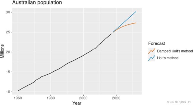
Figure 8.4: Forecasting annual Australian population (millions) over 2018-2032. For the damped trend method, ϕ=0.90.
We have set the damping parameter to a relatively low number (ϕ=0.90) to exaggerate the effect of damping for comparison夸大阻尼的影响以进行比较. Usually, we would estimate ϕ along with the other parameters. We have also used a rather large forecast horizon (h=15) to highlight the difference between a damped trend and a linear trend.
Example: Internet usage
In this example, we compare the forecasting performance of the three exponential smoothing methods that we have considered so far in forecasting the number of users connected to the internet via a server. The data is observed over 100 minutes and is shown in Figure 8.5. Figure 8.5: Users connected to the internet through a server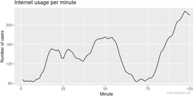
We will use time series cross-validation to compare the one-step forecast accuracy of the three methods.
www_usage %>%
  stretch_tsibble(.init = 10) %>%
  model(
    SES = ETS(value ~ error("A") + trend("N") + season("N")),
    Holt = ETS(value ~ error("A") + trend("A") + season("N")),
    Damped = ETS(value ~ error("A") + trend("Ad") +
                   season("N"))
  ) %>%
  forecast(h = 1) %>%
  accuracy(www_usage)
#> # A tibble: 3 × 10
#>   .model .type     ME  RMSE   MAE   MPE  MAPE  MASE RMSSE  ACF1
#>
#> 1 Damped Test  0.288   3.69  3.00 0.347  2.26 0.663 0.636 0.336
#> 2 Holt   Test  0.0610  3.87  3.17 0.244  2.38 0.701 0.668 0.296
#> 3 SES    Test  1.46    6.05  4.81 0.904  3.55 1.06  1.04  0.803
Damped Holt’s method is best whether you compare MAE or RMSE values. So we will proceed with using the damped Holt’s method and apply it to the whole data set to get forecasts for future minutes.
fit <- www_usage %>%
  model(
    Damped = ETS(value ~ error("A") + trend("Ad") +
                   season("N"))
  )
# Estimated parameters:
tidy(fit)
#> # A tibble: 5 × 3
#>   .model term  estimate
#>
#> 1 Damped alpha   1.00
#> 2 Damped beta    0.997
#> 3 Damped phi     0.815
#> 4 Damped l[0]   90.4
#> 5 Damped b[0] -0.0173 - The smoothing parameter for the slope
 is estimated to be almost one, indicating that the trend changes to mostly reflect the slope between the last two minutes
 of internet usage.
 - The value of α is very close to one, showing that the level
 reacts strongly to each new observation
 .
.
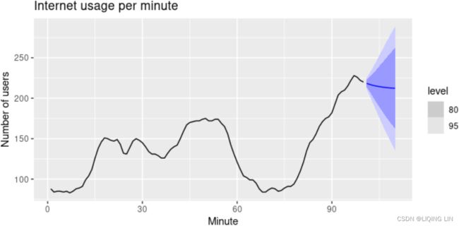 Figure 8.6: Forecasting internet usage: comparing forecasting performance of non-seasonal methods.
The resulting forecasts look sensible with decreasing trend预测看起来很合理,呈下降趋势, which flattens out due to the low value of the damping parameter (0.815), and relatively wide prediction intervals reflecting the variation in the historical data. The prediction intervals are calculated using the methods described in Section 8.7.
In this example, the process of selecting a method was relatively easy as both MSE and MAE comparisons suggested the same method (damped Holt’s). However, sometimes different accuracy measures will suggest different forecasting methods, and then a decision is required as to which forecasting method we prefer to use. As forecasting tasks can vary by many dimensions (length of forecast horizon, size of test set, forecast error measures, frequency of data, etc.), it is unlikely that one method will be better than all others for all forecasting scenarios. What we require from a forecasting method are consistently sensible forecasts预测方法的要求是始终如一的合理预测, and these should be frequently evaluated against the task at hand并且应该根据手头的任务经常评估这些预测.
8.3 Methods with seasonality
Holt (1957) and Winters (1960) extended Holt’s method to capture seasonality. The Holt-Winters seasonal method comprises the forecast equation and three smoothing equations — one for the level ![]() , one for the trend
, one for the trend  , and one for the seasonal component
  , with corresponding smoothing parameters α,
 ![]() and
and  . We use m to denote the period of the seasonality, i.e., the number of seasons in a year. For example, for quarterly data m=4, and for monthly data m=12.
There are two variations to this method that differ in the nature of the seasonal component.
- The additive method is preferred when the seasonal variations are roughly constant through the series, OR The additive decomposition is the most appropriate if the magnitude of the seasonal fluctuations季节性波动的幅度, or the variation around the trend-cycle,围绕趋势周期的变化 does not vary with the level of the time series


- while the multiplicative method is preferred when the seasonal variations are changing proportional to the level of the series. OR A multiplicative model is suitable when the seasonal variation fluctuates over time.
 ==>
==> https://blog.csdn.net/Linli522362242/article/details/127737895
 - With the additive method, the seasonal component is expressed in absolute terms in the scale of the observed series, and in the level equation the series is seasonally adjusted by subtracting the seasonal component. Within each year, the seasonal component will add up to approximately zero.
- With the multiplicative method, the seasonal component is expressed in relative terms (percentages), and the series is seasonally adjusted by dividing through by the seasonal component. Within each year, the seasonal component will sum up to approximately m(We use m to denote the period of the seasonality).
Holt-Winters’ additive method
The component form for the additive method is:
where k is the integer part of ![]() , which ensures that the estimates of the seasonal indices used for forecasting come from the final year of the sample.
, which ensures that the estimates of the seasonal indices used for forecasting come from the final year of the sample.
- The level equation shows a weighted average between
- the seasonally adjusted observation
 and
and - the non-seasonal forecast
 for time t.
- the seasonally adjusted observation
- The trend equation is identical to Holt’s linear method.
- is a weighted average of the estimated trend at time t
- based on and
- , the previous estimate of the trend.
-
- The seasonal equation shows a weighted average between
- the current seasonal index,
 , and
, and - the seasonal index of the same season last year (i.e., m time periods ago).
The equation for the seasonal component is often expressed as ![]()
If we substitute![]() from the smoothing equation for the level of the component form above
from the smoothing equation for the level of the component form above![]() , we get
, we get ![]()
which is identical to the smoothing equation for the seasonal component we specify here, with ![]() The usual parameter restriction is 0≤
The usual parameter restriction is 0≤![]() ≤1, which translates to 0≤γ≤1−α.
≤1, which translates to 0≤γ≤1−α.
Holt-Winters’ multiplicative method
The Holt-Winters exponential smoothing (triple) formula incorporates both trend ( ) and seasonality (
 ). The following equation shows multiplicative seasonality as an example:
The component form for the multiplicative method is: Setting h=1 gives the fitted values:
where k is the integer part of ![]()
When using ExponentialSmoothing to find the best  ,
, ![]() ,
,  parameter values, it does so by minimizing the error rate (the sum of squared error or SSE). So, every time in the loop you were passing new parameters values (for example, damped as either True or False ), the model was solving for the optimal set of values for the ,
 ![]() , coefficients by minimizing for SSE. This can be written as follows:
, coefficients by minimizing for SSE. This can be written as follows: ![]()
Example: Domestic overnight trips in Australia
We apply Holt-Winters’ method with both additive and multiplicative seasonality to forecast quarterly visitor nights in Australia spent by domestic tourists. Figure 8.7 shows the data from 1998–2017, and the forecasts for 2018–2020(h=3 years). The data show an obvious seasonal pattern, with peaks observed in the March quarter of each year, corresponding to the Australian summer.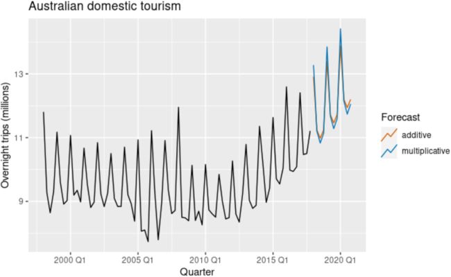
Figure 8.7: Forecasting domestic overnight trips in Australia using the Holt-Winters method with both additive and multiplicative seasonality.
Table 8.3: Applying Holt-Winters’ method with additive seasonality for forecasting domestic tourism in Australia. Notice that the additive seasonal component sums to approximately zero. The smoothing parameters are α=0.2620, ![]() =0.1646,
=0.1646,  =0.0001 and RMSE =0.4169.
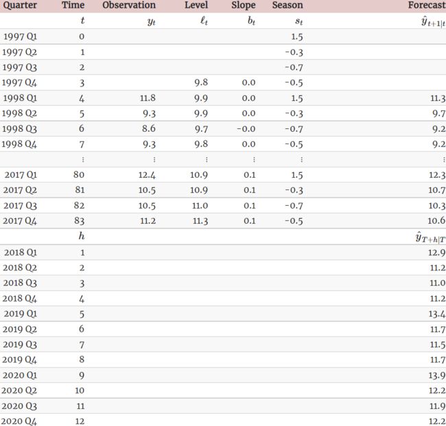
Table 8.4: Applying Holt-Winters’ method with multiplicative seasonality for forecasting domestic tourism in Australia. Notice that the multiplicative seasonal component sums to approximately m=4. The smoothing parameters are α=0.2237, ![]() =0.1360, =0.0001 and RMSE =0.4122(<RMSE =0.4169 from additive seasonality)
=0.1360, =0.0001 and RMSE =0.4122(<RMSE =0.4169 from additive seasonality)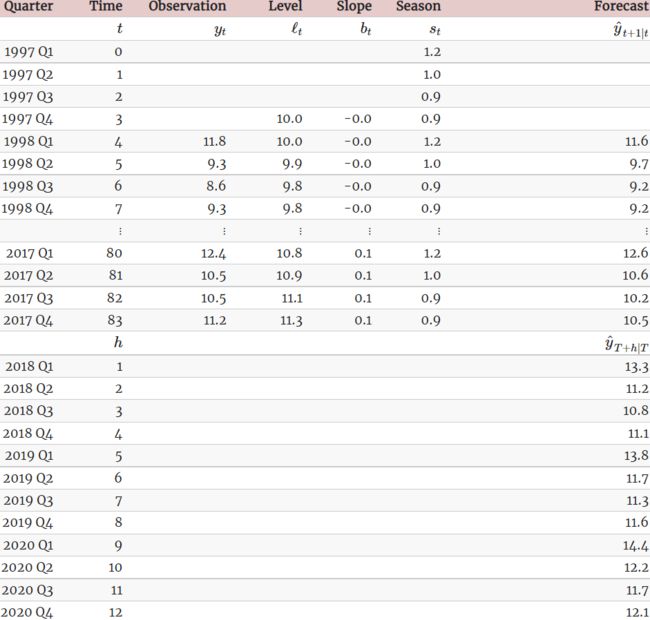
The applications of both methods (with additive and multiplicative seasonality) are presented in Tables 8.3 and 8.4 respectively. Because both methods have exactly the same number of parameters to estimate, we can compare the training RMSE from both models. In this case, the method with multiplicative seasonality fits the data slightly better.
The grey bars to the left of each panel show the relative scales of the components组件的相对比例. Each grey bar represents the same length but because the plots are on different scales, the bars vary in length. The longest grey bar in the bottom panel shows that the variation in the remainder component is small compared to the variation in the data, which has a bar about one quarter the size. If we shrunk the bottom three panels until their bars became the same size as that in the data panel, then all the panels would be on the same scale. https://blog.csdn.net/Linli522362242/article/details/127737895
The estimated components for both models are plotted in Figure 8.8.
- The small value of for the multiplicative model(better
 ) means that the seasonal component hardly changes over time几乎不随时间变化.
(The relative longer grey bar in the seasonal pannel shows that the variation in the seasonal component is small compared to the variation in the data) OR(check the vertical scale)
- The small value of
 (multiplicative seasonality
 :
: =0.1360) means the slope component hardly changes over time几乎不随时间变化
(compare the vertical scales of the slope and level components).
 Figure 8.8: Estimated components for the Holt-Winters method with additive and multiplicative seasonal components(better).
Figure 7.7: Estimated components for the Holt-Winters method with additive and multiplicative seasonal components. The estimated states for both models are plotted in Figure 7.7.
- The small value of (multiplicative model γ=0.002 vs additive model γ=0.426
 ) for the multiplicative model means that the seasonal component hardly changes over time(check the vertical scale).
 - The small value of β∗ for the additive model(
multiplicative model β∗=0.030 vs additive model β∗=0.0003) means the slope component hardly changes over time (check the vertical scale).
 - The increasing size of the seasonal component for the additive model suggests that the model is less appropriate than the multiplicative model (better).
- https://otexts.com/fpp2/holt-winters.html
multiplicative model RMSE=1.576 (better) vs additive model RMSE=1.763
Holt-Winters’ damped method阻尼法
Damping is possible with both additive and multiplicative Holt-Winters’ methods. A method that often provides accurate and robust forecasts for seasonal data is the Holt-Winters method with a damped trend and multiplicative seasonality: 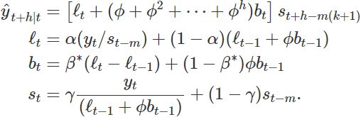
Example: Holt-Winters method with daily data
The Holt-Winters method can also be used for daily type of data, where the seasonal period is m=7, and the appropriate unit of time for h is in days. Here we forecast pedestrian traffic at a busy Melbourne train station in July 2016.
sth_cross_ped <- pedestrian %>%
  filter(Date >= "2016-07-01",
         Sensor == "Southern Cross Station") %>%
  index_by(Date) %>%
  summarise(Count = sum(Count)/1000)
sth_cross_ped %>%
  filter(Date <= "2016-07-31") %>%
  model(
    hw = ETS(Count ~ error("M") + trend("Ad") + season("M"))
  ) %>%
  forecast(h = "2 weeks") %>%
  autoplot(sth_cross_ped %>% filter(Date <= "2016-08-14")) +
  labs(title = "Daily traffic: Southern Cross",
       y="Pedestrians ('000)")
Figure 8.9: Forecasts of daily pedestrian traffic at the Southern Cross railway station, Melbourne.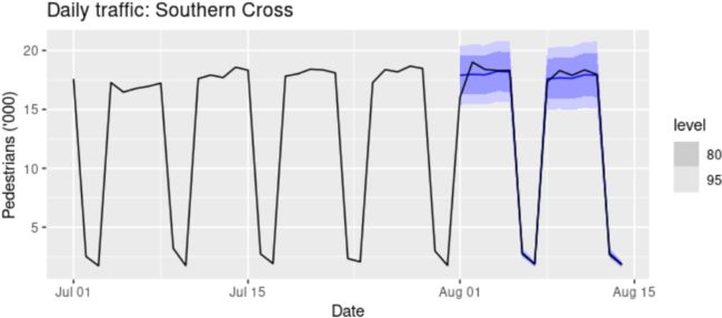
Clearly the model has identified the weekly seasonal pattern and the increasing trend at the end of the data, and the forecasts are a close match to the test data.
Example: Holt-Winters method with daily data
The Holt-Winters method can also be used for daily type of data, where the seasonal period is m=7, and the appropriate unit of time for h is in days. Here, we generate daily forecasts for the last five weeks for the hyndsight data, which contains the daily pageviews on the Hyndsight blog for one year starting April 30, 2014.
fc <- hw(subset(hyndsight,end=length(hyndsight)-35),
         damped = TRUE, seasonal="multiplicative", h=35)
autoplot(hyndsight) +
  autolayer(fc, series="HW multi damped", PI=FALSE)+
  guides(colour=guide_legend(title="Daily forecasts"))
Figure 7.8: Forecasts of daily pageviews on the Hyndsight blog. Clearly the model has identified the weekly seasonal pattern and the increasing trend at the end of the data, and the forecasts are a close match to the test data.
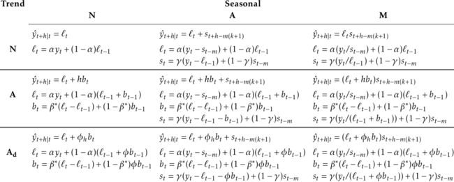
8.4 A taxonomy of exponential smoothing methods
Exponential smoothing methods are not restricted to those we have presented so far. By considering variations in the combinations of the trend and seasonal components, 9 exponential smoothing methods are possible, listed in Table 8.5. Each method is labelled by a pair of letters (T,S) defining the type of ‘Trend’ and ‘Seasonal’ components. For example, (A,M) is the method with an Additive trend and Multiplicative seasonality; (![]() ,N) is the method with Damped trend and No seasonality; and so on.
,N) is the method with Damped trend and No seasonality; and so on.
Table 8.5: A two-way classification of exponential smoothing methods
Some of these methods we have already seen using other names: 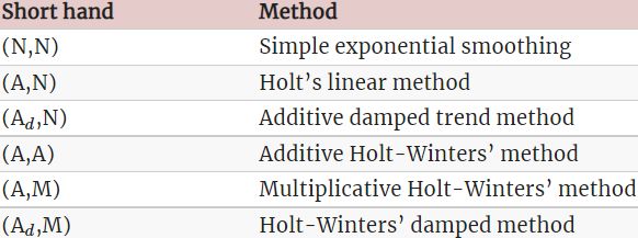
This type of classification was first proposed by Pegels (1969), who also included a method with a multiplicative trend. It was later extended by Gardner (1985) to include methods with an additive damped trend and by J. W. Taylor (2003) to include methods with a multiplicative damped trend. We do not consider the multiplicative trend methods in this book as they tend to produce poor forecasts. See Hyndman et al. (2008) for a more thorough discussion of all exponential smoothing methods.
Table 8.6 gives the recursive formulas for applying the 9 exponential smoothing methods in Table 8.5. Each cell includes the forecast equation for generating h-step-ahead forecasts, and the smoothing equations for applying the method.
Table 8.6: Formulas for recursive calculations and point forecasts. In each case, ![]() denotes the series level at time t,
denotes the series level at time t, ![]() denotes the slope at time t,
denotes the slope at time t, ![]() denotes the seasonal component of the series at time t, and m denotes the number of seasons in a year; α,
denotes the seasonal component of the series at time t, and m denotes the number of seasons in a year; α, ![]() , and
, and  are smoothing parameters,
 ![]() , and k is the integer part of
, and k is the integer part of ![]() .
.
8.5 Innovations state space models for exponential smoothing
In the rest of this chapter, we study the statistical models that underlie the exponential smoothing methods we have considered so far. The exponential smoothing methods presented in Table 8.6 are algorithms which generate point forecasts. The statistical models in this section generate the same point forecasts, but can also generate prediction (or forecast) intervals. A statistical model is a stochastic (or random) data generating process that can produce an entire forecast distribution. We will also describe how to use the model selection criteria introduced in Chapter 7 to choose the model in an objective manner.
Each model consists of
- a measurement equation that describes the observed data, and
- some state equations that describe how the unobserved components or states (level, trend, seasonal) change over time.
- Hence, these are referred to as state space models.
For each method there exist two models: one with additive errors and one with multiplicative errors. The point forecasts produced by the models are identical if they use the same smoothing parameter values.如果模型使用相同的平滑参数值,则它们产生的点预测是相同的。 They will, however, generate different prediction intervals它们将生成不同的预测区间.
To distinguish between a model with additive errors and one with multiplicative errors (and also to distinguish the models from the methods), we add a third letter to the classification of Table 8.5. We label each state space model as ETS(⋅,⋅,⋅⋅,⋅,⋅) for (Error, Trend, Seasonal). This label can also be thought of as ExponenTial Smoothing. Using the same notation as in Table 8.5, the possibilities for each component (or state) are:
- Error ={A,M},
- Trend ={
 } and
} and - Seasonal ={N,A,M}.
ETS(A,N,N)~(Error, Trend, Seasonal): simple exponential smoothing with additive errors
Recall the component form of simple exponential smoothing: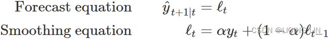
If we re-arrange the smoothing equation for the level, we get the “error correction” form,  where
where ![]() is the residual at time t.
is the residual at time t.
The training data errors lead to the adjustment of the estimated level throughout the smoothing process for t=1,…,T. For example, if the error at time t is negative ![]() , then
, then ![]() and so the level
and so the level![]() at time t−1 has been over-estimated. The new level
at time t−1 has been over-estimated. The new level ![]() is then the previous level
is then the previous level ![]() adjusted downwards新水平是之前水平向下调整的水平. The closer α is to one, the “rougher” the estimate of the level (large adjustments take place). The smaller the α, the “smoother” the level (small adjustments take place).
adjusted downwards新水平是之前水平向下调整的水平. The closer α is to one, the “rougher” the estimate of the level (large adjustments take place). The smaller the α, the “smoother” the level (small adjustments take place).
We can also write ![]() , so that each observation can be represented by the previous level plus an error. To make this into an innovations state space model, all we need to do is specify the probability distribution for
, so that each observation can be represented by the previous level plus an error. To make this into an innovations state space model, all we need to do is specify the probability distribution for  . For a model with additive errors, we assume that residuals (the one-step training errors) are normally distributed white noise with mean 0 and variance
  . A short-hand notation for this is
 ![]() ; NID stands for “Normally and Independently Distributed”.
; NID stands for “Normally and Independently Distributed”.
Then the equations of the model can be written as  (8.3) and (8.4)
We refer to (8.3) as the measurement (or observation) equation and (8.4) as the state (or transition) equation. These two equations, together with the statistical distribution of the errors, form a fully specified statistical model(The statistical models in this section generate the same point forecasts, but can also generate prediction (or forecast) intervals). Specifically, these constitute an innovations state space model underlying simple exponential smoothing.
The term “innovations” comes from the fact that all equations use the same random error process,  . For the same reason, this formulation is also referred to as a “single source of error” model. There are alternative multiple source of error formulations which we do not present here.
The measurement (or observation) equation shows the relationship between the observations and the unobserved states . In this case, observation is a linear function of
- the level
 , the predictable part of ,
 - and the error , the unpredictable part of .
- For other innovations state space models, this relationship may be nonlinear.
The state (or transition) equation shows the evolution of the state through time. The influence of the smoothing parameter α is the same as for the methods discussed earlier. For example, α governs the amount of change in successive levels:
- high values of α allow rapid changes in the level;
- low values of α lead to smooth changes.
- If α=0, the level of the series does not change over time;
- if α=1, the model reduces to a random walk model,
 . (See Section 9.1 for a discussion of this model.)
ETS(M,N,N)~~(Error, Trend, Seasonal): simple exponential smoothing with multiplicative errors
In a similar fashion, we can specify models with multiplicative errors by writing the one-step-ahead training errors as relative errors 
where ![]() . Substituting
. Substituting ![]() gives
gives ![]() and
and ![]() .
.
Then we can write the multiplicative form of the state space model as  <==
<==![]()
ETS(A,A,N)~(Error, Trend, Seasonal): Holt’s linear trend method with additive errors
#####################
Holt’s linear trend method
![]() ==>h=1 and t=t-1 ==>
==>h=1 and t=t-1 ==>
#####################
For this model, we assume that the one-step-ahead training errors are given by ![]() . Substituting this into the error correction equations for Holt’s linear trend method we obtain
. Substituting this into the error correction equations for Holt’s linear trend method we obtain
 <==
<==
where for simplicity we have set ![]() . <== Trend <==
. <== Trend <== ![]()
ETS(M,A,N)~(Error, Trend, Seasonal): Holt’s linear trend method with multiplicative errors
Specifying one-step-ahead training errors as relative errors such that 
and following an approach similar to that used above, the innovations state space model underlying Holt’s linear trend method with multiplicative errors is specified as 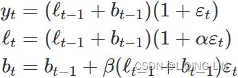
where again ![]() and
and ![]() .
.
Other ETS~(Error, Trend, Seasonal) models
In a similar fashion, we can write an innovations state space model for each of the exponential smoothing methods of Table 8.6. Table 8.7 presents the equations for all of the models in the ETS framework.
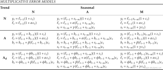 Table 8.7: State space equations for each of the models in the ETS framework.
8.6 Estimation and model selection
Estimating ETS~(Error, Trend, Seasonal) models
An alternative to estimating the parameters by minimizing the sum of squared errors is to maximise the “likelihood”. https://blog.csdn.net/Linli522362242/article/details/96480059The likelihood is the probability of the data arising from the specified model. Thus, a large likelihood is associated with a good model. For an additive error model, maximizing the likelihood (assuming normally distributed errors) gives the same results as minimizing the sum of squared errors. However, different results will be obtained for multiplicative error models. In this section, we will estimate the smoothing parameters α, β, γ and ϕ, and the initial states ![]() ,
, ![]() ,
, ![]() ,
,![]() ,…,
,…,![]() , by maximizing the likelihood.
, by maximizing the likelihood.
The possible values that the smoothing parameters can take are restricted. Traditionally, the parameters have been constrained to lie between 0 and 1 so that the equations can be interpreted as weighted averages. That is, 0<α, ![]() ,
,![]() , ϕ<1. For the state space models, we have set
, ϕ<1. For the state space models, we have set ![]() and
and ![]() . Therefore, the traditional restrictions translate to 0<α<1, 0<β<α and 0<<1−α. In practice, the damping parameter
. Therefore, the traditional restrictions translate to 0<α<1, 0<β<α and 0<<1−α. In practice, the damping parameter ![]() is usually constrained further to prevent numerical difficulties in estimating the model. In the
is usually constrained further to prevent numerical difficulties in estimating the model. In the fable package, it is restricted so that 0.8<ϕ<0.98.
Another way to view the parameters is through a consideration of the mathematical properties of the state space models. The parameters are constrained in order to prevent observations in the distant past having a continuing effect on current forecasts. This leads to some admissibility可接受性 constraints on the parameters, which are usually (but not always) less restrictive than the traditional constraints region (Hyndman et al., 2008, pp. 149–161). For example,
- for the ETS(A,N,N) model, the traditional parameter region is 0<α<1 but the admissible region is 0<α<2.
- For the ETS(A,A,N) model, the traditional parameter region is 0<α<1 and 0<β<α but the admissible region is 0<α<2 and 0<β<4−2α.
Model selection AICs vs BIC
A great advantage of the ETS statistical framework is that information criteria can be used for model selection. The AIC(Akaike Information Criterion), ![]() and BIC(Bayesian Information Criterion), introduced in Section 7.5, can be used here to determine which of the ETS models is most appropriate for a given time series.
and BIC(Bayesian Information Criterion), introduced in Section 7.5, can be used here to determine which of the ETS models is most appropriate for a given time series.
For ETS models, Akaike’s Information Criterion (AIC) is defined as
![]()
- n is the number of instances, the number of data points in X, the number of observations, or equivalently, the sample size;
- k is the total number of parameters learned or estimated by the model and initial states that have been estimated (including the residual variance).. For example, in multiple linear regression, the estimated parameters are the intercept, the slope parameters, and the constant variance of the errors; thus ,
- Here, 2k is considered the penalty term.
 is the maximized value of the likelihood function of the model M. i.e.
 , where
  are the parameter values that maximize the likelihood function,
  = the observed data;
- The Akaike Information Criterion (AIC) is a metric that aims to find a balance between a model's maximum likelihood and a model's simplicity. Overly complex models can sometimes overfit, meaning they can look like they learned but once they are presented with unseen data, they perform poorly. The AIC score penalizes as the number of parameters increases since they increase complexity.
- The Bayesian Information Criteria (BIC) is very similar to AIC but has a higher penalty term on the model's complexity. In general, the BIC penalty term is more significant, so it can encourage models with fewer parameters than AIC does. Therefore, if you change the sorting or evaluation criteria from AIC to BIC, you may see different results. Simpler models are preferred more with BIC:
- Both the BIC and the AIC penalize models that have more parameters to learn (e.g., more clusters) and reward models that fit the data well. They often end up selecting the same model. When they differ, the model selected by the BIC tends to be simpler(fewer parameters, 考虑了样本数量,样本数量过多时,可有效防止模型精度过高造成的模型复杂度过高) than the one selected by the AIC, but tends to not fit the data quite as well (this is especially true for larger datasets).
The AIC corrected for small sample bias (![]() ) is defined as
) is defined as![]()
Three of the combinations of (Error, Trend, Seasonal) can lead to numerical difficulties. Specifically, the models that can cause such instabilities are ETS(A,N,M), ETS(A,A,M), and ETS(A,Add,M), due to division by values potentially close to zero in the state equations. We normally do not consider these particular combinations when selecting a model.
Models with multiplicative errors are useful when the data are strictly positive, but are not numerically stable when the data contain zeros or negative values. Therefore, multiplicative error models will not be considered if the time series is not strictly positive. In that case, only the six fully additive models will be applied.
ETS(M,N,A): Domestic holiday tourist visitor nights in Australia
We now employ the ETS statistical framework to forecast Australian holiday tourism over the period 2016–2019. We let the ETS() function select the model by minimising the ![]() .
.
aus_holidays <- tourism %>%
  filter(Purpose == "Holiday") %>%
  summarise(Trips = sum(Trips)/1e3)
fit <- aus_holidays %>%
  model(ETS(Trips))
report(fit)
#> Series: Trips
#> Model: ETS(M,N,A)
#>   Smoothing parameters:
#>     alpha = 0.3484
#>     gamma = 1e-04
#>
#>   Initial states:
#>   l[0]    s[0]   s[-1]   s[-2] s[-3]
#>  9.727 -0.5376 -0.6884 -0.2934 1.519
#>
#>   sigma^2:  0.0022
#>
#>   AIC  AICc   BIC
#> 226.2 227.8 242.9
The model selected is ETS(M,N,A) ~(Error, Trend, Seasonal)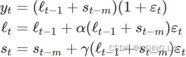
The parameter estimates are ![]() , and
, and ![]() . The output also returns the estimates for the initial states
. The output also returns the estimates for the initial states ![]() ,
,  ,
, ![]() ,
, ![]() and
and ![]() . Compare these with the values obtained for the Holt-Winters method with additive seasonality presented in Table 8.3.
. Compare these with the values obtained for the Holt-Winters method with additive seasonality presented in Table 8.3.
Figure 8.10 shows the states over time, while Figure 8.12 shows point forecasts and prediction intervals generated from the model. The small values of indicate that the seasonal states change very little over time(check the vertical scale).
components(fit) %>%
  autoplot() +
  labs(title = "ETS(M,N,A) components")
Figure 8.10: Graphical representation of the estimated states over time.
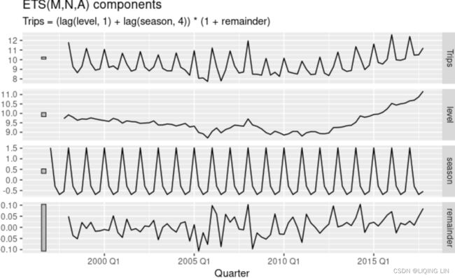
Because this model has multiplicative errors, the innovation residuals are not equivalent to the regular residuals (i.e., the one-step training errors)(check the vertical scale). The innovation residuals are given by ![]() , while the regular residuals are defined as
, while the regular residuals are defined as ![]() . We can obtain both using the
. We can obtain both using the augment() function. They are plotted in Figure 8.11. 
Figure 8.11: Residuals and one-step forecast errors from the ETS(M,N,A) model.
ETS(M,A,M): International tourist visitor nights in Australia
We now employ the ETS statistical framework to forecast tourist visitor nights in Australia by international arrivals over the period 2016–2019. We let the ets() function select the model by minimising the AICc.
aust <- window(austourists, start=2005)
fit <- ets(aust)
summary(fit)
#> ETS(M,A,M)
#>
#> Call:
#>  ets(y = aust)
#>
#>   Smoothing parameters:
#>     alpha = 0.1908
#>     beta  = 0.0392
#>     gamma = 2e-04
#>
#>   Initial states:
#>     l = 32.3679
#>     b = 0.9281
#>     s = 1.022 0.9628 0.7683 1.247
#>
#>   sigma:  0.0383
#>
#>   AIC  AICc   BIC
#> 224.9 230.2 240.9
#>
#> Training set error measures:
#>                   ME  RMSE  MAE     MPE  MAPE   MASE
#> Training set 0.04837 1.671 1.25 -0.1846 2.693 0.4095
#>                ACF1
#> Training set 0.2006
The model selected is ETS(M,A,M)~(Error, Trend, Seasonal):
The parameter estimates are  =0.1908,
 ![]() =0.0392, and
=0.0392, and  =0.0002. The output also returns the estimates for the initial states
 ![]() , ,
, , ![]() ,
, ![]() and
and ![]() . Compare these with the values obtained for the equivalent Holt-Winters linear trend method(A ,N)~(trend, No Seasonal component) with multiplicative seasonality presented in Table 7.4. The ETS(M,A,M) model will give different point forecasts to the multiplicative Holt-Winters’ method
. Compare these with the values obtained for the equivalent Holt-Winters linear trend method(A ,N)~(trend, No Seasonal component) with multiplicative seasonality presented in Table 7.4. The ETS(M,A,M) model will give different point forecasts to the multiplicative Holt-Winters’ method , because the parameters have been estimated differently. With the
 ets() function, the default estimation method is maximum likelihood rather than minimum sum of squares.
Figure 7.9 shows the states over time, while Figure 7.11 shows point forecasts and prediction intervals generated from the model. The small values of β and γ mean that the slope and seasonal components change very little over time(check the vertical scale). The narrow prediction intervals indicate that the series is relatively easy to forecast due to the strong trend and seasonality.
Figure 7.9: Graphical representation of the estimated states over time.
Because this model has multiplicative errors, the residuals are not equivalent to the one-step training errors. The residuals are given by ![]() , while the one-step training errors are defined as
, while the one-step training errors are defined as ![]() . We can obtain both using the
. We can obtain both using the residuals() function.  Figure 7.10: Residuals and one-step forecast errors from the ETS(M,A,M) model.
8.7 Point Forecasting with ETS(M,A,N) models
Point forecasts can be obtained from the models by iterating the equations for t=T+1,…,T+h and setting all ![]() for t>T.
for t>T.
For example, for model ETS(M,A,N)~(Error, Trend, Seasonal),################## where again![]() and
and ![]() .
.
##################
![]() . Therefore
. Therefore ![]() . Similarly,
. Similarly,
Therefore, ![]() , and so on. These forecasts are identical to the forecasts from Holt’s linear method
, and so on. These forecasts are identical to the forecasts from Holt’s linear method
Holt’s linear trend method(A,N) : (additive trend, No Seasonal component)
, and also to those from model ETS(A,A,N)(Point forecasts can be obtained from the models by iterating the equations for t=T+1,…,T+h and setting all ![]() for t>T ).
for t>T ).
Thus, the point forecasts obtained from the method and from the two models that underlie the method are identical (assuming that the same parameter values are used). ETS point forecasts constructed in this way are equal to the means of the forecast distributions, except for the models with multiplicative seasonality (Hyndman et al., 2008).
To obtain forecasts from an ETS model, we use the forecast() function from the fable package. This function will always return the means of the forecast distribution, even when they differ from these traditional point forecasts. 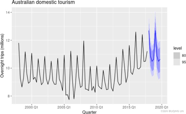 Figure 8.12: Forecasting Australian domestic overnight trips using an ETS(M,N,A) model.
ETS point forecasts are equal to the medians of the forecast distributions.
- For models with only additive components, the forecast distributions are normal, so the medians and means are equal.
- For ETS models with multiplicative errors, or with multiplicative seasonality, the point forecasts will not be equal to the means of the forecast distributions.
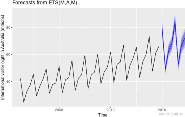 Figure 7.11: Forecasting international visitor nights in Australia using an ETS(M,A,M) model.
Prediction intervals
A big advantage of the statistical models is that prediction intervals can also be generated — something that cannot be done using the point forecasting methods alone. The prediction intervals will differ between models with additive and multiplicative methods.
For most ETS models, a prediction interval can be written as ![]()
where c depends on the coverage probability, and ![]() is the forecast variance. Values for c were given in Table 5.1. For ETS models, formulas for
is the forecast variance. Values for c were given in Table 5.1. For ETS models, formulas for ![]() can be complicated; the details are given in Chapter 6 of Hyndman et al. (2008). In Table 8.8 we give the formulas for the additive ETS models, which are the simplest.
can be complicated; the details are given in Chapter 6 of Hyndman et al. (2008). In Table 8.8 we give the formulas for the additive ETS models, which are the simplest.
Table 8.8: Forecast variance expressions for each additive state space model, where is the residual variance, m is the seasonal period, and k is the integer part of ![]() (i.e., the number of complete years in the forecast period prior to time T+h).
(i.e., the number of complete years in the forecast period prior to time T+h). 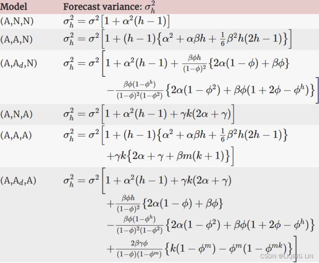
For a few ETS models, there are no known formulas for prediction intervals. In these cases, the forecast() function uses simulated future sample paths and computes prediction intervals from the percentiles of these simulated future paths.
Forecasting univariate time series data with exponential smoothing
In this recipe, you will explore the exponential smoothing technique using the statsmodels library. The ExponentialSmoothing classes in statsmodels resemble popular implementations from the R forecast package, such as ets() and HoltWinters() . In statsmodels, there are three different implementations (classes) of exponential smoothing, depending on the nature of the data you are working with:
- • SimpleExpSmoothing : Simple exponential smoothing is used when the time series process lacks seasonality and trend. This is also referred to as single exponential smoothing.
- • Holt : Holt's exponential smoothing is an enhancement of the simple exponential smoothing and is used when the time series process contains only trend (but no seasonality). It is refferred to as double exponential smoothing.
- • ExponentialSmoothing : Holt-Winters' exponential smoothing is an enhancement of Holt's exponential smoothing and is used when the time series process has both seasonality and trend. It is referred to as triple exponential smoothing.
In this recipe, you will perform exponential smoothing on both datasets. Since both the Holt class and the SimpleExpSmoothing class are restricted versions of the ExponentialSmoothing class, you will be using the latter. Instead of using all three, you can use the ExponentialSmoothing class to run the three diferent types since ExponentialSmoothing is a more generic implementation. You still need to determine whether your time series has trend, seasonality, or both. Let's get started:
Start with the life expectancy dataset and use the ExponentialSmoothing class. ExponentialSmoothing takes several parameters (referred to as hyperparameters):
- smoothing_level : A foat value for the smoothing factor for the level known as alpha (
 ), where 0 ≤ ≤ 1 .
 - smoothing_trend : A foat value for the smoothing factor for the trend known as beta (
 ), where 0 ≤ ≤ 1 .
 - smoothing_seasonal : A foat value for the smoothing factor for the seasonal trend known as gamma (
 ), where 0 ≤ ≤ 1 .
 - trend : A single choice from ( multiplicative or mul ), ( additive or add ), or None .
- seasonal : A single choice from ( multiplicative or mul ), ( additive or add ), or None .
- seasonal_periods : Takes an integer value representing the seasonality period, for example, 12 if the data is monthly or 4 if the information is quarterly.
- damped_trend : A Boolean value that is either True or False .
- use_boxcox : A Boolean value that is either True or False to determine if a Box-Cox transform should be applied.
Box-Cox allows us to make the data both normal and homoskedastic同方差 and is part of a family of power transforms that includes log transform and square root transform. Box-Cox is a powerful transform because it supports both root and log transforms, and others are made possible by changing the lambda values. https://blog.csdn.net/Linli522362242/article/details/127737895
The Box-Cox transformation relies on just one parameter, lambda ( λ ), and covers both logarithm and power transformations.- If λ is 0, then you get a natural log transformation;
- otherwise, it's a power transformation.
- If the lambda parameter is set to None , the function will find the optimal lambda ( λ ) value for you.
- One thing to point out is that the boxcox function requires the data to be positive Sometimes a Box-Cox transformation provides a shift parameter
 to achieve this; boxcox does not. Such a shift parameter is equivalent to adding a positive constant to x before calling boxcox.
However, Box and Cox did propose a second formula that can be used for negative y-values:
The confidence limits returned when alpha is provided give the interval where:
 自由度为1的
 卡方分布的1-的分位数, is confidence level
 with llf the log-likelihood function and χ2 the chi-squared function.
Start by creating a list that contains different combinations of values for these hyperparameters. This way, you get to evaluate a different combination at each run. In other words, at each iteration, you will be training a different model and capturing its scores. Once every combination has been evaluated, you will use the get_best_model function (from the Technical requirements section) to determine the best performing model and its associated hyperparameters values (optimal values through this exhaustive grid search). This can be a time-consuming process, but luckily, there is an alternative hybrid technique to shorten the search.
You can use the ExponentialSmoothing class to find the optimal values for alpha, beta, and gamma ( , , ). This eliminates the need to provide their values in the grid (you still can if you want to own the process). This will simplify the search process and you will only provide values for the remaining hyperparameters for the grid search. For example, the trend and seasonal types supply multiplicative and additive. You can visually determine if the components are multiplicative or additive by plotting their decomposition using the seasonal_decompose() function. But if you are still unsure, this exhaustive grid search method would be an alternate approach.
For the life DataFrame, you only have trend, so you only need to explore different values for the two parameters; that is, trend and damped :
create a combinator utility function that takes a list of parameter values and returns a Cartesian product of these choices. You will use this when performing a grid search for hyperparameter tuning. In grid search, you specify a combination of parameter values to train multiple models on each set and then evaluate the winning model using the get_best_model function. For example, suppose your list contains three possible values for three diferent parameters. In such a case, the combinator function will return a list containing 3x3 or nine possible combinations. This will become clearer as you dive into this chapter's recipes:
from statsmodels.tsa.api import ExponentialSmoothing
from itertools import product

trend = ['add', 'mul']
damped = [True, False]

def combinator(items, r=1):
    combo = [ i               # [trend, damped] ==> ['add', 'mul'] [True, False]
              for i in product( *items, repeat=r )
            ]          # Cartesian product of input iterables.
    return combo# return a list of tuples

life_ex_comb = combinator([trend, damped])
life_ex_comb![]()
OR
trend = ['add', 'mul']
damped = [True, False]

repeat=1
pools = [ tuple(pool)
          for pool in [trend, damped]
        ] *repeat
# print(pools)  # [('add', 'mul'), (True, False), ...repeat-1...]

result = [[]]
for pool in pools:
    result = [ x+[y]
               for x in result
                 for y in pool
             ]# '+' : insert op

# print(result) # [['add', True], ['add', False], ['mul', True], ['mul', False]]

combinations = []
for prod in result:
    combinations.append( tuple(prod) )# convert the element(here is list) to a tuple
combinations
Here, we have two parameters that take two different values, each providing us with a 2x2 or four total combinations to evaluate for.
Loop through the combination list and train (fit) a different model at each iteration. Capture the evaluation metrics in a dictionary to compare the results later. Example scores you will capture include RMSE, RMSPE, MAPE, AIC, and BIC,
- Root Mean Squared Percentage Error (RMSPE)均方根百分比误差,
- Root Mean Square Error (RMSE),
- Mean Square Error (MSE),
- Akaike's Information Criteria (AIC),
- Corrected Akaike's Information Criteria (AICc), and
- Bayesian Information Criteria (BIC),
to name a few. Keep in mind that most automated tools and software will use the AIC and BIC scores behind the scenes to determine the best model:
use_brute= True: Search for good starting values using a brute force (grid) optimizer.使用蛮力(网格)优化器搜索好的起始值。Exponential smoothing — statsmodels
from statsmodels.tools.eval_measures import rmspe, rmse
from sklearn.metrics import mean_absolute_percentage_error as mape

train = life_train.values.ravel() # flat
y = life_test.values.ravel()

score = {}

for i, (trend, dampen_trend) in enumerate( life_ex_comb ):
    exp = ExponentialSmoothing( train,
                                trend = trend,
                                damped_trend = dampen_trend,
                                seasonal = None
                              )
    model = exp.fit( use_brute=True,  # True: Search for good starting values using a brute force (grid) optimizer.
                                      # False: a naive set of starting values is used.
                     optimized = True # Estimate model parameters by maximizing the log-likelihood.
                   )                  # or minimizing the sum of squared errors
    # https://www.statsmodels.org/dev/examples/notebooks/generated/statespace_forecasting.html
    y_hat = model.forecast( len(y) ) # how many forecasting steps are desired
    score[i] = {'trend': trend,
                'damped': dampen_trend,
                'AIC': model.aic,
                'BIC': model.bic,
                'AICc': model.aicc,
                'RMSPE': rmspe(y, y_hat),
                'RMSE' : rmse(y, y_hat),
                'MAPE' : mape(y, y_hat),
                'model': model
               }
There will be recipes in which you will run multiple variations of a model as you search for the optimal configuration, a practice commonly called hyperparameter tuning. For example, you may train an ARIMA model with different parameter values and thus produce multiple variations of the ARIMA model (multiple models). The get_best_model function will compare the different models –for example, ARIMA models – to select the best model and the set of parameters associated with that model. The get_best_model function will take a dictionary that contains the produced model, parameters used, and the scores for each model. The function will return the winning model based on a scoring (metric) criterion of your choice. This is the metric parameter of the function, which defaults to AIC.
def get_best_model( score, metric='AIC' ):
    initial_score = score[0][metric]
    best_model = 0
    for idx_model, metric_score in score.items():
        if metric_score[metric] < initial_score:
            initial_score = metric_score[metric]
            best_model = idx_model
    print( f'Best model: {best_model} with lowest {metric} score: {initial_score}' )
    return score[best_model]['model']
To retrieve the best model using the get_best_model function, just pass the scores dictionary. For now, keep the default criteria set to metric='AIC' to be consistent:
life_best_model = get_best_model( score, 'AIC' )![]()
The get_best_model function returns the winning model object, a HoltWintersResultsWrapper class that you stored in the life_best_model variable. You have access to additional methods and attributes such as summary, predict, and forecast, to name a few. To access the model's summary, you can use the following code. To print the summary, you can use the summary method:
life_best_model.summary()This should produce a tabular layout summarizing the model – for example, the parameter values that were used and the calculated coefficients:
 Figure 10.5 – Exponential Smoothing summary for the life expectancy data
Notice that the optimal and values have been deduced.
You can forecast future values using the forecast method and then evaluate the results against the test set (unseen data by the model). The plot_forecast() function will produce the forecast and plot the results against the test data. Pass the model object stored in life_best_model and both the train and test sets for plotting:
Create the plot_forecast function, which takes a model object that you have trained, a starting position, and both the train and test datasets to create a plot that compares the forecast (predicted values) against actuals. This will become clearer as you dive into this chapter's recipes:
def plot_forecast( model, start_year, train, test ):
    forecast = pd.DataFrame( model.forecast( test.shape[0] ), # how many forecasting steps are desired
                             index = test.index
                           )

    ax = train.loc[start_year:].plot( style='--', figsize=(10,6) )
    test.plot( ax= ax )
    forecast.plot( ax=ax, style='-.')

    ax.legend(['original_train', 'orig_test', 'forecast'], fontsize=12)
    return ax
The start_year argument in the plot_forecast function slices the data from that point forward to make it easier to compare the results. Think of it as zooming in. For example, instead of showing data from 1960 to 2018 (59 months), you are just requesting the slice starting from 2000 and later.
plot_forecast( life_best_model, '2000', life_train, life_test )
plt.show()
This should produce a plot with the x-axis starting from the year 2000. There should be three lines: the actual data is split into two lines, one for the training data and another for test data, and a third line for the forecast (predicted values):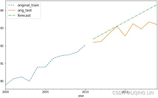 Figure 10.6 – Plotting the exponential smoothing forecast versus the actual data for the life expectancy dataset
Replicate the same process but using the milk DataFrame. Keep in mind that the most significant difference here is the addition of the seasonal parameters. This means you will be adding two additional hyperparameters to evaluate for – that is, seasonal and seasonal_periods .
################
The time series plot for the milk DataFrame shows a positive (upward) trend and a repeating seasonality (every summer). The milk production data is recorded monthly from January 1962 to December 1975 (168 months). The seasonal magnitudes and variations over time seem to be steady, indicating an additive nature. Having a seasonal decomposition that specifes the level, trend, and season of an additive model will reflect this as well. For more insight on seasonal decomposition, please review the Decomposing time series data recipe in https://blog.csdn.net/Linli522362242/article/details/127737895, Exploratory Data Analysis and Diagnosis.
Figure 10.3 – PACF and ACF for Monthly Milk Production after differencing twice
milk_diff_12_1 = milk.diff(12).diff(1).dropna()For the seasonal orders, P and Q , you should diagnose spikes or behaviors at lags 1s , 2s , 3s , and so on, where s is the number of periods in a season. For example, in the milk production data, s=12 (since there are 12 monthly periods in a season). Then, we observe for significance at 12 (s), 24 (2s), 36 (3s), and so on.
- Starting with the ACF plot,
- there is a signifcant spike at lag 1, which represents the non-seasonal order for the MA process as q=1 .
- The spike at lag 12 represents the seasonal order for the MA process as Q=1=12/S.
- Notice that there is a cut-off right after lag 1, then a spike at lag 12, followed by a cut-off (no other signifcant lags afterward) + exponential decay in the PACF plot==> MA
- These indicate a moving average model: an MA(1) for the non-seasonal component and an MA(1) for the seasonal component.
- The PACF plot : an exponential decay at lags 12, 24, and 36 indicates an MA model. So, the SARIMA model would be ARIMA (0, 1, 1) (0, 1, 1, 12) .
- SARIMA(p, d, q) (P, D, Q, S)
################
Build a Cartesian product for the different options. For seasonal_periods , you can explore three periods – 4, 6, and 12 months. This should give you a total of 24 models (2 x 2 x 2 x 3 = 24) that you will need to evaluate:
trend, damped = ['add', 'mul'], [True, False]
seasonal, periods = ['add', 'mul'], [4,6,12]

milk_exp_comb = combinator([trend, damped, seasonal, periods])
milk_exp_comb
Loop through the list of combinations to train multiple models and capture their scores:Exponential smoothing — statsmodels
y_train = milk_train.values.ravel() # flat
y_test = milk_test.values.ravel()

milk_model_scores = {}

for i, (trend, dampen_t, season, seasonal_p ) in enumerate( milk_exp_comb ):
    exp = ExponentialSmoothing( y_train,
                                trend=trend,
                                damped_trend = dampen_t,
                                seasonal = season,
                                seasonal_periods = seasonal_p
                              )
    model = exp.fit( use_brute=True,  # True: Search for good starting values using a brute force (grid) optimizer.
                                      # False: a naive set of starting values is used.
                     optimized=True   # Estimate model parameters by maximizing the log-likelihood.
                   )                  # or minimizing the sum of squared errors
    # https://www.statsmodels.org/dev/examples/notebooks/generated/statespace_forecasting.html
    y_hat = model.forecast( len(y_test) )  # how many forecasting steps are desired
    milk_model_scores[i] = {'trend': trend,
                            'damped': dampen_t,
                            'AIC': model.aic,
                            'BIC': model.bic,
                            'AICc': model.aicc,
                            'RMSPE': rmspe(y_test, y_hat),
                            'RMSE' : rmse(y_test, y_hat),
                            'MAPE' : mape(y_test, y_hat),
                            'model': model
                           }
Upon completion, run the get_best_model function to obtain the winning model:
milk_model = get_best_model( milk_model_scores ) ![]()
 Figure 10.7 – Exponential Smoothing summary for the Monthly Milk Production data
Notice the optimal combination of values for Trend , Seasonal , and Seasonal Periods 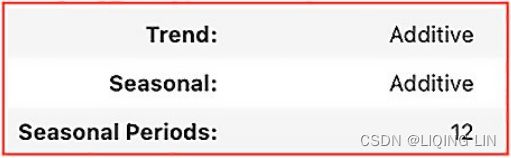 . The optimal Seasonal Periods was at 12 months or lags. The summary results table will show the coefficients for all those lags, and it will be a long list. Notice how the ExponentialSmoothing class was able to determine the optimal coefcients for alpha ( α ), beta ( β ), and gamma ( γ ).
Recall that the model is selected based on the AIC score. Therefore, you should explore the different metrics that have been captured, for example, using get_best_model(milk_scores, metric=' BIC', same summary ).
Compare your forecast using the best model against the test data:
plot_forecast( milk_model, '1969', milk_train, milk_test)
plt.show()
This should produce a plot with the x-axis starting from the year 1969. There should be three lines: the actual data is split into two lines, one for the training data and another for test data, and a third line for the forecast (predicted values):
 Figure 10.8 – Plotting the exponential smoothing forecast versus actual the Monthly Milk Production data
Overall, the model did a decent job of capturing the effect of trend and seasonality and they looked close to the actual values from the test set.
There are different techniques for smoothing time series data, such as simple moving average, simple exponential smoothing, Holt's exponential smoothing, and Holt-Winter's exponential smoothing, to name a few.
The moving average model treats past values equally, while exponential smoothing type models put more emphasis (weight) on more recent observations. In other words, older observations decay in weight exponentially, hence the "exponential" term. This is based on the logical assumption that more recent events are likely to be more important than much older events; for example, what happened yesterday or the day before is more relevant than what happened 2 months ago for a daily time series.
The formula for simple exponential smoothing (single) for time series processes without trend or seasonality is as follows:(8.1 Simple exponential smoothing~ Component form)
The formula for Holt's exponential smoothing (double) incorporates the addition of the
trend (b) and its smoothing parameter, beta (![]() ). Hence, once a trend is included, the model will output the values for both coefficients – that is, alpha and beta ( α,
). Hence, once a trend is included, the model will output the values for both coefficients – that is, alpha and beta ( α,![]() ), Setting h=1 gives the fitted values(8.2 Methods with trend ~ Holt’s linear trend method):
), Setting h=1 gives the fitted values(8.2 Methods with trend ~ Holt’s linear trend method):
Setting h=1 gives the fitted values:
The Holt-Winters exponential smoothing (triple) formula incorporates both trend () and seasonality (). The following equation shows multiplicative seasonality as an example(8.3 Methods with seasonality Holt-Winters’ multiplicative method):
The component form for the multiplicative method is: Setting h=1 gives the fitted values:
where k is the integer part of ![]()
When using ExponentialSmoothing to find the best , ![]() , parameter values, it does so by minimizing the error rate (the sum of squared error or SSE). So, every time in the loop you were passing new parameters values (for example, damped as either True or False ), the model was solving for the optimal set of values for the ,
, parameter values, it does so by minimizing the error rate (the sum of squared error or SSE). So, every time in the loop you were passing new parameters values (for example, damped as either True or False ), the model was solving for the optimal set of values for the , ![]() , coefficients by minimizing for SSE. This can be written as follows:
, coefficients by minimizing for SSE. This can be written as follows: ![]()
In some textbooks, you will see diferent letters used for level, trend, and seasonality, but the overall structure of the formulas holds.
Generally, exponential smoothing is a fast and effective technique for smoothing a time series for improved analysis, dealing with outliers, data imputation数据插补, and forecasting (prediction).
darts
An exciting library known as darts has a wrapper on top of statsmodels's ExponentialSmoothing.
pip install dartsTo install using conda , run the following command:
conda install -c conda-forge -c pytorch u8darts-all
import darts

darts.__version__![]() darts · PyPI
darts · PyPI
Load the ExponentialSmoothing and TimeSeries classes:
from darts.models import ExponentialSmoothing
from darts import TimeSeries
darts expects the data to be an instance of the TimeSeries class, so you need to convert your pandas DataFrame before using it to train the model. The TimeSeries class provides the from_dataframe method, which you will be using:
model = ExponentialSmoothing( seasonal_periods=12 )
ts = TimeSeries.from_dataframe( milk.reset_index(),
                                time_col='month',
                                value_cols='production', freq='MS'
                              )
ts 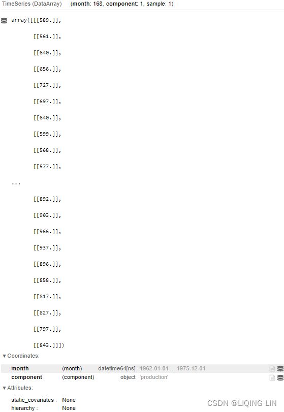
When creating the TimeSeries object, you must specify which column name is the date and which column contains the observations (values). You can train the model using the .fit() method. Once trained, you can forecast using the .predict() method. To plot the results, you can use the .plot() method:
train, test = split_data(ts, 0.15) ![]()
Exponential Smoothing — darts documentation
model.fit(train)
forecast = model.predict( len(test), # the number of time steps after the end of the series for which to produce predictions.
num_samples=100 # Number of times a prediction is sampled from a probabilistic model
)
plt.figure(figsize=(12,8))
train.plot()
# Plot the median, 5th and 95th percentiles:
forecast.plot( label='forecast', low_quantile=0.15, high_quantile=0.95 )
plt.show()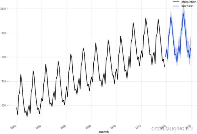 Figure 10.9 – Forecasting plot generated from Darts for the Monthly Milk Production data
forecast 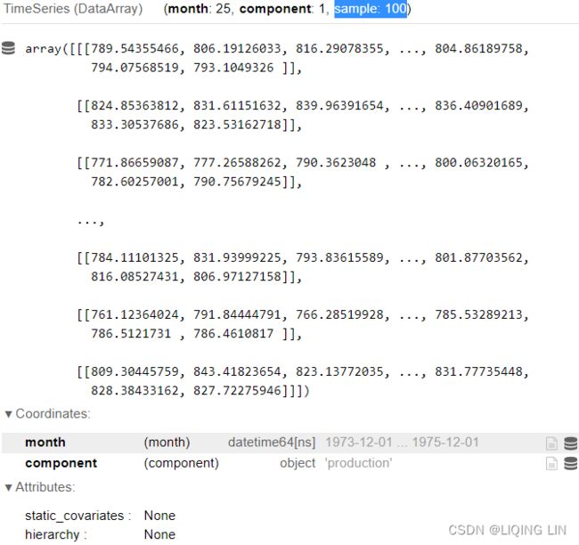
The darts library automated the evaluation process to find the optimal configuration (hyperparameters). Darts' ExponentialSmoothing class is a wrapper to statsmodels's ExponentialSmoothing class, which means you have access to familiar methods and attributes, such as the .summary() method:
model.model.summary() 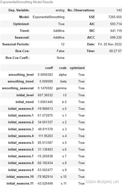 This should produce the familiar statsmodels tabular summary of the model and the optimized parameter values. As a challenge, compare the summary using Dart with the results shown in Figure 10.7. Though you will notice you achieved similar results, it was with less effort using Darts但使用 Darts 却更省力.
To learn more about the ExponentialSmoothing class, you can visit statsmodels's official documentation at statsmodels.tsa.holtwinters.ExponentialSmoothing — statsmodels.
Did you notice that you did not have to test for stationarity with exponential smoothing? Exponential smoothing is appropriate for non-stationary time series (for example, a time series with trend or seasonality).
from bokeh.plotting import figure, show
from bokeh.models import RangeTool
from bokeh.models import Band, ColumnDataSource

model.fit(train)
forecast = model.predict( len(test), # the number of time steps after the end of the series for which to produce predictions.
                          num_samples=100 # Number of times a prediction is sampled from a probabilistic model
                        )
# create a new plot with a datetime axis type
p = figure(width=600, height=400, x_axis_type="datetime")
# p.line(train.time_index, train.all_values().reshape([-1]), color='navy', alpha=0.5)
xs=[train.time_index,
    test.time_index]
ys=[train.all_values().reshape([-1]),
    test.all_values().reshape([-1]),]
p.multi_line(xs,ys, line_color=['black','blue'], line_width=[2,2])

band_df = pd.DataFrame()
band_df.index=forecast.time_index
band_df['lower'] = forecast.quantile(0.15).all_values().reshape([-1])
band_df['upper'] = forecast.quantile(0.95).all_values().reshape([-1])

source = ColumnDataSource(band_df.reset_index())

band = Band( base='month',
             lower='lower',
             upper='upper',
             source=source,
             level='underlay',
             fill_alpha=0.3, #line_width=1,
             fill_color='blue',
             line_color=None
           )
p.add_layout(band)

# train.plot()
# # Plot the median, 5th and 95th percentiles:
# forecast.plot( label='forecast', low_quantile=0.15, high_quantile=0.95 )
# plt.show()
show(p)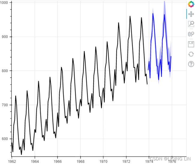
figure — Bokeh 2.4.3 Documentation
Configuring plot tools — Bokeh 2.4.3 Documentation
from bokeh.plotting import figure, show
from bokeh.models import RangeTool
from bokeh.models import Band, ColumnDataSource, HoverTool

source = ColumnDataSource( data={ 'xs':[train.time_index,
                                        test.time_index,
                                       ],
                                  'ys':[train.all_values().reshape([-1]),
                                        test.all_values().reshape([-1]),
                                       ],
                                  'labels':['train', 'test'],
                                  'line_color':['black','blue'],
                                  'line_width':[2,2],
                                }
                         )

# create a new plot with a datetime axis type
p = figure(width=700, height=500, x_axis_type="datetime")
# p.line(train.time_index, train.all_values().reshape([-1]), color='navy', alpha=0.5)


p.multi_line( xs='xs', ys='ys', source=source,
              legend_field='labels',
              line_color='line_color', line_width='line_width',
            )
p.legend.location = "top_left"
# $x : x-coordinate under the cursor in data space
# $y: y-coordinate under the cursor in data space
p.add_tools( HoverTool( tooltips=[('Production Month','$x{%Y-%m}'),
                                  ('Production', '$y'),
                                 ],
                        formatters={'$x':'datetime',
                                    '$y':'numeral',
                                   },
                        mode='vline',

                      )
           )

model.fit(train)
forecast = model.predict( len(test), # the number of time steps after the end of the series for which to produce predictions.
                          num_samples=100 # Number of times a prediction is sampled from a probabilistic model
                        )

band_df = pd.DataFrame()
band_df.index=forecast.time_index
band_df['lower'] = forecast.quantile(0.15).all_values().reshape([-1])
band_df['upper'] = forecast.quantile(0.95).all_values().reshape([-1])

source2 = ColumnDataSource(band_df.reset_index())

band = Band( base='month',
             lower='lower',
             upper='upper',
             source=source2,
             level='underlay',
             fill_alpha=0.3, #line_width=1,
             fill_color='blue',
             line_color=None
           )
p.add_layout(band)

# train.plot()
# # Plot the median, 5th and 95th percentiles:
# forecast.plot( label='forecast', low_quantile=0.15, high_quantile=0.95 )
# plt.show()
show(p) 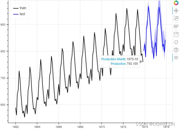
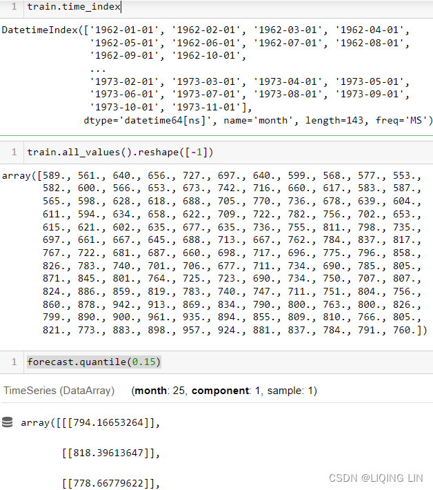
In the next section, while building an ARIMA model, you will be testing for stationarity to determine the differencing factor and leverage the ACF and PACF plots that were discussed earlier in this chapter.
Forecasting univariate time series data with non-seasonal ARIMA
In this recipe, you will explore non-seasonal ARIMA and use the implementation in the statsmodels package. ARIMA stands for AutoRegressive Integrated Moving Average, which combines three main components: the AutoRegressive or AR(p) model, the Moving Average or MA(q) model, and an Integrated (differencing) factor or I(d).
An ARIMA model can be defined by the p, d, and q parameters, so for a non-seasonal time series, it is described as ARIMA(p, d, q). The p and q parameters are called orders; for example, in AR of order p and MA of order q. They can also be called lags since they represent the number of periods we need to lag for. You may also come across another reference for p and q, namely polynomial degree.
ARIMA models can handle non-stationary time series data through differencing, a time series transformation technique, to make a non-stationary time series stationary. The integration or order of differencing, d, is one of the parameters that you will need to pick a value for when building the model. For a refresher on stationarity, please refer to the Detecting time series stationarity recipe in https://blog.csdn.net/Linli522362242/article/details/127737895, Exploratory Data Analysis and Diagnosis.
Even though ARIMA models do not assume stationarity, they do assume no seasonality in the data. On the other hand, an ARIMA model can handle trends in the data through the integrated factor, d . For example, first-order differencing can make a time series stationary by removing the trend effect (detrending) but not the seasonality effect. When seasonality is present, you can use the Seasonal ARIMA (SARIMA) model.
There are different models for handling different types of time series data. Therefore, it is essential to ensure the model you've selected is ideal for the kind of data and problem you are trying to solve. In this recipe, you will use the life DataFrame since it has trend and no seasonality.
You will combine visual inspection (using the ACF and PACF plots) and statistical tests to make an informed decision for the AR and MA orders. Tese topics were covered in Chapter 9, Exploratory Data Analysis and Diagnosis, in the Testing data for autocorrelation, Decomposing time series data, and Detecting time series stationarity recipes. Let's get started:
1. seasonal_decompose
1. Start by performing decomposition to break the data into the three main components – trend, seasonality, and the residual (noise):
from statsmodels.tsa.arima.model import ARIMA
from statsmodels.stats.diagnostic import acorr_ljungbox
from statsmodels.tsa.seasonal import seasonal_decompose

plt.rcParams['figure.figsize'] = (10,10)

decomposed = seasonal_decompose( life )
decomposed.plot()
plt.show()
Figure 10.10 – Decomposition of life expectancy data
Notice that the dataset shows a positive trend but no seasonality effect, as expected.
2. detrend and check_stationarity
2. You will need to detrend the data first. Perform a first-order differencing and then test for stationarity by using the check_stationarity function you created earlier in this chapter:
from statsmodels.tsa.api import adfuller

def check_stationary( df ):
    results = adfuller(df)[1:3] #
    s = 'Non-Stationary'
    if results[0] < 0.05: # p-value < 0.05
        s = 'Stationary'

    print( f"{s}\t p-value:{results[0]} \t lags:{results[1]}" )
    return (s, results[0])

life_df1 = life.diff().dropna()
check_stationary( life_df1 )![]()
Now, the data is stationary. The p-value is significant, and you can reject the null hypothesis ( and conclude that the data does not contain a unit root and is stationary). Note that the default periods value for diff is 1 . Generally, diff(periods=n) is the difference between the current observation at period t and its lagged version at period t-n . In the case of diff(1) or diff() , the lagged version is t-1 (for example, the prior month's observation).
You can plot the differenced time series data using the plot method:
life_df1.plot(figsize=(12,6))
plt.show()
Figure 10.11 – First-order differencing for life expectancy data (detrending)
adfuller(life_df1)-8.51009975733831, The test statistic.(t-statistic < any critical value, we can consider the detrending time series is stationary)
1.1737760312328632e-13, MacKinnon’s approximate p-value based on MacKinnon
1, The number of lags used.
57,, The number of observations used for the ADF regression and calculation of the critical values.
{'1%': -3.5506699942762414, Critical values for the test statistic at the 1 %
'5%': -2.913766394626147, Critical values for the test statistic at the 5 %
'10%': -2.5946240473991997}, Critical values for the test statistic at the 10 %
5.512107228858611) The maximized information criterion if autolag is not None.(default autolag='AIC', )
check_stationary( life )![]()
###################
You will explore two statistical tests, the Augmented Dickey-Fuller (ADF) test and the Kwiatkowski-Phillips-Schmidt-Shin (KPSS) test, using the statsmodels library. Both ADF and KPSS test for unit roots in a univariate time series process. Note that unit roots are just one cause for a time series to be non-stationary, but generally, the presence of unit roots indicates non-stationarity.
Both ADF and KPSS are based on linear regression and are a type of statistical hypothesis test. For example,
- the null hypothesis for ADF states that there is a unit root in the time series, and thus, it is non-stationary.
- On the other hand, KPSS has the opposite null hypothesis, which assumes the time series is stationary.
###################
Next, you will need to determine the p and q parameters for the ARIMA (p, d, q) model.
3. plot_acf(MA(q)) and plot_pacf(AR(p))
3. The ACF and PACF plots will help you estimate the appropriate p and q values for the AR and MA models, respectively. Use plot_acf and plot_pacf on the stationary life_df1 data:
plt.style.use("default")

fig, ax = plt.subplots(2,1, figsize=(10,8))

plot_acf( life_df1, ax=ax[0] )
plot_pacf( life_df1, ax=ax[1] )
plt.show()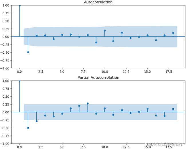
In the preceding example, the zero lag(which is the correlation of the time series with itself ) was kept in the plot to help you visually compare past lags. The ACF and PACF at lag(0) are always one, so sometimes, it is removed from the plot since it does not provide any signifcance. Therefore, you must focus on lag(1) to determine its significance, as well as other prior lags that are of signifcance.
- The ACF plot provides the significant lags for the MA(q) model. The ACF plot shows a cut-of after lag 1, indicating an MA(1) model.
- The PACF plot provides the significant lags for the AR(p) model. There is a gradual decay with oscillation after lag 1, indicating a MA model at lag 1 or MA(1). This indicates a lack of an AR model, so the p order is zero or AR(0). Please refer to Table 10.1 for more details.
- An MA(1) process is also called a first-order process, indicating that the current value (at time t) is based on the value immediately preceding it (at time t-1).

 is white noise
Of course, we do not observe the values of, so it is not really a regression in the usual sense
Notice that each value of can be thought of as a weighted moving average of the past few forecast errors. However, moving average models should not be confused with the moving average smoothing we discussed in Chapter 6. A moving average model is used for forecasting future values, while moving average smoothing is used for estimating the trend-cycle of past values.
mpf6_Time Series Data_quandl_更正kernel PCA_AIC_BIC_trend_log_return_seasonal_decompose_sARIMAx_ADFull_LIQING LIN的博客-CSDN博客
Now, you can build the ARIMA(p, d, q) model using these values to get an ARIMA(0, 1, 1) . Sometimes, it is not clear what the optimal lag values are (the order values for p and q ), so you may need to run different ARIMA models with different values for the p , d , and q parameters, similar to what you did for the grid search method (Cartesian product of the p , d , and q) in the Forecasting univariate time series data with Exponential Smoothing recipe.
4. grid search to find the ARIMA model on the training set
4. Train the ARIMA model on the training set, life_train, and inspect the model's summary. Don't use the differenced life_df1 version here since ARIMA will apply differencing based on the value of the d parameter. In this example, first-order differencing was satisfactory to detrend and make the data stationary, and you set d=1 :
model = ARIMA( life_train, order=(0,1,1) )
results = model.fit()
results.summary()
Notice that the AIC and BIC scores are provided, but they do not mean much in isolation; they are more meaningful when you're comparing multiple models.
Since the ARIMA model is mainly an MA process with an integration (differencing) factor, d , the summary results only provide the coefficient values for the MA(1) model. More on that in the How it works… section.
In this recipe, you will perform a Ljung-Box test to check for
- autocorrelations up to a specifed lag and
- whether they are significantly far of from 0.
- The null hypothesis for the Ljung-Box test states that the previous lags are not correlated with the current period. In other words, you are testing for the absence of autocorrelation.
When running the test using acorr_ljungbox from statsmodels, you need to provide a lag value. The test will run for all lags up to the specified lag (maximum lag).
The autocorrelation test is another helpful test for model diagnostics. As discussed in the https://blog.csdn.net/Linli522362242/article/details/127737895, Applying power transformations, there are assumptions that you need to test against the model's residuals. For example, when testing for autocorrelation on the residuals, the expectation is that
- there should be no autocorrelation between the residuals.
- This ensures that the model has captured all the necessary information.
- The presence of autocorrelation in the residuals can indicate that the model missed an opportunity to capture critical information and will need to be evaluated.
- The assumption is that if the model captured all the information, the residuals from the model's prediction are random (noise) and do not follow a pattern.
from statsmodels.stats.diagnostic import acorr_ljungbox

(acorr_ljungbox( life_df1,
                 lags=26,
                 return_df=True
               )<0.05
)['lb_pvalue'].sum() ![]() # there is autocorrelation as we would expect
# there is autocorrelation as we would expect
acorr_ljungbox( life_df1,
                 lags=26,
                 return_df=True
) 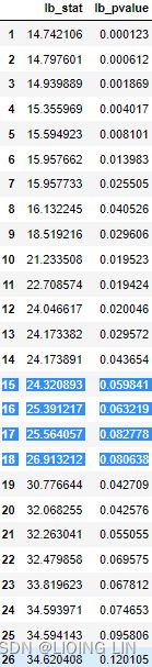
 (more accurate) Ljung-Box test
large values of Q∗ suggest that the autocorrelations do not come from a white noise series(there is autocorrelation.).
How large is too large? If the autocorrelations did come from a white noise series, then both Q and Q∗ would have a χ2 distribution with (h−K) degrees of freedom, where K is the number of parameters in the model. If they are calculated from raw data原数据 (rather than the residuals from a model), then set K=0.
- h is the maximum lag being considered
- We suggest using h=10 for non-seasonal data and
- h=2m for seasonal data, where m is the period of seasonality.
- T is the number of observations
-
 is the autocorrelation for lag k.
 - If each is close to zero, then Q will be small.
- If some values are large (positive or negative), then Q will be large.
-
auto_lag(default False): Flag indicating whether to automatically determine the optimal lag length based on threshold of maximum correlation value.
(acorr_ljungbox( life_df1,
                 lags=26,
                 auto_lag=True, # determine the optimal lag length based on
                 return_df=True # threshold of maximum correlation value
               )<0.05
)['lb_pvalue'].sum()![]() same with the previous ACF and Partial ACF: MA(1)
same with the previous ACF and Partial ACF: MA(1)
5. acorr_ljungbox to validate the model's residuals
5. You will need to validate the model's residuals to determine if the ARIMA model you built captured the signals in the time series. The assumption is that if the model captured all the information, the residuals from the model's prediction are random (noise) and do not follow a pattern. For example, you expect no autocorrelation in the residuals. Start by using the acorr_ljungbox test on the residuals. You should expect no autocorrelation:
(acorr_ljungbox( results.resid,
                 lags=26,
                 return_df=True
               )<0.05
)['lb_pvalue'].sum()![]() The result shows 0 , which is an aggregate(sum()) of the results for the first 26 lags, indicating no autocorrelation.
The result shows 0 , which is an aggregate(sum()) of the results for the first 26 lags, indicating no autocorrelation.
plot_acf( results.resid, zero=False )
plt.show()
This should produce an ACF plot. Here you would expect the plot to show no significant lags. In other words, all the vertical lines should be closer to zero or at zero for all lags:
 Figure 10.14 – ACF plot showing no autocorrelation for the residuals
This plot confirms no signs of autocorrelation (visually).
6. plot_diagnostics to inspect the distribution of the residuals
6. You can also inspect the distribution of the residuals. For example, you would expect normally distributed residuals with a mean of zero. You can use the QQPlot and Kernel Density Estimation (KDE) plot to observe the distribution and assess normality. You can accomplish this with the plot_diagnostics method:
Produces a 2x2 plot grid with the following plots (ordered clockwise from top left):
-
Standardized residuals over time
-
Histogram plus estimated density of standardized residuals, along with a Normal(0,1) density plotted for reference.
-
Normal Q-Q plot, with Normal reference line.
-
Correlogram
results.plot_diagnostics(figsize=(10,10))
plt.show()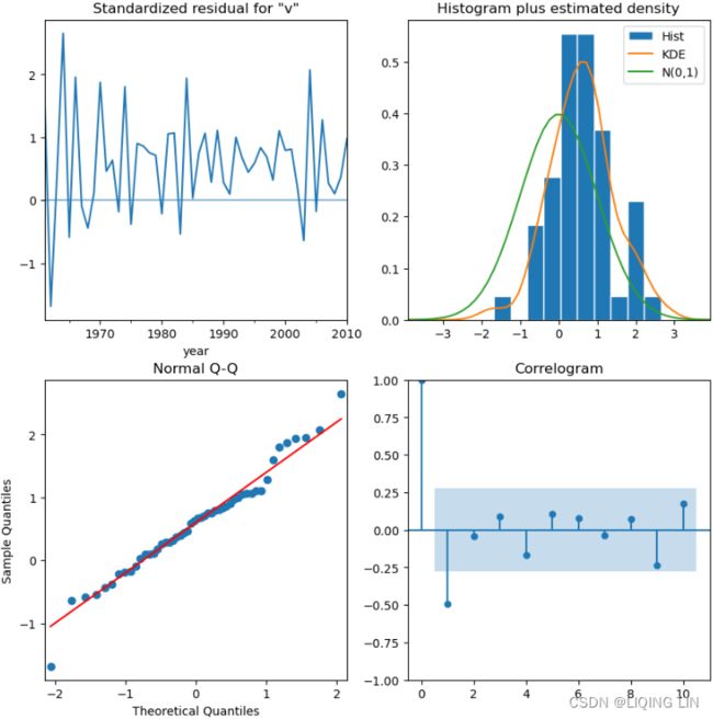 Figure 10.15 – Visual diagnostics for the ARIMA(0,1,1) model
The plots show a slight deviation from a normal distribution. For example, a perfect normally distributed dataset will have a perfect bell-curved KDE plot and all the points will be perfectly aligned on the line in the QQPlot.
So far, the results and diagnostics indicate a decent model一个不错的模型, though there might be room for improvements. Building an ARIMA model can be an iterative process that involves creating and testing different models.
7. forecast (prediction) VS test dataset
7. The final step is to create a forecast (prediction) and compare it with your test dataset (unseen or out of sample data). Use the plot_forecast() function you created earlier in this chapter in the Technical requirements section:
plot_forecast( results, '1998', life_train, life_test )
plt.show()
This should produce a plot with the x-axis starting from the year 1998. There should be three lines: the actual data is split into two lines, one for the training data and another for the test data, and a third line for the forecast (predicted values):
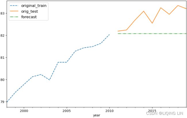 Figure 10.16 – ARIMA(0,1,1) forecast versus the actual Monthly Milk Production data
The dashed line (forecast) doesn't seem to follow the expected trend. Compare this with the results from the exponential smoothing model in Figure 10.6, which did a much better job. To resolve this, you can run multiple ARIMA models with different (p, d, q) values and compare the RMSE, MAPE, AIC, or BIC scores to pick the best-fitted model. You will explore this option in the There's more... section.
Sometimes, it isn't easy to identify if the time series is an MA or AR process or determine the optimal order (lag) values for p or q . You can look at the following example of a naive grid search approach by trying different combinations for p , d , and q to train other ARIMA models before picking a winning model.
Here, you will leverage the combinator() function that you created in the Technical requirements section. You will train multiple ARIMA models and then use get_best_model() to find the best model. As a starter, try a combination of (0,1,2) for each of the three hyperparameters (p, d, and q). You will be testing 3x3x3 or 27 ARIMA models:
from itertools import product

def combinator(items, r=1):
    combo = [ i               # [trend, damped] ==> ['add', 'mul'] [True, False]
              for i in product( *items, repeat=r )
            ]          # Cartesian product of input iterables.
    return combo# return a list of tuples

pv, dv, qv = [ list( range(3) ) ]*3 # [[0, 1, 2], [0, 1, 2], [0, 1, 2]]
vals = combinator([ pv, dv, qv ])
score = {}

vals
import warnings
warnings.filterwarnings('ignore')

for i, (p,d,q) in enumerate( vals ):
    m = ARIMA( life_train, order=(p,d,q) )
    model = m.fit()

    y = life_test.values.ravel()
    y_hat = model.forecast( steps=len(y) )

    score[i] = {'order': (p,d,q),
                'AIC': model.aic,
                'BIC': model.bic,
                'AICc': model.aicc,

                'RMSPE': rmspe(y, y_hat),
                'RMSE' : rmse(y, y_hat),
                'MAPE' : mape(y, y_hat),
                'model': model
               }
best_model = get_best_model( score, 'AIC' ) ![]()
If you run best_model.summary() to view the model's summary, you will notice that it is an ARIMA(0,2, 2). This confirms our earlier assumption that this is a moving average process, but we missed the orders.
To view the results of all 27=3x3x3 models in a DataFrame (tabular format), you can use the following command:
pd.DataFrame( score ).T.sort_values(by='AIC').reset_index()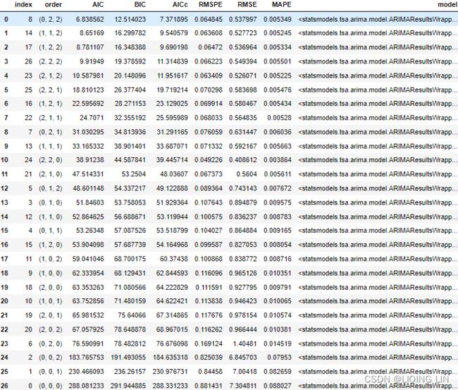
Figure 10.17 – Results from the 27 ARIMA models sorted by AIC score
The Akaike Information Criterion (AIC) is a metric that aims to find a balance between a model's maximum likelihood and a model's simplicity. Overly complex models can sometimes overfit, meaning they can look like they learned but once they are presented with unseen data, they perform poorly. The AIC score penalizes as the number of parameters increases since they increase complexity:
(acorr_ljungbox( best_model.resid,
                 lags=26,
                 return_df=True
               )<0.05
)['lb_pvalue'].sum() ![]() # there is autocorrelation as we would expect
# there is autocorrelation as we would expect
plot_acf( best_model.resid, zero=False )
plt.show()
ACF plot showing autocorrelation for the residuals
best_model.plot_diagnostics( figsize=(10,10) )
plt.show()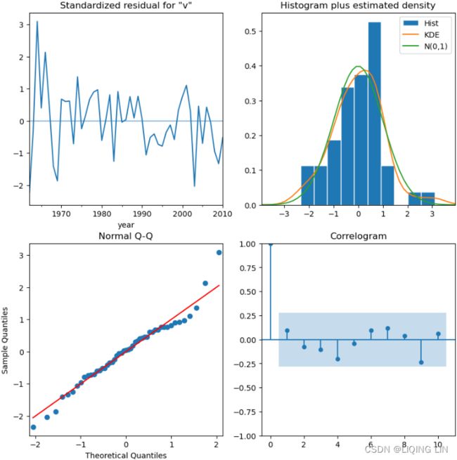
Visual diagnostics for the ARIMA(0,2,2) model
The plots show a slight deviation from a normal distribution. For example, a perfect normally distributed dataset will have a perfect bell-curved KDE plot and all the points will be perfectly aligned on the line in the QQPlot.
So far, the results and diagnostics indicate a decent model一个不错的模型, though there might be room for improvements. Building an ARIMA model can be an iterative process that involves creating and testing different models.
To plot a forecast using the best model, you can run the following command:
plot_forecast( best_model, '1998', life_train, life_test )
plt.show()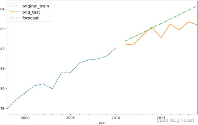
As a challenge, compare the output from the preceding code with Figure 10.16 from the ARIMA(0, 1, 1) model(bad) and Figure 10.6 from the Exponential Smoothing model(same).
How about the milk data, which has trend and seasonality? The next recipe will explore working with a SARIMA model to handle such data.
Forecast versus Predict Methods
In the plot_forecast function, we used the forecast method. In statsmodels, the SARIMA family of models, such as ARMA and ARIMA, have two methods for making predictions: predict and forecast .
The predict method allows you to include both in-sample and out-of-sample predictions, hence why the method takes the start and end parameters. On the other hand, the forecast method only takes steps , which is the number of out-of-sample forecasts, starting from the end of the sample or the training set.