ggstatsplot | 一个满足你日常统计需求的高颜值R包(四)
ggstatsplot | 一个满足你日常统计需求的高颜值R包(四)
1. 写在前面
点图用处非常广泛,可以展示变量的分布情况,变量之间的相关性,回归结果等
本期介绍的是ggstatsplot包中绘制dotplot,scatterplot相关函数
2. 用到的包
rm(list=ls())
library(tidyverse)
library(ggstatsplot)
library(ggsci)
3. 示例数据
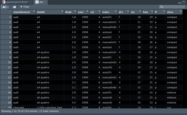
dat <- mpg

4. dotplot展示样本分布
4.1 初步绘制
用到的函数是
ggscatterstats
由于因子太多,我们在这里用filter函数过滤一下
df <- dplyr::filter(ggplot2::mpg, cyl %in% c("4", "6"))
## 生成足够多的颜色
paletter_vector <-
paletteer::paletteer_d(
palette = "palettetown::venusaur",
n = nlevels(as.factor(df$manufacturer)),
type = "discrete"
)
## 开始画图
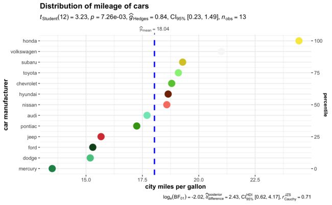
ggdotplotstats(
data = df,
x = cty,
y = manufacturer,
xlab = "city miles per gallon",
ylab = "car manufacturer",
test.value = 15.5,
point.args = list(
shape = 16,
color = paletter_vector,
size = 5
),
title = "Distribution of mileage of cars",
#ggtheme = ggplot2::theme_dark()
)
4.2 复杂分组绘制
用到的函数是
grouped_ggdotplotstats
我们看一下不同cyl和cty的manufacturer分布情况
当然你也可以使用purrr包批量绘制,前面几期都讲过了,
这里就不赘述了
grouped_ggdotplotstats(
  ## arguments relevant for ggdotplotstats
  data = df,
  grouping.var = cyl, ## grouping variable
  x = cty,
  y = manufacturer,
  xlab = "city miles per gallon",
  ylab = "car manufacturer",
  type = "bayes", ## Bayesian test
  test.value = 15.5,
  ## arguments relevant for `combine_plots`
  annotation.args = list(title = "Fuel economy data"),
  plotgrid.args = list(nrow = 2)
)
5. scatterplot展示变量相关性
5.1 初步绘制
用到的函数是
ggscatterstats
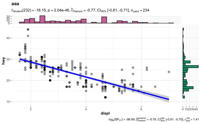
ggscatterstats(
  data = dat,
  x = displ,
  y = hwy,
  xlab = "displ", ## label for the x-axis
  ylab = "hwy", ## label for the y-axis
  label.var = manufacturer, ## variable to use for labeling data points
  label.expression = displ > 5 & hwy> 24, ## which points to label
  point.label.args = list(alpha = 0.7, size = 4, color = "grey50"),
  xfill = "#CC79A7", ## fill for marginals on the x-axis
  yfill = "#009E73", ## fill for marginals on the y-axis
  title = "aaa",
  caption = "Source"
)
5.2 复杂分组绘制
用到的函数是
grouped_ggscatterstats
我们看一下不同cly的displ的hwy的相关性
当然purrr包也是支持批量绘制的
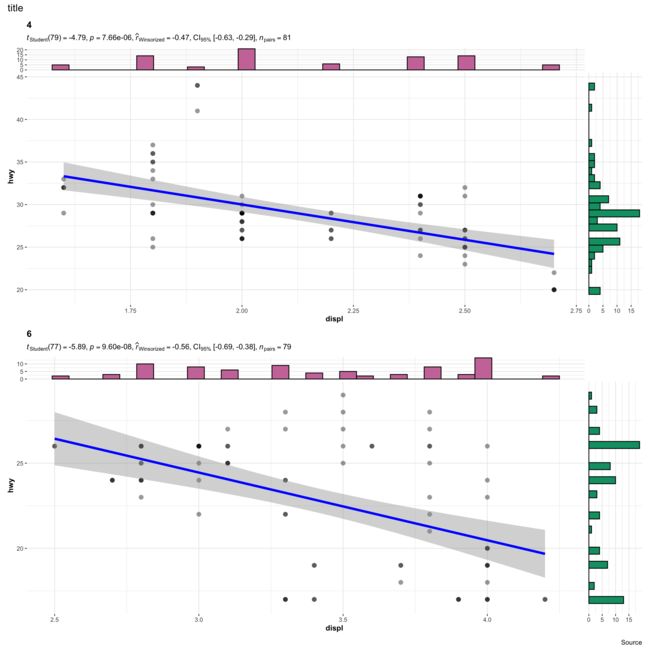
grouped_ggscatterstats(
  ## arguments relevant for ggscatterstats
  data = df,
  x = displ,
  y = hwy,
  grouping.var = cyl,
  xlab = "displ", ## label for the x-axis
  ylab = "hwy", ## label for the y-axis
  label.var = manufacturer, ## variable to use for labeling data points
  type = "r",
  label.expression = displ > 5 & hwy> 24, ## which points to label
  point.label.args = list(alpha = 0.7, size = 4, color = "grey50"),
  xfill = "#CC79A7", ## fill for marginals on the x-axis
  yfill = "#009E73", ## fill for marginals on the y-axis
  # ggtheme = ggthemes::theme_tufte(),
  ## arguments relevant for combine_plots
  annotation.args = list(
    title = "title",
    caption = "Source"
    ),
  plotgrid.args = list(nrow = 2, ncol = 1)
)


点个在看吧各位~ ✐.ɴɪᴄᴇ ᴅᴀʏ 〰
[外链图片转存失败,源站可能有防盗链机制,建议将图片保存下来直接上传(img-EKFB1P9f-1660733459651)(https://picbed-1312756706.cos.ap-nanjing.myqcloud.com/img/202208170104716.png)]
1. 写在前面
点图用处非常广泛,可以展示变量的分布情况,变量之间的相关性,回归结果等
本期介绍的是ggstatsplot包中绘制dotplot,scatterplot相关函数
2. 用到的包
rm(list=ls())
library(tidyverse)
library(ggstatsplot)
library(ggsci)
3. 示例数据
dat <- mpg
4. dotplot展示样本分布
4.1 初步绘制
用到的函数是
ggscatterstats
由于因子太多,我们在这里用filter函数过滤一下
df <- dplyr::filter(ggplot2::mpg, cyl %in% c("4", "6"))

## 生成足够多的颜色
paletter_vector <-
  paletteer::paletteer_d(
    palette = "palettetown::venusaur",
    n = nlevels(as.factor(df$manufacturer)),
    type = "discrete"
  )

## 开始画图
ggdotplotstats(
  data = df,
  x = cty,
  y = manufacturer,
  xlab = "city miles per gallon",
  ylab = "car manufacturer",
  test.value = 15.5,
  point.args = list(
    shape = 16,
    color = paletter_vector,
    size = 5
  ),
  title = "Distribution of mileage of cars",
  #ggtheme = ggplot2::theme_dark()
)

4.2 复杂分组绘制
用到的函数是
grouped_ggdotplotstats
我们看一下不同cyl和cty的manufacturer分布情况
当然你也可以使用purrr包批量绘制,前面几期都讲过了,
这里就不赘述了
grouped_ggdotplotstats(
  ## arguments relevant for ggdotplotstats
  data = df,
  grouping.var = cyl, ## grouping variable
  x = cty,
  y = manufacturer,
  xlab = "city miles per gallon",
  ylab = "car manufacturer",
  type = "bayes", ## Bayesian test
  test.value = 15.5,
  ## arguments relevant for `combine_plots`
  annotation.args = list(title = "Fuel economy data"),
  plotgrid.args = list(nrow = 2)
)

5. scatterplot展示变量相关性
5.1 初步绘制
用到的函数是
ggscatterstats
ggscatterstats(
  data = dat,
  x = displ,
  y = hwy,
  xlab = "displ", ## label for the x-axis
  ylab = "hwy", ## label for the y-axis
  label.var = manufacturer, ## variable to use for labeling data points
  label.expression = displ > 5 & hwy> 24, ## which points to label
  point.label.args = list(alpha = 0.7, size = 4, color = "grey50"),
  xfill = "#CC79A7", ## fill for marginals on the x-axis
  yfill = "#009E73", ## fill for marginals on the y-axis
  title = "aaa",
  caption = "Source"
)

5.2 复杂分组绘制
用到的函数是
grouped_ggscatterstats
我们看一下不同cly的displ的hwy的相关性
当然purrr包也是支持批量绘制的
grouped_ggscatterstats(
  ## arguments relevant for ggscatterstats
  data = df,
  x = displ,
  y = hwy,
  grouping.var = cyl,
  xlab = "displ", ## label for the x-axis
  ylab = "hwy", ## label for the y-axis
  label.var = manufacturer, ## variable to use for labeling data points
  type = "r",
  label.expression = displ > 5 & hwy> 24, ## which points to label
  point.label.args = list(alpha = 0.7, size = 4, color = "grey50"),
  xfill = "#CC79A7", ## fill for marginals on the x-axis
  yfill = "#009E73", ## fill for marginals on the y-axis
  # ggtheme = ggthemes::theme_tufte(),
  ## arguments relevant for combine_plots
  annotation.args = list(
    title = "title",
    caption = "Source"
    ),
  plotgrid.args = list(nrow = 2, ncol = 1)
)


点个在看吧各位~ ✐.ɴɪᴄᴇ ᴅᴀʏ 〰
ggstatsplot | 一个满足你日常统计需求的高颜值R包(四)
1. 写在前面
点图用处非常广泛,可以展示变量的分布情况,变量之间的相关性,回归结果等
本期介绍的是ggstatsplot包中绘制dotplot,scatterplot相关函数
2. 用到的包
rm(list=ls())
library(tidyverse)
library(ggstatsplot)
library(ggsci)
3. 示例数据
dat <- mpg

4. dotplot展示样本分布
4.1 初步绘制
用到的函数是
ggscatterstats
由于因子太多,我们在这里用filter函数过滤一下
df <- dplyr::filter(ggplot2::mpg, cyl %in% c("4", "6"))

## 生成足够多的颜色
paletter_vector <-
  paletteer::paletteer_d(
    palette = "palettetown::venusaur",
    n = nlevels(as.factor(df$manufacturer)),
    type = "discrete"
  )

## 开始画图
ggdotplotstats(
  data = df,
  x = cty,
  y = manufacturer,
  xlab = "city miles per gallon",
  ylab = "car manufacturer",
  test.value = 15.5,
  point.args = list(
    shape = 16,
    color = paletter_vector,
    size = 5
  ),
  title = "Distribution of mileage of cars",
  #ggtheme = ggplot2::theme_dark()
)

4.2 复杂分组绘制
用到的函数是
grouped_ggdotplotstats
我们看一下不同cyl和cty的manufacturer分布情况
当然你也可以使用purrr包批量绘制,前面几期都讲过了,
这里就不赘述了
grouped_ggdotplotstats(
  ## arguments relevant for ggdotplotstats
  data = df,
  grouping.var = cyl, ## grouping variable
  x = cty,
  y = manufacturer,
  xlab = "city miles per gallon",
  ylab = "car manufacturer",
  type = "bayes", ## Bayesian test
  test.value = 15.5,
  ## arguments relevant for `combine_plots`
  annotation.args = list(title = "Fuel economy data"),
  plotgrid.args = list(nrow = 2)
)

5. scatterplot展示变量相关性
5.1 初步绘制
用到的函数是
ggscatterstats
ggscatterstats(
  data = dat,
  x = displ,
  y = hwy,
  xlab = "displ", ## label for the x-axis
  ylab = "hwy", ## label for the y-axis
  label.var = manufacturer, ## variable to use for labeling data points
  label.expression = displ > 5 & hwy> 24, ## which points to label
  point.label.args = list(alpha = 0.7, size = 4, color = "grey50"),
  xfill = "#CC79A7", ## fill for marginals on the x-axis
  yfill = "#009E73", ## fill for marginals on the y-axis
  title = "aaa",
  caption = "Source"
)

5.2 复杂分组绘制
用到的函数是
grouped_ggscatterstats
我们看一下不同cly的displ的hwy的相关性
当然purrr包也是支持批量绘制的
grouped_ggscatterstats(
  ## arguments relevant for ggscatterstats
  data = df,
  x = displ,
  y = hwy,
  grouping.var = cyl,
  xlab = "displ", ## label for the x-axis
  ylab = "hwy", ## label for the y-axis
  label.var = manufacturer, ## variable to use for labeling data points
  type = "r",
  label.expression = displ > 5 & hwy> 24, ## which points to label
  point.label.args = list(alpha = 0.7, size = 4, color = "grey50"),
  xfill = "#CC79A7", ## fill for marginals on the x-axis
  yfill = "#009E73", ## fill for marginals on the y-axis
  # ggtheme = ggthemes::theme_tufte(),
  ## arguments relevant for combine_plots
  annotation.args = list(
    title = "title",
    caption = "Source"
    ),
  plotgrid.args = list(nrow = 2, ncol = 1)
)


点个在看吧各位~ ✐.ɴɪᴄᴇ ᴅᴀʏ 〰
