2012美国大选献金项目数据分析
文章目录
-
- 1、数据载入与预览
- 1.1 数据加载
- 1.2 数据合并
- 1.3 数据预览
- 1.3.1 查看是否有空值
- 1.3.2用统计学指标快速描述数值型属性的概要
- 2、数据的预处理
- 2.1 数据清洗
- 2.1.1 查看缺失值所在的列
- 2.1.2 对空值进行填充
- 2.2 数据转换
- 2.2.1 对候选人进行去重
- 2.2.2 添加党派
- 2.2.3 统计各党派被支持的次数
- 2.2.4 统计各个党派被捐赠的总金额
- 2.2.5 统计按照职业的分类汇总各党派被捐赠的金额
- 2.2.6 对职业分类汇总的赞助总金额进行排序(由大到小)
- 2.2.7 对职业进行去重
- 2.3 数据筛选
- 2.3.1 对捐赠金额的筛选
- 2.3.2 查看各个候选人所获得的捐赠总金额
- 2.3.3 对各个候选人所得的捐赠金额呈现数据的可视化
- 2.3.4 得到选举人为Obama、Romney的子集数据
- 2.3.5 数据的离散化
- 2.3.6 对赞助金额进行分组分析并可视化
- 3、数据聚合与分组运算
- 3.1 运用透视表(pivot_table)分析Obama、Romney两大巨头和捐献职业的关系
- 3.2 对Obama、Romney两大巨头总投资前十的职业数据可视化
- 3.3 根据职业信息分组聚合运算
- 3.4 根据公司信息分组聚合运算
- 3.5 对各区间的赞助金额进行分组分析并可视化呈现
- 4、根据时间序列分析大选趋势
- 4.1 数据调整
- 4.2 以时间序列作为行索引
- 4.3 频度转换以及可视化
1、数据载入与预览
#导入必要的库
import pandas as pd
import numpy as np
from pandas import DataFrame,Series
import matplotlib.pyplot as plt
import datetime
1.1 数据加载
contb1 = pd.read_csv('D:/2012美国大选献金数据/usa_election_01.csv')
contb2 = pd.read_csv('D:/2012美国大选献金数据/usa_election_02.csv')
contb3 = pd.read_csv('D:/2012美国大选献金数据/usa_election_03.csv')
1.2 数据合并
contb = pd.concat([contb1,contb2,contb3],axis=0)
# 查看前五行数据
contb.head()

字段说明:
— cand_nm :候选人姓名
— contbr_nm : 捐赠人姓名
— contbr_st :捐赠人所在州
— contbr_employer : 捐赠人所在公司
— contbr_occupation : 捐赠人职业
— contb_receipt_amt :捐赠数额(美元)
— contb_receipt_dt : 捐款的日期
1.3 数据预览
1.3.1 查看是否有空值
contb.info()
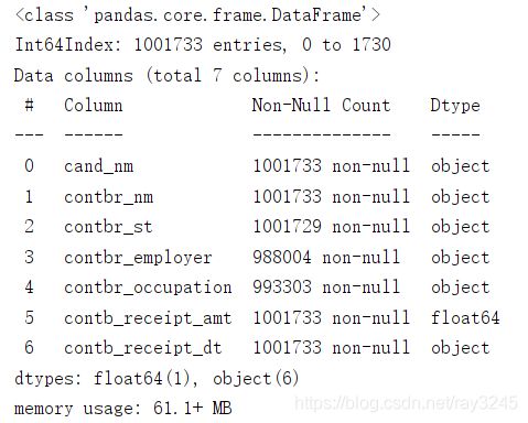
由图可知:
— 共有1001733行,7列数据;
— contbr_employer 、contbr_occupation 以及 contbr_st 存在空值;
1.3.2用统计学指标快速描述数值型属性的概要
contb.describe()

2、数据的预处理
2.1 数据清洗
2.1.1 查看缺失值所在的列
bool = contb.isnull().any(axis=1)
contb.loc[bool]

2.1.2 对空值进行填充
contb.fillna(value='NOT PROVIDE',inplace=True)
有些用户没有在 contbr_employer 、contbr_occupation 以及 contbr_st 上面提供信息导致了空值的出现,于是使用 ‘NOT PROVIDE’ 进行填充

这里我们再用 info() 进行查看,所有带有空值的数据被 NOT PROVIDE 填充后,不再有空值。
2.2 数据转换
2.2.1 对候选人进行去重
contb['cand_nm'].unique()
contb['cand_nm'].nunique()

去重并且进行去重统计后发现,一共有13名候选人参选
2.2.2 添加党派
通过网络搜索或爬取等方式获取每位总统候选人的所属党派,建立字典party,把候选人的名字作为键,所属党派作为对应的值
字典的建立:
party = {
  'Bachmann, Michelle': 'Republican',
  'Romney, Mitt': 'Republican',
  'Obama, Barack': 'Democrat',
  "Roemer, Charles E. 'Buddy' III": 'Republican',
  'Pawlenty, Timothy': 'Republican',
  'Johnson, Gary Earl': 'Libertarian',
  'Paul, Ron': 'Republican',
  'Santorum, Rick': 'Republican',
  'Cain, Herman': 'Republican',
  'Gingrich, Newt': 'Republican',
  'McCotter, Thaddeus G': 'Republican',
  'Huntsman, Jon': 'Republican',
  'Perry, Rick': 'Republican'
 }
执行映射操作并添加新的一列 party :
contb['party'] = contb['cand_nm'].map(party)
# 再查看一下前五行
contb.head()

发现已经新入加党派列 party ,100万数据,增加一列耗时129ms
2.2.3 统计各党派被支持的次数
contb['party'].value_counts()

2.2.4 统计各个党派被捐赠的总金额
contb.groupby('party')['contb_receipt_amt'].sum()

2.2.5 统计按照职业的分类汇总各党派被捐赠的金额
contb.groupby('contbr_occupation')['contb_receipt_amt'].sum()

2.2.6 对职业分类汇总的赞助总金额进行排序(由大到小)
contb.groupby('contbr_occupation')['contb_receipt_amt'].sum().sort_values(ascending=False)
# ascending = False 代表降序 True代表升序

2.2.7 对职业进行去重
按照职位进行汇总,计算赞助总金额,发现不少职业是相同的,只不过是表达形式不一样而已,如C.E.O.与CEO,都是一个职业
利用函数进行转换:
occupation = {'INFORMATION REQUESTED PER BEST EFFORTS':'NOT PROVIDE',
             'INFORMATION REQUESTED':'NOT PROVIDE',
              'C.E.O.':'CEO',
              'LAWYER':'ATTORNEY',
              'SELF':'SELF-EMPLOYED',
              'SELF EMPLOYED ':'SELF-EMPLOYED'}
contb['contbr_occupation'] = contb['contbr_occupation'].map(lambda x:occupation.get(x,x))
occupation.get(x,x)在字典occupation中寻找对应的值,若没有则返回值本身
2.3 数据筛选
2.3.1 对捐赠金额的筛选
contb.shape
contb = contb[ contb['contb_receipt_amt'] > 0 ]
contb.shape

可以看出去重前与去重后的行列数据不一致,说明有献金金额小于0的异常值
2.3.2 查看各个候选人所获得的捐赠总金额
contb_receipt_amt = contb.groupby(by='cand_nm')['contb_receipt_amt'].sum().sort_values(ascending=False)
contb_receipt_amt
各个候选人所获得的捐赠总金额排序后发现奥巴马与罗姆尼为前两位

2.3.3 对各个候选人所得的捐赠金额呈现数据的可视化
plt.figure(figsize=(8,8))
plt.pie( contb_receipt_amt.values , labels=contb_receipt_amt.index,autopct='%1.1f%%')

从上面的数据可以更清晰地看出,支持Obama, Barack 和 Romney, Mitt 所获得捐赠所占的比例是最大的,各为43.9%和28.5%
2.3.4 得到选举人为Obama、Romney的子集数据
Obama_Romney = contb.query(" cand_nm == 'Obama, Barack' | cand_nm == 'Romney, Mitt'")# | 为与运算

运用reset_index再将行索引重新设置一下,继续从0开始排到数据末尾
Obama_Romney.reset_index(drop=True,inplace=True)

2.3.5 数据的离散化
利用cut函数根据金额大小将数据离散化到多个面元中,再添加给新建的数据
bins = [0,1,10,100,1000,10000,100000,1000000,10000000]
labels = pd.cut(Obama_Romney['contb_receipt_amt'],bins)
Obama_Romney['labels'] = labels
Obama_Romney.head()

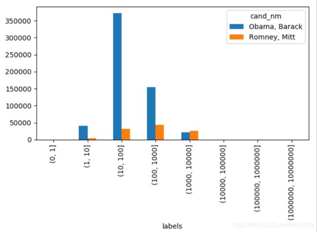
2.3.6 对赞助金额进行分组分析并可视化
统计各区间Obama、Romney接收捐赠次数
Obama_Romney.groupby(by=['cand_nm','labels'])['labels'].count().unstack(level=0, fill_value=0)

绘制各区间Obama、Romney接收捐赠次数
bar= Obama_Romney.groupby(by=['cand_nm','labels'])['labels'].count().unstack(level=0).fillna(value=0)
bar.plot(kind='bar')
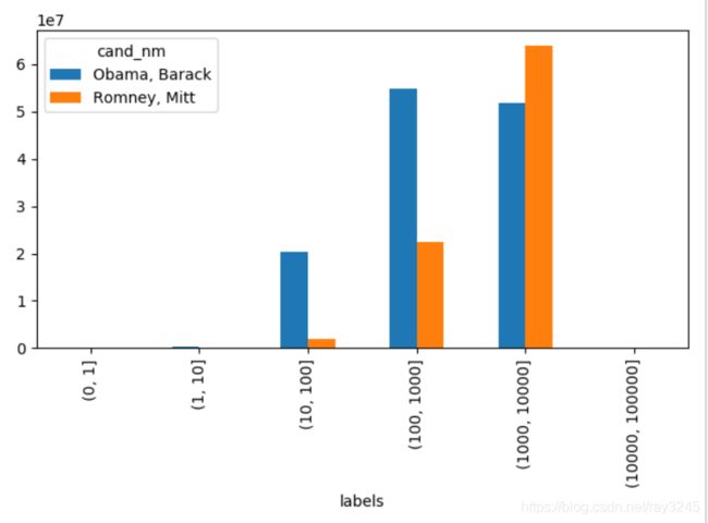
统计Obama、Romney各区间赞助总金额
Obama_Romney.groupby(by=['cand_nm','labels'])['contb_receipt_amt'].sum().unstack(level=0).fillna(value=0)

绘制Obama、Romney各区间赞助总金额
bar=Obama_Romney.groupby(by=['cand_nm','labels'])['contb_receipt_amt'].sum().unstack(level=0).fillna(value=0)
bar.plot(kind='bar')

3、数据聚合与分组运算
3.1 运用透视表(pivot_table)分析Obama、Romney两大巨头和捐献职业的关系
python中数据表的功能与excel中的功能类似
# 先对职业进行分组再用sum函数进行聚合运算,再对Obama、Romney两大巨头的数据进行汇总
pivot = Obama_Romney.pivot_table( index='contbr_occupation' , values='contb_receipt_amt',aggfunc={'sum'} , columns='cand_nm').fillna(0)
pivot_sum = pivot['sum']

# 取Obama与Romney的总和
pivot_sum['total'] = pivot_sum['Obama, Barack'] + pivot_sum['Romney, Mitt']

# 排序后取前十
pivot_sum = pivot_sum.sort_values(by='total',ascending=False)[0:10]

# 将 “NOT PROVIDE” 去掉
pivot_sum.drop(labels='NOT PROVIDE',axis=0,inplace=True)
pivot_sum

可以看出,对于Obama、Romney两大巨头来说,退休人员、律师、医师等是捐献金额比较多的职业
3.2 对Obama、Romney两大巨头总投资前十的职业数据可视化
pivot_sum.plot(kind='bar')
plt.show()

3.3 根据职业信息分组聚合运算
Obama_Romney.groupby(by=['cand_nm','contbr_occupation'])['contb_receipt_amt'].sum().sort_values(ascending=False)[:15].unstack(level=0)

从数据可以看出,Obama更受精英群体(律师、医生、咨询顾问)的欢迎,Romney则得到更多企业家或企业高管的支持
3.4 根据公司信息分组聚合运算
Obama_Romney.groupby(by=['cand_nm','contbr_employer'])['contb_receipt_amt'].sum().sort_values(ascending=False)[:25].unstack(level=0)

从数据可以看出,Obama:微软、盛德国际律师事务所、欧华律师事务所等; Romney:瑞士瑞信银行、摩根斯坦利、高盛公司、巴克莱资本、H.I.G.资本等
3.5 对各区间的赞助金额进行分组分析并可视化呈现
在前面2.3.5中我们已经利用cut()函数,根据出资额大小将数据离散化到多个面元中,接下来我们就要对每个离散化的面元进行分组分析
# 统计各区间Obama、Romney接收捐赠次数
Obama_Romney.groupby(by=['cand_nm','labels']).size().unstack(level=0)

# 绘制Obama、Romney各区间赞助总金额
Obama_Romney.groupby(by=['cand_nm','labels'])['contb_receipt_amt'].sum().unstack(level=0).fillna(0)

# 个人捐款(捐献额大于100000 的都是团体捐款)
# 绘制图形只显示个人捐献情况
nm_amt = Obama_Romney.groupby(by=['cand_nm','labels'])['contb_receipt_amt'].sum().unstack(level=0).fillna(0)
nm_amt[0:-2].plot(kind='bar')
百分比堆积图的效果则比条形图更加明显,实现如下:
nm_amt_per = nm_amt.div( nm_amt.sum(axis=1),axis=0)
nm_amt_per[0:-2].plot(kind='bar',stacked=True)
plt.xlabel('contb_receipt_amt')
plt.show()
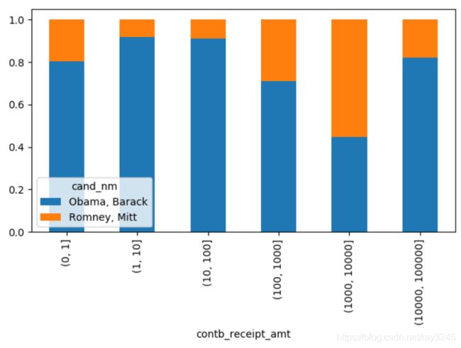
可以明显的看出,在小额赞助方面,Obama无论是在数量还是金额上都比Romney更有优势
4、根据时间序列分析大选趋势
4.1 数据调整
Obama_Romney.head()

可以看到日期并非是 “年-月-日” 的形式,而且月份为英文的显示形式,需要转换成数字
months = {'JAN' : 1, 'FEB' : 2, 'MAR' : 3, 'APR' : 4, 'MAY' : 5, 'JUN' : 6,'JUL' : 7, 'AUG' : 8, 'SEP' : 9, 'OCT': 10, 'NOV': 11, 'DEC' : 12}
def func(x):
    x = x.split('-')
    x[1] = months[x[1]]
    x[2] = '20' + x[2]
    return datetime.date( int(x[2]),int(x[1]),int(x[0]))
# map()可以自定义一个函数传入一个Serise里面
Obama_Romney['contb_receipt_dt'] = Obama_Romney['contb_receipt_dt'].map(func)
Obama_Romney

可以看到转换成功,接下来我们将它转换为datetime类型
Obama_Romney['contb_receipt_dt']  = pd.to_datetime(Obama_Romney['contb_receipt_dt'])
Obama_Romney.dtypes

4.2 以时间序列作为行索引
Obama_Romney.set_index(Obama_Romney['contb_receipt_dt'],inplace=True)
# 再将多余的列删除
Obama_Romney.drop(labels='contb_receipt_dt',axis=1,inplace=True)
Obama_Romney

4.3 频度转换以及可视化
这里我们把频率从每日转换为每月,属于高频转低频的降采样
频度转换前提是:行索引必须是时间序列
# resample会对数据进行分组,然后再调用聚合函数
# 这里: A:年 , M:月 , D:天
nm_month = Obama_Romney.groupby(by='cand_nm').resample('M')['contb_receipt_amt'].count().unstack(level=0)
运用面积图呈现:
plt.figure(figsize=(30,8))
ax = plt.subplot(1,1,1)
nm_month.plot(kind='area',ax=ax,alpha=0.7)
plt.show()

我们把2011年4月到2012年4月这段时间里两位总统候选人接受的赞助数做个对比可以看出,越临近竞选,大家赞助的热情越高涨,而奥巴马在各个时段里都占据着绝对的优势