Python数据分析与挖掘——回归模型的诊断
当回归模型构建好之后,并不意味着建模过程的结束,还需要进一步对模型进行诊断,目的就是使诊断后的模型更加健壮。统计学家在发明线性回归模型的时候就提出了一些假设前提,只有在满足这些假设前提的情况下,所得的模型才是合理的。本节的主要内容就是针对如下几点假设,完成模型的诊断工作:
- 误差项 ε 服从正态分布。
- 无多重共线性。
- 线性相关性。
- 误差项 ε 的独立性。
- 方差齐性。
除了上面提到的五点假设之外,还需要注意的是,线性回归模型对异常值是非常敏感的,即模型的构建过程非常容易受到异常值的影响,所以诊断过程中还需要对原始数据的观测进行异常点识别和处理。接下来,结合理论知识与Python代码逐一展开模型的诊断过程。
正态性检验
虽然模型的前提假设是对残差项要求服从正态分布,但是其实质就是要求因变量服从正态分布。对于多元线性回归模型y=Xβ+ε来说,等式右边的自变量属于已知变量,而等式左边的因变量为未知变量(故需要通过建模进行预测)。所以,要求误差项服从正态分布,就是要求因变量服从正态分布,关于正态性检验通常运用两类方法,分别是定性的图形法(直方图、PP图或QQ图)和定量的非参数法(Shapiro检验和K-S检验),接下来通过具体的代码对原数据集中的利润变量进行正态性检验。
1.直方图法
import scipy.stats as stats
import pandas as pd
import matplotlib.pyplot as plt
import seaborn as sns

#导入数据
Profit_data = pd.read_excel(r'Predict to Profit.xlsx')
#中文和负号的正常显示
plt.rcParams['font.sans-serif'] = ['Microsoft YaHei']
plt.rcParams['axes.unicode_minus'] = False
#绘制直方图
sns.distplot(a=Profit_data.Profit, bins=10, fit=stats.norm, norm_hist=True,
             hist_kws={'color':'steelblue', 'edgecolor':'black'},
             kde_kws={'color':'black', 'linestyle':'--', 'label':'核密度曲线'},
             fit_kws={'color':'red', 'linestyle':':', 'label':'正态密度曲线'})
#显示图例
plt.legend()
#显示图形
plt.show()
结果:

上图中绘制了因变量Profit的直方图、核密度曲线和理论正态分布的密度曲线,添加两条曲线的目的就是比对数据的实际分布与理论分布之间的差异。如果两条曲线近似或吻合,就说明该变量近似服从正态分布。从图中看,核密度曲线与正态密度曲线的趋势比较吻合,故直观上可以认为利润变量服从正态分布。
2.PP图与QQ图
import pandas as pd
import matplotlib.pyplot as plt
import statsmodels.api as sm

#导入数据
Profit_data = pd.read_excel(r'Predict to Profit.xlsx')
#中文和负号的正常显示
plt.rcParams['font.sans-serif'] = ['Microsoft YaHei']
plt.rcParams['axes.unicode_minus'] = False
#残差的正态性检验(PP图和QQ图法)
pp_qq_plot = sm.ProbPlot(Profit_data.Profit)
#绘制PP图
pp_qq_plot.ppplot(line='45')  #line='45'
#设置横纵坐标的刻度范围
plt.xlim((0, 1.2))   #x轴的刻度范围被设为a到b
plt.ylim((0, 1.2))    #y轴的刻度范围被设为a'到b'
plt.title('P-P图')
#绘制QQ图
pp_qq_plot.qqplot(line='q')
plt.title('Q-Q图')

#显示图形
plt.show()
结果:


PP图的思想是比对正态分布的累计概率值和实际分布的累计概率值,而QQ图则比对正态分布的分位数和实际分布的分位数。
判断变量是否近似服从正态分布的标准是:如果散点都比较均匀地散落在直线上,就说明变量近似服从正态分布,否则就认为数据不服从正态分布。从上图可知,PP图绘制的散点离直线较远,且全是1,可能程序有误(但我不知道错在何处),这种偏离较大的就说明不服从正态分布。而QQ图,绘制的散点均落在直线的附近,没有较大的偏离,故认为利润变量近似服从正态分布。
参考此链接,重新画PP图
python q-q图 和PP图
import pandas as pd
import matplotlib.pyplot as plt
from scipy import stats

#导入数据
Profit_data = pd.read_excel(r'Predict to Profit.xlsx')
#中文和负号的正常显示
plt.rcParams['font.sans-serif'] = ['Microsoft YaHei']
plt.rcParams['axes.unicode_minus'] = False

stats.probplot(Profit_data.Profit, dist=stats.norm, sparams=(0,1), plot=plt)
plt.show()
结果:

这次就比较正常了。PP图,绘制的散点均落在直线的附近,没有较大的偏离,故认为利润变量近似服从正态分布。
3.Shapiro检验和K-S检验
这两种检验方法均属于非参数方法,它们的原假设被设定为变量服从正态分布,两者的最大区别在于适用的数据量不一样,若数据量低于5000,则使用shapiro检验法比较合理,否则使用K-S检验法。scipy的子模块stats提供了专门的检验函数,分别是shapiro函数和kstest函数,由于利润数据集的样本量小于5000,故下面运用shapiro函数对利润做定量的正态性检验:
Shapiro检验
import scipy.stats as stats
import pandas as pd

#导入数据
Profit_data = pd.read_excel(r'Predict to Profit.xlsx')

#Shapiro检验
Shapiro_test = stats.shapiro(Profit_data.Profit)
print(Shapiro_test)
结果:
(0.9793398380279541, 0.537902295589447)
如上结果所示,元组中的第一个元素是shapiro检验的统计量值,第二个元素是对应的概率值p。由于p值大于置信水平0.05,故接受利润变量服从正态分布的原假设。
K-S检验
为了应用K-S检验的函数kstest,这里随机生成正态分布变量x1和均匀分布变量x2,具体操作代码如下:
import scipy.stats as stats
import pandas as pd
import numpy as np

#导入数据
Profit_data = pd.read_excel(r'Predict to Profit.xlsx')

#生成正态分布和均匀分布随机数
rnorm = np.random.normal(loc=5, scale=2, size=10000)
runif = np.random.uniform(low=1, high=100, size=10000)
#正态性检验
KS_Test1 = stats.kstest(rvs=rnorm, args=(rnorm.mean(), rnorm.std()), cdf='norm')
KS_Test2 = stats.kstest(rvs=runif, args=(runif.mean(), runif.std()), cdf='norm')
print(KS_Test1)
print(KS_Test2)
结果:
KstestResult(statistic=0.004649394170337412, pvalue=0.9820888807219965)
KstestResult(statistic=0.06005710016181054, pvalue=9.381733550745589e-32)
如上结果所示,正态分布随机数的检验 p 值大于置信水平0.05,则需接受原假设;均匀分布随机数的检验 p 值远远小于0.05,则需拒绝原假设。需要说明的是,如果使用 kstest 函数对变量进行正态性检验,必须指定 args 参数,它用于传递被检验变量的均值和标准差。

多重共线性检验
多重共线性是指模型中的自变量之间存在较高的线性相关关系,它的存在会给模型带来严重的后果,例如由“最小二乘法”得到的偏回归系数无效、增大偏回归系数的方差、模型缺乏稳定性等,所以,对模型的多重共线性检验就显得尤其重要了。
关于多重共线性的检验可以使用方差膨胀因子VIF来鉴定,如果 VIF大于10,则说明变量间存在多重共线性;如果VIF大于100,则表名 变量间存在严重的多重共线性。方差膨胀因子VIF的计算步骤如下:

Python中的statsmodels模块提供了计算方差膨胀因子VIF的函数,下面利用该函数计算两个自变量的方差膨胀因子:
import pandas as pd
import statsmodels.api as sm
from statsmodels.stats.outliers_influence import variance_inflation_factor

#导入数据
Profit_data = pd.read_excel(r'Predict to Profit.xlsx')

#自变量X(包含RD_Spend、Marketing_Spending和常数列1)
X = sm.add_constant(Profit_data.loc[:,['RD_Spend','Marketing_Spend']])

#构造空的数据框,用于存储VIF值
vif = pd.DataFrame()
vif['features'] = X.columns
vif['VIF Faxtor'] = [variance_inflation_factor(X.values, i) for i in range(X.shape[1])]
#返回VIF的值
print(vif)
结果:
          features  VIF Faxtor
0            const    4.540984
1         RD_Spend    2.026141
2  Marketing_Spend    2.026141
如上结果所示,两个自变量对应的方差膨胀因子均低于10,说明构建模型的数据并不存在多重共线性。如果发现变量之间存在多重共线性的话,可以考虑删除变量或者重新选择模型(如岭回归模型或LASSO模型)。
线性相关性检验
线性相关性检验,顾名思义,就是确保用于建模的自变量和因变量之间存在线性关系。关于线性关系的判断,可以使用Pearson相关系数和可视化方法进行识别,有关Pearson相关系数的计算公式如下:

Pearson相关系数的计算可以直接使用数据框的corrwith“方法”,该方法最大的好处是可以计算任意指定变量间的相关系数。下面使用该方法计算因变量与每个自变量之间的相关系数,具体代码如下:
import pandas as pd

#导入数据
Profit_data = pd.read_excel(r'Predict to Profit.xlsx')
#生成由State变量衍生的哑变量
dummies = pd.get_dummies(Profit_data.State)

#将哑变量与原始数据集水平合并
Profit_data = pd.concat([Profit_data, dummies], axis=1)
#计算数据集Profit_data中每个自变量与因变量利润之间的相关系数
coefficient_of_association = Profit_data.drop('Profit', axis=1).corrwith(Profit_data.Profit)
print(coefficient_of_association)
结果:
RD_Spend           0.978437
Administration     0.205841
Marketing_Spend    0.739307
California        -0.083258
Florida            0.088008
New York          -0.004679
dtype: float64
如上结果所示,自变量中只有研发成本和市场营销成本与利润之间存在较高的相关系数,相关性分别达到0.978和0.739,而其他变量与利润之间几乎没有线性相关性可言。通常情况下,可以参考下表判断相关系数对应的相关程度:

以管理成本Administration为例,与利润之间的相关系数只有0.2,被认定为不相关,这里的不相关只能说明两者之间不存在线性关系。如果利润和管理成本之间存在非线性关系时,Pearson相关系数也同样会很小,所以还需要通过可视化的方法,观察自变量与因变量之间的散点关系。
读者可以应用matplotlib模块中的scatter函数绘制五个自变量与因变量之间的散点图,那样做可能会使代码显得冗长。这里介绍另一个绘制散点图的函数,那就是seaborn模块中的pairplot函数,它可以绘制多个变量间的散点图矩阵。
import pandas as pd
import matplotlib.pyplot as plt
import seaborn
#导入数据
Profit_data = pd.read_excel(r'Predict to Profit.xlsx')
#生成由State变量衍生的哑变量
dummies = pd.get_dummies(Profit_data.State)

#将哑变量与原始数据集水平合并
Profit_New = pd.concat([Profit_data, dummies], axis=1)
#绘制散点图矩阵
seaborn.pairplot(Profit_New.loc[:, ['RD_Spend', 'Administration', 'Marketing_Spend', 'Profit']])
#显示图形
plt.show()
结果:

如上图所示,由于California与Florida都是哑变量,故没有将其放入散点图矩阵中。从图中结果可知,研发成本与利润之间的散点图几乎为一条向上倾斜的直线(见左下角的散点图),说明两种变量确实存在很强的线性关系;市场营销成本与利润的散点图同样向上倾斜,但很多点的分布还是比较分散的(见第一列第三行的散点图);管理成本与利润之间的散点图呈水平趋势,而且分布也比较宽,说明两者之间确实没有任何关系(见第一列第二行的散点图)。
以Python数据分析与挖掘——线性回归预测模型中最后一个多元线性回归案例中重构的模型model为例,综合考虑相关系数、散点图矩阵和t检验的结果,最终确定只保留模型model中的RD_Spend和Marketing_Spend两个自变量,下面重新对该模型做修正:
import pandas as pd
import statsmodels.api as sm
from sklearn import model_selection
#导入数据
Profit_data = pd.read_excel(r'Predict to Profit.xlsx')
#生成由State变量衍生的哑变量
dummies = pd.get_dummies(Profit_data.State)

#将哑变量与原始数据集水平合并
Profit_New = pd.concat([Profit_data, dummies], axis=1)
#删除State变量和New York变量(因为State变量已被分解为哑变量,New York变量需要作为参照组)
Profit_New.drop(labels=['State', 'New York'], axis=1, inplace=True)
#将数据集拆分为训练集和测试集
train, test = model_selection.train_test_split(Profit_New, test_size=0.2, random_state=1234)
#根据train数据集建模
model = sm.formula.ols('Profit ~ RD_Spend + Marketing_Spend', data=train).fit()
print(model.params)
结果:
Intercept          51902.112471
RD_Spend               0.785116
Marketing_Spend        0.019402
dtype: float64
如上结果所示,返回的是模型两个自变量的系数估计值,可以将多元线性回归模型表示成:
Profit = 51902.11 + 0.79RD_Spend + 0.02Marketing_Spend
异常值检验
由于多元线性回归模型容易受到极端值的影响,故需要利用统计方法对观测样本进行异常点检测。如果在建模过程中发现异常数据,需要对数据集进行整改,如删除异常值或衍生出是否为异常值的哑变量。对于线性回归模型来说,通常利用帽子矩阵、DFFITS准则、学生化残差或Cook距离进行异常点检测。接下来,分别对这四种检测方法做简单介绍。


如果使用如上四种方法判别数据集的第 i 个样本是否为异常点,前提是已经构造好一个线性回归模型,然后基于 get_influence “方法”获得四种统计量的值。为了检验模型中数据集的样本是否存在异常,这里沿用上节中构造的模型model,具体代码如下:
import pandas as pd
import statsmodels.api as sm
from sklearn import model_selection
#导入数据
Profit_data = pd.read_excel(r'Predict to Profit.xlsx')
#生成由State变量衍生的哑变量
dummies = pd.get_dummies(Profit_data.State)

#将哑变量与原始数据集水平合并
Profit_New = pd.concat([Profit_data, dummies], axis=1)
#删除State变量和New York变量(因为State变量已被分解为哑变量,New York变量需要作为参照组)
Profit_New.drop(labels=['State', 'New York'], axis=1, inplace=True)
#将数据集拆分为训练集和测试集
train, test = model_selection.train_test_split(Profit_New, test_size=0.2, random_state=1234)
#根据train数据集建模
model = sm.formula.ols('Profit ~ RD_Spend + Marketing_Spend', data=train).fit()
#异常值检验
outliers = model.get_influence()
#高杠杆值点(帽子矩阵)
leverage = outliers.hat_matrix_diag
#DFFITS值
dffits = outliers.dffits[0]
#学生化残差
resid_stu = outliers.resid_studentized_external
#Cook距离
cook = outliers.cooks_distance[0]
#合并各种异常值检验的统计量值
contat1 = pd.concat([pd.Series(leverage, name='leverage'), pd.Series(dffits, name='dffits'), pd.Series(resid_stu, name='resid_stu'), pd.Series(cook, name='cook')], axis=1)
#重设train数据的行索引
train.index = range(train.shape[0])
#将上面的统计量与train数据集合并
profit_outliers = pd.concat([train, contat1], axis=1)
#横向最多显示多少个字符, 一般80不适合横向的屏幕,平时多用200
pd.set_option('display.width', 200)
#显示所有列
pd.set_option('display.max_columns',None)
#显示所有行
pd.set_option('display.max_rows', None)
print(profit_outliers)
结果:
     RD_Spend  Administration  Marketing_Spend     Profit  California  Florida  leverage    dffits  resid_stu      cook
0    28663.76       127056.21        201126.82   90708.19           0        1  0.066517  0.466410   1.747255  0.068601
1    15505.73       127382.30         35534.17   69758.98           0        0  0.093362  0.221230   0.689408  0.016556
2    94657.16       145077.58        282574.31  125370.37           0        0  0.032741 -0.156225  -0.849138  0.008199
3   101913.08       110594.11        229160.95  146121.95           0        1  0.039600  0.270677   1.332998  0.023906
4    78389.47       153773.43        299737.29  111313.02           0        0  0.042983 -0.228563  -1.078496  0.017335
5    76253.86       113867.30        298664.47  118474.03           1        0  0.044181  0.026111   0.121448  0.000234
6    73994.56       122782.75        303319.26  110352.25           0        1  0.048683 -0.168768  -0.746047  0.009613
7   162597.70       151377.59        443898.53  191792.06           1        0  0.139015  0.205420   0.511222  0.014360
8    63408.86       129219.61         46085.25   97427.84           1        0  0.104886 -0.245154  -0.716172  0.020308
9     1315.46       115816.21        297114.46   49490.75           0        1  0.234707 -0.782584  -1.413128  0.198645
10   72107.60       127864.55        353183.81  105008.31           0        0  0.087053 -0.450209  -1.457963  0.065514
11   46426.07       157693.92        210797.67   96712.80           1        0  0.041879  0.119666   0.572383  0.004864
12   64664.71       139553.16        137962.62  107404.34           1        0  0.040765  0.056572   0.274422  0.001095
13   55493.95       103057.49        214634.81   96778.92           0        1  0.033414 -0.070685  -0.380175  0.001706
14  165349.20       136897.80        471784.10  192261.83           0        0  0.157309  0.085344   0.197530  0.002494
15  100671.96        91790.61        249744.55  144259.40           1        0  0.034674  0.217372   1.146938  0.015613
16  130298.13       145530.06        323876.68  155752.60           0        1  0.064526 -0.168778  -0.642633  0.009653
17  144372.41       118671.85        383199.62  182901.99           0        0  0.092154  0.459079   1.440910  0.068212
18   44069.95        51283.14        197029.42   89949.14           1        0  0.041515 -0.010429  -0.050112  0.000037
19  134615.46       147198.87        127716.82  156122.51           1        0  0.198225 -0.287490  -0.578189  0.028069
20  153441.51       101145.55        407934.54  191050.39           0        1  0.111903  0.547076   1.541196  0.096093
21   46014.02        85047.44        205517.64   96479.51           0        0  0.041069  0.123798   0.598206  0.005201
22    1000.23       124153.04          1903.93   64926.08           0        0  0.123066  0.665447   1.776351  0.139268
23  123334.88       108679.17        304981.62  149759.96           1        0  0.055189 -0.159797  -0.661171  0.008647
24   78013.11       121597.55        264346.06  126992.93           1        0  0.030444  0.208746   1.178029  0.014370
25  131876.90        99814.71        362861.36  156991.12           0        0  0.072362 -0.209529  -0.750203  0.014814
26   66051.52       182645.56        118148.20  103282.38           0        1  0.051354 -0.086574  -0.372092  0.002560
27   28754.33       118546.05        172795.67   78239.91           1        0  0.057602  0.013626   0.055116  0.000064
28   38558.51        82982.09        174999.30   81005.76           1        0  0.044443 -0.132193  -0.612965  0.005928
29   61994.48       115641.28         91131.24   99937.59           0        1  0.065062 -0.085819  -0.325321  0.002518
30   75328.87       144135.98        134050.07  105733.54           0        1  0.050435 -0.248326  -1.077499  0.020464
31   27892.92        84710.77        164470.71   77798.83           0        1  0.057331  0.026752   0.108479  0.000245
32   67532.53       105751.03        304768.73  108733.99           0        1  0.057031 -0.069590  -0.282969  0.001657
33  114523.61       122616.84        261776.23  129917.04           0        0  0.047971 -0.552373  -2.460744  0.089182
34   77044.01        99281.34        140574.81  108552.04           0        0  0.048516 -0.200692  -0.888771  0.013505
35   93863.75       127320.38        249839.44  141585.52           0        1  0.030038  0.268459   1.525517  0.023169
36   20229.59        65947.93        185265.10   81229.06           0        0  0.077273  0.397774   1.374542  0.051470
37   86419.70       153514.11             0.00  122776.86           0        0  0.215634  0.234526   0.447292  0.018751
38       0.00       135426.92             0.00   42559.73           1        0  0.125090 -0.505557  -1.337025  0.083372
如上面结果所示,合并了train数据集和四种统计量的值,接下来要做的就是选择一种或多种判断方法,将异常点查询出来。为了简单起见,这里使用标准化残差,当标准化残差大于2时,即认为对应的数据点为异常值。
import pandas as pd
import statsmodels.api as sm
from sklearn import model_selection
import numpy as np
#导入数据
Profit_data = pd.read_excel(r'Predict to Profit.xlsx')
#生成由State变量衍生的哑变量
dummies = pd.get_dummies(Profit_data.State)

#将哑变量与原始数据集水平合并
Profit_New = pd.concat([Profit_data, dummies], axis=1)
#删除State变量和New York变量(因为State变量已被分解为哑变量,New York变量需要作为参照组)
Profit_New.drop(labels=['State', 'New York'], axis=1, inplace=True)
#将数据集拆分为训练集和测试集
train, test = model_selection.train_test_split(Profit_New, test_size=0.2, random_state=1234)
#根据train数据集建模
model = sm.formula.ols('Profit ~ RD_Spend + Marketing_Spend', data=train).fit()
#异常值检验
outliers = model.get_influence()
#高杠杆值点(帽子矩阵)
leverage = outliers.hat_matrix_diag
#DFFITS值
dffits = outliers.dffits[0]
#学生化残差
resid_stu = outliers.resid_studentized_external
#Cook距离
cook = outliers.cooks_distance[0]
#合并各种异常值检验的统计量值
contat1 = pd.concat([pd.Series(leverage, name='leverage'), pd.Series(dffits, name='dffits'), pd.Series(resid_stu, name='resid_stu'), pd.Series(cook, name='cook')], axis=1)
#重设train数据的行索引
train.index = range(train.shape[0])
#将上面的统计量与train数据集合并
profit_outliers = pd.concat([train, contat1], axis=1)
#计算异常值数量的比例
outliers_ratio = sum(np.where( (np.abs(profit_outliers.resid_stu)>2), 1, 0)) / profit_outliers.shape[0]
print(outliers_ratio)
结果:
0.02564102564102564
如上结果所示,通过标准化残差监控到了异常值,并且异常比例为2.5%。对于异常值的处理办法,可以使用两种策略,如果异常样本的比例不高(如小于等于5%),可以考虑将异常点删除;如果异常样本的比例比较高,选择删除会丢失一些重要信息,所以需要衍生哑变量,即对于异常点,设置哑变量的值为1,否则为0。如上可知,建模数据的异常比例只有2.5%,故考虑将其删除。
import pandas as pd
import statsmodels.api as sm
from sklearn import model_selection
import numpy as np
#导入数据
Profit_data = pd.read_excel(r'Predict to Profit.xlsx')
#生成由State变量衍生的哑变量
dummies = pd.get_dummies(Profit_data.State)

#将哑变量与原始数据集水平合并
Profit_New = pd.concat([Profit_data, dummies], axis=1)
#删除State变量和New York变量(因为State变量已被分解为哑变量,New York变量需要作为参照组)
Profit_New.drop(labels=['State', 'New York'], axis=1, inplace=True)
#将数据集拆分为训练集和测试集
train, test = model_selection.train_test_split(Profit_New, test_size=0.2, random_state=1234)
#根据train数据集建模
model = sm.formula.ols('Profit ~ RD_Spend + Marketing_Spend', data=train).fit()
#异常值检验
outliers = model.get_influence()
#高杠杆值点(帽子矩阵)
leverage = outliers.hat_matrix_diag
#DFFITS值
dffits = outliers.dffits[0]
#学生化残差
resid_stu = outliers.resid_studentized_external
#Cook距离
cook = outliers.cooks_distance[0]
#合并各种异常值检验的统计量值
contat1 = pd.concat([pd.Series(leverage, name='leverage'), pd.Series(dffits, name='dffits'), pd.Series(resid_stu, name='resid_stu'), pd.Series(cook, name='cook')], axis=1)
#重设train数据的行索引
train.index = range(train.shape[0])
#将上面的统计量与train数据集合并
profit_outliers = pd.concat([train, contat1], axis=1)
# 挑选出非异常的观测点
none_outliers = profit_outliers.loc[np.abs(profit_outliers.resid_stu)<=2]
# 应用无异常值的数据集重新建模
model_new = sm.formula.ols('Profit ~ RD_Spend + Marketing_Spend', data = none_outliers).fit()
print(model_new.params)
结果:
Intercept          51827.416821
RD_Spend               0.797038
Marketing_Spend        0.017740
dtype: float64
如上结果所示,经过异常点的排除,重构模型的偏回归系数发生了变动,故可以将模型写成如下公式:
Profit = 51827.42 + 0.80RD_Spend + 0.02Marketing_Spend
独立性检验
残差的独立性检验,说白了也是对因变量 y 的独立性检验,因为在线性回归模型的等式左右只有 y 和残差项 ε 属于随机变量,如果再加上正态分布,就构成了残差项独立同分布于正态分布的假设。关于残差的独立性检验通常使用Durbin-Watson统计量值来测试,如果DW值在2左右,则表明残差项之间是不相关的;如果与2偏离的较远,则说明不满足残差的独立性假设。对于DW统计量的值,其实都不需要另行计算,因为它包含在模型的概览信息中,以上节模型model_new为例:
import pandas as pd
import statsmodels.api as sm
from sklearn import model_selection
import numpy as np
#导入数据
Profit_data = pd.read_excel(r'Predict to Profit.xlsx')
#生成由State变量衍生的哑变量
dummies = pd.get_dummies(Profit_data.State)

#将哑变量与原始数据集水平合并
Profit_New = pd.concat([Profit_data, dummies], axis=1)
#删除State变量和New York变量(因为State变量已被分解为哑变量,New York变量需要作为参照组)
Profit_New.drop(labels=['State', 'New York'], axis=1, inplace=True)
#将数据集拆分为训练集和测试集
train, test = model_selection.train_test_split(Profit_New, test_size=0.2, random_state=1234)
#根据train数据集建模
model = sm.formula.ols('Profit ~ RD_Spend + Marketing_Spend', data=train).fit()
#异常值检验
outliers = model.get_influence()
#高杠杆值点(帽子矩阵)
leverage = outliers.hat_matrix_diag
#DFFITS值
dffits = outliers.dffits[0]
#学生化残差
resid_stu = outliers.resid_studentized_external
#Cook距离
cook = outliers.cooks_distance[0]
#合并各种异常值检验的统计量值
contat1 = pd.concat([pd.Series(leverage, name='leverage'), pd.Series(dffits, name='dffits'), pd.Series(resid_stu, name='resid_stu'), pd.Series(cook, name='cook')], axis=1)
#重设train数据的行索引
train.index = range(train.shape[0])
#将上面的统计量与train数据集合并
profit_outliers = pd.concat([train, contat1], axis=1)
# 挑选出非异常的观测点
none_outliers = profit_outliers.loc[np.abs(profit_outliers.resid_stu)<=2]
# 应用无异常值的数据集重新建模
model_new = sm.formula.ols('Profit ~ RD_Spend + Marketing_Spend', data = none_outliers).fit()
print(model_new.summary())
结果:
                            OLS Regression Results
==============================================================================
Dep. Variable:                 Profit   R-squared:                       0.967
Model:                            OLS   Adj. R-squared:                  0.966
Method:                 Least Squares   F-statistic:                     520.7
Date:                Thu, 04 Mar 2021   Prob (F-statistic):           9.16e-27
Time:                        22:49:45   Log-Likelihood:                -389.18
No. Observations:                  38   AIC:                             784.4
Df Residuals:                      35   BIC:                             789.3
Df Model:                           2
Covariance Type:            nonrobust
===================================================================================
                      coef    std err          t      P>|t|      [0.025      0.975]
-----------------------------------------------------------------------------------
Intercept        5.183e+04   2501.192     20.721      0.000    4.67e+04    5.69e+04
RD_Spend            0.7970      0.034     23.261      0.000       0.727       0.867
Marketing_Spend     0.0177      0.013      1.391      0.173      -0.008       0.044
==============================================================================
Omnibus:                        7.188   Durbin-Watson:                   2.065
Prob(Omnibus):                  0.027   Jarque-Bera (JB):                2.744
Skew:                           0.321   Prob(JB):                        0.254
Kurtosis:                       1.851   Cond. No.                     5.75e+05
==============================================================================

Notes:
[1] Standard Errors assume that the covariance matrix of the errors is correctly specified.
[2] The condition number is large, 5.75e+05. This might indicate that there are
strong multicollinearity or other numerical problems.
如上表所示,残差项对应的DW统计量值为2.065,比较接近于2,故可以认为模型的残差项之间是满足独立性这个假设前提的。
方差齐性检验
方差齐性是要求模型残差项的方差不随自变量的变动而呈现某种趋势,否则,残差的趋势就可以被自变量刻画。如果残差项不满足方差齐性(方差为一个常数),就会导致偏回归系数不具备有效性,甚至导致模型的预测也不准确。所以,建模后需要验证残差项是否满足方差齐性。关于方差齐性的检验,一般可以使用两种方法,即图形法(散点图)和统计检验法(BP检验)。
1.图形法
如上所说,方差齐性是指残差项的方差不随自变量的变动而变动,所以只需要绘制残差与自变量之间的散点图,就可以发现两者之间是否存在某种趋势:
import pandas as pd
import statsmodels.api as sm
from sklearn import model_selection
import numpy as np
import matplotlib.pyplot as plt
#导入数据
Profit_data = pd.read_excel(r'Predict to Profit.xlsx')
#生成由State变量衍生的哑变量
dummies = pd.get_dummies(Profit_data.State)

#将哑变量与原始数据集水平合并
Profit_New = pd.concat([Profit_data, dummies], axis=1)
#删除State变量和New York变量(因为State变量已被分解为哑变量,New York变量需要作为参照组)
Profit_New.drop(labels=['State', 'New York'], axis=1, inplace=True)
#将数据集拆分为训练集和测试集
train, test = model_selection.train_test_split(Profit_New, test_size=0.2, random_state=1234)
#根据train数据集建模
model = sm.formula.ols('Profit ~ RD_Spend + Marketing_Spend', data=train).fit()
#异常值检验
outliers = model.get_influence()
#高杠杆值点(帽子矩阵)
leverage = outliers.hat_matrix_diag
#DFFITS值
dffits = outliers.dffits[0]
#学生化残差
resid_stu = outliers.resid_studentized_external
#Cook距离
cook = outliers.cooks_distance[0]
#合并各种异常值检验的统计量值
contat1 = pd.concat([pd.Series(leverage, name='leverage'), pd.Series(dffits, name='dffits'), pd.Series(resid_stu, name='resid_stu'), pd.Series(cook, name='cook')], axis=1)
#重设train数据的行索引
train.index = range(train.shape[0])
#将上面的统计量与train数据集合并
profit_outliers = pd.concat([train, contat1], axis=1)
# 挑选出非异常的观测点
none_outliers = profit_outliers.loc[np.abs(profit_outliers.resid_stu)<=2]
# 应用无异常值的数据集重新建模
model_new = sm.formula.ols('Profit ~ RD_Spend + Marketing_Spend', data = none_outliers).fit()

#设置第一张子图的位置
ax1 = plt.subplot2grid(shape=(2,1), loc=(0,0))
#绘制散点图
ax1.scatter(none_outliers.RD_Spend, (model_new.resid - model_new.resid.mean())/model_new.resid.std())
#添加水平参考线
ax1.hlines(y=0, xmin=none_outliers.RD_Spend.min(), xmax=none_outliers.RD_Spend.max(), colors='red', linestyles='--')
#添加x轴和y轴标签
ax1.set_xlabel('RD_Spend')
ax1.set_ylabel('Std_Residual')

#设置第二张子图的位置
ax2 = plt.subplot2grid(shape=(2,1), loc=(1,0))
#绘制散点图
ax2.scatter(none_outliers.Marketing_Spend, (model_new.resid - model_new.resid.mean())/model_new.resid.std())
#添加水平参考线
ax2.hlines(y=0, xmin=none_outliers.Marketing_Spend.min(), xmax=none_outliers.Marketing_Spend.max(), colors='red', linestyles='--')
#添加x轴和y轴标签
ax2.set_xlabel('Marketing_Spend')
ax2.set_ylabel('Std_Residual')

#调整子图之间的水平间距和高度间距
plt.subplots_adjust(hspace=0.6, wspace=0.3)
#显示图形
plt.show()
结果:
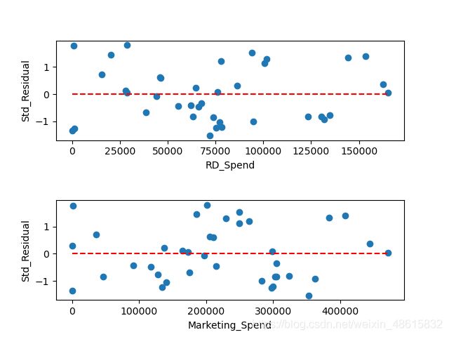
如上图所示,标准化残差并没有随自变量的变动而呈现喇叭形,所有的散点几乎均匀地分布在参考线y=0的附近。所以,可以说明模型的残差项满足方差齐性的前提假设。
2.BP检验
方差齐性检验的另一个统计方法是BP检验,它的原假设是残差的方差为一个常数,通过构造拉格朗日乘子LM统计量,实现方差齐性的检验。该检验可以借助于statsmodels模块中的het_breushpagan函数完成,具体代码如下:
import pandas as pd
import statsmodels.api as sm
from sklearn import model_selection
import numpy as np

#导入数据
Profit_data = pd.read_excel(r'Predict to Profit.xlsx')
#生成由State变量衍生的哑变量
dummies = pd.get_dummies(Profit_data.State)

#将哑变量与原始数据集水平合并
Profit_New = pd.concat([Profit_data, dummies], axis=1)
#删除State变量和New York变量(因为State变量已被分解为哑变量,New York变量需要作为参照组)
Profit_New.drop(labels=['State', 'New York'], axis=1, inplace=True)
#将数据集拆分为训练集和测试集
train, test = model_selection.train_test_split(Profit_New, test_size=0.2, random_state=1234)
#根据train数据集建模
model = sm.formula.ols('Profit ~ RD_Spend + Marketing_Spend', data=train).fit()
#异常值检验
outliers = model.get_influence()
#高杠杆值点(帽子矩阵)
leverage = outliers.hat_matrix_diag
#DFFITS值
dffits = outliers.dffits[0]
#学生化残差
resid_stu = outliers.resid_studentized_external
#Cook距离
cook = outliers.cooks_distance[0]
#合并各种异常值检验的统计量值
contat1 = pd.concat([pd.Series(leverage, name='leverage'), pd.Series(dffits, name='dffits'), pd.Series(resid_stu, name='resid_stu'), pd.Series(cook, name='cook')], axis=1)
#重设train数据的行索引
train.index = range(train.shape[0])
#将上面的统计量与train数据集合并
profit_outliers = pd.concat([train, contat1], axis=1)
# 挑选出非异常的观测点
none_outliers = profit_outliers.loc[np.abs(profit_outliers.resid_stu)<=2]
# 应用无异常值的数据集重新建模
model_new = sm.formula.ols('Profit ~ RD_Spend + Marketing_Spend', data = none_outliers).fit()

#BP检验
BP_test = sm.stats.diagnostic.het_breuschpagan(model_new.resid, exog_het=model_new.model.exog)
print(BP_test)
结果:
(1.4675103668308342, 0.48010272699006384, 0.7029751237162462, 0.5019659740962872)
如上结果所示,元组中一共包含四个值:
- 第一个值1.468为LM统计量;
- 第二个值是统计量对应的概率p值,该值大于0.05,说明接受残差方差为常数的原假设;
- 第三个值为F统计量,用于检验残差平方项与自变量之间是否独立,如果独立则表明残差方差齐性;
- 第四个值则为F统计量的概率p值,同样大于0.05,则进一步表示残差项满足方差齐性的假设。
如果模型的残差不满足齐性的话,可以考虑两类方法来解决:
- 一类是模型变换法;
- 另一类是“加权最小二乘法”(可以使用statsmodels模块中的wls函数)。
对于模型变换法来说,主要考虑残差与自变量之间的关系:
- 如果残差与某个自变量x成正比,则需将原模型的两边同除以x1/2;
- 如果残差与某个自变量x的平方成正比,则需将原始模型的两边同除以x;
对于加权最小二乘法来说,关键是如何确定权重,根据多方资料的搜索和验证,一般选择如下三种权重来进行对比测试:
- 残差绝对值的倒数作为权重。
- 残差平方的倒数作为权重。
- 用残差的平方对数与自变量X重新拟合建模,并将得到的拟合值取指数,用指数的倒数作为权重。
3.回归模型的预测
经过前文的模型构造、假设检验和模型诊断,最终确定合理的模型model_new。接下来要做的就是利用该模型完成测试集上的预测,具体代码如下:
import pandas as pd
import statsmodels.api as sm
from sklearn import model_selection
import numpy as np
import matplotlib.pyplot as plt
#导入数据
Profit_data = pd.read_excel(r'Predict to Profit.xlsx')
#生成由State变量衍生的哑变量
dummies = pd.get_dummies(Profit_data.State)

#将哑变量与原始数据集水平合并
Profit_New = pd.concat([Profit_data, dummies], axis=1)
#删除State变量和New York变量(因为State变量已被分解为哑变量,New York变量需要作为参照组)
Profit_New.drop(labels=['State', 'New York'], axis=1, inplace=True)
#将数据集拆分为训练集和测试集
train, test = model_selection.train_test_split(Profit_New, test_size=0.2, random_state=1234)
#根据train数据集建模
model = sm.formula.ols('Profit ~ RD_Spend + Marketing_Spend', data=train).fit()
#异常值检验
outliers = model.get_influence()
#高杠杆值点(帽子矩阵)
leverage = outliers.hat_matrix_diag
#DFFITS值
dffits = outliers.dffits[0]
#学生化残差
resid_stu = outliers.resid_studentized_external
#Cook距离
cook = outliers.cooks_distance[0]
#合并各种异常值检验的统计量值
contat1 = pd.concat([pd.Series(leverage, name='leverage'), pd.Series(dffits, name='dffits'), pd.Series(resid_stu, name='resid_stu'), pd.Series(cook, name='cook')], axis=1)
#重设train数据的行索引
train.index = range(train.shape[0])
#将上面的统计量与train数据集合并
profit_outliers = pd.concat([train, contat1], axis=1)
# 挑选出非异常的观测点
none_outliers = profit_outliers.loc[np.abs(profit_outliers.resid_stu)<=2]
# 应用无异常值的数据集重新建模
model_new = sm.formula.ols('Profit ~ RD_Spend + Marketing_Spend', data = none_outliers).fit()

#modle_new对测试集的预测
pred_new = model_new.predict(exog=test.loc[:, ['RD_Spend', 'Marketing_Spend']])
#绘制预测值与实际值的散点图
plt.scatter(x=test.Profit, y=pred_new)
#添加斜率为1、截距项为0的参考线
plt.plot([test.Profit.min(), test.Profit.max()], [test.Profit.min(), test.Profit.max()], color='red', linestyle='--')
#添加轴标签
plt.xlabel('实际值')
plt.ylabel('预测值')
#处理中文乱码
plt.rcParams['font.sans-serif'] = ['Microsoft YaHei']
#显示图形
plt.show()
结果:
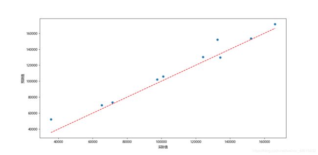
如上图所示,绘制了有关模型在测试集上的预测值和实际值的散点图,该散点图可以用来衡量预测值与实际值之间的距离差异。如果两者非常接近,那么得到的散点图一定会在对角线附近微微波动。从上图的结果来看,大部分的散点都落在对角线附近,说明模型的预测效果还是不错的。