R语言作图——Beeswarm plot(蜜蜂图)
原创:黄小仙
今天…
当小仙又打下"今天"这两个字的时候,小时候每天一篇日记的恐惧好像又回来了,过去这么久,我的文学功底果然没有一点长进!
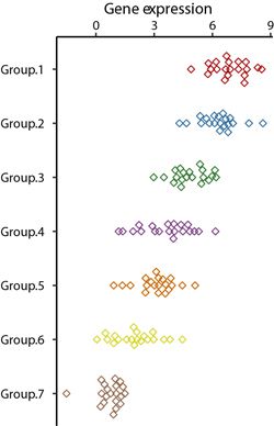
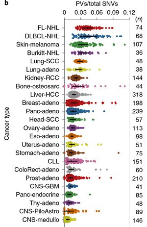
今天给大家分享的图来自于Nature Biotechnology上的一篇文章。
Nature系列的文章就不用多说了,无数科研人心中的神刊,一篇Nature文章需要耗费大量的心血和经费。不过小仙想提醒大家一下,当你中了Nature,除了高兴之外还要留意一下,文章发表还要再花一笔巨款。如果选择OA发表,版面费是€9500,换成人民币要66880元,不得不说这是个很吉利的数字啊,哈哈。有意思的是,Nature官方也给了解释,为什么他们的版面费会比一般的期刊贵这么多,大概就是他们收到的稿件太多,拒稿花费了大量的精力。小仙只有一个评价,暴利且傲娇。希望有一天咱们国内也能有个这样的期刊。
回归正题,要模仿的图如下:
Step1. 绘图数据的准备
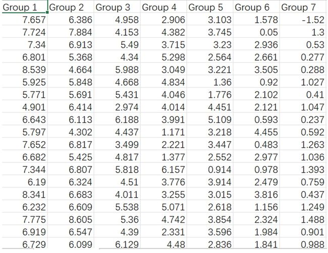
首先还是要把你想要绘图的数据调整成R语言可以识别的格式, 在excel中保存成csv格式。
数据的格式如下图:
Step2. 绘图数据的读取
data <- read.csv(“your file path”, header = T)
Step3.绘图所需package的调用
library(reshape2)
library(ggplot2)
library(ggbeeswarm)  ## 调用之前先安装install.packages("ggbeeswarm")
Step4.绘图
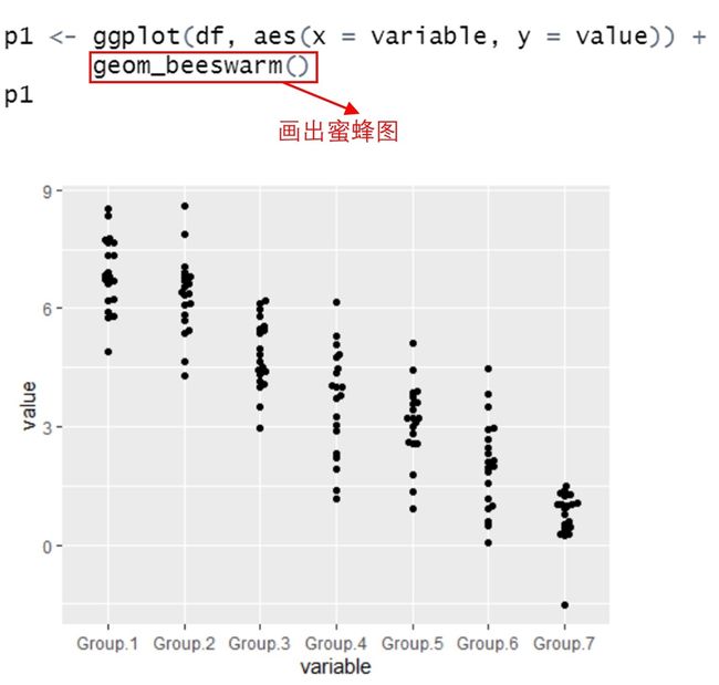
先画出普通的蜜蜂图
df <- melt(data) # 宽数据变成长数据
p1 <- ggplot(df, aes(x = variable, y = value)) +
      geom_beeswarm()
p1
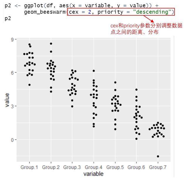
调整点的分布
p2 <- ggplot(df, aes(x = variable, y = value)) +
      geom_beeswarm(cex = 2, priority = "descending")
p2
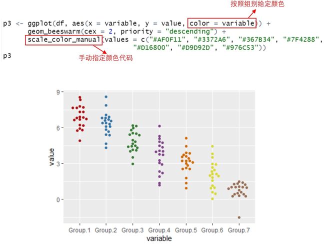
手动指定颜色
p3 <- ggplot(df, aes(x = variable, y = value, color = variable)) +
      geom_beeswarm(cex = 2, priority = "descending") +
      scale_color_manual(values = c("#AF0F11", "#3372A6", "#367B34", "#7F4288",
                                "#D16800", "#D9D92D", "#976C53"))
p3
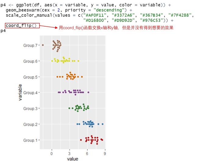
转换x轴和y轴
p4 <- ggplot(df, aes(x = variable, y = value, color = variable)) +
  geom_beeswarm(cex = 2, priority = "descending") +
  scale_color_manual(values = c("#AF0F11", "#3372A6", "#367B34", "#7F4288",
                                "#D16800", "#D9D92D", "#976C53")) +
  coord_flip()
p4
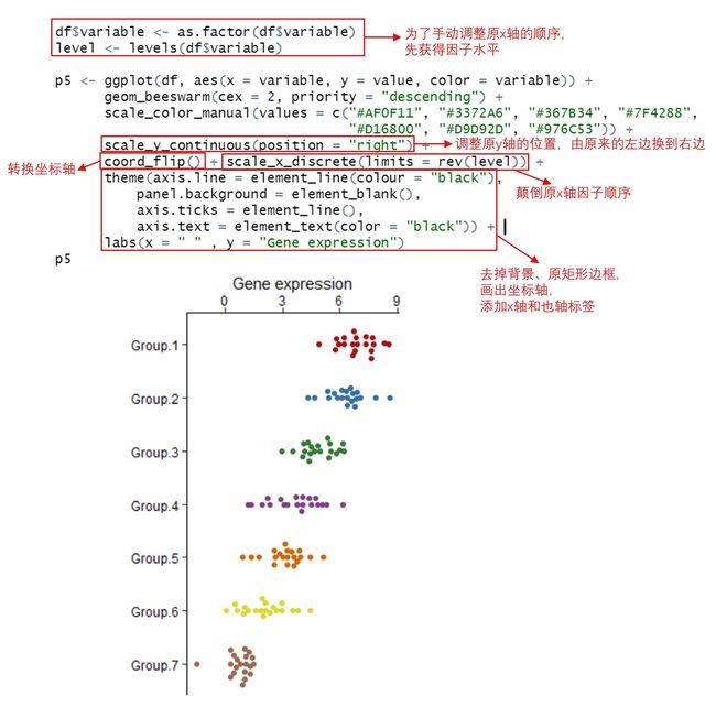
手动调整x轴和y轴
df$variable <- as.factor(df$variable)
level <- levels(df$variable)

p5 <- ggplot(df, aes(x = variable, y = value, color = variable)) +
      geom_beeswarm(cex = 2, priority = "descending") +
      scale_color_manual(values = c("#AF0F11", "#3372A6", "#367B34", "#7F4288",
                                    "#D16800", "#D9D92D", "#976C53")) +
      scale_y_continuous(position = "right") +
      coord_flip() + scale_x_discrete(limits = rev(level)) +
      theme(axis.line = element_line(colour = "black"),
          panel.background = element_blank(),
          axis.ticks = element_line(),
          axis.text = element_text(color = "black")) +
      labs(x = " " , y = "Gene expression")
p5
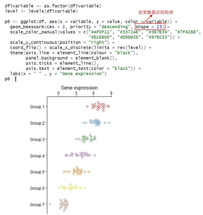
改变点的形状
df$variable <- as.factor(df$variable)
level <- levels(df$variable)

p6 <- ggplot(df, aes(x = variable, y = value, color = variable)) +
  geom_beeswarm(cex = 2, priority = "descending", shape = 23) +
  scale_color_manual(values = c("#AF0F11", "#3372A6", "#367B34", "#7F4288",
                                "#D16800", "#D9D92D", "#976C53")) +
  scale_y_continuous(position = "right") +
  coord_flip() + scale_x_discrete(limits = rev(level)) +
  theme(axis.line = element_line(colour = "black"),
        panel.background = element_blank(),
        axis.ticks = element_line(),
        axis.text = element_text(color = "black")) +
  labs(x = " " , y = "Gene expression")
p6
通过EPS导出的高清图