前言
demo地址
由于我电脑一直没搞好as,(主要是Android sdk的问题),所以用的vs开发学习,而且vs相比as轻量好多。
vs的配置看这里,而且还有一个好处是相对于有很多嵌套的flutter而言,他会自动在添加尾注,比较容易找嵌套。如图
as安装好了,我的电脑一直没装好是因为我曾经改了本地电脑host文件,把下载sdk的网址给重定向了。改回来按照挂网下载,一步一步就好了。修改hosts方法
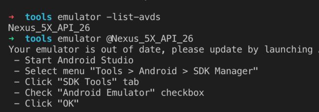
mac电脑脚本启动安卓模拟器
每次看安卓效果,还需要先启动as,太麻烦。接下来只需要用脚本就行了
//进入Android tools目录
cd ~/Android/sdk1/android-sdk-macosx/tools
//查看模拟器列表
 emulator -list-avds
Nexus_5X_API_26
//启动模拟器
 emulator @Nexus_5X_API_26
mac电脑脚本启动simulator模拟器
open -a Simulator
至于选择模拟器列表,我目前还不清楚,有知道的小伙伴麻烦告知一下
vscode多个模拟器选择
ps 这篇文章是针对初学者,先简单上手,不会每个讲的很细。
正文
常用组件的思维导图
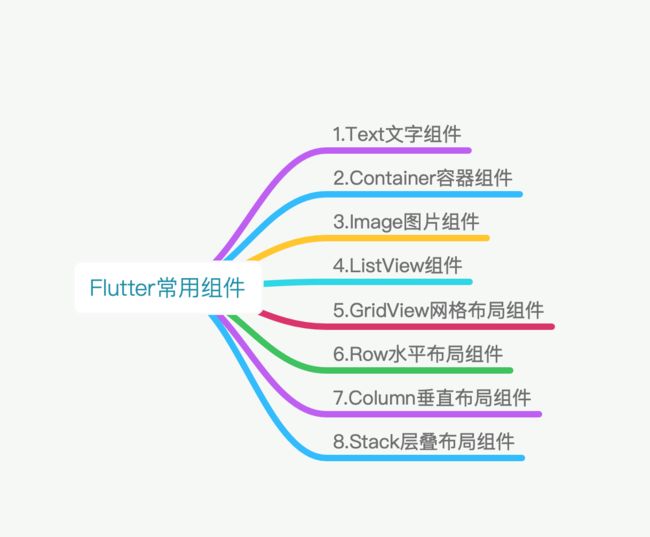
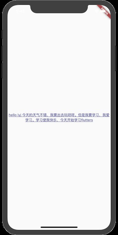
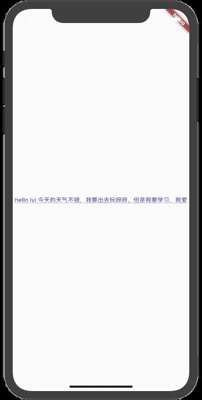
1.Text文字组件
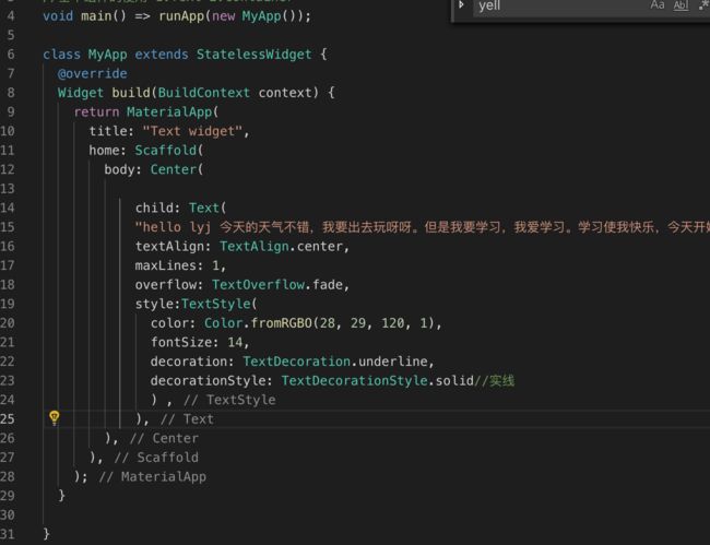
demo代码
import 'package:flutter/material.dart';

//基本组件的使用 1.Text 2.Container
void main() => runApp(new MyApp());

class MyApp extends StatelessWidget {
  @override
  Widget build(BuildContext context) {
    return MaterialApp(
      title: "Text widget",
      home: Scaffold(
        body: Center(
            child: Text(
            "hello lyj 今天的天气不错,我要出去玩呀呀。但是我要学习,我爱学习。学习使我快乐,今天开始学习flutters",
            textAlign: TextAlign.center,
            // maxLines: 1,
            // overflow: TextOverflow.ellipsis,
            style:TextStyle(
              color: Color.fromRGBO(28, 29, 120, 1),
              fontSize: 14,
              decoration: TextDecoration.underline,
              decorationStyle: TextDecorationStyle.solid//实线
              ) ,
            ),


        ),
      ),
    );
  }

}
效果图
StatefulWidget: 具有可变状态的窗口部件,也就是你在使用应用的时候就可以随时变化,比如我们常见的进度条,随着进度不断变化。
StatelessWidget:代表只有一种状态的组件,不可变状态窗口部件,也就是你在使用时不可以改变,比如固定的文字(写上后就在那里了,死也不会变了)。
在Widget组件中都是通过build方法来描述自己的内部结构。这里的build表示构建MyApp中使用的是MaterialApp的系统组件。
home标签的值:Scaffold是Material library中提供的一个组件,我们可以在里面设置导航栏、标题和包含主屏幕widget树的body属性。可以看到这里是在页面上添加了AppBar和一个Text。
Center是一个可以把子组件放在中心的组件
常用属性
TextAlign属性
center: 文本以居中形式对齐
left:左对齐,经常使用,让文本居左进行对齐,效果和start一样。
right:右对齐,使用频率也不算高。
start:以开始位置进行对齐,类似于左对齐。
end: 以为本结尾处进行对齐,不常用。有点类似右对齐.
maxLines属性
顾名思义就是行数了,如果不写就是多行了
overflow属性
overflow属性是用来设置文本溢出时,如何处理,它有下面几个常用的值供我们选择。
- clip:直接切断,剩下的文字就没有了。
- ellipsis:在后边显示省略号,这个在工作中经常使用。
fade: 溢出的部分会进行一个渐变消失的效果,当然是上线的渐变,不是左右的哦。
其中fade效果如图
 fade效果
style属性
常用的有
fontSize大小Color颜色fontWeight加粗之类fontFamily字体类别 类似于ios中fontName关于自定义字体 这里decoration装饰字体,可以配置下划线、删除线等等,一般和'decorationStyle'配置使用,例如demo
属性比较多,可以查看api https://docs.flutter.io/flutter/painting/TextStyle-class.html
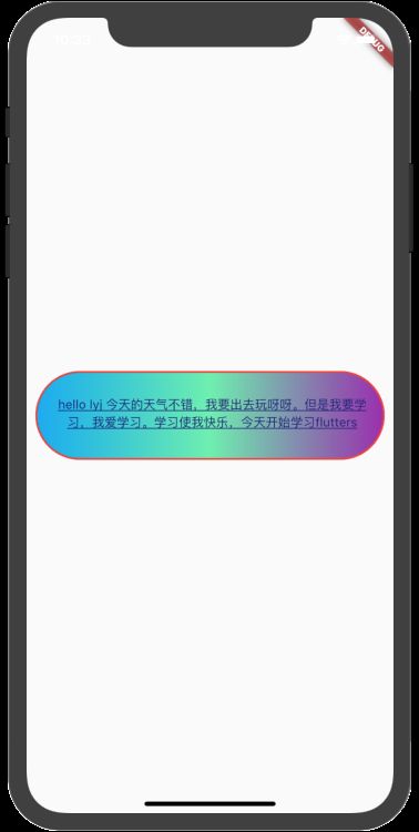
2.Container组件
Container 可让您创建矩形视觉元素。container 可以装饰为一个BoxDecoration, 如 background、一个边框、或者一个阴影。 Container 也可以具有边距(margins)、填充(padding)和应用于其大小的约束(constraints)。container类似于html中的div
demo代码
  import 'package:flutter/material.dart';

//基本组件的使用 1.Text 2.Container
void main() => runApp(new MyApp());

class MyApp extends StatelessWidget {
  @override
  Widget build(BuildContext context) {
    return MaterialApp(
      title: "Text widget",
      home: Scaffold(
        body: Center(
          child: Container(
            child: Text(
            "hello lyj 今天的天气不错,我要出去玩呀呀。但是我要学习,我爱学习。学习使我快乐,今天开始学习flutters",
            textAlign: TextAlign.center,
            // maxLines: 1,
            // overflow: TextOverflow.ellipsis,
            style:TextStyle(
              color: Color.fromRGBO(28, 29, 120, 1),
              fontSize: 14,
              decoration: TextDecoration.underline,
              decorationStyle: TextDecorationStyle.solid//实线
              ) ,
            ),
            alignment: Alignment.center,
            width: 500,
            height: 100,
            // color: Colors.red,
            // padding: const EdgeInsets.all(10.0),
            padding: const EdgeInsets.fromLTRB(10, 5, 5, 10),//内编剧
            margin: const EdgeInsets.all(10.0),//外边距
            decoration: BoxDecoration(
              gradient: const LinearGradient(
                colors: [Colors.lightBlue,Colors.greenAccent,Colors.purple]
              ),
              border: Border.all(color: Colors.red,width: 2),
              borderRadius: BorderRadius.circular(50)
            ),
          )
        ),
      ),
    );
  }
}
效果图
常用属性
alignment属性
bottomCenter:下部居中对齐。
botomLeft: 下部左对齐。
bottomRight:下部右对齐。
center:纵横双向居中对齐。
centerLeft:纵向居中横向居左对齐。
centerRight:纵向居中横向居右对齐。
topLeft:顶部左侧对齐。
topCenter:顶部居中对齐。
topRight: 顶部居左对齐。
width和height设置宽和高;color设置背景色
padding内编剧
常用的方法有
-
EdgeInsets.all(10.0)标识上下左右都是10 -
EdgeInsets.fromLTRB(value1,value2,value3,value4)可以满足我们的需求,LTRB分别代表左、上、右、下
margin外边距用法类似于padding,可以看demo,有外边距
decoration修饰器,主要的功能是设置背景和边框,例如demo添加了一个红色的边框以及渐变的颜色(需要注意的是如果你设置了decoration,就不要再设置color属性了,因为这样会冲突)
3. Image组件
放置图片的组件
demo
import 'package:flutter/material.dart';

//3.iamge
void main() => runApp(new MyApp());

class MyApp extends StatelessWidget {
  @override
  Widget build(BuildContext context) {
    return MaterialApp(
      title: "Text widget",
      home: Scaffold(
        body: Center(
            child: ListView(
          children: [
            Container(
              child: Image.network(
                "https://timgsa.baidu.com/timg?image&quality=80&size=b9999_10000&sec=1555747523962&di=a1c0b1b4f8561a79e5dcb4a7409b022c&imgtype=0&src=http%3A%2F%2Fp0.ssl.qhimg.com%2Ft01c3f5bf72e7d1ac67.png",
                scale: 1.0,
                fit: BoxFit.contain,
                color: Colors.greenAccent,
                colorBlendMode: BlendMode.darken,
                repeat: ImageRepeat.repeatY,
              ),
              // alignment: Alignment.center,
              width: 500,
              height: 400,
              color: Colors.red,
              // padding: const EdgeInsets.all(10.0),
            ),
             Container(
              child: Image.asset(
                'images/Apr-27-2019 16-03-03.gif',
                scale: 1.0,
              ),
              // padding: const EdgeInsets.all(10.0),
            ),
          ],
        )),
      ),
    );
  }
}
效果图
加入图片的几种方式
Image.asset:加载资源图片,就是加载项目资源目录中的图片,加入图片后会增大打包的包体体积,用的是相对路径。相当于ios工程中的Assets.xcassets。Image.network:网络资源图片,意思就是你需要加入一段http://xxxx.xxx的这样的网络路径地址。相当于ios中的常用的sdwebimageImage.file:加载本地图片,就是加载本地文件中的图片,这个是一个绝对路径,跟包体无关。Image.memory: 加载Uint8List资源图片
加载资源图片 需要用到pubspec.yaml文件
如果想配置项目资源文件,就需要使用pubspec.yaml文件,需要把资源文件在这里声明。
比如在项目根目录下新建了一个images文件夹,文件夹下面放了一个图片,图片的名称叫做Apr-27-2019 16-03-03.gif,那我们在pubspec.yaml文件里就要写如下代码进行声明。
assets:
   - images/Apr-27-2019 16-03-03.gif
代码里
Image.asset(
                'images/Apr-27-2019 16-03-03.gif',
                scale: 1.0,
                fit: BoxFit.fill,
              )
fit属性
fit属性可以控制图片的拉伸和挤压,这些都是根据图片的父级容器来的
这里和ios中的UIimageview.contentmode比较
BoxFit.fill:全图显示,图片会被拉伸,并充满父容器。 相当于UIViewContentModeScaleToFillBoxFit.contain:全图显示,显示原比例,可能会有空隙。UIViewContentModeScaleAspectFitBoxFit.cover:显示可能拉伸,可能裁切,充满(图片要充满整个容器,还不变形)。UIViewContentModeScaleAspectFillBoxFit.fitWidth:宽度充满(横向充满),显示可能拉伸,可能裁切。BoxFit.fitHeight:高度充满(竖向充满),显示可能拉伸,可能裁切。BoxFit.scaleDown:效果和contain差不多,但是此属性不允许显示超过源图片大小,可小不可大。
colorBlendMode混合模式,flutter有一个可以和颜色color配合使用,可以让图片改变颜色
colorBlendMode混合模式 很多可以看官方api,这个和ios中CGBlendMode的文档很类似
repeat图片重复
- ImageRepeat.repeat : 横向和纵向都进行重复,直到铺满整个画布。
- ImageRepeat.repeatX: 横向重复,纵向不重复。
- ImageRepeat.repeatY:纵向重复,横向不重复。
demo中用的就是纵向重复
4. ListView组件
相当于ios中的tableview
demo
import 'package:flutter/material.dart';

//3.listView 相当于tableview 纵向
void main() => runApp(new MyApp());

class MyApp extends StatelessWidget {
  @override
  Widget build(BuildContext context) {
    return MaterialApp(
      title: "Text widget",
      home: Scaffold(
        appBar: AppBar(
          title: Text('listview'),
        ),
        body:  ListView(

          children: [
            ListTile(
              title: Text('access_time'),
              leading: Icon(Icons.access_time),
            ),
            ListTile(
              leading: Icon(Icons.account_balance),
              title: Text('account_balance'),
            ),
            new Image.network(
                'https://timgsa.baidu.com/timg?image&quality=80&size=b9999_10000&sec=1555747523962&di=a1c0b1b4f8561a79e5dcb4a7409b022c&imgtype=0&src=http%3A%2F%2Fp0.ssl.qhimg.com%2Ft01c3f5bf72e7d1ac67.png'
                ),
            new Image.network(
                'https://ss2.bdstatic.com/70cFvnSh_Q1YnxGkpoWK1HF6hhy/it/u=4214474476,1941437198&fm=26&gp=0.jpg'
                ),

          ],
        ),
      ),
    );
  }
}
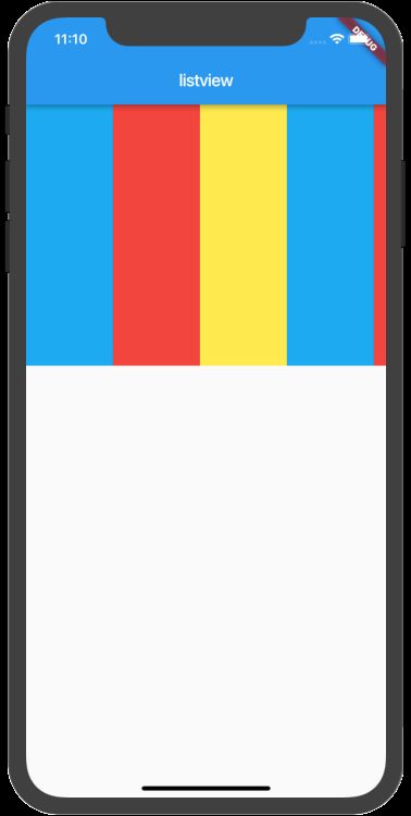
效果图
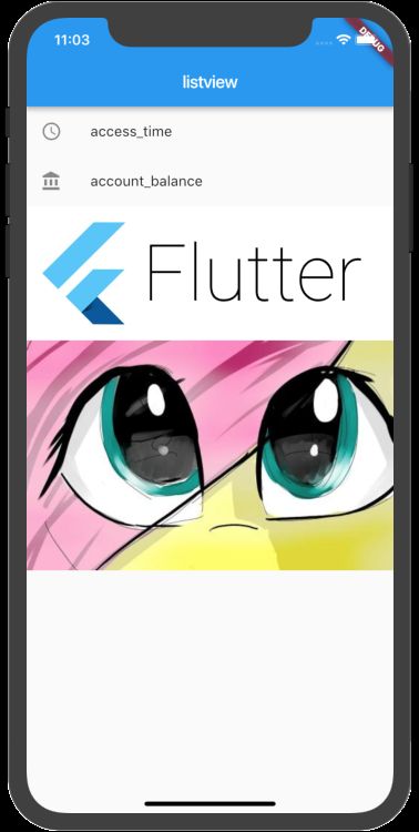
在flutter中如果可以存放一个元素的话一般是child,可以存放多个的话为children,所以ListView用children来初始化一个数组demo中用了官方的ListTile类似于ios中提供的原生官方cell。
横向列表只需要修改属性scrollDirection属性
Axis.horizontal:横向滚动或者叫水平方向滚动。
Axis.vertical:纵向滚动或者叫垂直方向滚动。
例如
import 'package:flutter/material.dart';

//3.listView 横向 优化代码
void main() => runApp(new MyApp());

/* mylist */
class Mylist extends  StatelessWidget{

  @override
  Widget build(BuildContext context) {

    return ListView(
            scrollDirection: Axis.horizontal,
          children: [
            Container(
              width: 100,
              color: Colors.lightBlue,
            ),
            Container(
              width: 100,
              color: Colors.red,
            ),
            Container(
              width: 100,
              color: Colors.yellow,
            ), Container(
              width: 100,
              color: Colors.lightBlue,
            ),
            Container(
              width: 100,
              color: Colors.red,
            ),
            Container(
              width: 100,
              color: Colors.yellow,
            )
          ],
        );
  }
}

class MyApp extends StatelessWidget {
  @override
  Widget build(BuildContext context) {
    return MaterialApp(
      title: "Text widget",
      home: Scaffold(
        appBar: AppBar(
          title: Text('listview'),
        ),
        body: Container(
          height:300 ,
          child: Mylist()
        )
      ),
    );
  }
}
在这个
横向demo中把初始化的listview单独拿出来,可以减少代码的嵌套。
5. GridView组件
使用GridView将widget放置为二维列表。 GridView提供了两个预制list,或者您可以构建自定义网格。当GridView检测到其内容太长而不适合渲染框时,它会自动滚动。类似于ios中collectionView
import 'package:flutter/material.dart';

//4.GridView
void main () => runApp(MyApp());

class MYGridView extends StatelessWidget{
  @override
  Widget build(BuildContext context) {
    // TODO: implement build
    return GridView.count(
          padding:EdgeInsets.all(2),//外部容器的边距
          crossAxisCount: 3,
          crossAxisSpacing: 10,
          mainAxisSpacing: 5.0,
          childAspectRatio: 2,
          children: [
            Container(
              color: Colors.red,
              child: Text(
                '我是李雁军1',
              textAlign: TextAlign.center,),
              alignment: Alignment.center,
            ),
            Container(
              color: Colors.red,
              child: Text('我是李雁军'),
            ),
            Container(
              color: Colors.red,
              child: Text('我是李雁军'),
            ),
            Container(
              color: Colors.yellow,
              child: Text('我是李雁军'),
            ),
            Container(
              color: Colors.yellow,
              child: Text('我是李雁军'),
            ),
            Container(
              color: Colors.yellow,
              child: Text('我是李雁军'),
            ),
            Container(
              color: Colors.blue,
              child: Text('我在中国'),
            )
          ],
          );
  }
}

class MyGridView2 extends StatelessWidget {
  @override
  Widget build(BuildContext context) {
    // TODO: implement build
    return GridView(
      gridDelegate: SliverGridDelegateWithFixedCrossAxisCount(
        crossAxisCount: 3,
        crossAxisSpacing: 10,
        mainAxisSpacing: 5.0,
        childAspectRatio: 0.7
      ),
      children: [
         Container(
              color: Colors.red,
              child: Text(
                '我是李雁军1',
              textAlign: TextAlign.center,),
              alignment: Alignment.center,
            ),
            Container(
              color: Colors.red,
              child: Text('我是李雁军'),
            ),
            Container(
              color: Colors.red,
              child: Text('我是李雁军'),
            ),
            Container(
              color: Colors.yellow,
              child: Text('我是李雁军'),
            ),
            Container(
              color: Colors.yellow,
              child: Text('我是李雁军'),
            ),
            Container(
              color: Colors.yellow,
              child: Text('我是李雁军'),
            ),
            Container(
              color: Colors.blue,
              child: Text('我在中国'),
            )
      ],
    );
  }
}


class MyApp extends StatelessWidget {

  @override
  Widget build(BuildContext context) {
    return MaterialApp(
      title: "GridView",
      home: Scaffold(
        appBar: AppBar(
          title: Text('GridView') ,
        ),
        body:MyGridView2()
      ),
    );
  }

}
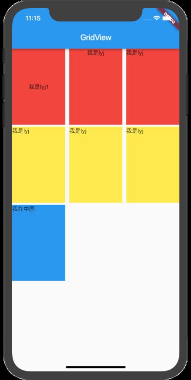
使用GridView将widget放置为二维列表。 GridView提供了两个预制list,或者您可以构建自定义网格。当GridView检测到其内容太长而不适合渲染框时,它会自动滚动。
- 在网格中放置widget
- 检测列内容超过渲染框时自动提供滚动
- 构建您自己的自定义grid,或使用一下提供的grid之一:
GridView.count允许您指定列数GridView.extent允许您指定项的最大像素宽度
demo中用了GridView.count和 自定义两个方法
常用属性
padding:表示内边距,这个小伙伴们应该很熟悉。crossAxisCount:网格的列数,相当于一行放置的网格数量。crossAxisSpacing:表示每个网格横向之间的间距。mainAxisSpacing:表示网格纵向的间隔scrollDirection:类似于ListView也可以设置方向。不过方向变了只会,相应的crossAxisSpacing和mainAxisSpacing对调一下childAspectRatio:宽高比,这个值的意思是宽是高的多少倍,如:2.0表示款式高的2倍。
6.Row水平布局组件
Row表示水平布局,水平放置几个组件
import 'package:flutter/material.dart';

//6.Row
void main() => runApp(MyApp());

class MyRow extends StatelessWidget {
  @override
  Widget build(BuildContext context) {
    // TODO: implement build
    return Row(
      children: [
        Expanded(
            child: RaisedButton(
                onPressed: () {
                  print('点击');
                },
                color: Colors.redAccent,
                child:  Text('红色按钮'))),
        Expanded(
            child: RaisedButton(
                onPressed: () {
                  print('点击');
                },
                color: Colors.yellow,
                child:  Text('黄色按钮'))),
        Expanded(
            child: RaisedButton(
                onPressed: () {
                  print('点击');
                },
                color: Colors.blueAccent,
                child:  Text('蓝色按钮'))),
        Expanded(
            child: RaisedButton(
                onPressed: () {
                  print('点击');
                },
                color: Colors.greenAccent,
                child: new Text('绿色按钮')))
      ],
    );
  }
}

//第一列按照大小 剩下的平均
class MyRow1 extends StatelessWidget {
  @override
  Widget build(BuildContext context) {
    // TODO: implement build
    return Row(
      children: [
         RaisedButton(
                onPressed: () {
                  print('点击');
                },
                color: Colors.redAccent,
                child:  Text('红色按钮hahhahh')),
        Expanded(
            child: RaisedButton(
                onPressed: () {
                  print('点击');
                },
                color: Colors.yellow,
                child:  Text('黄色按钮'))),
        Expanded(
            child: RaisedButton(
                onPressed: () {
                  print('点击');
                },
                color: Colors.blueAccent,
                child:  Text('蓝色按钮'))),
       Expanded(
            child: RaisedButton(
                onPressed: () {
                  print('点击');
                },
                color: Colors.pink,
                child:  Text('红色按钮')))

      ],
    );
  }
}

class MyApp extends StatelessWidget {
  @override
  Widget build(BuildContext context) {
    return MaterialApp(
      title: "GridView",
      home: Scaffold(
          appBar: AppBar(
            title: Text('Row横向布局'),
          ),
          body: MyRow()),
    );
  }
}
效果图
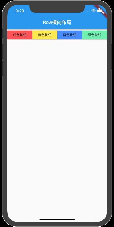
这里介绍一下
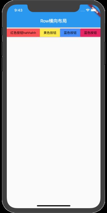
Expanded组件,Expanded会把平分Expanded所占的空间,demo里MyRow就是平分4个按钮
如果不放在Expanded里面,就会按照内容撑开,如MyRow1。效果
7.Column垂直布局组件
相对于Row组件,Column是垂直方向的布局
import 'package:flutter/material.dart';

//6.Column
void main() => runApp(MyApp());

class MyColumn extends StatelessWidget {
  @override
  Widget build(BuildContext context) {
    // TODO: implement build
    return Column(
      crossAxisAlignment: CrossAxisAlignment.start, //副轴
      mainAxisAlignment: MainAxisAlignment.center, //主轴
      children: [
        Container(
            color: Colors.redAccent,
            height: 60,
            width: MediaQuery.of(context).size.width,
            child: Text('我是lyj,哈哈哈')),
        Container(color: Colors.blue, child: Text('这里是垂直布局'),
         width: MediaQuery.of(context).size.width,
        ),
        Container(color: Colors.yellowAccent, child: Text('今天天气有点小雨,要在家里学习'),
         width: MediaQuery.of(context).size.width

        )
      ],
    );
  }
}


class MyApp extends StatelessWidget {
  @override
  Widget build(BuildContext context) {
    return MaterialApp(
      title: "Column纵向布局1",
      home: Scaffold(
          appBar: AppBar(
            title: Text('Column纵向布局'),
          ),
          body:  MyColumn()
          ),
    );
  }
}s
效果图
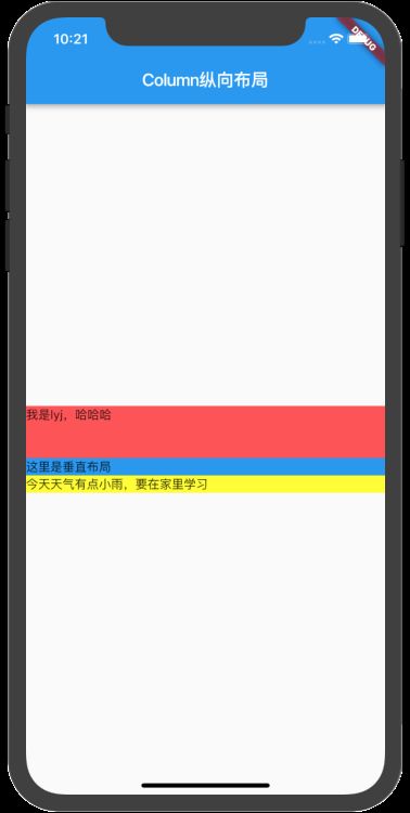
MediaQuery.of(context).size.width表示屏幕的宽度
主轴和副轴的辨识
demo里有mainAxisAlignment属性,意思就是主轴对齐方式,那什么是主轴,什么又是幅轴那。
main轴:如果你用column组件,那垂直就是主轴,如果你用Row组件,那水平就是主轴。
cross轴:cross轴我们称为幅轴,是和主轴垂直的方向。比如Row组件,那垂直就是幅轴,Column组件的幅轴就是水平方向的。
enum MainAxisAlignment {
//将子控件放在主轴的开始位置
start,
//将子控件放在主轴的结束位置
end,
//将子控件放在主轴的中间位置
center,
//将主轴空白位置进行均分,排列子元素,手尾没有空隙
spaceBetween,
//将主轴空白区域均分,使中间各个子控件间距相等,首尾子控件间距为中间子控件间距的一半
spaceAround,
//将主轴空白区域均分,使各个子控件间距相等
spaceEvenly,
}
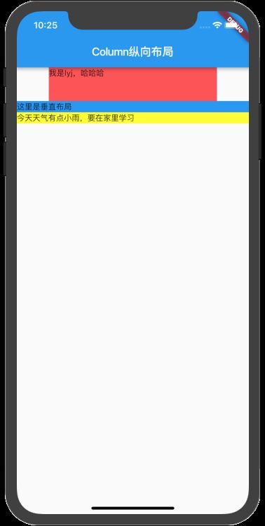
我们把副轴设置为center,主轴设置为start,其中一个宽度设置300,否则看不出效果
crossAxisAlignment: CrossAxisAlignment.center,//副轴
mainAxisAlignment: MainAxisAlignment.start, //主轴
8.Stack层叠布局组件
- 用于与另一个widget重叠的widget
- 子列表中的第一个widget是base widget; 随后的子widget被覆盖在基础widget的顶部
- Stack的内容不能滚动
- 您可以选择剪切超过渲染框的子项
class MyApp extends StatelessWidget {
  @override
  Widget build(BuildContext context) {
var myStack = Stack(
      alignment: const FractionalOffset(0.5, 0.8),
      children: [
        CircleAvatar(
          backgroundColor: Colors.redAccent,
          radius: 100,
        ),
         Container(
            decoration: new BoxDecoration(
              color: Colors.lightBlue,
            ),
            padding: EdgeInsets.all(5.0),
            child: new Text('李雁军'),
          )
      ],
    );

    return MaterialApp(
      title: "stack布局",
      home: Scaffold(
          appBar: AppBar(
            title: Text('stack布局'),
          ),
          // body: Center(child: Mystack1())),
       body: Center(child: myStack)),
    );
  }
}
效果图
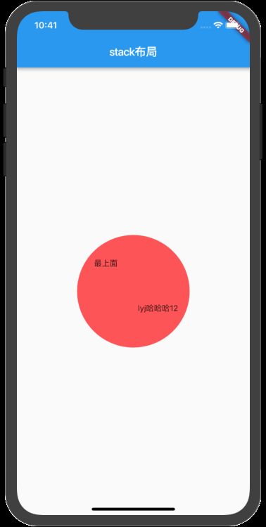
如果一共有2个组件,可以使用
alignment属性,标识第二个相对于第一个位置,数值都是从0到1。如demo中的myStack,水平居中,垂直考下些
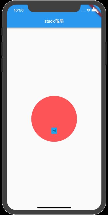
如果一共有2个以上组件,可以使用
Positioned组件包含子组件,如Mystack1
Positioned组件的属性
bottom: 距离层叠组件下边的距离left:距离层叠组件左边的距离top:距离层叠组件上边的距离right:距离层叠组件右边的距离width: 层叠定位组件的宽度height: 层叠定位组件的高度
综合练习(官方demo)
import 'package:flutter/material.dart';

void main() => runApp(MaterialApp(
      title: '官网的布局',
      home: MyHomeScreen(),
    ));

//屏幕部分
//1.第二行
class SecondLine extends StatelessWidget {
  @override
  Widget build(BuildContext context) {
    return Container(
      // color: Colors.blue[300],
      padding: const EdgeInsets.all(32.0),
      child: Row(
        children: [
          Expanded(
            child: Column(
              crossAxisAlignment: CrossAxisAlignment.start,
              children: [
                Container(
                    padding: const EdgeInsets.only(bottom: 8),
                    child: Text('Oeschinen Lake 重复的多写几句看看重复的多写几句看看重复的多写几句看看',
                        style: TextStyle(
                            fontWeight: FontWeight.bold, color: Colors.black))),
                Text('Kandersteg, Switzerland',
                    style: TextStyle(
                        fontWeight: FontWeight.bold, color: Colors.grey[500])),
              ],
            ),
          ),
          Icon(
            Icons.star,
            color: Colors.red[500],
          ),
          new Text('41'),
        ],
      ),
    );
  }
}

//第三行
class ThirdLine extends StatelessWidget {
  @override
  Widget build(BuildContext context) {
    MaterialButton buildButtonColumn1(IconData icon, String label) {
      Color color = Theme.of(context).primaryColor;
      return MaterialButton(
        onPressed: () => {print('$label被点击')},
        child: Column(
          mainAxisAlignment: MainAxisAlignment.center,
          children: [
            Icon(icon, color: color),
            Container(
              margin: const EdgeInsets.only(top: 8.0),
              child: new Text(label,
                  style: TextStyle(
                    fontSize: 12.0,
                    fontWeight: FontWeight.w400,
                    color: color,
                  )),
            )
          ],
        ),
      );
    }

    return Container(
      padding: const EdgeInsets.fromLTRB(40, 10, 40, 10),
      // color: Colors.red,
      child: Row(
        mainAxisAlignment: MainAxisAlignment.spaceEvenly,
        children: [
          Expanded(
            child: Container(
              // color: Colors.blueGrey,
              child: buildButtonColumn1(Icons.call, 'CALL'),
            ),
          ),
          Expanded(
            child: Container(
              // color: Colors.yellow,
              child: buildButtonColumn1(Icons.near_me, 'ROUTE'),
            ),
          ),
          Expanded(
            child: Container(
              // color: Colors.pink,
              child: buildButtonColumn1(Icons.share, 'SHARE'),
            ),
          )
        ],
      ),
    );
  }
}

class FourLine extends StatelessWidget {
  @override
  Widget build(BuildContext context) {
    return Container(
      padding: const EdgeInsets.all(32.0),
      child: Text(
        '''
Lake Oeschinen lies at the foot of the Blüemlisalp in the Bernese Alps. Situated 1,578 meters above sea level, it is one of the larger Alpine Lakes. A gondola ride from Kandersteg, followed by a half-hour walk through pastures and pine forest, leads you to the lake, which warms to 20 degrees Celsius in the summer. Activities enjoyed here include rowing, and riding the summer toboggan run.
        ''',
        style: TextStyle(
            fontSize: 12.0, fontWeight: FontWeight.normal, color: Colors.grey),
      ),
    );
  }
}

class MyHomeScreen extends StatelessWidget {
  @override
  Widget build(BuildContext context) {
    // TODO: implement build
    return Scaffold(
        appBar: AppBar(
          title: Text('首页'),
        ),
        body: ListView(
          children: [
             Image.network(
                  'https://upload-images.jianshu.io/upload_images/5157505-d19846f019de6e3c.png?imageMogr2/auto-orient/strip%7CimageView2/2/w/1000',
                  width: MediaQuery.of(context).size.width,
                  height: 200,
                  scale: 1,
                ),
                SecondLine(),
                ThirdLine(),
                FourLine()
          ],
        ));
  }
}
效果
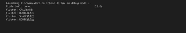
官方用的Column,我这里用的ListView和MaterialButton实现可以滑动以及点击的效果。