【CSS基础】选择器进阶+背景属性+元素显示模式+三大特性
目录
-
- 1.CSS的复合选择器
-
- 1.1 后代选择器
- 1.2 子代选择器
- 1.3 并集选择器
- 1.4 交集选择器
- 1.5 hover伪类选择器
- 1.6 复合选择器总结
- 2.背景相关属性
-
- 2.1 背景颜色
- 2.2 背景图片
- 2.3 背景平铺
- 2.4 背景位置
- 2.5 背景相关属性的连写形式
- 3.CSS 的元素显示模式
-
- 3.1 块级元素
- 3.2 行内元素
- 3.3 行内块元素
- 3.4 元素显示模式总结
- 3.5 元素显示模式转换
- 3.6 HTML嵌套规范注意点
- 3.7 居中方法总结
- 4.CSS三大特性
-
- 4.1 继承性
- 4.2 层叠性
- 4.3 优先级
- 5.综合案例
1.CSS的复合选择器
1.1 后代选择器
作用:
- 根据 HTML 标签的嵌套关系,选择父元素后代中满足条件的元素
选择器语法:
元素1 元素2 { 样式声明 }
结果:
- 在选择器1所找到标签的后代(儿子、孙子、重孙子…)中,找到满足选择器2的标签,设置样式
注意点:
-
后代包括:儿子、孙子、重孙子……
-
后代选择器中,选择器与选择器之前通过空格隔开
例如:
ul li { 样式声明 } /* 选择 ul 里面所有的 li 标签元素 */
- 元素1 和 元素2 中间用 空格 隔开
- 元素1 是父级,元素2 是子级,最终选择的是 元素2,即:元素1 是不会生效样式的
- 元素2 可以是儿子,也可以是孙子等,只要是 元素1 的后代即可
- 元素1 和 元素2 可以是任意基础选择器
小案例:
DOCTYPE html>
<html lang="en">
<head>
    <meta charset="UTF-8">
    <meta http-equiv="X-UA-Compatible" content="IE=edge">
    <meta name="viewport" content="width=device-width, initial-scale=1.0">
    <title>Documenttitle>
    <style>
        /* 找到div的儿子p设置文字颜色是红色 */
        /* 父选择器   后代选择器 {} */
        div p {
            color: red;
        }
    style>
head>
<body>

    <p>这是一个p标签p>
    <div>
        <p>这是div的儿子pp>
    div>
body>
html>

1.2 子代选择器
子元素选择器(子选择器)只能选择作为某元素的最近一级子元素,简单理解就是选亲儿子元素。
注意:是最近一级而并非最近一个!
语法:
元素1>元素2 { 样式声明 }
上述语法表示选择元素1 里面的所有直接后代(子元素)元素2。
例如:
div>p { 样式声明 } /* 选择 div 里面所有最近一级 p 标签元素 */
- 元素1 和 元素2 中间用 大于号 隔开
- 元素1 是父级,元素2 是子级,最终选择的是元素2,即元素1 是不会生效样式的
- 元素2 必须是亲儿子,其孙子、重孙之类都不归他管,你也可以叫:亲儿子选择器
DOCTYPE html>
<html lang="en">
<head>
<meta charset="UTF-8">
<meta http-equiv="X-UA-Compatible" content="IE=edge">
<meta name="viewport" content="width=device-width, initial-scale=1.0">
<title>Documenttitle>
<style>
/* 空格隔开的是后代, 儿子,孙子,重孙子 */
/* div a {
color: red;
} */
/* 只想选中儿子a */
/* div的儿子a文字颜色是红色 */
div>a {
color: red;
}
style>
head>
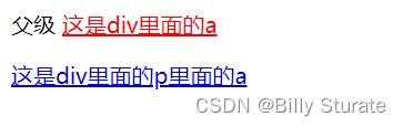
<body>
<div>
父级
<a href="#">这是div里面的aa>
<p>
<a href="#">这是div里面的p里面的aa>
p>
div>
body>
html>
1.3 并集选择器
作用:
- 同时选择多组标签,设置相同的样式,通常用于集体声明
选择器语法:
元素1, 元素2, 元素3 { 样式声明 }
元素1,
元素2,
元素3 {
    样式声明
}
/* 推荐写法,编码风格 */
上述语法表示选择元素1、元素2 和 元素3。
注意点:
-
并集选择器中的每组选择器之间通过 , 分隔
-
并集选择器中的每组选择器可以是基础选择器或者复合选择器
-
并集选择器中的每组选择器通常一行写一个,提高代码的可读性
例如:
ul, div { 样式声明 } /* 选择 ul 和 div标签元素 */
- 元素1 和 元素2 中间用逗号隔开(最后一个不加逗号)
- 逗号可以理解为和的意思
- 并集选择器通常用于集体声明
DOCTYPE html>
<html lang="en">
<head>
<meta charset="UTF-8">
<meta http-equiv="X-UA-Compatible" content="IE=edge">
<meta name="viewport" content="width=device-width, initial-scale=1.0">
<title>Documenttitle>
<style>
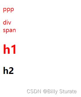
/* p div span h1 文字颜色是红色 */
/* 选择器1, 选择器2 {} */
p,
div,
span,
h1 {
color: red;
}
style>
head>
<body>
<p>pppp>
<div>divdiv>
<span>spanspan>
<h1>h1h1>
<h2>h2h2>
body>
html>
1.4 交集选择器
作用: 选中页面中同时满足多个选择器的标签
选择器语法:
选择器1选择器2 { css }
结果:
- (既又原则)找到页面中既能被选择器1选中,又能被选择器2选中的标签,设置样式
注意点:
-
交集选择器中的选择器之间是紧挨着的,没有东西分隔
-
交集选择器中如果有标签选择器,标签选择器必须写在最前面
DOCTYPE html>
<html lang="en">
<head>
<meta charset="UTF-8">
<meta http-equiv="X-UA-Compatible" content="IE=edge">
<meta name="viewport" content="width=device-width, initial-scale=1.0">
<title>Documenttitle>
<style>
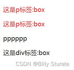
/* p {
color: red;
} */
/* .box {
color: red;
} */
/* 必须是p标签,而且添加了box类 */
p.box {
color: red;
}
/* #dilireba {
color: red;
} */
/* .box1 {
color: green;
} */
style>
head>
<body>
<p class="box box1" id="dilireba">这是p标签:boxp>
<p class="box">这是p标签:boxp>
<p>ppppppp>
<div class="box">这是div标签:boxdiv>
body>
html>
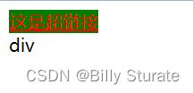
1.5 hover伪类选择器
作用: 选中鼠标悬停在元素上的状态,设置样式
选择器语法:
选择器:hover { css }
DOCTYPE html>
<html lang="en">
<head>
    <meta charset="UTF-8">
    <meta http-equiv="X-UA-Compatible" content="IE=edge">
    <meta name="viewport" content="width=device-width, initial-scale=1.0">
    <title>Documenttitle>
    <style>
        /* 悬停的时候文字颜色是红色 */
        a:hover {
            color: red;
            background-color: green;
        }

        /* 用户鼠标悬停到div的时候, 文字是绿色 */
        div:hover {
            color: green;
        }
    style>
head>
<body>
    <a href="#">这是超链接a>

    <div>divdiv>
body>
html>
1.6 复合选择器总结
| 选择器 | 作用 | 特征 | 使用情况 | 隔开符号及用法 |
|---|---|---|---|---|
| 后代选择器 | 用来选择后代元素 | 可以是子孙后代 | 较多 | 符号是空格 .nav a |
| 子代选择器 | 选择最近一级元素 | 只选亲儿子 | 较少 | 符号是大于 .nav>p |
| 并集选择器 | 选择某些相同样式的元素 | 可以用于集体声明 | 较多 | 符号是逗号 .nav, .header |
| 交集选择器 | 可以确定满足条件的标签 | 可以确定满足条件的标签 | 较多 | 标签连着写 |
| 链接伪类选择器 | 选择不同状态的链接 | 跟链接相关 | 较多 | 重点记住 a{} 和 a:hover 实际开发的写法 |
强调:复合选择器的层级写得越细越好(可读性,可维护性,安全性),同时将复合选择器的层级写得越细,可以提前避免大部分的选择器优先级混乱!
2.背景相关属性
2.1 背景颜色
background-color 属性定义了元素的背景颜色。
background-color: 颜色值;
一般情况下元素背景颜色默认值是 transparent(透明),我们也可以手动指定背景颜色为透明色。
background-color: transparent;
目前 CSS 还支持丰富的渐变色,但是某些浏览器不支持,这里了解即可,具体内容请查阅资料。
注意点:
- 背景颜色默认值是透明: rgba(0,0,0,0) 、transparent
- 背景颜色不会影响盒子大小,并且还能看清盒子的大小和位置,一般在布局中会习惯先给盒子设置背景颜色
DOCTYPE html>
<html lang="en">
<head>
    <meta charset="UTF-8">
    <meta http-equiv="X-UA-Compatible" content="IE=edge">
    <meta name="viewport" content="width=device-width, initial-scale=1.0">
    <title>Documenttitle>
    <style>
        div {
            width: 400px;
            height: 400px;
            /* background-color: pink; */
            /* background-color: #ccc; */
            /* 红绿蓝三原色, a是透明度0-1 */
            /* background-color: rgba(0, 0, 0, 0.5); */
            background-color: rgba(0, 0, 0, .5);
        }
    style>
head>
<body>
    <div>divdiv>
body>
html>

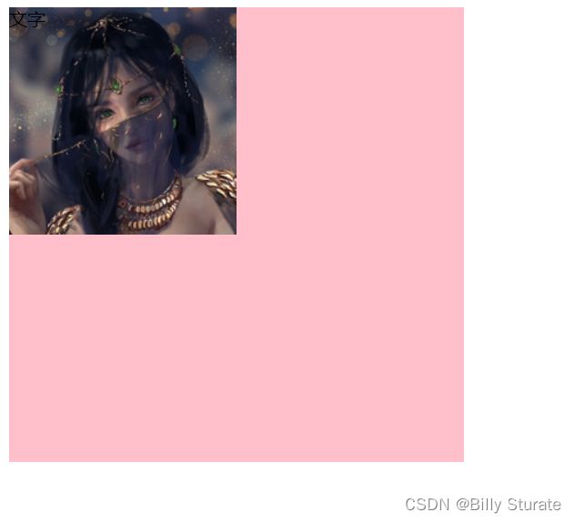
2.2 背景图片
background-image 属性描述了元素的背景图像,实际开发常用于 logo 或者一些装饰性的小图片或者是超大的背景图片, 优点是非常便于控制位置(精灵图也是一种运用场景)。
background-image : none | url(url)
| 参数值 | 作用 |
|---|---|
none |
无背景图(默认的) |
url |
使用绝对或相对地址指定背景图像 |
注意:背景图片后面的地址,千万不要忘记加 URL, 同时里面的路径不要加引号。
DOCTYPE html>
<html lang="en">
<head>
    <meta charset="UTF-8">
    <meta http-equiv="X-UA-Compatible" content="IE=edge">
    <meta name="viewport" content="width=device-width, initial-scale=1.0">
    <title>Documenttitle>
    <style>
        div {
            width: 400px;
            height: 400px;
            background-color: pink;
            background-image: url(./images/1.jpg);
            /* 1、背景图片不平铺 */
            /* background-repeat: no-repeat; */
            /* 2、默认情况下,背景图片是平铺的 */
            /* background-repeat: repeat; */ /* 页面元素既可以添加背景颜色也可以添加背景图片,只不过背景图片区域会覆						盖背景颜色 */
        }
    style>
head>
<body>
    <div>文字div>
body>
html>

2.3 背景平铺
如果需要在 HTML 页面上对背景图像进行平铺,可以使用 background-repeat 属性。
注:平铺可以简单的理解为“重复”。
background-repeat: repeat | no-repeat | repeat-x | repeat-y
| 参数值 | 作用 |
|---|---|
repeat |
背景图像在纵向和横向上平铺(默认的) |
no-repeat |
背景图像不平铺 |
repeat-x |
背景图像在横向上平铺 |
repeat-y |
背景图像在纵向上平铺 |
DOCTYPE html>
<html lang="en">
<head>
    <meta charset="UTF-8">
    <meta http-equiv="X-UA-Compatible" content="IE=edge">
    <meta name="viewport" content="width=device-width, initial-scale=1.0">
    <title>Documenttitle>
    <style>
        div {
            width: 400px;
            height: 400px;
            background-color: pink;
            background-image: url(./images/1.jpg);
            /* background-repeat: repeat; */
            /* 不平铺: 图片只显示一个 */
            background-repeat: no-repeat;
            /* background-repeat: repeat-x; */
            /* background-repeat: repeat-y; */
        }
    style>
head>
<body>
    <div>文字div>
body>
html>
2.4 背景位置
利用 background-position 属性可以改变图片在背景中的位置。
background-position: xm y;
参数代表的意思是:x 坐标 和 y 坐标,可以使用 方位名词 或者 精确单位。
| 参数值 | 说明 |
|---|---|
length |
百分数 | 由浮点数字和单位标识符组成的长度值 |
position |
top | center | bottom | left | rigth 方位名词 |
-
参数是方位名词
- 如果指定的两个值都是方位名词,则两个值前后顺序无关,比如 left top 和 top left 效果一致
- 如果只指定了一个方位名词,另一个值省略,则第二个值默认居中对齐
-
参数是精确单位
- 如果参数值是精确坐标,那么第一个肯定是 x 坐标,第二个一定是 y 坐标
- 如果只指定一个数值,那该数值一定是 x 坐标,另一个默认垂直居中
-
参数是混合单位
- 如果指定的两个值是精确单位和方位名词混合使用,则第一个值是 x 坐标,第二个值是 y 坐标
DOCTYPE html>
<html lang="en">
<head>
    <meta charset="UTF-8">
    <meta http-equiv="X-UA-Compatible" content="IE=edge">
    <meta name="viewport" content="width=device-width, initial-scale=1.0">
    <title>Documenttitle>
    <style>
        div {
            width: 400px;
            height: 400px;
            background-color: pink;
            background-image: url(./images/1.jpg);
            background-repeat: no-repeat;
            /* background-position: right 0; */
            /* background-position: right bottom; */
            /* background-position: center center; */
            /* background-position: center; */
            /* background-position: 50px 0; */
            /* background-position: 50px 100px; */
            background-position: -50px -100px;

            /* 正数: 向右向下移动; 负数:向左向上移动 */
            /* 注意: 背景色和背景图只显示在盒子里面 */
        }
    style>
head>
<body>
    <div>文字div>
body>
html>
2.5 背景相关属性的连写形式
为了简化背景属性的代码,我们可以将这些属性合并简写在同一个属性 background 中,从而节约代码量。
当使用简写属性时,没有特定的书写顺序,一般习惯约定顺序为:
background: 背景颜色 背景图片地址 背景平铺 背景图像滚动 背景图片位置
background: transparent url(image.jpg) no-repeat fixed top;
这是实际开发中,我们更提倡的写法。
DOCTYPE html>
<html lang="en">
<head>
    <meta charset="UTF-8">
    <meta http-equiv="X-UA-Compatible" content="IE=edge">
    <meta name="viewport" content="width=device-width, initial-scale=1.0">
    <title>Documenttitle>
    <style>
        div {
            width: 400px;
            height: 400px;
            /* 不分先后顺序 背景色  背景图  背景图平铺  背景图位置 */
            /* background: pink url(./images/1.jpg) no-repeat center bottom; */
            /* 背景图位置如果是英文单词可以颠倒顺序 */
            background: pink url(./images/1.jpg) no-repeat bottom center ;

            /* 测试背景图位置如果是数值 不要颠倒顺序 */
            /* 水平50px, 垂直100px */
            /* background: pink url(./images/1.jpg) no-repeat 50px 100px; */
            background: pink url(./images/1.jpg) no-repeat 100px 50px;

        }
    style>
head>
<body>
    <div>div>
body>
html>
3.CSS 的元素显示模式
3.1 块级元素
显示特点:
- 独占一行(一行只能显示一个)
- 宽度默认是父元素的宽度,高度默认由内容撑开
- 可以设置宽高
代表标签:
- div、p、h系列、ul、li、dl、dt、dd、form、header、nav、footer……
注意:
- 文字类的块级元素内不能放置块级元素,会发生语法错误
标签主要用于存放文字,因此里面不能放块级元素,特别是不能放
- 同理,
~
等都是文字类块级标签,里面也不能放其他块级元素
DOCTYPE html>
<html lang="en">
<head>
    <meta charset="UTF-8">
    <meta http-equiv="X-UA-Compatible" content="IE=edge">
    <meta name="viewport" content="width=device-width, initial-scale=1.0">
    <title>Documenttitle>
    <style>
        /* 块: 独占一行; 宽度默认是父级100%; 添加宽度都生效 */
        div {
            width: 300px;
            height: 300px;
            background-color: pink;

            /* 行内块 */
            /* display: inline-block; */

            /* 行内 */
            display: inline;
        }
    style>
head>
<body>
    <div>11111div>
    <div>22222div>
body>
html>

3.2 行内元素
显示特点:
- 一行可以显示多个
- 宽度和高度默认由内容撑开
- 不可以设置宽高
代表标签:
- a、span 、b、u、i、s、strong、ins、em、del……
DOCTYPE html>
<html lang="en">
<head>
    <meta charset="UTF-8">
    <meta http-equiv="X-UA-Compatible" content="IE=edge">
    <meta name="viewport" content="width=device-width, initial-scale=1.0">
    <title>Documenttitle>
    <style>
        /* 行内: 不换行; 设置宽高不生效; 尺寸和内容的大小相同 */
        span {
            width: 300px;
            height: 300px;
            background-color: pink;

            /* 行内块 */
            /* display: inline-block; */

            /* 块 */
            display: block;
        }
    style>
head>
<body>
    <span>spanspan>
    <span>spanspan>
body>
html>
3.3 行内块元素
显示特点:
- 一行可以显示多个
- 可以设置宽高
代表标签:
- input、textarea、button、select……
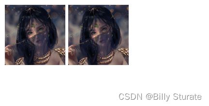
- 特殊情况:img标签有行内块元素特点,但是Chrome调试工具中显示结果是inline
DOCTYPE html>
<html lang="en">
<head>
    <meta charset="UTF-8">
    <meta http-equiv="X-UA-Compatible" content="IE=edge">
    <meta name="viewport" content="width=device-width, initial-scale=1.0">
    <title>Documenttitle>
    <style>
        /* 行内块: 一行显示多个; 加宽高生效 */
        img {
            width: 100px;
            height: 100px;
        }
    style>
head>
<body>
    <img src="./images/1.jpg" alt="">
    <img src="./images/1.jpg" alt="">
body>
html>
3.4 元素显示模式总结
| 元素模式 | 元素排列 | 设置样式 | 默认宽度 | 包含 |
|---|---|---|---|---|
| 块级元素 | 一行只能放一个块级元素 | 可以设置宽度和高度 | 容器的 100% | 容量级可以包含任何标签 |
| 行内元素 | 一行可以放多个行内元素 | 不可以直接设置宽度和高度 | 它本身内容的宽度 | 容纳文本或其他行内元素 |
| 行内块元素 | 一行放多个行内块元素 | 可以设置宽度和高度 | 它本身内容的宽度 |
学习元素显示模式的主要目的是分清它们各自的特点,当我们网页布局的时候,在合适的地方用合适的标签元素。
3.5 元素显示模式转换
特殊情况下,我们需要元素模式的转换,简单理解: 一个模式的元素需要另外一种模式的特性
比如:想要增加链接 的触发范围。
- 转换为块元素:
display: block;(由于经常需要设置宽高,所以通常会将行内元素转换为块元素) - 转换为行内元素:
display: inline; - 转换为行内块:
display: inline-block;(常用)
3.6 HTML嵌套规范注意点
-
块级元素一般作为大容器,可以嵌套:文本、块级元素、行内元素、行内块元素等等……
- 但是:p标签中不要嵌套div、p、h等块级元素
-
a标签内部可以嵌套任意元素
- 但是:a标签不能嵌套a标签
DOCTYPE html>
<html lang="en">
<head>
    <meta charset="UTF-8">
    <meta http-equiv="X-UA-Compatible" content="IE=edge">
    <meta name="viewport" content="width=device-width, initial-scale=1.0">
    <title>Documenttitle>
head>
<body>


    <p>
        <div>divdivdiv>
    p>
body>
html>
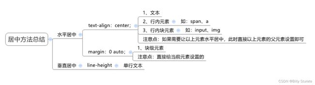
3.7 居中方法总结
4.CSS三大特性
4.1 继承性
现实中的继承:我们继承了父亲的姓。
CSS 中的继承:子标签会继承父标签的某些样式,如:文本颜色和字号,简单的理解就是:子承父业。
- 恰当地使用继承可以简化代码,降低 CSS 样式的复杂性
- 子元素可以继承父元素的样式(
text-、font-、line-、color) 文本、字体、段落、颜色
DOCTYPE html>
<html lang="en">
<head>
<meta charset="UTF-8">
<meta http-equiv="X-UA-Compatible" content="IE=edge">
<meta name="viewport" content="width=device-width, initial-scale=1.0">
<title>Documenttitle>
<style>
/* 控制文字的属性都能继承; 不是控制文字的都不能继承 */
div {
color: red;
font-size: 30px;
height: 300px;
}
style>
head>
<body>
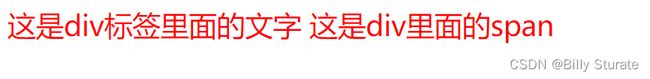
<div>
这是div标签里面的文字
<span>这是div里面的spanspan>
div>
body>
html>
DOCTYPE html>
<html lang="en">
<head>
<meta charset="UTF-8">
<meta http-equiv="X-UA-Compatible" content="IE=edge">
<meta name="viewport" content="width=device-width, initial-scale=1.0">
<title>Documenttitle>
<style>
div {
color: red;
font-size: 12px;
}
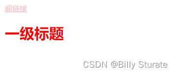
a {
color: pink;
}
style>
head>
<body>
<div>
<a href="#">超链接a>
<h1>一级标题h1>
div>
body>
html>
4.2 层叠性
给同一个选择器设置相同的样式,此时一个样式就会覆盖(层叠)另一个冲突的样式,层叠性主要解决样式冲突的问题。
层叠性原则:
- 样式冲突,遵循的原则是
就近原则,哪个样式距离结构近,就执行哪个样式 - 样式不冲突,不会层叠
注:就近的标准是:后 > 前
DOCTYPE html>
<html lang="en">
<head>
    <meta charset="UTF-8">
    <meta http-equiv="X-UA-Compatible" content="IE=edge">
    <meta name="viewport" content="width=device-width, initial-scale=1.0">
    <title>Documenttitle>
    <style>
        div {
            color: red;
            color: green;
        }

        .box {
            font-size: 30px;
        }
    style>
head>
<body>
    <div class="box">文字div>
body>
html>
4.3 优先级
优先级的介绍
- 特性:不同选择器具有不同的优先级,优先级高的选择器样式会覆盖优先级低选择器样式
- 优先级公式:
继承 < 通配符选择器 < 标签选择器 < 类选择器 < id选择器 < 行内样式 < !important - 注意点:
- !important写在属性值的后面,分号的前面!
- !important不能提升继承的优先级,只要是继承优先级最低!
- 实际开发中不建议使用 !important 。
DOCTYPE html>
<html lang="en">
<head>
    <meta charset="UTF-8">
    <meta http-equiv="X-UA-Compatible" content="IE=edge">
    <meta name="viewport" content="width=device-width, initial-scale=1.0">
    <title>Documenttitle>
    <style>
        #box {
            color: orange;
        }

        .box {
            color: blue;
        }

        div {
            color: green !important;
        }

        body {
            color: red;
        }

        /* !important不要给继承的添加, 自己有样式无法继承父级样式 */
    style>
head>
<body>

    <div class="box" id="box" style="color: pink;">测试优先级div>
body>
html>

权重叠加计算
-
场景:如果是复合选择器,此时需要通过权重叠加计算方法,判断最终哪个选择器优先级最高会生效
-
权重叠加计算公式:(每一级之间不存在进位)

- 比较规则:
- 先比较第一级数字,如果比较出来了,之后的统统不看
- 如果第一级数字相同,此时再去比较第二级数字,如果比较出来了,之后的统统不看
- ……
- 如果最终所有数字都相同,表示优先级相同,则比较层叠性(谁写在下面,谁说了算!)
- 注意点:!important如果不是继承,则权重最高,天下第一!
DOCTYPE html>
<html lang="en">
<head>
  <meta charset="UTF-8">
  <meta name="viewport" content="width=device-width, initial-scale=1.0">
  <title>Documenttitle>
  <style>
    /* #one {
      color: red;
    }

    .son {
      color: blue;
    }

    p {
      color: green;
    } */

    /* (行内, id, 类, 标签) */

    /* (0, 1, 0, 1) */
     div #one {
      color: orange;
    }

    /* (0, 0, 2, 0) */
    .father .son {
      color: skyblue;
    }

    /* 0, 0, 1, 1 */
    .father p {
      color: purple;
    }

    /* 0, 0, 0, 2 */
    div p {
      color: pink;
    }

  style>
head>
<body>
  <div class="father">
    <p class="son" id="one">我是一个标签p>
  div>
body>
html>

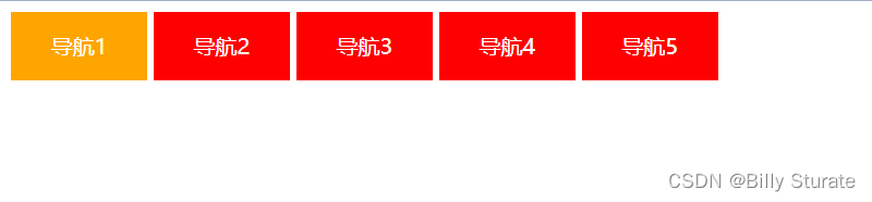
5.综合案例
DOCTYPE html>
<html lang="en">
<head>
    <meta charset="UTF-8">
    <meta http-equiv="X-UA-Compatible" content="IE=edge">
    <meta name="viewport" content="width=device-width, initial-scale=1.0">
    <title>Documenttitle>
    <style>
        /* a 显示模式是行内, 加宽高默认不生效, 转显示模式: 行内块 */
        a {
            text-decoration: none;
            width: 100px;
            height: 50px;
            background-color: red;
            display: inline-block;
            color: #fff;
            text-align: center;
            line-height: 50px;
        }

        a:hover {
            background-color: orange;
        }
    style>
head>
<body>


    <a href="#">导航1a>
    <a href="#">导航2a>
    <a href="#">导航3a>
    <a href="#">导航4a>
    <a href="#">导航5a>
body>
html>
DOCTYPE html>
<html lang="en">
<head>
<meta charset="UTF-8">
<meta http-equiv="X-UA-Compatible" content="IE=edge">
<meta name="viewport" content="width=device-width, initial-scale=1.0">
<title>Documenttitle>
<style>
a {
text-decoration: none;
width: 120px;
height: 58px;
background-color: pink;
display: inline-block;
text-align: center;
line-height: 50px;
color: #fff;
}
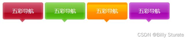
/* 每个a的背景图不同, 单独找到每个a, 设置不同的背景图片 */
.one {
background-image: url(./images/bg1.png);
}
.two {
background-image: url(./images/bg2.png);
}
.three {
background-image: url(./images/bg3.png);
}
.four {
background-image: url(./images/bg4.png);
}
.one:hover {
background-image: url(./images/bg5.png);
}
.two:hover {
background-image: url(./images/bg6.png);
}
.three:hover {
background-image: url(./images/bg7.png);
}
.four:hover {
background-image: url(./images/bg8.png);
}
style>
head>
<body>
<a href="#" class="one">五彩导航a>
<a href="#" class="two">五彩导航a>
<a href="#" class="three">五彩导航a>
<a href="#" class="four">五彩导航a>
body>
html>