Gradients made easy
本文转自http://www.codeproject.com/KB/GDI-plus/Gradiator.aspx
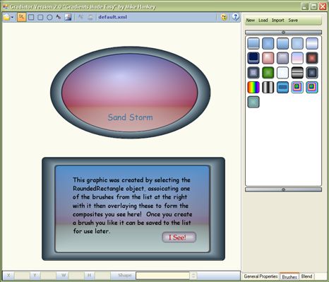
Introduction
I must admit I got a basic understanding of Gradient Brushes and hurriedly started coding. But, I didn't really get a good understanding of Gradients until I started playing with this utility. At that point, I realized that I needed to go back and do some further research on the subject. So, I've been researching, upgrading, researching,...well you get the idea. And, since I was upgrading the Gradiator application, I thought I would relate what I learned while this research/upgrade process has been going on.
In the latest upgrade, I have:
- Changed the UI, hopefully to make it a tad easier to use
- Added a brush manager with the ability to load/save your favorite brushes
- Added a color selector with the ability to load/save color palettes
- Added a status bar with the ability to modify the position and size, view the current shape type, and cycle through shapes
I'm not going to go knee deep into explaining the graphics, GDI+, or even gradients; instead, I'm going to give a brief overview of each of the important concepts and then, I'll move on and and get into how to create the gradients that you see/have seen in this article. A lot of them were easy, some I stumbled on, and some I really had to scratch my head and just try different things, but overall, I've managed to create some pretty nice graphics and you can too. The first thing we need to do is get a basic understanding of the concepts, so this first section is devoted to that.
- Concepts
- Introduction to Gradients
- Linear Gradient Brush
- PathGradientBrush
- Blending
- Color Blending
- Alpha Blending
- Using Gradiator
- An Example
- References and Links
I need to add a disclaimer here and state that for some applications, GDI+ may be slow because at this point, it doesn't take advantage of the hardware acceleration features built in to many of the graphics cards. Hopefully, in the future, this will be solved. But until that time, there are things we can do to make sure we're getting the most from GDI+.
- Use double buffering.
- Only redraw areas that need to be redrawn.
- Avoid drawing in controls such as
PanelorPictureBox, instead use the parent control's client area. - If you can use
DrawImageUnscaledinstead ofDrawImage, the auto scaling is nice, but eats resources.
I'm sure there are more tips on performance, but these are the ones I've personally found to be helpful.
As I've used/developed this application, I have added functionality that I've found useful and time saving. There is a lot more that could be done with this application, and if you have any suggestions or want to add to it, please feel free to. I have provided default and web color palettes, and a brush palette with some interesting brushes. If you come up with any brushes you find interesting, I would be interested in seeing them. Barney says "share" :)
As always, I hope this article is instructive and the application useful. If you learn as much from it as I did writing it, then we are both rich.
Introduction to Gradients
My interpretation of a gradient is the progression from one color to another at a defined angle. Webster's definition: "ascending or descending with a uniform slope".
The two types of gradients that will be covered here are the Linear and Radial gradient brushes.
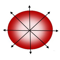
The gradient in Figure 1 is the simplest type of linear gradient. It "starts" with the color white and progresses to the color red at an angle of 0 degrees. The code used to draw the above gradient is:
private void label1_Paint(object sender, PaintEventArgs e)

{

    LinearGradientBrush lgb =

      new LinearGradientBrush(label1.ClientRectangle, clr1, clr2, 0f, true);


    e.Graphics.FillRectangle(lgb, label1.ClientRectangle);


    lgb.Dispose();

}
 Figure 2.
Simple path gradient
The gradient in Figure 2 is the simplest type of radial gradient. It also starts at one color and progresses to another, but the axis begins at a center point with a center color, and progresses outward to the end color, also white and red as in the above figure. The code to draw the gradient in Figure 2 is:
private void label1_Paint(object sender, PaintEventArgs e)

{

    GraphicsPath gp = new GraphicsPath();

    gp.AddEllipse(label1.ClientRectangle);


    PathGradientBrush pgb = new PathGradientBrush(gp);


    pgb.CenterPoint = new PointF(label1.ClientRectangle.Width / 2,

                                 label1.ClientRectangle.Height / 2);

    pgb.CenterColor = Color.White;

    pgb.SurroundingColors = new Color[] { Color.Red };


    e.Graphics.FillPath(pgb, gp);


    pgb.Dispose();

    gp.Dispose();

}
Linear Gradient Brushes
Now that we've got the basics out of the way, we can find out what else we can do with gradients. Two interesting methods that can be used to alter the way in which gradients are drawn are: SetSigmaShapeBell and SetTriangularShape.
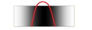
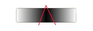
Figure 3 and 4 show the result of using the SetSigmaShapeBell and SetBlendTriangularShape methods with the middle of the label as the focus point and a drop off rate of 50%. As you can see from the figures, the bell shape method distributes the center color over a broader range than its triangular counterpart.
The constructors for both brushes have parameters that allow one to determine the focal point and the rate of fall off from that point. The example code below shows how to use a linear gradient brush to draw the gradient of Figure 4:
private void label1_Paint(object sender, PaintEventArgs e)

{

    LinearGradientBrush lgb =

      new LinearGradientBrush(label1.ClientRectangle, clr1, clr2, 0f, true);

    lgb.SetBlendTriangularShape(.5f, 1.0f);

    e.Graphics.FillRectangle(lgb, label1.ClientRectangle);


    lgb.Dispose();

}
We've seen this code before, but with the addition of the highlighted text. The first parameter defines the focal point and the second the drop off scale. In this case, I used a drop off rate of 100% for a dramatic/visual effect.
You can also use an additional property that controls the overall brightness and ratio of red to green to blue, the gamma correction property. For a detailed discussion of gamma correction, refer to this link.
Path Gradient Brushes
The path gradient brush employs the same methods as the linear brush, and behaves similarly, but the outcome looks different because the path gradient brush works radially. One thing worth mentioning here is that when setting the focus, the focus starts at the outer edge (from 0) and works towards the center (to 1.0). To set the center point, use the path gradient's center point property.
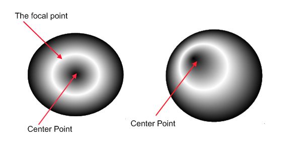
In Figure 5, on the left, we are using the SetTriangularBlendShape method and setting the focal point to 50%, and again the focal scale is set to 100%, and on the right, the focal point has been shifted to the upper left corner. Using the SetTriangularBlendShape and the SetSigmaShapeBell methods in conjunction with the FocusScales, which is similar to the focus parameter for both methods, defines the scaling of the gradient. Note: oddly enough, the FocusScales work just the opposite of there equivalents in that they start at the center (0) and work out (1).
The code used to produce the left hand drawing in Figure 5 is listed below:
private void label1_Paint(object sender, PaintEventArgs e)

{

    GraphicsPath gp = new GraphicsPath();

    gp.AddEllipse(label1.ClientRectangle);


    PathGradientBrush pgb = new PathGradientBrush(gp);


    pgb.CenterPoint = new PointF(label1.ClientRectangle.Width / 2,

                                 label1.ClientRectangle.Height / 2);

    pgb.CenterColor = Color.White;

    pgb.SurroundingColors = new Color[] { Color.Red };

    pgb.SetTriangularBlendShape(.5f, 1.0f);

    pgb.FocusScales = new PointF(0f, 0f);


    e.Graphics.FillPath(pgb, gp);


    pgb.Dispose();

    gp.Dispose();

}
As an example of using the SetTriangularBlendShape method with the FocusScales property, we will use the left drawing in Figure 5. If we use the above code but change the FocusScales property to (.5f, .5f), the focal point will be 75% out from the center of the shape.
Blending
With blending, we can define a custom gradient and therefore take control over how the gradient is rendered. Blending allows us to override the normal blending behavior and set points along the path where we define alternate drop off rates. We still go from a start color to an end color, but as you can see in the figure below, the drop off rates at the various positions allow much greater control over the rendering process.

A couple of terms are in order here:
- Position - A point along the gradient path
- Factor - Drop off rate at the defined position
In Figure 6 above, I have numbered the positions, and combined with the listing below, you will get a better understanding of how blending works. This code is used to produce the right hand drawing in Figure 6.
private void label1_Paint(object sender, PaintEventArgs e)

{

    GraphicsPath gp = new GraphicsPath();

    gp.AddEllipse(label1.ClientRectangle);


    PathGradientBrush pgb = new PathGradientBrush(gp);

    pgb.FocusScales = new PointF(0f, 0f);


    Blend blnd = new Blend();

    blnd.Positions = new float[] { 0f, .25f, .5f, .75f, 1f };

    blnd.Factors = new float[] { 1f, 0f, 1f, 0f, 1f };

    pgb.Blend = blnd;

    e.Graphics.FillPath(pgb, gp);


    pgb.Dispose();

    gp.Dispose();

}
Both gradients were drawn using the same values, and from what we've learned so far, the outcome is predictable. The only difference being the PathGradientBrush, the positions radiate outward from the center point, and at the positions noted, you can see the transitions made.
Note: There are three things that are very important here:
- The number of positions and factors must be the same.
- The first position must be 0 and the last 1.
- The number of positions, factors, and colors should not exceed the number of points in the graphics point list. If it does, I turn off color blending, or GDI+ throws an exception. (Working on this.)
If either of these conditions is not met, GDI+ will throw an exception.
Color Blending
Color blending works much the same as regular blending except that at each position, instead of a drop off value, we can use a color. An interesting observation can be made at this point, if we move point 2 to where the dotted line is, this will move the end position for red over to where the arrow is and effectively make point 3 useless, which is pretty much the way we would expect it to behave. But, if either of the two objects are semitransparent, then the color in the resultant union is a blend of the two colors, and will in itself be an alpha blend. Alpha blending will be covered in the next section.
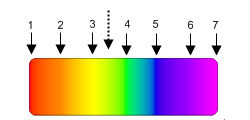
Figure 7 shows an example of a shape that employs the color blend features of the linear gradient brush. As you can see, the color at each position is a different color of the rainbow at evenly spaced positions along a gradient path of 0 degrees. The snippet below was used to draw Figure 7.
private void label1_Paint(object sender, PaintEventArgs e)

{

    GraphicsPath gp = new GraphicsPath();

    gp.AddEllipse(label1.ClientRectangle);


    PathGradientBrush pgb = new PathGradientBrush(gp);


    pgb.CenterPoint = new PointF(label1.ClientRectangle.Width / 2,

                                 label1.ClientRectangle.Height / 2);

    pgb.CenterColor = Color.White;

    pgb.SurroundingColors = new Color[] { Color.Red };

    pgb.SetTriangularBlendShape(.5f, 1.0f);

    pgb.FocusScales = new PointF(0f, 0f);


    e.Graphics.FillPath(pgb, gp);


    pgb.Dispose();

    gp.Dispose();

}
Alpha Blending
While I was searching for a good explanation for alpha blending, I ran across the following from an article "Alpha Blending Tutorial" written by Toshihiro Horie, and it pretty much says it all.
What is alpha blending? It's a way of mixing the colors of two images together to form a final image. An example of naturally occurring alpha blending is a rainbow over a waterfall. If you think of the rainbow by itself as one image, and the background waterfall as another, then the final image can be formed by alpha blending the two together. Pixel artists and programmers sometimes call alpha blending "translucency"-- it is the same thing. In addition, when the blending factor changes dynamically over time, alpha blending is called "cross fade" or "dissolve".
To add alpha blending to your drawings, merely adjust the first argument in the Color.FromArgb method call. This is the alpha channel parameter and can have a value from 0 - 255, 0 being completely transparent and 255 being opaque. Things get interesting when you start using alpha blending. It adds another dimension to the problem. The reason for this is that where the shapes overlap, it forms a blend of the two colors and the opacity level of each. I can akin this to an artist when he mixes colors on his palette to form a new color. In the same way, you can adjust the levels of each...add a little more white, a little less black, etc..
Using Gradiator
I have used this application as I've been developing it, and have used it as a kind of a doodle pad. I get an idea and scratch my head for a while, then I start doodling and go smoke a cig, think a little more and then save it, try it, then go back and tweak it until I get what I want. The problem is, the more I use Gradiator, my skills get better, and I run across something that looks better, and I just can't seem to finalize the dang thing. The About dialog is a perfect example since I want it to reflect what can be done with gradients. Check it out, there are only four objects drawn on the form, and two are text, the other two are the background and the button.
Overview
In a nutshell, what we are doing here is creating brushes to render our shapes. When we first create a shape, the default brush assigned to it is a solid brush with a white background and a border. You change the properties of the brush using the Properties editor located in the tab control to the right of the workspace area. I couldn't put all the controls I needed in one area and have room for a decent workspace, and I didn't want a bunch of floaters, so I compromised and divided the functionality as I saw it, so ended up with three tabs, and they are:
- General Properties - This tab contains the common properties for the brush selected
- Brushes - Brush management
- Blend - Blend property editor
The Shape Editor
I don't think a lot needs to be said about the shape editor itself, it's just a basic graphics editor that allows you to create, move, and resize a few basic shapes.
To create a shape: Click on the shape desired, move mouse into the canvas area, press the left mouse button at the place you want to start the shape, and drag out until you get to the end point, and release the mouse button.
To select a shape: Click anywhere within the shape boundary. Something I did a little different when selecting the shapes, that is bothersome in some cases, but a really nice feature for most editing. In my selection logic, if you have two objects and one sits on top of the other, I select the smaller of the two; if they are the same, I pick the last one drawn (top of z-order), but if the top shape is not transparent, then you will not see the shape underneath, unless you bring it to the top, by selecting it and pressing the right mouse button and choosing the "bring to top" option. I did this because when I'm working with two objects, it allows me to see what I'm doing when I'm positioning the shape in the background. Once you start using Gradiator, you will appreciate this option.
To move a shape: Press and hold the left mouse button anywhere within the shape boundary, and move it to the new location.
To resize an object: Press and hold the left mouse button within the resizing rectangles, and drag to new shape. You can only resize in the positive direction right now. I'm still working on this problem.
Brush Manager
The brush manager is the repository for brushes that you've created and want to use in the future. You can:
- Create a new brush palette.
- Load a palette - On startup, a default palette is loaded called "default palette.xml" in the startup directory.
- Import a palette, appending it to the current palette.
- Save the current palette to file.
To use brushes from the palette, use the shape editor to create shape primitives, and if not already selected, select it, then click on any one of the thumbnail images from the brush manager's list to associate it with the primitive. These primitives, either opaque or semitransparent, may then be overlaid one on top of another to produce composite images. Now, to save a brush once you have it, just select it and right click, choose the "Save Brush" option, and it will be added to the brush manager's list. Be sure to save before you exit the application.
Blend Editor
Here is where you can really get artistic and create some nice images. I'm by no means an artist, but after spending a short time working with blends, it became easier to visualize what I wanted to do and how to achieve the images shown in this article (even a blind squirrel gets a nut occasionally).
The only real advice I can give you here is just play with it!
To use the editor, select an object, go to the Blend tab, and select either Blend or the Color Blend style by using the check box to turn blending on or off then selecting the type of blend desired, regular blending being the default. Blending is only available when using the linear gradient or path gradient brushes, for obvious reasons. The type of blending determines which parameters are meaningful, for:
LinearGradientBrush- Position and FactorPathGradientBrush- Color and Position
Color Selector
For color selection, I decided to devise a way to have a selector active. To do this, I put a color swatch next to each color property. In some cases, this is kind of a pain, but overall, it turned out to be a good solution. To select a color, go to the color selector and pick a color, then for the property you wish to modify, left click on the swatch. To transfer the color from the property swatch to the primary color in the color selector, right click on the Properties swatch. On startup, a default color palette "color palette.xml" is loaded from the startup directory.
An Example
When I first started, I had a little trick I would do if I got confused. I would choose a color/position combo in the area that I was confused about and dramatically change the color. This would give me a general idea what the blend covered and the color distribution if opacity was involved. The point here is if you don't understand the way I'm explaining, or I'm explaining it wrong, go into the gradient, create a shape, and associate this brush with it, and change the color or just play with it. I tried thin borders, thick borders, and a lot of different things before I got to this. Shading around the edge took a little head scratching (I told ya I ain't no artiste').
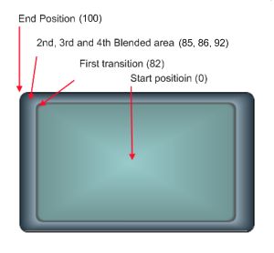
So, here was what I was thinking when I created this:
- Picture frame-ish so I can overlay something in this area or blend it to suit
- A nice clean transition between the client area and the border
- Shading for the border, hopefully adding a little 3D look to it
Well, let's get started. While I'm putting a Saliva CD and getting a quick smoke, you can start up Gradiator or not (smoke em if ya got em), and then we'll begin.
Ok, I'm back.
So, let's start at the center and wind our way out:
- Start position (0): Let's start with a light/powder blue.
- 82: We want to end this transition abruptly, so we gradate to a steel blue/gray, just a tad darker so it isn't plain.
- 85: We want a dark shaded area make it appear sunken. (85 - 82 = 3) So we have a 3 pixel shaded area.
- 86: After the darker shaded area, we want a thin light area, back to the steel gray, to represent that it's raised, and to start the edge blend.
- 92: At this point, we've gradated from the steel color and we want to darken it, fade the colors out. If we bypassed this step, the transition would be linear and would look like a ramp instead of having the curved edge look as in the above example.
A couple of observations can be made:
- If we change the first two colors and make them transparent, then it will be a true frame since the client area is transparent!
- Pay attention to perspective. Look at the border size on the sides as compared to the top and bottom. If it were square, this wouldn't be a problem. Just something to keep in mind.
Well, that's about it...Good luck!
References and Links
All the illustrations in this article where generated using the Gradiator application.
- An article can be found here on CP that covers alpha blending: Transparency Tutorial with C# - Part 1, by Joe Pardue.
- This is a very good article that gives an overview of the concepts used in this application for color blending: Painting with Solid Colors and Gradients Overview.
- If you are interested in learning about the basics of color, this is a good site: RGB World.
- Color Tools - Reference Charts, Swatches, Software, and More.
- The physics of light and color.
- A good site for beginners, covers the basics of GDI+.
- Two applications similar in concept to this one; both named GradientMaker: Robin Studio: Gradient Maker and Gradient Maker Application.
- An excellent book for graphics programming, in general, is "Graphics Programming with GDI+" by Mahesh Chand, Microsoft .NET Development Series, ISBN 0-321-16077-0.
License
This article, along with any associated source code and files, is licensed under The Code Project Open License (CPOL)