UCell:单细胞评分分析R包及可视化应用
****单细胞评分我们之前说过AUCell和seurat自带的打分函数:
跟着Cell学单细胞转录组分析(十一):单细胞基因评分|AUCell评分
我们之前讲过单细胞评分,一个是Seurat自带的打分函AddModuleScore()。一个是AUcell包。最近看到一个评分R包,感觉还是挺好的这里分享一下。Ucell是基于Mann-Whitney U统计的单细胞评分R包,灵感来源于SUCell,使用起来稳定性较好,且与其他的方式相比较,Ucell计算所需的时间和耗费的内存更小。即使在计算能力有限的机器上也可以在几分钟内处理大型数据集。UCell可以应用于任何单细胞数据矩阵,可直接与Seurat对象交互。Ucell在高分SCI文章的应用还是挺多的,我们在自己的分析中也可以视情况选择使用。原始文献参考: https://www.sciencedirect.com/science/article/pii/S2001037021002816?via%3Dihub这里我们使用seurat单细胞对象进行演示。首先对单细胞marker基因的评分,这个有利于细胞分群的鉴定。
setwd('D:/KS项目/公众号文章/Ucell单细胞评分')
library(Seurat)
BiocManager::install("UCell")
library(UCell)
uterus <- readRDS("D:/KS项目/公众号文章/uterus.rds")
DimPlot(uterus,label = T)+NoLegend()

#UCell评分函数AddModuleScore_UCell可以提供方seurat对象
#评分基因set是以list的形式提供
markers <- list()
markers$SM <- c("ACTA2", "RGS5")
markers$Marc <- c("MS4A6A", "CD68","LYZ")
markers$Ly <- c("CCL5", "STK17B","PTPRC")
markers$SF <- c("DCN", "COL6A3", "LUM")
markers$Endo <- c("PECAM1","PCDH17", "VWF")
markers$unEP <- c("EPCAM", "CDH1")
markers$cEP <- c("FOXJ1","CDHR3","DYDC2")

#评分计算
marker_score <- AddModuleScore_UCell(uterus,
                                     features=markers)
#可视化是Ucell score
library(stringr)
library(ggplot2)
library(viridis)
a <- colnames([email protected]) %>% str_subset("_UCell")
FeaturePlot(marker_score,features = a,order = T, ncol = 4, cols = viridis(256))
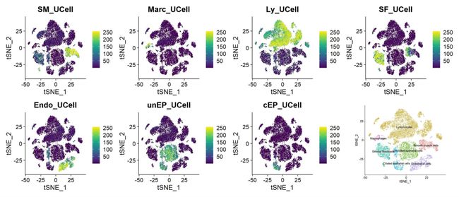
image.png
第二个是对于通路的评分,并进行可视化,参考这篇文章:
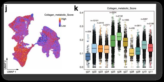
image.png
(reference:A reference single-cell regulomic and transcriptomic map of cynomolgus monkeys)
library(clusterProfiler)
metabolism <- read.gmt("KEGG_metabolism_nc.gmt")
unique(metabolism$term)
#我们选择其中一条通路进行评分
Oxidative <- subset(metabolism, term=="Oxidative phosphorylation")
Oxidative <- list(Oxidative$gene)#将基因整成list
names(Oxidative)[1] <- 'Oxidative'
DefaultAssay(uterus) <- 'RNA'
metabolism_score <- AddModuleScore_UCell(uterus,
                                         features=Oxidative,
                                         name="_metabolism_score")

#可视化所有细胞
FeaturePlot(metabolism_score,features = "Oxidative_metabolism_score",
            order = T,cols = viridis(256))

FeaturePlot(metabolism_score,features = "Oxidative_metabolism_score",
            order = T,cols = viridis(256), split.by = 'orig.ident')
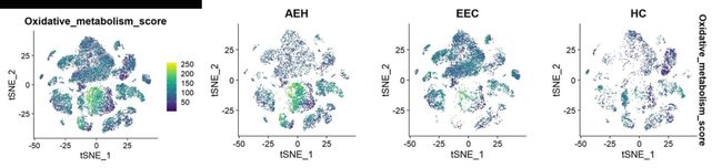
image.png
做箱线图:
library(ggrastr)
library(dplyr)
data<- FetchData(metabolism_score,vars = c("celltype","Oxidative_metabolism_score"))
data$cellid <- case_when(data$celltype ==unique(data$celltype)[1] ~ "SMC",
                         data$celltype ==unique(data$celltype)[2] ~ 'Ly',
                         data$celltype ==unique(data$celltype)[3] ~ 'unEP',
                         data$celltype ==unique(data$celltype)[4] ~ 'SF',
                         data$celltype ==unique(data$celltype)[5] ~ 'cEP',
                         data$celltype ==unique(data$celltype)[6] ~ 'Endo',
                         data$celltype ==unique(data$celltype)[7] ~ 'Macro')
colors <- c('#507BA8','#F38D37','#5D9F53','#B5972D','#48998E','#E05758','#F1CE60')


ggplot(data, aes(x=cellid,y=Oxidative_metabolism_score,fill=cellid,color=cellid)) +
  theme_bw()+RotatedAxis()+
  theme(panel.grid = element_blank(),
        axis.text.x=element_text(size=12),
        axis.text.y = element_text(size=10),
        plot.title = element_text(hjust = 0.5),
        legend.position = 'none')+
  labs(x=NULL,y=NULL,title = "Oxidative_metabolism_score")+
  geom_jitter_rast(col="#00000033", pch=19,cex=2, position = position_jitter(0.2))+
  geom_boxplot(position=position_dodge(0))+
  scale_fill_manual(values = colors)+
  geom_boxplot(position=position_dodge(0),color='black',
               outlier.colour  = NA,outlier.fill=NA,outlier.shape=NA)

image.png
这里卖个关子,我们做了那么多的ggplot可视化,给大家思考一下,细胞数是如何添加上的(纯代码,简单的方式)。
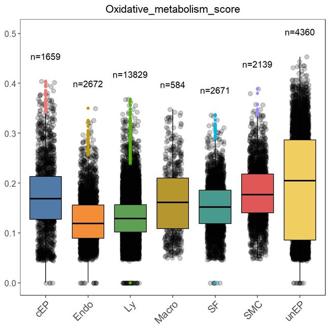
image.png
第三种应用是对于基因集的评分。看看这些评分在我们样本之间的差异。
#做基因集评分
genes <- list(c("PTEN","PIK3CA","KRAS","ARID1A","RCA1","WNT5A"))
names(genes) <- 'gene'
gene_score <- AddModuleScore_UCell(uterus,features=genes,name="_score")


#提取数据
library(ggpubr)
df<- FetchData(gene_score,vars = c("orig.ident","gene_score"))
df$orig.ident <- factor(df$orig.ident,levels = c("HC","EEC","AEH"))#设置顺序


#设置比较组
my_comparisons1 <- list(c("HC", "EEC"))
my_comparisons2 <- list(c("AEH", "EEC"))
my_comparisons3 <- list(c("HC", "AEH"))

#做小提琴图
ggplot(df,aes(x=orig.ident,y=gene_score,fill=orig.ident))+
  geom_violin(color='black',size=1)+#小提琴
  theme_classic() +
  theme(text = element_text(size=10, colour = "black")) +
  theme(plot.title = element_text(hjust = 0.5, size = 15),
        axis.text.x = element_text(colour = "black", size = 12),
        axis.text.y = element_text(colour = "black", size = 10),
        axis.title.y = element_text(color = 'black', size = 12),
        axis.line = element_line(size = 1))+
  theme(legend.position="none") +
  geom_boxplot(width=0.1, fill="white", outlier.shape = NA) +#箱线图
  stat_compare_means(method="t.test",hide.ns = F,
                     comparisons =c(my_comparisons1,my_comparisons2,my_comparisons3),
                     label="p.signif",
                     bracket.size=0.8,
                     size=6)#添加显著性比较
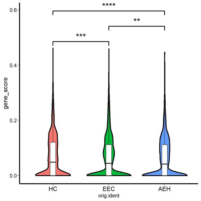
image.png
这个方法用在自己的数据集研究中还是挺有用的,觉得分享有用的点个赞,点一下分享再走呗!