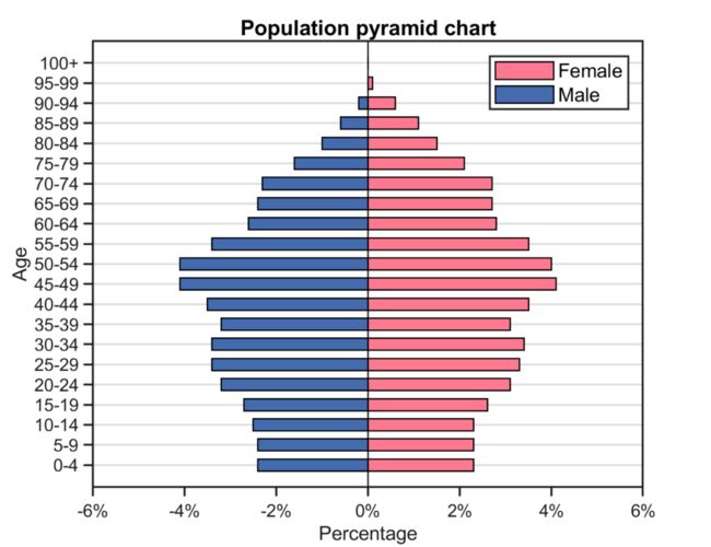
Matlab论文插图绘制模板第101期—人口金字塔图
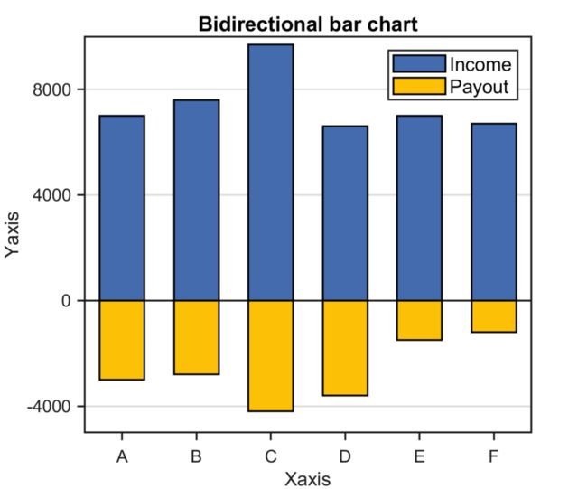
在之前的文章中,分享了Matlab双向柱状图的绘制模板:
进一步,再来分享一种特殊的双向柱状图:人口金字塔图。
先来看一下成品效果:
特别提示:本期内容『数据+代码』已上传资源群中,加群的朋友请自行下载。有需要的朋友可以关注同名公号【阿昆的科研日常】,后台回复关键词【绘图桶】查看加入方式。
模板中最关键的部分内容:
1. 数据准备
此部分主要是读取原始数据,并构建用于绘图的初始数据。
% 读取数据load data.mat% 初始化数据X = x;Y1 = dataset1;Y2 = dataset2;lbs = {'0-4' '5-9' '10-14' '15-19' '20-24' '25-29' '30-34' '35-39' '40-44',...'45-49' '50-54' '55-59' '60-64' '65-69' '70-74' '75-79' '80-84' '85-89',...'90-94' '95-99' '100+'};
2. 颜色定义
作图不配色就好比做菜不放盐,总让人感觉少些味道。
但颜色搭配比较考验个人审美,需要多加尝试。
这里直接使用TheColor配色工具中的XKCD配色库:
%% 颜色定义C1 = TheColor('xkcd',260);C2 = TheColor('xkcd',426);
3. 人口金字塔图绘制
通过调用两次‘barh’命令,绘制初始人口金字塔图。
GO1 = barh(X,Y1,0.6,'EdgeColor','k','LineWidth',0.7);GO2 = barh(X,Y2,0.6,'EdgeColor','k','LineWidth',0.7);hTitle = title('Population pyramid chart');hXLabel = xlabel('Percentage');hYLabel = ylabel('Age');
4. 细节优化
为了插图的美观,将初始人口金字塔图赋上之前选择的颜色,并对基线属性进行调整:
% 赋色GO1.FaceColor = C1;GO2.FaceColor = C2;% 基线调整BL = get(GO2,'BaseLine');BL.LineWidth = 0.7;
然后,对坐标轴细节等进行美化:
% 坐标区调整set(gca, 'Box', 'off', ... % 边框'LineWidth', 1, 'GridLineStyle', '-',... % 坐标轴线宽'XGrid', 'off', 'YGrid', 'on', ... % 网格'TickDir', 'out', 'TickLength', [.015 .015], ... % 刻度'XMinorTick', 'off', 'YMinorTick', 'off', ... % 小刻度'XColor', [.1 .1 .1], 'YColor', [.1 .1 .1]) % 坐标轴颜色set(gca, 'XTick', -6:2:6,...'Xlim' , [-6 6], ...'Xticklabel',{'-6%','-4%','-2%','0%','2%','4%','6%'},...'YTick', 1:21,...'Yticklabel',lbs)% LegendhLegend = legend([GO1,GO2], ...'Female','Male', ...'Location', 'northeast');% 字体和字号set(gca, 'FontName', 'Arial', 'FontSize', 9)set([hLegend,hXLabel,hYLabel], 'FontSize', 10, 'FontName', 'Arial')set(hTitle, 'FontSize', 11, 'FontWeight' , 'bold')% 背景颜色set(gcf,'Color',[1 1 1])% 添加上、右框线xc = get(gca,'XColor');yc = get(gca,'YColor');unit = get(gca,'units');ax = axes( 'Units', unit,...'Position',get(gca,'Position'),...'XAxisLocation','top',...'YAxisLocation','right',...'Color','none',...'XColor',xc,...'YColor',yc);set(ax, 'linewidth',1,...'XTick', [],...'YTick', []);
设置完毕后,以期刊所需分辨率、格式输出图片。
%% 图片输出figW = figureWidth;figH = figureHeight;set(figureHandle,'PaperUnits',figureUnits);set(figureHandle,'PaperPosition',[0 0 figW figH]);fileout = 'test';print(figureHandle,[fileout,'.png'],'-r300','-dpng');
以上。