python matplotlib入门
matplotli工具是python语言下的画图工具,可以很好用来画散点图, 图表等。
1. 安装Matplotlib
若使用的是Ubuntu系统,可以通过如下命令来安装
sudo apt-get install python-matplotlib
若是Fedora系统,使用如下命令安装
sudo yum install python-matplotlib
也可以通过pip工具来安装matplotlib
sudo pip install matplotlib
使用如下方式来检测有没有安装成功
import matplotlib若没有错误表示安装成功
通过如下命令来查看安装的matplotlib版本(以下输出是通过ipython来验证的)
In [9]: import matplotlib
In [10]: matplotlib.__version__
Out[10]: '1.5.1'
2. 基本用法
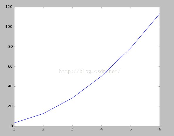
画折线图
import matplotlib.pyplot as plt

radius = [1.0, 2.0, 3.0, 4.0, 5.0, 6.0]
area = [3.14159, 12.56636, 28.27431, 50.26544, 78.53975, 113.09724]

plt.plot(radius, area)

plt.show()
显示
画散点图
import matplotlib.pyplot as plt

radius = [1.0, 2.0, 3.0, 4.0, 5.0, 6.0]
area = [3.14159, 12.56636, 28.27431, 50.26544, 78.53975, 113.09724]

plt.plot(radius, area, 'o')

plt.show()
显示
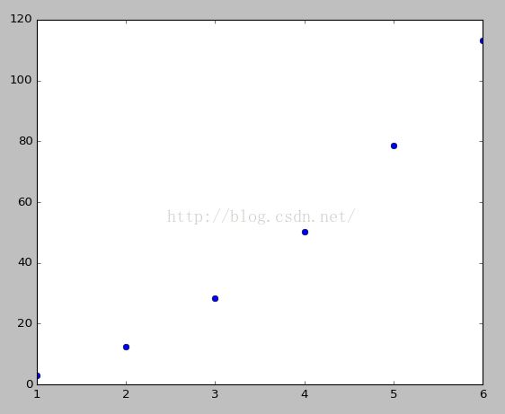
注意: 使用plt.plot(x,y)画图时,x和y的维度比较相同
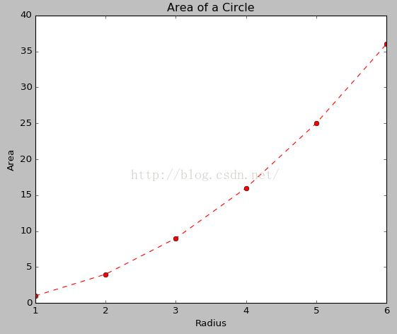
添加注释,
给上图添加一些说明(如坐标标注,添加标题等)
import matplotlib.pyplot as plt

radius = [1.0, 2.0, 3.0, 4.0, 5.0, 6.0]
area = [3.14159, 12.56636, 28.27431, 50.26544, 78.53975, 113.09724]

plt.plot(radius, area, 'o')

plt.xlabel('Radius')
plt.ylabel('Area')
plt.title('Area of a Circle')

plt.show()
显示为

同时,可以设置plt.plot()中的marker, linestyle和color等属性来以不同的风格显示。
例如:
import matplotlib.pyplot as plt

radius = [1.0, 2.0, 3.0, 4.0, 5.0, 6.0]
area = [3.14159, 12.56636, 28.27431, 50.26544, 78.53975, 113.09724]

plt.plot(radius, square, marker='o', linestyle='--', color='r')

plt.xlabel('Radius')
plt.ylabel('Area')
plt.title('Area of a Circle')

plt.show()
或者
import matplotlib.pyplot as plt

radius = [1.0, 2.0, 3.0, 4.0, 5.0, 6.0]
area = [3.14159, 12.56636, 28.27431, 50.26544, 78.53975, 113.09724]

plt.plot(radius, square, 'ro--')

plt.xlabel('Radius')
plt.ylabel('Area')
plt.title('Area of a Circle')

plt.show()
其中marker, linestyle和color的取值如下表
color的设置
| Color Code | Color Displayed |
| r | Red |
| b | Blue |
| g | Green |
| c | Cyan |
| m | Magenta |
| y | Yellow |
| k | Black |
| w | White |
| Marker Code> | Marker Displayed |
| + | Plus Sign |
| . | Dot |
| o | Circle |
| * | Star |
| p | Pentagon |
| s | Square |
| x | X Character |
| D | Diamond |
| h | Hexagon |
| ^ | Triangle |
| Linestyle Code | Line style Displayed |
| – | Solid Line |
| — | Dashed Line |
| : | Dotted Line |
| -. | Dash-Dotted Line |
| None | No Connecting Lines |
import matplotlib.pyplot as plt
radius = [1.0, 2.0, 3.0, 4.0, 5.0, 6.0]
area = [3.14159, 12.56636, 28.27431, 50.26544, 78.53975, 113.09724]
square = [1.0, 4.0, 9.0, 16.0, 25.0, 36.0]

plt.plot(radius, area, label='Circle')
plt.plot(radius, square, marker='o', linestyle='--', color='r', label='Square')

plt.xlabel('Radius/Side')
plt.ylabel('Area')
plt.title('Area of Shapes')
plt.legend()

plt.show()
显示

注:上图右上角的表示是通过plt.legend()结合plt.plot的label来实现的。
还可以按如下方式进行标识
import numpy as np
import matplotlib.pyplot as plt

# Compute the x and y coordinates for points on sine and cosine curves
x = np.arange(0, 3 * np.pi, 0.1)
y_sin = np.sin(x)
y_cos = np.cos(x)
z_cos = y_sin + y_cos

# Plot the points using matplotlib
plt.plot(x, y_sin, 'r')
plt.plot(x, y_cos, 'b')
plt.plot(x, z_cos, 'g')

plt.xlabel('x axis label')
plt.ylabel('y axis label')
plt.title('Sine and Cosine')
plt.legend(['Sine', 'Cosine', 'Sine+Cosine'])

plt.show()
3. 参考
1. http://matplotlib.org/users/pyplot_tutorial.html
2. http://www.ast.uct.ac.za/~sarblyth/pythonGuide/PythonPlottingBeginnersGuide.pdf
3. https://bespokeblog.wordpress.com/2011/07/07/basic-data-plotting-with-matplotlib-part-2-lines-points-formatting/
4. http://cs231n.github.io/python-numpy-tutorial/#matplotlib-plotting