一、双柱状图 + 折线图源代码
import matplotlib
from matplotlib import pyplot as plt
from matplotlib.ticker import FuncFormatter
from matplotlib import ticker
from matplotlib.font_manager import FontManager
from matplotlib.font_manager import FontProperties
def bar_line():
x = ['A', 'B', 'C', 'D']
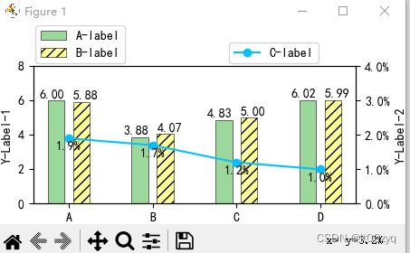
y1 = [6.00, 3.88, 4.83, 6.02]
y2 = [5.88, 4.07, 5.00, 5.99]
y3 = [0.019, 0.017, 0.012, 0.010]
font = FontProperties(fname=r"C:\Windows\Fonts/simhei.ttf", size=10)
matplotlib.use('TkAgg')
plt.rcParams['axes.unicode_minus'] = False
plt.rcParams['font.family'] = ['SimHei']
plt.rcParams['font.sans-serif'] = ['SimHei']
plt.rc('font', family='SimHei', size=10)
fontsize = 10
plt.rcParams['figure.figsize'] = (4.5, 2.2)
bar_width = 0.2
x_ticks = range(len(x))
bar_1_x = [ii - bar_width + 0.05 for ii in x_ticks]
bar_2_x = [ww + bar_width - 0.05 for ww in x_ticks]
fig, ax1 = plt.subplots()
labels1 = ax1.get_xticklabels() + ax1.get_yticklabels()
[label.set_fontname('SimHei') for label in labels1]
ax1.bar(bar_1_x, y1, lw=0.4, color="#9cd79c", edgecolor="k", label="非可信推理", width=bar_width)
for a, b in zip(bar_1_x, y1):
ax1.text(a-0.05, b + 0.05, '%.2f' % b, ha='center', va='bottom', fontsize=fontsize, font=font)
ax1.bar(bar_2_x, y2, lw=0.4, color="#ffff99", edgecolor="k", label="可信推理", width=bar_width, hatch='/'*3)
for a, b in zip(bar_2_x, y2):
ax1.text(a+0.05, b + 0.05, '%.2f' % b, ha='center', va='bottom', fontsize=fontsize, font=font)
ax1.set_ylim(0, 8)
ax1.set_ylabel("推理时延(秒)", fontsize=fontsize, font=font)
ax1.legend(loc=3, bbox_to_anchor=(0, 1), borderaxespad=0.2, prop=font)
ax2 = ax1.twinx()
labels2 = ax2.get_xticklabels() + ax2.get_yticklabels()
[label.set_fontname('SimHei') for label in labels2]
ax2.plot(x, y3, 'o-', color="#04C0FF", label=" 可信验证开销")
for a, b in zip(x, y3):
ax2.text(a, b - 0.004, '{:.1f}%'.format(b*100), ha='center', va='bottom', fontsize=fontsize, font=font)
ax2.set_ylim(0, 0.04)
ax2.yaxis.set_major_formatter(ticker.PercentFormatter(xmax=1, decimals=1))
ax2.set_ylabel("时间开销占比", fontsize=fontsize)
ax2.legend(loc=3, bbox_to_anchor=(0.6, 1), borderaxespad=0.2, prop=font)
plt.xticks(x_ticks, labels=list(x))
plt.tight_layout()
plt.show()
if __name__ == '__main__':
bar_line()
二、效果图