python绘制二维核密度估计图(Kernel Density Estimation)
def kernelDensityEstimation():
# Generate fake data
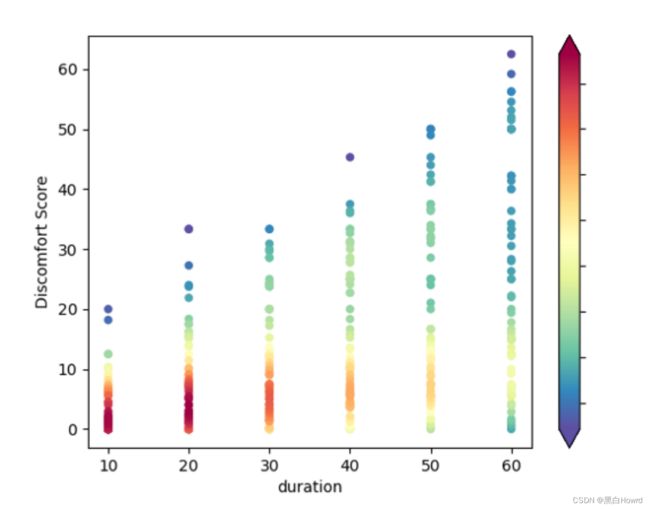
df = pd.read_csv("draw_picture/down_150.csv")
x = df['time']
y = df['score']
# Calculate the point density
xy = np.vstack([x,y])
z = gaussian_kde(xy)(xy)
# Sort the points by density, so that the densest points are plotted last
idx = z.argsort()
x, y, z = x[idx], y[idx], z[idx]
fig, ax = plt.subplots()
# reverse bar color
plt.scatter(x, y,c=z, s=20, cmap='Spectral_r')
# plt.title("up_60")
cb = plt.colorbar(extend='both')
cb.ax.yaxis.set_tick_params(labelright=False)
plt.ylabel("Discomfort Score")
plt.xlabel("duration")
plt.show()