前言
在此之前,已经跟大家分享了如何使用echarts画折线图、双折线图、柱状图,今天跟大家分享一下使用echarts画多维柱状图。
使用echarts遇到过的坑:
- 一定要给图表容器添加宽度与高度。
- 图表在容器中可以调整位置,让图表显示的更完整。
1.引入相关js
2.确定容器
3.定义画多维柱状图的方法,配置图表参数
/**
 * 画多维柱状图
 * @param container 容器
 * @param titleName 标题名称
 * @param legendData 菜单列表
 * @param xData x轴数据
 * @param seriesDatas 多维图表数据
 */
function drawManyBar(container, titleName, legendData, xData, seriesDatas) {
    var ticket = echarts.init(document.getElementById(container));
    ticketOption = {
        //标题样式
        title : {
            text : titleName,
            textStyle : {
                color : 'white',
            },
            left : 'left'
        },
        //提示框
        tooltip : {
            trigger : 'axis',
            backgroundColor : 'gray',
            axisPointer : {
                type : 'shadow'
            },
            //提示信息格式,支持html样式
            formatter : function(params) {
                var res = '';
                res += '' + params[0].name + '(万元)';
                for ( var i = 0, l = params.length; i < l; i++) {
                    res += '
' + ((i == 4) ? '  ' : '')
                            + params[i].seriesName + ' : '
                            + params[i].value;
                }
                res += '';
                return res;
            }
        },
        //菜单
        legend : {
            //菜单字体样式
            textStyle : {
                color : 'white'
            },
            //菜单位置
            x : 'right',
            //菜单数据
            data : legendData
        },

        xAxis : [ {
            type : 'category',
            axisLine : {
                show : true,
                //x轴线样式
                lineStyle : {
                    color : '#17273B',
                    width : 1,
                    type : 'solid',
                }
            },
            //x轴字体设置
            axisLabel : {
                show : true,
                fontSize : 12,
                color : 'white'
            },
            data : xData
        } ],
        yAxis : [ {
            type : 'value',
            //y轴字体设置
            axisLabel : {
                show : true,
                color : 'white',
                fontSize : 12,
                formatter : function(value) {
                    return value + '万';
                }
            },
            //y轴线设置不显示
            axisLine : {
                show : false
            },
            //与x轴平行的线样式
            splitLine : {
                show : true,
                lineStyle : {
                    color : '#17273B',
                    width : 1,
                    type : 'dashd',
                }
            }
        } ],
        series : [ {
            name : '5A',
            type : 'bar',
            //柱子宽度
            barWidth : 8,
            //柱状图样式
            itemStyle : {
                color : 'red',
                barBorderRadius : [ 30, 30, 0, 0 ]
            },
            data : seriesDatas[0]
        }, {
            name : '4A',
            type : 'bar',
            barWidth : 8,
            itemStyle : {
                color : 'orange',
                barBorderRadius : [ 30, 30, 0, 0 ]
            },
            data : seriesDatas[1]
        }, {
            name : '3A',
            type : 'bar',
            barWidth : 8,
            itemStyle : {
                color : 'yellow',
                barBorderRadius : [ 30, 30, 0, 0 ]
            },
            data : seriesDatas[2]
        }, {
            name : '2A',
            type : 'bar',
            barWidth : 8,
            itemStyle : {
                color : 'green',
                barBorderRadius : [ 30, 30, 0, 0 ]
            },
            data : seriesDatas[3]
        }, {
            name : 'A',
            type : 'bar',
            barWidth : 8,
            itemStyle : {
                color : 'blue',
                barBorderRadius : [ 30, 30, 0, 0 ]
            },
            data : seriesDatas[4]
        } ]
    };
    ticket.setOption(ticketOption);
}
4.调用方法,传递参数
var titleName = '景区门票收入走势';
var legendData = [ '5A', '4A', '3A', '2A', 'A' ];
var xData = [ '一季度', '二季度', '三季度', '四季度' ];
var seriesDatas = [[ 83, 56, 77, 99 ], [ 62, 55, 67, 82 ], [ 71, 45, 62, 79 ], [ 78, 40, 58, 77 ], [ 76, 33, 52, 67 ]];
drawManyBar('manyBar', titleName, legendData, xData, seriesDatas);
5.划重点,方法说明
- 多维柱状图与单柱状图的区别在于,使用了多组数据。
- 提示框组件,可以根据需求自定义显示格式,在tooltip里面,加入formatter,支持html样式。
- y轴是可以根据需要设置不同的单位的,比如万、K、毫升、C°等等,只需要在yAxis里面加入formatter,我这里使用的就是万。
- 与x轴平行的线,如果设置为true,但是width设置为0,该线是不显示的,设置为false则不受width值影响。
6.上图
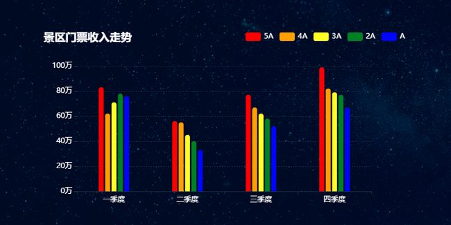
多维柱状图.png
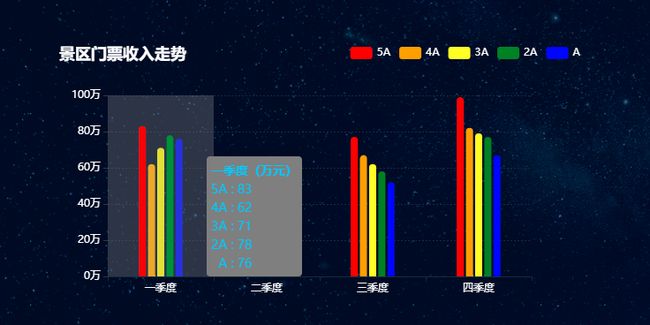
柱状图悬浮.png