跟着顶级科研报告IPCC学绘图:温度折线/柱图/条带/双y轴
复现IPCC气候变化过程图
引言
升温条带Warming stripes(有时称为气候条带,目前尚无合适且统一的中文释义)是数据可视化图形,使用一系列按时间顺序排列的彩色条纹来视觉化描绘长期温度趋势。

在IPCC报告中经常使用这一方案

IPCC是科研报告,同时也是向大众传播信息的媒介,变暖条纹体现了一种“极简主义” ,设想仅使用颜色来避免技术干扰,向非科学家直观地传达全球变暖趋势,非常值得我们学习。
升温条带为何显著?
近年来,极端天气事件越发频繁,而是成为一种常态。2022 年,暴雨季风引发了各地区的洪水事件[1]。另一方面,各个区域经历了几十年来最严重的热浪[2],干旱加剧,影响了中国广大地区的粮食生产、工业和基础设施。在欧洲一些国家,炎热的夏季已经变得越来越多,热浪席卷各处,而十年前情况并非如此。
2020 年,全球气温比工业化前水平高出1.2 °C (IPCC)。到本世纪末(2100 年),气温上升预计将达到约 100%。乐观情景下比工业化前水平高出1.8 ° C,当前政策下比工业化前水平高出2.7 ° C(IPCC)。
科学家们一致认为,到 2100 年,全球气温上升需要限制在比工业化前水平高1.5 °C的范围内,以防止气候系统发生不可逆转的变化(IPCC)。
数据和方法
本文通过 NASA过去 142 年的历史全球温度异常和NOAA的过去几十年二氧化碳全球浓度数据,基于 Python 中的 matplotlib 和 seaborn 包可视化数据。
代码
从 1880 年开始记录以来,全球年平均地表气温变化数据可从 NASA GISS 网站获取:https://data.giss.nasa.gov/gistemp/graphs_v4/
同时文末也提供了本文的数据和代码。
import pandas as pd
df = pd.read_csv('data/graph.csv')
#https://data.giss.nasa.gov/gistemp/graphs_v4/

为了可视化的一致性,自定义了 matplotlib 的默认设置。
import matplotlib.pyplot as plt
#figure size and font size
plt.rcParams["figure.figsize"] = (10, 6)
plt.rcParams["font.size"] = 14

#grid lines
plt.rcParams["axes.grid"] = True
plt.rcParams["axes.grid.axis"] = "y"

#Setting up axes
plt.rcParams['axes.spines.bottom'] = True
plt.rcParams['axes.spines.left'] = False
plt.rcParams['axes.spines.right'] = False
plt.rcParams['axes.spines.top'] = False
plt.rcParams['axes.linewidth'] = 0.5

#Ticks
plt.rcParams['ytick.major.width'] = 0
plt.rcParams['ytick.major.size'] = 0
首先进行一个简单的绘制。
import numpy as np
fig, ax = plt.subplots()
df["Annual Mean"].plot(ax = ax, c = "black", marker = "s")
df["Lowess Smoothing"].plot(ax = ax, c = "red")

x = df.index.tolist()
y = df["Annual Mean"].tolist()

# Define the 95% confidence interval
ci = np.mean(y) + 1.96 * np.std(y) / np.sqrt(len(y))
plt.fill_between(x, y-ci, y+ci,
             color = "gray",
                alpha = 0.25,
                label = "LSAT+SST Uncertainty")

ax.axhline(y = 0, linestyle = "--", color = "black")
plt.legend(loc = "upper left")
plt.ylabel("Temperature anomaly w.r.t. 1951-80 mean (°C)")
plt.title("Global surface air temperature change estimates based on land and ocean data")
plt.show()

黑线表示全球年平均地表气温相对于 1951-1980 年平均值的变化。红线是五年最低平滑线。
温度异常数据存在不确定性,这些不确定性源于测量、台站记录和土地覆盖变化导致的系统偏差。灰色阴影区域代表 95% 置信区间
本图也类似于IPCC的一贯表达方式。
本图也类似于IPCC的一贯表达方式。

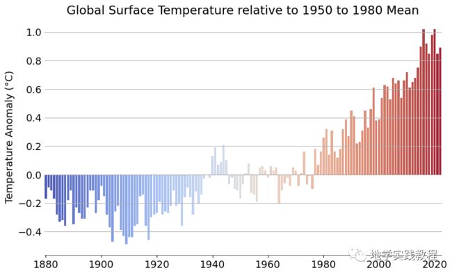
接下来绘制一个简单的条形图。
df["Annual Mean"].plot(kind = "bar")
years = np.arange(1880, 2022, 20)
plt.xticks(ticks = np.arange(0, 142, 20), labels = years)
plt.title("Global Surface Temperature relative to 1950 to 1980 Mean")
plt.ylabel("Temperature Anomaly (°C)")
plt.show()

现在的条形图很单调,我们想添加温度的映射,首先查看色卡:
my_cmap = plt.get_cmap("coolwarm")
my_cmap

映射色卡,这一步功能用seaborn则很方便:(只需要一行代码)
import seaborn as sns
sns.barplot(x = df.index, y = df["Annual Mean"],
            palette = "coolwarm")
years = np.arange(1880, 2022, 20)
plt.xticks(ticks = np.arange(0, 142, 20), labels = years)
plt.title("Global Surface Temperature relative to 1950 to 1980 Mean")
plt.ylabel("Temperature Anomaly (°C)")
plt.show()
如果使用matplotlib,相对麻烦,思路是用 lambda 匿名函数将温度缩放在 0 1之间。所选颜色图 (coolwarm)my_cmap包含 255 种组合,其中my_cmap([0])指的是蓝色,my_cmap([1])指的是红色。其次,缩放值为每个条纹选择这些颜色y。
x = df['Year'].tolist()
y = df["Annual Mean"].values.tolist()
#rescale y between 0 (min) and 1 (max)
rescale = lambda y: (y - np.min(y)) / (np.max(y) - np.min(y))
plt.bar(x, y, color = my_cmap(rescale(y)), width = 0.8)
years = np.arange(1880, 2022, 20)
plt.xticks(ticks = years, labels = years)
plt.title("Global surface temperature relative to 1951-1980 Mean")
plt.ylabel("Temperature Anomaly (°C)"); plt.xlabel("Year")
plt.show()
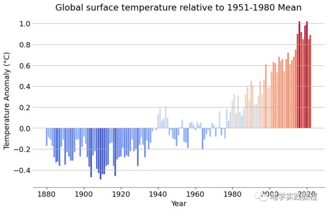
两张可视化是一致的,接下来想创建升温条带,这里使用PatchCollection功能,这个函数让我们能自定义各种图案。
首先将年平均气温异常读取为 pandas anomaly。然后用PatchCollection为 1880 年至 2021 年间的每一年创建了统一的条纹。数据anomaly相当于 PatchCollection col
from matplotlib.collections import PatchCollection
from matplotlib.patches import Rectangle
#matplotlib.patches.Rectangle

anomaly = df["Annual Mean"]

fig = plt.figure(figsize = (10, 1.5))
ax = fig.add_axes([0, 0, 1, 1])

#turn the x and y-axis off
ax.set_axis_off()

#create a collection with a rectangle for each year
col = PatchCollection([
                    Rectangle((y, -1),  #xy
                    1,       #width
                    2        #height
                     ) for y in np.arange(1880, 2022)])

#use the anomaly data for colormap
col.set_array(anomaly)

#apply the colormap colors
cmap = plt.get_cmap("coolwarm")
col.set_cmap(cmap)

ax.add_collection(col)

#average global temperature line

ax.axhline(0, linestyle = "--", color = "white")
df.plot(ax = ax, linestyle = "-", color = "black", legend = False)
#add title and text
ax.set_title("Warming Stripes (1880-2021)", loc = "center", y = 0.75)
ax.text(x = 1880, y = -1, s = "1880")
ax.text(x = 2022, y = -1, s = "2021")

ax.set_ylim(-1, 2)
ax.set_xlim(1870, 2030)

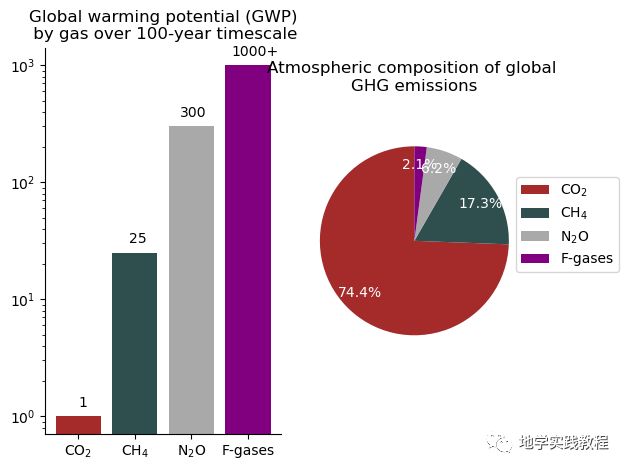
全球温度变暖有多方面原因,CO2温室气体是一个主要的原因:截至 2016 年,二氧化碳 (CO2) 占全球温室气体排放量的四分之三,其次是甲烷 (CH₄,17%)、一氧化二氮 (N2O,6%) ,可参考相关报告。
import matplotlib.pyplot as plt
gases = ["CO$_2$", "CH$_4$", "N$_2$O", "F-gases"]
warming_potential = [1, 25, 300, 1000]
text_height = [i*1.2 for i in warming_potential]
text = ["1", "25", "300", "1000+"]
volume = [74.4, 17.3, 6.2, 2.1]
colors = ["brown", "darkslategray", "darkgray", "purple"]


fig, (ax1, ax2) = plt.subplots(1, 2)

ax1.bar(gases, warming_potential, color = colors)
for i, height, word in zip(range(4), text_height, text):
    ax1.text(x = i * 0.9, y = height, s = word)
ax1.set_yscale("log")
ax1.set_title("Global warming potential (GWP)\n by gas over 100-year timescale", y = 1)
ax1.spines.top.set_visible(False)
ax1.spines.right.set_visible(False)

autopct = lambda p:f'{p:.1f}%'
ax2.pie(x = volume, radius = 1, startangle = 90, labels = gases,
        autopct = autopct, pctdistance = 0.8, colors = colors, textprops = {"color":"white"})
ax2.legend(labels = gases, bbox_to_anchor = (0.9, 0.8), ncol = 1)
ax2.set_title("Atmospheric composition of global \nGHG emissions", y = 1.1)

plt.tight_layout()
plt.show()
最后将二氧化碳与温度结合在一个图里,创建双y轴图像,来完成本文的收尾~
co2_annual = pd.read_csv('data/co2_annmean_mlo.csv')
# https://gml.noaa.gov/ccgg/trends/global.html#global
rescale = lambda y: (y - np.min(y)) / (np.max(y) - np.min(y))

fig, ax1 = plt.subplots()
df_temp = df[df['Year'] >= 1959]
x = df_temp['Year'].tolist()
y = df_temp["mean"].values.tolist()

ax1.bar(x, y, color = my_cmap(rescale(y)), width = 0.8)
ax1.set_ylabel("Temperature anomaly \n relative to 1951-80 mean (°C)", color = "red")
ax1.tick_params(axis='y', color='red', labelcolor='red')
ax1.grid(False)

#Add twin axes
ax2 = ax1.twinx()
ax2.plot(x, co2_annual['mean'], color = "black", marker = "o", markersize = 4)
ax2.set_ylabel("CO$_2$ (ppm)")
ax2.grid(False)

ax2.tick_params(axis='y')

for pos in ["top"]:
    ax1.spines[pos].set_visible(False)
    ax2.spines[pos].set_visible(False)

plt.grid()
plt.title("Global temperature anomaly and atmospheric CO$_2$ emissions concentration\n (1959-2021)",
         pad = 20)

plt.show()

reference
-
https://www.nytimes.com/2022/09/14/world/asia/pakistan-floods.html
-
https://multimedia.scmp.com/infographics/news/china/article/3190803/china-drought/index.html