【Flutter--- UI搭建笔记】
如何布局
Visible Widget
- Text
- Image
- Icon
Text('Hello World')

Image.asset(
  'images/lake.jpg',
  fit: BoxFit.cover,
),

Icon(
  Icons.star,
  color: Colors.red[500],
),
添加到 Layout Widget
1个child
- Center
- Container
Center(
  child: Text('Hello World'),
),
很多child
- Row
- Column
- ListView
- Stack.
添加到Page
- Material App
- Material App需要使用MaterialApp作为page
- Material App 可以使用 Scaffold widget,提供了default banner, background color, and has API for adding drawers, snack bars, and bottom sheets.
class MyApp extends StatelessWidget {
  @override
  Widget build(BuildContext context) {
    return MaterialApp(
      title: 'Flutter layout demo',
      home: Scaffold(
        appBar: AppBar(
          title: Text('Flutter layout demo'),
        ),
        body: Center(
          child: Text('Hello World'),
        ),
      ),
    );
  }
}
- None matiral app
non-Material app doesn’t include an AppBar, title, or background color.
class MyApp extends StatelessWidget {
  @override
  Widget build(BuildContext context) {
    return Container(
      decoration: BoxDecoration(color: Colors.white),
      child: Center(
        child: Text(
          'Hello World',
          textDirection: TextDirection.ltr,
          style: TextStyle(
            fontSize: 32,
            color: Colors.black87,
          ),
        ),
      ),
    );
  }
}
Aligning widgets
MainAxisAlignment
- Row的主轴是水平方向上面的
- Column是竖直方向上的

Row(
  mainAxisAlignment: MainAxisAlignment.spaceEvenly,
  children: [
    Image.asset('images/pic1.jpg'),
    Image.asset('images/pic2.jpg'),
    Image.asset('images/pic3.jpg'),
  ],
);

Column(
  mainAxisAlignment: MainAxisAlignment.spaceEvenly,
  children: [
    Image.asset('images/pic1.jpg'),
    Image.asset('images/pic2.jpg'),
    Image.asset('images/pic3.jpg'),
  ],
);

Sizing widgets
- 如果图在Row摆列中,超出屏幕范围了(图太大)。可以用Expand,类似Android ImageView scaleType:fitXY
Row(
  crossAxisAlignment: CrossAxisAlignment.center,
  children: [
    Expanded(
      child: Image.asset('images/pic1.jpg'),
    ),
    Expanded(
      child: Image.asset('images/pic2.jpg'),
    ),
    Expanded(
      child: Image.asset('images/pic3.jpg'),
    ),
  ],
);
- 突出一个Item为别的两倍,类似Android里的 weight
- flex: 2
Row(
  crossAxisAlignment: CrossAxisAlignment.center,
  children: [
    Expanded(
      child: Image.asset('images/pic1.jpg'),
    ),
    Expanded(
      flex: 2,
      child: Image.asset('images/pic2.jpg'),
    ),
    Expanded(
      child: Image.asset('images/pic3.jpg'),
    ),
  ],
);
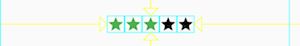
Packing widgets
缩短widget之间的空间
Row(
  mainAxisSize: MainAxisSize.min,
  children: [
    Icon(Icons.star, color: Colors.green[500]),
    Icon(Icons.star, color: Colors.green[500]),
    Icon(Icons.star, color: Colors.green[500]),
    Icon(Icons.star, color: Colors.black),
    Icon(Icons.star, color: Colors.black),
  ],
)
Nesting rows and columns


对于嵌套过深,为了便于阅读,可以将组件 在变量、方法里声明。
var stars = Row(
  mainAxisSize: MainAxisSize.min,
  children: [
    Icon(Icons.star, color: Colors.green[500]),
    Icon(Icons.star, color: Colors.green[500]),
    Icon(Icons.star, color: Colors.green[500]),
    Icon(Icons.star, color: Colors.black),
    Icon(Icons.star, color: Colors.black),
  ],
);

final ratings = Container(
  padding: EdgeInsets.all(20),
  child: Row(
    mainAxisAlignment: MainAxisAlignment.spaceEvenly,
    children: [
      stars,
      Text(
        '170 Reviews',
        style: TextStyle(
          color: Colors.black,
          fontWeight: FontWeight.w800,
          fontFamily: 'Roboto',
          letterSpacing: 0.5,
          fontSize: 20,
        ),
      ),
    ],
  ),
);
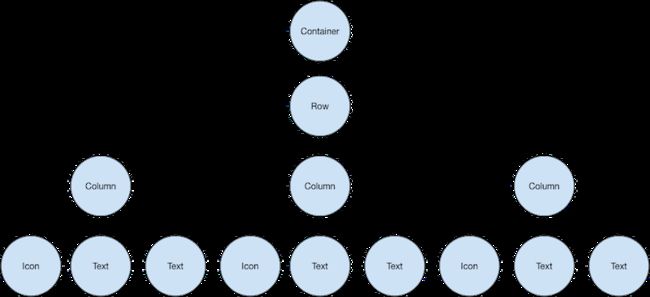
DefaultTextStyle.merge用于同一Text的style
final descTextStyle = TextStyle(
  color: Colors.black,
  fontWeight: FontWeight.w800,
  fontFamily: 'Roboto',
  letterSpacing: 0.5,
  fontSize: 18,
  height: 2,
);

// DefaultTextStyle.merge() allows you to create a default text
// style that is inherited by its child and all subsequent children.
final iconList = DefaultTextStyle.merge(
  style: descTextStyle,
  child: Container(
    padding: EdgeInsets.all(20),
    child: Row(
      mainAxisAlignment: MainAxisAlignment.spaceEvenly,
      children: [
        Column(
          children: [
            Icon(Icons.kitchen, color: Colors.green[500]),
            Text('PREP:'),
            Text('25 min'),
          ],
        ),
        Column(
          children: [
            Icon(Icons.timer, color: Colors.green[500]),
            Text('COOK:'),
            Text('1 hr'),
          ],
        ),
        Column(
          children: [
            Icon(Icons.restaurant, color: Colors.green[500]),
            Text('FEEDS:'),
            Text('4-6'),
          ],
        ),
      ],
    ),
  ),
);
常见Widget
- 标准widget
- Material库widget
Standard widgets
- Container:
- Add padding, margins, borders
- Change background color or image
- Contains a single child widget, but that child can be a Row, Column, or even the root of a widget tree

Widget _buildImageColumn() => Container(
      decoration: BoxDecoration(
        color: Colors.black26,
      ),
      child: Column(
        children: [
          _buildImageRow(1),
          _buildImageRow(3),
        ],
      ),
    );

    Widget _buildDecoratedImage(int imageIndex) => Expanded(
      child: Container(
        decoration: BoxDecoration(
          border: Border.all(width: 10, color: Colors.black38),
          borderRadius: const BorderRadius.all(const Radius.circular(8)),
        ),
        margin: const EdgeInsets.all(4),
        child: Image.asset('images/pic$imageIndex.jpg'),
      ),
    );

Widget _buildImageRow(int imageIndex) => Row(
      children: [
        _buildDecoratedImage(imageIndex),
        _buildDecoratedImage(imageIndex + 1),
      ],
    );
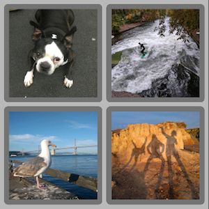
- GridView: Lays widgets out as a scrollable grid.
- 超出以后scroll
- 可以设定grid粒度
- GridView.count 列数
- GridView.extent 一个item的最大宽度
[外链图片转存失败,源站可能有防盗链机制,建议将图片保存下来直接上传(img-FJEqjxHx-1614937254851)()]
Widget _buildGrid() => GridView.extent(
    maxCrossAxisExtent: 150,
    padding: const EdgeInsets.all(4),
    mainAxisSpacing: 4,
    crossAxisSpacing: 4,
    children: _buildGridTileList(30));

// The images are saved with names pic0.jpg, pic1.jpg...pic29.jpg.
// The List.generate() constructor allows an easy way to create
// a list when objects have a predictable naming pattern.
List _buildGridTileList(int count) => List.generate(
    count, (i) => Container(child: Image.asset('images/pic$i.jpg')));
- ListView: Lays widgets out as a scrollable list.
Tile 瓷砖、瓦片,这里就是ListView里的Item
Widget _buildList() => ListView(
      children: [
        _tile('CineArts at the Empire', '85 W Portal Ave', Icons.theaters),
        _tile('The Castro Theater', '429 Castro St', Icons.theaters),
        _tile('Alamo Drafthouse Cinema', '2550 Mission St', Icons.theaters),
        _tile('Roxie Theater', '3117 16th St', Icons.theaters),
        _tile('United Artists Stonestown Twin', '501 Buckingham Way',
            Icons.theaters),
        _tile('AMC Metreon 16', '135 4th St #3000', Icons.theaters),
        Divider(),
        _tile('K\'s Kitchen', '757 Monterey Blvd', Icons.restaurant),
        _tile('Emmy\'s Restaurant', '1923 Ocean Ave', Icons.restaurant),
        _tile(
            'Chaiya Thai Restaurant', '272 Claremont Blvd', Icons.restaurant),
        _tile('La Ciccia', '291 30th St', Icons.restaurant),
      ],
    );

ListTile _tile(String title, String subtitle, IconData icon) => ListTile(
      title: Text(title,
          style: TextStyle(
            fontWeight: FontWeight.w500,
            fontSize: 20,
          )),
      subtitle: Text(subtitle),
      leading: Icon(
        icon,
        color: Colors.blue[500],
      ),
    );

- Stack: Overlaps a widget on top of another.
- 叠在别的Widget上

- 叠在别的Widget上
Widget _buildStack() => Stack(
    alignment: const Alignment(0.6, 0.6),
    children: [
      CircleAvatar(
        backgroundImage: AssetImage('images/pic.jpg'),
        radius: 100,
      ),
      Container(
        decoration: BoxDecoration(
          color: Colors.black45,
        ),
        child: Text(
          'Mia B',
          style: TextStyle(
            fontSize: 20,
            fontWeight: FontWeight.bold,
            color: Colors.white,
          ),
        ),
      ),
    ],
  );
Material widgets
- Card: Organizes related info into a box with rounded corners and a drop shadow.
- Implements a Material card
- Used for presenting related nuggets of information
- Accepts a single child, but that child can be a Row, Column, or other widget that holds a list of children
- Displayed with rounded corners and a drop shadow
- A Card’s content can’t scroll
- From the Material library
- By default, a Card shrinks its size to 0 by 0 pixels. You can use SizedBox to constrain the size of a card.
- single child, but its child can be a column, row, list, grid, or other widget

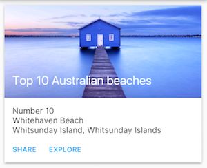
Widget _buildCard() => SizedBox(
    height: 210,
    child: Card(
      child: Column(
        children: [
          ListTile(
            title: Text('1625 Main Street',
                style: TextStyle(fontWeight: FontWeight.w500)),
            subtitle: Text('My City, CA 99984'),
            leading: Icon(
              Icons.restaurant_menu,
              color: Colors.blue[500],
            ),
          ),
          Divider(),
          ListTile(
            title: Text('(408) 555-1212',
                style: TextStyle(fontWeight: FontWeight.w500)),
            leading: Icon(
              Icons.contact_phone,
              color: Colors.blue[500],
            ),
          ),
          ListTile(
            title: Text('[email protected]'),
            leading: Icon(
              Icons.contact_mail,
              color: Colors.blue[500],
            ),
          ),
        ],
      ),
    ),
  );
- ListTile: Organizes up to 3 lines of text, and optional leading and trailing icons, into a row.
- A specialized row that contains up to 3 lines of text and optional icons
- Less configurable than Row, but easier to use
- From the Material library
- 常用于 Card、ListView
- a row 多至 3 lines of text 和 可选的 leading and trailing icons