前端追梦人CSS教程
一. 基础概念
1.1 什么是CSS
层叠样式表(英文全称:Cascading Style Sheets)是一种用来表现HTML(标准通用标记语言的一个应用)或XML(标准通用标记语言的一个子集)等文件样式的计算机语言。
1.2 语法
选择器 {
	color: blue;
  font-size: 12p;
}
1.3 选择器
根据规则选取页面中的dom元素, 包含以下选择器分类:
| .class | .intro | 选择所有class=“intro”的元素 | 1 |
|---|---|---|---|
| #id | #firstname | 选择所有id=“firstname”的元素 | 1 |
| * | * | 选择所有元素 | 2 |
| element | p | 选择所有元素 | 1 |
| element,element | div,p | 选择所有元素和元素 | 1 |
| element element | div p | 选择元素内的所有元素 | 1 |
| element>element | div>p | 选择所有父级是元素的元素 | 2 |
| element+element | div+p | 选择所有紧接着元素之后的元素 | 2 |
| [attribute] | [target] | 选择所有带有target属性元素 | 2 |
| [attribute=value] | [target=-blank] | 选择所有使用target=“-blank”的元素 | 2 |
| [attribute~=value] | [title~=flower] | 选择标题属性包含单词”flower”的所有元素 | 2 |
| [attribute | =language] | [lang | =en] |
| :link | a:link | 选择所有未访问链接 | 1 |
| :visited | a:visited | 选择所有访问过的链接 | 1 |
| :active | a:active | 选择活动链接 | 1 |
| :hover | a:hover | 选择鼠标在链接上面时 | 1 |
| :focus | input:focus | 选择具有焦点的输入元素 | 2 |
| :first-letter | p:first-letter | 选择每一个元素的第一个字母 | 1 |
| :first-line | p:first-line | 选择每一个元素的第一行 | 1 |
| :first-child | p:first-child | 指定只有当元素是其父级的第一个子级的样式。 | 2 |
| :before | p:before | 在每个元素之前插入内容 | 2 |
| :after | p:after | 在每个元素之后插入内容 | 2 |
| :lang(language) | p:lang(it) | 选择一个lang属性的起始值=“it”的所有元素 | 2 |
| element1~element2 | p~ul | 选择p元素之后的每一个ul元素 | 3 |
| [attribute^=value] | a[src^=“https”] | 选择每一个src属性的值以”https”开头的元素 | 3 |
| [attribute$=value] | a[src$=“.pdf”] | 选择每一个src属性的值以”.pdf”结尾的元素 | 3 |
| [attribute*=value] | a[src*=“axihe”] | 选择每一个src属性的值包含子字符串”axihe”的元素 | 3 |
| :first-of-type | p:first-of-type | 选择每个p元素是其父级的第一个p元素 | 3 |
| :last-of-type | p:last-of-type | 选择每个p元素是其父级的最后一个p元素 | 3 |
| :only-of-type | p:only-of-type | 选择每个p元素是其父级的唯一p元素 | 3 |
| :only-child | p:only-child | 选择每个p元素是其父级的唯一子元素 | 3 |
| :nth-child(n) | p:nth-child(2) | 选择每个p元素是其父级的第二个子元素 | 3 |
| :nth-last-child(n) | p:nth-last-child(2) | 选择每个p元素的是其父级的第二个子元素,从最后一个子项计数 | 3 |
| :nth-of-type(n) | p:nth-of-type(2) | 选择每个p元素是其父级的第二个p元素 | 3 |
| :nth-last-of-type(n) | p:nth-last-of-type(2) | 选择每个p元素的是其父级的第二个p元素,从最后一个子项计数 | 3 |
| :last-child | p:last-child | 选择每个p元素是其父级的最后一个子级。 | 3 |
| :root | :root | 选择文档的根元素 | 3 |
| :empty | p:empty | 选择每个没有任何子级的p元素(包括文本节点) | 3 |
| :target | #news:target | 选择当前活动的#news元素(包含该锚名称的点击的URL) | 3 |
| :enabled | input:enabled | 选择每一个已启用的输入元素 | 3 |
| :disabled | input:disabled | 选择每一个禁用的输入元素 | 3 |
| :checked | input:checked | 选择每个选中的输入元素 | 3 |
| :not(selector) | :not§ | 选择每个并非p元素的元素 | 3 |
| ::selection | ::selection | 匹配元素中被用户选中或处于高亮状态的部分 | 3 |
| :out-of-range | :out-of-range | 匹配值在指定区间之外的input元素 | 3 |
| :in-range | :in-range | 匹配值在指定区间之内的input元素 | 3 |
| :read-write | :read-write | 用于匹配可读及可写的元素 | 3 |
| :read-only | :read-only | 用于匹配设置 “readonly”(只读) 属性的元素 | 3 |
| :optional | :optional | 用于匹配可选的输入元素 | 3 |
| :required | :required | 用于匹配设置了 “required” 属性的元素 | 3 |
| :valid | :valid | 用于匹配输入值为合法的元素 | 3 |
| :invalid | :invalid | 用于匹配输入值为非法的元素 | 3 |
1.4 插入样式表的方法
插入样式表的方法有三种:
- 外部样式表(External style sheet)
- 内部样式表(Internal style sheet)
- 内联样式(Inline style)
1.5 样式优先级
内联样式)Inline style > (内部样式)Internal style sheet >(外部样式)External style sheet > 浏览器默认样式
优先级逐级增加的选择器列表:
- 通用选择器(*)
- 元素(类型)选择器
- 类选择器
- 属性选择器
- 伪类
- ID 选择器
- 内联样式
经验法则:
- Always 要优化考虑使用样式规则的优先级来解决问题而不是
!important - Only 只在需要覆盖全站或外部 css(例如引用的 ExtJs 或者 YUI )的特定页面中使用
!important - Never 永远不要在全站范围的 css 上使用
!important - Never 永远不要在你的插件中使用
!important
权重的计算
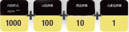
<html>
  <head>
    <style type="text/css">
        #redP p {
             /* 权值 = 100+1=101 */
             color:#F00;  /* 红色 */
        }

        #redP .red em {
             /* 权值 = 100+10+1=111 */
             color:#00F; /* 蓝色 */

        }

        #redP p span em {
             /* 权值 = 100+1+1+1=103 */
             color:#FF0;/*黄色*/
        }
    style>
  head>
  <body>
     <div id="redP">
        <p class="red">red
           <span><em>em redem>span>
        p>
        <p>redp>
     div>
  body>
html>
二. 常用属性
2.1 background
background的值的顺序是background-color,background-image,background-repeat,background-attachment,background-position,background-size。
如果用background-size,一定要用/分隔
定义背景效果
| background | 复合属性。设置对象的背景特性。 | 1 |
|---|---|---|
| background-attachment | 设置或检索背景图像是随对象内容滚动还是固定的。必须先指定background-image属性。 | 1 |
| background-color | 设置或检索对象的背景颜色。 | 1 |
| background-image | 设置或检索对象的背景图像。 | 1 |
| background-position | 设置或检索对象的背景图像位置。必须先指定background-image属性。 | 1 |
| background-repeat | 设置或检索对象的背景图像如何铺排填充。必须先指定background-image属性。 | 1 |
| background-clip | 指定对象的背景图像向外裁剪的区域。 | 3 |
| background-origin | S设置或检索对象的背景图像计算background-position时的参考原点(位置)。 | 3 |
| background-size | 检索或设置对象的背景图像的尺寸大小。 | 3 |
2.2 文本属性
| color | 设置文本颜色 |
|---|---|
| direction | 设置文本方向。 |
| letter-spacing | 设置字符间距 |
| line-height | 设置行高 |
| text-align | 对齐元素中的文本 |
| text-decoration | 向文本添加修饰 |
| text-indent | 缩进元素中文本的首行 |
| text-shadow | 设置文本阴影 |
| text-transform | 控制元素中的字母 |
| unicode-bidi | 设置或返回文本是否被重写 |
| vertical-align | 设置元素的垂直对齐 |
| white-space | 设置元素中空白的处理方式 |
| word-spacing | 设置字间距 |
2.3 字体Font
2.3.1 CSS字形

Scans-serif: 无衬线
Serif: 有称线
- 通用字体系列 - 拥有相似外观的字体系统组合(如 “Serif” 或 “Monospace”)
- 特定字体系列 - 一个特定的字体系列(如 “Times” 或 “Courier”)
| Serif | Times New Roman Georgia | Serif字体中字符在行的末端拥有额外的装饰 |
|---|---|---|
| Sans-serif | Arial Verdana | "Sans"是指无 - 这些字体在末端没有额外的装饰 |
| Monospace | Courier New Lucida Console | 所有的等宽字符具有相同的宽度 |
2.3.2 字体系列
font-family 属性设置文本的字体系列。
font-family 属性应该设置几个字体名称作为一种"后备"机制,如果浏览器不支持第一种字体,他将尝试下一种字体。
注意: 如果字体系列的名称超过一个字,它必须用引号,如Font Family:“宋体”
p{font-family:"Times New Roman", Times, serif;}
2.3.3 字体样式
- 正常(normal) - 正常显示文本
- 斜体(italic) - 以斜体字显示的文字
- 倾斜的文字(oblique) - 文字向一边倾斜(和斜体非常类似,但不太支持)
2.3.4 字体大小
绝对大小:
- 设置一个指定大小的文本
- 不允许用户在所有浏览器中改变文本大小
- 确定了输出的物理尺寸时绝对大小很有用
相对大小:
- 相对于周围的元素来设置大小
- 允许用户在浏览器中改变文字大小
| font | 在一个声明中设置所有字体属性 | 1 |
|---|---|---|
| font-family | 规定文本的字体系列 | 1 |
| font-size | 规定文本的字体尺寸 | 1 |
| font-style | 规定文本的字体样式 | 1 |
| font-variant | 规定文本的字体样式 | 1 |
| font-weight | 规定字体的粗细 | 1 |
| @font-face | 一个规则,允许网站下载并使用其他超过”Web- safe”字体的字体 | 3 |
| font-size-adjust | 为元素规定 aspect 值 | 3 |
| font-stretch | 收缩或拉伸当前的字体系列 | 3 |
2.4 边框 (Border) 和 轮廓 (Outline)
| border | 复合属性。设置对象边框的特性。 | 1 |
|---|---|---|
| border-bottom | 复合属性。设置对象底部边框的特性。 | 1 |
| border-bottom-color | 设置或检索对象的底部边框颜色。 | 1 |
| border-bottom-style | 设置或检索对象的底部边框样式。 | 1 |
| border-bottom-width | 设置或检索对象的底部边框宽度。 | 1 |
| border-color | 置或检索对象的边框颜色。 | 1 |
| border-left | 复合属性。设置对象左边边框的特性。 | 1 |
| border-left-color | 设置或检索对象的左边边框颜色。 | 1 |
| border-left-style | 设置或检索对象的左边边框样式。 | 1 |
| border-left-width | 设置或检索对象的左边边框宽度。 | 1 |
| border-right | 复合属性。设置对象右边边框的特性。 | 1 |
| border-right-color | 设置或检索对象的右边边框颜色。 | 1 |
| border-right-style | 设置或检索对象的右边边框样式。 | 1 |
| border-right-width | 设置或检索对象的右边边框宽度。 | 1 |
| border-style | 设置或检索对象的边框样式。 | 1 |
| border-top | 复合属性。设置对象顶部边框的特性。 | 1 |
| border-top-color | 设置或检索对象的顶部边框颜色 | 1 |
| border-top-style | 设置或检索对象的顶部边框样式。 | 1 |
| border-top-width | 设置或检索对象的顶部边框宽度。 | 1 |
| border-width | 设置或检索对象的边框宽度。 | 1 |
| outline | 复合属性。设置或检索对象外的线条轮廓。 | 2 |
| outline-color | 设置或检索对象外的线条轮廓的颜色。 | 2 |
| outline-style | 设置或检索对象外的线条轮廓的样式。 | 2 |
| outline-width | 设置或检索对象外的线条轮廓的宽度。 | 2 |
| border-bottom-left-radius | 设置或检索对象的左下角圆角边框。 提供 2 个参数,2 个参数以空格分隔, 每个参数允许设置 1 个参数值, 第 1 个参数表示水平半径,第 2 个参数表示垂直半径, 如第 2 个参数省略,则默认等于第 1 个参数 | 3 |
| border-bottom-right-radius | 设置或检索对象的右下角圆角边框。 | 3 |
| border-image | 设置或检索对象的边框样式使用图像来填充。 | 3 |
| border-image-outset | 规定边框图像超过边框的量。 | 3 |
| border-image-repeat | 规定图像边框是否应该被重复(repeated)、拉伸(stretched)或铺满(rounded)。 | 3 |
| border-image-slice | 规定图像边框的向内偏移。 | 3 |
| border-image-source | 规定要使用的图像,代替 border-style 属性中设置的边框样式。 | 3 |
| border-image-width | 规定图像边框的宽度。 | 3 |
| border-radius | 设置或检索对象使用圆角边框。 | 3 |
| border-top-left-radius | 定义左上角边框的形状。 | 3 |
| border-top-right-radius | 定义右上角边框的形状。 | 3 |
| box-decoration-break | 规定行内元素被折行 | 3 |
| box-shadow | 向方框添加一个或多个阴影。 | 3 |
2.5 动画属性
| @keyframes | 定义一个动画,@keyframes定义的动画名称用来被animation-name所使用。 | 3 |
|---|---|---|
| animation | 复合属性。检索或设置对象所应用的动画特效。 | 3 |
| animation-name | 检索或设置对象所应用的动画名称 ,必须与规则@keyframes配合使用,因为动画名称由@keyframes定义 | 3 |
| animation-duration | 检索或设置对象动画的持续时间 | 3 |
| animation-timing-function | 检索或设置对象动画的过渡类型 | 3 |
| animation-delay | 检索或设置对象动画的延迟时间 | 3 |
| animation-iteration-count | 检索或设置对象动画的循环次数 | 3 |
| animation-direction | 检索或设置对象动画在循环中是否反向运动 | 3 |
| animation-play-state | 检索或设置对象动画的状态 | 3 |
2.6 内边距
| padding | 在一个声明中设置所有填充属性 | 1 |
|---|---|---|
| padding-bottom | 设置元素的底填充 | 1 |
| padding-left | 设置元素的左填充 | 1 |
| padding-right | 设置元素的右填充 | 1 |
| padding-top | 设置元素的顶部填充 | 1 |
2.7 链接样式
- a:link - 正常,未访问过的链接
- a:visited - 用户已访问过的链接
- a:hover - 当用户鼠标放在链接上时
- a:active - 链接被点击的那一刻
顺序规则:
- a:hover 必须跟在 a:link 和 a:visited后面
- a:active 必须跟在 a:hover后面
a:link {color:#000000;}      /* 未访问链接*/
a:visited {color:#00FF00;}  /* 已访问链接 */
a:hover {color:#FF00FF;}  /* 鼠标移动到链接上 */
a:active {color:#0000FF;}  /* 鼠标点击时 */
2.8 列表样式(ul)
CSS列表属性作用如下:
- 设置不同的列表项标记为有序列表
- 设置不同的列表项标记为无序列表
- 设置列表项标记为图像
在HTML中,有两种类型的列表:
- 无序列表 - 列表项标记用特殊图形(如小黑点、小方框等)
- 有序列表 - 列表项的标记有数字或字母
使用CSS,可以列出进一步的样式,并可用图像作列表项标记。
2.8.1 作为列表项标记的图像
ul {
            list-style: disc inside url(http://img5.imgtn.bdimg.com/it/u=2916716554,654971401&fm=26&gp=0.jpg);
        }
2.8.2 所有的CSS列表属性
| list-style | 简写属性。用于把所有用于列表的属性设置于一个声明中 |
|---|---|
| list-style-image | 将图象设置为列表项标志。 |
| list-style-position | 设置列表中列表项标志的位置。 |
| list-style-type | 设置列表项标志的类型。 |
2.9 CSS Table(表格)
2.9.1 表格边框
table, th, td {
    border: 1px solid black;
}
2.9.2 折叠边框
border-collapse 属性设置表格的边框是否被折叠成一个单一的边框或隔开:
table{
    border-collapse:collapse;
}
table,th, td{
    border: 1px solid black;
}
2.9.3 表格宽度和高度
table
{
    width:100%;
}
th
{
    height:50px;
}
2.9.4 表格文字对齐
表格中的文本对齐和垂直对齐属性。
text-align属性设置水平对齐方式,向左,右,或中心:
td {
    text-align:right;
}
垂直对齐属性设置垂直对齐,比如顶部,底部或中间:
td {
    height:50px;
    vertical-align:bottom;
}
2.9.5 表格填充
td {
    padding:15px;
}
2.9.6 表格颜色
table, td, th
{
    border:1px solid green;
}
th
{
    background-color:green;
    color:white;
}
2.10 CSS 盒子模型
在HTML中的每个element(元素)都可以看作一个矩形的盒子,矩形从内到外依次由元素的内容(content)、内边距(padding)、边框(border)、外边距(margin)组成。
在CSS的布局中,元素的矩形被称为"Box Model",即盒子模型。在浏览器渲染页面时,盒子模型决定了元素的大小和位置。
[外链图片转存失败,源站可能有防盗链机制,建议将图片保存下来直接上传(img-hnrCsB3E-1604913788979)(https://a.axihe.com/img/css/box-model.gif)]
- Margin(外边距) - 清除边框外的区域,外边距是透明的。
- Border(边框) - 围绕在内边距和内容外的边框。
- Padding(内边距) - 清除内容周围的区域,内边距是透明的。
- Content(内容) - 盒子的内容,显示文本和图像。
2.10.1 元素的宽度和高度
CSS 框模型 (Box Model) 规定了元素框处理元素内容、内边距、边框 和 外边距 的方式。
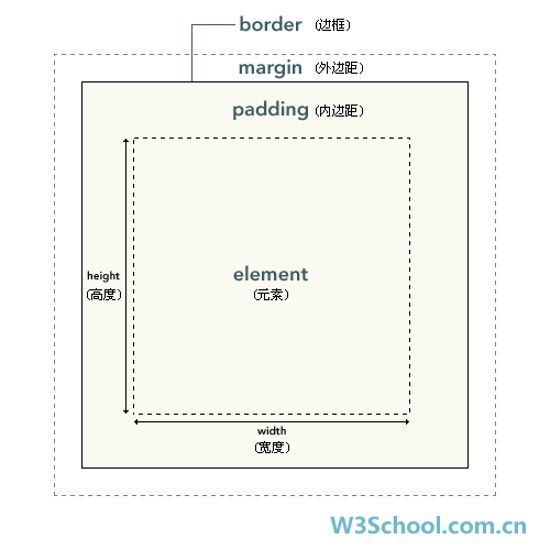
元素框的最内部分是实际的内容,直接包围内容的是内边距。内边距呈现了元素的背景。内边距的边缘是边框。边框以外是外边距,外边距默认是透明的,因此不会遮挡其后的任何元素。
2.10.2 浏览器的兼容性问题
内边距、边框和外边距都是可选的,默认值是零。但是,许多元素将由用户代理样式表设置外边距和内边距。可以通过将元素的 margin 和 padding 设置为零来覆盖这些浏览器样式。这可以分别进行,也可以使用通用选择器对所有元素进行设置:
* {
  margin: 0;
  padding: 0;
}
建议不要给元素添加具有指定宽度的内边距,而是尝试将内边距或外边距添加到元素的父元素和子元素。
在 CSS 中,width 和 height 指的是内容区域的宽度和高度。增加内边距、边框和外边距不会影响内容区域的尺寸,但是会增加元素框的总尺寸。
假设框的每个边上有 10 个像素的外边距和 5 个像素的内边距。如果希望这个元素框达到 100 个像素,就需要将内容的宽度设置为 70 像素,请看下图:
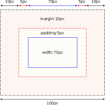
#box {
  width: 70px;
  margin: 10px;
  padding: 5px;
}
2.10.3 获取DOM元素宽高的属性
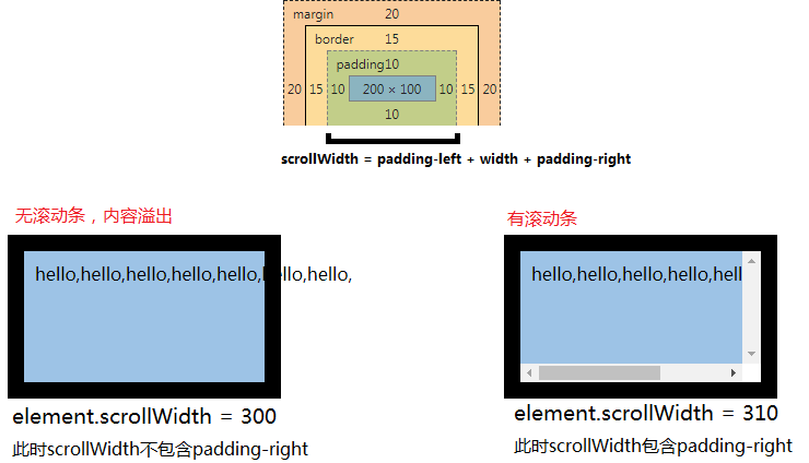
在DOM中,获取元素高宽有以下属性:clientWidth/clientHeight、offsetWidth/offsetHeight、scrollWidth/scrollHeight
clientWidth、clientHeight:
说明:包含内边距、内容区域的宽度、高度;若含有滚动条,将会减去滚动条的宽度、高度。
公式:
element.clientWidth = padding-left + width + padding-right
element.clientHeight = padding-top + height + padding-bottom

offsetWidth、offsetHeight:
说明:包含了边框、内边距、内容区域以及滚动条等范围的宽度、高度。
公式:
element.offsetWidth = border-left + padding-left + width + padding-right + border-right
element.offsetHeight = border-top + padding-top + height + padding-bottom + border-bottom
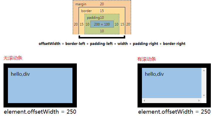
scrollWidth、scrollHeight
说明:与clientWidth、clientHeight类似(包含内边距、内容区域,但不包括滚动条),不同的是scrollWidth、scrollHeight与元素的overflow样式属性息息相关:
当块级元素的内容超出元素大小时,其内容会根据overflow设定的值出现滚动条或内容溢出,scrollWidth、scrollHeight包含了这些不可见的内容区域。
2.10.4 box-sizing
| 属性值 | 属性含义 |
|---|---|
| Content-box | 说明:表示CSS中的width和height属性的值只会应用到元素的内容区域。将采用标准模式****解析计算,也是默认模式 |
| Border-box | 表示元素的边框和内边距的范围包含在CSS中的width、height内。将采用怪异模式进行计算 |
注意: 两种盒子模型都不将margin计算在内
2.10.5 jQuery中元素宽度(高度)
$(element).width():获取元素content(内容)区域的宽度。若元素的含有 box-sizing: border-box ,会减去相应的padding、boder。
$(element).innerWidth():获取元素 content区域 + padding 的宽度。
$(element).outerWidth():获取元素 content区域 + padding + boder 的宽度。
$(element).outerWidth(true):获取元素 content区域 + padding + boder + margin 的宽度。
2.11 CSS margin(外边距)
| margin | 简写属性。在一个声明中设置所有外边距属性。 |
|---|---|
| margin-bottom | 设置元素的下外边距。 |
| margin-left | 设置元素的左外边距。 |
| margin-right | 设置元素的右外边距。 |
| margin-top | 设置元素的上外边距。 |
2.11.1 CSS 外边距合并
外边距合并指的是,当两个垂直外边距相遇时,它们将形成一个外边距。
合并后的外边距的高度等于两个发生合并的外边距的高度中的较大者。

尽管看上去有些奇怪,但是外边距甚至可以与自身发生合并。
假设有一个空元素,它有外边距,但是没有边框或填充。在这种情况下,上外边距与下外边距就碰到了一起,它们会发生合并:
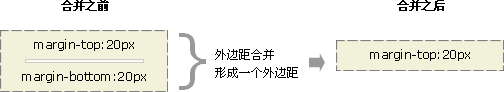
如果这个外边距遇到另一个元素的外边距,它还会发生合并:
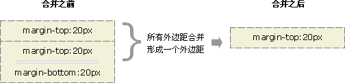
这就是一系列的段落元素占用空间非常小的原因,因为它们的所有外边距都合并到一起,形成了一个小的外边距。外边距合并初看上去可能有点奇怪,但是实际上,它是有意义的。以由几个段落组成的典型文本页面为例。第一个段落上面的空间等于段落的上外边距。如果没有外边距合并,后续所有段落之间的外边距都将是相邻上外边距和下外边距的和。这意味着段落之间的空间是页面顶部的两倍。如果发生外边距合并,段落之间的上外边距和下外边距就合并在一起,这样各处的距离就一致了。
只有普通文档流中块框的垂直外边距才会发生外边距合并。行内框、浮动框或绝对定位之间的外边距不会合并。
2.11.2 BFC
**Box:**CSS渲染的时候是以Box作为渲染的基本单位。Box的类型由元素的类型和display属性决定,box的类型分为block-level box 和inline-level box(不包括css3的时候)。不同类型的box参与不同类型的formatting context布局。
所谓的 Formatting context(格式化上下文), 它是 W3C CSS2.1 规范中的一个概念。
它是页面中的一块渲染区域,并且有一套渲染规则.
它决定了其子元素将如何定位,以及和其他元素的关系和相互作用。
而 Block Formatting Contexts (BFC,块级格式化上下文),就是 一个块级元素 的渲染显示规则。通俗一点讲,可以把 BFC 理解为一个封闭的大箱子,,容器里面的子元素不会影响到外面的元素,反之也如此。
1 内部的盒子会在垂直方向,一个个地放置;
2 BFC是页面上的一个隔离的独立容器;
3 属于同一个BFC的 两个相邻Box的 上下margin会发生重叠 ;
4 计算BFC的高度时,浮动元素也参与计算
5 每个元素的左边,与包含的盒子的左边相接触,即使存在浮动也是如此;
6 BFC的区域不会与float重叠;
那么如何触发 BFC呢?只要元素满足下面任一条件即可触发 BFC 特性:
- 根元素
- float属性不为none
- position为absolute或fixed
- display为inline-block, table-cell, table-caption, flex, inline-flex
- overflow不为visible
2.11.3 BFC的特性及应用
- 同一个 BFC下外边距 会发生折叠
.p {
  width:200px;
  height:50px;
  margin:50px 0;
  background-color:red;
}
盒子垂直方向的距离由margin决定,
属于 同一个BFC的 + 两个相邻Box的 + 上下margin 会发生重叠
上文的例子 之所以发生外边距折叠,是因为他们 同属于 body这个根元素, 所以我们需要让 它们 不属于同一个BFC,就能避免外边距折叠:
<div class="p">div>

<div class="wrap">
  <div class="p">div>
div>
wrap {
  overflow:hidden;

.p {
  width:200px;
  height:50px;
  margin:50px 0;
  background-color:red;
  }
-
BFC可以包含浮动的元素(清除浮动)
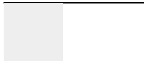
<div style="border: 1px solid #000;">
    <div style="width: 50px; height: 50px; background: #eee;
               float: left;">
    div>
div>
外层的div会无法包含 内部浮动的div,效果见下图:
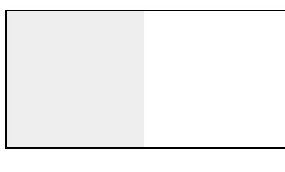
但如果我们 触发外部容器的BFC,根据BFC规范中的第4条:计算BFC的高度时,浮动元素也参与计算,那么外部div容器就可以包裹着浮动元素,所以只要把代码修改如下:
就可以完成以下效果:
-
BFC可以阻止元素被浮动元素覆盖
<div class="aside">div>
<div class="main">div>

div {
  width:300px;
}
.aside {
  width: 100px;
  height: 150px;
  float: left;
  background: black;
}
.main {
  height:200px;
  background-color:red;
}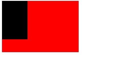
-
之所以是这样,是因为上文的 规则5: 每个元素的左边,与包含的盒子的左边相接触,即使存在浮动也是如此;
所以要想改变效果,使其互补干扰,就得利用规则6 :BFC的区域不会与float重叠,
让 `` 也能触发BFC的性质,即:
.main {
  overflow:hidden;
  height:200px;
  background-color:red;
}
通过这种方法,就能 用来实现 两列的自适应布局。
2.13.4 IFC
Inline Formatting Contexts,也就是“内联格式化上下文”。
符合以下任一条件即会生成一个IFC
- 块级元素中仅包含内联级别元素
形成条件非常简单,需要注意的是当IFC中有块级元素插入时,会产生两个匿名块将父元素分割开来,产生两个IFC,这里不做过多介绍。
IFC布局规则
- 子元素水平方向横向排列,并且垂直方向起点为元素顶部。
- 子元素只会计算横向样式空间,【padding、border、margin】,垂直方向样式空间不会被计算,【padding、border、margin】。
- 在垂直方向上,子元素会以不同形式来对齐(vertical-align)
- 能把在一行上的框都完全包含进去的一个矩形区域,被称为该行的行框(line box)。行框的宽度是由包含块(containing box)和与其中的浮动来决定。
- IFC中的“line box”一般左右边贴紧其包含块,但float元素会优先排列。
- IFC中的“line box”高度由 CSS 行高计算规则来确定,同个IFC下的多个line box高度可能会不同。
- 当 inline-level boxes的总宽度少于包含它们的line box时,其水平渲染规则由 text-align 属性值来决定。
- 当一个“inline box”超过父元素的宽度时,它会被分割成多个boxes,这些 oxes 分布在多个“line box”中。如果子元素未设置强制换行的情况下,“inline box”将不可被分割,将会溢出父元素。
2.12 CSS padding(填充)
| padding | 使用简写属性设置在一个声明中的所有填充属性 |
|---|---|
| padding-bottom | 设置元素的底部填充 |
| padding-left | 设置元素的左部填充 |
| padding-right | 设置元素的右部填充 |
| padding-top | 设置元素的顶部填充 |
2.13 CSS 尺寸 (Dimension)
| height | 设置元素的高度。 |
|---|---|
| line-height | 设置行高。 |
| max-height | 设置元素的最大高度。 |
| max-width | 设置元素的最大宽度。 |
| min-height | 设置元素的最小高度。 |
| min-width | 设置元素的最小宽度。 |
| width | 设置元素的宽度。 |
2.14 CSS Display(显示) 与 Visibility(可见性)
隐藏一个元素可以通过把display属性设置为”none”,或把visibility属性设置为”hidden”。但是请注意,这两种方法会产生不同的结果。
visibility:hidden可以隐藏某个元素,但隐藏的元素仍需占用与未隐藏之前一样的空间。也就是说,该元素虽然被隐藏了,但仍然会影响布局。
2.15 CSS里常见的块级元素和行内元素
根据CSS规范的规定,每一个网页元素都有一个display属性,用于确定该元素的类型,每一个元素都有默认的display属性值,比如div元素,它的默认display属性值为“block”,成为“块级”元素(block-level);而span元素的默认display属性值为“inline”,称为“行内”元素。
div这样的块级元素,就会自动占据一定矩形空间,可以通过设置高度、宽度、内外边距等属性,来调整的这个矩形的样子;与之相反,像“span”“a”这样的行内元素,则没有自己的独立空间,它是依附于其他块级元素存在的,因此,对行内元素设置高度、宽度、内外边距等属性,都是无效的。
内联元素(行内元素)内联元素(inline element)
- a - 锚点
- abbr - 缩写
- acronym - 首字
- b - 粗体(不推荐)
- bdo - bidi override
- big - 大字体
- br - 换行
- cite - 引用
- code - 计算机代码(在引用源码的时候需要)
- dfn - 定义字段
- em - 强调
- font - 字体设定(不推荐)
- i - 斜体
- img - 图片
- input - 输入框
- kbd - 定义键盘文本
- label - 表格标签
- q - 短引用
- s - 中划线(不推荐)
- samp - 定义范例计算机代码
- select - 项目选择
- small - 小字体文本
- span - 常用内联容器,定义文本内区块
- strike - 中划线
- strong - 粗体强调
- sub - 下标
- sup - 上标
- textarea - 多行文本输入框
- tt - 电传文本
- u - 下划线
- var - 定义变量
块元素(block element)
- address - 地址
- blockquote - 块引用
- center - 举中对齐块
- dir - 目录列表
- div - 常用块级容易,也是css layout的主要标签
- dl - 定义列表
- fieldset - form控制组
- form - 交互表单
- h1 - 大标题
- h2 - 副标题
- h3 - 3级标题
- h4 - 4级标题
- h5 - 5级标题
- h6 - 6级标题
- hr - 水平分隔线
- isindex - input prompt
- menu - 菜单列表
- noframes - frames可选内容,(对于不支持frame的浏览器显示此区块内容
- noscript - )可选脚本内容(对于不支持script的浏览器显示此内容)
- ol - 排序表单
- p - 段落
- pre - 格式化文本
- table - 表格
- ul - 非排序列表
可变元素
可变元素为根据上下文语境决定该元素为块元素或者内联元素。
- applet - java applet
- button - 按钮
- del - 删除文本
- iframe - inline frame
- ins - 插入的文本
- map - 图片区块(map)
- object - object对象
- script - 客户端脚本
2.16 CSS Position(定位)
2.16.1 定位类型
position 属性的五个值:
-
static HTML 元素的默认值,即没有定位,遵循正常的文档流对象。
静态定位的元素不会受到 top, bottom, left, right影响。
-
relative 相对定位元素的定位是相对其正常位置。
h2.pos_left { position:relative; left:-20px; } h2.pos_right { position:relative; left:20px; } -
fixed 元素的位置相对于浏览器窗口是固定位置。即使窗口是滚动的它也不会移动: Fixed 定位在 IE7 和 IE8 下需要描述 !DOCTYPE 才能支持。Fixed定位使元素的位置与文档流无关,因此不占据空间。Fixed定位的元素和其他元素重叠。
-
absolute 设置为绝对定位的元素框从文档流完全删除,并相对于其包含块定位,包含块可能是文档中的另一个元素或者是初始包含块。元素原先在正常文档流中所占的空间会关闭,就好像该元素原来不存在一样。元素定位后生成一个块级框,而不论原来它在正常流中生成何种类型的框。
-
sticky 粘性定位 依赖于用户的滚动,在 position:relative 与 position:fixed 定位之间切换。
它的行为就像 position:relative; 而当页面滚动超出目标区域时,它的表现就像 position:fixed;,它会固定在目标位置。
<html lang="en">
<head>
    <meta charset="UTF-8">
    <meta name="viewport" content="width=device-width, initial-scale=1.0">
    <title>Documenttitle>
    <link rel="stylesheet" href="./test.css">
head>
<body>
   <header>headerheader>
   <nav>
       <ul>
           <li>nav-item1li>
           <li>nav-item2li>
           <li>nav-item3li>
           <li>nav-item4li>
           <li>nav-item5li>
       ul>
   nav>
   <main>
       main content
   main>
body>
html>
header { border-bottom: 1px dashed #555; text-align: center; } nav { position: sticky; top: 20px; } ul { list-style: disc; } ul li { display: inline-block; background-color: antiquewhite; } main { height: 800px; background-color: aqua; }
元素可以使用的顶部top,底部bottom,左侧left和右侧right属性定位。然而,这些属性无法工作,除非是先设定position属性。他们也有不同的工作方式,这取决于定位方法。
2.16.2 z-index
元素的定位与文档流无关,所以它们可以覆盖页面上的其它元素
z-index属性指定了一个元素的堆叠顺序(哪个元素应该放在前面,或后面)
一个元素可以有正数或负数的堆叠顺序
img {
    position:absolute;
    left:0px;
    top:0px;
    z-index:-1;
}
2.16.3 所有的CSS定位属性
| bottom | 定义了定位元素下外边距 边界与其包含块下边界之间的偏移。 | autolength % inherit | 2 |
|---|---|---|---|
| clip | 剪辑一个绝对定位的元素 | shape autoinherit | 2 |
| cursor | 显示光标移动到指定的类型 | url auto crosshair default pointer move e-resize ne-resize nw-resize n-resize se-resize sw-resize s-resize w-resize text wait help | 2 |
| left | 定义了定位元素左外边距边界 与其包含块左边界之间的偏移。 | auto length % inherit | 2 |
| overflow | 设置当元素的内容溢出 其区域时发生的事情。 | auto hidden scroll visible inherit | 2 |
| overflow-y | 指定如何处理顶部/底部 边缘的内容溢出元素的内容区域 | auto hidden scroll visible no-display no-content | 2 |
| overflow-x | 指定如何处理右边/左边 边缘的内容溢出元素的内容区域 | auto hidden scroll visible no-display no-content | 2 |
| position | 指定元素的定位类型 | absolute fixed relative static inherit | 2 |
| right | 定义了定位元素右外边距边界 与其包含块右边界之间的偏移。 | auto length % inherit | 2 |
| top | 定义了一个定位元素的上外边距 边界与其包含块上边界之间的偏移。 | auto length % inherit | 2 |
| z-index | 设置元素的堆叠顺序 | number auto inherit | 2 |
2.17 CSS Overflow
CSS overflow 属性用于控制内容溢出元素框时显示的方式。
overflow属性有以下值:
| visible | 默认值。内容不会被修剪,会呈现在元素框之外。 |
|---|---|
| hidden | 内容会被修剪,并且其余内容是不可见的。 |
| scroll | 内容会被修剪,但是浏览器会显示滚动条以便查看其余的内容。 |
| auto | 如果内容被修剪,则浏览器会显示滚动条以便查看其余的内容。 |
| inherit | 规定应该从父元素继承 overflow 属性的值。 |
**注意:**overflow 属性只工作于指定高度的块元素上。
2.18 CSS Float(浮动)
浮动的框可以向左或向右移动,直到它的外边缘碰到包含框或另一个浮动框的边框为止。
由于浮动框不在文档的普通流中,所以文档的普通流中的块框表现得就像浮动框不存在一样。
float语法:
float : none | left |right
参数值:
none : 对象不浮动
left : 对象浮在左边
right : 对象浮在右边
一个例子
<div class="divcss5">
    <div class="divcss5_left">布局靠左浮动div>
    <div class="divcss5_right">布局靠右浮动div>
    <div class="clear">div>
div>
.divcss5{ width:400px;padding:10px;border:1px solid #F00}
.divcss5_left{ float:left;width:150px;border:1px solid #00F;height:50px}
.divcss5_right{ float:right;width:150px;border:1px solid #00F;height:50px}
.clear{ clear:both}
2.18.1 清除浮动的方法(最常用的4种)
- 额外标签法(在最后一个浮动标签后,新加一个标签,给其设置clear:both;)(不推荐)
<html lang="en">
<head>
    <meta charset="UTF-8">
    <meta name="viewport" content="width=device-width, initial-scale=1.0">
    <meta http-equiv="X-UA-Compatible" content="ie=edge">
    <title>Documenttitle>
    <style>
    .fahter{
        width: 400px;
        border: 1px solid deeppink;
    }
    .big{
        width: 200px;
        height: 200px;
        background: darkorange;
        float: left;
    }
    .small{
        width: 120px;
        height: 120px;
        background: darkmagenta;
        float: left;
    }
    .footer{
        width: 900px;
        height: 100px;
        background: darkslateblue;
    }
    .clear{
        clear:both;
    }
    style>
head>
<body>
    <div class="fahter">
        <div class="big">bigdiv>
        <div class="small">smalldiv>
        <div class="clear">额外标签法div>
    div>
    <div class="footer">div>
body>
html>
优点:通俗易懂,方便
缺点:添加无意义标签,语义化差
不建议使用。
- 父级添加overflow属性(父元素添加overflow:hidden)(不推荐)
通过触发BFC方式,实现清除浮动
    .fahter{
        width: 400px;
        border: 1px solid deeppink;
        overflow: hidden;
    }
优点:代码简洁
缺点:内容增多的时候容易造成不会自动换行导致内容被隐藏掉,无法显示要溢出的元素
不推荐使用
- 使用after伪元素清除浮动(推荐使用)
    .clearfix:after{/*伪元素是行内元素 正常浏览器清除浮动方法*/
        content: "";
        display: block;
        height: 0;
        clear:both;
        visibility: hidden;
    }
    .clearfix{
        *zoom: 1;/*ie6清除浮动的方式 *号只有IE6-IE7执行,其他浏览器不执行*/
    }

<body>
    <div class="fahter clearfix">
        <div class="big">bigdiv>
        <div class="small">smalldiv>

    div>
    <div class="footer">div>
body>
优点:符合闭合浮动思想,结构语义化正确
缺点:ie6-7不支持伪元素:after,使用zoom:1触发hasLayout.
推荐使用
-
使用before和after双伪元素清除浮动
     .clearfix:after,.clearfix:before{
        content: "";
        display: table;
    }
    .clearfix:after{
        clear: both;
    }
    .clearfix{
        *zoom: 1;
    }

 <div class="fahter clearfix">
        <div class="big">bigdiv>
        <div class="small">smalldiv>
    div>
    <div class="footer">div>
优点:代码更简洁
缺点:用zoom:1触发hasLayout.
推荐使用
2.19 CSS 居中
-
text-align:center方式
<div class="center"> <span class="center_text"> 123 span> div>center{ text-align:center; } center_text{ display:inline-block; width:500px }这种方式可以水平居中块级元素中的行内元素,如inline,inline-block;
但是如果用来居中块级元素中的块级元素时,如div中的div,一旦内层的div有自己的宽度,这种方法就会失效。只能让里面div的文字等内容居中,而div仍然是左对齐的。
-
margin:0 auto方式
<div class="center"> <span class="center_text"> 我是块级元素,我是块级元素,我给自己设了display:block span> div>center_text{ display:block; width:500px; margin:0 auto; }这种对齐方式要求内部元素(.content_text)是块级元素,并且不能脱离文档流(如设置position:absolute),否则无效。
-
脱离文档流的居中方式。
这种通常应用在自定义弹框当中,把背景层设置成透明灰色,内容居中显示在最前面。<div class="mask"> <div class="content"><br> 我是要居中的板块 div> div>.mask{ display: block; position: fixed; top: 0; left: 0; width: 100%; height: 100%; background: #000; filter: alpha(opacity=30); -ms-filter: "alpha(opacity=30)"; opacity: .3; z-index: 10000; } .center{ display: block; position: fixed; _position: absolute; top: 50%; left: 50%; width: 666px; height:400px; margin-left: -333px; margin-top: -200px; z-index: 10001; box-shadow: 2px 2px 4px #A0A0A0, -2px -2px 4px #A0A0A0; background-color: #fff; }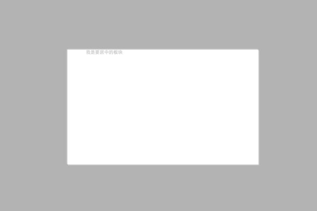 这种居中方式,把内部div设置宽高之后,再设置top、left各为50%,设置完之后,这里是按照左端居中的,接着我们使用负边距的方式调整,将margin-top设置为负的高度的一半,margin-left设置为负的宽度的一半,就可以居中了。
这种方式还有一种居中方法就是设置margin:-(内部div高度的一半) auto;这用就不用设置left的值了。
-
display:table-cell
display:table-cell配合width,text-align:center,vertical-align:middle让大小不固定元素垂直居中,这个方式将要对其的元素设置成为一个td,float、``absolute等属性都会影响它的实现,不响应margin属性;<div> <span>hellospan> div> body>div { display: table; width: 300px; height: 200px; text-align: center; background-color: aqua; } div span { display: table-cell; vertical-align: middle; } -
垂直居中
行内元素的垂直居中把height和line-height的值设置成一样的即可。<div class="center"> <span class="center_text"> 我是要居中的内容 span> div>center { height:40px; line-heigth: 40px; } -
使用css3的translate水平垂直居中元素
<div class="center">
  <div class="center_text">
    我是要居中的内容
    div>
div>
.center { position: relative; height: 500px; } .center_text{ position: absolute; top: 50%; left: 50%; transform: translate(-50%, -50%); width: 300px; height: 600px; }这种方式将脱离文档流的元素,设置top:50%,left:50%,然后使用transform来向左向上偏移半个内元素的宽和高。
-
使用css3计算的方式居中元素calc
<div class="center">
  <div class="center_text">
    我是要居中的内容
	  div>
div>
.center { position: relative; height: 300px; width: 1000px; border: 1px solid #ccc; } .center_text{ position: absolute; top: calc(50% - 50px); left: calc(50% - 150px); width: 300px; height: 100px; border: 1px solid #000; }
-
2.20 CSS 伪类
CSS伪类是用来添加一些选择器的特殊效果。
语法
selector:pseudo-class {property:value;}
CSS类也可以使用伪类:
selector.class:pseudo-class {property:value;}
2.20.1 anchor伪类
在支持 CSS 的浏览器中,链接的不同状态都可以以不同的方式显示
a:link {color:#FF0000;} /* 未访问的链接 */
a:visited {color:#00FF00;} /* 已访问的链接 */
a:hover {color:#FF00FF;} /* 鼠标划过链接 */
a:active {color:#0000FF;} /* 已选中的链接 */
注意: 在CSS定义中,a:hover 必须被置于 a:link 和 a:visited 之后,才是有效的。
注意: 在 CSS 定义中,a:active 必须被置于 a:hover 之后,才是有效的。
**注意:**伪类的名称不区分大小写。
2.20.2 伪类和CSS类
伪类可以与 CSS 类配合使用:
a.red:visited {color:#FF0000;}

<a class="red" href="css-syntax.html">CSS 语法a>
2.20.3 CSS :first-child 伪类
您可以使用 :first-child 伪类来选择父元素的第一个子元素。
注意:在IE8的之前版本必须声明 ,这样 :first-child 才能生效。
元素匹配第一个
在下面的例子中,选择器匹配作为任何元素的第一个子元素的
元素:
p:first-child{
    color:blue;
}
元素中的第一个 元素匹配所有
在下面的例子中,选择相匹配的所有
元素的第一个 元素:
p > i:first-child {
    color:blue;
}
元素中的所有 元素匹配所有作为第一个子元素的
在下面的例子中,选择器匹配所有作为元素的第一个子元素的
元素中的所有 元素:
p:first-child i {
    color:blue;
}
CSS - :lang 伪类
:lang 伪类使你有能力为不同的语言定义特殊的规则
注意:IE8必须声明 才能支持;lang伪类。
在下面的例子中,:lang 类为属性值为 no 的q元素定义引号的类型:
q:lang(no) {quotes: "~" "~";}
所有CSS伪类/元素
| :checked | input:checked | 选择所有选中的表单元素 |
|---|---|---|
| :disabled | input:disabled | 选择所有禁用的表单元素 |
| :empty | p:empty | 选择所有没有子元素的p元素 |
| :enabled | input:enabled | 选择所有启用的表单元素 |
| :first-of-type | p:first-of-type | 选择的每个 p 元素是其父元素的第一个 p 元素 |
| :in-range | input:in-range | 选择元素指定范围内的值 |
| :invalid | input:invalid | 选择所有无效的元素 |
| :last-child | p:last-child | 选择所有p元素的最后一个子元素 |
| :last-of-type | p:last-of-type | 选择每个p元素是其母元素的最后一个p元素 |
| :not(selector) | :not§ | 选择所有p以外的元素 |
| :nth-child(n) | p:nth-child(2) | 选择所有 p 元素的父元素的第二个子元素 |
| :nth-last-child(n) | p:nth-last-child(2) | 选择所有p元素倒数的第二个子元素 |
| :nth-last-of-type(n) | p:nth-last-of-type(2) | 选择所有p元素倒数的第二个为p的子元素 |
| :nth-of-type(n) | p:nth-of-type(2) | 选择所有p元素第二个为p的子元素 |
| :only-of-type | p:only-of-type | 选择所有仅有一个子元素为p的元素 |
| :only-child | p:only-child | 选择所有仅有一个子元素的p元素 |
| :optional | input:optional | 选择没有”required”的元素属性 |
| :out-of-range | input:out-of-range | 选择指定范围以外的值的元素属性 |
| :read-only | input:read-only | 选择只读属性的元素属性 |
| :read-write | input:read-write | 选择没有只读属性的元素属性 |
| :required | input:required | 选择有”required”属性指定的元素属性 |
| :root | root | 选择文档的根元素 |
| :target | #news:target | 选择当前活动#news元素(点击URL包含锚的名字) |
| :valid | input:valid | 选择所有有效值的属性 |
| :link | a:link | 选择所有未访问链接 |
| :visited | a:visited | 选择所有访问过的链接 |
| :active | a:active | 选择正在活动链接 |
| :hover | a:hover | 把鼠标放在链接上的状态 |
| :focus | input:focus | 选择元素输入后具有焦点 |
| :first-letter | p:first-letter | 选择每个元素的第一个字母 |
| :first-line | p:first-line | 选择每个元素的第一行 |
| :first-child | p:first-child | 选择器匹配属于任意元素的第一个子元素的元素 |
| :before | p:before | 在每个元素之前插入内容 |
| :after | p:after | 在每个元素之后插入内容 |
| :lang(language) | p:lang(it) | 为元素的lang属性选择一个开始值 |
2.21 CSS 伪元素
CSS伪元素是用来添加一些选择器的特殊效果。
伪元素的语法:
selector:pseudo-element {property:value;}
CSS类也可以使用伪元素:
selector.class:pseudo-element {property:value;}
:first-line 伪元素
“first-line” 伪元素用于向文本的首行设置特殊样式。
在下面的例子中,浏览器会根据 “first-line” 伪元素中的样式对 p 元素的第一行文本进行格式化:
p:first-line { color:#ff0000; font-variant:small-caps;}
注意:“first-line” 伪元素只能用于块级元素。
注意: 下面的属性可应用于 “first-line” 伪元素:
- font properties
- color properties
- background properties
- word-spacing
- letter-spacing
- text-decoration
- vertical-align
- text-transform
- line-height
- clear
:first-letter 伪元素
“first-letter” 伪元素用于向文本的首字母设置特殊样式:
p:first-letter { color:#ff0000; font-size:xx-large;}
注意: “first-letter” 伪元素只能用于块级元素。
注意: 下面的属性可应用于 “first-letter” 伪元素:
- font properties
- color properties
- background properties
- margin properties
- padding properties
- border properties
- text-decoration
- vertical-align (only if “float” is “none”)
- text-transform
- line-height
- float
- clear
伪元素和CSS类
伪元素可以结合CSS类:
p.article:first-letter {color:#ff0000;}"article">文章段落
上面的例子会使所有 class 为 article 的段落的首字母变为红色。
多个伪元素
可以结合多个伪元素来使用。
在下面的例子中,段落的第一个字母将显示为红色,其字体大小为 xx-large。第一行中的其余文本将为蓝色,并以小型大写字母显示。
段落中的其余文本将以默认字体大小和颜色来显示:
p:first-letter{
  color:#ff0000;
  font-size:xx-large;
}
p:first-line {
  color:#0000ff;
  font-variant:small-caps;
}
CSS - :before 伪元素
“:before” 伪元素可以在元素的内容前面插入新内容。
下面的例子在每个
元素前面插入一幅图片:
h1:before {
 content:url(smiley.gif);
}
CSS - :after 伪元素
“:after” 伪元素可以在元素的内容之后插入新内容。
下面的例子在每个
元素后面插入一幅图片:
h1:after {
  content:url(smiley.gif);
}
所有CSS伪类/元素
| 选择器 | 示例 | 示例说明 |
|---|---|---|
| :link | a:link | 选择所有未访问链接 |
| :visited | a:visited | 选择所有访问过的链接 |
| :active | a:active | 选择正在活动链接 |
| :hover | a:hover | 把鼠标放在链接上的状态 |
| :focus | input:focus | 选择元素输入后具有焦点 |
| :first-letter | p:first-letter | 选择每个元素的第一个字母 |
| :first-line | p:first-line | 选择每个元素的第一行 |
| :first-child | p:first-child | 选择器匹配属于任意元素的第一个子元素的 <]p> 元素 |
| :before | p:before | 在每个元素之前插入内容 |
| :after | p:after | 在每个元素之后插入内容 |
| :lang(language) | p:lang(it) | 为元素的lang属性选择一个开始值 |
2.22 CSS 导航栏
作为标准的HTML基础一个导航栏是必须的
。在我们的例子中我们将建立一个标准的HTML列表导航栏。
导航条基本上是一个链接列表,所以使用
- 和
- 元素非常有意义:
<ul>
  <li><a href="#home">主页a>li>
  <li><a href="#news">新闻a>li>
  <li><a href="#contact">联系a>li>
  <li><a href="#about">关于a>li>
ul>
现在,让我们从列表中删除边距和填充:
ul {
    list-style-type: none;
    margin: 0;
    padding: 0;
}
例子解析:
- list-style-type:none - 移除列表前小标志。一个导航栏并不需要列表标记
- 移除浏览器的默认设置将边距和填充设置为0
上面的例子中的代码是垂直和水平导航栏使用的标准代码。
2.22.1 垂直导航栏
<html lang="en">

<head>
  <meta charset="UTF-8">
  <meta name="viewport" content="width=device-width, initial-scale=1.0">
  <title>Documenttitle>
  <link rel="stylesheet" href="./test.css">
head>

<body>
  <ul class="vertical">
    <li><a href="#">技术01a>li>
    <li><a href="#">技术02a>li>
    <li><a href="#">技术03a>li>
    <li><a href="#">技术04a>li>
    <li><a href="#">技术05a>li>
    <li><a href="#">技术06a>li>
    <li><a href="#">技术07a>li>
    <li><a href="#">技术08a>li>
    <li><a href="#">技术09a>li>
    <li><a href="#">技术10a>li>
    <li><a href="#">技术11a>li>
    <li><a href="#">技术12a>li>
    <li><a href="#">技术13a>li>
    <li><a href="#">技术14a>li>
    <li><a href="#">技术15a>li>
    <li><a href="#">技术16a>li>
    <li><a href="#">技术17a>li>
    <li><a href="#">技术18a>li>
    <li><a href="#">技术19a>li>
    <li><a href="#">技术20a>li>
  ul>

body>

html>
* {
    margin: 0;
    padding: 0;
}
html,
body {
    height: 100%;
    overflow: hidden;
}

ul.vertical {
    list-style-type: none;
    margin: 0;
    padding: 0;
    width: 25%;
    height: 100%;
    overflow: auto;
    background-color: #f1f1f1;
}

ul.vertical li a {
    display: block;
    color: #000;
    padding: 8px 16px;
    text-decoration: none;
    text-align: center;
}
ul.vertical li {
    border-bottom: 1px solid #555;
}
ul.vertical li:last-child {
    border-bottom: none;
}

ul.vertical li a:hover {
    background-color: #555;
    color: #fff;
}

.active {
    background-color: #4CAF50;
}
2.22.2 水平导航栏
有两种方法创建横向导航栏。使用**内联(inline)或浮动(float)**的列表项。
这两种方法都很好,但如果你想导航链接具有相同的大小,你必须使用浮动的方法。
<html lang="en">
<head>
    <meta charset="UTF-8">
    <meta name="viewport" content="width=device-width, initial-scale=1.0">
    <title>Documenttitle>
    <style>
        * {
            margin: 0;
            padding: 0;
        }
        html,
        body {
            height: 100%;
            overflow: auto;
        }
        ul {
            list-style-type: none;
            margin: 0;
            padding: 0;
            background-color: #333;
            overflow: hidden;
            width: 100%;
            position: fixed;
            top: 0;
        }

        ul li {
            float: left;
            border-right: 1px solid #bbb;
        }

        ul li:last-child {
            border-right: none;
        }

        ul li a {
            display: block;
            height: 60px;
            box-sizing: border-box;
            padding: 0 16px;
            line-height: 60px;
            color: white;
            text-decoration: none;
        }

        .content {
            height: 2000px;
            background-color: #bbb;
            margin-top: 60px;
        }

        .active {
            background-color: #4caf54;
        }
    style>
head>
<body>
  <ul>
      <li><a href="#">导航项01a>li>
      <li><a href="#">导航项02a>li>
      <li><a href="#">导航项03a>li>
      <li><a href="#">导航项04a>li>
      <li style="float: right;"><a class="active" href="#">导航项05a>li>
  ul>
  <div class="content">
    content
  div>
body>
html>
2.23 CSS 下拉菜单
使用 CSS 创建一个鼠标移动上去后显示下拉菜单的效果。
<html lang="en">
<head>
    <meta charset="UTF-8">
    <meta name="viewport" content="width=device-width, initial-scale=1.0">
    <title>Documenttitle>
    <style>
        .dropdown {
            position: relative;
            display: inline-block;
        }
        .dropdown .dropdown-content {
            visibility: collapse;
            position: absolute;
            background-color: #f9f9f9;
            width: 100%;
            box-shadow: 0px 8px 16px 0px rgba(0, 0, 0, .2);
            text-align: center;
            z-index: 1;
        }
        .dropdown:hover .dropdown-content {
            visibility: visible;
        }

        .dropdown .dropdown-content ul {
            list-style-type: none;
            padding: 0;
            margin: 0;
        }

        .dropdown .dropdown-content ul li {
            cursor: pointer;
        }

        .dropdown .dropdown-content ul li:hover {
            color: blue;
            text-decoration: underline;
        }
    style>

    <script>
        document.addEventListener('DOMContentLoaded', () => {
            var lis = document.getElementsByTagName('li')
            for (const li of lis) {
                li.addEventListener('click', () => {
                    alert(li.textContent)
                })
            }
        })
    script>
head>
<body>
    <div class="dropdown">
        <button>悬浮我button>
        <div class="dropdown-content">
            <ul>
                <li>item1li>
                <li>item2li>
                <li>item3li>
                <li>item4li>
                <li>item5li>
                <li>item6li>
            ul>
        div>
    div>
body>
html>
2.24 CSS 提示工具(Tooltip)
<html lang="en">
<head>
    <meta charset="UTF-8">
    <meta name="viewport" content="width=device-width, initial-scale=1.0">
    <title>Documenttitle>
    <style>
        body {
            padding: 60px;
        }
        div {
            margin: 20px;
        }
        /* Tooltip 容器 */
        .tooltip {
            position: relative;
            display: inline-block;
            border-bottom: 1px dotted black; /* 悬停元素上显示点线 */
        }

        /* Tooltip 文本 */
        .tooltip .tooltiptext {
            visibility: hidden;
            width: 120px;
            background-color: black;
            color: #fff;
            text-align: center;
            padding: 5px 0;
            border-radius: 6px;

            /* 定位 */
            position: absolute;
            z-index: 1;
        }

        /* 鼠标移动上去后显示提示框 */
        .tooltip:hover .tooltiptext {
            visibility: visible;
        }

        .tooltip.right .tooltiptext {
            top: -5px;
            left: 105%;
        }

        .tooltip.left .tooltiptext {
            top: -5px;
            right: 105%;
        }

        .tooltip.top .tooltiptext {
            width: 120px;
            bottom: 100%;
            left: 50%;
            margin-left: -60px; /* 使用一半宽度 (120/2 = 60) 来居中提示工具 */
        }

        .tooltip.bottom .tooltiptext {
            width: 120px;
            top: 100%;
            left: 50%;
            margin-left: -60px; /* 使用一半宽度 (120/2 = 60) 来居中提示工具 */
        }

        /* 顶部提示框/底部箭头 */
        .tooltip.top .tooltiptext::after {
            content: " ";
            position: absolute;
            top: 100%; /* 提示工具底部 */
            left: 50%;
            margin-left: -5px;
            border-width: 5px;
            border-style: solid;
            border-color: black transparent transparent transparent;
        }

        /* 底部提示框/顶部箭头 */
        .tooltip.bottom .tooltiptext::after {
            content: " ";
            position: absolute;
            bottom: 100%;  /* 提示工具头部 */
            left: 50%;
            margin-left: -5px;
            border-width: 5px;
            border-style: solid;
            border-color: transparent transparent black transparent;
        }
        /* 右侧提示框/左侧箭头 */
        .tooltip.right .tooltiptext::after {
            content: " ";
            position: absolute;
            right: 100%;
            top: 50%;
            margin-top: -5px;
            border-width: 5px;
            border-style: solid;
            border-color: transparent black transparent transparent;
        }
        /*  左侧提示框/右侧箭头 */
        .tooltip.left .tooltiptext::after {
            content: " ";
            position: absolute;
            top: 50%;
            left: 100%; /* 提示工具右侧 */
            margin-top: -5px;
            border-width: 5px;
            border-style: solid;
            border-color: transparent transparent transparent black;
        }

        .tooltip .tooltiptext {
            opacity: 0;
            transition: opacity 1s;
        }
        .tooltip:hover .tooltiptext {
            opacity: 1;
        }

        style>
head>
<body>
    <div class="tooltip top">顶部提示框
        <span class="tooltiptext">提示文本span>
    div>
    <div class="tooltip bottom">底部提示框
        <span class="tooltiptext">提示文本span>
    div>
    <div class="tooltip right">右侧提示框
        <span class="tooltiptext">提示文本span>
    div>
    <div class="tooltip left">左侧提示框
        <span class="tooltiptext">提示文本span>
    div>
body>
html>
2.25 CSS 图像透明/不透明
<html lang="en">
<head>
    <meta charset="UTF-8">
    <meta name="viewport" content="width=device-width, initial-scale=1.0">
    <title>Documenttitle>
    <style>
        img {
            opacity: 0.5;
            filter: alpha(opacity=50); /*for ie8 and earlier*/
            border-radius: 5px;
            transition: ease opacity 1s;
        }
        img:hover {
            opacity: 1;
            filter: alpha(opacity=100); /*for ie8 and earlier*/
        }
    style>
head>
<body>
    <figure>
        <figcaption>
            <h1>带有透明效果的图片h1>
        figcaption>
        <img src="https://dss2.bdstatic.com/70cFvnSh_Q1YnxGkpoWK1HF6hhy/it/u=3252521864,872614242&fm=26&gp=0.jpg" alt="">
    figure>
body>
html>
2.26 CSS 精灵图/雪碧图
精灵图/雪碧图就是图像拼合也就是单个图像的集合。有许多图像的网页可能需要很长的时间来加载和生成多个服务器的请求。使用图像拼合会降低服务器的请求数量,并节省带宽。
<html lang="en">
<head>
    <meta charset="UTF-8">
    <meta name="viewport" content="width=device-width, initial-scale=1.0">
    <title>Documenttitle>
    <style>
        #navlist {
            position: relative;
        }
        #navlist li {
                margin: 0;
                padding: 0;
                list-style: none;
                display: inline-block;
                height: 44px;
                line-height: 44px;
                text-align: center;
                cursor: pointer;
        }
        #navlist a {
            height: 44px;
            width: 46px;
            display: block;
        }

        ul > li:nth-child(1) {
            background: url('./img_navsprites.gif') 0 0;
        }

        ul > li:nth-child(1):hover {
            background: url('img_navsprites_hover.gif') 0 -45px;
        }
        ul > li:nth-child(2) {
            background:url('img_navsprites.gif') -47px 0;
        }
    style>
head>
<body>
    <nav id="navlist">
        <ul>
            <li>
                <a>1a>
            li>
            <li>
                <a>2a>
            li>
            <li>
                <a>3a>
            li>
            <li>
                <a>4a>
            li>
        ul>
    nav>
body>
html>
2.27 CSS 媒体类型@media 规则
在下面的例子告诉我们浏览器屏幕上显示一个 14 像素的 Verdana 字体样式。但是如果页面打印,将是 10 个像素的 Times 字体。请注意,font-weight 在屏幕上和纸上设置为粗体:
@media screen
{
    p.test {font-family:verdana,sans-serif;font-size:14px;}
}
@media print
{
    p.test {font-family:times,serif;font-size:10px;}
}
@media screen,print
{
    p.test {font-weight:bold;}
}
其他媒体类型
| all | 用于所有的媒体设备。 |
|---|---|
| aural | 用于语音和音频合成器。 |
| braille | 用于盲人用点字法触觉回馈设备。 |
| embossed | 用于分页的盲人用点字法打印机。 |
| handheld | 用于小的手持的设备。 |
| 用于打印机。 | |
| projection | 用于方案展示,比如幻灯片。 |
| screen | 用于电脑显示器。 |
| tty | 用于使用固定密度字母栅格的媒体,比如电传打字机和终端。 |
| tv | 用于电视机类型的设备。 |
三. CSS3新增特性总结
1.CSS3简介
CSS3是CSS(层叠样式表)技术的升级版本,于1999年开始制订,2001年5月23日W3C完成了CSS3的工作草案,主要包括盒子模型、列表模块、超链接方式、语言模块、背景和边框、文字特效、多栏布局等模块
2.过渡
过渡,是我在项目里面用得最多的一个特性了!也相信是很多人用得最多的一个例子!我平常使用就是想让一些交互效果(主要是hover动画),变得生动一些,不会显得那么生硬!好了,下面进入正文!
引用菜鸟教程的说法:CSS3 过渡是元素从一种样式逐渐改变为另一种的效果。要实现这一点,必须规定两项内容:指定要添加效果的CSS属性指定效果的持续时间。
2-1语法
transition: CSS属性,花费时间,效果曲线(默认ease),延迟时间(默认0)复制代码
栗子1
/*宽度从原始值到制定值的一个过渡,运动曲线ease,运动时间0.5秒,0.2秒后执行过渡*/
transition:width,.5s,ease,.2s复制代码
栗子2
/*所有属性从原始值到制定值的一个过渡,运动曲线ease,运动时间0.5秒*/
transition:all,.5s
复制代码
上面栗子是简写模式,也可以分开写各个属性(这个在下面就不再重复了)
transition-property: width;
transition-duration: 1s;
transition-timing-function: linear;
transition-delay: 2s;
复制代码
实例
<html lang="en">

<head>
    <meta charset="UTF-8">
    <meta name="viewport" content="width=device-width, initial-scale=1.0">
    <title>Documenttitle>
    <style>
        /* 文本颜色过渡 */
        p {
            transition-property: color;
            transition-delay: 0ms;
            transition-timing-function: cubic-bezier(0.075, 0.82, 0.165, 1);
            transition-duration: 1s;
        }

        p:hover {
            color: aqua;
        }
    style>

    <style>
        /* 导航栏下拉菜单过滤 */
        ul {
            list-style: none;
            margin: 0;
            padding: 0;
        }

        .demo-ui > li {
           float: left;
           background-color: antiquewhite;
           text-align: center;
           position: relative;
           cursor: pointer;
           min-width: 120px;
        }

        .demo-ui > li:hover >ul {
            transform: scaleY(1);
        }

        .demo-ui > li > ul {
            position: absolute;
            transition: all .5s;
            transform-origin: 0 0;
            transform: scaleY(0);
        }


        .demo-ui > li > ul > li {
            display: block;
            padding: 12px 16px;
            background-color: #fff;
            border-color: #000;
            border-width: 1px;
            border-style: dashed;
        }
    style>
head>

<body>
    <section>
        <h1>文本颜色过渡效果h1>
        <p>
            Lorem ipsum dolor sit amet consectetur adipisicing elit. Et dignissimos tempore fugiat natus ipsa
            voluptatibus, repellendus similique. Quisquam iste, ut animi recusandae illum vero fugiat molestiae
            voluptatem magnam culpa tenetur.Deserunt, dolorum. Facere non et consectetur modi maiores, mollitia,
            molestias excepturi architecto tenetur laborum quae obcaecati? Placeat ratione, ipsa possimus voluptatum
            quam sed maiores exercitationem, eius fugit sit sint voluptatem.
        p>
    section>

    <section>
        <h1>下拉菜单过渡效果h1>
        <ul class="demo-ui">
            <li>
                nav1
                <ul>
                    <li>child-nav1li>
                    <li>child-nav2li>
                    <li>child-nav3li>
                ul>
            li>
            <li>
                nav2
                <ul>
                    <li>child-nav1li>
                    <li>child-nav2li>
                    <li>child-nav3li>
                ul>
            li>
            <li>
                nav3
                <ul>
                    <li>child-nav1li>
                    <li>child-nav2li>
                    <li>child-nav3li>
                ul>
            li>
        ul>

    section>
body>

html>
3.动画
动画这个平常用的也很多,主要是做一个预设的动画。和一些页面交互的动画效果,结果和过渡应该一样,让页面不会那么生硬!
3-1.语法
animation:动画名称,一个周期花费时间,运动曲线(默认ease),动画延迟(默认0),播放次数(默认1),是否反向播放动画(默认normal),是否暂停动画(默认running)复制代码
栗子1
/*执行一次logo2-line动画,运动时间2秒,运动曲线为 linear*/
animation: logo2-line 2s linear;复制代码
栗子2
/*2秒后开始执行一次logo2-line动画,运动时间2秒,运动曲线为 linear*/
animation: logo2-line 2s linear 2s;复制代码
栗子3
/*无限执行logo2-line动画,每次运动时间2秒,运动曲线为 linear,并且执行反向动画*/
animation: logo2-line 2s linear alternate infinite;复制代码
还有一个重要属性
animation-fill-mode : none | forwards | backwards | both;
/*none:不改变默认行为。
forwards :当动画完成后,保持最后一个属性值(在最后一个关键帧中定义)。
backwards:在 animation-delay 所指定的一段时间内,在动画显示之前,应用开始属性值(在第一个关键帧中定义)。
both:向前和向后填充模式都被应用。  */      复制代码
3-2.logo展示动画
这个是我用公司logo写的动画,没那么精细
代码如下
<html lang="en">
<head>
    <meta charset="UTF-8">
    <title>Titletitle>
    <link rel="stylesheet" href="reset.css">
head>
<style>
.logo-box{
    width: 600px;
    margin: 100px auto;
    font-size: 0;
    position: relative;
}
.logo-box div{
    display: inline-block;
}
.logo-box .logo-text{
    margin-left: 10px;
}
.logo-box .logo1{
    animation: logo1 1s ease-in 2s;
    animation-fill-mode:backwards;
}
.logo-box .logo-text{
    animation: logoText 1s ease-in 3s;
    animation-fill-mode:backwards;
}
.logo-box .logo2{
    position: absolute;
    top: 20px;
    left: 20px;
    animation: logo2-middle 2s ease-in;
}
.logo-box .logo2 img{
    animation: logo2-line 2s linear;
}
@keyframes logo1 {
    0%{
        transform:rotate(180deg);
        opacity: 0;
    }
    100%{
        transform:rotate(0deg);
        opacity: 1;
    }
}
@keyframes logoText {
    0%{
        transform:translateX(30px);
        opacity: 0;
    }
    100%{
        transform:translateX(0);
        opacity: 1;
    }
}
@keyframes logo2-line {
    0% { transform: translateX(200px)}
    25% { transform: translateX(150px)}
    50% { transform: translateX(100px)}
    75% { transform: translateX(50px)}
    100% { transform: translateX(0); }
}

@keyframes logo2-middle {
    0% { transform: translateY(0);     }
    25% { transform: translateY(-100px);     }
    50% { transform: translateY(0);     }
    75% { transform: translateY(-50px);     }
    100% { transform: translateY(0); }
}
style>
<body>
<div class="logo-box">
<div class="logo1"><img src="logo1.jpg"/>div>
<div class="logo2"><img src="logo2.jpg"/>div>
<div class="logo-text"><img src="logo3.jpg"/>div>
div>

<div class="wraper"><div class="item">div>div>

body>
html>
下面让大家看一个专业级别的
代码如下
<html lang="en">
<head>
    <meta charset="UTF-8">
    <title>Titletitle>
head>
<style>
    body {
        font-family: Arial,"Helvetica Neue",Helvetica,sans-serif;
        overflow: hidden;
        background: #fff;
    }

    .center {
        margin: 80px auto;
    }

    .so {
        display: block;
        width: 500px;
        height: 156px;
        background: #ffffff;
    }
    .so .inner {
        width: 500px;
        height: 156px;
        position: absolute;
    }
    .so .inner * {
        position: absolute;
        animation-iteration-count: infinite;
        animation-duration: 3.5s;
    }
    .so .inner .name {
        position: absolute;
        font-size: 54px;
        left: 130px;
        top: 95px;
    }
    .so .inner .name .b {
        font-weight: bold;
    }
    .so .inner .stack-box {
        top: 100px;
        width: 115px;
        height: 56px;
    }
    .so .inner .box {
        width: 115px;
        height: 56px;
        left: 0px;
    }
    .so .inner .box div {
        background: #BCBBBB;
    }
    .so .inner .box .bottom {
        bottom: 0px;
        left: 0px;
        width: 115px;
        height: 12px;
    }
    .so .inner .box .left {
        bottom: 11px;
        left: 0px;
        width: 12px;
        height: 34px;
    }
    .so .inner .box .right {
        bottom: 11px;
        left: 103px;
        width: 12px;
        height: 34px;
    }
    .so .inner .box .top {
        top: 0px;
        left: 0px;
        width: 0;
        height: 12px;
    }
    .so .inner .stack {
        left: 22px;
        top: 22px;
    }
    .so .inner .stack .inner-item {
        background: #F48024;
        width: 71px;
        height: 12px;
    }
    .so .inner .stack .item {
        transition: transform 0.3s;
        width: 291px;
    }
    .so .inner .stack div:nth-child(1) {
        transform: rotate(0deg);
    }
    .so .inner .stack div:nth-child(2) {
        transform: rotate(12deg);
    }
    .so .inner .stack div:nth-child(3) {
        transform: rotate(24deg);
    }
    .so .inner .stack div:nth-child(4) {
        transform: rotate(36deg);
    }
    .so .inner .stack div:nth-child(5) {
        transform: rotate(48deg);
    }
    .so .inner .box {
        animation-name: box;
    }
    .so .inner .box .top {
        animation-name: box-top;
    }
    .so .inner .box .left {
        animation-name: box-left;
    }
    .so .inner .box .right {
        animation-name: box-right;
    }
    .so .inner .box .bottom {
        animation-name: box-bottom;
    }
    .so .inner .stack-box {
        animation-name: stack-box;
    }
    .so .inner .stack {
        animation-name: stack;
    }
    .so .inner .stack .inner-item {
        animation-name: stack-items;
    }
    .so .inner .stack .item:nth-child(1) {
        animation-name: stack-item-1;
    }
    .so .inner .stack .item:nth-child(2) {
        animation-name: stack-item-2;
    }
    .so .inner .stack .item:nth-child(3) {
        animation-name: stack-item-3;
    }
    .so .inner .stack .item:nth-child(4) {
        animation-name: stack-item-4;
    }
    .so .inner .stack .item:nth-child(5) {
        animation-name: stack-item-5;
    }
    @keyframes stack {
        0% {
            left: 22px;
        }
        15% {
            left: 22px;
        }
        30% {
            left: 52px;
        }
        50% {
            left: 52px;
        }
        80% {
            left: 22px;
        }
    }
    @keyframes stack-item-1 {
        0% {
            transform: rotate(12deg * 0);
        }
        10% {
            transform: rotate(0deg);
        }
        50% {
            transform: rotate(0deg);
        }
        54% {
            transform: rotate(0deg);
        }
        92% {
            transform: rotate(12deg * 0);
        }
    }
    @keyframes stack-item-2 {
        0% {
            transform: rotate(12deg * 1);
        }
        10% {
            transform: rotate(0deg);
        }
        50% {
            transform: rotate(0deg);
        }
        54% {
            transform: rotate(0deg);
        }
        92% {
            transform: rotate(12deg * 1);
        }
    }
    @keyframes stack-item-3 {
        0% {
            transform: rotate(12deg * 2);
        }
        10% {
            transform: rotate(0deg);
        }
        50% {
            transform: rotate(0deg);
        }
        54% {
            transform: rotate(0deg);
        }
        92% {
            transform: rotate(12deg * 2);
        }
    }
    @keyframes stack-item-4 {
        0% {
            transform: rotate(12deg * 3);
        }
        10% {
            transform: rotate(0deg);
        }
        50% {
            transform: rotate(0deg);
        }
        54% {
            transform: rotate(0deg);
        }
        92% {
            transform: rotate(12deg * 3);
        }
    }
    @keyframes stack-item-5 {
        0% {
            transform: rotate(12deg * 4);
        }
        10% {
            transform: rotate(0deg);
        }
        50% {
            transform: rotate(0deg);
        }
        54% {
            transform: rotate(0deg);
        }
        92% {
            transform: rotate(12deg * 4);
        }
    }
    @keyframes stack-items {
        0% {
            width: 71px;
        }
        15% {
            width: 71px;
        }
        30% {
            width: 12px;
        }
        50% {
            width: 12px;
        }
        80% {
            width: 71px;
        }
    }
    @keyframes box {
        0% {
            left: 0;
        }
        15% {
            left: 0;
        }
        30% {
            left: 30px;
        }
        50% {
            left: 30px;
        }
        80% {
            left: 0;
        }
    }
    @keyframes box-top {
        0% {
            width: 0;
        }
        6% {
            width: 0;
        }
        15% {
            width: 115px;
        }
        30% {
            width: 56px;
        }
        50% {
            width: 56px;
        }
        59% {
            width: 0;
        }
    }
    @keyframes box-bottom {
        0% {
            width: 115px;
        }
        15% {
            width: 115px;
        }
        30% {
            width: 56px;
        }
        50% {
            width: 56px;
        }
        80% {
            width: 115px;
        }
    }
    @keyframes box-right {
        15% {
            left: 103px;
        }
        30% {
            left: 44px;
        }
        50% {
            left: 44px;
        }
        80% {
            left: 103px;
        }
    }
    @keyframes stack-box {
        0% {
            transform: rotate(0deg);
        }
        30% {
            transform: rotate(0deg);
        }
        40% {
            transform: rotate(135deg);
        }
        50% {
            transform: rotate(135deg);
        }
        83% {
            transform: rotate(360deg);
        }
        100% {
            transform: rotate(360deg);
        }
    }
style>
<body>
<div class="so center">
    <div class="inner">
        <div class="stack-box">
            <div class="stack">
                <div class="item">
                    <div class="inner-item">div>
                div>
                <div class="item">
                    <div class="inner-item">div>
                div>
                <div class="item">
                    <div class="inner-item">div>
                div>
                <div class="item">
                    <div class="inner-item">div>
                div>
                <div class="item">
                    <div class="inner-item">div>
                div>
            div>
            <div class="box">
                <div class="bottom">div>
                <div class="left">div>
                <div class="right">div>
                <div class="top">div>
            div>
        div>
        <div class="name">
            stack<span class="b">overflowspan>
        div>
    div>
div>
body>
html>
3-3.loading效果
<html lang="en">
<head>
    <meta charset="UTF-8">
    <meta name="viewport" content="width=device-width, initial-scale=1.0">
    <title>Documenttitle>
    <style>
        .loading-box {
            position: absolute;
            top: 0;
            left: 0;
            right: 0;
            bottom: 0;
            margin: auto;
            overflow: hidden;
            background-color: #ddd;
        }
        .loading-box .loading-dot {
            height: 12px;
            width: 12px;
            opacity: 0;
            border-radius: 50%;
            background: #666;
            background-color: #4b9cdb;
            display: inline-block;
            margin: 0 10px;
            animation-name: loading;
            animation-duration: 4s;
            animation-iteration-count: infinite;
            animation-timing-function: ease;
            transform: translateX(-300px);
        }

        .loading-box .loading-dot:nth-child(1) {
            animation-delay: .8s;
        }
        .loading-box .loading-dot:nth-child(2) {
            animation-delay: .7s;
        }
        .loading-box .loading-dot:nth-child(3) {
            animation-delay: .6s;
        }
        .loading-box .loading-dot:nth-child(4) {
            animation-delay: .5s;
        }
        .loading-box .loading-dot:nth-child(5) {
            animation-delay: .4s;
        }
        .loading-box .loading-dot:nth-child(6) {
            animation-delay: .3s;
        }
        .loading-box .loading-dot:nth-child(7) {
            animation-delay: .2s;
        }
        .loading-box .loading-dot:nth-child(8) {
            animation-delay: .1s;
        }

        @keyframes loading {
            40% {
                transform: translateX(0);
                opacity: .8;
            }
            100% {
                transform: translateX(300px);
                opacity: 0;
            }
        }
    style>
head>
<body>
    <div class="loading-box">
        <div class="loading-dot">div>
        <div class="loading-dot">div>
        <div class="loading-dot">div>
        <div class="loading-dot">div>
        <div class="loading-dot">div>
        <div class="loading-dot">div>
        <div class="loading-dot">div>
        <div class="loading-dot">div>
    div>
body>
html>
css3-loading
3-4.音乐震动条
代码如下
<html lang="en">
<head>
  <meta charset="UTF-8">
  <title>纯CSS3模拟跳动的音符效果title>
  <style>
    *{margin:0;padding:0;list-style: none;}
    body{background-color: #efefef;}
    .demo-music {
      position: absolute;
      width: 100%;
      height: 200px;
      top: 120px;
      zoom: 1.5;
    }

    .demo-music .music {
      width: 80px;
      height: 50px;
      top: 50%;
      left: 50%;
      -webkit-transform: translate(-40px, -25px);
      transform: translate(-40px, -25px);
      position: absolute;
    }

    .demo-music #waves {
      width: 80px;
      height: 50px;
      position: absolute;
      top: 12px;
      left: 12px;
    }

    .demo-music #waves li {
      position: relative;
      float: left;
      height: 100%;
      width: 12%;
      overflow: hidden;
      margin-right: 1px;
    }

    .demo-music #waves li span {
      position: absolute;
      bottom: 0;
      display: block;
      height: 100%;
      width: 100px;
      background: #09f;
    }

    .demo-music #waves .li1 span {
      animation: waves 0.8s linear 0s infinite alternate;
      -webkit-animation: waves 0.8s linear 0s infinite alternate;
    }

    .demo-music #waves .li2 span {
      animation: waves 0.9s linear 0s infinite alternate;
      -webkit-animation: waves 0.9s linear 0s infinite alternate;
    }

    .demo-music #waves .li3 span {
      animation: waves 1s linear 0s infinite alternate;
      -webkit-animation: waves 1s linear 0s infinite alternate;
    }

    .demo-music #waves .li4 span {
      animation: waves 0.8s linear 0s infinite alternate;
      -webkit-animation: waves 0.8s linear 0s infinite alternate;
    }

    .demo-music #waves .li5 span {
      animation: waves 0.7s linear 0s infinite alternate;
      -webkit-animation: waves 0.7s linear 0s infinite alternate;
    }

    .demo-music #waves .li6 span {
      animation: waves 0.8s linear 0s infinite alternate;
      -webkit-animation: waves 0.8s linear 0s infinite alternate;
    }
    @-webkit-keyframes waves {
      10% {
        height: 20%;
      }
      20% {
        height: 60%;
      }
      40% {
        height: 40%;
      }
      50% {
        height: 100%;
      }
      100% {
        height: 50%;
      }
    }

    @keyframes waves {
      10% {
        height: 20%;
      }
      20% {
        height: 60%;
      }
      40% {
        height: 40%;
      }
      50% {
        height: 100%;
      }
      100% {
        height: 50%;
      }
    }
  style>
head>
<body>
  <div class="demo-music">
    <div class="music">
      <ul id="waves" class="movement">
        <li class="li1"><span class="ani-li">span>li>
        <li class="li2"><span class="ani-li">span>li>
        <li class="li3"><span class="ani-li">span>li>
        <li class="li4"><span class="ani-li">span>li>
        <li class="li5"><span class="ani-li">span>li>
        <li class="li6"><span class="ani-li">span>li>
      ul>
      <div class="music-state">div>
    div>
    div>
body>
html>
4.形状转换
这一部分,分2d转换和3d转换。
rotate判断:
正向轴对着眼睛,顺时针则旋转角度为正,逆时针则旋转角度为负。
或者用左手法则也行:伸出左手,大拇指指向正轴方向,四个手指的指向即是旋转正向,但务必记住是左手!
注:rotate后三维坐标轴也会跟着改变
旋转的动画效果
http://www.100sucai.com/demos.php?id=1551760986
4-1.语法
transform:适用于2D或3D转换的元素
transform-origin:转换元素的位置(围绕那个点进行转换)。默认(x,y,z):(50%,50%,0)
4-2.实例
transform:rotate(30deg); 旋转30弧度
transform:translate(30px,30px); 平移x: 30px ,y: 30px
transform:scale(.8); 缩放0.8倍
transform: skew(10deg,10deg); 倾斜x轴方向: 10弧度, y方向10弧度
transform:rotateX(180deg); 沿x方向旋转180弧度
transform:rotateY(180deg); 沿y轴方向旋转180弧度
transform:rotate3d(10,10,10,90deg); 使元素在这三个纬度中移动,也可以分开写,如:translateX(length),translateY(length), translateZ(length)。注意z轴的值只能为px
画一个立方体
<html>
<head>
<style>
.main{
	height: 500px;
	width: 500px;
	position: absolute;
	left: 50%;
	top: 50%;
	border:0px solid black;
	transform: translate(-50%,-50%) rotateX(45deg) rotateY(45deg);
	transform-style: preserve-3d;
}

.main div{
	position: absolute;
	left: 50%;
	top: 50%;
	height: 250px;
	width: 250px;
	display: flex;
	justify-content: center;
	align-items: center;
	font-size: 60px;
	font-weight: bold;
}

.main:hover{
	transform: translate(-50%,-50%)  rotateX(145deg) rotateY(45deg) rotateZ(105deg);
	transition: all 5s;
}

.face1{
	background-color: pink;
	transform:translate(-50%,-50%) translateY(-125px) rotateX(90deg);
}

.face2{
	background-color: red;
	transform:translate(-50%,-50%) translateX(-125px) rotateY(90deg);
}

.face3{
	background-color: blue;
	transform:translate(-50%,-50%) translateZ(-125px);
}

.face4{
	background-color: yellow;
	transform:translate(-50%,-50%) translateY(125px) rotateX(90deg);
}

.face5{
	background-color: green;
	transform:translate(-50%,-50%) translateX(125px) rotateY(90deg);
}

.face6{
	background-color: orange;
	transform:translate(-50%,-50%) translateZ(125px);
}

style>
head>
<body>
	<div class="main">
		<div class="face1">1div>
		<div class="face2">2div>
		<div class="face3">3div>
		<div class="face4">4div>
		<div class="face5">5div>
		<div class="face6">6div>
	div>
body>
html>
上述效果更复杂的例子
<html lang="en">

<head>
    <meta charset="UTF-8">
    <meta name="viewport" content="width=device-width, initial-scale=1.0">
    <title>Documenttitle>
    <style>
        #ul {
            width: 200px;
            height: 200px;
            margin: 100px auto;
            position: relative;
            transform-style: preserve-3d;
            -webkit-
        }

        #ul li {
            width: 200px;
            height: 200px;
            position: absolute;
            text-align: center;
            line-height: 200px;
            font-size: 80px;
            font-weight: bold;
            color: #fff;
        }

        li:nth-child(1) {
            background: rgba(255, 0, 0, 1);
            -webkit-transform: rotateX(90deg) translateZ(100px);
        }

        li:nth-child(2) {
            background: rgba(0, 255, 255, 1);
            -webkit-transform: rotateX(270deg) translateZ(100px);
        }

        li:nth-child(3) {
            background: rgba(255, 0, 255, 1);
            -webkit-transform: rotateY(90deg) translateZ(100px);
        }

        li:nth-child(4) {
            background: rgba(0, 255, 0, 1);
            -webkit-transform: rotateY(270deg) translateZ(100px);
        }

        li:nth-child(5) {
            background: rgba(200, 200, 0, 1);
            -webkit-transform: translateZ(-100px);
        }

        li:nth-child(6) {
            background: rgba(0, 0, 255, 1);
            -webkit-transform: translateZ(100px);
        }

        .button {
            width: 200px;
            margin: 20px auto;
            position: relative;
        }

        input {
            width: 50px;
            height: 30px;
            position: absolute;
            cursor: pointer;
        }

        input:nth-child(1) {
            left: 100px;
            top: 0;
        }

        input:nth-child(2) {
            left: 200px;
            top: 50px;
        }

        input:nth-child(3) {
            left: 0px;
            top: 50px;
        }

        input:nth-child(4) {
            left: 100px;
            top: 100px;
        }

        input:nth-child(5) {
            left: 100px;
            top: 50px;
        }

        @keyframes run {
            0% {
                -webkit-transform: rotateX(0deg) rotateY(0deg);
            }

            100% {
                -webkit-transform: rotateX(360deg) rotateY(360deg);
            }

        }
    style>
head>

<body>
    <ul id="ul">
        <li>1li>
        <li>2li>
        <li>3li>
        <li>4li>
        <li>5li>
        <li>6li>
    ul>
    <div class="button">
        <input type="button" value="上">
        <input type="button" value="右">
        <input type="button" value="左">
        <input type="button" value="下">
        <input type="button" value="重置">
    div>

    <script>
        var ul = document.getElementById('ul');
        var inputs = document.getElementsByTagName('input');
        var x = 0, y = 0;
        function run() {
            ul.style.webkitTransition = '-webkit-transform 3s linear';
            if (inputs[0] == this) {
                x += 90;
            }
            if (inputs[1] == this) {
                y += 90;
            }
            if (inputs[2] == this) {
                y -= 90;
            }
            if (inputs[3] == this) {
                x -= 90;
            }
            if (inputs[4] == this) {
                x = 0;
                y = 0;
                ul.style.webkitTransition = '-webkit-transform 0.1s linear';
            }
            ul.style.webkitTransform = "rotateX(" + x + "deg) rotateY(" + y + "deg)"; //变换效果(沿X轴和Y轴旋转)
        }
        for (var i = 0; i < inputs.length; i++) {
            inputs[i].onclick = run;
        }
        document.addEventListener('keydown', function (e) {
            ul.style.webkitTransition = '-webkit-transform 3s linear';
            switch (e.keyCode) {
                case 37: y -= 90;    //左箭头
                    break;
                case 38: x += 90;    //上箭头
                    break;
                case 39: y += 90;    //下箭头
                    break;
                case 40: x -= 90;    //右箭头
                    break;
                case 13: x = 0; y = 0;    //回车 (当回车时,迅速转回初始状态)
                    ul.style.webkitTransition = '-webkit-transform 0.1s linear';
                    break;
            }
            ul.style.webkitTransform = "rotateX(" + x + "deg) rotateY(" + y + "deg)"; //变换效果(沿X轴和Y轴旋转)
        }, false);

    script>
body>

html>
4.3 三维透视距离perspective属性
perspective 属性定义 3D 元素距视图的距离,以像素计。该属性允许您改变 3D 元素查看 3D 元素的视图。
当为元素定义 perspective 属性时,其子元素会获得透视效果,而不是元素本身。
perspective CSS属性确定了z=0平面与用户之间的距离,以便为3d定位的元素提供一些透视图。每个带有z>0的三维元素变得更大;每个z<0的3d元素变得更小。效果的强度由该属性的值决定。
**注释:**perspective 属性只影响 3D 转换元素。
**提示:**请与 perspective-origin 属性一同使用该属性,这样您就能够改变 3D 元素的底部位置。
perspective: number|none;
| 值 | 描述 |
|---|---|
| number | 元素距离视图的距离,以像素计。 |
| none | 默认值。与 0 相同。不设置透视。 |
5.选择器
css3提供的选择器可以让我们的开发,更加方便!
参见1.3节或者https://www.w3school.com.cn/cssref/css_selectors.asp
6.阴影
以前没有css3的时候,或者需要兼容低版本浏览器的时候,阴影只能用图片实现,但是现在不需要,css3就提供了!
6-1.语法
box-shadow: 水平阴影的位置 垂直阴影的位置 模糊距离 阴影的大小 阴影的颜色 阴影开始方向(默认是从里往外,设置inset就是从外往里);
6-1.栗子
<html>
<head>
<meta charset="utf-8">
<title>title>
<style>
div
{
    width:300px;
    height:100px;
    background:#09f;
    box-shadow: 10px 10px 5px #888888;
}
style>
head>
<body>

<div>div>

body>
html>
7.边框
7-1.边框图片
7-1-1.语法
border-image 属性是一个简写属性,用于设置以下属性:
- border-image-source
- border-image-slice
- border-image-width
- border-image-outset
- border-image-repeat
| border-image-source | 用在边框的图片的路径。 | |
|---|---|---|
| border-image-slice | 图片边框向内偏移。 | |
| border-image-width | 图片边框的宽度。 | |
| border-image-outset | 边框图像区域超出边框的量。 | |
| border-image-repeat | 图像边框是否应平铺(repeated)、铺满(rounded)或拉伸(stretched)。 |
/* source | slice */
border-image: linear-gradient(red, blue) 27;

/* source | slice | repeat */
border-image: url("/images/border.png") 27 space;

/* source | slice | width */
border-image: linear-gradient(red, blue) 27 / 35px;

/* source | slice | width | outset | repeat */
border-image: url("/images/border.png") 27 23 / 50px 30px / 1rem round space;
7-1-2.栗子
<html lang="en">
<head>
    <meta charset="UTF-8">
    <meta name="viewport" content="width=device-width, initial-scale=1.0">
    <title>Documenttitle>
    <style>
        .box {
            width: 200px;
            height: 200px;
            border: 15px solid transparent;
            border-image: url(https://www.runoob.com/images/border.png) 27 round;
        }
    style>
head>
<body>
    <div class="box">div>
body>
html>
7-2.边框圆角
7-2-1.语法
border-radius: n1,n2,n3,n4;
border-radius: n1,n2,n3,n4/n1,n2,n3,n4;
/*n1-n4四个值的顺序是:左上角,右上角,右下角,左下角。*/
复制代码
7-2-2.栗子
<html>
<head>
<meta charset="utf-8">
<title>title>
<style>
div
{
    border:2px solid #a1a1a1;
    padding:10px 40px;
    background:#dddddd;
    text-align:center;
    width:300px;
    border-radius:25px 0 25px 0;
}
style>
head>
<body>
<div>border-radiusdiv>
body>
html>
8.背景
这一块主要讲css3提供背景的三个属性
background-clip
background-clip CSS属性设置元素的背景是否扩展到其边框框、填充框或内容框之下。
border-box
背景延伸到边界的外部边缘(但在z顺序中是在边界下面)。
padding-box
背景延伸到填充的外部边缘。边界下面没有背景。
Content-box
背景是在内容框内绘制的。
text
背景是在前景文本中绘制的。
background-origin
background-origin CSS属性设置背景的原点:从边框开始,在边框内,或在填充内
border-box
背景位置相对于边框框。
padding-box
背景位置相对于填充框。
content-box
背景位置相对于内容框。
background-size
background-size CSS属性设置元素背景图像的大小。图像可以保留其自然大小、拉伸或约束以适应可用空间。
contain
在不裁剪或拉伸图像的情况下,使图像尽可能大。
cover
在不拉伸图像的情况下,将图像缩放到尽可能大的尺寸。如果图像的比例与元素不同,它会被垂直或水平裁剪,这样就不会留下空白。
auto
将背景图像按相应的方向缩放,以保持其固有比例。
将相应维度中的图像拉伸到指定的长度。不允许有负值。
< percentage>百分比
将相应尺寸的图像拉伸到背景定位区域的指定百分比。背景定位区域由background-origin的值(默认情况下,填充框)决定。但是,如果背景的background-attachment值是固定的,那么定位区域就是整个视口。不允许有负值。
多张背景图
栗子
<html lang="en">
<head>
    <meta charset="UTF-8">
    <meta name="viewport" content="width=device-width, initial-scale=1.0">
    <title>Documenttitle>
    <style>
        #box {
            width: 600px;
            height: 600px;
            border: 15px solid rgba(0,0,0,.3);
            padding: 20px;
            background: top / contain no-repeat url(https://dss2.bdstatic.com/70cFvnSh_Q1YnxGkpoWK1HF6hhy/it/u=3252521864,872614242&fm=26&gp=0.jpg),
            bottom / contain no-repeat url(https://ss0.bdstatic.com/70cFuHSh_Q1YnxGkpoWK1HF6hhy/it/u=2853553659,1775735885&fm=26&gp=0.jpg);
        }
    style>
head>
<body>
    <div id="box">

    div>
body>
html>
9.倒影box-reflect
比如我们要实现下述效果
在早前要实现这样的效果我们都必须借助于类似于Photoshop这样的制作图软件来实现,然后通过引入一张image。那么除了图片,我们有没有别的方法能实现呢?值得庆幸的是,到目前为之,CSS3有一个属性box-reflect可以实现。那么今天我们要给大家介绍的就是这个属性的应用。
9.1 语法
box-reflect:none | ? ?
由于此属性并不是W3C标准属性,在具体使用之时,还是需要添加浏览器的私有属性,根据浏览器的兼容性,使用box-reflect时需要添加-webkit和前缀:
-webkit-box-reflect:none |  ? ?
box-reflect:none |  ? ?
可惜的是在Firefox下并不支持这个属性,不过值得庆幸的是,在Firefox下可以通过-moz-element()来模拟实现
其主要包括以下几个属性值:
-
**
none*此值为box-reflect默认值,表示无倒影效果; -
此值表示
box-reflect生成倒影的方向,主要包括以下几个值:
- **
above*表示生成的倒影在对象(原图)的上方; - **
below*表示生成的倒影在对象(原图)的下方; - **
left*表示生成的倒影在对象(原图)的左侧; - **
right*表示生成的倒影在对象(原图)的右侧;
- **
-
用来设置生成倒影与对象(原图)之间的间距,其取值可以是固定的像素值,也可以是百分比值,如:
- ***使用长度值来设置生成的倒影与原图之间的间距,只要是CSS中的长度单位都可以,此值可以使用负值;
- ***使用百分比来设置生成的倒影与原图之间的间距,此值也可以使用负值
-
****用来设置倒影的遮罩效果,可以是背景图片,也可以是渐变生成的背景图像。
9.2 倒影的方向
box-reflect倒影方向跟我们CSS中的margin和padding类似,包括上、右、下、和左四个方向,每个方向都可以使用关键词来定义。下面我们能过简单的示例向大家演示这样的效果
倒影在对象的上方
<html lang="en">
<head>
    <meta charset="UTF-8">
    <meta name="viewport" content="width=device-width, initial-scale=1.0">
    <title>Documenttitle>
    <style>
        .box-reflect {
            position: absolute;
            top: 50%;
            left: 50%;
            transform: translate(-50%, -50%);
        }
        .box-reflect img { -webkit-box-reflect: above; box-reflect: above; }
    style>
head>
<body>
    <div class="box-reflect"><img src="http://img4.imgtn.bdimg.com/it/u=2853553659,1775735885&fm=26&gp=0.jpg" alt="" height="200"/>div>
body>
html>
倒影使用图片遮罩
<html lang="en">
<head>
    <meta charset="UTF-8">
    <meta name="viewport" content="width=device-width, initial-scale=1.0">
    <title>Documenttitle>
    <style>
        .box-reflect {
            position: absolute;
            top: 50%;
            left: 50%;
            transform: translate(-50%, -50%);
        }
        .box-reflect img {
            -webkit-box-reflect: above 0 url(https://user-gold-cdn.xitu.io/2017/11/15/15fbf409f492ec3e?imageView2/0/w/1280/h/960/format/webp/ignore-error/1);
        }
    style>
head>
<body>
    <div class="box-reflect"><img src="http://img4.imgtn.bdimg.com/it/u=2853553659,1775735885&fm=26&gp=0.jpg" alt="" height="200"/>div>
body>
html>
10.文字
换行
word-break
word-break CSS属性设置换行符是否出现在文本会溢出其内容框的地方。
normal
使用默认的换行规则。
break-all
为了防止溢出,应该在任何两个字符之间插入断字(不包括中文/日文/韩文文本)。
keep-all
中文/日文/韩文(CJK)文本不应使用断字。非cjk文本行为与正常情况相同。
break-word
与word-break: normal和overflow-wrap: anywhere具有相同的效果,而与overflow-wrap属性的实际值无关。
超出省略号
这个其实有三行代码,禁止换行,超出隐藏,超出省略号
html
This is some long text that will not fit in the box复制代码
css
div
{
    width:200px;
    border:1px solid #000000;
    overflow:hidden;
    white-space:nowrap;
    text-overflow:ellipsis;
}
多行超出省略号
超出省略号。这个对于大家来说,不难!但是以前如果是多行超出省略号,就只能用js模拟!现在css3提供了多行省略号的方法!遗憾就是这个暂时只支持webkit浏览器!
代码如下
<html>
<head>
<meta charset="utf-8">
<title>title>
<style>
div
{
    width:400px;
    margin:0 auto;
    overflow : hidden;
    border:1px solid #ccc;
    text-overflow: ellipsis;
    display: -webkit-box;
    -webkit-line-clamp: 2;
    -webkit-box-orient: vertical;
}
style>
head>
<body>

<div>这里将会超出隐藏这里将会超出隐藏这里将会超出隐藏这里将会超出隐藏这里将会超出隐藏这里将会超出隐藏这里将会超出隐藏这里将会超出隐藏这里将会超出隐藏这里将会超出隐藏这里将会超出隐藏这里将会超出隐藏这里将会超出隐藏这里将会超出隐藏这里将会超出隐藏这里将会超出隐藏这里将会超出隐藏这里将会超出隐藏这里将会超出隐藏这里将会超出隐藏这里将会超出隐藏这里将会超出隐藏这里将会超出隐藏这里将会超出隐藏这里将会超出隐藏这里将会超出隐藏这里将会超出隐藏这里将会超出隐藏这里将会超出隐藏这里将会超出隐藏这里将会超出隐藏这里将会超出隐藏这里将会超出隐藏这里将会超出隐藏这里将会超出隐藏这里将会超出隐藏这里将会超出隐藏div>


body>
html>
这样发现边框贴着难看,要撑开一点,但是撑开上下边框不要使用padding
正确姿势是这样写
<html lang="en">
<head>
    <meta charset="UTF-8">
    <meta name="viewport" content="width=device-width, initial-scale=1.0">
    <title>Documenttitle>
    <style>
        p {
            display: -webkit-box;
            -webkit-line-clamp: 5;
            -webkit-box-orient: vertical;
            overflow: hidden;
            text-overflow: ellipsis;
            border: 1px solid rgba(0, 0, 0, .3);
            color: #555;
            padding: 0 20px;
            line-height: 30px;
            height: 150px;
        }
    style>
head>
<body>
    <p>
        Lorem ipsum dolor, sit amet consectetur adipisicing elit. Laudantium, nam minima? Adipisci laboriosam accusantium molestias numquam necessitatibus ullam vero dolorem excepturi reiciendis voluptate veniam, animi tempora, at blanditiis autem perferendis?
        Odio natus accusantium at obcaecati sequi dolor reiciendis minus quisquam pariatur, enim magnam explicabo, alias ratione aliquid minima ea doloribus quae repellendus excepturi perspiciatis id expedita iusto mollitia! Magni, labore?
        Mollitia sed magnam, minus facere veritatis praesentium quia error animi rerum perferendis dolores cupiditate et voluptates dolore nostrum maiores a sequi repudiandae cumque earum veniam vero soluta. Nisi, quae vitae!
        Mollitia placeat quod enim quia aperiam ab hic iste incidunt nostrum velit pariatur, inventore doloremque. Sit explicabo quaerat perferendis dolorum rem. Vel alias possimus laboriosam quidem distinctio natus commodi molestias.
        Assumenda, rem alias maiores quidem dolore ratione aliquid aspernatur at! Inventore deserunt corrupti quo repellendus laboriosam sit aliquam nulla non magni cum ipsum, voluptatibus officia ab commodi assumenda asperiores fuga.
        Voluptates, velit dolor? Ut debitis perferendis ducimus natus eligendi molestiae dolores porro facere eveniet, nisi sunt quo! Rem eum ad eius, deleniti hic pariatur earum mollitia animi maiores rerum perferendis!
        Excepturi eaque illum at quibusdam dolore voluptatum recusandae ducimus accusantium corrupti, vero quos atque nam suscipit, officiis perspiciatis quaerat a. Et rerum nulla quod expedita id est libero officiis voluptate?
        Doloremque consequuntur sit tempore, ratione commodi praesentium magnam magni ex a, facere quae, et assumenda eligendi culpa aperiam! Officiis soluta iure aspernatur libero esse voluptas provident quod consequatur nulla impedit.
        Quo non, veniam nemo labore corrupti voluptas adipisci laboriosam nisi obcaecati eaque laborum facere sed accusantium? Vitae, quidem reiciendis. Maxime amet dicta iusto quisquam alias assumenda ullam labore quibusdam deleniti!
        Odit dolores, enim et libero quo magni, reprehenderit eos quidem esse similique explicabo! Possimus ex, harum, quod temporibus numquam itaque perspiciatis quia inventore perferendis adipisci voluptatem rem quae alias sunt!
    p>
body>
html>
文字阴影
语法:text-shadow:水平阴影,垂直阴影,模糊的距离,以及阴影的颜色。
栗子:text-shadow: 0 0 10px #f00;
11.颜色
这个其实就是css3提供了新的颜色表示方法。
rgba
一个是rgba(rgb为颜色值,a为透明度)
color: rgba(255,00,00,1);
background: rgba(00,00,00,.5);
hsla
h:色相”,“s:饱和度”,“l:亮度”,“a:透明度”
color: hsla( 112, 72%, 33%, 0.68);
background-color: hsla( 49, 65%, 60%, 0.68);复制代码
12.渐变
css3的渐变可以说是一大亮点,提供了线性渐变,径向渐变
渐变这一部分,由于用法灵活,功能也强大,这个写起来很长,写一点又感觉没什么意思,我这里贴几个链接教程给大家,在文章我不多说了,毕竟我也是从那几个地方学的,他们写得也是比我好,比我详细!
CSS3 Gradient分为linear-gradient(线性渐变)和radial-gradient(径向渐变)。而我们今天主要是针对线性渐变来剖析其具体的用法。为了更好的应用CSS3 Gradient,我们需要先了解一下目前的几种现代浏览器的内核,主流内容主要有Mozilla(Gecko)(熟悉的有Firefox,Flock等浏览器)、WebKit(熟悉的有Safari、Chrome等浏览器)、Opera(presto)(Opera浏览器)、Trident(讨厌的IE浏览器)。本文照常忽略IE不管,我们主要看看在Mozilla、Webkit、Opera下的应用,当然在IE下也可以实现,他需要通过IE特有的滤镜来实现。
12.1 线性渐变在Mozilla下的应用
-moz-linear-gradient( [ || ,]? , [, ]* )
**参数:**其共有三个参数,第一个参数表示线性渐变的方向,top是从上到下、left是从左到右,如果定义成left top,那就是从左上角到右下角。第二个和第三个参数分别是起点颜色和终点颜色。你还可以在它们之间插入更多的参数,表示多种颜色的渐变。如图所示:
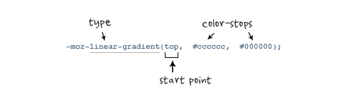
<html lang="en">
<head>
    <meta charset="UTF-8">
    <meta name="viewport" content="width=device-width, initial-scale=1.0">
    <title>Documenttitle>
    <style>
        .linear-box {
            width: 200px;
            height: 200px;
            background: -moz-linear-gradient(left top, red, green);
        }
    style>
head>
<body>
    <div class="linear-box">
        linear-gradient
    div>
body>
html>
12.2 线性渐变在Webkit下的应用
语法:
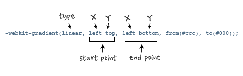
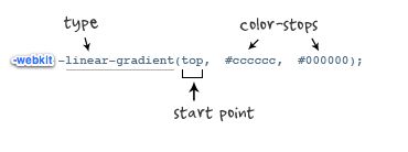
参数:**-webkit-gradient是webkit引擎对渐变的实现参数,一共有五个。第一个参数表示渐变类型(type),可以是linear(线性渐变)或者radial(径向渐变)。第二个参数和第三个参数,都是一对值,分别表示渐变起点和终点。这对值可以用坐标形式表示,也可以用关键值表示,比如 left top(左上角)和left bottom(左下角)。第四个和第五个参数,分别是两个color-stop函数。color-stop函数接受两个参数,第一个表示渐变的位置,0为起点,0.5为中点,1为结束点;第二个表示该点的颜色。
background: -webkit-gradient(linear,center top,center bottom,from(#ccc), to(#000));
-webkit-linear-gradient(top,#ccc,#000);
12.3 线性渐变在Opera下的应用
参数:-o-linear-gradient有三个参数。第一个参数表示线性渐变的方向,top是从上到下、left是从左到右,如果定义成left top,那就是从左上角到右下角。第二个和第三个参数分别是起点颜色和终点颜色。你还可以在它们之间插入更多的参数,表示多种颜色的渐变。(注:Opera支持的版本有限,本例测试都是在Opera11.1版本下,后面不在提示),如图所示:
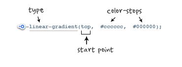
示例:
background: -o-linear-gradient(top,#ccc, #000);
12.4 线性渐变在Trident (IE)下的应用
语法:
filter: progid:DXImageTransform.Microsoft.gradient(GradientType=0, startColorstr=#1471da, endColorstr=#1C85FB);/*IE<9>*/
-ms-filter: "progid:DXImageTransform.Microsoft.gradient (GradientType=0, startColorstr=#1471da, endColorstr=#1C85FB)";/*IE8+*/
IE依靠滤镜实现渐变。startColorstr表示起点的颜色,endColorstr表示终点颜色。GradientType表示渐变类型,0为缺省值,表示垂直渐变,1表示水平渐变。如图所示:
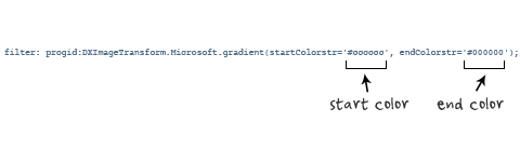
12.5 重复线性渐变
使用repeating-linear-gradient来实现重复线性渐变
body {
  background-image: repeating-linear-gradient(-45deg,
      transparent,
      transparent 20px,
      black 20px,
      black 40px);
  /* with multiple color stop lengths */
  background-image: repeating-linear-gradient(-45deg,
      transparent 0 20px,
      black 20px 40px);
}
12.6 径向渐变
CSS3径向渐变是圆形或椭圆形渐变。颜色不再沿着一条直线轴变化,而是从一个起点朝所有方向混合。
radial-gradient() 参数的组成部分主要包括五大部分:形状、大小、圆心位置、颜色和颜色位置。
接下来我将以具体实例对这五大部分逐一进行讲解。首先,定义一个200*150的矩形:
width: 200px; height: 150px;
一、传入两个或多个颜色参数
同样以红色到黄色渐变为例:
background: radial-gradient(#f00,#ff0);
显示效果很简单,就是一个以矩形中心点为圆心、矩形宽高为横纵向直径、颜色由红到黄向外的渐变
当然,与线性渐变类似的,同样可以传入更多的颜色参数,例如:
background: radial-gradient(#f00,#ff0,#0f0);
二、传入颜色位置参数
该参数紧跟与颜色值之后,例如:
radial-gradient(#f00 0,#ff0 100%);
以上效果同图一,同样可以类比线性渐变,具体不再赘述。
三、传入渐变形状参数
渐变形状有两种:圆(cicle)和椭圆(ellipse)。例如:
background: radial-gradient(circle,#f00 0,#ff0 100%);
显示效果是一个圆形状的渐变:
background: radial-gradient(ellipse,#f00 0,#ff0 100%);
显示效果是一个椭圆形状的渐变:
四、传入渐变大小参数
1. 具体数值(或百分比)
除了可以像上述显式地声明渐变形状,我们也可以通过传入渐变大小参数来确定形状,例如:
background: radial-gradient(60px,#f00 0,#ff0 100%);
此处只传入一个大小参数,则表示该渐变形状为圆,并且半径大小为60px
若传入两个大小不同的参数,则表示该渐变形状为椭圆,例如:
background: radial-gradient(50% 60px,#f00 0,#ff0 100%);
效果为长半轴为100px(元素宽度的50%)、短半轴为60px的椭圆形渐变
我们也可以在声明渐变形状的同时在其后紧跟渐变大小,中间用空格隔开
background: radial-gradient(circle 60px,#f00 0,#ff0 100%);
background: radial-gradient(ellipse 50% 60px,#f00 0,#ff0 100%);
需要特别注意的是,若渐变形状为圆形,则该渐变大小不能为百分数,而椭圆既可以为具体数值也可以为百分数,个人认为或许是因为圆形半径若为百分数的话就无法确定是以元素的宽为标准还是以高为标准了。
2. 大小声明
一共有以下四种:
closest-side (指定径向渐变的半径长度为从圆心到离圆心最近的边)
closest-corner (指定径向渐变的半径长度为从圆心到离圆心最近的角)
farthest-side (指定径向渐变的半径长度为从圆心到离圆心最远的边)
farthest-corner (指定径向渐变的半径长度为从圆心到离圆心最远的角)
以 closest-side 为例:
background: radial-gradient(circle closest-side,#f00 0,#ff0 100%);
五、传入渐变圆心位置参数
1. 具体数值(或百分数)
background: radial-gradient(circle farthest-side at 0 0,#f00 0%,#ff0 100%);
效果为圆心位置位于元素左上角,半径为元素宽度的圆形渐变
2. 方位名称
background: radial-gradient(circle closest-side at center,#f00 0,#ff0 100%);
background: radial-gradient(circle farthest-side at top left,#f00 0,#ff0 100%);
注意: 圆心位置参数一定要置于radial-gradient()第一个参数的末尾,顺序千万不能放反了哦~~
六、重复渐变
虽然上面已经讲完径向渐变的五大组成部分,但是,与线性渐变一样,径向渐变也同样还存在着重复渐变,我们可以用repeating-radial-gradient()来实现。例如:
background: repeating-radial-gradient(circle at center,#f00 0,#f00 10%,#ff0 10%,#ff0 20%);
13.Filter(滤镜)
css3的滤镜filter属性,可以对网页中的图片进行类似Photoshop图片处理的效果。
浏览器支持情况:只有IE浏览器不支持filter(滤镜)属性,为了兼容低版本的safari和google浏览器,需要加上前缀-webkit-
filter(滤镜)属性现在规范中支持的效果有:
- grayscale 灰度(值为0-1之间的小数)
filter:grayscale(1);

-webkit-filter:grayscale(1);
0表示灰度为0%,显示原图,1 表示灰度为100%灰色。
- sepia 褐色(值为0-1之间的小数)
filter:sepia(1);

-webkit-filter:sepia(1);
0表示褐色度为0%,显示原图,1 表示褐色度为100%显示褐色。
- saturate 饱和度(值为num)
filter:saturate(1.8);

 -webkit-filter:saturate(1.8);
0表示饱和为0,图片显示黑白色,0.5表示饱和度为原图的一半,1表示饱和度等于原图,数值大于1表示饱和度加强。
- hue-rotate 色相旋转(值为angle)角度deg
filter:hue-rotate(60deg);

 -webkit-filter:hue-rotate(60deg);
表示色相旋转的具体角度。
- invert 反色(值为0-1之间的小数)
filter:invert(1);

-webkit-filter:invert(1);
0表示不反色显示原图,1表示100%完全反色。
- opacity 透明度(值为0-1之间的小数)
filter:opacity(0.5);

-webkit-filter:opacity(0.5);
0表示完全透明,0.5表示半透明,1表示100%完全不透明。
- brightness 亮度(值为num)
filter:brightness(2);

-webkit-filter:brightness(2);
0表示亮度为0,显示黑色,0.5表示亮度为原图的一半,1表示原图亮度,数值大于1表示亮度加强。
- contrast 对比度(值为num)
filter:contrast(1.8);

-webkit-filter:contrast(1.8);
0表示对比度为0,为纯色,0.5表示对比度为原图的一半,1为原图对比度,数值大于1,值越大,对比度越强。
- blur 模糊(值为length)
filter:blur(5px);

-webkit-filter:blur(5px);
表示虚化程度像素值。
- drop-shadow 阴影
filter:drop-shadow(0 0 10px #000);

 -webkit-filter:drop-shadow(0 0 10px #000);
和css3 box-shadow属性值一致。多个属性值可以写一起,用空格隔开,类似transform多属性写法
14.弹性布局(FlexBox)
Flex 是 Flexible Box 的缩写,意为"弹性布局",用来为盒状模型提供最大的灵活性。
任何一个容器都可以指定为 Flex 布局。
.box{
  display: flex;
}
行内元素也可以使用 Flex 布局。
.box{
  display: inline-flex;
}
Webkit 内核的浏览器,必须加上-webkit前缀。
.box{
  display: -webkit-flex; /* Safari */
  display: flex;
}
注意,设为 Flex 布局以后,子元素的float、clear和vertical-align属性将失效。
14.1 基本概念
采用 Flex 布局的元素,称为 Flex 容器(flex container),简称"容器"。它的所有子元素自动成为容器成员,称为 Flex 项目(flex item),简称"项目"。
容器默认存在两根轴:水平的主轴(main axis)和垂直的交叉轴(cross axis)。主轴的开始位置(与边框的交叉点)叫做main start,结束位置叫做main end;交叉轴的开始位置叫做cross start,结束位置叫做cross end。
项目默认沿主轴排列。单个项目占据的主轴空间叫做main size,占据的交叉轴空间叫做cross size。
14.2 容器的属性
以下6个属性设置在容器上。
- flex-direction
- flex-wrap
- flex-flow
- justify-content
- align-items
- align-content
14.2.1 flex-direction设置主轴方向
它可能有4个值。
row(默认值):主轴为水平方向,起点在左端。row-reverse:主轴为水平方向,起点在右端。column:主轴为垂直方向,起点在上沿。column-reverse:主轴为垂直方向,起点在下沿。
14.2.3 flex-wrap设置flex布局的换行方式
默认情况下,项目都排在一条线(又称"轴线")上。flex-wrap属性定义,如果一条轴线排不下,如何换行。

.box{
  flex-wrap: nowrap | wrap | wrap-reverse;
}
它可能取三个值。
(1)nowrap(默认):不换行。
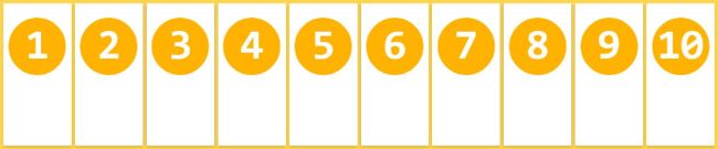
(2)wrap:换行,第一行在上方。
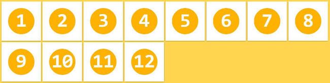
(3)wrap-reverse:换行,第一行在下方。

14.2.4 flex-flow简写flex-direction和flex-wrap
flex-flow属性是flex-direction属性和flex-wrap属性的简写形式,默认值为row nowrap。
14.2.5 justify-content属性
justify-content属性定义了项目在主轴上的对齐方式。
.box {
  justify-content: flex-start | flex-end | center | space-between | space-around;
}
它可能取5个值,具体对齐方式与轴的方向有关。下面假设主轴为从左到右。
flex-start(默认值):左对齐flex-end:右对齐center: 居中space-between:两端对齐,项目之间的间隔都相等。space-around:每个项目两侧的间隔相等。所以,项目之间的间隔比项目与边框的间隔大一倍。
14.2.6 align-items属性
align-items属性定义项目在交叉轴上如何对齐。
.box {
  align-items: flex-start | flex-end | center | baseline | stretch;
}
它可能取5个值。具体的对齐方式与交叉轴的方向有关,下面假设交叉轴从上到下。
flex-start:交叉轴的起点对齐。flex-end:交叉轴的终点对齐。center:交叉轴的中点对齐。baseline: 项目的第一行文字的基线对齐。stretch(默认值):如果项目未设置高度或设为auto,将占满整个容器的高度。
14.2.7 align-content属性
align-content属性定义了多根轴线的对齐方式。如果项目只有一根轴线,该属性不起作用。
.box {
  align-content: flex-start | flex-end | center | space-between | space-around | stretch;
}
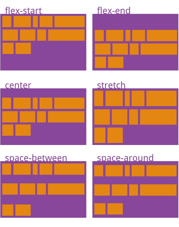
该属性可能取6个值。
flex-start:与交叉轴的起点对齐。flex-end:与交叉轴的终点对齐。center:与交叉轴的中点对齐。space-between:与交叉轴两端对齐,轴线之间的间隔平均分布。space-around:每根轴线两侧的间隔都相等。所以,轴线之间的间隔比轴线与边框的间隔大一倍。stretch(默认值):轴线占满整个交叉轴。
多轴我的理解为:flex-flow 中有一个属性,nowrap 和 wrap 这表示当主轴一次性不能排下这么多元素的时候,采取的排序方法,wrap的意思就是一行排不下了,换到下一行来展示,如果下一行还是展示不下,就再换到下一行。
如果flex-flow设置为row的话,采用wrap方法展示了3行。那么就有3个主轴平行的,那么就属于多轴了。
14.3 项目的属性
以下6个属性设置在项目上。
orderflex-growflex-shrinkflex-basisflexalign-self
14.3.1 order
order属性定义项目的排列顺序。数值越小,排列越靠前,默认为0。
.item { order:; }
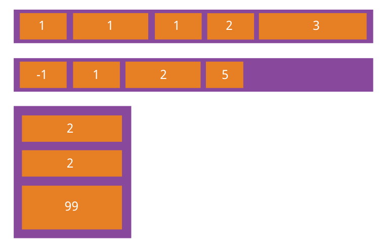
14.3.2 fle-grow
flex-grow属性定义项目的放大比例,默认为0,即如果存在剩余空间,也不放大。
.item { flex-grow:; /* default 0 */ }
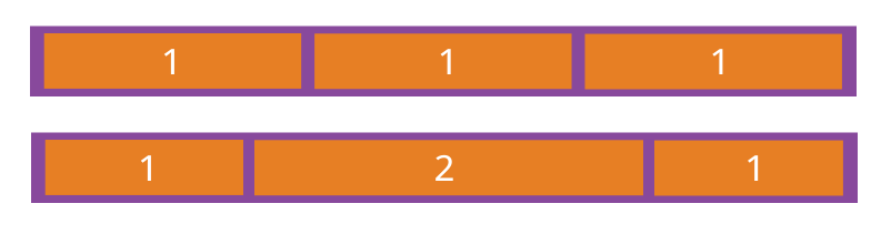
如果所有项目的flex-grow属性都为1,则它们将等分剩余空间(如果有的话)。如果一个项目的flex-grow属性为2,其他项目都为1,则前者占据的剩余空间将比其他项多一倍。
14.3.3 flex-shrink
flex-shrink属性定义了项目的缩小比例,默认为1,即如果空间不足,该项目将缩小。
.item { flex-shrink:; /* default 1 */ }
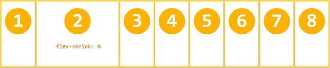
如果所有项目的flex-shrink属性都为1,当空间不足时,都将等比例缩小。如果一个项目的flex-shrink属性为0,其他项目都为1,则空间不足时,前者不缩小。
负值对该属性无效。
14.3.4 flex-basis
flex-basis属性定义了在分配多余空间之前,项目占据的主轴空间(main size)。浏览器根据这个属性,计算主轴是否有多余空间。它的默认值为auto,即项目的本来大小。
.item { flex-basis:| auto; /* default auto */ }
它可以设为跟width或height属性一样的值(比如350px),则项目将占据固定空间。
14.3.5 flex属性
flex属性是flex-grow, flex-shrink 和 flex-basis的简写,默认值为0 1 auto。后两个属性可选。
.item {
  flex: none | [ <'flex-grow'> <'flex-shrink'>? || <'flex-basis'> ]
}
该属性有两个快捷值:auto (1 1 auto) 和 none (0 0 auto)。
建议优先使用这个属性,而不是单独写三个分离的属性,因为浏览器会推算相关值。
14.3.6 align-self
align-self属性允许单个项目有与其他项目不一样的对齐方式,可覆盖align-items属性。默认值为auto,表示继承父元素的align-items属性,如果没有父元素,则等同于stretch。
.item {
  align-self: auto | flex-start | flex-end | center | baseline | stretch;
}
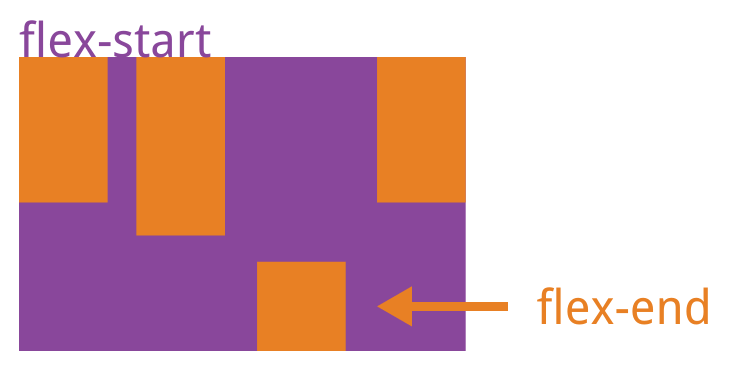
该属性可能取6个值,除了auto,其他都与align-items属性完全一致。
15.网格布局(GridLayout)
CSS网格布局(又称“网格”),是一种二维网格布局系统。CSS在处理网页布局方面一直做的不是很好。一开始我们用的是table(表格)布局,然后用float(浮动),position(定位)和inline-block(行内块)布局,但是这些方法本质上是hack,遗漏了很多功能,例如垂直居中。后来出了flexbox(盒子布局),解决了很多布局问题,但是它仅仅是一维布局,而不是复杂的二维布局,实际上它们(flexbox与grid)能很好的配合使用。Grid布局是第一个专门为解决布局问题而创建的CSS模块,2012年11月06日成立草案。
目前浏览器还不支持Grid布局,IE10和IE11支持老的语法。如果你想体验Grid布局的强大,推荐使用开通过“体验新功能”的Chrome, Opera 或 Firefox, Chrome:打开浏览器,输入chrome://flags,找到"experimental web platform features",启用并重启浏览器;Opera:输入opera://flags,与Chrome一样;Firefox:输入layout.css.grid.enabled。
15.1 重要术语
1.网格容器(Grid Container)
元素应用display:grid,它是其所有网格项的父元素。下面例子container就是网格容器。
<div class="container">
  <div class="item item-1">div>
  <div class="item item-2">div>
  <div class="item item-3">div>
div>
2**.网格项(Grid Item)**
网格容器的子元素,下面的item元素是网格项,但sub-item不是。
<div class="container">
  <div class="item">div>
  <div class="item">
    <p class="sub-item">p>
  div>
  <div class="item">div>
div>
3.网格线(Grid Line)
组成网格线的分界线。它们可以是列网格线(column grid lines),也可以是行网格线(row grid lines)并且居于行或列的任意一侧
[外链图片转存失败,源站可能有防盗链机制,建议将图片保存下来直接上传(img-0IqqcHZi-1604913789016)(/Users/liwei/Library/Application Support/typora-user-images/image-20200527115221947.png)]
4.网格轨道(Grid Track)
两个相邻的网格线之间为网格轨道。你可以认为它们是网格的列或行,下面在第二个和第三个网格线之间的黄色部分为网格轨道。
[外链图片转存失败,源站可能有防盗链机制,建议将图片保存下来直接上传(img-dtK3CtKm-1604913789016)(/Users/liwei/Library/Application Support/typora-user-images/image-20200527115203607.png)]
-
网格单元(Grid Cell)
两个相邻的列网格线和两个相邻的行网格线组成的是网格单元,它是最小的网格单元。下面行网格线1(row grid lines 1)、行网格线2(row grid lines 2)和列网格线2(column grid lines 2)、列网格线3(column grid lines 3)组成的黄色区域为网格单元。 -
网格区(Grid Area)
网格区是由任意数量网格单元组成,下面行网格线1(row grid lines 1)、行网格线3(row grid lines 3)和列网格线1(column grid lines 1)、列网格线3(column grid lines3)组成的黄色区域为网格区。
15.2 容器属性
设置在网格容器上的属性
- display
- grid-template-columns
- grid-template-rows
- grid-template-areas
- grid-column-gap
- grid-row-gap
- grid-gap
- justify-items
- align-items
- justify-content
- align-content
- grid-auto-columns
- grid-auto-rows
- grid-auto-flow
- grid
1. display
grid | inline-grid | subgrid;
属性值:
grid: 生成块级网格
inline-grid: 生成行内网格
subgrid: 如果网格容器本身是网格项(嵌套网格容器),此属性用来继承其父网格容器的列、行大小。
注:当元素设置了网格布局,column、float、clear、vertical-align属性无效。
2. grid-template-columns和grid-template-rows
grid-template-rows: … | … ;
设置行和列的大小,在行轨道或列轨道两边是网格线。
属性值:
track-size: 轨道大小,可以使用css长度,百分比或用分数(用fr单位)。
line-name: 网格线名字,你可以选择任何名字。
例子:
当你设置行或列大小为auto时,网格会自动分配空间和网格线名称。
.container{
    display:grid;
    grid-template-columns: 40px 50px auto 50px 40px;
    grid-template-rows: 25% 100px auto;
}
3. grid-numbers
你也可以给网格线定义名字,注意名字需要写在[]里面。
.container{
    display:grid;
    grid-template-columns: [first] 40px [line2] 50px [line3] auto [col4-start] 50px [five] 40px [end];
    grid-template-rows: [row1-start] 25% [row1-end] 100px [third-line] auto [last-line];
}
4.grid-names
每条网格线可以有多个名字,例如上面行的第二条线有两个名字,分别是row1-end和row2-start。
.container{
    display:grid;
    grid-template-rows: [row1-start] 25% [row1-end row2-start] 25% [row2-end];
}
如果你定义包含重复部分,可以使用repeat()简化。
.container{
    display:grid;
    grid-template-columns: repeat(3, 20px [col-start]) 5%;
}
上面等同于下面:
.container{
    display:grid;
    grid-template-columns: 20px [col-start] 20px [col-start] 20px [col-start] 5%;
}
用fr单位可以将容器分为几等份,例如下面分成三等份。
.container{
    display:grid;
    grid-template-columns: 1fr 1fr 1fr;
}
如果fr单位和实际值一起使用,设置fr的行或列将分(除了实际值)剩余部分。
.container{
    display:grid;
    grid-template-columns: 1fr 50px 1fr 1fr;
}
5.grid-template-areas
通过获取网格项中的grid-area属性值(名称),来定义网格模版。重复网格区(grid-area)名称将跨越网格单元格,‘.’代表空网格单元。
属性值:
grid-area-name: 网格项的grid-area属性值(名字)
‘.’ : 空网格单元
none: 不定义网格区域
实例
<html lang="en">
<head>
    <meta charset="UTF-8">
    <meta name="viewport" content="width=device-width, initial-scale=1.0">
    <title>Documenttitle>
    <style>
        * {
            margin: 0;
            padding: 0;
        }
        body {
            overflow: hidden;
        }
        .container {
            height: calc(100vh);
            display: grid;
            grid-gap: 15px;
            justify-items: stretch;
            align-items: center;
            grid-template-rows: auto;
            grid-template-columns: 240px auto auto;
            grid-template-rows: 64px auto auto;
            grid-template-areas: "header header header"
                                "aside main main"
                                "aside main main"
        }

        .container .header {
            grid-area: header;
            text-align: center;
            height: 64px;
            line-height: 64px;
            background: -webkit-linear-gradient(right, rgb(0, 162, 255), #03A9F4);
            color: #fff;
            font-size: 24px;
        }

        .container aside {
            grid-area: aside;
        }
        .container aside {
            overflow: auto;
        }
        .container aside ul {
            list-style: none;
            padding-top: 10px;
        }
        .container aside ul li {
            padding: 12px 16px;
            color: #555;
            cursor: pointer;
            transition: ease all .3s;
            border-bottom: 1px solid #eee;
            text-align: center;
        }
        .container aside ul li:last-child {
            border-bottom: none;
        }
        .container aside ul li:hover {
            color: #03A9F4;
        }
        .container main {
            grid-area: main;
            overflow: auto;
            padding: 10px 20px;
        }
        .container main article h1 {
            cursor: pointer;
        }
        .container main article h1:hover {
            color:cornflowerblue
        }
        .container main article p {
            color: #555;
            font-family: Arial, Helvetica, sans-serif;
            word-spacing: 3px;
            line-height: 22px;
            text-align: justify;
        }
    style>
head>
<body>
    <div class="container">
        <div class="header">
            网格布局练习实例
        div>
        <aside>
            <ul>
                <li>功能模块01li>
                <li>功能模块02li>
                <li>功能模块03li>
                <li>功能模块04li>
                <li>功能模块05li>
                <li>功能模块06li>
                <li>功能模块07li>
                <li>功能模块08li>
                <li>功能模块09li>
                <li>功能模块10li>
                <li>功能模块11li>
                <li>功能模块12li>
                <li>功能模块13li>
                <li>功能模块14li>
                <li>功能模块15li>
                <li>功能模块16li>
                <li>功能模块17li>
                <li>功能模块18li>
                <li>功能模块19li>
                <li>功能模块20li>
            ul>
        aside>
        <main>
            <article>
                <h1>article1h1>
                <p>
                    Lorem ipsum dolor sit amet consectetur adipisicing elit. Libero alias molestias aliquid minima amet sapiente ut eos? Commodi quos placeat neque ad voluptatum voluptatibus, suscipit inventore dignissimos, tempore reprehenderit doloribus.
                    Rem quibusdam dolore sint corrupti exercitationem, fugiat, distinctio earum reprehenderit sit laudantium totam beatae necessitatibus voluptates quasi obcaecati tempora rerum ullam vel, eaque officiis minima ipsum id modi. Modi, est!
                    Nam doloremque voluptatum laboriosam quod autem labore ut a cupiditate quia beatae minus, rerum quo eius, nobis illo totam laudantium? Reprehenderit et accusantium quae deleniti quod tempora eos dolorum similique!
                p>
            article>
            <article>
                <h1>article2h1>
                <p>
                    Lorem ipsum dolor sit amet consectetur adipisicing elit. Sit, facilis animi asperiores architecto magni reiciendis recusandae accusantium maiores aperiam quis porro! Dolores nam ex reiciendis quos autem facere ullam tempora.
                    Reiciendis eum eligendi quia perferendis saepe aperiam tempora consectetur dignissimos! Sint asperiores sunt ab, nulla eius rem perferendis culpa eos? Nesciunt, nihil labore cumque nemo minima ipsa magni unde in.
                    Atque aperiam consequuntur eius illum nulla perferendis omnis consequatur maxime, cupiditate quia aspernatur architecto repudiandae, id adipisci debitis? Illo quasi quidem fuga ex nesciunt quas qui magni assumenda officia porro.
                    Distinctio exercitationem officiis quae dolor quaerat amet molestias error quod atque ipsa nesciunt libero, praesentium minus ut magnam natus, sint, repudiandae laboriosam? Eius dicta pariatur modi recusandae numquam exercitationem illo.
                    Officia optio tempore asperiores iure. Ab in itaque accusantium quasi explicabo harum sed impedit ipsa eveniet fugit aperiam neque labore, nostrum consectetur voluptatem est totam rem asperiores alias commodi debitis.
                p>
            article>
        main>
    div>
body>
html>
6. grid-column-gap和 grid-row-gap ;
网格单元间距。
属性值:
line-size: 网格线间距,设置单位值。
例子:
.container{
    display:grid;
    grid-template-columns: 100px 50px 100px;
    grid-template-rows: 80px auto 80px;
    grid-column-gap: 10px;
    grid-row-gap: 15px;
}
注:间隔仅仅作用在网格单元之间,不作用在容器边缘。
7.grid-gap
是grid-column-gap 和 grid-row-gap简写。
例子:
.container{
    display:grid;
    grid-template-columns: 100px 50px 100px;
    grid-template-rows: 80px auto 80px;
    grid-gap: 10px 15px;
}
注:如果只设置一个值,那么grid-column-gap 和 grid-row-gap都为那个值。
8. justify-items
start | end | center | stretch(默认) ;
垂直于列网格线对齐,适用于网格容器里的所有网格项。
属性值:
start: 左对齐。
end: 右对齐。
center: 居中对齐。
stretch: 填满(默认)。
例子:
.container{
    display:grid;
    justify-items: start;
}
.container{
    display:grid;
    justify-items: end;
}
.container{
    display:grid;
    justify-items: center;
}
.container{
    display:grid;
    justify-items: stretch;
}
9. align-items
start | end | center | stretch ;
垂直于行网格线对齐,适用于网格容器里的所有网格项。
属性值:
start: 顶部对齐。
end: 底部对齐。
center: 居中对齐。
stretch:填满(默认)。
例子:
.container{
    display:grid;
    align-items: start;
}
.container{
    display:grid;
    align-items: end;
}
.container{
    display:grid;
    align-items: center;
}
.container{
    display:grid;
    align-items: stretch;
}
10. justify-content
start | end | center | stretch | space-around | space-between | space-evenly ;
如果用像px非弹性单位定义的话,总网格区域大小有可能小于网格容器,这时候你可以设置网格的对齐方式(垂直于列网格线对齐)。
属性值:
start: 左对齐。
end: 右对齐。
center: 居中对齐。
stretch: 填满网格容器。
space-around: 网格项两边间距相等,网格项之间间隔是单侧的2倍。
space-between: 两边对齐,网格项之间间隔相等。
space-evenly: 网格项间隔相等。
例子:
.container{
    display:grid;
    justify-content: start;
}
.container{
    display:grid;
    justify-content: end;
}
.container{
    display:grid;
    justify-content: center;
}
.container{
    display:grid;
    justify-content: stretch;
}
.container{
    display:grid;
    justify-content: space-around;
}
.container{
    display:grid;
    justify-content: space-between;
}
.container{
    display:grid;
    justify-content: space-evenly;
}
11. align-content
start | end | center | stretch | space-around | space-between | space-evenly ;
如果用像px非弹性单位定义的话,总网格区域大小有可能小于网格容器,这时候你可以设置网格的对齐方式(垂直于行网格线对齐)。
属性值:
start: 顶部对齐。
end: 底部对齐。
center: 居中对齐。
stretch: 填满网格容器。
space-around: 网格项两边间距相等,网格项之间间隔是单侧的2倍。
space-between: 两边对齐,网格项之间间隔相等。
space-evenly: 网格项间隔相等。
例子:
.container{
    display:grid;
    align-content: start;
}
.container{
    display:grid;
    align-content: end;
}
.container{
    display:grid;
    align-content: center;
}
.container{
    display:grid;
    align-content: stretch;
}
.container{
    display:grid;
    align-content: space-around;
}
.container{
    display:grid;
    align-content: space-between;
}
.container{
    display:grid;
    align-content: space-evenly;
}
12.grid-auto-columns和 grid-auto-rows
自动生成隐式网格轨道(列和行),当你定位网格项超出网格容器范围时,将自动创建隐式网格轨道。
属性值:
track-size: 网格轨道大小,可以是固定值,百分比或者是分数(fr单位)。
为了说明隐式网格轨道是怎么创建的,我们先看下面列子:
.container{
    display:grid;
    grid-template-columns: 60px 60px;
    grid-template-rows: 90px 90px
}
grid-auto
这是2✖️2的网格,但是我们来用grid-column 和 grid-row给网格项定位如下:
.item-a{
    grid-column: 1 / 2;
    grid-row: 2 / 3;
}
.item-b{
    grid-column: 5 / 6;
    grid-row: 2 / 3;
}
implicit-tracks
我们可以看出,网格项item-b定位在第五根列网格线(column line 5 )和第六根列网格线(column line 6 )之间。但是我们网格容器根本不存在这两条网格线,所以就用两个0宽度来填充。在这里我们可以用网格自动行(grid-auto-rows)和网格自动列(grid-auto-columns)来定义这些隐式轨道宽度。
.container{
    display:grid;
    grid-auto-columns: 60px;
}
13. grid-auto-flow
row(默认) | column | dense ;
在没有设置网格项的位置时,这个属性控制网格项怎样排列。
属性值:
row: 按照行依次从左到右排列。
column: 按照列依次从上到下排列。
dense: 按先后顺序排列。
来看看下面结构:
    item-a
    item-b
    item-c
    item-d
    item-e
下面定义5列2行网格,同时定义grid-auto-flow:row。
.container{
    display: grid;
    grid-template-columns: 60px 60px 60px 60px 60px;
    grid-template-rows: 30px 30px;
    grid-auto-flow: row;
}
像下面布局网格项。
.item-a{
    grid-column: 1;
    grid-row: 1 / 3;
}
.item-e{
    grid-column: 5;
    grid-row: 1 / 3;
}
由于我们设置了grid-auto-flow:row,item-b、item-c和item-d在行上是从左到右排列
14. grid-template
该属性是grid-template-columns, grid-template-rows和grid-template-areas的简写属性
grid-template:
            "a a a" 40px
            "b c c" 40px
            "b c c" 40px / 1fr 1fr 1fr;

grid-template:
            "b b a" auto
            "b b c" 2ch
            "b b c" 1em / 20% 20px 1fr;

grid-template:
            "a a ." minmax(50px, auto)
            "a a ." 80px
            "b b c" auto / 2em 3em auto;
15. grid
grid: none | / | [ [ / ] ];
是一种简写形式,设置网格容器所有属性。
属性值:
none: 设置为所有属性的默认值。
/ : 设置行和列的值,其他属性为默认值。
[ [ / ] ] : 设置网格自动流、网格自动行、网格自动列的值,其他未设置则为默认值。
例子1:
.container{
    grid: 200px auto / 1fr auto 1fr;
}

等同于

.container{
    grid-template-rows: 200px auto;
    grid-template-columns: 1fr auto 1fr;
    grid-template-areas: none;
}
例子2:
.container{
    grid: column 1fr / auto;
}
等同于
.container{
    grid-auto-flow: column;
    grid-auto-rows: 1fr;
    grid-auto-columns: auto;
grid属性更多的书写方法
/* <'grid-template'> values */
grid: none;
grid: "a" 100px "b" 1fr;
grid: [linename1] "a" 100px [linename2];
grid: "a" 200px "b" min-content;
grid: "a" minmax(100px, max-content) "b" 20%;
grid: 100px / 200px;
grid: minmax(400px, min-content) / repeat(auto-fill, 50px);

/* <'grid-template-rows'> /
   [ auto-flow && dense? ] <'grid-auto-columns'>? values */
grid: 200px / auto-flow;
grid: 30% / auto-flow dense;
grid: repeat(3, [line1 line2 line3] 200px) / auto-flow 300px;
grid: [line1] minmax(20em, max-content) / auto-flow dense 40%;

/* [ auto-flow && dense? ] <'grid-auto-rows'>? /
   <'grid-template-columns'> values */
grid: auto-flow / 200px;
grid: auto-flow dense / 30%;
grid: auto-flow 300px / repeat(3, [line1 line2 line3] 200px);
grid: auto-flow dense 40% / [line1] minmax(20em, max-content);

/* Global values */
grid: inherit;
grid: initial;
grid: unset;
16.使用@supports来判断浏览器是否支持grid布局
@supports(display: grid) {
            .container {
                display: grid;
                grid: "a a a" 100px "b c c" 200px "b c c" minmax(20em, max-content) / 1fr 1fr 1fr;
            }
            .container .item-a {
                grid-area: a;
            }

            .container .item-b {
                grid-area: c;
            }
        }
17. win-8开始菜单效果
<html lang="en">
<head>
    <meta charset="UTF-8">
    <meta name="viewport" content="width=device-width, initial-scale=1.0">
    <title>Documenttitle>
    <style>
        .win-8 {
            display: grid;
            grid-template-columns: 1fr 1fr 1fr;
            grid-template-rows: 200px 200px 200px;
            grid-template-areas: "a a b"
                                 "a a c"
                                 "d e c";
            grid-gap: 6px;
        }
        .win-8 .red {
            grid-area: a;
            background-color: red;
        }
        .win-8 .light-green {
            grid-area: b;
            background-color: chartreuse;
        }
        .win-8 .dark-green {
            grid-area: d;
            background-color: green;
        }
        .win-8 .orange {
            grid-area: e;
            background-color: orange;
        }
        .win-8 .purple {
            grid-area: c;
            background-color: purple;
        }
    style>
head>
<body>
    <div class="win-8">
        <div class="red">1div>
        <div class="light-green">2div>
        <div class="dark-green">3div>
        <div class="orange">4div>
        <div class="purple">6div>
    div>
body>
html>
16.多列布局
| column-count | 规定元素应该被分隔的列数。 | 3 |
|---|---|---|
| column-fill | 规定如何填充列。 | 3 |
| column-gap | 规定列之间的间隔。 | 3 |
| column-rule | 设置所有 column-rule-* 属性的简写属性。 | 3 |
| column-rule-color | 规定列之间分割线的颜色。 | 3 |
| column-rule-style | 规定列之间分割线的样式。 | 3 |
| column-rule-width | 规定列之间分线的宽度。 | 3 |
| column-span | 规定元素应该横跨的列数。 | 3 |
| column-width | 规定列的宽度 | 3 |
| columns | 规定设置 column-width 和 column-count 的简写属性。 当column-count和column-width同时设置时,有时候并不能同时满足。比如column-count为3,column-width为200px,而总宽度为500px,显然不能同时并存,此时就只有2行,并且宽度也可能超过200px。 | 3 |
<html lang="en">
<head>
    <meta charset="UTF-8">
    <meta name="viewport" content="width=device-width, initial-scale=1.0">
    <title>Documenttitle>
    <style>
        p {
            column-gap: 20px;
            column-rule-width:1px;
            column-rule-color:#ff0000;
            column-rule-style:dotted;
            columns: 200px 3;
        }

    style>
head>
<body>
    <p>
        Lorem ipsum dolor sit amet consectetur adipisicing elit. Saepe dolorum, dolorem voluptatum ea sequi enim quas excepturi ratione, eius esse nulla nobis iste voluptas fugiat corporis doloribus veniam molestias reiciendis.
        Consequuntur illum ab, corporis aliquam tempora eaque eos, excepturi provident, nobis doloribus perspiciatis dolor. Necessitatibus aliquid nostrum odio ex, dolore eius dolorem delectus quam? Quis reprehenderit ut saepe modi aut?
        Soluta tenetur totam iure delectus cumque. Magni repellendus earum corrupti voluptatum, non voluptas harum sequi voluptatibus asperiores, reiciendis exercitationem quas. Et sunt quos officiis deleniti recusandae sapiente omnis incidunt suscipit!
        Illo nostrum sapiente sequi dolores rerum ipsa esse repellat reiciendis, quia veniam, ipsam, quidem nulla accusamus nisi consequuntur soluta quos error. Sint voluptatum dignissimos blanditiis unde optio! Alias, iusto deserunt.
        Deserunt itaque quis nemo repellendus amet consequatur quisquam culpa, quos, provident animi quasi. Alias, cupiditate, minus id eveniet, cum sint delectus inventore doloremque itaque facilis voluptatum impedit animi! Nemo, molestias.
    p>
body>
html>
17.媒体查询
所谓媒体查询就是通过监测页面尺寸变化,不同媒体类型,设置不同间断点达到布局调整的一种特性
比如
如果文档宽度小于 300 像素则修改背景颜色(background-color):
@media screen and (max-width: 300px) {
    body {
        background-color:lightblue;
    }
}
浏览器兼容性
| Rule | Chrome | Ie | Firefox | Safari | Opera |
|---|---|---|---|---|---|
| @media | 21 | 9 | 3.5 | 4.0 | 9 |
可以使用内联样式来定义媒体查询样式, 也可以针对媒体查询间断点通过link标签引入不同的外部样式表
@media mediatype and|not|only (media feature) {
    CSS-Code;
}
你也可以针对不同的媒体使用不同 stylesheets :

"stylesheet" media="mediatype and|not|only (media feature)" href="mystylesheet.css">
17.2 可用的媒体类型
| all | 用于所有设备 |
|---|---|
| aural | 已废弃。用于语音和声音合成器 |
| braille | 已废弃。 应用于盲文触摸式反馈设备 |
| embossed | 已废弃。 用于打印的盲人印刷设备 |
| handheld | 已废弃。 用于掌上设备或更小的装置,如PDA和小型电话 |
| 用于打印机和打印预览 | |
| projection | 已废弃。 用于投影设备 |
| screen | 用于电脑屏幕,平板电脑,智能手机等。 |
| speech | 应用于屏幕阅读器等发声设备 |
| tty | 已废弃。 用于固定的字符网格,如电报、终端设备和对字符有限制的便携设备 |
| tv | 已废弃。 用于电视和网络电视 |
17.3 可用的媒体查询功能
| aspect-ratio | 定义输出设备中的页面可见区域宽度与高度的比率 |
|---|---|
| color | 定义输出设备每一组彩色原件的个数。如果不是彩色设备,则值等于0 |
| color-index | 定义在输出设备的彩色查询表中的条目数。如果没有使用彩色查询表,则值等于0 |
| device-aspect-ratio | 定义输出设备的屏幕可见宽度与高度的比率。 |
| device-height | 定义输出设备的屏幕可见高度。 |
| device-width | 定义输出设备的屏幕可见宽度。 |
| grid | 用来查询输出设备是否使用栅格或点阵。 |
| height | 定义输出设备中的页面可见区域高度。 |
| max-aspect-ratio | 定义输出设备的屏幕可见宽度与高度的最大比率。 |
| max-color | 定义输出设备每一组彩色原件的最大个数。 |
| max-color-index | 定义在输出设备的彩色查询表中的最大条目数。 |
| max-device-aspect-ratio | 定义输出设备的屏幕可见宽度与高度的最大比率。 |
| max-device-height | 定义输出设备的屏幕可见的最大高度。 |
| max-device-width | 定义输出设备的屏幕最大可见宽度。 |
| max-height | 定义输出设备中的页面最大可见区域高度。 |
| max-monochrome | 定义在一个单色框架缓冲区中每像素包含的最大单色原件个数。 |
| max-resolution | 定义设备的最大分辨率。 |
| max-width | 定义输出设备中的页面最大可见区域宽度。 |
| min-aspect-ratio | 定义输出设备中的页面可见区域宽度与高度的最小比率。 |
| min-color | 定义输出设备每一组彩色原件的最小个数。 |
| min-color-index | 定义在输出设备的彩色查询表中的最小条目数。 |
| min-device-aspect-ratio | 定义输出设备的屏幕可见宽度与高度的最小比率。 |
| min-device-width | 定义输出设备的屏幕最小可见宽度。 |
| min-device-height | 定义输出设备的屏幕的最小可见高度。 |
| min-height | 定义输出设备中的页面最小可见区域高度。 |
| min-monochrome | 定义在一个单色框架缓冲区中每像素包含的最小单色原件个数 |
| min-resolution | 定义设备的最小分辨率。 |
| min-width | 定义输出设备中的页面最小可见区域宽度。 |
| monochrome | 定义在一个单色框架缓冲区中每像素包含的单色原件个数。如果不是单色设备,则值等于0 |
| orientation | 定义输出设备中的页面可见区域高度是否大于或等于宽度。 |
| resolution | 定义设备的分辨率。如:96dpi, 300dpi, 118dpcm |
| scan | 定义电视类设备的扫描工序。 |
| width | 定义输出设备中的页面可见区域宽度。 |
19.混合模式
blend-mode是CSS的一种值类型。它用于描述当元素重叠时颜色该如何展示。可以用于background-blend-mode和mix-blend-mode这两个属性。
当应用了混合模式后,这一属性会根据特定的算法将重叠的前景(顶)色和背景(底)色生成一个新的颜色值。
- mix-blend-mode属性用来定义元素与背景的混合模式,可以是元素与背景图片的混合,也可以是元素与背景色的混合
- background-blend-mode属性用来定义背景的混合模式,可以是背景图片与背景图片的混合,也可以是背景图片和背景色的混合
一个小例子
<html lang="en">
<head>
    <meta charset="UTF-8">
    <meta name="viewport" content="width=device-width, initial-scale=1.0">
    <title>Documenttitle>
    <style>
        * {
            margin: 0;
            padding: 0;
        }

        body {
            height: 100vh;
            width: 100vw;
            background-image: -webkit-linear-gradient(left, white 0%, white 50%, black 50%);
        }

        h1 {
            position: absolute;
            top: 50%;
            left: 50%;
            color: #fff;
            transform: translate(-50%, -50%);
            mix-blend-mode: difference;
        }
    style>
head>
<body>
    <div class="left">div>
    <div class="right">div>
    <h1>Hello Worldh1>
body>
html>
引题的小例子就是用的mix-blend-mode属性,实现的是文本和背景图的混合。下面介绍一下混合模式的取值情况,我们首先学习3个术语:基色,混合色和结果色。
- 基色:指当前图层之下的图层颜色。
- 混合色:指当前图层的颜色。
- 结果色:指混合后得到的颜色。
19.1 可用的混合模式值
- normal 正常 直接返回结果色
- multiply 正片叠底 查看每个通道中的颜色信息,并将基色与混合色复合
- screen 滤色 与“正片叠底”相反,查看每个通道的颜色信息,将图像的基色与混合色结合起来产生比两种颜色都浅的第三种颜色
- overlay 叠加 把图像的基色与混合色相混合产生一种中间色。
- darken 变暗 查看每个通道中的颜色信息,并选择基色或混合色中较暗的颜色作为结果色
- lighten 变亮 查看每个通道中的颜色信息,并选择基色或混合色中较亮的颜色作为结果色
- color-dodge 颜色减淡 查看每个通道中的颜色信息,并通过减小对比度使基色变亮以反映混合色。与黑色混合则不发生变化
- color-burn 颜色加深 查看每个通道中的颜色信息,并通过增加对比度使基色变暗以反映混合色,如果与白色混合的话将不会产生变化
- hard-light 强光 产生一种强光照射的效果。如果混合色比基色更亮一些,那么结果色将更亮;如果混合色比基色更暗一些,那么结果色将更暗
- soft-light 柔光 产生一种柔光照射的效果。如果混合色比基色更亮一些,那么结果色将更亮;如果混合色比基色更暗一些,那么结果色将更暗,使图像的亮度反差增大
- difference 差值 查看每个通道中的颜色信息,从图像中基色的亮度值减去混合色的亮度值,如果结果为负,则取正值,产生反相效果
- exclusion 排除 与“差值”模式相似,但是具有高对比度和低饱和度的特点。比用“差值”模式获得的颜色要柔和、更明亮一些
- hue 色相 选择基色的亮度和饱和度值与混合色进行混合而创建的效果,混合后的亮度及饱和度取决于基色,但色相取决于混合色
- saturation 饱和度 在保持基色色相和亮度值的前提下,只用混合色的饱和度值进行着色。基色与混合色的饱和度值不同时,才使用混合色进行着色处理。若饱和度为0,则与任何混合色叠加均无变化。当基色不变的情况下,混合色图像饱和度越低,结果色饱和度越低;混合色图像饱和度越高,结果色饱和度越高
- color 颜色 引用基色的明度和混合色的色相与饱和度创建结果色。它能够使用混合色的饱和度和色相同时进行着色,这样可以保护图像的灰色色调,但结果色的颜色由混合色决定。颜色模式可以看作是饱和度模式和色相模式的综合效果,一般用于为图像添加单色效果
- luminosity 亮度 能够使用混合色的亮度值进行着色,而保持基色的饱和度和色相数值不变。其实就是用基色中的“色相”和“饱和度”以及混合色的亮度创建结果色
如下我们可以将15中混合模式分为5类:
- 变暗:multiply,darken,color-burn
- 变亮:screen,lighten,color-dodge
- 调整对比度:overlay,hard-light,soft-light
- 反差:difference,exclusion
- 颜色组成:hue,saturation,color,luminosity
19.2 isolation的使用
隔离isolation的作用是创建一个堆叠上下文stacking context,主要用于与mix-blend-mode属性一起使用时,将混合模式只应用于某一个元素或某一组元素
isolation
初始值: auto
应用于: 所有元素
继承性: 无
值: auto | isolate(创建新的堆叠上下文) | initial | inherit | unset
实例
<html lang="en">
  <head>
    <meta charset="UTF-8" />
    <meta name="viewport" content="width=device-width, initial-scale=1.0" />
    <title>Documenttitle>
    <style>
      .a {
        background-color: rgb(0, 255, 0);
      }
      #b {
        width: 200px;
        height: 210px;
      }
      .c {
        width: 100px;
        height: 100px;
        border: 1px solid black;
        padding: 2px;
        mix-blend-mode: difference;
      }
      #d {
        isolation: auto;
      }
      #e {
        isolation: isolate; /* ID为e的div中的类c的dom元素不与父元素进行混合 */
      }
    style>
  head>
  <body>
    <div id="b" class="a">
      <div id="d">
        <div class="a c">autodiv>
      div>
      <div id="e">
        <div class="a c">isolatediv>
      div>
    div>
  body>
html>
19.3 实例
让阴天的天空变蓝
<html lang="en">
<head>
    <meta charset="UTF-8">
    <meta name="viewport" content="width=device-width, initial-scale=1.0">
    <title>Documenttitle>
    <style>
        .box1 {
            width: 600px;
            height: 480px;
            float: left;
            background: url("http://p9.qhimg.com/t012932e87662183569.jpg") no-repeat fixed center/100% 100%;
        }
        .box2 {
            width: 600px;
            height: 480px;
            float: left;
            margin-left: 20px;
            background: url(http://p6.qhimg.com/t0110da9f699fc645b4.png) no-repeat top/ 160px 50px,

                        url(http://p0.qhimg.com/t01628bd068d6f37961.png) no-repeat 30px 50px/ 160px 50px,

                        url(http://p2.qhimg.com/t0160c558d31f4d5202.png) no-repeat 380px 60px/160px 50px,

                        url(http://p9.qhimg.com/t012932e87662183569.jpg) no-repeat,

                        linear-gradient(#0aa0fe 0%, #baf5ff 55%, #85c1cb 55%);
            background-color: #09a8e0;
            background-blend-mode: lighten, lighten, lighten, multiply, darken;

        }
    style>
head>
<body>
    <div class="box1">div>
    <div class="box2">div>
body>
html>
如上,我们通过多背景的混合实现了更好看点图像,效果图如下(左侧为未应用混合模式的效果)。我们通过渐变实现了天的渐变蓝与水的绿,并且额外增加了三朵漂浮的云朵。
image
注意,当存在多背景时,background-blend-mode混合模式的顺序与background-img属性一致。如果混合模式的值长度小于背景图的值长度,则会重复混合模式的值,循环匹配。如果大于背景图的值长度,则会被截取。
上述例子改造为多元素混合,基于mix-blend-mode属性来实现
<html lang="en">
  <head>
    <meta charset="UTF-8" />
    <meta name="viewport" content="width=device-width, initial-scale=1.0" />
    <title>Documenttitle>
    <style>
      .wrapper {
        position: relative;

        border: 1px solid #ddd;

        margin-right: 5px;

        width: 300px;

        height: 200px;

        background: linear-gradient(#0aa0fe 0%, #baf5ff 55%, #85c1cb 55%);

        background-size: 100%;

        background-position: center center;

        background-repeat: no-repeat;

        overflow: hidden;
      }

      .img {
        width: 100%;

        height: 100%;

        background: url(http://p9.qhimg.com/t012932e87662183569.jpg);

        background-size: 100%;

        background-position: center center;

        background-repeat: no-repeat;

        mix-blend-mode: multiply;
      }

      .cloud {
        position: absolute;

        background-size: 100%;

        background-position: center center;

        background-repeat: no-repeat;

        mix-blend-mode: lighten;
      }

      .cloud1 {
        background-image: url(http://p6.qhimg.com/t0110da9f699fc645b4.png);

        left: 30px;

        top: 50px;

        width: 60px;

        height: 20px;
      }

      .cloud2 {
        background-image: url(http://p0.qhimg.com/t01628bd068d6f37961.png);

        left: 230px;

        top: 50px;

        width: 80px;

        height: 30px;
      }

      .cloud3 {
        background-image: url(http://p2.qhimg.com/t0160c558d31f4d5202.png);

        left: 130px;

        top: 25px;

        width: 100px;

        height: 30px;
      }
    style>
  head>
  <body>
    <div class="wrapper">
      <div class="img">div>

      <div class="cloud cloud1">div>

      <div class="cloud cloud2">div>

      <div class="cloud cloud3">div>
    div>
  body>
html>
[外链图片转存失败,源站可能有防盗链机制,建议将图片保存下来直接上传(img-JeaTafjK-1604913789019)(/Users/liwei/Library/Application Support/typora-user-images/image-20200528164121760.png)]
在canvas和svg中也可以使用混合模式
四. CSS响应式设计
3.1 CSS Viewport
3.1.1 viewport的概念
在 PC 端,视口指的是浏览器的可视区域,其宽度和浏览器窗口的宽度保持一致。在 CSS 标准文档中,视口也被称为初始包含块,它是所有 CSS 百分比宽度推算的根源,给 CSS 布局限制了一个最大宽度。
而移动端则较为复杂,它涉及到三个视口:布局视口(Layout Viewport)、视觉视口(Visual Viewport)和理想视口(Ideal Viewport)。
在 PC 端,视口指的是浏览器的可视区域,其宽度和浏览器窗口的宽度保持一致。在 CSS 标准文档中,视口也被称为初始包含块,它是所有 CSS 百分比宽度推算的根源,给 CSS 布局限制了一个最大宽度。
而移动端则较为复杂,它涉及到三个视口:布局视口(Layout Viewport)、视觉视口(Visual Viewport)和理想视口(Ideal Viewport)。
本文主要讨论移动端中的视口。
1. 基本概念
1.1 两种像素
像素是计算机屏幕中显示特定颜色的最小区域。屏幕中的像素越多,同一范围内能看到的内容就越多。或者说,当设备尺寸相同时,像素越密集,画面就越精细。
那么,当我们在 CSS 中为一个元素设置属性 width: 250px; 时,会发生什么?这个元素的宽度究竟是多少像素呢?
事实上,这里已经涉及了两种不同的像素:物理像素和 CSS 像素。
物理像素(设备像素,device pixels)
指的是设备屏幕的物理像素,任何设备的物理像素数量都是固定的。
CSS 像素(CSS pixels)
是 CSS 和 JS 中使用的一个抽象概念。它和物理像素之间的比例取决于屏幕的特性(是否为高密度)以及用户进行的缩放,由浏览器自行换算。
在 Apple 的视网膜屏(Retina)中,每 4 个像素为一组,渲染出普通屏幕中一个像素显示区域内的图像,从而实现更为精细的显示效果。此时, 250px 的元素跨越了 500 个物理像素的宽度。
如果用户进行了放大,那么一个 CSS 像素还将跨越更多的物理像素。
1.2 三种视口
移动端浏览器通常宽度是 240px~640px,而大多数为 PC 端设计的网站宽度至少为 800px,如果仍以浏览器窗口作为视口的话,网站内容在手机上看起来会非常窄。
因此,引入了布局视口、视觉视口和理想视口三个概念,使得移动端中的视口与浏览器宽度不再相关联。
布局视口(layout viewport)
一般移动设备的浏览器都默认设置了一个 viewport 元标签,定义一个虚拟的布局视口(layout viewport),用于解决早期的页面在手机上显示的问题。iOS, Android 基本都将这个视口分辨率设置为 980px,所以 PC 上的网页基本能在手机上呈现,只不过元素看上去很小,一般默认可以通过手动缩放网页。
布局视口的宽度/高度可以通过 document.documentElement.clientWidth / Height 获取。
可以看到,默认的布局视口宽度为 980px。如果要显式设置布局视口,可以使用 HTML 中的 meta 标签:
<meta name="viewport" content="width=400">
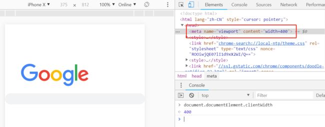
布局视口使视口与移动端浏览器屏幕宽度完全独立开。CSS 布局将会根据它来进行计算,并被它约束。
视觉视口(visual viewport)
视觉视口是用户当前看到的区域,用户可以通过缩放操作视觉视口,同时不会影响布局视口。
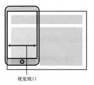
视觉视口和缩放比例的关系为:
当前缩放值 = 理想视口宽度 / 视觉视口宽度
所以,当用户放大时,视觉视口将会变小,CSS 像素将跨越更多的物理像素。
理想视口(ideal viewport)
布局视口的默认宽度并不是一个理想的宽度,于是 Apple 和其他浏览器厂商引入了理想视口的概念,它对设备而言是最理想的布局视口尺寸。显示在理想视口中的网站具有最理想的宽度,用户无需进行缩放。
理想视口的值其实就是屏幕分辨率的值,它对应的像素叫做设备逻辑像素(device independent pixel, dip)。dip 和设备的物理像素无关,一个 dip 在任意像素密度的设备屏幕上都占据相同的空间。如果用户没有进行缩放,那么一个 CSS 像素就等于一个 dip。
用下面的方法可以使布局视口与理想视口的宽度一致:
<meta name="viewport" content="width=device-width">
实际上,这就是响应式布局的基础。
2. 视口的设置
我们可以使用视口元标签(viewport meta 标签)来进行布局视口的设置。
<meta name="viewport"
    content="width=device-width,initial-scale=1.0,maximum-scale=1">
下面是每个属性的详细说明:
| 属性名 | 取值 | 描述 |
|---|---|---|
| width | 正整数或device-width | 定义视口的宽度,单位为像素 |
| height | 正整数或device-height | 定义视口的高度,单位为像素,一般不用 |
| initial-scale | [0.0-10.0] | 定义初始缩放值 |
| minimum-scale | [0.0-10.0] | 定义放大最大比例,它必须小于或等于maximum-scale设置 |
| maximum-scale | [0.0-10.0] | 定义缩小最小比例,它必须大于或等于minimum-scale设置 |
| user-scalable | yes / no | 定义是否允许用户手动缩放页面,默认值 yes |
有几点值得注意:
- viewport 标签只对移动端浏览器有效,对 PC 端浏览器是无效的
- 当缩放比例为 100% 时,dip 宽度 = CSS 像素宽度 = 理想视口的宽度 = 布局视口的宽度
- 单独设置 initial-scale 或 width 都会有兼容性问题,所以设置布局视口为理想视口的最佳方法是同时设置这两个属性
- 即使设置了 user-scalable = no,在 Android Chrome 浏览器中也可以强制启用手动缩放
3. 一倍图、二倍图、三倍图
MacBook Pro 视网膜屏(Retina)显示器硬件像素是 2880px * 1800px。当设置屏幕分辨率为 1920px * 1200px 的时候,理想视口的宽度值是 1920px, 那么 dip 的宽度值就是 1920px。其与理想视口宽度的比值为1.5(2880/1920),这个比值叫做设备像素比:
逻辑像素宽度 * 设备像素比 = 物理像素宽度
设备像素比可以通过 window.devicePixelRatio 来获取,或者使用 CSS 中的 device-pixel-ratio。
下面是常见的设备像素比:
- 普通密度桌面显示屏:
devicePixelRatio = 1 - 高密度桌面显示屏(Mac Retina):
devicePixelRatio = 2 - 主流手机显示屏:
devicePixelRatio = 2 or 3
对于一张 100px * 100px 的图片,通过 CSS 设置其宽高:
{
    width:100px;
    height:100px;
}
在普通显示屏的电脑中打开是正常的,但假设在手机或 Retina 屏中打开,按照逻辑分辨率来渲染,他们的 devicePixelRatio = 2,那么就相当于拿 4 个物理像素来描绘 1 个电子像素。这等于拿一个2倍的放大镜去看图片,图片就会变得模糊。
这时,就需要使用 @2x 甚至 @3x 图来避免图片的失真。
3.2 栅格布局
<html lang="en">

<head>
    <meta charset="UTF-8">
    <meta http-equiv="X-UA-Compatible" content="ie=edge">
    <meta name="viewport" content="width=device-width, initial-scale=1.0">
    <title>Documenttitle>
    <style>
        .col-1 {
            width: 8.33%;
        }

        .col-2 {
            width: 16.66%;
        }

        .col-3 {
            width: 25%;
        }

        .col-4 {
            width: 33.33%;
        }

        .col-5 {
            width: 41.66%;
        }

        .col-6 {
            width: 50%;
        }

        .col-7 {
            width: 58.33%;
        }

        .col-8 {
            width: 66.66%;
        }

        .col-9 {
            width: 75%;
        }

        .col-10 {
            width: 83.33%;
        }

        .col-11 {
            width: 91.66%;
        }

        .col-12 {
            width: 100%;
        }

        [class*="col-"] {
            float: left;
            padding: 15px;
            border: 1px solid red;
        }

        .row:after {
            content: "";
            clear: both;
            display: block;
        }
    style>

    <style>
        * {
            box-sizing: border-box;
        }
        html {
            font-family: "Lucida Sans", sans-serif;
        }

        .header {
            background-color: #9933cc;
            color: #ffffff;
            padding: 15px;
        }

        .menu ul {
            list-style-type: none;
            margin: 0;
            padding: 0;
        }

        .menu li {
            padding: 8px;
            margin-bottom: 7px;
            background-color: #33b5e5;
            color: #ffffff;
            box-shadow: 0 1px 3px rgba(0, 0, 0, 0.12), 0 1px 2px rgba(0, 0, 0, 0.24);
        }

        .menu li:hover {
            background-color: #0099cc;
        }

        .menu {
            width: 25%;
            float: left;
            border-right: 1px solid #333;
            height: 100vh;
        }
        .main {
            width: 75%;
            float: left;
        }
    style>
head>

<body>
    <header class="header">
        header
    header>
    <menu class="menu">menumenu>
    <main class="main">
        <div class="row">
            <div class="col-3">
                col-3
            div>
            <div class="col-9">
                col-9
            div>
        div>
        <div class="row">
            <div class="col-3">box01div>
            <div class="col-3">box02div>
            <div class="col-3">box03div>
            <div class="col-3">box04div>
        div>
    main>
body>

html>
3.3 CSS 媒体查询
3.3.1 使用媒体查询完善栅格系统(添加断点)
<html lang="en">

<head>
    <meta charset="UTF-8">
    <meta http-equiv="X-UA-Compatible" content="ie=edge">
    <meta name="viewport" content="width=device-width, initial-scale=1.0">
    <title>Documenttitle>
    <style>
        @media only screen and (min-width: 600px) {
            /* For tablets: */
            .col-m-1 {width: 8.33%;}
            .col-m-2 {width: 16.66%;}
            .col-m-3 {width: 25%;}
            .col-m-4 {width: 33.33%;}
            .col-m-5 {width: 41.66%;}
            .col-m-6 {width: 50%;}
            .col-m-7 {width: 58.33%;}
            .col-m-8 {width: 66.66%;}
            .col-m-9 {width: 75%;}
            .col-m-10 {width: 83.33%;}
            .col-m-11 {width: 91.66%;}
            .col-m-12 {width: 100%;}
        }
        @media only screen and (min-width: 768px) {
            /* For desktop: */
            .col-1 {width: 8.33%;}
            .col-2 {width: 16.66%;}
            .col-3 {width: 25%;}
            .col-4 {width: 33.33%;}
            .col-5 {width: 41.66%;}
            .col-6 {width: 50%;}
            .col-7 {width: 58.33%;}
            .col-8 {width: 66.66%;}
            .col-9 {width: 75%;}
            .col-10 {width: 83.33%;}
            .col-11 {width: 91.66%;}
            .col-12 {width: 100%;}
        }

        [class*="col-"] {
            float: left;
            padding: 15px;
            border: 1px solid red;
        }

        .row:after {
            content: "";
            clear: both;
            display: block;
        }

        @media only screen and (max-width: 768px) {
            /* For mobile phones: */
            [class*="col-"] {
                width: 100%;
            }
        }
    style>

    <style>
        * {
            box-sizing: border-box;
        }
        html {
            font-family: "Lucida Sans", sans-serif;
            orientation: landscape;
        }

        .header {
            background-color: #9933cc;
            color: #ffffff;
            padding: 15px;
        }

        .menu ul {
            list-style-type: none;
            margin: 0;
            padding: 0;
        }

        .menu li {
            padding: 8px;
            margin-bottom: 7px;
            background-color: #33b5e5;
            color: #ffffff;
            box-shadow: 0 1px 3px rgba(0, 0, 0, 0.12), 0 1px 2px rgba(0, 0, 0, 0.24);
        }

        .menu li:hover {
            background-color: #0099cc;
        }

        .menu {
            width: 25%;
            float: left;
            border-right: 1px solid #333;
            height: 100vh;
        }
        .main {
            width: 75%;
            float: left;
        }
    style>
head>

<body>
    <header class="header">
        header
    header>
    <menu class="menu">menumenu>
    <main class="main">
        <div class="row">
            <div class="col-3">
                col-3
            div>
            <div class="col-9">
                col-9
            div>
        div>
        <div class="row">
            <div class="col-3">box01div>
            <div class="col-3">box02div>
            <div class="col-3">box03div>
            <div class="col-3">box04div>
        div>
    main>
body>

html>
3.3.2 针对屏幕方向的媒体查询
body {
  display: flex;
}

div {
  background: yellow;
}

@media (orientation: landscape) {
  body {
    flex-direction: row;
  }
}

@media (orientation: portrait) {
  body {
    flex-direction: column;
  }
}