python中数据可视化
数据可视化(Data Visualization)
Data Visualization is the graphical representation of Data. It involves producing efficient visual elements like charts, dashboards, graphs, mappings etc. so as to give an accessible way of understanding trends, outliers and patterns of data to people. The state of achieving people’s mind depends on our creativity in visualizing data and by maintaining a communicative relationship between audience and the represented data.
数据可视化是数据的图形表示。 它涉及产生有效的视觉元素,例如图表,仪表板,图形,映射等,从而为人们提供一种易于理解的趋势,离群值和数据模式。 实现人们思想的状态取决于我们在可视化数据以及保持受众与所代表数据之间的沟通关系方面的创造力。
可视化Python (Python for Visualization)
Python is a highly popular general purpose programming language and it comes extremely useful for Data Scientists to create beautiful visualizations. Python provides the Data Scientists with various packages both for data processing and visualization. In this article, we are going to use some of Python’s well-known visualization packages, Matplotlib and Seaborn.
Python是一种非常流行的通用编程语言,它对于数据科学家创建漂亮的可视化文件非常有用。 Python为数据科学家提供了用于数据处理和可视化的各种软件包。 在本文中,我们将使用Python的一些知名可视化软件包Matplotlib和Seaborn。
可视化涉及的步骤 (Steps Involved in our Visualization)
- Importing packages导入包
- Importing and Cleaning Data导入和清理数据
- Creating beautiful Visualizations (12 Types of Visuals)创建漂亮的可视化效果(12种视觉效果)
步骤1:汇入套件 (Step-1 : Importing Packages)
Not only for Data Visualization, every process to be held in Python should be started by importing the required packages. Our primary packages include Pandas for Data processing, Matplotlib for visuals, Seaborn for advanced visuals and Numpy for scientific calculations. Let’s import!
不仅对于数据可视化,要导入Python的每个进程都应通过导入所需的包来启动。 我们的主要软件包包括用于数据处理的熊猫,用于视觉的Matplotlib,用于高级视觉的Seaborn和用于科学计算的Numpy。 让我们导入!
Python Implementation:
Python实现:
In the above code, we imported all primary packages and set our graph style to ‘ggplot’ (grammar of graphics). Apart from ‘ggplot’, you can also use many other styles available in python (Click here to refer styles in python). We will also use ‘cyberpunk’ style for upcoming specific chart types. At last, we are mentioning our charts’ measurements.
在上面的代码中,我们导入了所有主要包,并将图形样式设置为“ ggplot”(图形语法)。 除了'ggplot'之外,您还可以使用python中提供的许多其他样式(单击此处以引用python中的样式)。 对于即将发布的特定图表类型,我们还将使用“网络朋克”风格。 最后,我们要提到图表的度量。
步骤2:导入和清理数据 (Step-2 : Importing and Cleaning Data)
This is an important step as a perfect data is an essential need for a perfect visualization. Throughout this article, we will be using a Kaggle dataset on Immigration to Canada from 1980–2013. (Click here for the dataset). Follow the code for importing and cleaning the data.
这是重要的一步,因为完美的数据是完美可视化的必要条件。 在整个本文中,我们将使用1980-2013年间有关加拿大移民的Kaggle数据集。 (单击此处获取数据集)。 请遵循代码导入和清理数据。
Python Implementation:
Python实现:
We have successfully imported and cleaned our dataset. Now we are set to do our visualizations using our cleaned dataset.
我们已经成功导入并清理了数据集。 现在我们准备使用清理后的数据集进行可视化。
步骤3:创建漂亮的可视化效果 (Step-3 : Creating Beautiful Visualizations)
In this step we are going to create 12 different types of Visualizations right from basic charts to advanced charts. Let’s do it!
在这一步中,我们将创建从基本图表到高级图表的12种不同类型的可视化。 我们开始做吧!
i) Line Chart
i)折线图
Line chart is the most common chart of all visualizations and it is very useful for the observation of trend and time series analysis. We will start doing it in python with basic single line plot and we’ll proceed with Multiple line chart.
折线图是所有可视化中最常见的图表,对于观察趋势和时间序列分析非常有用。 我们将使用基本的单线图在python中开始做,然后继续进行多线图。
Single Line chart Python Implementation:
单折线图Python实现:
# Single line chart


fig1 = df.loc['Haiti', years].plot(kind = 'line', color = 'r')
plt.title('Immigration from Haiti to Canada from 1980-2013',color = 'black')
plt.xlabel('Years',color = 'black')
plt.ylabel('Number of Immigrants',color = 'black')
plt.xticks(color = 'black')
plt.yticks(color = 'black')
plt.savefig('linechart_single.png')


plt.show()
Output:
输出:

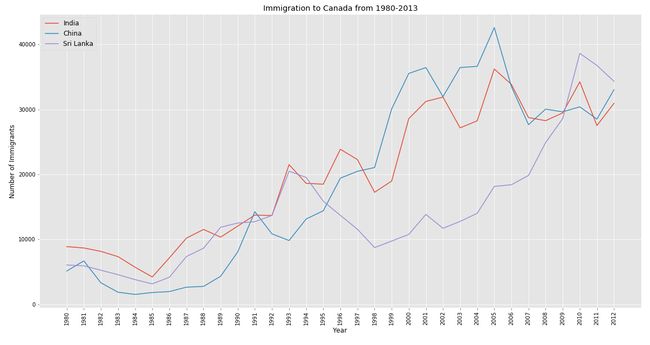
Multiple Line chart Python Implementation:
多个折线图Python实现:
# Multiple lines


fig2 = plt.plot(df.loc['India',years], label = 'India')
plt.plot(df.loc['China',years], label = 'China')
plt.plot(df.loc['Philippines',years], label = 'Sri Lanka')
plt.legend(loc = 'upper left', fontsize = 12)
plt.xticks(rotation = 90, color = 'black')
plt.yticks(color = 'black')
plt.title('Immigration to Canada from 1980-2013',color = 'black')
plt.xlabel('Year',color = 'black')
plt.ylabel('Number of Immigrants',color = 'black')
plt.savefig('linechart_multiple.png')


plt.show()
Output:
输出:
All plots are based on ‘ggplot’ style. Now let’s try out Multiple Line Chart using ‘cyberpunk’ style and this style is suitable only for specific chart types. In order to use ‘cyberpunk’ style in python, it is essential to install ‘mplcyberpunk’ package. After installing it, follow the code to produce neon-style plot.
所有图均基于“ ggplot”样式。 现在,让我们尝试使用“ cyberpunk”样式的“多个折线图”,该样式仅适用于特定的图表类型。 为了在python中使用'cyberpunk'样式,必须安装'mplcyberpunk'软件包。 安装后,按照代码生成霓虹灯样式的图。
Cyberpunk line chart Python Implementation:
赛博朋克折线图Python实现:
# Cyberpunk Multiple Line Chart


import mplcyberpunk
style.use('cyberpunk')


plt.plot(df.loc['India',years], label = 'India')
plt.plot(df.loc['China',years], label = 'China')
plt.plot(df.loc['Philippines',years], label = 'Sri Lanka')
plt.legend(loc = 'upper left', fontsize = 14)
plt.xticks(rotation = 90, color = 'white', fontsize = 14, fontweight = 'bold')
plt.yticks(color = 'white', fontsize = 14, fontweight = 'bold')
plt.title('Immigration to Canada from 1980-2013',color = 'white', fontsize = 20, fontweight = 'bold')
plt.xlabel('Year',color = 'white', fontsize = 16, fontweight = 'bold')
plt.ylabel('Number of Immigrants',color = 'white',fontsize = 16, fontweight = 'bold')
plt.savefig('cyber_line.png')


plt.show()
Output:
输出:

ii) Bar Chart
ii)条形图
Bar Chart is a type of representation mainly used for ranking values. It can easily represented in Python using Matplotlib. We are going to further divide Bar Chart into Vertical bar chart, Horizontal bar chart and Grouped bar chart. There are also many other types but these three are majorly used for visualizations. Let’s do it in Python!
条形图是主要用于对值进行排名的一种表示形式。 它可以使用Matplotlib在Python中轻松表示。 我们将把条形图进一步分为垂直条形图,水平条形图和分组条形图。 还有许多其他类型,但是这三种主要用于可视化。 让我们用Python来做!
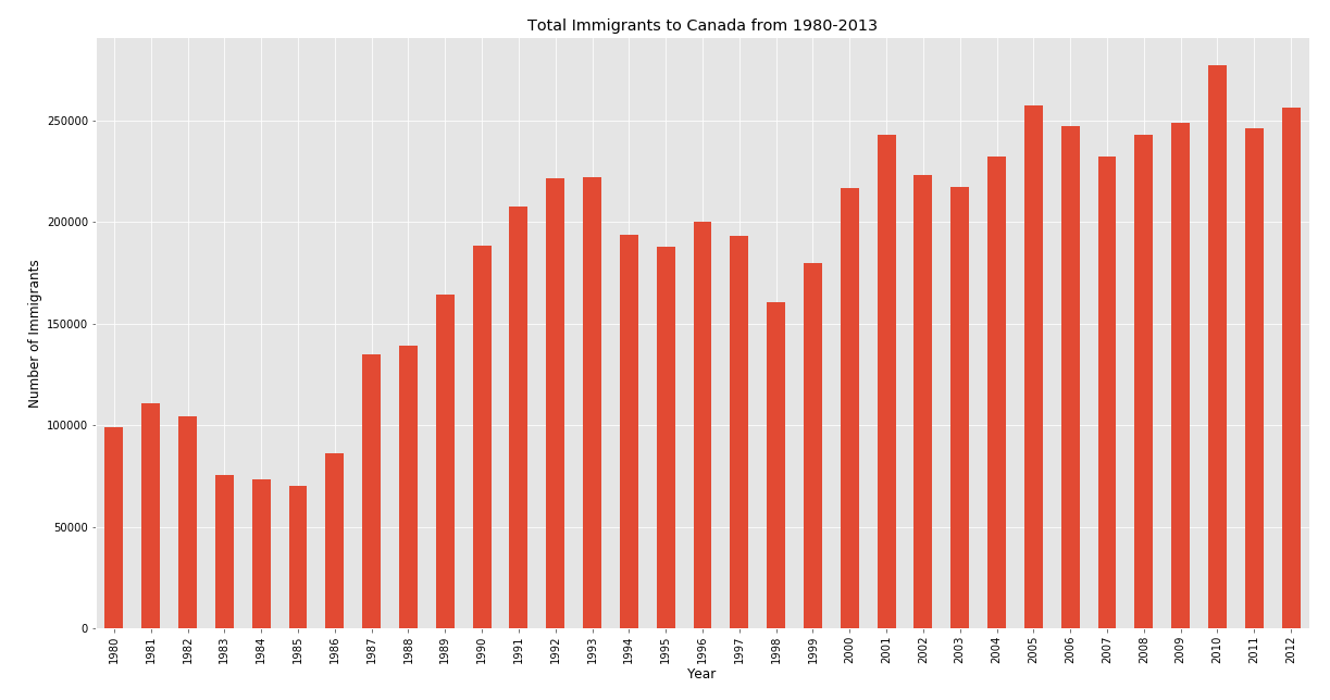
Vertical bar chart Python Implementation:
垂直条形图Python实现:
# Vertical
style.use('ggplot')


df_tot = pd.DataFrame(df.loc[:,years].sum())
df_tot.rename(columns = {0:'total'}, inplace = True)


df_tot.plot(kind = 'bar', legend = False)
plt.title('Total Immigrants to Canada from 1980-2013',color = 'black')
plt.xticks(color = 'black')
plt.yticks(color = 'black')
plt.xlabel('Year',color = 'black')
plt.ylabel('Number of Immigrants',color = 'black')
plt.savefig('bar_vertical.png')


plt.show()
Output:
输出:
Horizontal bar chart Python Implementation:
水平条形图Python实现:
# Horizontal


df_top10 = pd.DataFrame(df.nlargest(10,'total')['total'].sort_values(ascending = True))


df_top10.plot.barh(legend = False, color = 'crimson', edgecolor = 'lightcoral')
plt.title('Top 10 Immigrant Countries to Canada from 1980-2013',color = 'black')
plt.xlabel('Number of Immigrants',color = 'black')
plt.ylabel('Country',color = 'black')
plt.xticks(color = 'black')
plt.yticks(color = 'black')
plt.savefig('bar_horizontal.png')


plt.show()
Output:
输出:
Grouped bar chart Python Implementation:
分组条形图Python实现:
# Grouped


year_int10 = list(map(str, (1980,1990,2000,2010, 2013)))
df_group = pd.DataFrame(df.loc[['India','China','Philippines','Pakistan'],year_int10].T)


df_group.plot.bar(edgecolor = 'white')
plt.title('Total Immigrants to Canada from 1980-2013',color = 'black')
plt.xticks(color = 'black')
plt.yticks(color = 'black')
plt.xlabel('Year',color = 'black')
plt.ylabel('Number of Immigrants',color = 'black')
plt.legend(title = 'Country', fontsize = 12)
plt.savefig('bar_grouped.png')


plt.show()
Output:
输出:

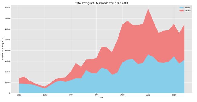
iii) Area Chart
iii)面积图
Like line charts, Area charts are extremely useful for time series analysis. The representation of Area chart is most similar to line chart but the only difference is that Area charts are coloured between spaces. This type of representation is also divided into Simple area chart, Stacked area chart and Unstacked area chart. Let’s dive into the coding section of Area Charts!
与折线图一样,面积图对于时间序列分析非常有用。 面积图的表示形式与折线图最相似,但是唯一的区别是,面积图在空格之间着色。 这种表示形式也分为简单区域图,堆积区域图和未堆积区域图。 让我们深入了解“面积图”的编码部分!
Simple area chart Python Implementation:
简单区域图Python实现:
For this we are going to use ‘df_tot’ dataframe which we created during producing the vertical bar chart.
为此,我们将使用在生成垂直条形图期间创建的“ df_tot”数据框。
# simple area chart


plt.fill_between(df_tot.index, df_tot['total'], color="skyblue", alpha=0.4)
plt.plot(df_tot.index, df_tot['total'], color = 'Slateblue', alpha = 0.6)
plt.title('Total Immigrants to Canada from 1980-2013', fontsize = 18, color = 'black')
plt.yticks(fontsize = 12, color = 'black')
plt.xticks(fontsize = 12, rotation = 90, color = 'black')
plt.xlabel('Year', fontsize = 14, color = 'black')
plt.ylabel('Number of Immigrants', fontsize = 14, color = 'black')
plt.savefig('area_simple.png')


plt.show()
Output:
输出:

We can also produce a simple area chart using the ‘cyberpunk’ plot style which we did before for Multiple line chart. Now let’s do it for Simple Area Chart.
我们也可以使用“ cyberpunk”绘图样式生成一个简单的面积图,就像以前对“多折线图”所做的那样。 现在,让我们针对简单区域图进行操作。
Cyberpunk simple area chart Python Implementation:
赛博朋克简单区域图Python实现:
# cyberpunk simple area chart


import mplcyberpunk


style.use('cyberpunk')


plt.fill_between(df_tot.index, df_tot['total'], color = 'greenyellow', alpha = 0.1)
plt.plot(df_tot.index, df_tot['total'], color = 'palegreen', alpha = 1)
mplcyberpunk.add_glow_effects()
plt.title('Total Immigrants to Canada from 1980-2013', fontsize = 20,fontweight = 'bold', color = 'white')
plt.yticks(fontsize = 14, color = 'white',fontweight = 'bold')
plt.xticks(fontsize = 14, rotation = 90, color = 'white',fontweight = 'bold')
plt.xlabel('Year', fontsize = 16, color = 'white',fontweight = 'bold')
plt.ylabel('Number of Immigrants', fontsize = 16, color = 'white',fontweight = 'bold')
plt.savefig('cyber_area_simple.png')


plt.show()
Output:
输出:
Stacked area chart Python Implementation:
堆积面积图Python实现:
# stacked area chart


color = ['skyblue','lightcoral']
top2_list = df.nlargest(2, 'total').index.tolist()
df_top2 = pd.DataFrame(df.loc[top2_list, years].T)


df_top2.plot(kind = 'area', stacked = True, color = color)
plt.title('Total Immigrants to Canada from 1980-2013',color = 'black')
plt.legend(fontsize = 12)
plt.xlabel('Year',color = 'black')
plt.ylabel('Number of Immigrants',color = 'black')
plt.xticks(color = 'black')
plt.yticks(color = 'black')
plt.savefig('area_stacked.png')


plt.show()
Output:
输出:
Unstacked area chart Python Implementation:
未堆积面积图Python实现:
# unstacked area chart


df_top2.plot(kind = 'area', stacked = False, color = color)
plt.title('Total Immigrants to Canada from 1980-2013',color = 'black')
plt.xlabel('Year',color = 'black')
plt.ylabel('Number of Immigrants',color = 'black')
plt.legend(fontsize = 12)
plt.xticks(color = 'black')
plt.yticks(color = 'black')
plt.savefig('area_unstacked.png')


plt.show()
Output:
输出:

iv) Box Plot
iv)箱线图
Box plot is often used for Exploratory Data Analysis to get a statistical view of a given dataframe. It also helps us to observe the skewness, distribution and outliers of a data too. We are going to see how to plot Vertical and Horizontal box plot in Python.
箱形图通常用于探索性数据分析,以获取给定数据框的统计视图。 它还可以帮助我们观察数据的偏度,分布和离群值。 我们将看到如何在Python中绘制“垂直”和“水平”箱形图。
Vertical box plot Python Implementation:
垂直箱形图Python实现:
# Vertical Box Plot


df_box = pd.DataFrame(df.loc[['India','China','Pakistan','UK & Ireland','Philippines'], years].T)


df_box.plot(kind = 'box')
plt.title('Top 5 Immigrant Countries to Canada from 1980-2013', color = 'black')
plt.xlabel('Country', color = 'black')
plt.ylabel('Number of Immigrants', color = 'black')
plt.savefig('box_vertical.png')


plt.show()
Output:
输出:
Horizontal box plot Python Implementation:
水平箱图Python实现:
# horizontal box plot


df_box.plot(kind = 'box', vert = False)
plt.title('Top 5 Immigrant Countries to Canada from 1980-2013', color = 'black')
plt.ylabel('Country', color = 'black')
plt.xlabel('Number of Immigrants', color = 'black')
plt.savefig('box_horizontal.png')


plt.show()
Output:
输出:

v) Scatter Plot
v)散点图
Scatter plot is a representation that displays values pertaining to typically two variables each other. It is very useful to observe relations between the X and the Y variable in the axis. Let’s produce a simple scatter plot using the ‘Iris’ dataset in Python!
散点图是一种表示形式,通常显示彼此有关的两个变量的值。 观察轴上X和Y变量之间的关系非常有用。 让我们使用Python中的“虹膜”数据集生成一个简单的散点图!
Scatter plot Python Implementation:
散点图Python实现:
import seaborn as sb
df_iris = sb.load_dataset('iris')


sb.scatterplot('sepal_length','sepal_width', data = df_iris, s = 200, linewidth = 3, edgecolor = 'Red')
plt.title('Scatter Plot sample', color = 'black', fontsize = 18)
plt.savefig('scatter.png')


plt.show()
Output:
输出:

vi) Histogram
vi)直方图
Histogram is a type of chart which is commonly used for observing the frequency distribution of a given variable. For this type of chart, we are going to use the same iris dataset which used before and Seaborn for better quality. Let’s make a histogram in Python!
直方图是一种图表类型,通常用于观察给定变量的频率分布。 对于这种类型的图表,我们将使用之前和Seaborn相同的虹膜数据集,以提高质量。 让我们用Python制作直方图!
Histogram Python Implementation:
直方图Python实现:
df_iris = sb.load_dataset('iris')


sb.distplot(df_iris['sepal_length'], color = 'Red', label = 'Sepal Length')
sb.distplot(df_iris['sepal_width'], color = 'skyblue', label = 'Sepal Width')
plt.legend(fontsize = 12)
plt.xlabel('Sepal Width', color = 'black')
plt.ylabel('Frequency', color = 'black')
plt.xticks(color = 'black')
plt.yticks(color = 'black')
plt.savefig('histogram.png')


plt.show()
Output:
输出:

vii) Bubble Plot
vii)气泡图
This type of chart is most similar to scatter plot but, it represents three dimensions of data. For this chart, we are going produce the values using NumPy’s ‘random’ function and Matplotlib to produce the chart. Let’s do it in Python!
这种图表最类似于散点图,但是它代表了数据的三个维度。 对于此图表,我们将使用NumPy的“随机”函数和Matplotlib生成值以生成图表。 让我们用Python来做!
Bubble plot Python Implementation:
气泡图Python实现:
# Bubble Plot


x = np.random.rand(1,30,1)
y = np.random.rand(1,30,1)
size = np.random.rand(1,30,1)


plt.scatter(x,y,s = size*4000, alpha = 0.4, color = 'r', edgecolor = 'Red', linewidth = 4)
plt.title('Bubble Plot Sample', color = 'black')
plt.savefig('bubble.png')


plt.show()
Output:
输出:
viii) Pie Chart
viii)饼图
Pie chart is a circular statistical graphic divided into slices to represent numerical proportions of the given data. Using matplotlib, we can produce beautiful custom pie charts. Let’s produce a pie chart in Python!
饼图是圆形统计图形,分为多个切片以表示给定数据的数值比例。 使用matplotlib,我们可以生成漂亮的自定义饼图。 让我们用Python制作一个饼图!
Pie chart Python Implementation:
饼图Python实现:
# Pie Chart


df_pie = pd.DataFrame(df.groupby('continent')['total'].sum().T)
colors = ['gold', 'yellowgreen', 'lightcoral', 'lightskyblue', 'lightgreen', 'pink']
explode = [0,0.1,0,0,0.1,0.1]


plt.pie(df_pie, colors = colors, autopct = '%1.1f%%', startangle = 90, explode = explode, pctdistance = 1.12, shadow = True)
plt.title('Continent-Wise Immigrants Distribution', color = 'black', y = 1.1, fontsize = 18)
plt.legend(df_pie.index, loc = 'upper left', fontsize = 12)
plt.axis('equal')
plt.savefig('pie.png')


plt.show()
Output:
输出:

ix) Doughnut Chart
ix)甜甜圈图
Doughnut chart is most similar to pie chart but we can use more than one data series to plot but, for our visualization we are going to use only one Dataset which is the Immigration dataset. Let’s do it in Python!
甜甜圈图与饼图最相似,但是我们可以使用多个数据系列进行绘制,但是对于我们的可视化,我们将仅使用一个数据集(即“移民”数据集)。 让我们用Python来做!
Doughnut chart Python Implementation:
甜甜圈图Python实现:
# Doughnut Chart


top5_list = df.nlargest(5, 'total').index.tolist()
df_top5 = pd.DataFrame(df.loc[top5_list, 'total'].T)
circle = plt.Circle( (0,0), 0.7, color='white')
colors = ['gold', 'yellowgreen', 'lightcoral', 'lightskyblue', 'lightgreen', 'pink']


plt.pie(df_top5['total'], autopct = '%1.1f%%', shadow = True, explode = [0.1,0,0,0,0], colors = colors, startangle = 90)
fig = plt.gcf()
fig.gca().add_artist(circle)
plt.legend(df_top5.index, fontsize = 12, loc = 'upper left')
plt.title('Top 5 Immigrant Country Distribution', color = 'black', fontsize = 18)
plt.axis('equal')
plt.savefig('doughnut.png')


plt.show()
Output:
输出:

x) Regression Plot
x)回归图
Regression plots helps data scientists to observe patterns in dataset during Exploratory Data Analysis (EDA) and represents the linear relationships between two variables. It also illustrates the trend between the given ‘X’ and ‘Y’ variables. So, let’s do a Strong trend and a Weak trend regression plot using Seaborn in Python!
回归图可帮助数据科学家在探索性数据分析(EDA)期间观察数据集中的模式,并表示两个变量之间的线性关系。 它还说明了给定的“ X”和“ Y”变量之间的趋势。 因此,让我们在Python中使用Seaborn来绘制Strong趋势和Weak趋势回归图!
Strong trend regression Python Implementation:
强趋势回归Python实现:
# Strong trend


df_reg = pd.DataFrame(df.loc['China',years])
df_reg.reset_index(inplace = True)
df_reg.rename(columns = {'index':'year'}, inplace = True)
df_reg[['year','China']] = df_reg[['year','China']].astype(int)


sb.regplot(x = 'year', y = 'China', data = df_reg, color = 'b', scatter_kws = {'s':150,'alpha':0.4})
plt.title('Total Immigration from China to Canada from 1980-2013', color = 'black')
plt.xlabel('Year', color = 'black')
plt.ylabel('Number of Immigrants', color = 'black')
plt.xticks(color = 'black')
plt.yticks(color = 'black')
plt.savefig('reg_strong.png')


plt.show()
Output:
输出:
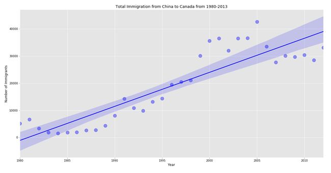
We can observe that the total immigrants to Canada represents a strong trend which means the numbers are increasing year by year. Now, let’s create a Weak trend regression plot.
我们可以看到,加拿大的移民总数呈现出强劲的趋势,这意味着人数逐年增加。 现在,让我们创建一个弱趋势回归图。
Weak trend regression Python Implementation:
弱趋势回归Python实现:
# Weak trend


df_reg1 = pd.DataFrame(df.loc[['Denmark','Norway','Sweden'],years].sum())
df_reg1.reset_index(inplace = True)
df_reg1.rename(columns = {'index':'year',0:'total'}, inplace = True)
df_reg1[['year','total']] = df_reg1[['year','total']].astype(int)


sb.regplot(x = 'year', y = 'total', data = df_reg1, color = 'Red', scatter_kws = {'s':150,'alpha':0.4})
plt.title('Total Immigrants from Scandinavia to Canada from 1980-2013', color = 'black')
plt.xticks(color = 'black')
plt.yticks(color = 'black')
plt.xlabel('Year', color = 'black')
plt.ylabel('Number of Immigrants', color = 'black')
plt.savefig('reg_weak.png')


plt.show()
Output:
输出:
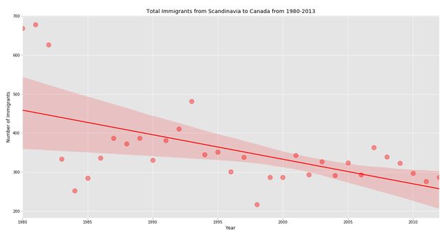
It is clear that the total immigrants from Scandinavia (Germany, Norway and Sweden) to Canada fell down year by year hence, it followed a weak trend.
显然,从斯堪的纳维亚半岛(德国,挪威和瑞典)到加拿大的移民总数逐年下降,因此,趋势呈疲软态势。
xii) Word Cloud
xii)词云
A word cloud is a visual representation of a text data which illustrates the keywords in it and helps people to easily understand the context of the text data. Unfortunately, Matplotlib don’t have a built-in function to create a word cloud. So, we are going to use the ‘Pywaffle’ package in Python to create a word cloud also, create a text file of an article or essay to make use of it. Let’s do it!
词云是文本数据的可视表示形式,它可以说明其中的关键字,并可以帮助人们轻松理解文本数据的上下文。 不幸的是,Matplotlib没有内置功能来创建词云。 因此,我们还将在Python中使用“ Pywaffle”包来创建词云,并创建文章或文章的文本文件以加以利用。 我们开始做吧!
Word cloud Python Implementation:
词云Python实现:
# word cloud


from wordcloud import WordCloud, STOPWORDS


text = open('sample.txt', 'r', encoding = 'utf-8').read()
stopwords = set(STOPWORDS)
wordcloud = WordCloud(background_color = 'white', max_words = 200, stopwords = stopwords)


wordcloud.generate(text)
plt.imshow(wordcloud, interpolation = 'bilinear')
plt.axis('off')
plt.savefig('wordcloud.png')


plt.show()
Output:
输出:

From this word cloud chart we observe that the given text file is all about Blockchain and its components like consensus, PoW (Proof-of-Work), hash, block and so on. Awesome!
从这个词云图表中,我们观察到给定的文本文件全部涉及区块链及其组成部分,例如共识,PoW(工作量证明),哈希,区块等。 太棒了!
xiii) Lollipop Chart
xiii)棒棒糖图
This type of chart is way more similar to Bar chart. Lollipop charts help in ranking values and to observe the trend. Creating a lollipop chart is so simple in Matplotlib and let’s do it!
这种图表与条形图更相似。 棒棒糖图表有助于对值进行排名并观察趋势。 在Matplotlib中创建棒棒糖图表非常简单,让我们开始吧!
Lollipop chart Python Implementation:
棒棒糖图表Python实现:
# Lollipop chart


plt.stem(df_tot.index, df_tot['total'])
plt.title('Total Immigrants to Canada from 1980-2013', color = 'black')
plt.xlabel('Year', color = 'black')
plt.ylabel('Number of Immigrants', color = 'black')
plt.xticks(color = 'black')
plt.yticks(color = 'black')
plt.savefig('lollipop.png')


plt.show()
Output:
输出:

最后的想法!(Final Thoughts!)
Finally, we come to end by learning how to create twelve different types of visualizations in Python by making use of various packages like Matplotlib, Seaborn, Pywaffle and so on. But, this isn’t the end. We just covered some of the basic visuals in python and there are much more than you think of like Geospatial visualizations, Networks, Sankey diagram and the list goes on and on. You can find great resources on the internet and many free online courses. Apart from learning, practical implementation is the identity of your knowledge. So, start learning and get your feet wet by getting into the world of Data Science. If you missed any coding sections for any of the chart types, don’t worry I’ve provided the full code for all of the visualizations.
最后,我们通过学习如何使用Matplotlib,Seaborn,Pywaffle等各种包在Python中创建十二种不同类型的可视化来结束。 但是,这还没有结束。 我们仅介绍了python中的一些基本视觉效果,而且还有比您想象的更多的东西,例如地理空间可视化效果,网络,Sankey图,并且列表还在不断增加。 您可以在Internet和许多免费的在线课程中找到大量资源。 除了学习,实际的实现是您知识的身份。 因此,开始学习,并进入数据科学世界,这将为您带来好处。 如果您错过了任何图表类型的任何编码部分,请不要担心我已为所有可视化提供了完整的代码。
Happy Visualizing!
快乐的可视化!
Full code:
完整代码:
import pandas as pd
import numpy as np
import seaborn as sb
import matplotlib.pyplot as plt
from matplotlib import style
# setting style for graphs
style.use('ggplot')
# setting measurement
plt.rcParams['figure.figsize'] = (20,10)


df = pd.read_excel('Canada.xlsx',1, skiprows = range(20), skipfooter = 2)
df.drop(['AREA','REG','DEV','Type','Coverage','DevName'], axis=1, inplace=True)
df.rename(columns = {'OdName':'country','AreaName':'continent','RegName':'region'}, inplace = True)
df['total'] = df.sum(axis = 1)
df = df.set_index('country')
df.rename(index = {'United Kingdom of Great Britain and Northern Ireland':'UK & Ireland'}, inplace = True)
df.columns = df.columns.astype(str)
years = list(map(str, range(1980,2013)))


# 1. Line Plot


# Single line chart
fig1 = df.loc['Haiti', years].plot(kind = 'line', color = 'r')
plt.title('Immigration from Haiti to Canada from 1980-2013',color = 'black')
plt.xlabel('Years',color = 'black')
plt.ylabel('Number of Immigrants',color = 'black')
plt.xticks(color = 'black')
plt.yticks(color = 'black')
plt.savefig('line_single.png')
plt.show()
# Multiple lines
fig2 = plt.plot(df.loc['India',years], label = 'India')
plt.plot(df.loc['China',years], label = 'China')
plt.plot(df.loc['Philippines',years], label = 'Sri Lanka')
plt.legend(loc = 'upper left', fontsize = 12)
plt.xticks(rotation = 90, color = 'black')
plt.yticks(color = 'black')
plt.title('Immigration to Canada from 1980-2013',color = 'black')
plt.xlabel('Year',color = 'black')
plt.ylabel('Number of Immigrants',color = 'black')
plt.savefig('line_multiple.png')
plt.show()


# 2. Bar Plot


# Vertical
df_tot = pd.DataFrame(df.loc[:,years].sum())
df_tot.rename(columns = {0:'total'}, inplace = True)
fig3 = df_tot.plot(kind = 'bar', legend = False)
plt.title('Total Immigrants to Canada from 1980-2013',color = 'black')
plt.xticks(color = 'black')
plt.yticks(color = 'black')
plt.xlabel('Year',color = 'black')
plt.ylabel('Number of Immigrants',color = 'black')
plt.savefig('bar_vertical.png')
plt.show()
# Grouped
year_int10 = list(map(str, (1980,1990,2000,2010, 2013)))
df_group = pd.DataFrame(df.loc[['India','China','Philippines','Pakistan'],year_int10].T)
fig4 = df_group.plot.bar(edgecolor = 'white')
plt.title('Total Immigrants to Canada from 1980-2013',color = 'black')
plt.xticks(color = 'black')
plt.yticks(color = 'black')
plt.xlabel('Year',color = 'black')
plt.ylabel('Number of Immigrants',color = 'black')
plt.legend(title = 'Country', fontsize = 12)
plt.savefig('bar_grouped.png')
plt.show()
# Horizontal
df_top10 = pd.DataFrame(df.nlargest(10,'total')['total'].sort_values(ascending = True))
fig5 = df_top10.plot.barh(legend = False, color = 'crimson', edgecolor = 'lightcoral')
plt.title('Top 10 Immigrant Countries to Canada from 1980-2013',color = 'black')
plt.xlabel('Number of Immigrants',color = 'black')
plt.ylabel('Country',color = 'black')
plt.xticks(color = 'black')
plt.yticks(color = 'black')
plt.savefig('bar_horizontal.png')
plt.show()


# 3. Histogram


df_iris = sb.load_dataset('iris')
fig6 = sb.distplot(df_iris['sepal_length'], color = 'Red', label = 'Sepal Length')
sb.distplot(df_iris['sepal_width'], color = 'skyblue', label = 'Sepal Width')
plt.legend(fontsize = 12)
plt.xlabel('Sepal Width', color = 'black')
plt.ylabel('Frequency', color = 'black')
plt.xticks(color = 'black')
plt.yticks(color = 'black')
plt.savefig('histogram.png')
plt.show()


# 4. Area Plots


# simple
fig7 = plt.fill_between(df_tot.index, df_tot['total'], color="skyblue", alpha=0.4)
plt.plot(df_tot.index, df_tot['total'], color = 'Slateblue', alpha = 0.6)
plt.title('Total Immigrants to Canada from 1980-2013', fontsize = 18, color = 'black')
plt.yticks(fontsize = 12, color = 'black')
plt.xticks(fontsize = 12, rotation = 90, color = 'black')
plt.xlabel('Year', fontsize = 14, color = 'black')
plt.ylabel('Number of Immigrants', fontsize = 14, color = 'black')
plt.savefig('area_simple.png')
plt.show()
# stacked
color = ['skyblue','lightcoral']
top2_list = df.nlargest(2, 'total').index.tolist()
df_top2 = pd.DataFrame(df.loc[top2_list, years].T)
fig8 = df_top2.plot(kind = 'area', stacked = True, color = color)
plt.title('Total Immigrants to Canada from 1980-2013',color = 'black')
plt.legend(fontsize = 12)
plt.xlabel('Year',color = 'black')
plt.ylabel('Number of Immigrants',color = 'black')
plt.xticks(color = 'black')
plt.yticks(color = 'black')
plt.savefig('area_stacked.png')
plt.show()
# unstacked
fig9 = df_top2.plot(kind = 'area', stacked = False, color = color)
plt.title('Total Immigrants to Canada from 1980-2013',color = 'black')
plt.xlabel('Year',color = 'black')
plt.ylabel('Number of Immigrants',color = 'black')
plt.legend(fontsize = 12)
plt.xticks(color = 'black')
plt.yticks(color = 'black')
plt.savefig('area_unstacked.png')
plt.show()


# 5. Box Plot


# Horizontal
df_box = pd.DataFrame(df.loc[['India','China','Pakistan','UK & Ireland','Philippines'], years].T)
fig10 = df_box.plot(kind = 'box')
plt.title('Top 5 Immigrant Countries to Canada from 1980-2013', color = 'black')
plt.xlabel('Country', color = 'black')
plt.ylabel('Number of Immigrants', color = 'black')
plt.savefig('box_horizontal.png')
plt.show()
# Vertical
fig11 = df_box.plot(kind = 'box', vert = False)
plt.title('Top 5 Immigrant Countries to Canada from 1980-2013', color = 'black')
plt.ylabel('Country', color = 'black')
plt.xlabel('Number of Immigrants', color = 'black')
plt.savefig('box_vertical.png')
plt.show()


# 6. Scatter Plot
df_iris = sb.load_dataset('iris')
fig12 = sb.scatterplot('sepal_length','sepal_width', data = df_iris, s = 200, linewidth = 3, edgecolor = 'Red')
plt.title('Scatter Plot sample', color = 'black', fontsize = 18)
plt.savefig('scatter.png')
plt.show()


# 7. Bubble Plot
x = np.random.rand(1,30,1)
y = np.random.rand(1,30,1)
size = np.random.rand(1,30,1)
fig14 = plt.scatter(x,y,s = size*4000, alpha = 0.4, color = 'r', edgecolor = 'Red', linewidth = 4)
plt.title('Bubble Plot Sample', color = 'black')
plt.savefig('bubble.png')
plt.show()


# 8. Pie Chart


df_pie = pd.DataFrame(df.groupby('continent')['total'].sum().T)
colors = ['gold', 'yellowgreen', 'lightcoral', 'lightskyblue', 'lightgreen', 'pink']
explode = [0,0.1,0,0,0.1,0.1]
fig15 = plt.pie(df_pie, colors = colors, autopct = '%1.1f%%', startangle = 90, explode = explode, pctdistance = 1.12,
                shadow = True)
plt.title('Continent-Wise Immigrants Distribution', color = 'black', y = 1.1, fontsize = 18)
plt.legend(df_pie.index, loc = 'upper left', fontsize = 12)
plt.axis('equal')
plt.savefig('pie.png')
plt.show()


# 9. Regression Plot


# Strong trend
df_reg = pd.DataFrame(df.loc['China',years])
df_reg.reset_index(inplace = True)
df_reg.rename(columns = {'index':'year'}, inplace = True)
df_reg[['year','China']] = df_reg[['year','China']].astype(int)
fig16 = sb.regplot(x = 'year', y = 'China', data = df_reg, color = 'b',
                   scatter_kws = {'s':150,'alpha':0.4})
plt.title('Total Immigration from China to Canada from 1980-2013', color = 'black')
plt.xlabel('Year', color = 'black')
plt.ylabel('Number of Immigrants', color = 'black')
plt.xticks(color = 'black')
plt.yticks(color = 'black')
plt.savefig('reg_strong.png')
plt.show()
# Weak trend
df_reg1 = pd.DataFrame(df.loc[['Denmark','Norway','Sweden'],years].sum())
df_reg1.reset_index(inplace = True)
df_reg1.rename(columns = {'index':'year',0:'total'}, inplace = True)
df_reg1[['year','total']] = df_reg1[['year','total']].astype(int)
fig17 = sb.regplot(x = 'year', y = 'total', data = df_reg1, color = 'Red', scatter_kws = {'s':150,'alpha':0.4})
plt.title('Total Immigrants from Scandinavia to Canada from 1980-2013', color = 'black')
plt.xticks(color = 'black')
plt.yticks(color = 'black')
plt.xlabel('Year', color = 'black')
plt.ylabel('Number of Immigrants', color = 'black')
plt.savefig('reg_weak.png')
plt.show()


# 10. Word Cloud


from wordcloud import WordCloud, STOPWORDS


text = open('sample.txt', 'r', encoding = 'utf-8').read()
stopwords = set(STOPWORDS)
wordcloud = WordCloud(background_color = 'white', max_words = 200, stopwords = stopwords)
wordcloud.generate(text)
fig18 = plt.imshow(wordcloud, interpolation = 'bilinear')
plt.axis('off')
plt.savefig('wordcloud.png')
plt.show()


# 11. Doughnut Chart


top5_list = df.nlargest(5, 'total').index.tolist()
df_top5 = pd.DataFrame(df.loc[top5_list, 'total'].T)
circle = plt.Circle( (0,0), 0.7, color='white')
colors = ['gold', 'yellowgreen', 'lightcoral', 'lightskyblue', 'lightgreen', 'pink']
plt.pie(df_top5['total'], autopct = '%1.1f%%', shadow = True, explode = [0.1,0,0,0,0], colors = colors, startangle = 90)
fig20 = plt.gcf()
fig20.gca().add_artist(circle)
plt.legend(df_top5.index, fontsize = 12, loc = 'upper left')
plt.title('Top 5 Immigrant Country Distribution', color = 'black', fontsize = 18)
plt.axis('equal')
plt.savefig('doughnut.png')
plt.show()


# 12. Lollipop chart


fig19 = plt.stem(df_tot.index, df_tot['total'])
plt.title('Total Immigrants to Canada from 1980-2013', color = 'black')
plt.xlabel('Year', color = 'black')
plt.ylabel('Number of Immigrants', color = 'black')
plt.xticks(color = 'black')
plt.yticks(color = 'black')
plt.savefig('lollipop.png')
plt.show()
翻译自: https://towardsdatascience.com/step-by-step-guide-to-data-visualizations-in-python-b322129a1540
python中数据可视化