把多个ROC曲线画在一张图上
为了展示实验效果,ROC曲线也能更直观的展示而且美观。所以我想画出ROC曲线。下面是两个方法:1)只画一个ROC曲线,2)多个ROC曲线展示在一张图上。
注:我是已经有y-pred,所以直接用即可,不需要在计算y_pred。
1 画一个ROC曲线
from sklearn.metrics import roc_curve, auc
import matplotlib.pyplot as plt
# 这里设置lable里真是1.
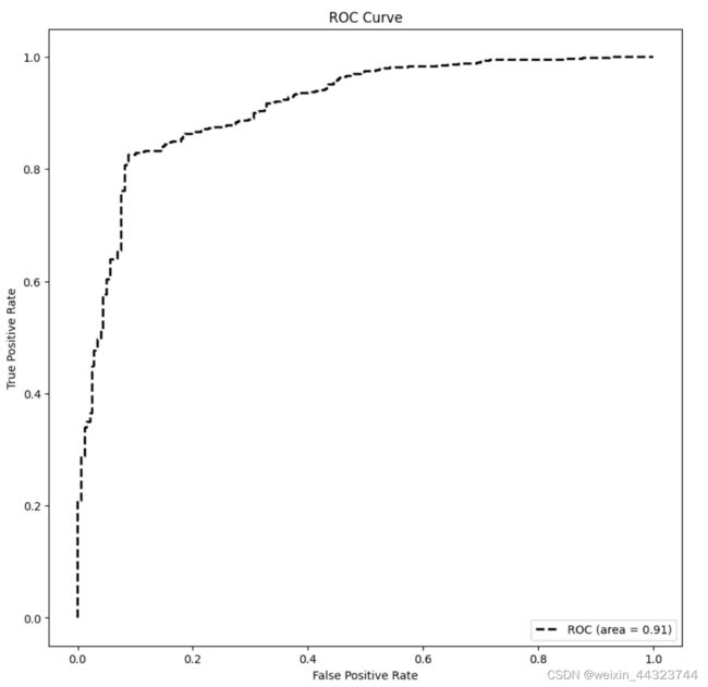
fpr, tpr, thersholds = roc_curve(y_label, y_pred, pos_label=1)
for i, value in enumerate(thersholds):
print("%f %f %f" % (fpr[i], tpr[i], value))
roc_auc = auc(fpr, tpr)
plt.figure(figsize=(10, 10), dpi=100)
plt.plot(fpr, tpr, 'k--', label='ROC (area = {0:.2f})'.format(roc_auc), lw=2)
plt.xlim([-0.05, 1.05]) # 设置x、y轴的上下限,以免和边缘重合,更好的观察图像的整体
plt.ylim([-0.05, 1.05])
plt.xlabel('False Positive Rate')
plt.ylabel('True Positive Rate') # 可以使用中文,但需要导入一些库即字体
plt.title('ROC Curve')
plt.legend(loc="lower right")
plt.show()
2 将多个ROC曲线展示在一张图上
定义画图函数
def multi_models_roc(names, sampling_methods, colors, y_label, save=True, dpin=100):
    """
    将多个机器模型的roc图输出到一张图上

    Args:
        names: list, 多个模型的名称
        sampling_methods: list, 多个模型的实例化对象
        save: 选择是否将结果保存(默认为png格式)

    Returns:
        返回图片对象plt
    """
    plt.figure(figsize=(10, 10), dpi=dpin)

    for (name, y_pred, colorname) in zip(names, sampling_methods, colors):


        fpr, tpr, thresholds = roc_curve(y_label, y_pred, pos_label=1)

        plt.plot(fpr, tpr, lw=5, label='{} (AUC={:.3f})'.format(name, auc(fpr, tpr)),color = colorname)
        plt.plot([0, 1], [0, 1], '--', lw=5, color = 'grey')
        plt.axis('square')
        plt.xlim([0, 1])
        plt.ylim([0, 1])
        plt.xlabel('False Positive Rate',fontsize=20)
        plt.ylabel('True Positive Rate',fontsize=20)
        plt.title('ROC Curve',fontsize=25)
        plt.legend(loc='lower right',fontsize=20)

    if save:
        plt.savefig('multi_models_roc.png')

    return plt
调用multi_models_roc
names = ['UTrans_Mem',
         'Unet_Mem',
         ]

# sampling_methods里为 y_pred.
sampling_methods = [preds_UT_mem,
                    preds_U_mem,
                   ]
#color:'crimson','orange','gold','mediumseagreen','steelblue', 'mediumpurple'
colors = ['crimson',
          'orange',
         ]

#ROC curves
train_roc_graph = multi_models_roc(names, sampling_methods, colors, label[0], save = True)
train_roc_graph.savefig('ROC_Train_all.png')

下面的链接里又更详细的介绍。
(56条消息) python 将多个模型的ROC曲线绘制在一张图里(含图例)_柳奈奈的博客-CSDN博客_pytorch多分类roc曲线绘制