HTML基础--CSS样式表(一)
1.CSS内部样式
- 一般会写在
标签中
DOCTYPE html>
<html lang="en">
<head>
    <meta charset="UTF-8">
    <meta http-equiv="X-UA-Compatible" content="IE=edge">
    <meta name="viewport" content="width=device-width, initial-scale=1.0">
    <title>Documenttitle>
    <style>
        h1{
            color: red;
        }
        h2{
            color: yellow;
        }
        h3{
            color: blue;
        }
    style>
head>
<body>
    <h1>11111111111h1>
    <h2>22222222222h2>
    <h3>33333333333h3>

body>
html>
2.外部样式表
<head>
    <meta charset="UTF-8">
    <meta http-equiv="X-UA-Compatible" content="IE=edge">
    <meta name="viewport" content="width=device-width, initial-scale=1.0">
    <title>Documenttitle>

    <link rel="stylesheet" type="text/css" href="../css/index.css"/>

    <style type="text/css">
        @import url("../css/index.css");
    style>
head>
<body>
    <h1>111111h1>
    <h2>2222222h2>
    <h3>333333h3>
body>
- 扩展知识点:link与import之间的区别
- 差别1:本质的区别:link属于XHTML标签,而,@import完全是CSS提供的一种方式
- 差别2:加载顺序的差别:当一个页面被加载的时候(就是浏览者浏览的时候),link引用的css会同时被加载,而@import引用的CSS会等到页面全部被下载完再被加载。所以有时候浏览@import加载CSS的页面时开始会没有样式,就是闪烁,网速慢的时候还挺明显
- 差别3:兼容性的差别:@import是CSS2.1提出的,所以老的浏览器不支持,@import只有在IE5以上的才能识别,而link标签没有这个问题
3.行内样式表
DOCTYPE html>
<html lang="en">
<head>
    <meta charset="UTF-8">
    <meta http-equiv="X-UA-Compatible" content="IE=edge">
    <meta name="viewport" content="width=device-width, initial-scale=1.0">
    <title>行内样式、内联样式、嵌入式样式title>
head>
<body>
    <div style="width: 200px; height:200px; color: red;">我是divdiv>

body>
html>
4.样式表的优先级
-
!import>行内>内部>外部
-
例子:
color:red!important -
针对同一个属性,同一个标签,否则不存在优先级的问题
5.标签选择器
- 直接使用标签名(也被称之为元素选择器)
6.类选择器
- 在类名之前加个点
- 在一个便签中有两个class并且有共同属性时,跟class的定义位置有关,定义时后面定义的会覆盖前面的,class的书写位置无关
7.id选择器
- 一个id名称只能对应文档中一个具体的元素对象(唯一性)
- 使用方式:在id名前加一个#号
8.通配符选择器
*{ margin:0;padding:0; }
- margin是外边距
- padding是内边距
9.群组和后代选择器
DOCTYPE html>
<html lang="en">
<head>
    <meta charset="UTF-8">
    <meta http-equiv="X-UA-Compatible" content="IE=edge">
    <meta name="viewport" content="width=device-width, initial-scale=1.0">
    <title>Documenttitle>
    <style>
        /* div{
            background-color: yellow;
        }
        p{
            background-color: yellow;
        }
        h1{
            background-color: yellow;
        } */
        *{
            margin: 0;
            padding: 0;
        }

        /* 群组选择器:提出公共代码,节约代码量 */
        div,.boxp,h1{
            background-color: yellow;
        }
    style>

head>
<body>
    <div>111111111111111div>
    <p class="boxp">1111111111111111p>
    <h1>111111111111h1>

body>
html>
DOCTYPE html>
<html lang="en">
<head>
    <meta charset="UTF-8">
    <meta http-equiv="X-UA-Compatible" content="IE=edge">
    <meta name="viewport" content="width=device-width, initial-scale=1.0">
    <title>Documenttitle>
    <style>

/* 后代选择器(空格选择器),使用空格 */
        div p{
            background-color: yellow;
        }
    style>

head>
<body>
    <div>
        <p>
            111111111111
        p>
    div>

    <p>2222222222222p>

body>
html>
- 后代选择器实际上是从右到左去匹配!
10.伪类选择器
- 语法:
- a:link{属性:属性值}超链接的初始状态
- a:visited{属性:属性值;}超链接被访问后的状态
- a:hover{属性:属性值}:鼠标悬停,即鼠标划过超链接时的状态
- a:active{属性:属性值}超链接被激活时的状态,即鼠标按下时超链接的状态
- Link–visited–hover–active
- 说明:
- A)当这四个超链接伪类选择器符联合使用时,应注意他们的顺序,正常顺序为:a:link,a:visited,a:hover,a:active,错误的顺序有时会使超链接的样式失效
- B)为了简化代码,可以把伪类选择器符中相同的声明提出来放在a选择符中;例如:a{color:red} a:hover{color:green}表示超链接的初始和访问过后的状态一样,鼠标划过的状态和点击时的状态一样
DOCTYPE html>
<html lang="en">
<head>
    <meta charset="UTF-8">
    <meta http-equiv="X-UA-Compatible" content="IE=edge">
    <meta name="viewport" content="width=device-width, initial-scale=1.0">
    <title>Documenttitle>
    <style>
        /* 初始状态 */
        a:link{
            color: yellow;
        }
/* 点击过后 */
        a:visited{
            color: red;
        }
        /* 鼠标悬停 */
        a:hover{
color: blue;
        }

        /* 点击激活,激活的那一刻 */
        a:active{
            color: green;
        }
    style>
head>
<body>
    <a href="http://www.baidu.com">百度a>
body>
html>
11.新闻导航案例
DOCTYPE html>
<html lang="en">
<head>
    <meta charset="UTF-8">
    <meta http-equiv="X-UA-Compatible" content="IE=edge">
    <meta name="viewport" content="width=device-width, initial-scale=1.0">
    <title>Documenttitle>
    <style>

        /* a:link{
            background-color: black;
            color: white;
        }

        a:visited{
            background-color: black;
            color: white;
        }

        a:hover{
            background-color: red;
        }

        a:active{
            background-color: red;
        } */

        a{
            background-color: black;
            color: white;
        }

        a:hover{
            background-color: red;
        }

        /* a:active{
            background-color: red;
        } */

        .home{
            background-color: red;
        }
    style>

head>
<body>
    <a href="" class="home">首页a>
    <a href="">国内a>
    <a href="">国际a>
    <a href="">军事a>
    <a href="">财经a>
body>
html>
12.选择器权重
| 个数 | 选择器 | 权重,CSS中用四位数字表示权重,权重的表达方式如:0,0,0,0 |
|---|---|---|
| 1 | 类型(元素选择器) | 0001 |
| 2 | Class选择器(类选择器) | 0010 |
| 3 | id选择器 | 0100 |
| 4 | 包含选择器 | 为包含选择符的权重之和 |
| 5 | 内联选择器 | 1000 |
| 6 | !import | 10000 |
| CSS选择器解析规则1: | 当不同选择符的样式设置有冲突的时候,高权重选择器符的样式会覆盖低权重选择符的样式 | |
| CSS选择器解析规则2: | 相同权重的选择符,样式遵循就近原则,哪个选择符最后定义,就采用哪个选择符样式 |
13.文本属性
| 个数 | 属性 | 描述 | 说明 |
|---|---|---|---|
| 1 | font-size | 字体大小 | 单位是px,浏览器默认是16px,设计图常用字号是12px |
| 2 | font-family | 字体 | 当字体中是中文字体、英文字体中有空格时,需加双引号;多个字体中间用逗号链接,先解析第一个字体,如果没有解析第二个字体,以此类推 |
| 3 | color | 颜色 | color:red color:#ff0; color:rgb(255,0,0) 0-255,rgba()–最后一个数字表示透明度 |
| 4 | font-weight | 加粗 | font-weight:bolder(更粗的)/bold(加粗)/normal(常规) font-weight:100-900;100-500不加粗,600-900加粗 |
| 5 | font-style | 倾斜 | font-style:italic(斜体字)/oblique(倾斜的文字)/normal(常规显示) |
| 6 | text-align | 文本水平对齐 | text-align:left水平靠左text-align:right水平靠右text-align:center;水平居中text-align:justify;水平两端对齐,但是只对多行起作用 |
| 7 | line-height | 行高 | lline-height的数据=height的数据,可以实现单行文本垂直居中,行高 |
| 8 | text-indent | 首行缩进 | text-indent可以取负值;text-indent属性只对第一行起作用,一般使用2em,即相对字体大小的两倍 |
| 9 | letter-spacing | 字间距 | 控制文字与文字之间的距离,字符间距 |
| 10 | word-spacing | 词间距 | 可以取负值 |
| 11 | text-decoration | 文本修饰 | text-decoration:none没有(一般用在超链接中)/underline下划线/overline上划线/line-through删除线,如果要使用多个,使用空格隔开 |
| 12 | font | 文字简写 | font是font-style font-weight font-size/line-height fomt-family的简写。例:font:italic 800 30px/80px "宋体"顺序不能改变,必须同时指定font-size和font-family属性时才起作用 |
| 13 | text-transform | 大小写 | capitalize–首字母大写,lowercase小写,uppercase全部大写,none不做设置 |
- font-family常用字体:
- 微软雅黑
- 楷体
- 宋体
- 字体加粗:100细体,400正常,700加粗,900更粗体
14.千锋简介案例
DOCTYPE html>
<html lang="en">

<head>
    <meta charset="UTF-8">
    <meta http-equiv="X-UA-Compatible" content="IE=edge">
    <meta name="viewport" content="width=device-width, initial-scale=1.0">
    <title>Documenttitle>
    <style>
        .title {
            height: 50px;
            width: 200px;
            font-size: 25px;
            background-color: #808080;
            color: #fff;
            text-align: center;
            line-height: 50px;
        }

        .p1 {
            width: 500px;
            font-size: 20px;
            text-indent: 2em;
        }

        span {
            color: red;
        }
    style>
head>

<body>
    <p class="title">千锋简介p>
    <p class="p1"><strong>Lorem ipsum, dolor sit amet consectetur strong>adipisicing elit.
        Fuga, amet modi pariatur dolorem
        officia, quas quasi
        aliquid molestiae qui,
        <span>deleniti mollitia magnam praesentium quaerat at animi tempore span>
        assumenda quibusdam ex.
    p>

    <p class="p1">Lorem,<strong> ipsum dolor sit amet consectetur adipisicingstrong> elit. Natus assumenda, dolore
        libero
        explicabo, commodi
        minima voluptate molestiae et excepturi provident animi in iure exercitationem aperiam vel nostrum repellat
        mollitia voluptas!p>
    <p class="p1">Lorem ipsum dolor sit amet consectetur adipisicing elit. Accusamus reiciendis adipisci dolore ex
        maxime libero
        provident debitis inventore soluta voluptatem quisquam, illum hic in accusantium! Perspiciatis fuga quis
        voluptatem corporis.p>

body>

html>
- 格式化代码

15.列表属性
| 个数 | 属性 | 描述 | 说明 |
|---|---|---|---|
| 1 | list-style-type | 定义列表符合样式 | list-style-type:disc(实心圆)/circle(空心圆)/square(实心方块)/none(去掉符号) |
| 2 | list-style-image | 将图片设置为列表符合样式 | list-style-image:url(); |
| 3 | list-style-position | 设置列表项标记的放置位置 | list-style-position:outside;列表的外面 默认值 list-style-position:inside列表的里面 |
| 4 | list-style | 简写 | list-style:none去除列表符号 list-style:disc url() inside(这里顺序可以随便改换) |
16.背景属性
| 个数 | 属性 | 描述 | 说明 |
|---|---|---|---|
| 1 | background-color | 背景颜色 | background-color:red |
| 2 | background-image | 背景图片 | background-image:url() |
| 3 | background-repeat | 背景图片的平铺 | background-repeat:no-repeat/repeat/repeat-x/repeat-y |
| 4 | background-position | 背景图片的定位 | background-position:水平位置 垂直位置;可以给负值(可以给数值也可以使用right、left、center) |
| 5 | background-attachment | 背景图片的固定 | background-attachment:scorll(滚动,默认值)/fixed(固定,固定在浏览器窗口,固定之后就相对于浏览器窗口了) |
| 可以简写成background | |||
| 6 | background-size | 背景图片的大小 | `background-size:500px 500px |
DOCTYPE html>
<html lang="en">

<head>
    <meta charset="UTF-8">
    <meta http-equiv="X-UA-Compatible" content="IE=edge">
    <meta name="viewport" content="width=device-width, initial-scale=1.0">
    <title>Documenttitle>
    <style>
        .box1 {
            width: 200px;
            height: 200px;
            background-color: yellow;
        }

        .box2 {
            width: 900px;
            height: 1000px;
            background-color: rgba(255, 0, 0, 0.549);
            background-image: url("../img/2056332.jpg");
            background-size: contain;
            background-repeat: no-repeat;
            background-attachment: fixed;
        }

        .box3 {
            width: 500px;
            height: 270px;
            background-color: green;
            background-image: url("../img/2056309.jpg");
            /*
            默认是平铺效果
            */
            background-repeat: no-repeat;
            background-position: 70% 10%;
            /* background-position: right top; */
            background-size: contain;
            background-attachment: scroll;

        }
    style>
head>

<body>
    <div class="box1">大家好
        <div class="box2">div>
    div>
    <div class="box3">

    div>

body>

html>
17.视觉差案例
DOCTYPE html>
<html lang="en">

<head>
    <meta charset="UTF-8">
    <meta http-equiv="X-UA-Compatible" content="IE=edge">
    <meta name="viewport" content="width=device-width, initial-scale=1.0">
    <title>Documenttitle>
    <style>
        div {
            width: 100%;
            height: 100%;
            background-color: white;
            background-position: center;
            background-size: cover;
            background-attachment: fixed;

        }

        .box1 {
            background-image: url("../img/2056309.jpg");

        }

        .box2 {
            background-image: url("../img/2056332.jpg");
        }

        .box3 {
            background-image: url("../img/2056359.jpg");
        }

        * {
            margin: 0;
            padding: 0;
        }

        html,
        body {
            height: 100%;
        }
    style>
head>

<body>
    <div class="box1">div>
    <div class="box2">div>
    <div class="box3">div>

body>

html>
18.知乎案例
DOCTYPE html>
<html lang="en">

<head>
    <meta charset="UTF-8">
    <meta http-equiv="X-UA-Compatible" content="IE=edge">
    <meta name="viewport" content="width=device-width, initial-scale=1.0">
    <title>Documenttitle>
    <style>
        .box {
            width: 50%;
            height: 100%;
            background-color: yellow;
            margin: 0 auto;

        }

        * {
            margin: 0;
            padding: 0;
        }

        html,
        body {
            height: 100%;
        }

        body {
            background-image: url("../img/2056309.jpg");
            background-position: center;
            background-size: cover;
            background-attachment: fixed;
        }
    style>
head>

<body>
    <div class="box">

    div>

body>

html>
19.背景的复合属性
DOCTYPE html>
<html lang="en">

<head>
    <meta charset="UTF-8">
    <meta http-equiv="X-UA-Compatible" content="IE=edge">
    <meta name="viewport" content="width=device-width, initial-scale=1.0">
    <title>Documenttitle>
    <style>
        /*
复合写法:
1.使用空格隔开
2.顺序可以换
3.可以只取一个值,放在后面的能覆盖前面的值
4.background-size必须独立写
*/
        div {
            width: 300px;
            height: 300px;
            /* background-color: yellow;
            background-image: url("../img/2056309.jpg");
            background-position: center;
            background-repeat: no-repeat;
            background-size: contain;
            background-attachment: fixed; */
            background: yellow url("../img/2056309.jpg") center no-repeat fixed;
            background-size: contain;
            margin: 0 auto;

        }

        * {
            margin: 0;
            padding: 0;
        }
    style>
head>

<body>
    <div>div>
body>

html>
20.浮动属性
| 个数 | 属性 | 描述 | 说明 |
|---|---|---|---|
| 1 | float | float:left | 元素靠左边浮动 |
| 2 | float | float:right | 元素靠右边浮动 |
| 3 | float | float:none | 元素不浮动 |
| 浮动的作用1: | 定义网页中其他文本如何环绕该元素显示 | ||
| 浮动的作用2: | 就是让竖着的东西横着来 | ||
| 4 | clear | Clear:none; | 允许有浮动对象 |
| 5 | clear | Clear:right | 不允许右边有浮动对象 |
| 6 | clear | Clear:right | 不允许左边有浮对象 |
| 7 | clear | Clear:both | 不允许有浮动对象 |
| 清除浮动只是改变元素的排列方式,该元素还是漂浮着,不占据文档位置 |
DOCTYPE html>
<html lang="en">

<head>
    <meta charset="UTF-8">
    <meta http-equiv="X-UA-Compatible" content="IE=edge">
    <meta name="viewport" content="width=device-width, initial-scale=1.0">
    <title>Documenttitle>
    <style>
        div {
            width: 50%;
            height: 200px;
        }

        .red {
            background-color: red;
        }

        .yellow {
            background-color: yellow;
            width: 40%;
            float: left;
        }

        .blue {
            background-color: blue;

        }
    style>
head>

<body>
    <div class="red">div>
    <div class="yellow">div>
    <div class="blue">div>
body>

html>
-
谁先左浮动谁在左边,谁先右浮动谁在右边
-
浮动属于见缝插针,不会按照垂直一直排列
DOCTYPE html>
<html lang="en">

<head>
    <meta charset="UTF-8">
    <meta http-equiv="X-UA-Compatible" content="IE=edge">
    <meta name="viewport" content="width=device-width, initial-scale=1.0">
    <title>Documenttitle>
    <style>
        .box1,
        .box2 {
            width: 100px;
            height: 100px;
            float: left;

        }

        .box {
            width: 100px;
            height: 200px;
            background-color: blue;
        }

        .box1 {
            background-color: red;

        }

        .box2 {
            background-color: yellow;
        }

        /* 1.写死高度 */

        /* .container {
            height: 100px;
        } */

        /* 2.清浮动 */

        /* .box {
            clear: left;
        } */

        /* 3.当前浮动元素后面补一个盒子,不设置宽高,clear:both */

        /* 4.overflow:hidden */
        .container {
            overflow: hidden;
            /* bfc,让浮动元素计算高度 */
        }
    style>

head>

<body>
    <div class="container">
        <div class="box1">div>
        <div class="box2">div>

    div>

    <div class="box">div>
body>

html>
21.浮动案例
DOCTYPE html>
<html lang="en">

<head>
    <meta charset="UTF-8">
    <meta http-equiv="X-UA-Compatible" content="IE=edge">
    <meta name="viewport" content="width=device-width, initial-scale=1.0">
    <title>Documenttitle>
    <style>
        * {
            margin: 0;
            padding: 0;
        }

        div {
            float: left
        }

        div img {
            width: 187px;
            height: 125px;
        }

        div p {
            font-size: 12px;
            text-align: center;
            background-color: #f6f7f8;
            width: 187px;
        }
    style>
head>

<body>
    <div>
        <img
            src="http://contentcms-bj.cdn.bcebos.com/cmspic/a0f393d56f8964e95dcd077d3ed5e332.jpeg?x-bce-process=image/crop,x_0,y_57,w_640,h_430" />
        <p>吴磊时尚大片曝光 少年感十足p>
    div>
    <div>
        <img
            src="http://contentcms-bj.cdn.bcebos.com/cmspic/ad344613749749a3cd6305c34f29e98f.jpeg?x-bce-process=image/crop,x_0,y_91,w_640,h_430" />
        <p>吴磊时尚大片曝光 少年感十足p>
    div>
    <div>
        <img
            src="http://contentcms-bj.cdn.bcebos.com/cmspic/9fed4f6b5d6d22dde9af8195ff0598db.jpeg?x-bce-process=image/crop,x_0,y_305,w_640,h_430" />
        <p>吴磊时尚大片曝光 少年感十足p>
    div>
    <div>
        <img
            src="http://contentcms-bj.cdn.bcebos.com/cmspic/9379a58fe77d92527306ff58888f3ecd.jpeg?x-bce-process=image/crop,x_0,y_39,w_640,h_430" />
        <p>吴磊时尚大片曝光 少年感十足p>
    div>
    <div>
        <img
            src="http://contentcms-bj.cdn.bcebos.com/cmspic/c122866cea6c6df373f02b0e215a2cd6.jpeg?x-bce-process=image/crop,x_43,y_26,w_470,h_315" />
        <p>吴磊时尚大片曝光 少年感十足p>
    div>
body>

html>
22.盒子模型

<head>
    <meta charset="UTF-8">
    <meta http-equiv="X-UA-Compatible" content="IE=edge">
    <meta name="viewport" content="width=device-width, initial-scale=1.0">
    <title>Documenttitle>
    <style>
        div {
            width: 500px;
            height: 300px;
            background-color: yellow;
            text-align: justify;
            /* 内边距 */
            /* 1个值表示四个方向都一样,2个值表示上下和左右 */
            /* 3个值:上,左右,下
            4个值:上,右,下,左 */
            padding: 30px;
        }
    style>
head>

<body>
    <div>
        Lorem ipsum dolor sit amet consectetur adipisicing elit. Voluptas tempora eligendi culpa. Accusantium aspernatur
        minus asperiores impedit quibusdam cumque magni culpa vitae amet. Excepturi, id doloremque. Alias repudiandae
        voluptas aperiam?
    div>
body>
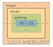
内边距特性
-
背景色延伸到内边距
-
可以使用padding-方向的写法设置单个方向
-
不能设置负数
边框
border:1px solid gray
-
三个属性分别是:大小,样式,颜色
-
其中样式有solid–实线,double是双实线,dashed线段线,dotted点状线
-
同样支持border-方向设置单个方向
-
同时,还可以单独设置大小,样式与颜色:border-width\border-style\border-color
-
1个值表示四个方向都一样
-
2个值表示上下和左右
-
3个值:上,左右,下
-
4个值:上,右,下,左
外边距特性
margin:1px 2px 3px 4px
-
支持四个方向
margin-topmargin-bottommargin-leftmargin-right
-
外边距支持负数
-
屏幕居中方案:
margin:0 auto
1.兄弟关系
- 垂直方向,外边距取两个当中的最大值,但是如果另一个为负数则会取和
- 水平方向,会直接求和
DOCTYPE html>
<html lang="en">

<head>
    <meta charset="UTF-8">
    <meta http-equiv="X-UA-Compatible" content="IE=edge">
    <meta name="viewport" content="width=device-width, initial-scale=1.0">
    <title>Documenttitle>
    <style>
        /* 群组选择器 */
        .box1,
        .box2,
        .box3,
        .box4 {
            width: 100px;
            height: 100px;
        }

        .box1 {
            background-color: red;
            margin-bottom: 20px;


        }

        .box2 {
            background-color: yellow;
            margin-top: 10px;
        }

        .box3 {
            background-color: blue;
            float: left;
            margin-right: 20px;
        }

        .box4 {
            background-color: green;
            float: left;
            margin-left: 10px;
        }
    style>
head>

<body>

    <div class="box1">div>
    <div class="box2">div>
    <div class="box3">div>
    <div class="box4">div>
body>

html>
2.父子关系
- 水平与垂直特性与兄弟关系相同
DOCTYPE html>
<html lang="en">

<head>
    <meta charset="UTF-8">
    <meta http-equiv="X-UA-Compatible" content="IE=edge">
    <meta name="viewport" content="width=device-width, initial-scale=1.0">
    <title>Documenttitle>
    <style>
        .box1,
        .box2 {
            padding: 0;
        }

        .box1 {
            width: 500px;
            height: 500px;
            background-color: red;
            margin-top: 10px;
            /* padding-top: 10px; */
            /* border: 1px solid transparent; */
            /* float: left; */
            overflow: hidden;
        }

        .box2 {
            width: 200px;
            height: 100px;
            background-color: yellow;
            margin-top: 30px;
            margin-left: 0;
            /* float: left; */
        }


        /* 1.子margin-top转化为父的padding-top */
        /* 2.给父盒子设置边框 */
        /* 3.给父或者子盒子添加浮动 */
        /* 4.overflow:hidden BFC块,不会影响外部*/
    style>
head>

<body>
    <div class="box1">
        <div class="box2">div>
    div>
body>

html>
23.PS基本操作
ps===图片处理软件(美工用来作图,前端用来测量,吸取颜色,切图)
拿到设计稿之后使用ps打开
-
图片放大和缩小
- ctrl++
- ctrl±
- alt+滚动
-
图片的移动
- 按住空格,鼠标变为小手,拖动图片
-
如何调整出标尺
- ctrl+r
- 作用:拖动参考线方便测量
- 视图里面找到标尺,把对勾勾选上
-
测量图片大小
- 标尺-右键-像素
- 使用矩形选框工具(左侧竖着第二个)
- 如何查看数据大小(窗口------信息面板=====wh)
-
截图
- 1.使用快捷键截图===每次只能截取一个
- 使用选框工具框选你要截取的区域
- ctrl+cctrl+n回车=ctrl+v=ctrl+s回车=======回车
- 2.切片工具(裁剪工具进行切换)
- 使用切片工具框选你要留住的区域,点击文件,存储为wen所用格式,弹窗里面点击存储
- 弹窗======格式:仅限图像,切片:所有用户切片
- 1.使用快捷键截图===每次只能截取一个
-
吸取颜色
- 使用吸管工具
- 吸取完颜色后,点击左下角的背景色,会有弹窗,在弹窗里面选择十六进制的颜色值并进行复制
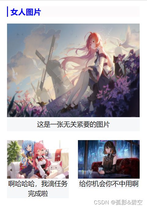
24.盒子案例
DOCTYPE html>
<html lang="en">

<head>
    <meta charset="UTF-8">
    <meta http-equiv="X-UA-Compatible" content="IE=edge">
    <meta name="viewport" content="width=device-width, initial-scale=1.0">
    <title>Documenttitle>
    <style>
        * {
            margin: 0;
            padding: 0;
        }

        img {
            display: block;
        }

        #box {
            width: 241px;
            height: 335px;
            background-color: white;
            margin: 0 auto;
            padding: 11px 11px 18px;
        }

        .title {
            width: 235px;
            height: 19px;
            background-color: rgb(252, 250, 250);
            padding-left: 4px;
            border-left: 2px solid blue;
            color: blue;
            font-size: 14px;
            line-height: 19px;
            font-weight: bold;
            margin-bottom: 12px;
        }

        /* .bigpic {
            width: 241px;
            height: 170px;
        } */

        .bigpic p {
            width: 241px;
            height: 26px;
            background-color: #f6f7f8;
            font-size: 12px;
            text-align: center;
            /* 垂直方向居中 */
            line-height: 26px;
            margin-bottom: 16px;
        }

        .smallpic p {
            font-size: 12px;
            width: 112px;
            background-color: #f6f7f8;
            line-height: 18px;
            text-align: center;
        }

        .smallpic img {
            width: 112px;
            height: 70px;
        }

        .left {
            float: left;
        }

        .right {
            float: right;
        }
    style>
head>

<body>
    <div id="box">
        <div class="title">女人图片div>
        <div class="bigpic">
            <img src="../img/2056309.jpg" style="width: 241px;height:170px" alt="" />

            <p>这是一张无关紧要的图片p>
        div>
        <div class="smallpic">
            <div class="left">
                <img src="../img/2056332.jpg" alt="" />
                <p>啊哈哈哈,我滴任务完成啦p>
            div>

            <div class="right">
                <img src="../img/2056359.jpg" alt="" />
                <p>给你机会你不中用啊p>
            div>
        div>
    div>
body>

html>
25.溢出属性
1.溢出属性(容器的)
说明:
overflow:visible/hidden(隐藏)/scroll/auto(自动)/inherit;
- visible:默认值,溢出内容会显示在元素之外
- hidden:溢出内容隐藏
- scroll:滚动,溢出内容以滚动方式显示
- auto:如果有溢出会添加滚动条,没有溢出正常显示
- inhreit:规定应该遵从父元素继承overflow属性
- overflow-x:X轴溢出
- overflow-Y:Y轴溢出
<head>
    <meta charset="UTF-8">
    <meta http-equiv="X-UA-Compatible" content="IE=edge">
    <meta name="viewport" content="width=device-width, initial-scale=1.0">
    <title>Documenttitle>
    <style>
        .box1 {
            width: 200px;
            height: 200px;
            background-color: yellow;
            /* overflow: visible;显示溢出 */
            /* overflow: hidden;溢出隐藏,文本裁切 */
            /* overflow: scroll;有没有溢出,都会有滚动条 */
            /* overflow: auto;只有溢出时才会有滚动条 */
            /* overflow: inherit;继承父元素的效果 */
            overflow: auto;
        }

        .box {
            width: 500px;
            height: 100px;
            overflow-y: auto;
            /* 要配合使用 */
            overflow-x: hidden;
        }
    style>
head>

<body>
    <div class="box1">
        Lorem ipsum dolor, sit amet consectetur adipisicing elit. Modi officia impedit commodi, quibusdam repellendus
        repudiandae ex ullam neque iusto id debitis dolorum? Consequatur iure reprehenderit fugiat quos reiciendis
        tempora pariatur.

    div>
    <div class="box"><img src="../img/2056309.jpg">div>
body>
2.空余空间
说明:
-
white-space:normal/nowrap/pre/pre-wrap/pre-line/inherit该属性用来设置如何处理元素内的空白; -
normal:默认值,空白会被浏览器忽略
-
nowrap:文本不会换行,文本会在同一行上继续,直到遇到
标签为止 -
pre-wrap:显示空格,回车,换行
-
pre-line:显示回车,不显示空格,换行
说明:
text-overflow:clip/ellipsis- clip:默认,不显示省略号(…)
- ellipsis:显示省略标记
当单行文本溢出显示省略号需要同时设置以下声明:
1.容器宽度:width:200px
2.强制文本在一行内显示:white-space:nowrap
3.溢出内容为隐藏:overflow:hidden
4.溢出文本显示省略号:text-overflow:ellipsis
26.溢出属性案例

DOCTYPE html>
<html lang="en">

<head>
    <meta charset="UTF-8">
    <meta http-equiv="X-UA-Compatible" content="IE=edge">
    <meta name="viewport" content="width=device-width, initial-scale=1.0">
    <title>Documenttitle>
    <style>
        * {
            margin: 0;
            padding: 0;
        }

        #box {
            width: 890px;
            height: 290px;
            background-color: white;
            margin: 0 auto;
            overflow: auto;
        }

        .info {
            width: 162px;
            height: 112px;
            border: 1px solid #808080;
            float: left;
            margin-right: 48px;
            margin-bottom: 20px;
        }

        .info div {
            width: 162px;
            height: 84px;
            background-color: #cccccc;
            background-image: url("../img/2056359.jpg");
            background-size: cover;
            font-size: 13px;
        }

        .price {
            height: 63px;
            line-height: 63px;
            padding-left: 21px;
            color: #b5b5b5;
        }

        .info .date {
            color: #b5b5b5;
            padding-left: 21px;
        }

        .category {
            background-color: white;
            height: 28px;
            line-height: 28px;
            color: #000;
            text-align: center;
            font-size: 12px;
        }

        .info:hover div {
            background-color: #219cea;
            background-image: url("../img/2056309.jpg");


        }

        .info:hover .price {
            color: white;
        }

        .info:hover .date {
            color: white
        }

        .info:hover .category {
            color: #219cea;
            background-image: url("../img/2056332.jpg");
            background-repeat: no-repeat;
            background-size: contain;
            background-position: right bottom;
        }
    style>
head>

<body>
    <div id="box">
        <div class="info">
            <div>
                <p class="price">¥100.00圆p>
                <p class="date">有效期至:2022-8-4p>
            div>
            <p class="category">[店铺类][商城类]p>
        div>

        <div class="info">
            <div>
                <p class="price">¥100.00圆p>
                <p class="date">有效期至:2022-8-4p>
            div>
            <p class="category">[店铺类][商城类]p>
        div>
        <div class="info">
            <div>
                <p class="price">¥100.00圆p>
                <p class="date">有效期至:2022-8-4p>
            div>
            <p class="category">[店铺类][商城类]p>
        div>
        <div class="info">
            <div>
                <p class="price">¥100.00圆p>
                <p class="date">有效期至:2022-8-4p>
            div>
            <p class="category">[店铺类][商城类]p>
        div>
        <div class="info">
            <div>
                <p class="price">¥100.00圆p>
                <p class="date">有效期至:2022-8-4p>
            div>
            <p class="category">[店铺类][商城类]p>
        div>
        <div class="info">
            <div>
                <p class="price">¥100.00圆p>
                <p class="date">有效期至:2022-8-4p>
            div>
            <p class="category">[店铺类][商城类]p>
        div>
        <div class="info">
            <div>
                <p class="price">¥100.00圆p>
                <p class="date">有效期至:2022-8-4p>
            div>
            <p class="category">[店铺类][商城类]p>
        div>
        <div class="info">
            <div>
                <p class="price">¥100.00圆p>
                <p class="date">有效期至:2022-8-4p>
            div>
            <p class="category">[店铺类][商城类]p>
        div>
        <div class="info">
            <div>
                <p class="price">¥100.00圆p>
                <p class="date">有效期至:2022-8-4p>
            div>
            <p class="category">[店铺类][商城类]p>
        div>
        <div class="info">
            <div>
                <p class="price">¥100.00圆p>
                <p class="date">有效期至:2022-8-4p>
            div>
            <p class="category">[店铺类][商城类]p>
        div>


    div>
body>

html>