【论文绘图】连续单变量
直方图
下面讲解用seaborn绘制分布图。seaborn中的displot和histplot是一样的底层代码。
penguins = sns.load_dataset("penguins")
sns.displot(penguins, x="flipper_length_mm")
选择bin大小
sns.displot(penguins, x="flipper_length_mm", bins=20)
不能过度依赖seaborn自动选择的并大小,否则可能出现这种尴尬的缝隙: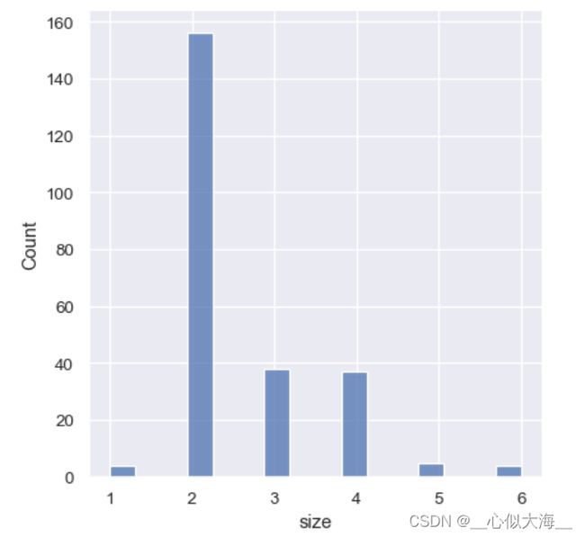
这时可以这样处理:
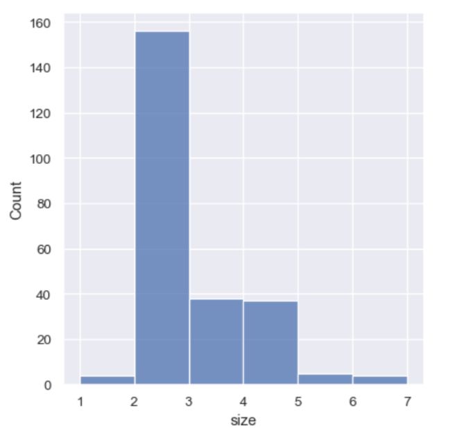
sns.displot(tips, x="size", bins=[1, 2, 3, 4, 5, 6, 7])

# 以下代码等价
sns.displot(tips, x="size", discrete=True)
也可以自己选择缝隙宽度:
sns.displot(tips, x="day", shrink=.8)
用直方图携带更多信息
sns.displot(penguins, x="flipper_length_mm", hue="species")

这样可能看不清楚
sns.displot(penguins, x="flipper_length_mm", hue="species", element="step")
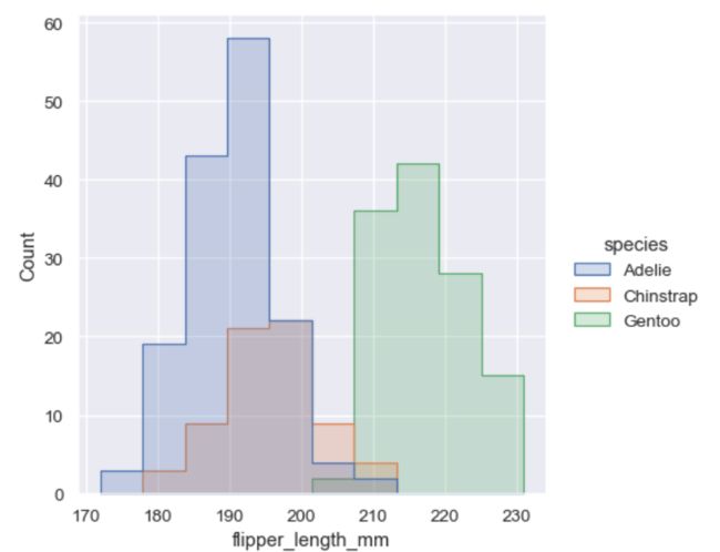
这样就好多了。
element的参数值还可以是‘stack’, ‘dodge’(保证没有重叠但是只适用于hue水平数较少的情况) .
当然,histplot也可以使用col,row参数绘制多个子图。
归一化的直方图统计
当每个子类的样本数不同时,以上方法绘制的直方图是不合理的。
sns.displot(penguins, x="flipper_length_mm", hue="species", stat="density", common_norm=False)
common_norm=False 保证了每个子类分别归一化,而不是所有样本一起归一化。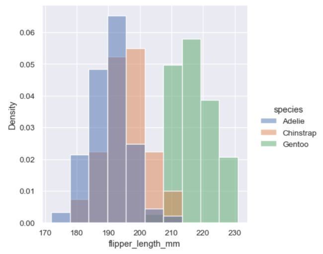
另一个选择是归一化bar的高度使得高度相加为1. 这样可解释性更强。
sns.displot(penguins, x="flipper_length_mm", hue="species", stat="probability")

核密度估计
sns.displot(penguins, x="flipper_length_mm", kind="kde")
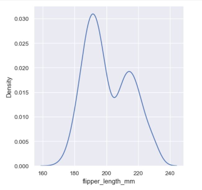
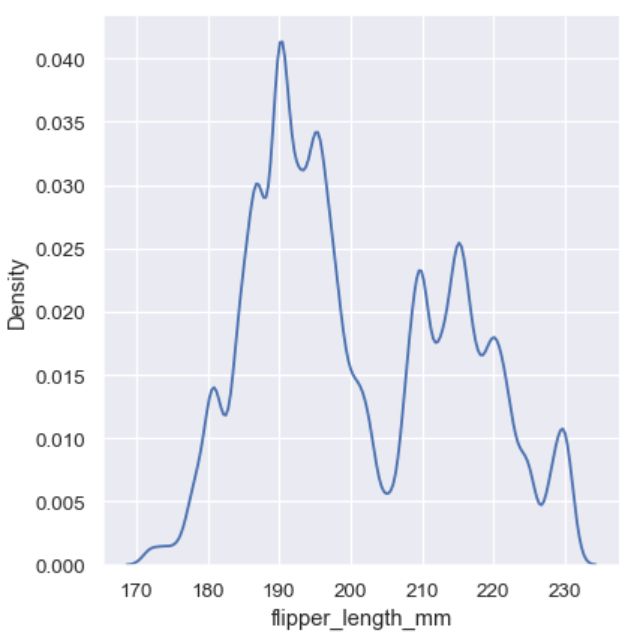
选择平滑度
太高的平滑度可能直接抹去有价值的特征,太低的平滑度又可能画出噪音。
sns.displot(penguins, x="flipper_length_mm", kind="kde", bw_adjust=.25)
多变量的KDE
sns.displot(penguins, x="flipper_length_mm", hue="species", kind="kde")
sns.displot(penguins, x="flipper_length_mm", hue="species", kind="kde", multiple="stack")
sns.displot(penguins, x="flipper_length_mm", hue="species", kind="kde", fill=True)
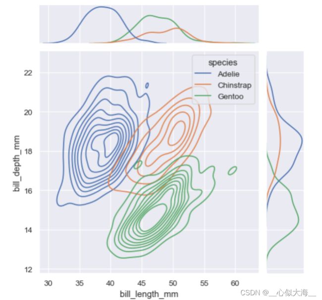
二元分布
sns.displot(penguins, x="bill_length_mm", y="bill_depth_mm")
sns.displot(penguins, x="bill_length_mm", y="bill_depth_mm", kind="kde")
sns.displot(penguins, x="bill_length_mm", y="bill_depth_mm", hue="species")
sns.displot(penguins, x="bill_length_mm", y="bill_depth_mm", binwidth=(2, .5))
sns.displot(penguins, x="bill_length_mm", y="bill_depth_mm", binwidth=(2, .5), cbar=True)
sns.jointplot(data=penguins, x="bill_length_mm", y="bill_depth_mm")

sns.jointplot(
    data=penguins,
    x="bill_length_mm", y="bill_depth_mm", hue="species",
    kind="kde"
)
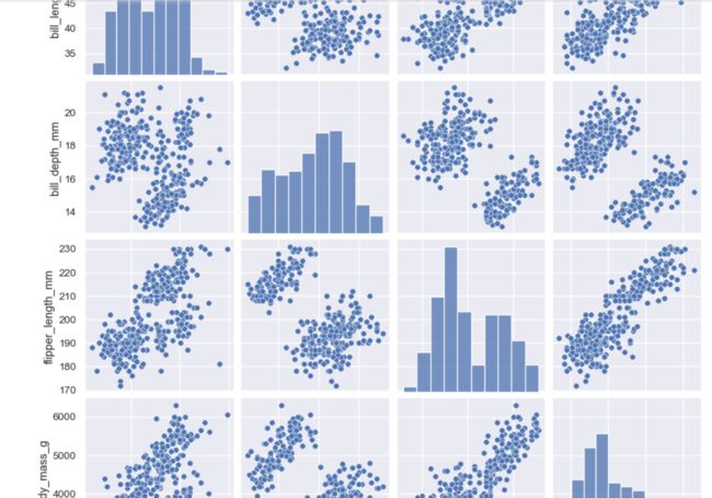
相关性分析
sns.pairplot(penguins)
g = sns.PairGrid(penguins)
g.map_upper(sns.histplot)
g.map_lower(sns.kdeplot, fill=True)
g.map_diag(sns.histplot, kde=True)
