HarmonyOS 鸿蒙应用开发( 六、实现自定义弹窗CustomDialog)
自定义弹窗(CustomDialog)可用于广告、中奖、警告、软件更新等与用户交互响应操作。开发者可以通过CustomDialogController类显示自定义弹窗。具体用法请参考自定义弹窗。
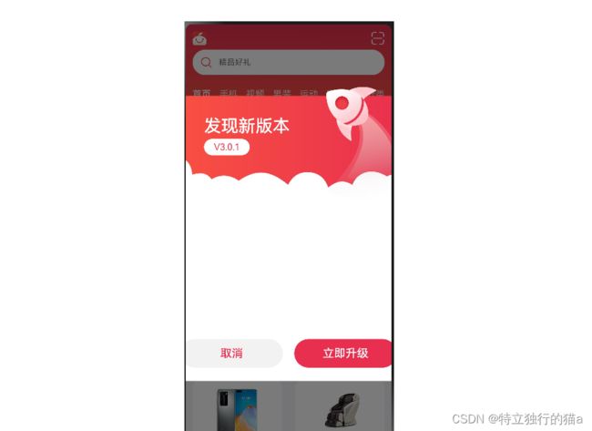
在应用的使用和开发中,弹窗是一个很常见的场景,自定义弹窗又因为极高的自由度得以广泛应用。本文以橘子购物中一个应用更新提示的弹窗介绍OpenHarmony的自定义弹窗。
简单使用
1.1 创建自定义弹窗
使用@CustomDialog装饰器装饰自定义弹窗。
@CustomDialog装饰器用于装饰自定义弹框,此装饰器内进行自定义内容(也就是弹框内容)。
@CustomDialog
struct CustomDialogExample {
  controller: CustomDialogController
  build() {
    Column() {
      Text('我是内容')
      .fontSize(20)
      .margin({ top: 10, bottom: 10 })
    }
  }
}
1.2 创建构造器,与装饰器呼应相连
在创建好自定义弹窗之后,我们New出来它的对象,他的类型是CustomDialogController。
dialogController: CustomDialogController = new CustomDialogController({
    builder: CustomDialogExample({}),
})
CustomDialogController参数详解
接口函数原型:
CustomDialogController(value:{builder: CustomDialog, cancel?: () => void, autoCancel?: boolean, alignment?: DialogAlignment,
                      offset?: Offset, customStyle?: boolean, gridCount?: number, maskColor?: ResourceColor,
                      openAnimation?: AnimateParam, closeAnimation?: AnimateParam})

这其中最重要的就是builder,我们需要自己实现一个构造器,也就是这个弹窗的页面。上述简单示例的CustomDialogExample,就是一个弹窗页面。
简单示例代码:
// xxx.ets
@CustomDialog
struct CustomDialogExample {
  @Link textValue: string
  @Link inputValue: string
  controller: CustomDialogController
  // 若尝试在CustomDialog中传入多个其他的Controller,以实现在CustomDialog中打开另一个或另一些CustomDialog,那么此处需要将指向自己的controller放在最后
  cancel: () => void
  confirm: () => void

  build() {
    Column() {
      Text('Change text').fontSize(20).margin({ top: 10, bottom: 10 })
      TextInput({ placeholder: '', text: this.textValue }).height(60).width('90%')
        .onChange((value: string) => {
          this.textValue = value
        })
      Text('Whether to change a text?').fontSize(16).margin({ bottom: 10 })
      Flex({ justifyContent: FlexAlign.SpaceAround }) {
        Button('cancel')
          .onClick(() => {
            this.controller.close()
            this.cancel()
          }).backgroundColor(0xffffff).fontColor(Color.Black)
        Button('confirm')
          .onClick(() => {
            this.inputValue = this.textValue
            this.controller.close()
            this.confirm()
          }).backgroundColor(0xffffff).fontColor(Color.Red)
      }.margin({ bottom: 10 })
    }
    // dialog默认的borderRadius为24vp,如果需要使用border属性,请和borderRadius属性一起使用。
  }
}

@Entry
@Component
struct CustomDialogUser {
  @State textValue: string = ''
  @State inputValue: string = 'click me'
  dialogController: CustomDialogController = new CustomDialogController({
    builder: CustomDialogExample({
      cancel: this.onCancel,
      confirm: this.onAccept,
      textValue: $textValue,
      inputValue: $inputValue
    }),
    cancel: this.existApp,
    autoCancel: true,
    alignment: DialogAlignment.Bottom,
    offset: { dx: 0, dy: -20 },
    gridCount: 4,
    customStyle: false
  })

  // 在自定义组件即将析构销毁时将dialogControlle删除和置空
  aboutToDisappear() {
    delete this.dialogController, // 删除dialogController
    this.dialogController = undefined // 将dialogController置空
  }

  onCancel() {
    console.info('Callback when the first button is clicked')
  }

  onAccept() {
    console.info('Callback when the second button is clicked')
  }

  existApp() {
    console.info('Click the callback in the blank area')
  }

  build() {
    Column() {
      Button(this.inputValue)
        .onClick(() => {
          if (this.dialogController != undefined) {
            this.dialogController.open()
          }
        }).backgroundColor(0x317aff)
    }.width('100%').margin({ top: 5 })
  }
}
升级弹窗界面示例
定义CustomDialogController
首先,我们需要定义一个CustomDialogController:
UpdateDialogController: CustomDialogController = new CustomDialogController({
  builder: UpdateDialog(),
  customStyle: true
})
这个CustomDialogController就代表弹窗,UpdateDialog()是弹窗的具体实现,customStyle为ture就表示弹窗样式可以自定义。
设置调用时机
在这个场景中,我们想要每次打开应用的时候弹窗,其他时候不弹窗,我们需要在首页组件的aboutToAppear中加入以下代码:
aboutToAppear() {
  if(AppStorage.Get('nowIndex') === undefined || AppStorage.Get('nowIndex') === 0){
    this.UpdateDialogController.open()
  }
}
aboutToAppear函数的调用时机是创建自定义组件的新实例后,执行其build()函数之前,所以在首页组件的aboutToAppear加入CustomDialogController的打开开逻辑可使弹窗仅在应用打开的时候触发。
aboutToAppear参考文档:自定义组件的生命周期
实现builder实例
实现实例可以直接在builder后面直接实现,也可以定义在其他文件中,然后通过调用的方式获取,本文以调用方式实现。
实例组件的定义前需加export才能暴露出去:
export struct UpdateDialog {}
@CustomDialog
export struct UpdateDialog {
  @State currentVersion: string = ''
  @State richTextData: string = ''
  @State lastVersion: string = ''
  @State updateContent: string = ''
  private context?: AbilityContext
  private customDialogController?: CustomDialogController

  async aboutToAppear() {
    this.context = getContext(this) as AbilityContext
    this.richTextData = await dialogFeature.getRichTextData(this.context)
    Logger.info(TAG, `this.richTextData = ${this.richTextData}`)
    await this.getData()
  }

  async getData() {
    try {
      this.currentVersion = await dialogFeature.getCurrentVersion()
      let requestResponseContent: RequestResponseContent = await dialogFeature.getLastVersion()
      if (requestResponseContent.content === null || requestResponseContent.content === undefined) {
        return
      }
      this.updateContent = requestResponseContent.content
      if (requestResponseContent.versionName === null || requestResponseContent.versionName === undefined) {
        return
      }
      this.lastVersion = requestResponseContent.versionName
    } catch (err) {
      Logger.info(TAG, `getApplicationVersion is fail`)
    }
  }
  ...
弹窗具体实现
自定义弹窗的实现就是在原页面的基础上再加一层页面,页面内容自定义。
弹窗页面我们可以通过stack组件实现,stack组件会使容器内的子组件堆叠布局,使用stack的好处是可以添加一层遮罩效果。
Stack() {
  // mask 遮罩层
  Column()
    .width('100%')
    .height('100%')
    .backgroundColor('#000000')
    .opacity(.4)

...
以上代码在stack的第一层设置了backgroundColor和opacity属性,这样会产生如开始示意图的遮罩效果。
需要注意的是,需要在取消按钮的调用函数中关闭弹窗,具体代码如下:
Button($r('app.string.cancel'))
  .onClick(() => {
    this.customDialogController.close()
  })
弹窗界面完整代码
build() {
  Stack() {
    // mask 遮罩层
    Column()
      .width('100%')
      .height('100%')
      .backgroundColor('#000000')
      .opacity(.4)
    Column() {
      Stack({ alignContent: Alignment.TopStart }) {
        Text($r('app.string.update_title'))
          .fontSize(30)
          .fontColor('#FFFFFF')
          .fontWeight(500)
          .margin({ top: 70, left: 76 })

        Text(`V${(this.lastVersion || updateData.versionName)}`)
          .fontSize(16)
          .backgroundColor('#FFFFFF')
          .textAlign(TextAlign.Center)
          .fontColor('#E9304E')
          .borderRadius(20)
          .width(80)
          .aspectRatio(2.8)
          .margin({ top: 110, left: 76 })

        Column() {
          // 富文本容器
          Scroll() {
            Column() {
              if (this.richTextData) {
                RichText((this.updateContent || this.richTextData))
                  .width('100%')
                  .height('100%')
              }
            }
            .width('100%')
          }
          .height(200)

          Row() {
            Button($r('app.string.cancel'))
              .commonButtonStyle()
              .fontSize(20)
              .margin({ left: 10 })
              .fontColor('#E92F4F')
              .backgroundColor('rgba(0,0,0,0.05)')
              .margin({ right: 10 })
              .onClick(() => {
                this.customDialogController.close()
              })
              .key("cancel")

            Button($r('app.string.update_now'))
              .commonButtonStyle()
              .fontSize(20)
              .margin({ right: 10 })
              .fontColor('#FFFFFF')
              .backgroundColor('#E92F4F')
              .margin({ left: 10 })
              .onClick(() => {
                this.customDialogController.close()
              })
              .key("Now")
          }
          .margin({ top: 30 })
        }
        .width('100%')
        .padding({ left: 25, right: 25 })
        .margin({ top: 230 })
      }
      .height(600)
      .width('100%')
      .backgroundImage($r('app.media.update'), ImageRepeat.NoRepeat)
      .backgroundImageSize(ImageSize.Contain)
    }
    .width(480)
    .padding({ left: 16, right: 16 })
  }
  .width('100%')
  .height('100%')
}
参考
本文供稿:刘家辉 (JaysonLiu3) - Gitee.com
本例参考的官方文档:橘子购物
自定义弹窗官方文档
自定义组件的生命周期-aboutToAppear
其他资源
层叠布局(Stack)-构建布局-开发布局-基于ArkTS的声明式开发范式-UI开发-开发-HarmonyOS应用开发
线性布局(Row/Column)-构建布局-开发布局-基于ArkTS的声明式开发范式-UI开发-开发-HarmonyOS应用开发
按钮(Button)-添加常用组件-添加组件-基于ArkTS的声明式开发范式-UI开发-开发-HarmonyOS应用开发
【鸿蒙软件开发】自定义弹窗(CustomDialog)_harmonyos developer自定义弹框-CSDN博客
免费的api接口网站有哪些? - 知乎
文档中心
applications_app_samples: We provide a series of app samples to help you quickly get familiar with the APIs and app development process of the OpenHarmony SDKs. | 为帮助开发者快速熟悉OpenHarmony SDK所提供的API和应用开发流程,我们提供了一系列的应用示例
Codelabs: 分享知识与见解,一起探索HarmonyOS的独特魅力。