lonboard:用于在Jupyter中进行快速、交互式地理空间矢量数据可视化
介绍
Lonboard以GeoArrow和GeoParquet等尖端技术为基础,结合基于 GPU 的地图渲染,旨在通过简单的界面以交互方式可视化大型地理空间数据集。
它能做什么:
- 在 Jupyter Notebooks 和 JupyterLab 中可视化地理空间矢量数据(如点、线和多边形)。
- 即使有数百万个数据点,也能快速、平稳地处理大型数据集。
- 创建具有缩放、平移和过滤功能的交互式地图。
怎么运行的:
- 从 Python 获取数据。
- Efficienty 将其转换为 Web 浏览器中的 JavaScript。
- 利用计算机的 GPU(图形处理单元)进行超快速渲染。
主要特征:
- 快速且交互式:轻松处理大型数据集,提供流畅的用户体验。
- 与 Jupyter 无缝集成:直接在您熟悉的 Jupyter 环境中工作。
- 支持各种数据源:可与 GeoPandas GeoDataFrame、shapefile、GeoJSON等配合使用。
- 可定制的可视化:提供调整颜色、样式和标签的选项,以创建信息丰富的地图。
- 交互功能:允许缩放、平移、过滤和探索数据关系。
如何使用:
- 安装Lonboard:在终端中使用命令。
- 在 Jupyter Notebook 中导入 Lonboard:添加import lonboard到你的代码中。
- 创建地图:使用该Map()功能创建交互式地图。
- 添加数据层:使用PointsLayer()、 LinesLayer()和PolygonsLayer()等函数来显示数据。
- 自定义地图:自定义颜色、样式、标签和交互功能。
安装
命令行
pip install lonboard
Jupyter
! pip install lonboard
示例
示例中的数据:lonboard示例数据
数据提取密码:1111
来自Ookla的测速数据
本示例将使用从 Ookla 的 "速度测试"应用程序收集并在 AWS 开放数据注册中心公开共享的数据:
- 全球固定宽带和移动(蜂窝)网络性能,分配给缩放级别 16 的网络 mercator 瓷砖(赤道处约 610.8 米乘 610.8 米)。
- 数据以 Shapefile 格式和 Apache Parquet 格式提供,几何图形以 EPSG:4326 中的已知文本 (WKT) 表示。
- 下载速度、上传速度和延迟是通过 Android 和 iOS 版的 Ookla 应用程序 Speedtest 收集的,并对每个磁贴进行平均。
import geopandas as gpd
import numpy as np
import pandas as pd
import matplotlib.pyplot as plt
import seaborn as sns
import shapely
from palettable.colorbrewer.diverging import BrBG_10

from lonboard import Map, ScatterplotLayer
from lonboard.colormap import apply_continuous_cmap
下面是 2019 年第一季度移动网络速度单一数据文件的 URL。
url = "https://ookla-open-data.s3.us-west-2.amazonaws.com/parquet/performance/type=mobile/year=2019/quarter=1/2019-01-01_performance_mobile_tiles.parquet"
可以直接从 AWS 获取该数据文件中的两列数据。该 pd.read_parquet 命令将对数据文件执行网络请求,因此在网络连接速度较慢的情况下可能需要一段时间。
# avg_d_kbps 是该数据点的平均下载速度,单位为千比特/秒
# tile 是表示给定 zoom-16 Web Mercator tile 的 WKT 字符串
columns = ["avg_d_kbps", "tile"]
df = pd.read_parquet(url, columns=columns)
df

tile列包含代表几何图形的字符串,我们需要将这些字符串解析为几何图形,为了简单起见,将其转换为中心点。
tile_geometries = shapely.from_wkt(df["tile"])
tile_centroids = shapely.centroid(tile_geometries)
现在,可以根据下载速度和形状几何图形创建一个 geopandas GeoDataFrame。
gdf = gpd.GeoDataFrame(df[["avg_d_kbps"]], geometry=tile_centroids)
为确保该演示在大多数电脑上都能快速运行,过滤欧洲上空的边界框。
gdf = gdf.cx[-11.83:25.5, 34.9:59]
gdf

要呈现点数据,首先要创建ScatterplotLayer,然后将其添加到Map对象中:
layer = ScatterplotLayer.from_geopandas(gdf)
map_ = Map(layers=[layer])
map_

可以查看ScatterplotLayer的文档,了解它还允许哪些渲染选项。
layer.get_fill_color = [0, 0, 200, 200]
map_

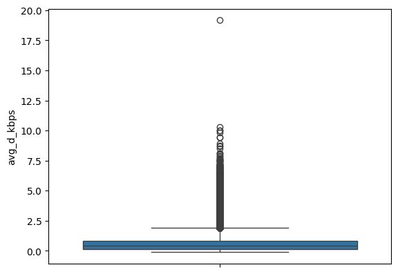
在本例中,数据据有与每个地点相关的下载速度,因此可以根据下载速度分色表示。给定最小界限为 5000,最大界限为 50000,归一化速度的线性比例为 0 至 1。
# min_bound = gdf['avg_d_kbps'].min()
# max_bound = gdf['avg_d_kbps'].max()
min_bound = 5000
max_bound = 50000
download_speed = gdf['avg_d_kbps']
normalized_download_speed = (download_speed - min_bound) / (max_bound - min_bound)  # 下载速度归一化
现在,normalized_download_speed会根据上面提供的界限进行线性缩放。请记住,色谱的输入范围是 0-1。因此,任何低于 0 的值都将获得颜色表中最左侧的颜色,而任何高于 1 的值都将获得颜色表中最右侧的颜色。
sns.boxplot(normalized_download_speed)
可以使用palettable软件包提供的任何色谱,看看下面的BrBG_10分歧色谱。
BrBG_10.mpl_colormap

现在,使用lonboard提供的辅助工具将颜色映射应用到normalized_download_speed上。可以在layer.get_fill_color中设置它,以更新现有颜色。
layer.get_fill_color = apply_continuous_cmap(normalized_download_speed, BrBG_10)
map_

可以将数组传递到该层支持的任何"accessors"中(这是以get_*开头的任何属性)。
# 在层更新为支持 pandas 系列之前,暂时将其转换为 numpy 数组
layer.get_radius = np.array(normalized_download_speed) * 200
layer.radius_units = "meters"
layer.radius_min_pixels = 0.5
map_
北美公路
import matplotlib.pyplot as plt
import seaborn as sns

import geopandas as gpd
import palettable.colorbrewer.diverging

from lonboard import Map, PathLayer
from lonboard.colormap import apply_continuous_cmap
使用GeoPandas通过互联网获取这些数据(45MB),并将其加载到GeoDataFrame中。这使用的是pyogrio引擎,速度更快。请确保已安装pyogrio。
url = 'https://naciscdn.org/naturalearth/10m/cultural/ne_10m_roads_north_america.zip'
gdf = gpd.read_file(url, engine="pyogrio")
gdf

只展示加州的数据。
gdf = gdf[gdf["state"] == "California"]
layer = PathLayer.from_geopandas(gdf, width_min_pixels=0.8)
map_ = Map(layers=[layer])
map_

可以查看PathLayer的文档,了解它还允许哪些渲染选项。
layer.get_color = [200, 0, 200]
map_

根据属性来定制渲染效果。字段scalerank显示道路在道路网络中的重要程度。
gdf['scalerank'].value_counts().sort_index().plot(kind='bar')
数值范围在3到12之间,要为这一列分配颜色映射,需要跨度在0和1之间的标准化值。
normalized_scale_rank = (gdf['scalerank'] - 3) / 9
sns.boxplot(normalized_scale_rank)

# 映射颜色
cmap = palettable.colorbrewer.diverging.PuOr_10
cmap.mpl_colormap

将在这个数组上使用apply_continuous_cmap来为数据生成颜色,只需将这个新数组设置到现有图层上,就能看到地图以新颜色更新!
layer.get_color = apply_continuous_cmap(values=normalized_scale_rank, cmap=cmap, alpha=0.8)
map_

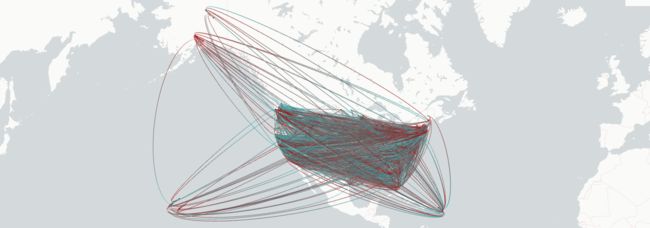
美国县与县之间的人口迁移
案例来源:https://deck.gl/examples/brushing-extension
该数据集最初来自美国人口普查局,代表了2009-2013年间各县的人口迁入和迁出情况。
import geopandas as gpd
import numpy as np
import pandas as pd
import pyarrow as pa
import requests
import shapely
from matplotlib.colors import Normalize

from lonboard import Map, ScatterplotLayer
from lonboard.experimental import ArcLayer, BrushingExtension
从1deck.gl-data1资源库中的版本获取数据。
url = "https://raw.githubusercontent.com/visgl/deck.gl-data/master/examples/arc/counties.json"
r = requests.get(url)
source_data = r.json()
将原始数据(即数据图表)归一化为表格结构,其中每一行代表一个来源县和目标县之间的一条"弧"。
arcs = []
targets = []
sources = []
pairs = {}

features = source_data["features"]
for i, county in enumerate(features):
    flows = county["properties"]["flows"]
    target_centroid = county["properties"]["centroid"]
    total_value = {
        "gain": 0,
        "loss": 0,
    }

    for to_id, value in flows.items():
        if value > 0:
            total_value["gain"] += value
        else:
            total_value["loss"] += value

        # 忽略过小的值
        if abs(value) < 50:
            continue

        pair_key = "-".join(map(str, sorted([i, int(to_id)])))
        source_centroid = features[int(to_id)]["properties"]["centroid"]
        gain = np.sign(flows[to_id])

        # add point at arc source
        sources.append(
            {
                "position": source_centroid,
                "target": target_centroid,
                "name": features[int(to_id)]["properties"]["name"],
                "radius": 3,
                "gain": -gain,
            }
        )
        # 消除重复弧
        if pair_key in pairs.keys():
            continue

        pairs[pair_key] = True

        if gain > 0:
            arcs.append(
                {
                    "target": target_centroid,
                    "source": source_centroid,
                    "value": flows[to_id],
                }
            )
        else:
            arcs.append(
                {
                    "target": source_centroid,
                    "source": target_centroid,
                    "value": flows[to_id],
                }
            )

    # 在弧形目标上添加点
    targets.append(
        {
            **total_value,
            "position": [target_centroid[0], target_centroid[1], 10],
            "net": total_value["gain"] + total_value["loss"],
            "name": county["properties"]["name"],
        }
    )

# 按半径排序,大目标 -> 小目标
targets = sorted(targets, key=lambda d: abs(d["net"]), reverse=True)
normalizer = Normalize(0, abs(targets[0]["net"]))
对于数据集中的每一行数据,可以将其传递给任何接受ColorAccessor的参数。
# 迁出
SOURCE_COLOR = [166, 3, 3]
# 迁入
TARGET_COLOR = [35, 181, 184]
# 合并为单个记录,用作查找表
COLORS = np.vstack(
    [np.array(SOURCE_COLOR, dtype=np.uint8), np.array(TARGET_COLOR, dtype=np.uint8)]
)
SOURCE_LOOKUP = 0
TARGET_LOOKUP = 1

brushing_extension = BrushingExtension(brushing_radius=200000)
将来源字典列表转换为GeoPandas的GeoDataFrame,然后传入ScatterplotLayer。
为源点创建ScatterplotLayer。
source_arr = np.array([source["position"] for source in sources])
source_positions = shapely.points(source_arr[:, 0], source_arr[:, 1])
source_gdf = gpd.GeoDataFrame(
    pd.DataFrame.from_records(sources)[["name", "radius", "gain"]],
    geometry=source_positions,
)
# 使用查找表 (COLORS),将目标颜色或源颜色应用到数组中
source_colors_lookup = np.where(source_gdf["gain"] > 0, TARGET_LOOKUP, SOURCE_LOOKUP)
source_fill_colors = COLORS[source_colors_lookup]

source_layer = ScatterplotLayer.from_geopandas(
    source_gdf,
    get_fill_color=source_fill_colors,
    radius_scale=3000,
    pickable=False,
    extensions=[brushing_extension],
)
为目标点创建ScatterplotLayer。
targets_arr = np.array([target["position"] for target in targets])
target_positions = shapely.points(targets_arr[:, 0], targets_arr[:, 1])
target_gdf = gpd.GeoDataFrame(
    pd.DataFrame.from_records(targets)[["name", "gain", "loss", "net"]],
    geometry=target_positions,
)
# 使用查找表 (COLORS),将目标颜色或源颜色应用到数组中
target_line_colors_lookup = np.where(target_gdf["net"] > 0, TARGET_LOOKUP, SOURCE_LOOKUP)
target_line_colors = COLORS[target_line_colors_lookup]

target_ring_layer = ScatterplotLayer.from_geopandas(
    target_gdf,
    get_line_color=target_line_colors,
    radius_scale=4000,
    pickable=True,
    stroked=True,
    filled=False,
    line_width_min_pixels=2,
    extensions=[brushing_extension],
)
注意:ArcLayer目前无法从GeoDataFrame创建,因为它需要两个点列,而不是一个,这也是它仍被标记为"experimental"模块的主要原因。
在这里,为每一列点传递一个numpy数组。只要数组的形状是(N, 2)或(N, 3)(即二维或三维坐标)。
value = np.array([arc["value"] for arc in arcs])
get_source_position = np.array([arc["source"] for arc in arcs])
get_target_position = np.array([arc["target"] for arc in arcs])
table = pa.table({"value": value})

arc_layer = ArcLayer(
    table=table,
    get_source_position=get_source_position,
    get_target_position=get_target_position,
    get_source_color=SOURCE_COLOR,
    get_target_color=TARGET_COLOR,
    get_width=1,
    opacity=0.4,
    pickable=False,
    extensions=[brushing_extension],
)
根据上述三个图创建一个地图。将鼠标悬停在地图上时,它应该只显示光标附近的弧线。可以修改brushing_extension.brushing_radius来控制光标周围刷子的大小。
map_ = Map(layers=[source_layer, target_ring_layer, arc_layer], picking_radius=10)
map_
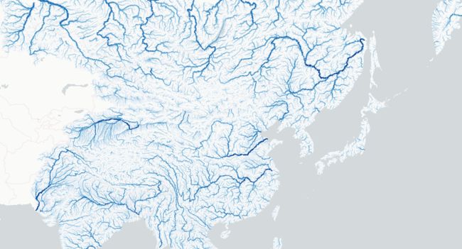
亚洲水系
import geopandas as gpd
from palettable.colorbrewer.sequential import Blues_8

from lonboard import Map, PathLayer
from lonboard.colormap import apply_continuous_cmap
url = "https://storage.googleapis.com/fao-maps-catalog-data/geonetwork/aquamaps/rivers_asia_37331.zip"
gdf = gpd.read_file(url, engine="pyogrio")
gdf['Strahler'].value_counts()
layer = PathLayer.from_geopandas(gdf)
layer.get_color = apply_continuous_cmap(gdf['Strahler'] / 7, Blues_8)
layer.get_width = gdf['Strahler']
layer.width_scale = 3000
layer.width_min_pixels = 0.5

m = Map(layers=[layer])
m
参考
lonboard学习文档:https://developmentseed.org/lonboard/latest/
lonboard仓库:https://github.com/developmentseed/lonboard