HarmonyOS TextInput基础属性讲解
TextInput 是一个文本框组件
我们在常规APP开发中 也会经常出现这类输入工具
我们还是老规矩 在编辑器中写一个
然后鼠标放在上面 等弹出提示 进入官方API
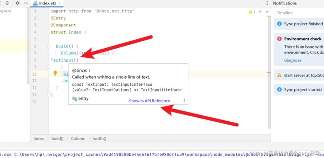
文档上 显示 它有三个参数

第一个参数 placeholder 是个字符串类型的参数
我们做其他项目应该也知道 placeholder 就是在输入框中没有内容时 默认的一个提示信息
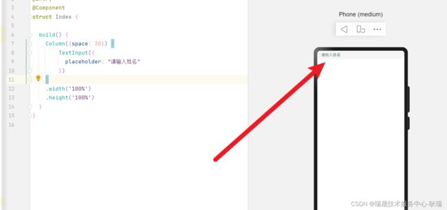
TextInput({
   placeholder: "请输入姓名"
})
第二个 text 也是个字符串类型的参数 控制输入框 默认的文本内容
TextInput({
	placeholder: "请输入姓名",
	text: "小猫猫"
})
做过传功前端项目的朋友 应该都知道 输入框有值后 placeholder就不展示了 因为它只是在没有内容时才提示的

但这里 要强调一下 text和v-model 还是不太一样 不是说 你把一个状态变量设置了 text 他就会跟着输入框内容的改变改变
例如 我们这样写
@Entry
@Component
struct Index {

  @State name:string = "小猫猫";

  build() {
    Column({space: 30}) {
        TextInput({
          placeholder: "请输入姓名",
          text: this.name
        }).onChange((value:string) =>{
            console.log(this.name);
        })
    }
    .width('100%')
    .height('100%')
  }
}
这里 我们定义了 name 状态变量 绑定 TextInput组件的 text属性
然后 我们输入内容 就会触发 onChange 然后我们打印我们绑定的name

我们会发现 输入框中的文本一直在变 但name是没有改变的 你用text只是给他个默认值 但输入框内容因为输入改变时 他是不会同步你绑定给text的属性的
这里 我们需要通过 onChange 来实现
@Entry
@Component
struct Index {

  @State name:string = "小猫猫";

  build() {
    Column({space: 30}) {
        TextInput({
          placeholder: "请输入姓名",
          text: this.name
        }).onChange((value:string) =>{
            this.name = value;
        })
    }
    .width('100%')
    .height('100%')
  }
}
onChange 接受的第一个参数 value 就是 我们输入的内容
这时 我们再次修改输入框内容

我们的状态变量 name 就可以同步更新了
controller 控制器属性
其实 就是可以控制到我们光标的位置
我们编写代码如下
@Entry
@Component
struct Index {

  @State name:string = "小猫猫";
  controller: TextInputController = new TextInputController();

  build() {
    Column({space: 30}) {
        TextInput({
          placeholder: "请输入姓名",
          text: this.name,
          controller: this.controller
        }).onChange((value:string) =>{
            this.name = value;
            console.log(this.name);
        })
          .width(200)
          .height(100)
          .backgroundColor("#FF0000")
          .border({width:10})
          .type(InputType.Password)
        Button('设置光标位置')
        .onClick(() => {
          this.controller.caretPosition(1)
        })
    }
    .width('100%')
    .height('100%')
  }
}
这里 我们声明一个 TextInputController 对象
然后绑定给 controller 属性
然后 我们按钮的点击事假 设置 this.controller.caretPosition(1) 指定光标停留在第二个字符串前面
因为 这个是 0下标开始的 我们给 caretPosition 1 表示在1下标前面
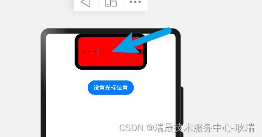
我们的代码 明显光标在最后 我们点击按钮

光标就到指定位置了
然后 属性方法
显示 最常见的 width组件宽度 height组件高度 backgroundColor背景颜色
我们代码如下
TextInput({
	placeholder: "请输入姓名",
	text: this.name
}).onChange((value:string) =>{
	this.name = value;
	console.log(this.name);
})
.width(200)
.height(100)
.backgroundColor("#FF0000")
200vp 宽 100vp 高 背景色#FF0000红色
边框给一个吧
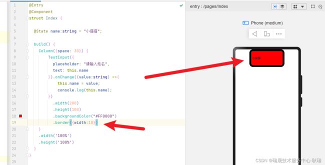
这里 因为我们 border 属性没给颜色 它默认成了一个黑色的效果
type 属性相对比较重要
我们在下面打出 .type(InputType.) 就会带出提示
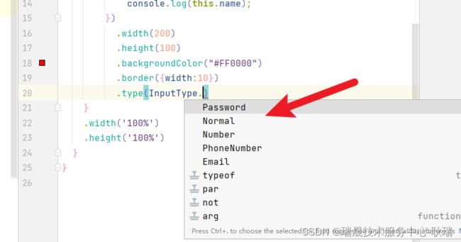
Normal 就是 我们默认的正常显示效果 文本输入框
Number 设置后 只能输入数字
PhoneNumber 电话号码类型输入框
Email 邮箱格式输入框
Password 密码框
这里 我们来个 Password
 TextInput({
placeholder: "请输入姓名",
    text: this.name
}).onChange((value:string) =>{
	this.name = value;
	console.log(this.name);
})
.width(200)
.height(100)
.backgroundColor("#FF0000")
.border({width:10})
.type(InputType.Password)
这样 我们文本框的内容就变成 3个小点了 加密了

然后 就是我们上面说的 onChange 当文本框内容发生改变时触发 它里面可以接到一个行参 value
就是用户输入的最新内容