Beginning Storyboards in iOS 5 Part 1
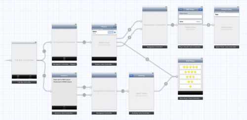
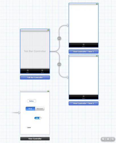
Storyboarding is an exciting new feature in iOS 5 that will save you a lot of time building user interfaces for your apps. To show you what a storyboard is, I’ll let a picture do the talking. This is the storyboard that we will be building in this tutorial:
You may not know exactly yet what the app does but you can clearly see which screens it has and how they are related. That is the power of using storyboards.
If you have an app with many different screens then storyboards can help reduce the amount of glue code you have to write to go from one screen to the next. Instead of using a separate nib file for each view controller, your app uses a single storyboard that contains the designs of all of these view controllers and the relationships between them.
Storyboards have a number of advantages over regular nibs:
- With a storyboard you have a better conceptual overview of all the screens in your app and the connections between them. It’s easier to keep track of everything because the entire design is in a single file, rather than spread out over many separate nibs.
- The storyboard describes the transitions between the various screens. These transitions are called “segues” and you create them by simply ctrl-dragging from one view controller to the next. Thanks to segues you need less code to take care of your UI.
- Storyboards make working with table views a lot easier with the new prototype cells and static cells features. You can design your table views almost completely in the storyboard editor, something else that cuts down on the amount of code you have to write.
Not everything is perfect, of course, and storyboards do have some limitations. The Storyboard Editor isn’t as powerful as Interface Builder yet, there are a few things IB can do that the Storyboard Editor unfortunately can’t. You also need a big monitor, especially when you write iPad apps!
If you’re the type who hates Interface Builder and who really wants to create his entire UI programmatically, then storyboards are probably not for you. Personally, I prefer to write as little code as possible — especially UI code! — so this tool is a welcome addition to my arsenal.
You can still use nibs with iOS 5 and Xcode 4.2. Using Interface Builder isn’t suddenly frowned upon now that we have storyboards. If you want to keep using nibs then go right ahead, but know that you can combine storyboards with nibs. It’s not an either-or situation.
In this tutorial we’ll take a look at what you can do with storyboards. The app we’re going to build is a bit pointless but it does show how to perform the most common tasks that you will be using storyboards for.
Getting Started
Fire up Xcode and create a new project. We’ll use the Single View Application template as our starting point and then build up the app from there.
Fill in the template options as follows:
- Product Name: Ratings
- Company Identifier: the identifier that you use for your apps, in reverse domain notation
- Class Prefix: leave this empty
- Device Family: iPhone
- Use Storyboard: check this
- Use Automatic Reference Counting: check this
- Include Unit Tests: this should be unchecked
After Xcode has created the project, the main Xcode window looks like this:
Our new project consists of two classes, AppDelegate and ViewController, and the star of this tutorial: the MainStoryboard.storyboard file. Notice that there are no .xib files in the project, not even MainWindow.xib.
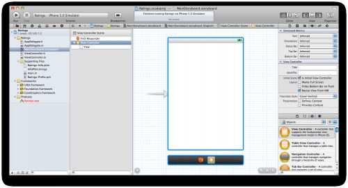
Let’s take a look at that storyboard. Click the MainStoryboard.storyboard file in the Project Navigator to open the Storyboard Editor:
The Storyboard Editor looks and works very much like Interface Builder. You can drag new controls from the Object Library (see bottom-right corner) into your view controller to design its layout. The difference is that the storyboard doesn’t contain just one view controller from your app, but all of them.
The official storyboard terminology is “scene”, but a scene is really nothing more than a view controller. Previously you would use a separate nib for each scene / view controller, but now they are all combined into a single storyboard.
On the iPhone only one of these scenes is visible at a time, but on the iPad you can show several at once, for example the master and detail panes in a split-view, or the content of a popover.
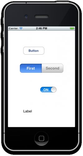
To get some feel for how the editor works, drag some controls into the blank view controller:
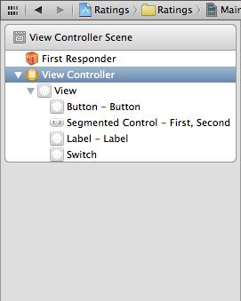
The sidebar on the left is the Document Outline:
In Interface Builder this area lists just the components from your nib but in the Storyboard Editor it shows the contents of all your view controllers. Currently there is only one view controller in our storyboard but in the course of this tutorial we’ll be adding several others.
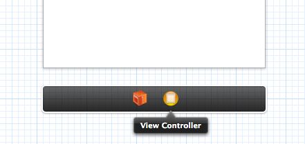
There is a miniature version of this Document Outline below the scene, named the Dock:
The Dock shows the top-level objects in the scene. Each scene has at least a First Responder object and a View Controller object, but it can potentially have other top-level objects as well. More about that later. The Dock is convenient for making connections. If you need to connect something to the view controller, you can simply drag to its icon in the Dock.
Note: You probably won’t be using the First Responder very much. This is a proxy object that refers to whatever object has first responder status at any given time. It was also present in Interface Builder and you probably never had a need to use it then either. As an example, you could hook up the Touch Up Inside event from a button to First Responder’s cut: selector. If at some point a text field has input focus then you can press that button to make the text field, which is now the first responder, cut its text to the pasteboard.
Run the app and it should look exactly like what we designed in the editor:
If you’ve ever made a nib-based app before then you always had a MainWindow.xib file. This nib contained the top-level UIWindow object, a reference to the App Delegate, and one or more view controllers. When you put your app’s UI in a storyboard, however, MainWindow.xib is no longer used.
So how does the storyboard get loaded by the app if there is no MainWindow.xib file?
Let’s take a peek at our application delegate. Open up AppDelegate.h and you’ll see it looks like this:
#import <UIKit/UIKit.h> @interface AppDelegate : UIResponder <UIApplicationDelegate> @property (strong, nonatomic) UIWindow *window; @end |
It is a requirement for using storyboards that your application delegate inherits from UIResponder (previously it used to inherit directly from NSObject) and that it has a UIWindow property (unlike before, this is not an IBOutlet).
If you look into AppDelegate.m, you’ll see that it does absolutely nothing, all the methods are practically empty. Even application:didFinishLaunchingWithOptions: simply returns YES. Previously, this would either add the main view controller’s view to the window or set the window’s rootViewController property, but none of that happens here.
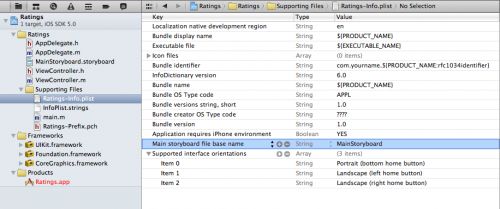
The secret is in the Info.plist file. Click on Ratings-Info.plist (it’s in the Supporting Files group) and you’ll see this:
In nib-based projects there was a key in Info.plist named NSMainNibFile, or “Main nib file base name”, that instructed UIApplication to load MainWindow.xib and hook it into the app. Our Info.plist no longer has that setting.
Instead, storyboard apps use the key UIMainStoryboardFile, or “Main storyboard file base name”, to specify the name of the storyboard that must be loaded when the app starts. When this setting is present, UIApplication will load the MainStoryboard.storyboard file and automatically instantiates the first view controller from that storyboard and puts its view into a new UIWindow object. No programming necessary.
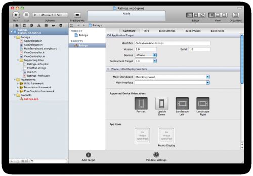
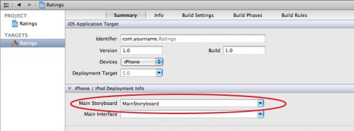
You can also see this in the Target Summary screen:
There is a new iPhone/iPod Deployment Info section that lets you choose between starting from a storyboard or from a nib file.
For the sake of completeness, also open main.m to see what’s in there:
#import <UIKit/UIKit.h> #import "AppDelegate.h" int main(int argc, char *argv[]) { @autoreleasepool { return UIApplicationMain(argc, argv, nil, NSStringFromClass([AppDelegate class])); } } |
Previously, the last parameter for UIApplicationMain() was nil but now it is NSStringFromClass([AppDelegate class]).
A big difference with having a MainWindow.xib is that the app delegate is not part of the storyboard. Because the app delegate is no longer being loaded from a nib (nor from the storyboard), we have to tell UIApplicationMain specifically what the name of our app delegate class is, otherwise it won’t be able to find it.
Just Add It To My Tab
Our Ratings app has a tabbed interface with two screens. With a storyboard it is really easy to create tabs.
Switch back to MainStoryboard.storyboard, and drag a Tab Bar Controller from the Object Library into the canvas. You may want to maximize your Xcode window first, because the Tab Bar Controller comes with two view controllers attached and you’ll need some room to maneuver.
The new Tab Bar Controller comes pre-configured with two other view controllers, one for each tab. UITabBarController is a so-called container view controller because it contains one or more other view controllers. Two other common containers are the Navigation Controller and the Split View Controller (we’ll see both of them later). Another cool addition to iOS 5 is a new API for writing your own container controllers – and later on in this book, we have a tutorial on that!
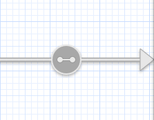
The container relationship is represented in the Storyboard Editor by the arrows between the Tab Bar controller and the view controllers that it contains.
Note: If you want to move the Tab Bar controller and its attached view controllers as a group, you can Cmd-click to select multiple scenes and then move them around together. (Selected scenes have a thick blue outline.)
Drag a label into the first view controller and give it the text “First Tab”. Also drag a label into the second view controller and name it “Second Tab”. This allows us to actually see something happen when you switch between the tabs.
Note: You can’t drag stuff into the scenes when the editor is zoomed out. You’ll need to return to the normal zoom level first.
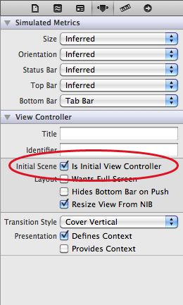
Select the Tab Bar Controller and go to the Attributes Inspector. Check the box that says Is Initial View Controller.
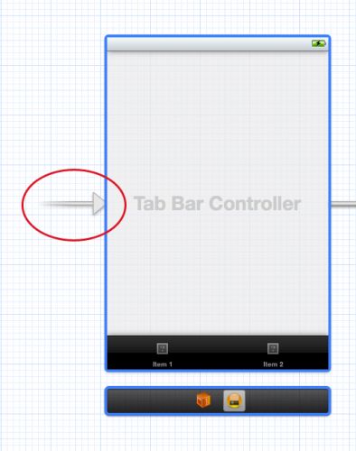
In the canvas the arrow that at first pointed to the regular view controller now points at the Tab Bar Controller:
This means that when you run the app, UIApplication will make the Tab Bar Controller the main screen of our app.
The storyboard always has a single view controller that is designated the initial view controller, that serves as the entry point into the storyboard.
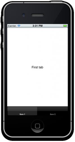
Run the app and try it out. The app now has a tab bar and you can switch between the two view controllers with the tabs:
Xcode actually comes with a template for building a tabbed app (unsurprisingly called the Tabbed Application template) that we could have used, but it’s good to know how this works so you can also create one by hand if you have to.
You can remove the view controller that was originally added by the template as we’ll no longer be using it. The storyboard now contains just the tab bar and the two scenes for its tabs.
By the way, if you connect more than five scenes to the Tab Bar Controller, it automatically gets a More… tab when you run the app. Pretty neat!
Adding a Table View Controller
The two scenes that are currently attached to the Tab Bar Controller are both regular UIViewControllers. I want to replace the scene from the first tab with a UITableViewController instead.
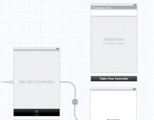
Click on that first view controller to select it and then delete it. From the Object Library drag a new Table View Controller into the canvas in the place where that scene used to be:
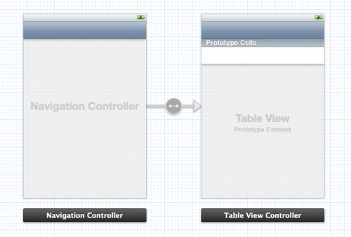
With the Table View Controller selected, choose Editor\Embed In\Navigation Controller from Xcode’s menubar. This adds yet another view controller to the canvas:
You could also have dragged in a Navigation Controller from the Object Library, but this Embed In command is just as easy.
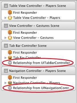
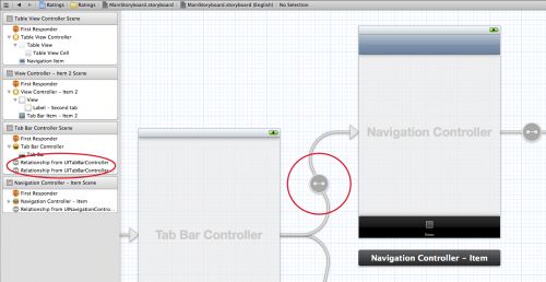
Because the Navigation Controller is also a container view controller (just like the Tab Bar Controller), it has a relationship arrow pointing at the Table View Controller. You can also see these relationships in the Document Outline:
Notice that embedding the Table View Controller gave it a navigation bar. The Storyboard Editor automatically put it there because this scene will now be displayed inside the Navigation Controller’s frame. It’s not a real UINavigationBar object but a simulated one.
If you look at the Attributes Inspector for the Table View Controller, you’ll see the Simulated metrics section at the top:
“Inferred” is the default setting for storyboards and it means the scene will show a navigation bar when it’s inside of a navigation controller, a tab bar when it’s inside of a tab bar controller, and so on. You could override these settings if you wanted to, but keep in mind they are here only to help you design your screens. The Simulated Metrics aren’t used during runtime, they’re just a visual design aid that shows what your screen will end up looking like.
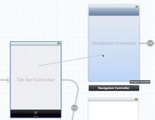
Let’s connect these new scenes to our Tab Bar Controller. Ctrl-drag from the Tab Bar Controller to the Navigation Controller:
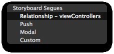
When you let go, a small popup menu appears:
Choose the Relationship – viewControllers option. This creates a new relationship arrow between the two scenes:
The Tab Bar Controller has two such relationships, one for each tab. The Navigation Controller itself has a relationship connection to the Table View Controller. There is also another type of arrow, the segue, that we’ll talk about later.
When we made this new connection, a new tab was added to the Tab Bar Controller, simply named “Item”. I want this new scene to be the first tab, so drag the tabs around to change their order:
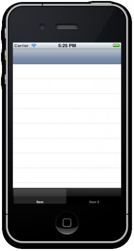
Run the app and try it out. The first tab now contains a table view inside a navigation controller.
Before we put some actual functionality into this app, let’s clean up the storyboard a little. I want to name the first tab “Players” and the second “Gestures”. You do not change this on the Tab Bar Controller itself, but in the view controllers that are connected to these tabs.
As soon as you connect a view controller to the Tab Bar Controller, it is given a Tab Bar Item object. You use the Tab Bar Item to configure the tab’s title and image.
Select the Tab Bar Item inside the Navigation Controller and in the Attributes Inspector set its Title to “Players”:
Rename the Tab Bar Item for the view controller from the second tab to “Gestures”.
We should also put some pictures on these tabs. The resources for this tutorial contains a subfolder named Images. Add that folder to the project. In the Attributes Inspector for the Players Tab Bar Item, choose the Players.png image. You probably guessed it, but give the Gestures item the image Gestures.png.
Similarly, a view controller inside a Navigation Controller has a Navigation Item that is used to configure the navigation bar. Select the Navigation Item for the Table View Controller and change its title in the Attributes Inspector to “Players”.
Alternatively, you can simply double-click the navigation bar and change the title there. (Note: You should double-click the simulated navigation bar in the Table View Controller, not the actual Navigation Bar object in the Navigation Controller.)
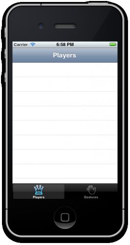
Run the app and marvel at our pretty tab bar, all without writing a single line of code!
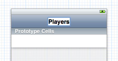
Prototype cells
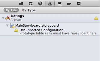
You may have noticed that ever since we added the Table View Controller, Xcode has been complaining:
The warning message is, “Unsupported Configuration: Prototype table cells must have reuse identifiers”. When you add a Table View Controller to a storyboard, it wants to use prototype cells by default but we haven’t properly configured this yet, hence the warning.
Prototype cells are one of the cool advantages that storyboards offer over regular nibs. Previously, if you wanted to use a table view cell with a custom design you either had to add your subviews to the cell programmatically, or create a new nib specifically for that cell and then load it from the nib with some magic. That’s still possible, but prototype cells make things a lot easier for you. Now you can design your cells directly in the storyboard editor.
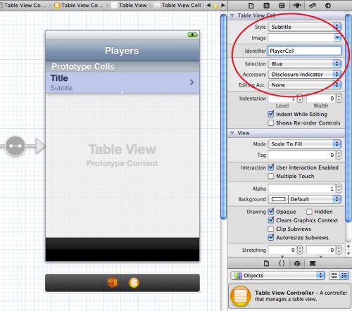
The Table View Controller comes with a blank prototype cell. Click on that cell to select it and in the Attributes Inspector set Style to Subtitle. This immediately changes the appearance of the cell to include two labels. If you’ve used table views before and created your own cells by hand, you may recognize this as the UITableViewCellStyleSubtitle style. With prototype cells you can either pick one of the built-in cell styles as we just did, or create your own custom design (which we’ll do shortly).
Set the Accessory attribute to Disclosure Indicator and give the cell the Reuse Identifier “PlayerCell”. That will make Xcode shut up about the warning. All prototype cells are still regular UITableViewCell objects and therefore should have a reuse identifier. Xcode is just making sure we don’t forget (at least for those of us who pay attention to its warnings).
Run the app, and… nothing has changed. That’s not so strange, we still have to make a data source for the table so it will know what rows to display.
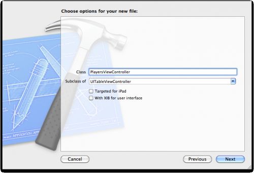
Add a new file to the project. Choose the UIViewController subclass template. Name the class PlayersViewController and make it a subclass of UITableViewController. The With XIB for user interface option should be unchecked because we already have the design of this view controller in the storyboard. No nibs today!
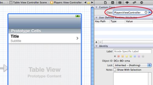
Go back to the Storyboard Editor and select the Table View Controller. In the Identity Inspector, set its Class to PlayersViewController. That is the essential step for hooking up a scene from the storyboard with your own view controller subclass. Don’t forget this or your class won’t be used!
From now on when you run the app that table view controller from the storyboard is actually an instance of our PlayersViewController class.
Add a mutable array property to PlayersViewController.h:
#import <UIKit/UIKit.h> @interface PlayersViewController : UITableViewController @property (nonatomic, strong) NSMutableArray *players; @end |
This array will contain the main data model for our app. It contains Player objects. Let’s make that Player class right now. Add a new file to the project using the Objective-C class template. Name it Player, subclass of NSObject.
Change Player.h to the following:
@interface Player : NSObject @property (nonatomic, copy) NSString *name; @property (nonatomic, copy) NSString *game; @property (nonatomic, assign) int rating; @end |
And change Player.m to:
#import "Player.h" @implementation Player @synthesize name; @synthesize game; @synthesize rating; @end |
There’s nothing special going on here. Player is simply a container object for these three properties: the name of the player, the game he’s playing, and a rating (1 to 5 stars).
We’ll make the array and some test Player objects in our App Delegate and then assign it to the PlayersViewController’s players property.
In AppDelegate.m, add an #import for the Player and PlayersViewController classes at the top of the file, and add a new instance variable named players:
#import "AppDelegate.h" #import "Player.h" #import "PlayersViewController.h" @implementation AppDelegate { NSMutableArray *players; } // Rest of file... |
Then change the didFinishLaunchingWithOptions method to:
- (BOOL)application:(UIApplication *)application didFinishLaunchingWithOptions:(NSDictionary *)launchOptions { players = [NSMutableArray arrayWithCapacity:20]; Player *player = [[Player alloc] init]; player.name = @"Bill Evans"; player.game = @"Tic-Tac-Toe"; player.rating = 4; [players addObject:player]; player = [[Player alloc] init]; player.name = @"Oscar Peterson"; player.game = @"Spin the Bottle"; player.rating = 5; [players addObject:player]; player = [[Player alloc] init]; player.name = @"Dave Brubeck"; player.game = @"Texas Hold’em Poker"; player.rating = 2; [players addObject:player]; UITabBarController *tabBarController = (UITabBarController *)self.window.rootViewController; UINavigationController *navigationController = [[tabBarController viewControllers] objectAtIndex:0]; PlayersViewController *playersViewController = [[navigationController viewControllers] objectAtIndex:0]; playersViewController.players = players; return YES; } |
This simply creates some Player objects and adds them to the players array. But then it does the following:
UITabBarController *tabBarController = (UITabBarController *) self.window.rootViewController; UINavigationController *navigationController = [[tabBarController viewControllers] objectAtIndex:0]; PlayersViewController *playersViewController = [[navigationController viewControllers] objectAtIndex:0]; playersViewController.players = players; |
Yikes, what is that?! We want to assign the players array to the players property of PlayersViewController so it can use this array for its data source. But the app delegate doesn’t know anything about PlayersViewController yet, so it will have to dig through the storyboard to find it.
This is one of the limitations of storyboards that I find annoying. With Interface Builder you always had a reference to the App Delegate in your MainWindow.xib and you could make connections from your top-level view controllers to outlets on the App Delegate. That is currently not possible with storyboards. You cannot make references to the app delegate from your top-level view controllers. That’s unfortunate, but we can always get those references programmatically.
UITabBarController *tabBarController = (UITabBarController *) self.window.rootViewController; |
We know that the storyboard’s initial view controller is a Tab Bar Controller, so we can look up the window’s rootViewController and cast it.
The PlayersViewController sits inside a navigation controller in the first tab, so we look up that UINavigationController object:
UINavigationController *navigationController = [[tabBarController viewControllers] objectAtIndex:0]; |
and then ask it for its root view controller, which is the PlayersViewController that we are looking for:
PlayersViewController *playersViewController = [[navigationController viewControllers] objectAtIndex:0]; |
Unfortunately, UINavigationController has no rootViewController property so we’ll have to delve into its viewControllers array. (It does have a topViewController property but that points to the top-most controller on the stack and we’re looking for the bottom-most one. At this point the app has just launched so technically we could have used topViewController, but that is not always the case.)
Now that we have an array full of Player objects, we can continue building the data source for PlayersViewController.
Open up PlayersViewController.m, adn change the table view data source methods to the following:
- (NSInteger)numberOfSectionsInTableView:(UITableView *)tableView { return 1; } - (NSInteger)tableView:(UITableView *)tableView numberOfRowsInSection:(NSInteger)section { return [self.players count]; } |
The real work happens in cellForRowAtIndexPath. The version from the Xcode template looks like this:
- (UITableViewCell *)tableView:(UITableView *)tableView cellForRowAtIndexPath:(NSIndexPath *)indexPath { static NSString *CellIdentifier = @"Cell"; UITableViewCell *cell = [tableView dequeueReusableCellWithIdentifier:CellIdentifier]; if (cell == nil) { cell = [[UITableViewCell alloc] initWithStyle:UITableViewCellStyleDefault reuseIdentifier:CellIdentifier]; } // Configure the cell... return cell; } |
That is no doubt how you’ve been writing your own table view code all this time. Well, no longer! Replace that method with:
- (UITableViewCell *)tableView:(UITableView *)tableView cellForRowAtIndexPath:(NSIndexPath *)indexPath { UITableViewCell *cell = [tableView dequeueReusableCellWithIdentifier:@"PlayerCell"]; Player *player = [self.players objectAtIndex:indexPath.row]; cell.textLabel.text = player.name; cell.detailTextLabel.text = player.game; return cell; } |
That looks a lot simpler! The only thing you need to do to get a new cell is:
UITableViewCell *cell = [tableView dequeueReusableCellWithIdentifier:@"PlayerCell"]; |
If there is no existing cell that can be recycled, this will automatically make a new copy of the prototype cell and return it to you. All you need to do is supply the reuse identifier that you set on the prototype cell in the storyboard editor, in our case “PlayerCell”. Don’t forget to set that identifier, or this little scheme won’t work!
Because this class doesn’t know anything about the Player object yet, it needs an #import at the top of the file:
#import "Player.h" |
And we should not forget to synthesize the property that we added earlier:
@synthesize players; |
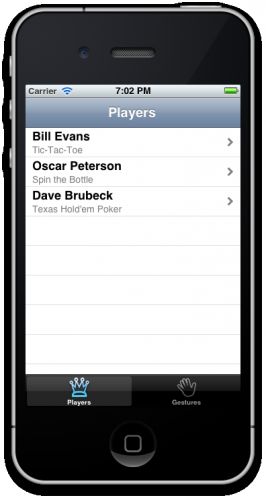
Now you can run the app, and lo and behold, the table view has players in it:
Note: In this app we’re using only one prototype cell but if your table needs to display different kinds of cells then you can simply add additional prototype cells to the storyboard. You can either duplicate the existing cell to make a new one, or increment the value of the Table View’s Prototype Cells attribute. Be sure to give each cell its own re-use identifier, though.
It just takes one line of code to use these newfangled prototype cells. I think that’s just great!
Designing Our Own Prototype Cells
Using a standard cell style is OK for many apps, but I want to add an image on the right-hand side of the cell that shows the player’s rating (in stars). Having an image view in that spot is not supported by the standard cell styles, so we’ll have to make a custom design.
Switch back to MainStoryboard.storyboard, select the prototype cell in the table view, and set its Style attribute to Custom. The default labels now disappear.
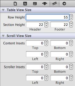
First make the cell a little taller. Either drag its handle at the bottom or change the Row Height value in the Size Inspector. I used the latter method to make the cell 55 points high.
Drag two Label objects from the Objects Library into the cell and place them roughly where the labels were previously. Just play with the font and colors and pick something you like. Do set the Highlighted color of both labels to white. That will look better when the user taps the cell and the cell background turns blue.
Drag an Image View into the cell and place it on the right, next to the disclosure indicator. Make it 81 points wide, the height isn’t very important. Set its Mode to Center (under View in the Attributes Inspector) so that whatever image we put into this view is not stretched.
I made the labels 210 points wide so they don’t overlap with the image view. The final design for the prototype cell looks something like this:
Because this is a custom designed cell, we can no longer use UITableViewCell’s textLabel and detailTextLabel properties to put text into the labels. These properties refer to labels that aren’t on our cell anymore. Instead, we will use tags to find the labels.
Give the Name label tag 100, the Game label tag 101, and the Image View tag 102. You can do this in the Attributes Inspector.
Then open PlayersViewController.m and change cellForRowAtIndexPath from PlayersViewController to:
- (UITableViewCell *)tableView:(UITableView *)tableView cellForRowAtIndexPath:(NSIndexPath *)indexPath { UITableViewCell *cell = [tableView dequeueReusableCellWithIdentifier:@"PlayerCell"]; Player *player = [self.players objectAtIndex:indexPath.row]; UILabel *nameLabel = (UILabel *)[cell viewWithTag:100]; nameLabel.text = player.name; UILabel *gameLabel = (UILabel *)[cell viewWithTag:101]; gameLabel.text = player.name; UIImageView * ratingImageView = (UIImageView *) [cell viewWithTag:102]; ratingImageView.image = [self imageForRating:player.rating]; return cell; } |
This uses a new method, imageForRating. Add that method above cellForRowAtIndexPath:
- (UIImage *)imageForRating:(int)rating { switch (rating) { case 1: return [UIImage imageNamed:@"1StarSmall.png"]; case 2: return [UIImage imageNamed:@"2StarsSmall.png"]; case 3: return [UIImage imageNamed:@"3StarsSmall.png"]; case 4: return [UIImage imageNamed:@"4StarsSmall.png"]; case 5: return [UIImage imageNamed:@"5StarsSmall.png"]; } return nil; } |
That should do it. Now run the app again.
Hmm, that doesn’t look quite right. We did change the height of the prototype cell but the table view doesn’t automatically take that into consideration. There are two ways to fix it: we can change the table view’s Row Height attribute or implement the heightForRowAtIndexPath method. The former is much easier, so let’s do that.
Note: You would use heightForRowAtIndexPath if you did not know the height of your cells in advance, or if different rows can have different heights.
Back in MainStoryboard.storyboard, in the Size Inspector of the Table View, set Row Height to 55:
By the way, if you changed the height of the cell by dragging its handle rather than typing in the value, then the table view’s Row Height property was automatically changed too. So it may have worked correctly for you the first time around.
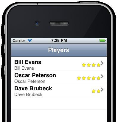
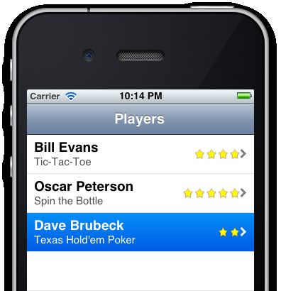
If you run the app now, it looks a lot better!
Using a Subclass for the Prototype Cell
Our table view already works pretty well but I’m not a big fan of using tags to access the labels and other subviews of the prototype cell. It would be much more handy if we could connect these labels to outlets and then use the corresponding properties. As it turns out, we can.
Add a new file to the project, with the Objective-C class template. Name it PlayerCell and make it a subclass of UITableViewCell.
Change PlayerCell.h to:
@interface PlayerCell : UITableViewCell @property (nonatomic, strong) IBOutlet UILabel *nameLabel; @property (nonatomic, strong) IBOutlet UILabel *gameLabel; @property (nonatomic, strong) IBOutlet UIImageView *ratingImageView; @end |
Replace the contents of PlayerCell.m with:
#import "PlayerCell.h" @implementation PlayerCell @synthesize nameLabel; @synthesize gameLabel; @synthesize ratingImageView; @end |
The class itself doesn’t do much, it just adds properties for nameLabel, gameLabel and ratingImageView.
Back in MainStoryboard.storyboard, select the prototype cell and change its Class to “PlayerCell” on the Identity Inspector. Now whenever you ask the table view for a new cell with dequeueReusableCellWithIdentifier, it returns a PlayerCell instance instead of a regular UITableViewCell.
Note that I gave this class the same name as the reuse identifier — they’re both called PlayerCell — but that’s only because I like to keep things consistent. The class name and reuse identifier have nothing to do with each other, so you could name them differently if you wanted to.
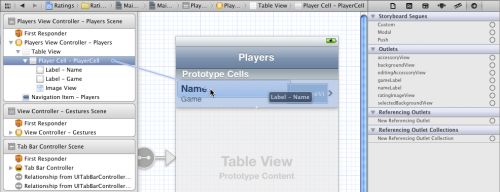
Now you can connect the labels and the image view to these outlets. Either select the label and drag from its Connections Inspector to the table view cell, or do it the other way around, ctrl-drag from the table view cell back to the label:
Important: You should hook up the controls to the table view cell, not to the view controller! You see, whenever your data source asks the table view for a new cell with dequeueReusableCellWithIdentifier, the table view doesn’t give you the actual prototype cell but a *copy* (or one of the previous cells is recycled if possible). This means there will be more than one instance of PlayerCell at any given time. If you were to connect a label from the cell to an outlet on the view controller, then several copies of the label will try to use the same outlet. That’s just asking for trouble. (On the other hand, connecting the prototype cell to actions on the view controller is perfectly fine. You would do that if you had custom buttons or other UIControls on your cell.)
Now that we’ve hooked up the properties, we can simplify our data source code one more time:
- (UITableViewCell *)tableView:(UITableView *)tableView cellForRowAtIndexPath:(NSIndexPath *)indexPath { PlayerCell *cell = (PlayerCell *)[tableView dequeueReusableCellWithIdentifier:@"PlayerCell"]; Player *player = [self.players objectAtIndex:indexPath.row]; cell.nameLabel.text = player.name; cell.gameLabel.text = player.game; cell.ratingImageView.image = [self imageForRating:player.rating]; return cell; } |
That’s more like it. We now cast the object that we receive from dequeueReusableCellWithIdentifier to a PlayerCell, and then we can simply use the properties that are wired up to the labels and the image view. I really like how using prototype cells makes table views a whole lot less messy!
You’ll need to import the PlayerCell class to make this work:
#import "PlayerCell.h" |
Run the app and try it out. When you run the app it should still look the same as before, but behind the scenes we’re now using our own table view cell subclass!
Here are some free design tips. There are a couple of things you need to take care of when you design your own table view cells. First off, you should set the highlighted color of the labels so that they look good then the user taps the row:
Second, you should make sure that the content you add is flexible so that when the table view cell resizes, the content sizes along with it. Cells will resize when you add the ability to delete or move rows, for example.
Add the following method to PlayersViewController.m:
- (void)tableView:(UITableView *)tableView commitEditingStyle:(UITableViewCellEditingStyle)editingStyle forRowAtIndexPath:(NSIndexPath *)indexPath { if (editingStyle == UITableViewCellEditingStyleDelete) { [self.players removeObjectAtIndex:indexPath.row]; [tableView deleteRowsAtIndexPaths:[NSArray arrayWithObject:indexPath] withRowAnimation:UITableViewRowAnimationFade]; } } |
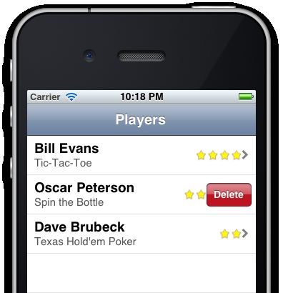
When this method is present, swipe-to-delete is enabled on the table. Run the app and swipe a row to see what happens.
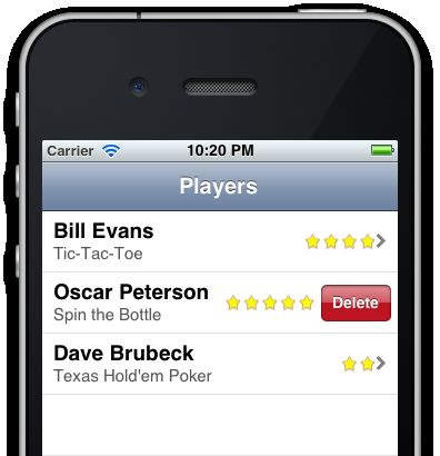
The Delete button slides into the cell but partially overlaps the stars image. What actually happens is that the cell resizes to make room for the Delete button, but the image view doesn’t follow along.
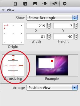
To fix this, open MainStoryBoard.storyboard, select the image view in the table view cell, and in the Size Inspector change the Autosizing so it sticks to its superview’s right edge:
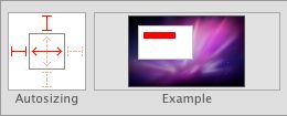
Autosizing for the labels should be set up as follows, so they’ll shrink when the cell shrinks:
With those changes, the Delete button appears to push aside the stars:
You could also make the stars disappear altogether to make room for the Delete button, but that’s left as an exercise for the reader. The important point is that you should keep these details in mind when you design your own table view cells!
http://www.raywenderlich.com/5138/beginning-storyboards-in-ios-5-part-1
