30个非凡的CSS技巧和例子
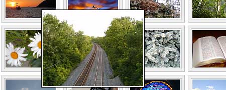
1. Hoverbox Image Gallery
A pure css-based gallery; hovering over an image enlarges it.
2. Advanced CSS Menu
A creative and complex navigation scheme.
3. Sliding Photograph Galleries
An accordion effect; hovering over an image expands it.
4. Lightbox Slides
Part of an article entitled "Supercharge your image borders " showcasing how you can use CSS styles to make images look more interesting.
5. Drop shadow on an image
Aan image effect demo and discussion based on a A List Apart article entitled, "CSS Drop shadows ".
6. Cross Browser Multi-Page Photograph Gallery
Hovering over the tabs changes the category, while hovering over an image enlarges it.
7. CSS Photo Zoom
Uses a single image and adjustment of the background-position attribute.
8. CSS gallery layout—smells like a table
Mimics a table layout, but uses lists. The gallery is also fluid width.
9. Sticky Footer
A static footer with very little XHTML required.
10. whatever: hover
A navigation menu that mimics Window’s Start menu.
11. CSS-Only Accordion Effect
An accordion effect using div’s and :hover ; the accordion effect can be vertical or horizontal.
12. Scalable CSS Buttons Using PNG and Background Colors
A technique that addresses vertical scaling, the use of many images, and lack of a hover effect.
13. Pushbutton Links
links that are styled to look like buttons without using images.
14. Scrollable Table with Fixed Header
The table’s captions stay put which is excellent for long tables.
15. Content Overlay with CSS
When you hover over the image, the container div is shown with more text.
16. A CSS styled table version 2
A beautifully styled, table with semantic mark-up - uses a background image.
17. PNG Overlay
Another way to add flare to images (rounds the corners and adds a border and drop shadow).
18. Showing Hyperlink Cues with CSS
Simple tutorial on adding icons to different types of links.
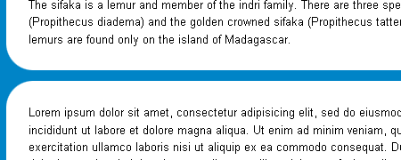
19. Simple Rounded Corner CSS Boxes
Uses only one image and very few lines of code and mark-up.
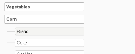
20. Sitemap Celebration
Tree-like navigation using nested lists, great for sitemap pages.
21. Easy cross-browser transparency
Opacity technique without the use of JavaScript (but at the cost of using non-valid XHTML code).
22. Curved corners 2
Fluid width and height divs with rounded corners.
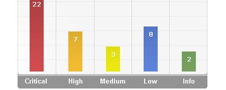
23. Creating a graph using percentage background images
List items <li> styled into bar graphs.
24. CSS Bar Graphs: Examples
3 bar graph examples - "Basic CSS Bar Graph", "Complex CSS Bar Graph", and "Vertical CSS Bar Graph" using div’s and definition list tags.
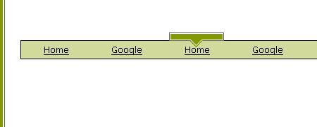
25. Animated Rollover Arrow
The arrow follows along the entire width of the navigation bar smoothly, without the use of JavaScript or animated gif’s.
26. A CSS-based Form Template
Showcases an accessible web form.
27. CSS Image Text Wrap
Using empty spacer div’s, the page’s text mimics a wrapping effect around the background image.
28. Before your very eyes - a fade-in image
A demo using opacity and a single image that gradually fades in to cover the text.
29. Pure CSS Pop-ups
A pop-up technique that works even in IE 5 Mac.
30. CSS Gradient Text Effect
Uses background image overlays, and empty span tag, and position: absolute to create a gradient effect on text.
原文链接:
30 Exceptional CSS Techniques and Examples
