Android shap的使用
shape 是形状的意思,使用它可以设置自己的shape
<selector xmlns:android="http://schemas.android.com/apk/res/android" >
    <item android:state_focused="true">
        <shape>
            <corners />
            <gradient />
            <padding />
            <size />
            <solid />
            <stroke />

        </shape>
    </item>

</selector>
它的所有属性都在上面了
从简单的开始看起:
1.solid就是控件填充的颜色,该标签只有一个属性
<solid
android:color="#ffff0000"/>
这个使用红色填充使用它的控件
2.padding 这个内填充,跟Xml的padding是一个意思,说明:略
该属性只有4个值
 <padding
                android:left="10dp"
                android:top="10dp"
                android:right="10dp"
                android:bottom="10dp"
                />
3. size 知道控件的宽度跟高度,控件的width height设置为wrap_content才有效,说明:略
只有2个值,不建议设置
<size

                android:width="50dp"
                android:height="100dp"/><pre name="code" class="java">
4. corners 这个是角度,只有5个属性
 <corners
                android:radius="30dp"
                android:bottomLeftRadius="10dp"
                android:topRightRadius="10dp"
                android:bottomRightRadius="10dp"
                android:topLeftRadius="50dp"
                 />
是各个顶点角度的值,单位是dp,值越大角度就越大,这个很容易理解,如果不理解,动手试验一下就明白了
5.stroke 是描边的意思 只有4个属性
<stroke
android:width="3dp"
android:color="#aaff0000"
android:dashWidth="10dp"
android:dashGap="20dp"
/>
默认的是实线的描边
width 是描边的宽度
cllor时候 描边的颜色
如果要使用虚线(-----) 那么就加入另外2个属性
dashWidth 是每个点(-)的长度
dashgap 每个点(-)之间的宽度
使用虚线时才需要设置这个值
6.gradient 最后一个最复杂的渐变效果
所有属性如下:
<pre name="code" class="java"> <gradient
                android:startColor=""
                android:centerColor=""
                android:endColor=""
                android:useLevel=""
                android:angle=""
                android:type=""
                android:centerX=""
                android:centerY=""
                android:gradientRadius=""
                 />
是使控件的颜色有一个渐变的过程的一个属性,使用这个的话,那么solid就不可以使用的,否则没有效果
so要注释掉solid属性
<pre name="code" class="java">startColor 跟 endColor 就是从哪一个颜色渐变到另一种颜色
<pre name="code" class="java">centerColor 是渐变的中间值,个人理解是前一半跟后一半要变化的变化量的控制useLevel 本人试验了,默认是false ,设置为true的话,没有找到其规律,
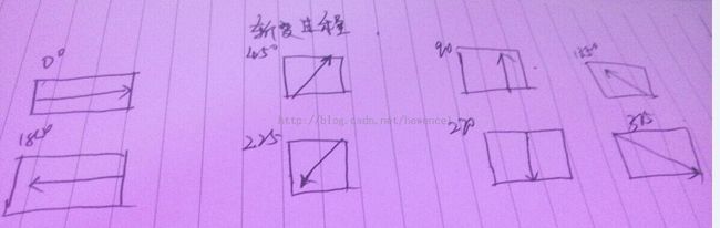
angle 是角度,必须要是45的倍数,否则运行时报错。角度指明从空间的哪一个角度开始渐变
度数是 渐变的角度, 比如说 0 就是从左到右的渐变,45 就是从左下角到右上角渐变,90 ,就是从下到上的渐变
如图 手绘的图,用软件话浪费时间
type 是类 默认是 linear (线性渐变)
type :radial 要指定半径也就是
android:gradientRadius="20"
type : sweep 这个值没有看懂啥意思
android:centerX=""
android:centerY=""
指定Xy轴的中心点
使用:
<Button
android:layout_width="wrap_content"
android:layout_height="50dp"
android:layout_centerHorizontal="true"
android:layout_below="@id/shape"
android:layout_marginTop="20dp"
android:background="@drawable/my_select"
android:text="Shape2"/>
xml为
<?xml version="1.0" encoding="utf-8"?>
<selector xmlns:android="http://schemas.android.com/apk/res/android" >


    <item android:state_focused="false">
        <shape>
            <corners
                android:radius="30dp"
                 />
            <gradient
                android:startColor="#ff000000"
                android:endColor="#ffffffff"
                android:angle="45"
                android:type="linear"

                />
            <!-- 默认是linear
            使用radial时要指定半径  那么从中心点开始变化 -->
            <padding
                android:left="10dp"
                android:top="10dp"
                android:right="10dp"
                android:bottom="10dp"
                />
            <!--   width  跟 height 的值被控件的值大/少时不生效
            除非使用wrap_content
             -->
            <size

                android:width="50dp"
                android:height="100dp"/>
            <!--  <solid
                android:color="#55ffff00"/>  -->
            <stroke
                android:width="3dp"
                android:color="#aaff0000"
                android:dashWidth="10dp"
                android:dashGap="20dp"
                 />

        </shape>
    </item>

</selector>
运行结果