CSS3 之2D变换(旋转,缩放,位移,矩阵函数)
CSS3 之2D变换
l transform
• rotate() 旋转函数 取值度数
– deg 度数
– Transform-origin旋转的基点
• skew()倾斜函数 取值度数
– skewX()
– skewY()
• scale()缩放函数 取值 正数、负数和小数
– scaleX()
– scaleY()
• translate()位移函数
– translateX()
– translateY()
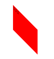
1. rotate() 旋转函数取值度数
– deg 度数
<style>
body{height:400px;border:1pxsolid #000;}
.box{width:100px;height:100px;background:Red;margin:100pxauto 0; transition:2s;}
body:hover .box{ -webkit-transform:rotate(360deg);}
</style>
</head>
<body>
<divclass="box">111</div>
</body>
2. 斜切
1) skewX()
<style>
body{height:400px;border:1pxsolid #000;}
.box{width:100px;height:100px;background:Red;margin:100pxauto 0; transition:2s;}
body:hover .box{ -webkit-transform:skewX(45deg);}
</style>
</head>
<body>
<divclass="box">111</div>
</body>


2) skewY()
<style>
body{height:400px;border:1pxsolid #000;}
.box{width:100px;height:100px;background:Red;margin:100pxauto 0; transition:2s;}
body:hover .box{ -webkit-transform:skewY(45deg);}
</style>
</head>
<body>
<divclass="box">111</div>
</body>
3) X,Y综合
<style>
body{height:400px;border:1pxsolid #000;}
.box{width:100px;height:100px;background:Red;margin:100pxauto 0; transition:2s;}
body:hover .box{ -webkit-transform:skew(15deg,30deg);}
</style>
</head>
<body>
<divclass="box">111</div>
</body>

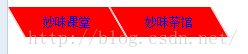
4) 综合案例:斜切的导航
<style>
ul{margin:0;padding:0; list-style:none;}
li{float:left;width:100px;text-align:center;height:30px;border:1px solid #fff; background:Red;font:12px/30px "宋体"; -webkit-transform:skewX(30deg);}
a{text-decoration:none;-webkit-transform:skewX(-30deg); display:block;}
</style>
</head>
<body>
<ul>
<li><ahref="#">妙味课堂</a></li>
<li><a href="#">妙味茶馆</a></li>
</ul>
</body>
3. scale()缩放函数取值正数、负数和小数
body{height:400px;border:1px solid #000;}
.box{width:100px;height:100px;background:Red;margin:100pxauto 0; transition:2s;}
body:hover .box{-webkit-transform:scale(2);}
</style>
</head>
<body>
<divclass="box">111</div>
</body>
放大2倍
4. translate()位移函数
<style>
body{height:400px;border:1px solid #000;}
.box{width:100px;height:100px;background:Red;margin:100pxauto 0; transition:2s;}
body:hover .box{ -webkit-transform:translate(-100px,200px);}
</style>
</head>
<body>
<div class="box">111</div>
</body>
向左下移动
5. Transform-origin变换基点
旋转默认是以元素中心旋转
例1:关键字形式
基点:右下 加旋转,缩小
<style>
body{height:300px;border:1px solid #000;}
.box{width:100px;height:100px;background:Red;margin:100pxauto; transition:5s; -webkit-transform-origin:rightbottom;}
body:hover .box{-webkit-transform:rotate(360deg) scale(0.2);}
</style>
</head>
<body>
<divclass="box">111</div>
</body>
例2:具体数值
<style>
body{height:300px;border:1pxsolid #000;}
.box{width:100px;height:100px;background:Red;margin:100pxauto; transition:5s; -webkit-transform-origin:200px200px;}
body:hover.box{ -webkit-transform:rotate(360deg) scale(0.2);}
</style>
</head>
<body>
<divclass="box">111</div>
</body>
基点在方块外,实现图片向外旋转出去的效果
6. Transform 执行顺序问题 — 后写先执行
<style>
body{height:300px;border:1pxsolid #000;}
.box{width:100px;height:100px;background:Red;margin:10px;transition:1s;}
body:hover.box:nth-of-type(1){ -webkit-transform:translateX(100px) scale(0.5);}
body:hover.box:nth-of-type(2){ -webkit-transform:scale(0.5) translateX(100px);}
</style>
</head>
<body>
<divclass="box">111</div>
<divclass="box">222</div>
</body>
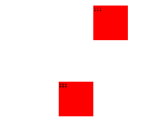
顺序不同,执行出效果就不同
第一个:先缩放0.5,再向右走100px
第二个:先向右走100px,再缩小0.5,相当于向右走50
7. matrix(a,b,c,d,e,f)矩阵函数
8.
标准模式:
matrix(1,0,0,1,0,0)(默认形式)
matrix(a,b,c,d,e,f);
IE模式:
progid:DXImageTransform.Microsoft.Matrix(M11= 1, M12= 0, M21= 0 , M22=1,SizingMethod='auto expand');
Matrix(M11= a, M12= c, M21= b , M22=d,SizingMethod='auto expand');
1) 通过矩阵实现位移
x轴位移: e=e+x
y轴位移: f=f+y
<style>
body{height:300px;border:1pxsolid #000;}
.box{width:100px;height:100px;background:red;transition:1s;}
body:hover .box{ -webkit-transform:matrix(1,0,0,1,200,300);}
/*
位移:
x:e+disX
y:f+disY
*/
</style>
</head>
<body>
<divclass="box"></div>
</body>
2) 缩放:
x轴缩放 a=x*a c=x*c;
y轴缩放 b=y*b d=y*d;
X轴缩放0.5,Y轴缩放0.2
<style>
body{height:300px;border:1pxsolid #000;}
.box{width:100px;height:100px;background:red;transition:1s;}
</style>
</head>
<body>
<div class="box"id="box"></div>
<script>
varoBox=document.getElementById("box");
oBox.onclick=function()
{
oBox.style.WebkitTransform="matrix(0.5,0,0,0.2,0,0)";
oBox.style.MozTransform="matrix(0.5,0,0,0.2,0,0)";
oBox.style.transform="matrix(0.5,0,0,0.2,0,0)";
oBox.style.filter="progid:DXImageTransform.Microsoft.Matrix(M11= 0.5, M12= 0, M21= 0 , M22=0.2,SizingMethod='auto expand')";
}
</script>
3) 通过矩阵实现倾斜
x轴倾斜: c=Math.tan(xDeg/180*Math.PI)
y轴倾斜: b=Math.tan(yDeg/180*Math.PI)
X轴倾斜30度,c=Math.tan(30/180*Math.PI)约等于0.58
<style>
body{height:300px;border:1pxsolid #000;}
.box{width:100px;height:100px;background:red;transition:1s;}
</style>
</head>
<body>
<div class="box"id="box"></div>
<script>
varoBox=document.getElementById("box");
oBox.onclick=function()
{
oBox.style.WebkitTransform="matrix(1,0,0.58,1,0,0)";
oBox.style.MozTransform="matrix(1,0,0.58,1,0,0)";
oBox.style.transform="matrix(1,0,0.58,1,0,0)";
oBox.style.filter="progid:DXImageTransform.Microsoft.Matrix(M11= 1, M12= 0.58, M21= 0 , M22=1,SizingMethod='auto expand')";
}
</script>
</body>
斜切加放大
<style>
body{height:300px;border:1pxsolid #000;}
.box{width:100px;height:100px;background:red;transition:1s;}
</style>
</head>
<body>
<div class="box"id="box"></div>
<script>
varoBox=document.getElementById("box");
oBox.onclick=function()
{
oBox.style.WebkitTransform="matrix(2,1.16,0,2,0,0)";
oBox.style.MozTransform="matrix(1,0.58,0,1,0,0)";
oBox.style.transform="matrix(1,0.58,0,1,0,0)";
oBox.style.filter="progid:DXImageTransform.Microsoft.Matrix(M11= 1, M12= 0, M21= 0.58 , M22=1,SizingMethod='auto expand')";
}
</script>
</body>
4) 通过矩阵实现旋转
a=Math.cos(deg/180*Math.PI);
b=Math.sin(deg/180*Math.PI);
c=-Math.sin(deg/180*Math.PI);
d=Math.cos(deg/180*Math.PI);
旋转30度
<style>
body{height:300px;border:1pxsolid #000;}
.box{width:100px;height:100px;background:red;transition:1s;}
</style>
</head>
<body>
<div class="box"id="box"></div>
<script>
varoBox=document.getElementById("box");
oBox.onclick=function()
{
oBox.style.WebkitTransform="matrix(0.87,0.5,-0.5,0.87,0,0)";
oBox.style.MozTransform="matrix(0.87,0.5,-0.5,0.87,0,0)";
oBox.style.transform="matrix(0.87,0.5,-0.5,0.87,0,0)";
oBox.style.filter="progid:DXImageTransform.Microsoft.Matrix(M11= 0.87, M12= -0.5, M21= 0.5 , M22=0.87,SizingMethod='auto expand')";
alert(this.offsetWidth);
}
</script>
一个小bug,在IE下,不是围绕中心旋转
5) IE下基点修正
<style>
.box{width:100px;height:100px;margin:30px auto;position:relative;border:1px solid #000;}
#box{width:100px;height:100px;background:red;position:absolute;left:0;top:0;}
</style>
</head>
<body>
<div class="box">
<divid="box"></div>
</div>
<script>
var oBox=document.getElementById("box");
var iDeg=0;
setInterval(function(){
iDeg++;
toRotate(oBox,iDeg);
},30);
function toRotate(obj,iDeg)
{
vara=Math.round(Math.cos(iDeg/180*Math.PI)*100)/100;
varb=Math.round(Math.sin(iDeg/180*Math.PI)*100)/100;
var c=-b;
var d=a;
obj.style.WebkitTransform="matrix("+a+","+b+","+c+","+d+",0,0)";
obj.style.MozTransform="matrix("+a+","+b+","+c+","+d+",0,0)";
obj.style.transform="matrix("+a+","+b+","+c+","+d+",0,0)";
obj.style.filter="progid:DXImageTransform.Microsoft.Matrix(M11="+a+", M12= "+c+", M21= "+b+" ,M22="+d+",SizingMethod='auto expand')";
obj.style.left=(obj.parentNode.offsetWidth-obj.offsetWidth)/2+"px";
obj.style.top=(obj.parentNode.offsetHeight-obj.offsetHeight)/2+"px";
}
</script>
</body>