100 outstanding interactive maps of 2015 – part 1…
http://visualoop.com/blog/90498/100-outstanding-interactive-maps-of-2015-part-1
Welcome to the first part of this post with 100 interactive maps that stood out in 2015, among the hundreds we featured every week on our Digital Cartography column. So, this means that this should not be considered as a “best maps of the year″ post, since we are not taking in consideration the ones that we didn’t feature on Visualoop – although we’re sure that most of the ones gathered in this compilation definitively deserve that title.
This was a year in which maps continued to be among the favorite – or at least, among the most used – visualizations used by news portals and online publishers in general. Major events happening at a worldwide scale, from the conflicts in Syria and Iraq, the refugee crisis and terrorist attacks, to historical elections in several countries, and maps were a crucial part of the journalistic effort to clarify and inform what was really taking place.
The popularity of maps can also be viewed in the number of independent projects by companies and designers that we brought together in this selection. These projects take full advantage of the tools – new and improved ones – and techniques for storytelling with maps, to create impressive visualizations around topics such as the environment, politics, economics, transport, health and sports, just to name a few.
Overall, it was another exciting year for visualization, and interactive map-making in particular. Hope you’ll appreciate these first 50 picks as much as we did – specially because it was really hard to select them among so many great examples.
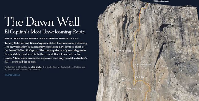
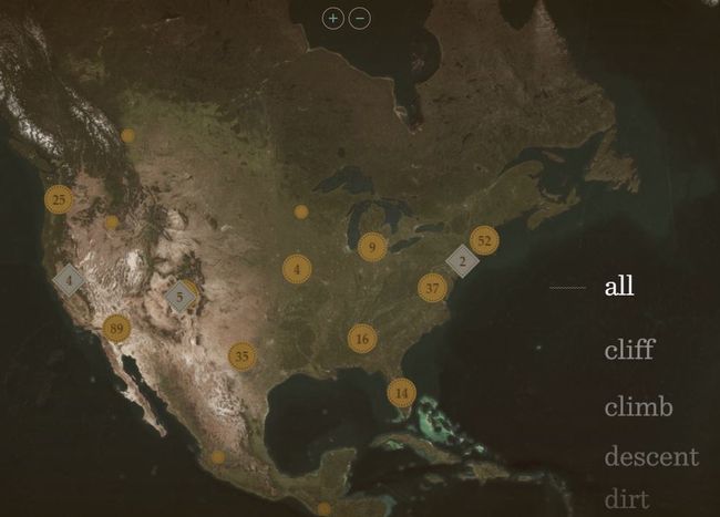
The Dawn Wall | The New York Times
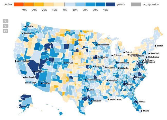
Mapping America’s Future | Urban Institute
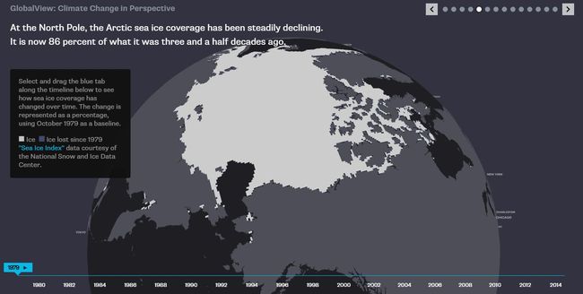
Global View: Climate Change in Perspective | Bloomberg
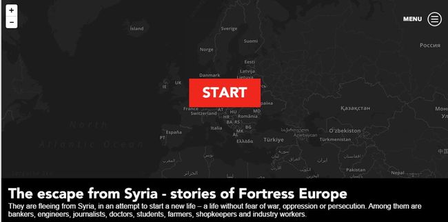
Fortress Europe | Sverige Radio
Mapping the Most Common Races | Flowing Data
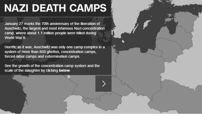
Nazi death camps | CNN
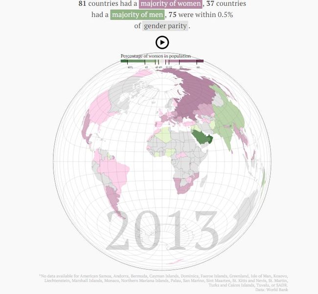
World Sex Map | Quartz
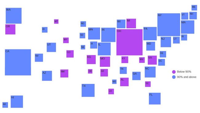
Why Measles May Just Be Getting Started | Bloomberg Visual Data
Religions of our representatives | The Washington Post
Stream of Foreign Wealth Flows to Elite New York Real Estate | The New York Times
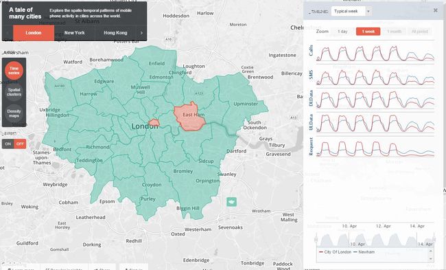
A tale of many cities | MIT Senseable Lab
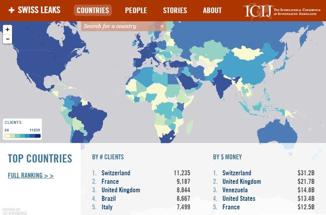
Swiss Leaks Data Explorer | ICIJ
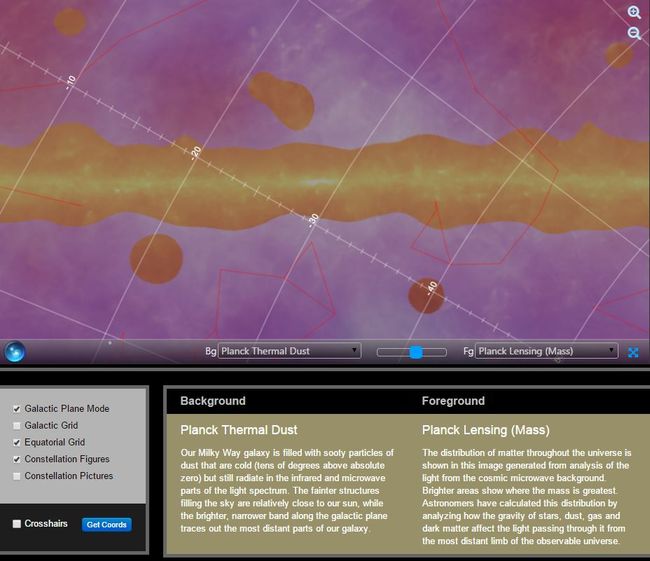
Map of Milky Way | NASA’s Jet Propulsion Lab /Planck Institute
Baidu Migration map | Baidu
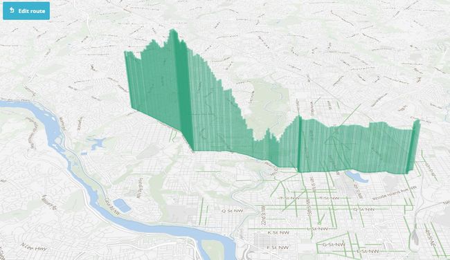
Capital Bikeshare | Mapbox
The first ten years of OpenStreetMap | Mapbox
Read more about this project
SF Tweet Data | Nick Shelton
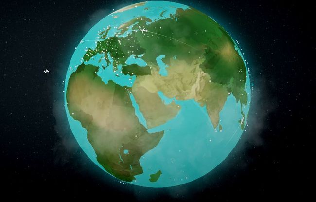
Airbnb activities around the world | Airbnb
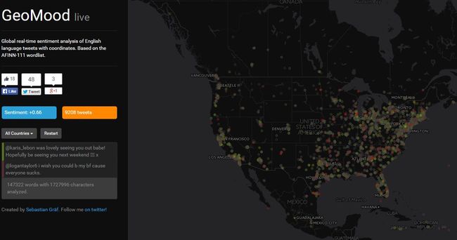
GeoMood | Sebastian Gräf
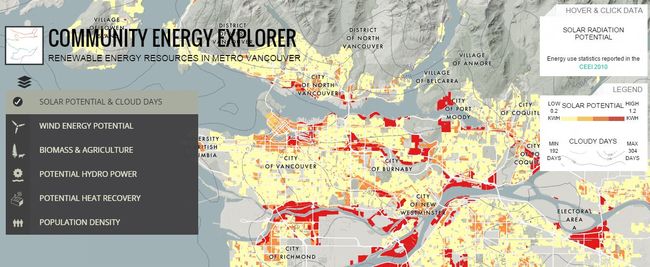
Energy Explorer | Metro Vancouver
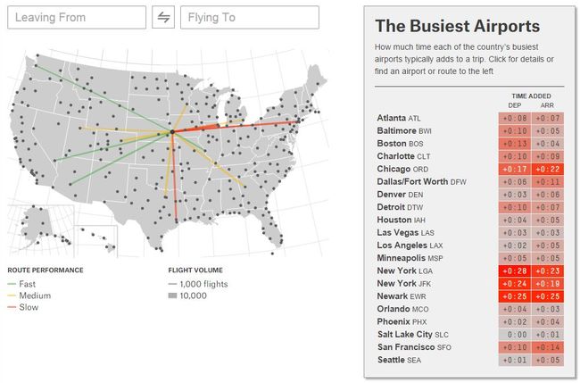
Which Flight Will Get You There Fastest? | FiveThirtyEight
Carsharing in Berlin | Tagesspigel
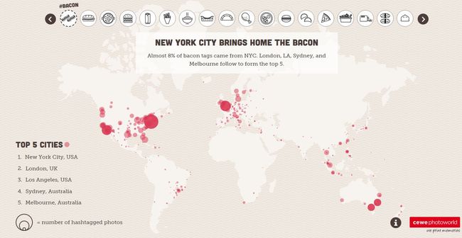
The food capitals of Instagram | Cewe Photoworld
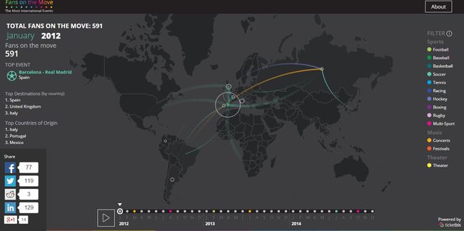
Fans on the Move | Ticketbiz
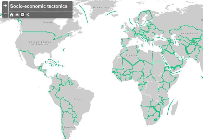
Socio-Economic Tectonics | Kenneth Field
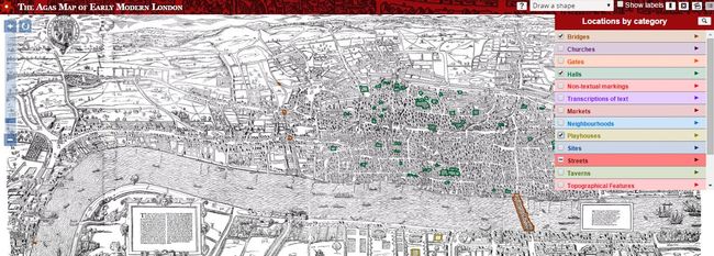
The Agas Map of early modern London | University of Victoria
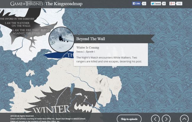
Game of Thrones: The Kingsroadmap – An interactive journey through seasons 1-5 | Direct TV
The Best and Worst Places to Grow Up: How Your Area Compares | The Upshot
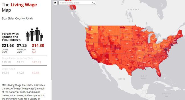
Living Wage Map | Esri
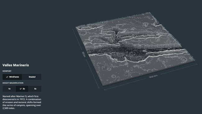
Mars explorer | MapBox
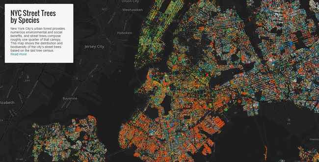
NYC Street Trees | Jill Hubley
(Read more about this project)
Divvy Trips | Divvy
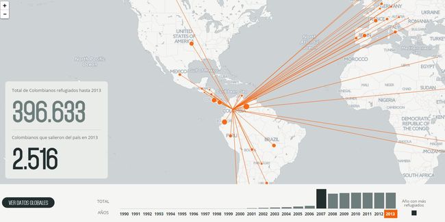
Colombia Refugiada | El Tiempo
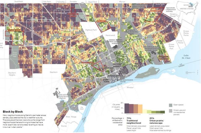
Taking Back Detroit | National Geographic
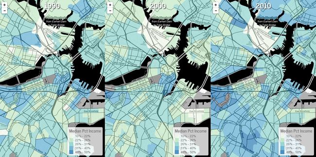
Rising Rents in Boston | Ungentry
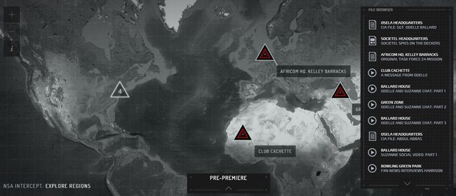
American Odeyssey Google Map | NBC
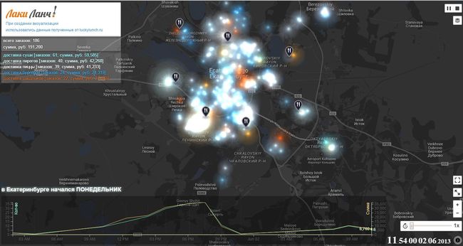
Lucky Lunch Map | Lucky Lunch
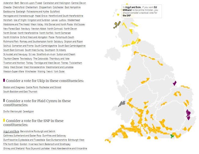
Election 2015: Where to vote tactically to get the prime minister you want | The Guardian
Well Storied | Land Rover
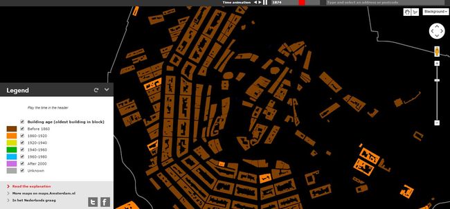
Amsterdam Growing Over Time | City of Amsterdam
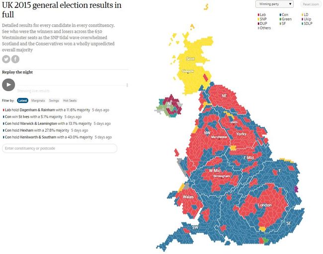
UK 2015 general election results in full | The Guardian
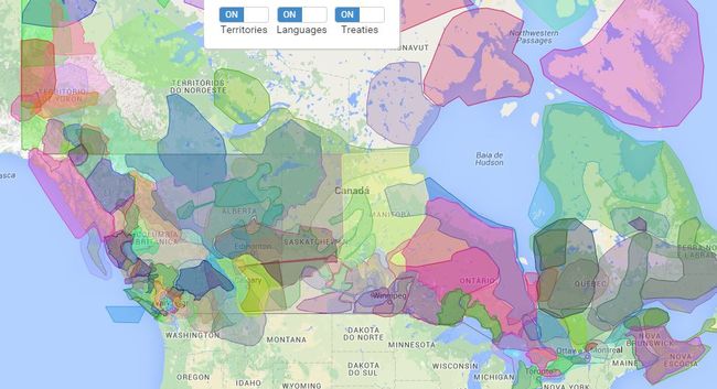
Native-land.ca | Victor Gerard Temprano
Homicide Monitor | Igarape Institute
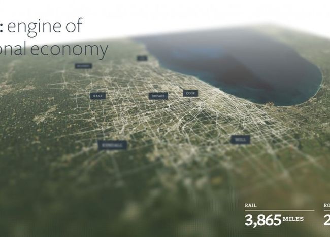
Mobility: engine of our regional economy | CMAP
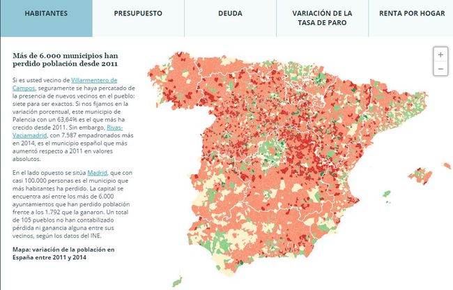
Spain in numbers | El Español
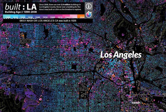
LA Building Age | cityHUB Los Angeles
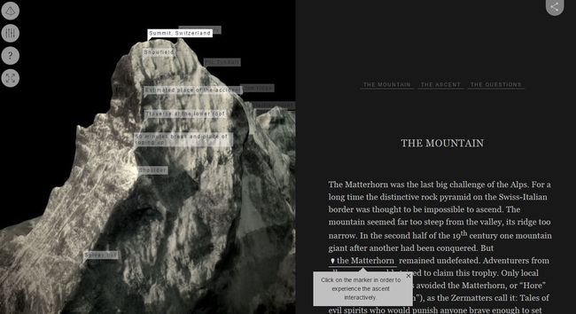
Chasing the Matterhorn | Neue Zurcher Zeitung
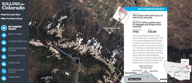
Killing the Colorado (maps) | Propublica
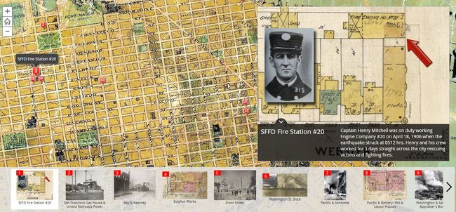
The San Francisco 1906 Earthquake & Fire | Chris Ingram
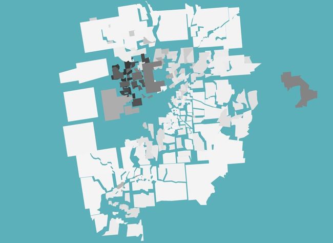
Visualizing The Racial Divide | Jim Vallandingham
That’s it for the first part of our selection of outstanding interactive maps of 2015. Don’t miss next week’s follow-up, as well as the other similar round ups we’ll be publishing in the next few days. And if that isn’t enough, feel free to browse through thousands of interactive maps on Pinterest.
