(二)安卓android游戏开发之2048游戏开发教程----深刻理解LinearLayout布局
(二)安卓android游戏开发之2048游戏开发教程----深刻理解LinearLayout布局
时间:2014年8月26日
出处:http://blog.csdn.net/u013011841
声明:欢迎指出错误
1、为什么要学习LinearLayout布局?
LinearLayout是安卓系统里面最基础最重要的一种布局,也叫线性布局,其他的布局跟线性布局只有一些细微的区别.学好了线性布局,其他的布局方式也能很快掌握。
2、什么是线性布局?
线性布局是一种所有控件在一条线上的容器(ViewGroup).
这里线性很重要,一定要理解为什么叫线性.
- PS: ViewGroup是什么意思呢? ViewGroup就是能容纳各种控件的容器,所以你在线性布局里面能一起放进去TextView、button等容器.

这里整个图设置为线性布局,高度为整个屏幕的高度,里面有三个控件,只是宽度所占用的比例不同,源代码如下:
<LinearLayout xmlns:android="http://schemas.android.com/apk/res/android"
    xmlns:tools="http://schemas.android.com/tools"
    android:id="@+id/LinearLayout2"
    android:layout_width="match_parent"
    android:layout_height="match_parent"
    tools:context=".MainActivity" >

    <TextView
        android:layout_width="wrap_content"
        android:layout_height="fill_parent"
        android:layout_weight="1"
        android:background="#00BFFF"/>

     <TextView
        android:layout_width="wrap_content"
        android:layout_height="fill_parent"
        android:layout_weight="2"
        android:background="#00EE00"/>

      <TextView
        android:layout_width="wrap_content"
        android:layout_height="fill_parent"
        android:layout_weight="1"
        android:background="#00BFFF" />

</LinearLayout>
3、线性布局最重要的属性! android:orientation
因为线性布局是一种控件在一条线上的ViewGroup, 因此这条线可以是水平方向和垂直方向的,你可以修改 android:orientation 属性来修改这个线性方向.
一旦选好了方向,比如说水平方向,那么控件只能一个一个能左到右堆放。布局的高度为其包含的控件中最高的控件的高度,宽度则没有限制。
上面的方向是水平走向的,那么我们再来一个垂直走向的。

源代码如下
<LinearLayout xmlns:android="http://schemas.android.com/apk/res/android"
    xmlns:tools="http://schemas.android.com/tools"
    android:id="@+id/LinearLayout2"
    android:layout_width="match_parent"
    android:layout_height="match_parent"
    android:orientation="vertical"
    tools:context=".MainActivity" >

    <TextView
        android:layout_width="match_parent"
        android:layout_height="wrap_content"
        android:layout_weight="1"
        android:background="#00BFFF"/>

     <TextView
        android:layout_width="match_parent"
        android:layout_height="wrap_content"
        android:layout_weight="2"
        android:background="#00EE00"/>

      <TextView
        android:layout_width="match_parent"
        android:layout_height="wrap_content"
        android:layout_weight="1"
        android:background="#00BFFF"/>

</LinearLayout>
4、线性布局第二重要的属性android:weight
线性布局还可以通过指定android:weight为控件选择比重,这个属性指明了该控件在屏幕中显示的“重要程度”.比重值大的优先铺满剩下的容器.
- 为什么说比重大的优先铺满剩下的容器?
一般来说我们不用刻意去了解这个事情,但是在某些特殊情况下会起到关键的作用,所以我们这里只需要了解就可以了。
假设第1第2个控件的比重为1,第3个控件的比重为2,我们先看看效果.

那么现在的意思是第3个控件比其他两个控件更重要,然后测量所有控件该占的宽度,设宽度400,前面两个控件占200宽度,然后在两个控件的右边显示浅蓝色的控件3,最后再根据前两个控件占的比重,求出分别占用的比例,在剩下的空间里把俩控件画出来。
<LinearLayout xmlns:android="http://schemas.android.com/apk/res/android"
    xmlns:tools="http://schemas.android.com/tools"
    android:id="@+id/LinearLayout2"
    android:layout_width="match_parent"
    android:layout_height="match_parent"  >

    <TextView
        android:layout_width="wrap_content"
        android:layout_height="match_parent"
        android:layout_weight="1"
        android:background="#00005F"/>

     <TextView
        android:layout_width="wrap_content"
        android:layout_height="match_parent"
        android:layout_weight="2"
        android:background="#000FFF"/>

      <TextView
        android:layout_width="wrap_content"
        android:layout_height="match_parent"
        android:layout_weight="2"
        android:background="#0FFFFF"/>

</LinearLayout>
5、为什么不在线性布局的线性方向上使用match_parent或fill_parent?
首先先说明一个事情就是推荐使用match_parent而不用fill_parent,因为在API 8开始谷歌就开始使用match_parent来替代fill_parent了,他们俩实现的功能完全一样,在新版本仍然兼容fill方法,但是不推荐使用了。
而谷歌推荐的呢就是采用"0dp"或者"wrap_content"(恰好包住内容)的方法来设置宽度,这样的话就是按正常的逻辑来生成布局的。
接下来我们就来说明一下为什么不使用match_parent!!
我们先给一段代码:
<LinearLayout xmlns:android="http://schemas.android.com/apk/res/android"
    xmlns:tools="http://schemas.android.com/tools"
    android:id="@+id/LinearLayout2"
    android:layout_width="match_parent"
    android:layout_height="match_parent"  >

    <TextView
        android:layout_width="match_parent"
        android:layout_height="match_parent"
        android:layout_weight="1"
        android:background="#00005F"/>

     <TextView
        android:layout_width="match_parent"
        android:layout_height="match_parent"
        android:layout_weight="2"
        android:background="#000FFF"/>

      <TextView
        android:layout_width="match_parent"
        android:layout_height="match_parent"
        android:layout_weight="2"
        android:background="#0FFFFF"/>

</LinearLayout>
看似跟上一段代码很像,就是把wrap_content改成match_content,比重设置不变,照理说应该还是上面那效果,但事实完全相反

这是为什么呢?这好像在背口决一样,选match_parent时比重大的占比例小,小的占的多。
事实是这样子的,我没读过源码,但是根据网上搜索的一些资料,我推测出谷歌给出的这个数学模型应该是这个样子的。

再举一个例子,如果不是match_parent
<LinearLayout xmlns:android="http://schemas.android.com/apk/res/android"
    xmlns:tools="http://schemas.android.com/tools"
    android:id="@+id/LinearLayout2"
    android:layout_width="match_parent"
    android:layout_height="match_parent"  >

    <TextView
        android:layout_width="wrap_content"
        android:layout_height="match_parent"
        android:layout_weight="1"
        android:text="11111111111111"
        android:background="#00005F"/>

     <TextView
        android:layout_width="wrap_content"
        android:layout_height="match_parent"
        android:layout_weight="2"
        android:background="#000FFF"/>

      <TextView
        android:layout_width="wrap_content"
        android:layout_height="match_parent"
        android:layout_weight="2"
        android:background="#0FFFFF"/>

</LinearLayout>
效果如下
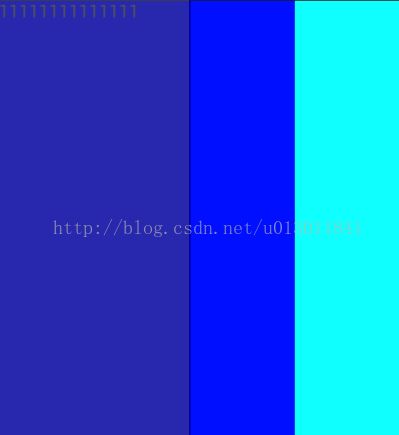
那么会发现虽然采用了wrap_parent,但是并没有恰好包裹控件,这是因为宽度是在原来的基础上还要加上剩余的空间的比例.
设屏幕为400,文字也就是控件本来的宽度占了180,剩下的宽度为120那么由Li=Lw+R*(wi/w1+w2+w3)=180+120*(1/5)=204.
剩下的俩控件宽度分别为(196/20)=98.
6、最后生成2048游戏布局
<LinearLayout xmlns:android="http://schemas.android.com/apk/res/android"
    xmlns:tools="http://schemas.android.com/tools"
    android:id="@+id/LinearLayout1"
    android:layout_width="match_parent"
    android:layout_height="match_parent"
    android:orientation="vertical"
    tools:context=".MainActivity">

    <LinearLayout
        android:layout_width="fill_parent"
        android:layout_height="wrap_content"
        android:orientation="horizontal">
        <TextView
            android:layout_width="wrap_content"
            android:layout_height="wrap_content"
            android:text="@string/Score"/>
        <TextView
            android:layout_width="fill_parent"
            android:layout_height="wrap_content"
            android:id="@+id/tvScore"/>

    </LinearLayout>

    <GridLayout
        android:layout_width="fill_parent"
        android:layout_height="0dp"
        android:layout_weight="1"
        android:id="@+id/gameView">

    </GridLayout>

</LinearLayout>
效果如下:


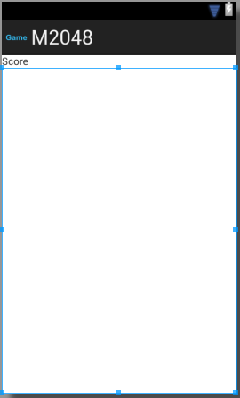
先是建立一行水平的线性布局,剩下的空间全部由表格布局填满。