reportLab的实践
1. 网上找的资料,先来个简单的:
from reportlab.pdfgen import canvas
def hello(c):
	c.drawString(100,100,"Hello World")
c = canvas.Canvas("hello.pdf")
hello(c)
c.showPage()
c.save()
页面能出一个hello的字
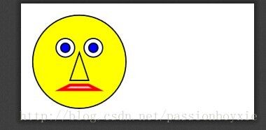
2. 下面出现个笑脸
from reportlab.lib import colors
from reportlab.graphics import shapes
from reportlab.graphics import widgetbase
from reportlab.graphics import renderPDF
d = shapes.Drawing(200, 100)
f = widgetbase.Face()
f.skinColor = colors.yellow
f.mood = "sad"
d.add(f)
renderPDF.drawToFile(d, 'face.pdf', 'A Face')
出现的结果如下:
3. 以下实现画饼图
from reportlab.graphics.charts.piecharts import Pie
from reportlab.graphics.shapes import Drawing, _DrawingEditorMixin
from reportlab.lib.colors import Color, magenta, cyan

class pietests(_DrawingEditorMixin,Drawing):
    def __init__(self,width=400,height=200,*args,**kw):
        Drawing.__init__(self,width,height,*args,**kw)
        self._add(self,Pie(),name='pie',validate=None,desc=None)
        self.pie.sideLabels       = 1
        self.pie.labels           = ['Label 1', 'Label 2', 'Label 3', 'Label 4', 'Label 5']
        self.pie.data             = [20, 10, 5, 5, 5]
        self.pie.width            = 140
        self.pie.height           = 140
        self.pie.y                = 35
        self.pie.x                = 125


def main():
    drawing = pietests()
    # you can do all sorts of things to drawing, lets just save it as pdf and png.
    drawing.save(formats=['pdf','png'],outDir='.',fnRoot=None)
    return 0

if __name__ == '__main__':
    main()
结果如下:
4. 画直线:
#!/usr/bin/env python2.6
#coding:utf-8

import traceback

from reportlab.graphics.shapes import Drawing
from reportlab.graphics.charts.lineplots import LinePlot
from reportlab.graphics.charts.textlabels import Label
from reportlab.graphics import renderPDF
from reportlab.graphics.widgets.markers import makeMarker
from reportlab.pdfbase import pdfmetrics, ttfonts

    #注意data的类型,
    #每一个数据点是一个元组
    #一条曲线对应一个存储数据点元组的元组
    #一个图形可以包含多条曲线,用列表存储曲线元组
data=[((1,100),(2,200),(3,300),(4,400),(5,500)),((1,50),(2,80),(3,400),(4,40),(5,70))]

drawing = Drawing(500, 300)

lp = LinePlot()
lp.x = 50 #坐标轴中心坐标
lp.y = 30
lp.height = 250
lp.width = 400
lp.data = data
lp.joinedLines = 1
lp.lines.symbol = makeMarker('FilledCircle')

lp.xValueAxis.valueMin = 1
lp.xValueAxis.valueMax = 5
lp.xValueAxis.valueStep = 1

lp.yValueAxis.valueMin = 0
lp.yValueAxis.valueMax = 500
lp.yValueAxis.valueStep = 100
drawing.add(lp)

title = Label()
    #若需要显示中文,需要先注册一个中文字体
pdfmetrics.registerFont(ttfonts.TTFont("haha", "simsun.ttc"))
title.fontName   = "haha"
title.fontSize   = 12
#title_text = unicode('你好','gbk')
title_text = "你好"
    #title_text = "abc"
title._text = title_text
title.x          = 250
title.y          = 280
title.textAnchor ='middle'
drawing.add(title)

Xlabel = Label()
Xlabel._text = 'x'
Xlabel.fontSize   = 12
Xlabel.x          = 480
Xlabel.y          = 30
Xlabel.textAnchor ='middle'
drawing.add(Xlabel)

Ylabel = Label()
Ylabel._text = "y"
Ylabel.fontSize   = 12
Ylabel.x          = 40
Ylabel.y          = 295
Ylabel.textAnchor ='middle'
drawing.add(Ylabel)

#try:
#    drawing.save(formats=['gif'],outDir=".",fnRoot="test")
#except:
#    traceback.print_exc()

renderPDF.drawToFile(drawing,'line.pdf','Double')
出的结果如下:
5. 画的曲线
from reportlab.graphics.shapes import Drawing
from reportlab.graphics.charts.barcharts import VerticalBarChart

drawing = Drawing(400, 200)
data = [
(13, 5, 20, 22, 37, 45, 19, 4),
(14, 6, 21, 23, 38, 46, 20, 5)
]
bc = VerticalBarChart()
bc.x = 50
bc.y = 50
bc.height = 125
bc.width = 300
bc.data = data
#bc.strokeColor = colors.black
bc.valueAxis.valueMin = 0
bc.valueAxis.valueMax = 50
bc.valueAxis.valueStep = 10
bc.categoryAxis.labels.boxAnchor = 'ne'
bc.categoryAxis.labels.dx = 8
bc.categoryAxis.labels.dy = -2
bc.categoryAxis.labels.angle = 30
bc.categoryAxis.categoryNames = ['Jan-99','Feb-99','Mar-99',
'Apr-99','May-99','Jun-99','Jul-99','Aug-99']

drawing.add(bc)
drawing.save()

from reportlab.graphics.charts.lineplots import LinePlot
from reportlab.graphics.widgets.markers import makeMarker

drawing = Drawing(400, 200)
data = [
((1,1), (2,2), (2.5,1), (3,3), (4,5)),
((1,2), (2,3), (2.5,2), (3.5,5), (4,6))
]
lp = LinePlot()
lp.x = 50
lp.y = 50
lp.height = 125
lp.width = 300
lp.data = data
lp.joinedLines = 1
lp.lines[0].symbol = makeMarker('FilledCircle')
lp.lines[1].symbol = makeMarker('Circle')
lp.lineLabelFormat = '%2.0f'
#lp.strokeColor = colors.black
lp.xValueAxis.valueMin = 0
lp.xValueAxis.valueMax = 5
lp.xValueAxis.valueSteps = [1, 2, 2.5, 3, 4, 5]
lp.xValueAxis.labelTextFormat = '%2.1f'
lp.yValueAxis.valueMin = 0
lp.yValueAxis.valueMax = 7
lp.yValueAxis.valueSteps = [1, 2, 3, 5, 6]
drawing.add(lp)
drawing.save()
drawing.save(formats=['pdf'],outDir='.',fnRoot=None)
出的结果

6. 画一个扫码的
from reportlab.graphics.barcode import code39, code128, code93
from reportlab.graphics.barcode import eanbc, qr, usps
from reportlab.graphics.shapes import Drawing
from reportlab.lib.pagesizes import letter
from reportlab.lib.units import mm
from reportlab.pdfgen import canvas
from reportlab.graphics import renderPDF

#----------------------------------------------------------------------
def createBarCodes():
    """
    Create barcode examples and embed in a PDF
    """
    c = canvas.Canvas("barcodes.pdf", pagesize=letter)

    barcode_value = "1234567890"

    barcode39 = code39.Extended39(barcode_value)
    barcode39Std = code39.Standard39(barcode_value, barHeight=20, stop=1)

    # code93 also has an Extended and MultiWidth version
    barcode93 = code93.Standard93(barcode_value)

    barcode128 = code128.Code128(barcode_value)
    # the multiwidth barcode appears to be broken
    #barcode128Multi = code128.MultiWidthBarcode(barcode_value)

    barcode_usps = usps.POSTNET("50158-9999")

    codes = [barcode39, barcode39Std, barcode93, barcode128, barcode_usps]

    x = 1 * mm
    y = 285 * mm
    x1 = 6.4 * mm

    for code in codes:
        code.drawOn(c, x, y)
        y = y - 15 * mm

    # draw the eanbc8 code
    barcode_eanbc8 = eanbc.Ean8BarcodeWidget(barcode_value)
    bounds = barcode_eanbc8.getBounds()
    width = bounds[2] - bounds[0]
    height = bounds[3] - bounds[1]
    d = Drawing(50, 10)
    d.add(barcode_eanbc8)
    renderPDF.draw(d, c, 15, 555)

    # draw the eanbc13 code
    barcode_eanbc13 = eanbc.Ean13BarcodeWidget(barcode_value)
    bounds = barcode_eanbc13.getBounds()
    width = bounds[2] - bounds[0]
    height = bounds[3] - bounds[1]
    d = Drawing(50, 10)
    d.add(barcode_eanbc13)
    renderPDF.draw(d, c, 15, 465)

    # draw a QR code
    qr_code = qr.QrCodeWidget('www.mousevspython.com')
    bounds = qr_code.getBounds()
    width = bounds[2] - bounds[0]
    height = bounds[3] - bounds[1]
    d = Drawing(45, 45, transform=[45./width,0,0,45./height,0,0])
    d.add(qr_code)
    renderPDF.draw(d, c, 15, 405)

    c.save()

if __name__ == "__main__":
    createBarCodes()
结果如下:
7 画一个增加了支持alpha(透明度)
"""
A simple usage of alpha (transparent) colours
"""
from reportlab.graphics.shapes import Rect
from reportlab.pdfgen.canvas import Canvas
from reportlab.lib.colors import PCMYKColor, PCMYKColorSep, Color, black, blue, red

filename = 'alpha.pdf'

red50transparent = Color( 100, 0, 0, alpha=0.5)

c = Canvas(filename,pagesize=(400,200))
c.setFillColor(black)
c.setFont('Helvetica', 10)

c.drawString(25,180, 'solid')
c.setFillColor(blue)
c.rect(25,25,100,100, fill=True, stroke=False)
c.setFillColor(red)
c.rect(100,75,100,100, fill=True, stroke=False)

c.setFillColor(black)
c.drawString(225,180, 'transparent')

c.setFillColor(blue)
c.rect(225,25,100,100, fill=True, stroke=False)
c.setFillColor(red50transparent)
c.rect(300,75,100,100, fill=True, stroke=False)

c.save()
结果如下:
8.画一个矩形
# -*- coding: utf-8 -*-
#字体库
import reportlab.lib.fonts
#canvas画图的类库
from reportlab.pdfgen.canvas import Canvas
#用于定位的inch库,inch将作为我们的高度宽度的单位
from reportlab.lib.units import inch

def pdf_head(canvas, headtext):
    #setFont是字体设置的函数,第一个参数是类型,第二个是大小
    canvas.setFont("Helvetica-Bold", 11.5)
    #向一张pdf页面上写string
    canvas.drawString(1*inch, 10.5*inch, headtext)
    #画一个矩形,并填充为黑色
    canvas.rect(1*inch, 10.3*inch, 6.5*inch, 0.12*inch,fill=1)
    #画一条直线
    canvas.line(1*inch, 10*inch, 7.5*inch, 10*inch)


if __name__ == "__main__":
    #声明Canvas类对象,传入的就是要生成的pdf文件名字
    can = Canvas('report.pdf')
    pdf_head(can, "test for REPORTLAB!")
    #showpage将保留之前的操作内容之后新建一张空白页
    can.showPage()
    #将所有的页内容存到打开的pdf文件里面。
    can.save()
结果如下:
