R语言数据分析、展现与实例(05)
柱形图
> library(RColorBrewer)
> citysales <- read.csv("citysales.csv")
> barplot(as.matrix(citysales[,2:4]),beside = TRUE,legend.text = citysales$City,args.legend=list(bty="n",horiz=TRUE),col=brewer.pal(5,"Set1"),border="white",ylim=c(0,100),ylab="Sales Revenue(1,000's of USD)",main="Sales Figures")
> box(bty="l")
堆叠效果
> library(RColorBrewer)
> citysales <- read.csv("citysales.csv")
> barplot(as.matrix(citysales[,2:4]),legend.text=citysales$City,
+         args.legend=list(bty="n",horiz=TRUE),
+         col=brewer.pal(5,"Set1"),border="white",ylim=c(0,200),ylab="Sales Revenue(1,000's of USD)",
+         main="Sales Figures")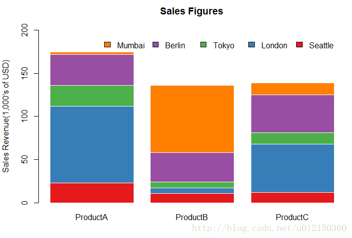
使用堆叠效果展示百分比
> citysalesperc <- read.csv("citysalesperc.csv")  #数据为各产品在各城市所占百分比
> par(mar=c(5,4,4,8),xpd=T)  # mar边缘距离(下左上右)
> barplot(as.matrix(citysalesperc[,2:4]),
+         col=brewer.pal(5,"Set1"),border="white",
+         ylab="Sales Revenue (1,000's of USD)",
+         main="Percentage Sales Figures")
> legend("right",legend=citysalesperc$City,bty="n",
+ inset=c(-0.3,0),fill=brewer.pal(5,"Set1"))        #inset 图例跟图的相对位置,fill图例的颜色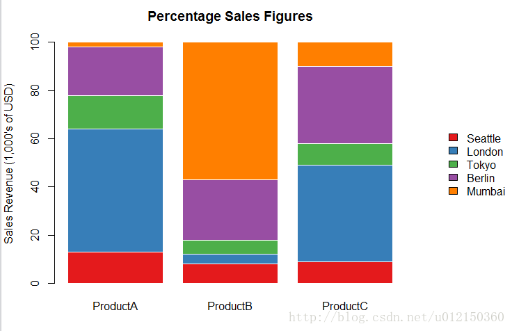
水平方向的柱形图
> barplot(as.matrix(citysales[,2:4]),
+         beside=TRUE,horiz=TRUE,     #将horiz设置为TRUE
+         legend.text=citysales$City,
+         args.legend=list(bty="n"),
+         col=brewer.pal(5,"Set1"),border="white",
+         xlim=c(0,100), xlab="Sales Revenue(1,000's of USD)",
+         main="Sales Figures")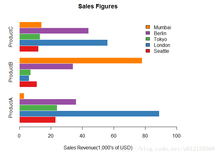
展示百分比的堆叠水平方向柱形图
> barplot(as.matrix(citysalesperc[,2:4]),
+         horiz=TRUE,
+         col=brewer.pal(5,"Set1"),border="white",
+         xlab="Percentage of Sales",
+         main="Perecentage Sales Figures")
> legend("right",legend=citysalesperc$City,bty="n",
+        inset=c(-0.3,0),fill=brewer.pal(5,"Set1"))
调整柱形图的宽度,间隔和颜色
> barplot(as.matrix(citysales[,2:4]),
+         beside=TRUE,
+         legend.text=citysales$City,
+         args.legend=list(bty="n",horiz=T),
+         col=c("#E5562A","#491A5B","#8C6CA8","#BD1B8A","#7CB6E4"),
+         border=FALSE,space=c(0,5),    #space这个里面0代表了柱子之间的距离,5代表了两组柱子之间的距离
+         ylim=c(0,100),ylab="Sales Revenue(1,000's of USD)",
+         main="Sales Figures")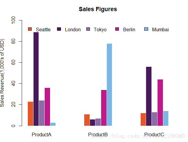
效果对比
> barplot(as.matrix(citysales[,2:4]),
+         beside=TRUE,
+         legend.text=citysales$City,
+         args.legend=list(bty="n",horiz=T),
+         ylim=c(0,100),ylab="Sales Revenue(1,000's of USD)",
+         main="Sales Figures")
柱子的顶端显示数据
> x<-barplot(as.matrix(citysales[,2:4]),
+            beside=TRUE,
+            legend.text=citysales$City,
+            args.legend=list(bty="n",horiz=TRUE),
+            col=brewer.pal(5,"Set1"),border="white",
+            ylim=c(0,100),ylab="Sales Revenue (1,000's of USD)",main="Sales Figures")
> y<-as.matrix(citysales[,2:4])
> text(x,y+2,labels = as.character(x))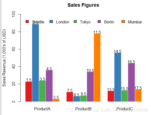
水平柱子旁标注数据
> y <- barplot(as.matrix(citysales[,2:4]),
+ beside=TRUE,horiz=TRUE,
+ legend.text=citysales$City,
+ args.legend=list(bty="n"),
+ col=brewer.pal(5,"Set1"),border="white",
+ xlim=c(0,100),xlab="Sales Revenue (1,000's of USD)",main="Sales Figures")
> x <- as.matrix(citysales[,2:4])
> text(x+2,y,as.character(x))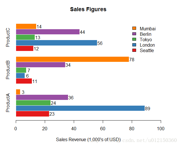
在柱子里面进行标注
> y <- barplot(as.matrix(rain[1,-1]),horiz = T,col="white",
+ yaxt="n",main="Rain in January",
+ xlab="Rainfall (mm)")
> x <- 0.5*rain[1,-1]
> text (x,y,colnames(rain[-1]))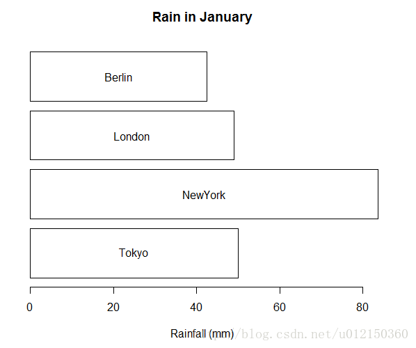
标注误差
> sales<-t(as.matrix(citysales[,-1]))
> sales
         [,1] [,2] [,3] [,4] [,5]
ProductA   23   89   24   36    3
ProductB   11    6    7   34   78
ProductC   12   56   13   44   14
> colnames(sales) <- citysales[,1]
> x<- barplot(sales,beside=T,legend.text=rownames(sales),
+     args.legend=list(bty="n",horiz=T),
+     col=brewer.pal(3,"Set2"),border="white",ylim=c(0,100),
+     ylab="Sales Revenue (1,000's of USD)",
+     main="Sales Figures")
> arrows(x0=x,y0=sales*0.95,
+ x1=x,y1=sales*1.05,
+ angle=90,
+ code=3,
+ length=0.04,
+ lwd=0.4)
点图
> library(reshape)
> sales <-melt(citysales)        # 将citysales转换成窄矩阵
> citysales
     City ProductA ProductB ProductC
1 Seattle       23       11       12
2  London       89        6       56
3   Tokyo       24        7       13
4  Berlin       36       34       44
5  Mumbai        3       78       14
> sales
      City variable value
1  Seattle ProductA    23
2   London ProductA    89
3    Tokyo ProductA    24
4   Berlin ProductA    36
5   Mumbai ProductA     3
6  Seattle ProductB    11
7   London ProductB     6
8    Tokyo ProductB     7
9   Berlin ProductB    34
10  Mumbai ProductB    78
11 Seattle ProductC    12
12  London ProductC    56
13   Tokyo ProductC    13
14  Berlin ProductC    44
15  Mumbai ProductC    14
> sales$color[sales[,2]=="ProductA"] <- "red"
> sales$color[sales[,2]=="ProductB"] <- "blue"
> sales$color[sales[,2]=="ProductC"] <- "violet"
> sales
      City variable value  color
1  Seattle ProductA    23    red
2   London ProductA    89    red
3    Tokyo ProductA    24    red
4   Berlin ProductA    36    red
5   Mumbai ProductA     3    red
6  Seattle ProductB    11   blue
7   London ProductB     6   blue
8    Tokyo ProductB     7   blue
9   Berlin ProductB    34   blue
10  Mumbai ProductB    78   blue
11 Seattle ProductC    12 violet
12  London ProductC    56 violet
13   Tokyo ProductC    13 violet
14  Berlin ProductC    44 violet
15  Mumbai ProductC    14 violet
> dotchart(sales[,3],labels=sales$City,groups=sales[,2],col=sales$color,pch=19,
+ main="Sales Figures",xlab="Sales Revenue(1,000's of USD)")
饼图
> browsers <- read.table("browsers.txt",header = TRUE)
> browsers
  Browser Share
1     IE8  13.5
2     IE7  12.8
3     IE6  10.9
4 Firefox  46.4
5  Chrome   9.8
6  Safari   3.6
7   Opera   2.3
> order(browsers[,2])
[1] 7 6 5 3 2 1 4
> browsers<-browsers[order(browsers[,2]),]  # 按第二列大小重新排列
> browsers
  Browser Share
7   Opera   2.3
6  Safari   3.6
5  Chrome   9.8
3     IE6  10.9
2     IE7  12.8
1     IE8  13.5
4 Firefox  46.4
> pie(browsers[,2],labels=browsers[,1],
+ clockwise = TRUE,  # 顺时针旋转
+ radius=1,           #半径为1
+ col=brewer.pal(7,"Set1"),
+ border="white",
+ main="Percentage Share of Internet Browser usage")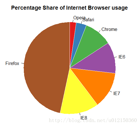
在饼图上标注百分比
> browsers<-read.table("browsers.txt",header=TRUE)
> browsers<-browsers[order(browsers[,2]),]
> pielabels <- sprintf("%s = %3.1f%s",browsers[,1],100*browsers[,2]/sum(browsers[,2]),"%")  #在饼图上添加标注,类似于C语言
> pie(browsers[,2],
+     labels=pielabels,
+     clockwise=TRUE,
+     radius=1,
+     col=brewer.pal(7,"Set1"),
+     border="white",
+     cex=0.8,
+     main="Percentage Share of Internet Browser usage")
增加图释
> browsers<-read.table("browsers.txt",header=TRUE)
> browsers<-browsers[order(browsers[,2]),]
> pielabels <- sprintf("%s = %3.1f%s", browsers[,1],
+ 100*browsers[,2]/sum(browsers[,2]), "%")
> pie(browsers[,2],
+ labels=NA,
+ clockwise=TRUE,
+ col=brewer.pal(7,"Set1"),
+ border="white",
+ radius= 0.7,
+ cex = 0.8,
+ main="Percentage Share of Internet Browser usage")
> legend("bottomright",legend=pielabels,bty="n",fill=brewer.pal(7,"Set1"))  #增加图例,内容为pielabels中的内容
直方图
> air <- read.csv("airpollution.csv")
> hist(air$Nitrogen.Oxides,xlab="Nitrogen Oxide Concentration",
+ main="Distribution of Nitrogen Oxide Concentrations") #直方图函数
以概率密度显示
> hist(air$Nitrogen.Oxides,
+      freq=FALSE,
+      xlab="Nitrogen Oxide Concentrations",
+      main="Distribution of Nitrogen Oxide Concentrations")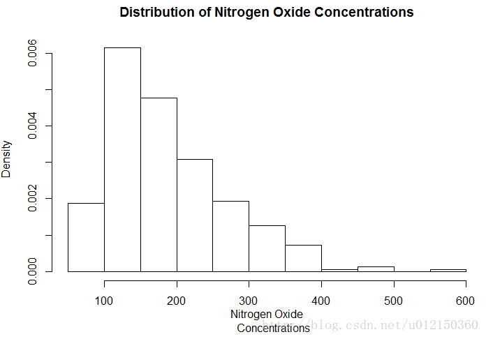
增加breaks
> hist(air$Nitrogen.Oxides,
+ breaks=20,       #指定直方图的密度
+ xlab="Nitrogen Oxide Concentrations",
+ main="Distribution of Nitrogen Oxide Concentrations")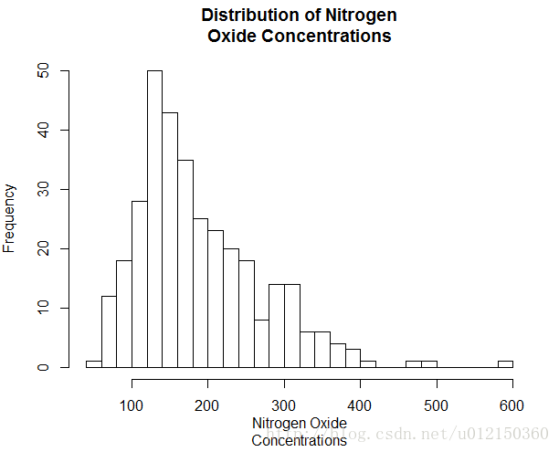
指定breaks范围
> hist(air$Nitrogen.Oxides,
+      breaks=c(0,100,200,300,400,500,600),  # break指定的是向量的时候,是指直方图柱子的断点
+      xlab="Nitrogen Oxide Concentrations",
+      main="Distribution of Nitrogen Oxide Concentrations")
用颜色美化
> hist(air$Respirable.Particles,
+ prob=TRUE,          # 纵轴以概率显示
+ col="black",border="white",
+ xlab="Respirable Particle Concentrations",
+ main="Distribution of Respirable Particle Concentrations")
用线条美化
> par(yaxs="i",las=1)
> hist(air$Respirable.Particles,
+ prob=TRUE,
+ col="black",border="white",
+ xlab="Respirable Particle Concentrations",
+ main="Distribution of Respirable Particle Concentrations")
> grid(nx=NA,ny=NULL,lty=1,lwd = 1,col="gray") #加网格线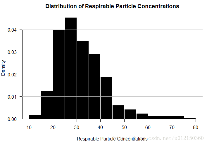
标识密度函数
> par(yaxs="i",las=1)
> hist(air$Respirable.Particles,
+      prob=TRUE,col="black",border="white",
+      xlab="Respirable Particle
+      Concentrations",
+      main="Distribution of Respirable Particle
+      Concentrations")
> box(bty="l")
> lines(density(air$Respirable.Particles,na.rm = T),col="red",lwd=4)
> grid(nx=NA,ny=NULL,lty=1,lwd=1,col="gray")
一组直方图
> panel.hist <- function(x, ...)
+ {
+     par(usr = c(par("usr")[1:2], 0, 1.5) )
+     hist(x,
+          prob=TRUE,add=TRUE,col="black",border="white")
+ }
> plot(iris[,1:4],
+      main="Relationships between
+      characteristics of iris flowers",
+      pch=19,col="blue",cex=0.9,
+      diag.panel=panel.hist) #diag.panel指定对角线所要画的内容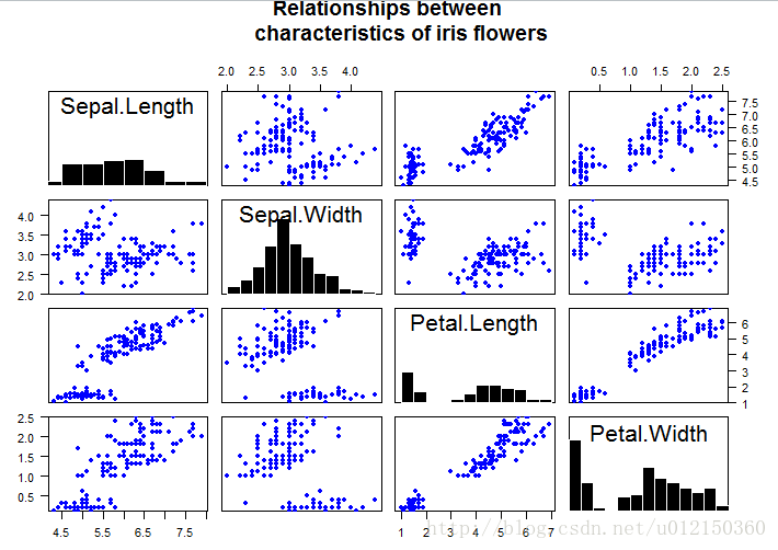
散点图+直方图
#Set up the layout first
> layout(matrix(c(2,0,1,3),2,2,byrow=TRUE),widths=c(3,1),
+ heights=c(1,3),TRUE)        #其解释见下方

#Make Scatterplot
> par(mar=c(5.1,4.1,0.1,0))
> plot(air$Respirable.Particles~air$Nitrogen.Oxides,
+ pch=19,col="black",
+ xlim=c(0,600),ylim=c(0,80),
+ xlab="Nitrogen Oxides Concentrations",
+ ylab="Respirable Particle Concentrations")

#Plot histogram of X variable in the top row
> par(mar=c(0,4.1,3,0))
> hist(air$Nitrogen.Oxides,
+ breaks=seq(0,600,100),ann=FALSE,axes=FALSE,
+ col="black",border="white")
> yhist <- hist(air$Respirable.Particles,
+ breaks=seq(0,80,10),plot=FALSE)

#Plot histogram of Y variable to the right of the scatterplot
> par(mar=c(5.1,0,0.1,1))
> barplot(yhist$density,
+ horiz=TRUE,space=0,axes=FALSE,
+ col="black",border="white")
- 上面的代码中,layout函数的解释:
最开头用了layout,第一个矩阵就matrix(c(2,0,1,3),2,2,byrow=TRUE)
这个矩阵写出来就张这个样子:
2 0
1 3
所以表示图2在左上角,图1在左下角,图3在右下角,右上角是0就是没有图。
然后后面就是先画图1,再画图2,再画图3。按照这个逻辑看就应该对了。
总体画图的顺序即为:第1个在左下方,第2个在左上方,第3个在右下方,右上方没有图(第i个图对应矩阵里i的位置)。
然后widths和heights确定了2列的宽度比、2行的高度比。
par(mar=c(5.1,4.1,0.1,0))
par(mar=c(0,4.1,3,0))
par(mar=c(5.1,0,0.1,1)) 的解释:(以后再补规整的图吧……)

箱型图
air<-read.csv("airpollution.csv")
boxplot(air,las=1)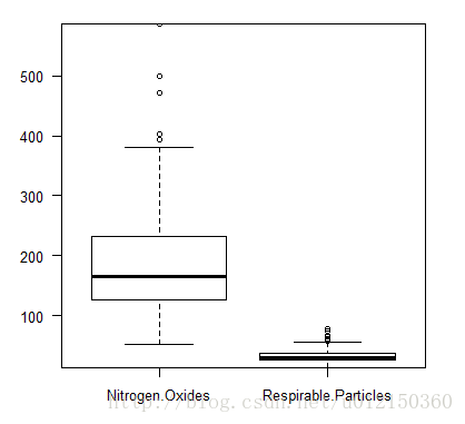
- 离群数据的判定:1.5倍的上下四分位数为标准
收窄箱体的宽度
> boxplot(air,boxwex=0.2,las=1) #boxwex设置箱体宽度
### 指定箱体宽度
> boxplot(air,width=c(1,2)) # width的向量指定第一个箱体宽度为1,第二个箱体宽度为2
分组
> metals<-read.csv("metals.csv")
> boxplot(Cu~Source,data=metals,
+         main="Summary of Copper (Cu) concentrations by Site")
> boxplot(Cu~Source*Expt,data=metals,   #Expt在此表中其实没有……但Source*Expt是说按这两列来进行分组是这么写
+ main="Summary of Copper (Cu) concentrations by Site")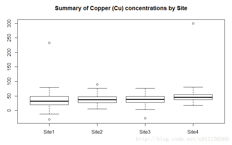
观测值数量决定箱体的宽度
> boxplot(Cu~Source,data=metals,
+ varwidth=TRUE,      #根据箱体的宽度可得观测值的数量
+ main="Summary of Copper concentrations by Site")
带notch的箱型图
> boxplot(Cu ~ Source, data = metals,
+         varwidth=TRUE,
+         notch=TRUE,           #此参数决定
+         main="Summary of Copper concentrations by Site")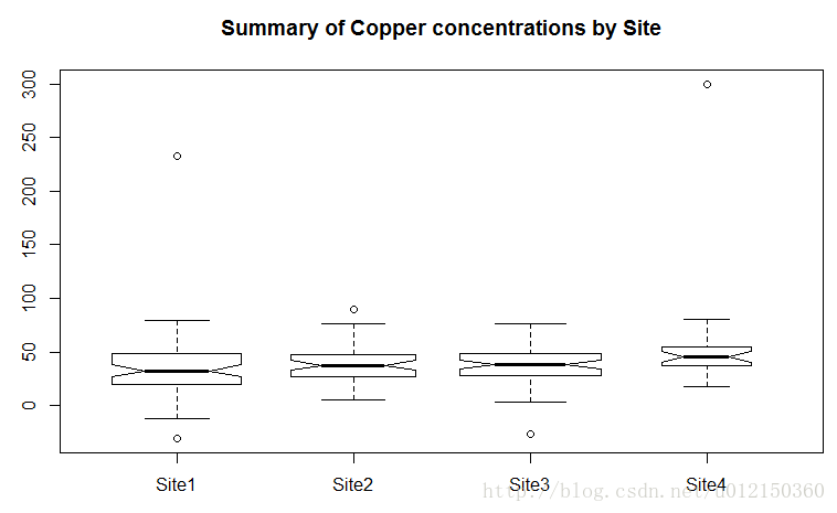
排除离群值
> boxplot(metals[,-1],
+         outline=FALSE,    #此参数决定是否排除离群值
+         main="Summary of metal concentrations by Site \n
+         (without outliers)")
水平放置
> boxplot(metals[,-1],
+         horizontal=TRUE, #此参数决定
+         las=1,
+         main="Summary of metal concentrations by Site")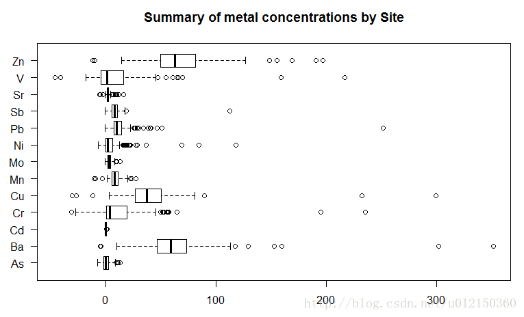
改变箱型风格
> boxplot(metals[,-1],
+         border = "white",
+         col = "orange",  #箱体颜色
+         boxwex = 0.3,   #箱体宽度
+         medlwd=1,    #中位线宽度
+         whiskcol="red",  #触须颜色
+         staplecol="blue",  #上面小横线的颜色
+         outcol="green",   #离群点的颜色
+         cex=0.3,    #离群点小圆盘的直径
+         outpch=19,     #离群点的样式
+         main="Summary of metal concentrations by Site")
> grid(nx=NA, #指没有垂直网格
+      ny=NULL, #指水平网格用默认分割
+      col="gray", #颜色设置
+      lty="dashed") #网格用虚线
延长须线
> boxplot(metals[,-1],
+         range=0,  #延长须线的长度,不考虑离群值
+         border = "white",col ="black",
+         boxwex =0.3,medlwd=1,whiskcol="black",
+         staplecol="black",outcol="red",cex=0.3,outpch=19,
+         main="Summary of metal concentrations by Site \n
+         (range=0)")
显示观测数量
> b<-boxplot(metals[,-1],
+            xaxt="n",border = "white",col = "black",
+            boxwex = 0.3,medlwd=1,whiskcol="black",
+            staplecol="black",outcol="red",cex=0.3,outpch=19,
+            main="Summary of metal concentrations by Site")
> axis(side=1,at=1:length(b$names),  #刻度值在下方,at设置坐标轴刻度
+      labels=paste(b$names,"\n(n=",b$n,")",sep=""), #显示metal名字,然后换行显示(n=……)
+      mgp=c(3,2,0)) #坐标轴问题距离图像的边缘距离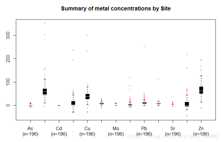
使用gplot包
> boxplot2(metals[,-1],
+           border = "white",col ="black",boxwex = 0.3,
+           medlwd=1,whiskcol="black",staplecol="black",
+           outcol="red",cex=0.3,outpch=19,
+           main="Summary of metal concentrations by Site")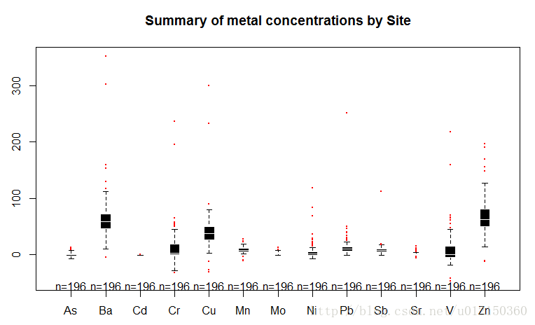
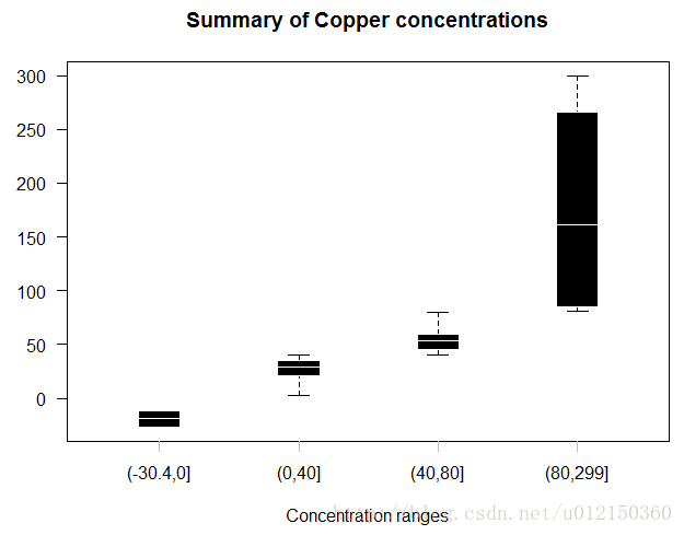
分割数据
> cuts<-c(0,40,80) #将数据范围的分割点,将数据划分为4个范围
> Y<-split(x=metals$Cu, f=findInterval(metals$Cu, cuts))  #将Cu 根据上述范围进行分组
> boxplot(Y,xaxt="n",
+         border = "white",col = "black",boxwex = 0.3,
+         medlwd=1,whiskcol="black",staplecol="black",
+         outcol="red",cex=0.3,outpch=19,
+         main="Summary of Copper concentrations",
+         xlab="Concentration ranges",las=1)
> axis(1,at=1:4,
+      labels=c("Below 0","0 to 40","40 to 80","Above 80"),
+      lwd=0,lwd.ticks=1,col="gray")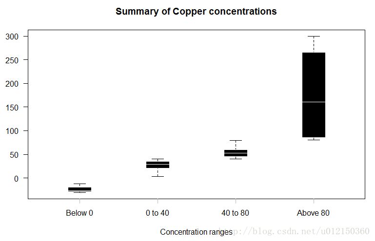
函数化
boxplot.cuts<-function(y,cuts,...) {
Y<-split(metals$Cu, f=findInterval(y, cuts))
b<-boxplot(Y,xaxt="n",
border = "white",col = "black",boxwex = 0.3,
medlwd=1,whiskcol="black",staplecol="black",
outcol="red",cex=0.3,outpch=19,
main="Summary of Copper concentrations",
xlab="Concentration ranges",las=1,...)
clabels<-paste("Below",cuts[1])
for(k in 1:(length(cuts)-1)) {
clabels<-c(clabels, paste(as.character(cuts[k]),
"to", as.character(cuts[k+1])))
}
clabels<-c(clabels,
paste("Above",as.character(cuts[length(cuts)])))
axis(1,at=1:length(clabels),
labels=clabels,lwd=0,lwd.ticks=1,col="gray")
}
调用
> boxplot.cuts(metals$Cu,c(0,30,60))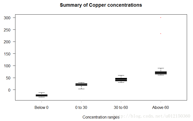
子集
> boxplot(Cu~Source,data=metals,subset=Cu>40) #subset可限定Cu>40的范围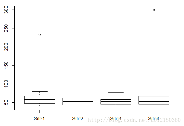
另一个函数
boxplot.cuts<-function(y,cuts) {
f=cut(y, c(min(y[!is.na(y)]),cuts,max(y[!is.na(y)])),
ordered_results=TRUE);
Y<-split(y, f=f)
b<-boxplot(Y,xaxt="n",
border = "white",col = "black",boxwex = 0.3,
medlwd=1,whiskcol="black",staplecol="black",
outcol="red",cex=0.3,outpch=19,
main="Summary of Copper concentrations",
xlab="Concentration ranges",las=1)
clabels = as.character(levels(f))
axis(1,at=1:length(clabels),
labels=clabels,lwd=0,lwd.ticks=1,col="gray")
}
调用
> boxplot.cuts(metals$Cu,c(0,40,80))