python画图--柱状图
python画图--柱状图
在上一篇(python画图--简单开始及折线图)的基础上,下面我们来画柱状图
有两种柱状图(一种为histogram, 另一种为bar chart)
一、bar chart
主要用的方法为:
atplotlib.pyplot.bar(left, height, width=0.8, bottom=None, hold=None, data=None, **kwargs)
参数说明:
left: 每一个柱形左侧的X坐标
height:每一个柱形的高度
width: 柱形之间的宽度
bottom: 柱形的Y坐标
color: 柱形的颜色
下面是代码示例:
# -*- coding: utf-8 -*-
import numpy as np
import matplotlib.mlab as mlab
import matplotlib.pyplot as plt

X=[0,1,2,3,4,5]
Y=[222,42,455,664,454,334]
fig = plt.figure()
plt.bar(X,Y,0.4,color="green")
plt.xlabel("X-axis")
plt.ylabel("Y-axis")
plt.title("bar chart")


plt.show()
plt.savefig("barChart.jpg")
结果如下:

下面是另一个例子:
# -*- coding: utf-8 -*-
import numpy as np
import matplotlib.pyplot as plt
import matplotlib as mpl

def draw_bar(labels,quants):
    width = 0.4
    ind = np.linspace(0.5,9.5,10)
    # make a square figure
    fig = plt.figure(1)
    ax  = fig.add_subplot(111)
    # Bar Plot
    ax.bar(ind-width/2,quants,width,color='green')
    # Set the ticks on x-axis
    ax.set_xticks(ind)
    ax.set_xticklabels(labels)
    # labels
    ax.set_xlabel('Country')
    ax.set_ylabel('GDP (Billion US dollar)')
    # title
    ax.set_title('Top 10 GDP Countries', bbox={'facecolor':'0.8', 'pad':5})
    plt.grid(True)
    plt.show()
    plt.savefig("bar.jpg")
    plt.close()

labels   = ['USA', 'China', 'India', 'Japan', 'Germany', 'Russia', 'Brazil', 'UK', 'France', 'Italy']

quants   = [15094025.0, 11299967.0, 4457784.0, 4440376.0, 3099080.0, 2383402.0, 2293954.0, 2260803.0, 2217900.0, 1846950.0]

draw_pie(labels,quants)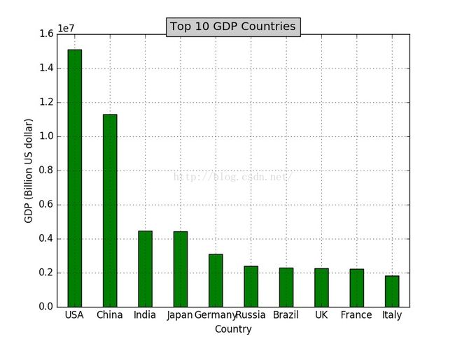
下面是官方文档有关于bar chart的说明:
链接:http://matplotlib.org/api/pyplot_api.html
matplotlib.pyplot.
bar
(
left,
height,
width=0.8,
bottom=None,
hold=None,
data=None,
**kwargs
)
Make a bar plot.
Make a bar plot with rectangles bounded by:
left,left+width,bottom,bottom+height- (left, right, bottom and top edges)
| Parameters: | left : sequence of scalars
height : sequence of scalars
width : scalar or array-like, optional
bottom : scalar or array-like, optional
color : scalar or array-like, optional
edgecolor : scalar or array-like, optional
linewidth : scalar or array-like, optional
tick_label : string or array-like, optional
xerr : scalar or array-like, optional
yerr : scalar or array-like, optional
ecolor : scalar or array-like, optional
capsize : scalar, optional
error_kw : dict, optional
align : {‘edge’, ‘center’}, optional
orientation : {‘vertical’, ‘horizontal’}, optional
log : boolean, optional
|
|---|---|
| Returns: | bars : matplotlib.container.BarContainer
|
See also
-
barh - Plot a horizontal bar plot.
Notes
In addition to the above described arguments, this function can take a data keyword argument. If such a data argument is given, the following arguments are replaced by data[
- All arguments with the following names: ‘height’, ‘color’, ‘ecolor’, ‘edgecolor’, ‘bottom’, ‘tick_label’, ‘width’, ‘yerr’, ‘xerr’, ‘linewidth’, ‘left’.
Additional kwargs: hold = [True|False] overrides default hold state
Examples
Example: A stacked bar chart.
(Source code, png, hires.png, pdf)
二、histogram
主要用的的方法为:plt.hist()
先来了解一下hist的参数:
matplotlib.pyplot.hist(
x, bins=10, range=None, normed=False,
weights=None, cumulative=False, bottom=None,
histtype=u'bar', align=u'mid', orientation=u'vertical',
rwidth=None, log=False, color=None, label=None, stacked=False,
hold=None, **kwargs)
x : (n,) array or sequence of (n,) arrays
这个参数是指定每个bin(箱子)分布的数据,对应x轴
bins : integer or array_like, optional
这个参数指定bin(箱子)的个数,也就是总共有几条条状图
normed : boolean, optional
If True, the first element of the return tuple will be the counts normalized to form a probability density, i.e.,n/(len(x)`dbin)
这个参数指定密度,也就是每个条状图的占比例比,默认为1
color : color or array_like of colors or None, optional
这个指定条状图的颜色
代码如下:
# -*- coding: utf-8 -*-
import numpy as np
import matplotlib.mlab as mlab
import matplotlib.pyplot as plt


# 数据
mu = 100 # mean of distribution
sigma = 15 # standard deviation of distribution
x = mu + sigma * np.random.randn(10000)

num_bins = 50
# the histogram of the data
n, bins, patches = plt.hist(x, num_bins, normed=1, facecolor='blue', alpha=0.5)

# add a 'best fit' line
y = mlab.normpdf(bins, mu, sigma)
plt.plot(bins, y, 'r--')
plt.xlabel('Smarts')
plt.ylabel('Probability')
plt.title(r'Histogram of IQ: $\mu=100$, $\sigma=15$')

# Tweak spacing to prevent clipping of ylabel
plt.subplots_adjust(left=0.15)
plt.show()
plt.savefig("hist.jpg")
结果如下:

以下是官方文档的描述:
链接:http://matplotlib.org/api/pyplot_api.html
matplotlib.pyplot.
hist
(
x,
bins=10,
range=None,
normed=False,
weights=None,
cumulative=False,
bottom=None,
histtype='bar',
align='mid',
orientation='vertical',
rwidth=None,
log=False,
color=None,
label=None,
stacked=False,
hold=None,
data=None,
**kwargs
)
Plot a histogram.
Compute and draw the histogram of x. The return value is a tuple (n, bins, patches) or ([n0, n1, ...], bins, [patches0, patches1,...]) if the input contains multiple data.
Multiple data can be provided via x as a list of datasets of potentially different length ([x0, x1, ...]), or as a 2-D ndarray in which each column is a dataset. Note that the ndarray form is transposed relative to the list form.
Masked arrays are not supported at present.
| Parameters: | x : (n,) array or sequence of (n,) arrays
bins : integer or array_like, optional
range : tuple or None, optional
normed : boolean, optional
weights : (n, ) array_like or None, optional
cumulative : boolean, optional
bottom : array_like, scalar, or None
histtype : {‘bar’, ‘barstacked’, ‘step’, ‘stepfilled’}, optional
align : {‘left’, ‘mid’, ‘right’}, optional
orientation : {‘horizontal’, ‘vertical’}, optional
rwidth : scalar or None, optional
log : boolean, optional
color : color or array_like of colors or None, optional
label : string or None, optional
stacked : boolean, optional
|
|---|---|
| Returns: | n : array or list of arrays
bins : array
patches : list or list of lists
|
See also
-
hist2d - 2D histograms
Notes
In addition to the above described arguments, this function can take a data keyword argument. If such a data argument is given, the following arguments are replaced by data[
- All arguments with the following names: ‘weights’, ‘x’.
Additional kwargs: hold = [True|False] overrides default hold state
Examples
(Source code, png, hires.png, pdf)
