知识点
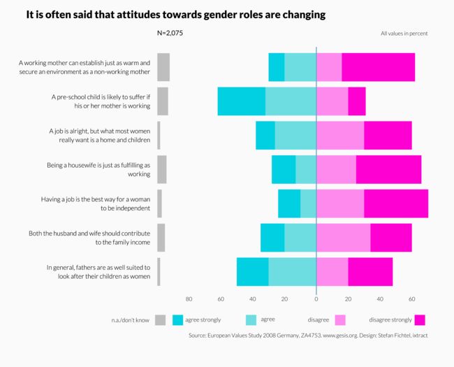
- 通过做负高度柱子和背景色柱子做出最坐边的灰色柱子
- 通过正负柱子做出蓝色和红色柱子
pdf_file <- "barcharts_multiple_all_2.pdf"
cairo_pdf(bg="grey98", pdf_file, width=13,height=10.5)

# 定义标签名称
myC_v159 <- "A working mother can establish just as warm and\nsecure an environment as a non-working mother"
myC_v160 <- "A pre-school child is likely to suffer if\nhis or her mother is working"
myC_v161 <- "A job is alright, but what most women\nreally want is a home and children"
myC_v162 <- "Being a housewife is just as fulfilling as\nworking"
myC_v163 <- "Having a job is the best way for a woman\nto be independent"
myC_v164 <- "Both the husband and wife should contribute\nto the family income"
myC_v165 <- "In general, fathers are as well suited to\nlook after their children as women"
myC_v166 <- "Men should take as much responsibility\nas women for their household and children"
mynames <- c(myC_v165, myC_v164, myC_v163, myC_v162, myC_v161,
    myC_v160, myC_v159)
myresponses <- c("n.a./don’t know", "agree strongly", "agree",
    "disagree", "disagree strongly")

add_fonts("lato")
par(omi = c(0.25, 0.75, 1, 0.75), mai = c(1.8, 3.75, 0.25, 0),
    lheight = 1.15, family = "Lato Light", las = 1)

library(RColorBrewer)
myC1 <- rgb(0, 208, 226, maxColorValue = 255)
myC2 <- rgb(109, 221, 225, maxColorValue = 255)
myC3 <- rgb(255, 138, 238, maxColorValue = 255)
myC4 <- rgb(255, 0, 210, maxColorValue = 255)
colours <- c("grey", myC1, myC2, myC3, myC4)

# 构造数据
col_1 <- c(2, 5, 3, 6, 2, 7, 8)
col_2 <- c(20, 15, 14, 15, 12, 30, 10)
col_3 <- c(30, 20, 10, 13, 26, 32, 20)
col_4 <- c(20, 34, 30, 25, 30, 20, 16)
col_5 <- rep(100, 7) - col_1 - col_2 - col_3 - col_4
z <- cbind(col_1, col_2, col_3, col_4, col_5)
myData0 <- cbind(z[, 1], z[, 2], z[, 3], z[, 4], z[, 5])
myData1 <- t(myData0)

# 添加柱子
barplot(-rep(100, 7), names.arg = mynames, cex.names = 1.1, horiz = T,
    border = par("bg"), xlim = c(-100, 70), col = colours[1],
    axes = F)
barplot(-(100 - myData1[1, ]), names.arg = mynames, cex.names = 1.1,
    horiz = T, border = par("bg"), xlim = c(-100, 70), col = par("bg"),
    axes = F, add = T)
barplot(-myData1[3:2, ], names.arg = mynames, cex.names = 1.1,
    horiz = T, border = NA, xlim = c(-100, 70), col = colours[3:2],
    axes = F, add = T)
barplot(myData1[4:5, ], names.arg = mynames, cex.names = 1.1,
    horiz = T, border = NA, xlim = c(-100, 70), col = colours[4:5],
    axes = F, add = T)

# 添加线段
arrows(0, -0.1, 0, 8.6, lwd = 2.5, length = 0, xpd = T, col = "skyblue3")

# 添加图例
px <- c(-98, -87, -41, 15, 65)
tx <- c(-105, -60, -26, 8, 60)
y <- rep(-1, 5)
points(px, y, pch = 15, cex = 4, col = colours, xpd = T)
text(tx, y, myresponses, adj = 1, xpd = T, font = 3)

# 添加x轴标签
mtext(c(80, 60, 40, 20, 0, 20, 40, 60), at = c(-80, -60, -40,
    -20, 0, 20, 40, 60), 1, line = 0, cex = 0.95)

# 添加标题
mtext("It is often said that attitudes towards gender roles are changing",
    3, line = 2.2, adj = 0, cex = 1.8, outer = T, family = "Lato Black")
mtext("All values in percent", 3, line = 1, adj = 1, cex = 0.95,
    font = 3)
mtext("Source: European Values Study 2008 Germany, ZA4753. www.gesis.org. Design: Stefan Fichtel, ixtract",
    1, line = 5.2, adj = 1, cex = 0.95, font = 3)
mtext("N=2,075", 3, line = 1, adj = 0, cex = 1.15, family = "Lato Regular",
    font = 3)
dev.off()
