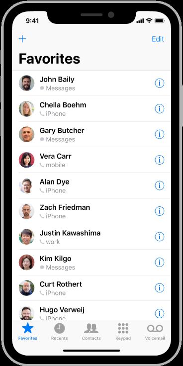
最新(BUG)
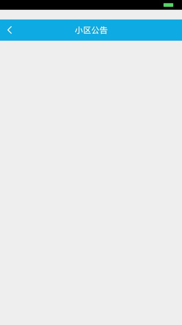
- 可能是iPhonex的问题,导致部分界面会出现,状态栏变黑且下移,目前出现在h5 的界面如
总结:
- iPhone X是@3x的。
- iPhone X显示屏的宽度与iPhone 6、iPhone 7和iPhone 8 4.7显示器的宽度相匹配。
- 1125px × 2436px (375pt × 812pt @3x) 是正方形的不是圆角残缺的。
- 系统布局会自动适配,非系统的相对简单,Provide a full-screen experience.提供全屏预览
- If your app currently hides the status bar, reconsider that decision on iPhone X.(如果你的导航栏隐藏了,貌似麻烦了。。我日我哭了)因为----状态栏占地屏幕应用程序可能不会充分利用。
- 因为屏幕分辨率不一样了,所以图片会被裁剪,要留出安全区域。。。避免重要信息被裁剪
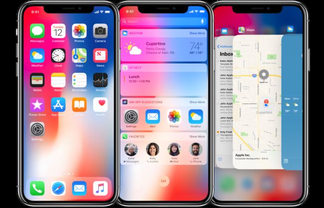
iPhone X includes a large, high-resolution, rounded, edge-to-edge display that delivers an immersive, content-rich experience like never before.
iPhone X包括一个大的、高分辨率的、圆形的、边对边的显示,它提供了前所未有的沉浸式、内容丰富的体验。
Screen Size
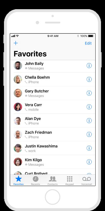
In portrait orientation, the width of the display on iPhone X matches the width of the 4.7" displays of iPhone 6, iPhone 7, and iPhone 8. The display on iPhone X, however, is 145pt taller than a 4.7" display, resulting in roughly 20% additional vertical space for content.
在肖像(图片)定位方面,iPhone X显示屏的宽度与iPhone 6、iPhone 7和iPhone 8 4.7显示器的宽度相匹配。显示在iPhone X,但是,是145pt比4.7”显示较高,导致大约20%额外的垂直空间的内容。
Portrait dimensions
画像的尺寸
Landscape dimensions
风景(横屏)尺度
1125px × 2436px (375pt × 812pt @3x)
2436px × 1125px (812pt × 375pt @3x)
Supply high-resolution images for all artwork in your app. iPhone X has a high-resolution display with a scale factor of @3x. For glyphs and other flat, vector artwork, it's best to provide resolution-independent PDFs. For rasterized artwork, provide both @3x and @2x versions of your artwork. See Image Size and Resolution and Custom Icons.
提供高分辨率的图像,所有的艺术品在你的应用程序。* iPhone X有一个高分辨率的显示比例因子@倍。字形等的平面、矢量图形,最好是提供独立的PDF文件的分辨率。用于光栅化的艺术品,同时提供“3X和@你的作品2x版本。
Layout
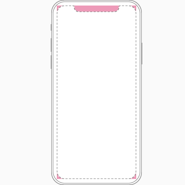
When designing for iPhone X, you must ensure that layouts fill the screen and aren't obscured by the device's rounded corners, sensor housing, or the indicator for accessing the Home screen.
当为iPhone X设计时,必须确保布局填满屏幕,而不是被设备的圆角、传感器外壳或访问主屏幕的指示器所掩盖。
Most apps that use standard, system-provided UI elements like navigation bars, tables, and collections automatically adapt to the device's new form factor. Background materials extend to the edges of the display and UI elements are appropriately inset and positioned.
大多数使用标准的、系统提供的UI元素(如导航栏、表格和集合)的应用程序会自动适应设备的新形式因素。背景材料扩展到显示的边缘,并且适当地插入和定位UI元素。
4.7" iPhone
iPhone X
For apps with custom layouts, supporting iPhone X should also be relatively easy, especially if your app uses Auto Layout and adheres to safe area and margin layout guides.
Preview your app on iPhone X. You can use Simulator (included with Xcode) to preview your app and check for clipping and other layout issues. Some features, like wide color imagery, are best previewed on actual devices.
Provide a full-screen experience. Make sure backgrounds extend to the edges of the display, and that vertically scrollable layouts, like tables and collections, continue all the way to the bottom.
对于具有定制布局的应用程序,支持iPhone X也应该相对容易,尤其是如果应用程序使用自动布局并遵循安全区域和边缘布局指南的话。
预览您的应用程序在iPhone上十* 可以使用模拟器(包括Xcode)预览您的应用程序和检查卡和其他布局问题。一些功能,如宽的彩色图像,是最好的预测在实际设备上。
提供全屏幕体验。* 确保背景延伸到边缘的显示,和垂直滚动的布局,如桌子(tables)和收藏(collections),继续一路底。
Inset essential content to prevent clipping. In general, content should be centered and symmetrically inset so it looks great in any orientation and isn't clipped by corners or the device's sensor housing, or obscured by the indicator for accessing the Home screen. For best results, use standard, system-provided interface elements and Auto Layout to construct your interface. All apps should adhere to the safe area and layout margins defined by UIKit, which ensure appropriate insetting based on the device and context. The safe area also prevents content from underlapping the status bar, navigation bar, toolbar, and tab bar.
插图基本内容防止裁剪。* 一般,内容应为中心对称嵌入所以它在任何方向上没有角或装置的传感器外壳夹看起来不错,或被指示访问主页。为了达到最佳效果,使用标准的、系统提供的接口元素和自动布局来构建接口。所有的应用程序应坚持安全区域布局由UIKit的利润,保证适当的嵌入基于设备上下文。安全区也可以防止内容从垫状态栏,导航栏,工具栏和标签栏。
Be mindful of the status bar height. The status bar is taller on iPhone X than on other iPhones. If your app assumes a fixed status bar height for positioning content below the status bar, you must update your app to dynamically position content based on the user's device. Note that the status bar on iPhone X doesn't change height when background tasks like voice recording and location tracking are active.
注意状态栏的高度。 * 状态栏高iPhone X比其他iPhone。如果你的应用程序假定一个固定状态栏高度来定位内容低于状态栏,你必须更新你的应用程序动态地基于用户的设备定位内容。注意,当像录音和位置跟踪这样的后台任务处于活动状态时,iPhone上的状态栏不会改变高度。
If your app currently hides the status bar, reconsider that decision on iPhone X. The display height on iPhone provides more vertical space for content than the displays of 4.7" iPhones, and the status bar occupies an area of the screen your app probably won't fully utilize. The status bar also displays information people find useful. It should only be hidden in exchange for added value.
*如果你的应用程序目前隐藏状态栏,重新考虑这个决定对iPhone X×× 显示高度的iPhone提供更多的垂直空间的内容比显示4.7的iPhone,和状态栏占地屏幕应用程序可能不会充分利用。状态栏也显示信息的人有用。它只能隐藏在附加价值交换。
Full-screen 4.7" device image
Cropping on iPhone X
Letterboxing on iPhone X
Full-screen iPhone X image
Cropping on a 4.7" device
Pillarboxing on a 4.7" device
Be mindful of aspect ratio differences when reusing existing artwork. iPhone X has a different aspect ratio than 4.7" iPhones. As a result, full-screen 4.7" iPhone artwork appears cropped or letterboxed when displayed full-screen on iPhone X. Likewise, full-screen iPhone X artwork appears cropped or pillarboxed when displayed full-screen on a 4.7" iPhone. Make sure that important visual content remains in view on both display sizes.
注意纵横比的差异时,重用现有的艺术品。* iPhone X有一个不同的方面比iPhone 4.7”。作为一个结果,全屏幕4.7“iPhone艺术品出现裁剪或邮筒时显示在iPhone X同样的全屏幕,全屏幕的iPhone X艺术品出现裁剪或pillarboxed时显示在4.7“iPhone全屏。确保在两个显示大小上都保留重要的视觉内容。
Avoid explicitly placing interactive controls at the very bottom of the screen and in corners. People use swipe gestures at the bottom edge of the display to access the Home screen and app switcher, and these gestures may cancel custom gestures you implement in this area. The far corners of the screen can be difficult areas for people to reach comfortably.
避免明确放置交互式控件在屏幕的底部和角落。* 人在屏幕的底部边缘使用滑动手势来访问主屏幕和应用程序切换器,这些手势可以取消自定义手势在这一地区实现你。屏幕的遥远角落可能是难以到达的舒适区域。
Don't mask or call special attention to key display features. Don't attempt to hide the device's rounded corners, sensor housing, or indicator for accessing the Home screen by placing black bars at the top and bottom of the screen. Don't use visual adornments like brackets, bezels, shapes, or instructional text to call special attention to these areas either.
不要掩盖或电话按键显示功能特别关注。* 不要试图隐藏设备的圆角,传感器外壳,或指示将黑网吧在屏幕的顶部和底部的访问主页。不要用视觉装饰如支架、挡板,形状,或说明文字唤起人们特别注意这些方面。
Allow auto-hiding of the indicator for accessing the Home screen sparingly. When auto-hiding is enabled, the indicator fades out if the user hasn't touched the screen for a few seconds. It reappears when the user touches the screen again. This behavior should be enabled only for passive viewing experiences like playing videos or photo slideshows.
允许自动隐藏指针访问主页屏幕节制。* 时自动隐藏功能,指示褪色了,如果用户没有几秒钟,触摸屏。它出现在用户触摸屏幕时再次。这种行为应该启用只有被动的观看体验,喜欢玩的视频或照片幻灯片。
