曼哈顿图的名字来源是因为其形如曼哈顿的天际线:高耸在较低高度的“建筑物”上方的摩天大楼的轮廓。主要用于GWAS结果的展示,今天让我们来看看如何绘制曼哈顿图。
什么是曼哈顿图 Manhattan Plot
曼哈顿图是一种散点图,通常用于显示具有大量数据点,许多非零振幅和更高振幅值分布的数据。该图通常用于全基因组关联研究(GWAS)以显示重要的SNP(来源wiki)。

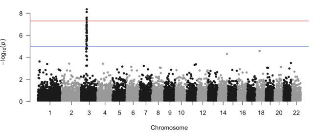
在图中每个点代表一个SNP,纵轴为每个SNP计算出来的Pvalue取-log10,横轴为SNP所在的染色体。基因位点的Pvalue越小即-log10(Pvalue)越大,其与表型性状或疾病等关联程度越强。而且通常来说受到连锁不平衡的影响,强关联位点周围的SNP也会显示出相对较高的信号强度,并依次向两边递减,所以会出现上图中红色部分的现象。一般,在GWAS的研究中,Pvalue的阈值在10^-6 或者10^-8以下。(现在可能要求更高了?好久没看过文章)
怎么做曼哈顿图 Manhattan Plot
用于做曼哈顿图最常用的一个R包叫做qqman——an R package for creating Q-Q and manhattan plots。本文我们直接使用该包中的例子进行讲解(毕竟我也没有可以绘图的GWAS数据哈哈哈)。没有安装的可以先输入install.packages("qqman")安装该包。当然qqman包由于是为曼哈顿图服务所以其实有很多限制,如果想要完全DIY我们可以使用ggplot。本文将会介绍使用这两个R包进行绘图。
下述内容来源于Manhattan plot in R: a review,我只是一个搬运工。
1)需要什么格式的数据
qqman提供的数据例子很直接就叫做"gwasResults",数据格式如下:
library(qqman)
data("gwasResults")
head(gwasResults)
  SNP CHR BP         P
1 rs1   1  1 0.9148060
2 rs2   1  2 0.9370754
3 rs3   1  3 0.2861395
4 rs4   1  4 0.8304476
5 rs5   1  5 0.6417455
6 rs6   1  6 0.5190959
第一列为SNP的名字,第二列CHR为所在染色体,第三列BP为染色体上所在位置。要注意如果你的CHR中存在X,Y这样的,需要给他们转化为数字如赋予23,24等,其中第一列SNP的名字是可选择的,后三列是必须提供的。
2)如何作图
利用manhattan函数即可作出相应的曼哈顿图。
manhattan(gwasResults, chr="CHR", bp="BP", snp="SNP", p="P" )
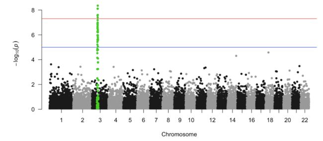
如果你想要标记其中一系列你感兴趣的SNP,怎么办呢?给出你感兴趣的snpsOfInterest列表即可。
snpsOfInterest
  [1] "rs3001" "rs3002" "rs3003" "rs3004" "rs3005" "rs3006" "rs3007" "rs3008" "rs3009" "rs3010" "rs3011"
 [12] "rs3012" "rs3013" "rs3014" "rs3015" "rs3016" "rs3017" "rs3018" "rs3019" "rs3020" "rs3021" "rs3022"
 [23] "rs3023" "rs3024" "rs3025" "rs3026" "rs3027" "rs3028" "rs3029" "rs3030" "rs3031" "rs3032" "rs3033"
 [34] "rs3034" "rs3035" "rs3036" "rs3037" "rs3038" "rs3039" "rs3040" "rs3041" "rs3042" "rs3043" "rs3044"
 [45] "rs3045" "rs3046" "rs3047" "rs3048" "rs3049" "rs3050" "rs3051" "rs3052" "rs3053" "rs3054" "rs3055"
 [56] "rs3056" "rs3057" "rs3058" "rs3059" "rs3060" "rs3061" "rs3062" "rs3063" "rs3064" "rs3065" "rs3066"
 [67] "rs3067" "rs3068" "rs3069" "rs3070" "rs3071" "rs3072" "rs3073" "rs3074" "rs3075" "rs3076" "rs3077"
 [78] "rs3078" "rs3079" "rs3080" "rs3081" "rs3082" "rs3083" "rs3084" "rs3085" "rs3086" "rs3087" "rs3088"
 [89] "rs3089" "rs3090" "rs3091" "rs3092" "rs3093" "rs3094" "rs3095" "rs3096" "rs3097" "rs3098" "rs3099"
[100] "rs3100"
manhattan(gwasResults, highlight = snpsOfInterest)
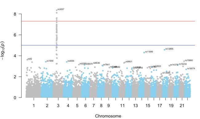
如果你想知道每条染色体上pvalue最小的SNP,你可以通过下述方式:
manhattan(gwasResults, annotatePval = 0.01)
manhattan(gwasResults, annotatePval = 0.0001)#不符合该筛选条件的即使-log10(pvalue)最高也不显示

如果不喜欢黑色和灰色的搭配,也可以自行改变颜色。
manhattan(gwasResults, annotatePval = 0.01,annotateTop = T, col = c("grey", "skyblue"))
那么使用ggplot要如何作图呢?
这里我们要对数据进行一点整理,需要用到一个十分实用的符号,我们称其为管道符号%>%,该符号的作用是可以将上一步的结果直接传输给下一步,像一个管道进行连接。
library(dplyr)
don <- gwasResults %>%

  # Compute chromosome size
  group_by(CHR) %>%
  summarise(chr_len=max(BP)) %>%

  # Calculate cumulative position of each chromosome
  mutate(tot=cumsum(chr_len)-chr_len) %>%
  select(-chr_len) %>%

  # Add this info to the initial dataset
  left_join(gwasResults, ., by=c("CHR"="CHR")) %>%

  # Add a cumulative position of each SNP
  arrange(CHR, BP) %>%
  mutate( BPcum=BP+tot)

head(don)
SNP CHR BP         P tot BPcum
1 rs1   1  1 0.9148060   0     1
2 rs2   1  2 0.9370754   0     2
3 rs3   1  3 0.2861395   0     3
4 rs4   1  4 0.8304476   0     4
5 rs5   1  5 0.6417455   0     5
6 rs6   1  6 0.5190959   0     6

axisdf = don %>% group_by(CHR) %>% summarize(center=( max(BPcum) + min(BPcum) ) / 2 )
head(axisdf)
# A tibble: 6 x 2
    CHR center

1     1   750.
2     2  2096
3     3  3212.
4     4  4204
5     5  5115
6     6  5966
don是用于作图的主要数据表,而axisdf是用于处理x轴,因为我们想要他们按照染色体的位置排布。上述数据处理完成后,我们就可以使用ggplot作图:
ggplot(don, aes(x=BPcum, y=-log10(P))) +

    geom_point( aes(color=as.factor(CHR)), alpha=0.8, size=1.3) +
    scale_color_manual(values = rep(c("grey", "skyblue"), 22 )) +
    scale_x_continuous( label = axisdf$CHR, breaks= axisdf$center ) +
    scale_y_continuous(expand = c(0, 0) ) +     # remove space between plot area and x axis
    theme_bw() +
    theme(
      legend.position="none",
      panel.border = element_blank(),
      panel.grid.major.x = element_blank(),
      panel.grid.minor.x = element_blank()
    )
我们这里展示一下有无scale_x_continuous( label = axisdf$CHR, breaks= axisdf$center )的差异,可以看到x轴的变化

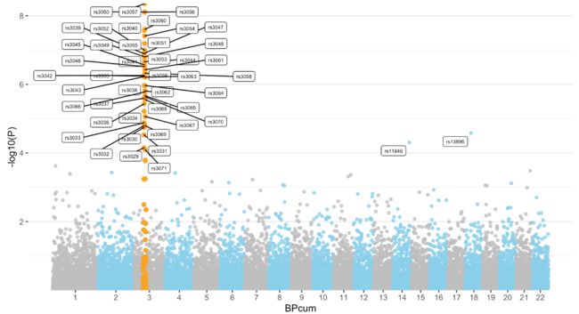
那么如果想要把某些SNP标记出来呢?那么我们在前期处理数据的时候需要将这些数据标记出来,这个过程和之前火山图标记显著的基因很类似:
don <- gwasResults %>%

  # Compute chromosome size
  group_by(CHR) %>%
  summarise(chr_len=max(BP)) %>%

  # Calculate cumulative position of each chromosome
  mutate(tot=cumsum(chr_len)-chr_len) %>%
  select(-chr_len) %>%

  # Add this info to the initial dataset
  left_join(gwasResults, ., by=c("CHR"="CHR")) %>%

  # Add a cumulative position of each SNP
  arrange(CHR, BP) %>%
  mutate( BPcum=BP+tot) %>%

  # !!!!!!Add highlight and annotation information
 mutate( is_highlight=ifelse(SNP %in% snpsOfInterest, "yes", "no")) %>%
  mutate( is_annotate=ifelse(-log10(P)>4, "yes", "no"))

# Prepare X axis
axisdf <- don %>% group_by(CHR) %>% summarize(center=( max(BPcum) + min(BPcum) ) / 2 )
然后画图的时候geom_point在颜色上进行区分,并使用geom_label_repel标注出来即可:
ggplot(don, aes(x=BPcum, y=-log10(P))) +

    # Show all points
    geom_point( aes(color=as.factor(CHR)), alpha=0.8, size=1.3) +
    scale_color_manual(values = rep(c("grey", "skyblue"), 22 )) +

    # custom X axis:
    scale_x_continuous( label = axisdf$CHR, breaks= axisdf$center ) +
    scale_y_continuous(expand = c(0, 0) ) +     # remove space between plot area and x axis

    # Add highlighted points
    geom_point(data=subset(don, is_highlight=="yes"), color="orange", size=2) +

    # Add label using ggrepel to avoid overlapping
    geom_label_repel( data=subset(don, is_annotate=="yes"), aes(label=SNP), size=2) +

    # Custom the theme:
    theme_bw() +
    theme(
      legend.position="none",
      panel.border = element_blank(),
      panel.grid.major.x = element_blank(),
      panel.grid.minor.x = element_blank()
    )
那么,关于曼哈顿图的分享就到这里啦。
往期R数据可视化分享
R数据可视化11: 相关性图
R数据可视化10: 蜜蜂图 Beeswarm
R数据可视化9: 棒棒糖图 Lollipop Chart
R数据可视化8: 金字塔图和偏差图
R数据可视化7: 气泡图 Bubble Plot
R数据可视化6: 面积图 Area Chart
R数据可视化5: 热图 Heatmap
R数据可视化4: PCA和PCoA图
R数据可视化3: 直方/条形图
R数据可视化2: 箱形图 Boxplot
R数据可视化1: 火山图