一.前言
申明:WPF自定义控件与样式是一个系列文章,前后是有些关联的,但大多是按照由简到繁的顺序逐步发布的等,若有不明白的地方可以参考本系列前面的文章,文末附有部分文章链接。
本文主要内容:
- 自定义Window窗体样式;
- 基于自定义窗体实现自定义MessageBox消息提示框;
二.自定义Window窗体样式
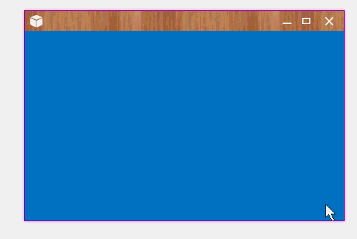
自定义的Window窗体效果:

因为WPF默认的窗体比较简陋,大都需要自己实现Window窗体样式效果,基本思路很简单:
- 第一步:干掉默认样式:WindowStyle = WindowStyle.None;
- 第二步:设置窗体透明:AllowsTransparency = true;
- 第三步:设置自己的窗体样式;
这样从外观样式上可以满足,但做为窗体该具备的基本功能还没有,需要另外来实现了:
- 窗体Icon、标题栏(可以通过样式实现);
- 窗体的基本按钮:最小化、最大化、关闭按钮;
- 窗体的鼠标拖动;
- 好像Win8、Win10的功能吧,窗体拖动到桌面边缘自动最大化、还原;
- 鼠标调整窗口大小;
- 双击标题栏最大化、还原;
上面的功能在本文中,一部分是自定义实现的,还有一部分是用了一个开源库(Microsoft.Windows.Shell)用于实现窗体大小、拖放等窗体基本功能,Microsoft.Windows.Shell文件下载:点我下载。
进入正题,自定义窗体WindowBase的后台C#代码:
    ///
    /// WindowBase.xaml 的交互逻辑
    ///  public class WindowBase : Window { #region 默认Header:窗体字体图标FIcon public static readonly DependencyProperty FIconProperty = DependencyProperty.Register("FIcon", typeof(string), typeof(WindowBase), new PropertyMetadata("\ue62e")); ///  /// 按钮字体图标编码 ///  public string FIcon { get { return (string)GetValue(FIconProperty); } set { SetValue(FIconProperty, value); } } #endregion #region 默认Header:窗体字体图标大小 public static readonly DependencyProperty FIconSizeProperty = DependencyProperty.Register("FIconSize", typeof(double), typeof(WindowBase), new PropertyMetadata(20D)); ///  /// 按钮字体图标大小 ///  public double FIconSize { get { return (double)GetValue(FIconSizeProperty); } set { SetValue(FIconSizeProperty, value); } } #endregion #region CaptionHeight 标题栏高度 public static readonly DependencyProperty CaptionHeightProperty = DependencyProperty.Register("CaptionHeight", typeof(double), typeof(WindowBase), new PropertyMetadata(26D)); ///  /// 标题高度 ///  public double CaptionHeight { get { return (double)GetValue(CaptionHeightProperty); } set { SetValue(CaptionHeightProperty, value); //this._WC.CaptionHeight = value;  } } #endregion #region CaptionBackground 标题栏背景色 public static readonly DependencyProperty CaptionBackgroundProperty = DependencyProperty.Register( "CaptionBackground", typeof(Brush), typeof(WindowBase), new PropertyMetadata(null)); public Brush CaptionBackground { get { return (Brush)GetValue(CaptionBackgroundProperty); } set { SetValue(CaptionBackgroundProperty, value); } } #endregion #region CaptionForeground 标题栏前景景色 public static readonly DependencyProperty CaptionForegroundProperty = DependencyProperty.Register( "CaptionForeground", typeof(Brush), typeof(WindowBase), new PropertyMetadata(null)); public Brush CaptionForeground { get { return (Brush)GetValue(CaptionForegroundProperty); } set { SetValue(CaptionForegroundProperty, value); } } #endregion #region Header 标题栏内容模板,以提高默认模板,可自定义 public static readonly DependencyProperty HeaderProperty = DependencyProperty.Register( "Header", typeof(ControlTemplate), typeof(WindowBase), new PropertyMetadata(null)); public ControlTemplate Header { get { return (ControlTemplate)GetValue(HeaderProperty); } set { SetValue(HeaderProperty, value); } } #endregion #region MaxboxEnable 是否显示最大化按钮 public static readonly DependencyProperty MaxboxEnableProperty = DependencyProperty.Register( "MaxboxEnable", typeof(bool), typeof(WindowBase), new PropertyMetadata(true)); public bool MaxboxEnable { get { return (bool)GetValue(MaxboxEnableProperty); } set { SetValue(MaxboxEnableProperty, value); } } #endregion #region MinboxEnable 是否显示最小化按钮 public static readonly DependencyProperty MinboxEnableProperty = DependencyProperty.Register( "MinboxEnable", typeof(bool), typeof(WindowBase), new PropertyMetadata(true)); public bool MinboxEnable { get { return (bool)GetValue(MinboxEnableProperty); } set { SetValue(MinboxEnableProperty, value); } } #endregion public WindowBase() { this.WindowStyle = WindowStyle.None; this.AllowsTransparency = true; this.WindowStartupLocation = WindowStartupLocation.CenterScreen; this.Style = this.FindResource("DefaultWindowStyle") as Style; this.Icon = Images.CreateImageSourceFromImage(Properties.Resources.logo); //12=6+6//Margin=6,Border.Effect.BlueRadius=6 this.MaxHeight = SystemParameters.WorkArea.Height + 12 + 2; //bind command this.BindCommand(SystemCommands.CloseWindowCommand, this.CloseCommand_Execute); this.BindCommand(ApplicationCommands.Close, this.CloseCommand_Execute); this.BindCommand(SystemCommands.MaximizeWindowCommand, this.MaxCommand_Execute); this.BindCommand(SystemCommands.MinimizeWindowCommand, this.MinCommand_Execute); } private void CloseCommand_Execute(object sender, ExecutedRoutedEventArgs e) { SystemCommands.CloseWindow(this); }