GEO数据挖掘练习
搜索文献,找到GSE号
成骨细胞矿化对基因的影响(Matrix mineralization controls gene expression in osteoblasts)
GSE114237
实验设计:4个非矿化样本 4个矿化样本
R代码参考
https://mp.weixin.qq.com/s/Z4fK6RObUEfjEyY_2VS4Nw
安装或载入所需各种包
library(stringi)
library(GEOquery)
library(limma)
library(ggfortify)
library(ggstatsplot)
library(VennDiagram)
如果有没安装的包 先设置镜像
r[ "CRAN" ] <- "- "https://mirrors.tuna.tsinghua.edu.cn/CRAN/";
/";
options( repos = r )
BioC <- getOption( "BioC_mirror" );
BioC[ "BioC_mirror" ] <- "- "https://mirrors.ustc.edu.cn/bioc/";
/";
options( BioC_mirror = BioC )
下载GEO数据
library( "GEOquery" )
GSE_name = 'GSE114237' #这填要下的号
options( 'download.file.method.GEOquery' = 'libcurl' )
gset <- getGEO( GSE_name, getGPL = T ) #getGPL = T意思就是下载这个GSE用的平台
save( gset, file = 'gset.Rdata' )
制作数据集
load( './'./gset.Rdata' )
View(gset)
library( "GEOquery" )
gset = gset[[1]] #这时候gset是个list 提取list中的第一个元素 就是表达相关信息
exprSet = exprs( gset ) #Geoquery包函数exprs用来提取表达矩阵
pdata = pData( gset ) #Geoquery包函数pData用来提取样本信息
group_list = as.character( pdata[, 24] ) #grouplist是个分组信息 作图用的 该取哪列取哪列 进去看一眼改个数 折腾半天 他给分成min组合demin组(矿化非矿化)
dim( exprSet )
exprSet[ 1:3, 1:5 ] #看一眼
n_expr = exprSet[ , grep( "^min", group_list )] #^这个符号表示取开头是什么什么的东西
View(n_expr)
g_expr = exprSet[ , grep( "^demin", group_list )] #n和g这俩命名照代码上抄的 应该自己改一个能看懂的
exprSet = cbind( n_expr, g_expr )
View(exprSet)
group_list = c(rep( 'min', ncol( n_expr ) ),
rep( 'demin', ncol( g_expr ) ) )
dim( exprSet ) #就是让min和demin重复多少列就多少遍完写grouplist里头
exprSet[ 1:8, 1:8 ] #瞅一眼
table( group_list )
save( exprSet, group_list, file = 'exprSet_by_group.Rdata') #保存Rdata的写法
筛选探针 去除没有注释的 或者没测出来东西的探针
GPL = gset@featureData@data #之前下GSE同时下了平台 GPL就是平台对探针的注释(意思就是每个探针都对应啥玩意)
colnames( GPL )
view( GPL )
看完感觉不对 因为GPL里头探针号没有对应的Gene symbol 得下个包找找这个平台的对应信息 先去GEO上找这个平台对应什么GPL号 然后根据GPL号
上曾老师博客里找这个平台对应什么探针 找着了就把包下下来
BiocInstaller::biocLite('hugene10sttranscriptcluster.db') #这包里有信息
library(hugene10sttranscriptcluster.db)
toTable(hugene10sttranscriptclusterSYMBOL) #toTable可以查看包里的对应信息
hgnc_id=toTable(hugene10sttranscriptclusterSYMBOL) #把这个信息赋值
View(hgnc_id)
合并提取出来的矩阵和对应信息
exprSet = exprSet[ rownames(exprSet) %in% hgnc_id[ , 1 ], ]
hgnc_id = hgnc_id[ match(rownames(exprSet), hgnc_id[ , 1 ] ), ]
dim( exprSet )
dim( hgnc_id )
tail( sort( table( hgnc_id[ , 2 ] ) ), n = 12L ) #n=12L啥意思没看懂 回头查查说明书 先往下进行
取出现频率最大的交集
MAX = by( exprSet, hgnc_id[ , 2 ],
function(x) rownames(x)[ which.max( rowMeans(x) ) ] )
MAX = as.character(MAX)
exprSet = exprSet[ rownames(exprSet) %in% MAX , ]
rownames( exprSet ) = hgnc_id[ match( rownames( exprSet ), hgnc_id[ , 1 ] ), 2 ]
exprSet = log(exprSet)
dim(exprSet)
exprSet[1:5,1:5]
save(exprSet, group_list, file = 'final_exprSet.Rdata')
聚类分析
install.packages("dplyr")
library(ggfortify)
library(stringi)
install.packages("stringi")
library(ggfortify)
colnames( exprSet ) = paste( group_list, 1:ncol( exprSet ), sep = '_' ) #sep = '_'分隔符默认
nodePar <- list( lab.cex = 0.3, pch = c( NA, 19 ), cex = 0.3, col = "red" )
hc = hclust( dist( t( exprSet ) ) )
png('hclust.png', res = 250, height = 1800)
plot( as.dendrogram( hc ), nodePar = nodePar, horiz = TRUE )
dev.off()

PCA图
data = as.data.frame( t( exprSet ) )
data$group = group_list
png( 'pca_plot.png', res=80 )
autoplot( prcomp( data[ , 1:( ncol( data ) - 1 ) ] ), data = data, colour = 'group',
label =T, frame = T) + theme_bw()
dev.off()
出完图发现有两个样本数据偏差跟别的比特别大 决定给他俩删了
剔除不好的数据样本
exprSet= exprSet[,1:2&4:7]
exprSet = exprSet[,-3]
exprSet = exprSet[,-7]
完事又发现group list又不对了 好像还得改一下group list 可能有不太蠢的办法 但我用了下面这个
#重新定义一下group list
table(group_list)
n_expr=n_expr[,-3]
g_expr=g_expr[,-4]
group_list = c(rep( 'min', ncol( n_expr ) ),
rep( 'demin', ncol( g_expr ) ) )
table(group_list)
再做一次PCA看看 结果还凑合吧

data = as.data.frame( t( exprSet ) )
data$group = group_list
png( 'pca_plot.png', res=80 )
autoplot( prcomp( data[ , 1:( ncol( data ) - 1 ) ] ), data = data, colour = 'group',
label =T, frame = T) + theme_bw()
dev.off()
差异分析
library( "limma" )
design <- model.matrix( ~0 + factor( group_list ) )
colnames( design ) = levels( factor( group_list ) )
rownames( design ) = colnames( exprSet )
design
contrast.matrix <- makeContrasts( "demin-min", levels = design ) #这块得改引号里的名 该改啥改啥
contrast.matrix
fit <- lmFit( exprSet, design )
fit2 <- contrasts.fit( fit, contrast.matrix )
fit2 <- eBayes( fit2 )
nrDEG = topTable( fit2, coef = 1, n = Inf )
write.table( nrDEG, file = "nrDEG.out")
head(nrDEG)
热图
library( "pheatmap" )
choose_gene = head( rownames( nrDEG ), 50 ) #取了前50个差异最大的基因 这数可以自己定
choose_matrix = exprSet[ choose_gene, ]
# choose_matrix = t( scale( t( exprSet ) ) ) 不知道这句是干啥的 给注释了感觉就好用了
annotation_col = data.frame( CellType = factor( group_list ) )
rownames( annotation_col ) = colnames( exprSet )
pheatmap( fontsize = 5, choose_matrix, annotation_col = annotation_col, show_rownames = T,
annotation_legend = T, filename = "heatmap.png")

火山图
library( "ggplot2" )
logFC_cutoff <- with( nrDEG, mean( abs( logFC ) ) + 2 * sd( abs( logFC ) ) )
logFC_cutoff
logFC_cutoff = 1 #这1就是火山图横坐标 把1里头的都算成没啥变异 这个也可以自己定 根据图定吧 可以调调
nrDEG$change = as.factor( ifelse( nrDEG$P.Value < 0.05 & abs(nrDEG$logFC) > logFC_cutoff,
ifelse( nrDEG$logFC > logFC_cutoff , 'UP', 'DOWN' ), 'STABLE' ) ) #这down up stable都是自己写的 可以写别的 我感觉写这个比较好
save( nrDEG, file = "nrDEG.Rdata" )
this_tile <- paste0( 'Cutoff for logFC is ', round( logFC_cutoff, 3 ),
'\nThe number of up gene is ', nrow(nrDEG[ nrDEG$change =='UP', ] ),
'\nThe number of down gene is ', nrow(nrDEG[ nrDEG$change =='DOWN', ] ) ) #这是写图上面的那三行字
volcano = ggplot(data = nrDEG, aes( x = logFC, y = -log10(P.Value), color = change)) +
geom_point( alpha = 0.4, size = 1) + #这里头这个size是火山图上那个小点点的大小 可以改 别的也能改 这里头带数的都可以改改包括下面的 我还没试
theme_set( theme_set( theme_bw( base_size = 15 ) ) ) +
xlab( "log2 fold change" ) + ylab( "-log10 p-value" ) +
ggtitle( this_tile ) + theme( plot.title = element_text( size = 15, hjust = 0.5)) +
scale_colour_manual( values = c('blue','black','red') )
print( volcano )
ggsave( volcano, filename = 'volcano.png' )
save.image(file = 'project1.Rdata') #保存了一下 有点干太多了

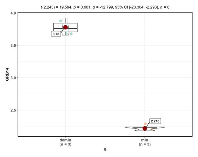
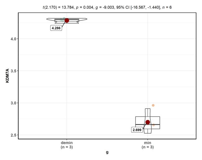
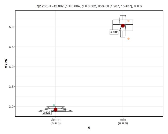
葫芦图
随便挑了4个基因 做了一下
special_gene = c( 'GRB14', 'KDM7A', 'DPP4', 'MYPN' )
for( gene in special_gene ){
# gene='GRB14' # 先做一个看看好使不 要好使就注释了
filename <- paste( gene, '.png', sep = '' )
TMP = exprSet[ rownames( exprSet ) == gene, ]
data = as.data.frame(TMP)
data$group = group_list
p <- ggbetweenstats(data = data, x = group, y = TMP,ylab = gene,xlab = 'g')
ggsave( p, filename = filename)
}
save.image(file = 'project1.Rdata')