Lesson 1A Building Layouts
05 - Views
layout
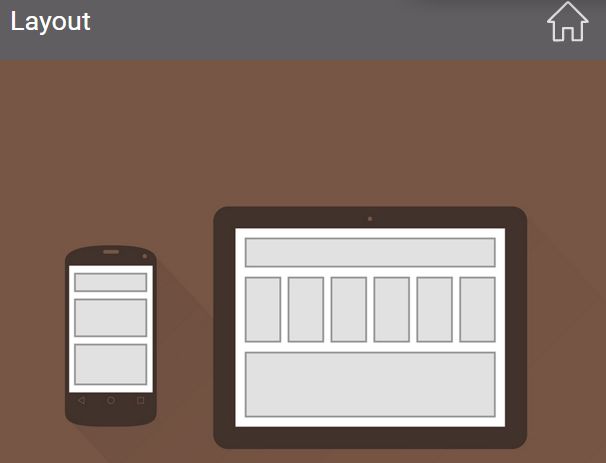
The layout of an app is the design or arrangement of what the user sees on the screen. This user interface is composed of rectangular areas called Views. Big Views can contain smaller Views, and there is always a biggest View that contains all the others.
User Interface
The user interface of an app is what we see on the screen of the Android device. It consists of one or more rectangular areas called Views, which display information. Some of the Views — the buttons, for example — also respond to a touch.
TextView
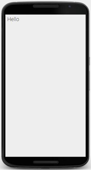
A View is a rectangular area on the screen. One type of View is a TextView, which displays one or more lines of text.
A TextView on the screen is drawn by a Java object inside the Android device. In fact, the Java object is the real TextView. But when talking about what the user sees, it’s convenient to refer to the rectangular area on the screen as the “TextView”.
ImageView
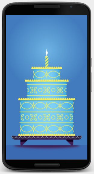
- DESCRIPTION:A View is a rectangular area on the screen. One type of View is anImageView, which displays an image such as an icon or a photograph.
An ImageView on the screen is drawn by a Java object inside the Android device. In fact, the Java object is the real ImageView. But when talking about what the user sees, it’s convenient to refer to the rectangular area on the screen as the “ImageView”.
-
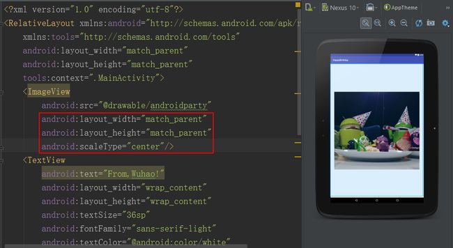
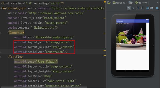
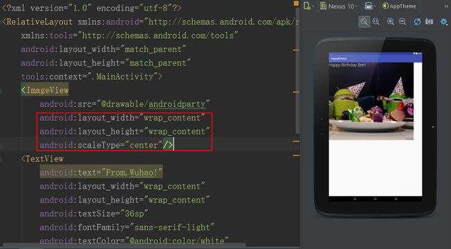
center vs centerCrop
Button
A View is a rectangular area on the screen. One type of View is a Button, which displays a piece of text. When touched, a properly configured Button tells the Android device to execute a method — a list of instructions, like a little program.
A Button on the screen is drawn by a Java object inside the Android device. In fact, the Java object is the real Button. But when talking about what the user sees, it’s convenient to refer to the rectangular area on the screen as the “Button”.
![Upload Paste_Image.png failed. Please try again.]
Camel case
A computer is a machine that follows a list of instructions called a program. An Android device is a computer and an app is a program.
We often name the things inside the device with a two-word phrase such as “linear layout” or “main activity”. But our language Java does not permit a space between the two words of a name. When eliminating the space, we capitalize the second word so we can see where one word ends and the next one begins. This typographic convention is called camel case, and it yields many of the words that give Android programming its distinctive flavor: LinearLayout, MainActivity, onClick.
XML
XML stands for “Extensible Markup Language”. It is a notation for writing information structured as a hierarchy or family tree. Examples include a Roman numeral outline of topics; a corporate organizational chart of divisions and subdivisions; or a listing of states, counties, and cities.
A state can contain many counties, and a county can contain many cities. But each city can be contained in only one county, and each county can be contained in only one state. In XML, we say that each item of data can contain many children, but can be contained in only one parent.
This family-tree structure makes XML ideal for describing the layout of the screen of an Android app, which is composed of rectangular areas calledViews. The layout always consists of one big View which may contain smaller ones, which may in turn contain even smaller ones.
12 - XML Syntax
XML Tag
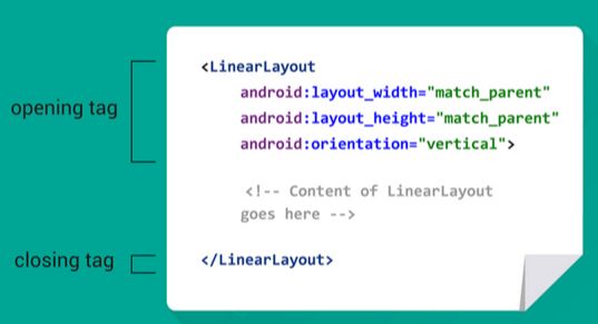
The Extensible Markup Language (XML) is a notation for writing a file containing pieces of information called elements. To indicate where an element begins and ends, we write tags. A tag is easy to recognize because it always begins and ends with the characters < and >. A tag also contains the name of the element (i.e. LinearLayout) whose beginning and end it marks.
An element often consists of a pair of tags, plus all the content between them. In this case, the second tag of the pair begins with the characters closes the first.
An element that does not need to enclose any content can consist of a single tag. In this case, the tag ends with the characters /> and we say that it is a self-closing tag.
Attributes
The Extensible Markup Language (XML) is a notation for writing a file containing pieces of information called elements. For example, a file describing the layout of the screen might contain elements representing buttons and images. The start of each element is marked with a tag surrounded by the characters < and >. A small element might consist of nothing but this tag.
An element can have smaller pieces of information called attributes written inside of its initial tag. Each attribute consists of a name and a value. For example, a TextView element might have an attribute whose name is “text” and whose value is “Hello”. We write the name of the attribute on the left, the value on the right, and join them with an equal sign. The value is always enclosed in double quotes.
13 - Change the TextView
dp (Density-Independent Pixel)
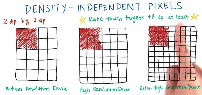
The screen of an Android device is made of rows and columns of glowing dots called pixels. Devices can range in screen density, which means how many pixels per inch (or dots per inch) are on the screen. For example, an mdpi (or medium density device) has 160 dots per inch, while an xxhdpi (extra extra high density device) has 480 dots per inch.
If we specify the size of views in pixel values, then views would appear very small on the higher density devices, where there are many pixels packed into a small area. If a button is too small, then it would be hard for the user to touch it.
To achieve a consistent physical size of Views, across devices of different screen densities, we use a unit of measure called a density-independent pixel (dp or dip, pronounced “dee pee” or “dip”). 1 dp is equal to 1 pixel on an mdpi device. 1 dp is equal to 3 pixels on an xxhdpi device, and so on for other devices. Per Material design guidelines, any touch target on the screen should be at least 48 dp wide by 48 dp tall. That way, a button in an app on one device will be approximately the same physical size as that button in the same app running on a device with a different screen density.
Android devices will automatically handle the conversion from dp to pixel values, so developers just have to use dp values when specifying measurements in their layouts. For example, dp’s can be used to specify the width and height of a View, shown in the illustration.
14 - Getting Past Errors
Link to the Common Views Cheatsheet
How to take a screenshot
Android Studio enables you to capture a screenshot or a short video of the device screen while your app is running. Screenshots and videos are useful as promotional materials for your app, and you can also attach them to bug reports that you send to your development team.
15 - Setting Wrap Content
Hard coding
A computer is a machine that follows a list of instructions called aprogram. An Android device is a computer and an app is a program.
One way to get information into an app is to write it in the instructions of the app:
add 10 + 20
or make the TextView 100dp wideThis is called hardcoding the information into the app.
The TextView in the above instruction is an example of a View, which is a rectangular area on the screen that can display information. A View can be contained in a larger View, called its parent. Assuming that the TextView is contained in a parent whose width is 100dp, we might write the above instruction if we wanted the TextView to occupy the entire width of its parent. One disadvantage of hardcoding the value 100dp into this instruction is that we would have to remember to rewrite it if we ever changed the width of the TextView’s parent.
This is one reason why we avoid writing hardcoded values. There would be less for us to remember to do if we could write an instruction that would tell the TextView to get its width automatically from its parent. Less maintenance means fewer bugs.
wrap_content
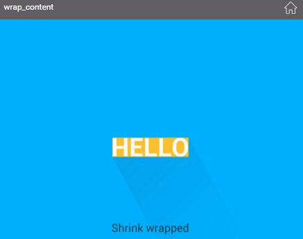
A View is a rectangular area on the screen, usually containing some content. For example, a TextView contains text, an ImageView contains an image, and a special type of View called a ViewGroup contains smaller Views inside of it.
We can specify the width or height of a View as a given distance. Alternatively, we can specify it as the special value wrap_content to shrink-wrap the View around its content. To prevent the View from wrapping itself too tightly, we can also specify a certain amount of padding.
16 - TextView Text Size
scale-independent pixel(sp)
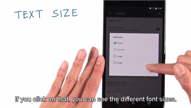
DESCRIPTION: A scale-independent pixel(sp) is a unit of length for specifying the size of a font of type. Its length depends on the user’s preference for font size, set in the Settings app of the Android device.To respect the user’s preferences, you should specify all font sizes in scale-independent pixels. All other measurements should be given in device-independent pixels(dp’s).
- Material Design typography guidelines
Google Material Design
- Android5.0新特性-Material Design
- Material Design for Developers
Material design is a comprehensive guide for visual, motion, and interaction design across platforms and devices. To use material design in your Android apps, follow the guidelines described in the material design specification and use the new components and functionality available in Android 5.0 (API level 21). - Optional challenge: Learn about text appearance from this G+ #AndroidDev #Protip
17 - TextView Text Color
Hexadecimal Colors
Hexadecimal color values are supported in all major browsers.
A hexadecimal color is specified with: #RRGGBB, where the RR (red), GG (green) and BB (blue) hexadecimal integers specify the components of the color. All values must be between 00 and FF.
For example, the #0000FF value is rendered as blue, because the blue component is set to its highest value (FF) and the others are set to the lowest value (00).
Color palette(调色板)
This color palette comprises primary and accent colors that can be used for illustration or to develop your brand colors. They’ve been designed to work harmoniously with each other.
The color palette starts with primary colors and fills in the spectrum to create a complete and usable palette for Android, Web, and iOS. Google suggests using the 500 colors as the primary colors in your app and the other colors as accents colors.
18 - Simple ImageView
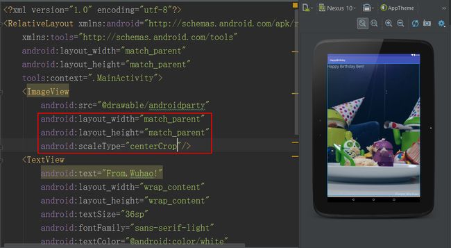
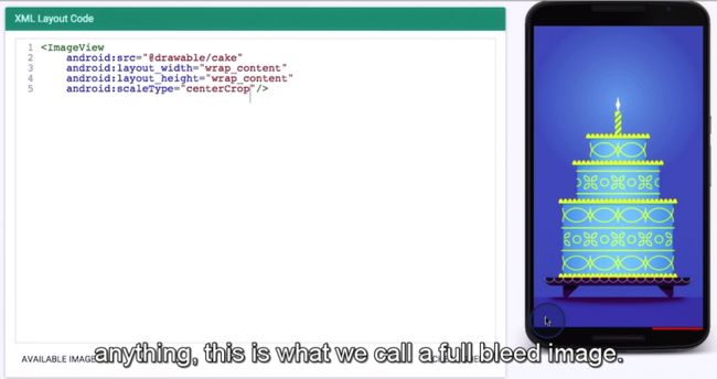
    android:src="@drawable/cake"
    android:layout_width="wrap_content"
    android:layout_height="wrap_content"


    android:scaleType="center"/>
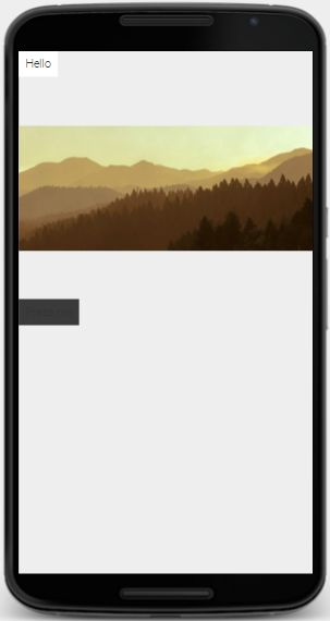
When displaying photographs, I like to use center crop. This is because it's typically okay to crop off the edges of the photograph in order to achieve this edge to edge look. When images go edge to edge without any white border or anything, this is what we call a full bleed image.
