title: Redesigning Pinterest, block by block
When I was a kid growing up in Sweden, my room was filled with classic BRIO-designed wooden toys. I remember being fascinated with the simple designs, bright colors and mix of abstract geometrical shapes and organic forms. The way they looked and moved invited you in to play with them.
The wooden train system was especially great. You could fit the track pieces together into circles, straightaways, s-curves, whatever you wanted. But you had to be thoughtful about how you created your routes — there was a logic to how the pieces fit together, and you couldn’t force the geometry.
Some twenty years later, my own kids play with these very same relics from my childhood. I can hear them clunking against the wood floor of their room right now. The enduring designs have held up across years and generations of change.
This wonderful self-evident simplicity of BRIO was on my mind last spring, when I first started to focus on a big problem that had developed with the design of Pinterest. Actually, 3 big problems.
Our UI was inconsistent
Our visual system was stale
Our marketing felt disconnected from our product
Over the years, the designs for our website, apps and marketing had all begun to drift, so they no longer felt like they had the same personality. A number of new features had also been added without a clear vision to how they fit into the overall design, so the interface had begun to feel cluttered and hard to understand. There was no visual hierarchy or system to help you understand what was important when you looked at any given page. As a result, all the inspiring ideas people save on Pinterest — by far the most important part of our experience — were getting lost.
As it turns out, it’s damn hard to design consistent and beautiful things at scale.
A matter of principles
The Pinterest experience as a whole was in sore need of simplifying and unifying. And if we were going to do that, we needed to identify some core design principles for ourselves.
I retreated to a dark corner of the Pinterest basement and spent the next few weeks playing with designs. I wasn’t even sure what I was doing at first — basically it was like my own grown-up version of banging blocks together. I started mulling on questions like, Why do people love Pinterest? What makes our product unique? What’s our personality? What are we all about?
The more I thought about it, the more I realized that the essence of Pinterest is a lot like my family’s beloved collection of BRIO toys. Both of them encourage you to play with different options, connect pieces together and create your own world. You can start with your own goals and projects in mind, or you can get inspired by what someone else is doing and build off that. Jump in and immediately start playing, stop whenever you want, then come back and pick up right where you left off.
Pushing the thinking even further, the essential qualities that Pinterest and BRIO shared bubbled down to 3 simple principles. These described the best qualities of Pinterest today, and laid the foundation for where we wanted to take the product in the future.
—
Lucid
It’s intuitive, not learned
You understand how things work without any direct explanation.
It makes the user feel powerful
Nothing makes you feel uncomfortable or like you can’t trust the system. The system provides you with the right components and asks you what to do next.
It makes the content taste better
The framework is totally seamless and hidden. You don’t notice it until you interact with it. You get to decide what you want it to be, instead of us forcing it on you.
2. Animated
It’s colorful
The personality is bold and stands out.
It’s visually responsive
The experience interactions in a physical way.
It’s unexpected
The experience is playful and fun, but never overwhelming.
3. Unbreakable
It’s built for explorationJust like a children’s toy, you want to try it out just to see what will happen. The more you investigate, the faster you learn and the more you get in return.
It’s impossible to mis-tapEverything is designed to help you navigate easily and do exactly what you had in mind.
It’s reversibleIf you accidentally do something that doesn’t produce the results you were looking for, it’s obvious how to correct it.
—
Once we blocked out these 3 principles, the next step was to translate them into something tangible that could potentially be the foundation of everything we built moving forward.
The basics
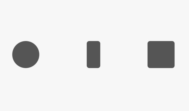
Shapes — We use basic and touch-friendly shapes that people naturally understand and want to interact with. The corners are rounded to make them feel more approachable.
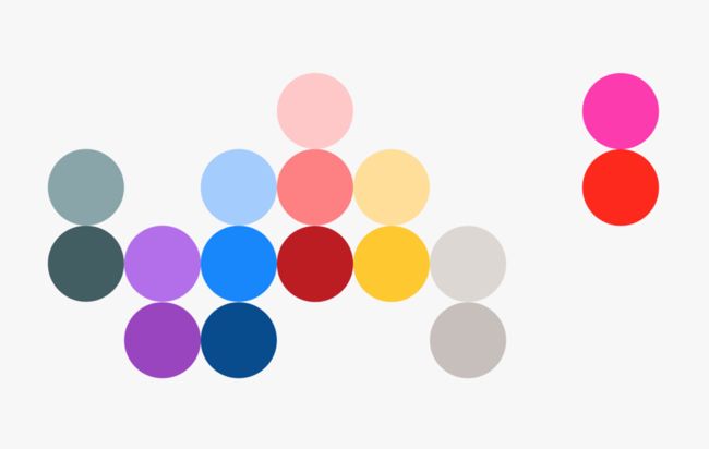
Colors — I’m a big fan of analogous color schemes. They feel very natural and reflect a feeling of calmness. When you combine a few different analogous color schemes that were originally based on some given complementary colors, the result is very interesting and unexpected.
Hierarchy — Everything is extremely hierarchical, so it’s always clear what’s most important. As we design we ask ourselves, What’s the most important thing for someone to understand here? What we can remove to make things even more obvious?
White space — In the old Pinterest design, the focus was on the containers that surrounded people’s content, which overpowered the content itself. All you saw were lots of lines, gradients, shades of grey. There was no room to breathe. Introducing white space gives a natural separation between elements without adding more visual noise. The result is balanced and structured, and the amount of whitespace adds personality and impact.
The early explorations and ideas
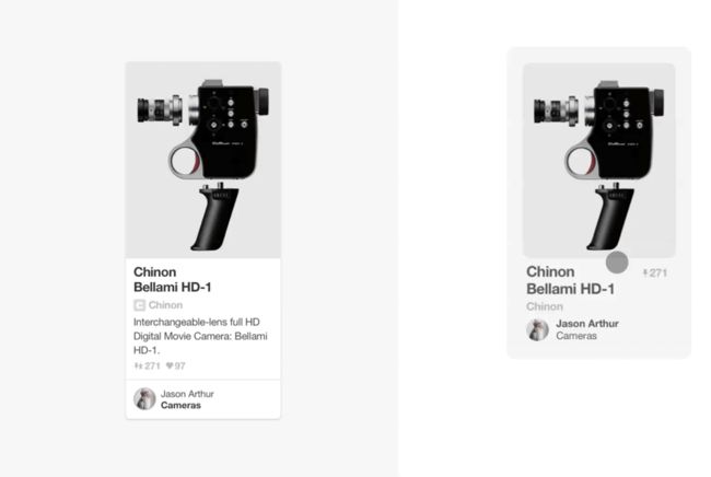
We wanted to see what would happen if we just removed all the containers from from the UI. Would the focus return to the objects themselves, or would the experience fall apart completely?
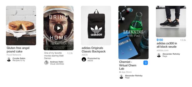
Turns out the resulting container-less grid felt great, and the emphasis was finally back on the ideas people were saving on Pinterest. We didn’t lose the containers entirely, since they do help clarify which info goes with what image. Instead, we wait to show the container until you’re curious enough to tap. That way, the interface visually teaches you how information is connected and grouped in our system. You only need to experience this interaction once to understand how a Pin is built.
Designing a new set of standards
After playing around with the designs and interactions for good couple months, the team and I finally got things to place where we felt like all 3 of our product design principles (lucid, animated, unbreakable) were represented. We were ready to put our newly established principles and design system to the test.
We wanted to start with a contained system, so we decided to tackle our iOS app first. For our first pass, we focused on the visual design — reworking the information architecture will come later. You canread all about the iOS redesign and coordinated backend rebuild in WIRED.
Along with redesigning the app, we also built what we’re calling Pinterest’s Product Design Standards, which includes:
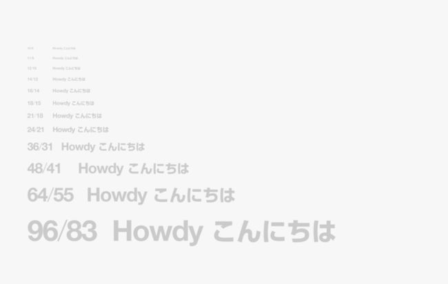
System—Shapes, typography, colors, grids
Structure— The arrangement of components
Environment — All the little pieces of the world we’re designing
We spent the next 9 months working closely with engineering to build each component, and we made lots of modifications and adjustments along the way. It’s been an incredible, collaborative effort making sure everything we built together not only meets our design goals, but is reusable and valuable to all other product engineering teams across Pinterest.
Below are just some of the ways our new Design Standards have taken shape across Pinterest.
The epic team that made it happen
Pretty much the entire product design team at Pinterest was involved in vetting and executing the new design system.
We also had a small team of crack designers (Annie Teng,Jay Marsh,Kimberly Fellman,Linus Wahlstedt,Long Cheng,Patrik Goethe,Rick Chatas,Susan Kare,Tom Watson,Woosung Kang) who worked closely with me and our amazing engineers to iterate on design decisions together, to find the right transitions and curves, to prototype different gestures, and so on and on. This was truly the best part of the process. Working across teams, incorporating feedback from multiple perspectives (a process known at Pinterest as “knitting”) made the results exponentially stronger. We also had a lot of fun.
And last, I worked closely with the Pinterest brand team to create new brand guidelines that reflect these same design principles. Our latest marketing is already starting to feel like it shares the same voice with our product.
Up next, we’ll be tackling the next wave of improvements for the iOS app, along with redesigning the Pinterest website and Android app, andwe’re looking for even more stellar designersto help make it happen.
I hope you are as excited as we are about where it will all end up.

