Day 2 of 100 days of daily UI design, theme "Credit Card Checkout".
The design theme is getting interesting, need a bit more thoughts than the first one. I was able to spend a little more time on thinking and making it today. Spent about 2 hours.
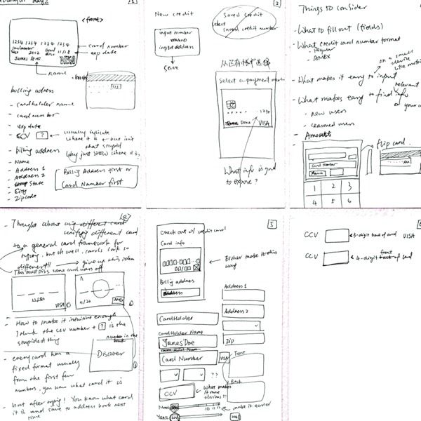
I started with scratching and sketching with pen and paper, capturing questions and ideas that came to my mind: why is this user on this check out page, is it because that he just added something to a shopping cart? Is there any other way to pay, other than credit card? What info is needed for this check out, only credit card number or billing info as well? Would saving the credit card info and bill info for further makes this user's life easier? What are some interesting interactions for input that I can play with?
I also wanted to address a couple of pain points (at least for myself) during credit card checkout:
1. Select credit card type: some checkout processes require you to select the card type first, then type in card number. It's kind of stupid, because a card type can be detected by first few digits. If a merchant only accepts certain credit card, make it straightforward like a statement, do not let users select. After all, do users care about what type of card it is? Probably nah.
2. Expiration month/year: scrolling through a long list of months and years is a pain. There must be a simpler way.
3. The "(?)" sign for the CCV (or CVV or CVC, whatever you call it). It's a technical term that probably hinder a newbie credit card user, not seasoned users, but, it's worth explaining a bit and in fact the "(?)" makes sense. But again, do users care what it is? They probably care more about where to find it. Make that straightforward. This can be a little different from Visa card (3 digits in the back) and American Express card (4 digits in the front).
With these, I scrabbled some ideas on paper, went to Twitter and Dribble to get some inspirations from other designers that already designed this checkout -- it's interesting that everyone makes different assumptions for this checkout and the designs looked so different.
My final assumption & ideas: a user just added a few products to cart and ready to checkout.
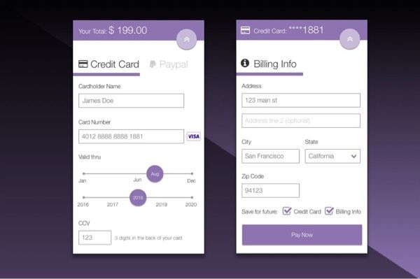
Page 1: he comes to the checkout screen and can still have a glance of the total amount (and go back if he wants). He can use Paypal if he wants to. As he types the credit card number, the card type is automatically recognized, and a note for CCV is displayed on screen. He slides the bar to find the card expiration date and inputs the CCV.
Page 2: he comes to the bill info page and fills everything out. He can save the card and billing info for future use. He clicks "Pay Now" to place order.
At the end, I thought about whether to replace "Pay Now" to "Pay $199.00 Now", but thought this may scare the user away and end up remove items or abandon the card, so I kept "Pay Now".
I liked today's work overall, but wish it can be more interactive, so that I can demonstrate how it works. Something to do in future practices. Also, it looks a bit like colored wireframes, rather than mockups, which I should also work on in upcoming practices.
Tools: started with Sketch (wanted to make something look nice), then Proto.io (wanted to add some animation, but realized I had so much to learn) and finally designed it with my favorite Axure.


