转载自KDnuggets:21 Must-Know Data Science Interview Questions and Answers
中文版在这里(上)
中文版在这里(下)
KDnuggets Editors bring you the answers to 20 Questions to Detect Fake Data Scientists, including what is regularization, Data Scientists we admire, model validation, and more.
By Gregory Piatetsky, KDnuggets.
The recent post on KDnuggets 20 Questions to Detect Fake Data Scientists has been very popular - most viewed in the month of January.
However these questions were lacking answers, so KDnuggets Editors got together and wrote the answers to these questions. I also added one more critical question - number 21, which was omitted from the 20 questions post.
Here are the answers. Because of the length, here are the answers to the first 11 questions, and here is part 2.
Q1. Explain what regularization is and why it is useful.
Answer by Matthew Mayo.
Regularization is the process of adding a tuning parameter to a model to induce smoothness in order to prevent overfitting. (see also KDnuggets posts on Overfitting)
This is most often done by adding a constant multiple to an existing weight vector. This constant is often either the L1 (Lasso) or L2 (ridge), but can in actuality can be any norm. The model predictions should then minimize the mean of the loss function calculated on the regularized training set.
Xavier Amatriain presents a good comparison of L1 and L2 regularization here, for those interested.
Fig 2: Lp ball: As the value of p decreases, the size of the corresponding L-pspace also decreases.
Q2. Which data scientists do you admire most? which startups?
Answer by Gregory Piatetsky:
This question does not have a correct answer, but here is my personal list of 12 Data Scientists I most admire, not in any particular order.
Geoff Hinton, Yann LeCun, and Yoshua Bengio- for persevering with Neural Nets when and starting the current Deep Learning revolution.
Demis Hassabis, for his amazing work on DeepMind, which achieved human or superhuman performance on Atari games and recently Go.
Jake Porway from DataKind and Rayid Ghani from U. Chicago/DSSG, for enabling data science contributions to social good.
DJ Patil, First US Chief Data Scientist, for using Data Science to make US government work better.
Kirk D. Borne for his influence and leadership on social media.
Claudia Perlich for brilliant work on ad ecosystem and serving as a great KDD-2014 chair.
Hilary Mason for great work at Bitly and inspiring others as a Big Data Rock Star.
Usama Fayyad, for showing leadership and setting high goals for KDD and Data Science, which helped inspire me and many thousands of others to do their best.
Hadley Wickham, for his fantastic work on Data Science and Data Visualization in R, including dplyr, ggplot2, and Rstudio.
There are too many excellent startups in Data Science area, but I will not list them here to avoid a conflict of interest.
Here is some of our previous coverage of startups.
Q3. How would you validate a model you created to generate a predictive model of a quantitative outcome variable using multiple regression.
Answer by Matthew Mayo.
Proposed methods for model validation:
If the values predicted by the model are far outside of the response variable range, this would immediately indicate poor estimation or model inaccuracy.
If the values seem to be reasonable, examine the parameters; any of the following would indicate poor estimation or multi-collinearity: opposite signs of expectations, unusually large or small values, or observed inconsistency when the model is fed new data.
Use the model for prediction by feeding it new data, and use the coefficient of determination(R squared) as a model validity measure.
Use data splitting to form a separate dataset for estimating model parameters, and another for validating predictions.
Use jackknife resampling if the dataset contains a small number of instances, and measure validity with R squared and mean squared error(MSE).
Q4. Explain what precision and recall are. How do they relate to the ROC curve?
Answer by Gregory Piatetsky:
Here is the answer from KDnuggets FAQ: Precision and Recall:
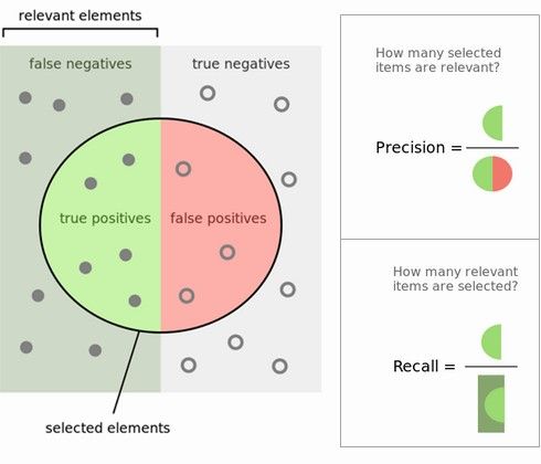
Calculating precision and recall is actually quite easy. Imagine there are 100 positive cases among 10,000 cases. You want to predict which ones are positive, and you pick 200 to have a better chance of catching many of the 100 positive cases. You record the IDs of your predictions, and when you get the actual results you sum up how many times you were right or wrong. There are four ways of being right or wrong:
TN / True Negative: case was negative and predicted negative
TP / True Positive: case was positive and predicted positive
FN / False Negative: case was positive but predicted negative
FP / False Positive: case was negative but predicted positive
Makes sense so far? Now you count how many of the 10,000 cases fall in each bucket, say:
Now, your boss asks you three questions:
1.What percent of your predictions were correct?
You answer: the "accuracy" was (9,760+60) out of 10,000 = 98.2%
2.What percent of the positive cases did you catch?
You answer: the "recall" was 60 out of 100 = 60%
3.What percent of positive predictions were correct?
You answer: the "precision" was 60 out of 200 = 30%
See also a very good explanation of Precision and recall in Wikipedia.
Fig 5: Precision and Recall.
ROC curve represents a relation between sensitivity (RECALL) and specificity(NOT PRECISION) and is commonly used to measure the performance of binary classifiers. However, when dealing with highly skewed datasets,Precision-Recall (PR) curves give a more representative picture of performance. See also this Quora answer:What is the difference between a ROC curve and a precision-recall curve?.
Q5. How can you prove that one improvement you've brought to an algorithm is really an improvement over not doing anything?
Answer by Anmol Rajpurohit.
Often it is observed that in the pursuit of rapid innovation (aka "quick fame"), the principles of scientific methodology are violated leading to misleading innovations, i.e. appealing insights that are confirmed without rigorous validation. One such scenario is the case that given the task of improving an algorithm to yield better results, you might come with several ideas with potential for improvement.
An obvious human urge is to announce these ideas ASAP and ask for their implementation. When asked for supporting data, often limited results are shared, which are very likely to be impacted by selection bias (known or unknown) or a misleading global minima (due to lack of appropriate variety in test data).
Data scientists do not let their human emotions overrun their logical reasoning. While the exact approach to prove that one improvement you've brought to an algorithm is really an improvement over not doing anything would depend on the actual case at hand, there are a few common guidelines:
Ensure that there is no selection bias in test data used for performance comparison
Ensure that the test data has sufficient variety in order to be symbolic of real-life data (helps avoid overfitting)
Ensure that "controlled experiment" principles are followed i.e. while comparing performance, the test environment (hardware, etc.) must be exactly the same while running original algorithm and new algorithm
Ensure that the results are repeatable with near similar results
Examine whether the results reflect local maxima/minima or global maxima/minima
One common way to achieve the above guidelines is through A/B testing, where both the versions of algorithm are kept running on similar environment for a considerably long time and real-life input data is randomly split between the two. This approach is particularly common in Web Analytics.
Q6. What is root cause analysis?
Answer by Gregory Piatetsky:
According to Wikipedia,
Root cause analysis (RCA) is a method of problem solving used for identifying the root causes of faults or problems. A factor is considered a root cause if removal thereof from the problem-fault-sequence prevents the final undesirable event from recurring; whereas a causal factor is one that affects an event's outcome, but is not a root cause.
Root cause analysis was initially developed to analyze industrial accidents, but is now widely used in other areas, such as healthcare, project management, or software testing.
Here is a useful Root Cause Analysis Toolkit from the state of Minnesota.
Essentially, you can find the root cause of a problem and show the relationship of causes by repeatedly asking the question, "Why?", until you find the root of the problem. This technique is commonly called "5 Whys", although is can be involve more or less than 5 questions.
Fig. 6 Whys Analysis Example, from The Art of Root Cause Analysis.
Q7. Are you familiar with price optimization, price elasticity, inventory management, competitive intelligence? Give examples.
Answer by Gregory Piatetsky:
Those are economics terms that are not frequently asked of Data Scientists but they are useful to know.
Price optimization is the use of mathematical tools to determine how customers will respond to different prices for its products and services through different channels.
Big Data and data mining enables use of personalization for price optimization. Now companies like Amazon can even take optimization further and show different prices to different visitors, based on their history, although there is a strong debate about whether this is fair.
Price elasticity in common usage typically refers to
Price elasticity of demand, a measure of price sensitivity. It is computed as:
Price Elasticity of Demand = % Change in Quantity Demanded / % Change in Price.
Similarly,Price elasticity of supply is an economics measure that shows how the quantity supplied of a good or service responds to a change in its price.
Inventory management is the overseeing and controlling of the ordering, storage and use of components that a company will use in the production of the items it will sell as well as the overseeing and controlling of quantities of finished products for sale.
Wikipedia defines
Competitive intelligence: the action of defining, gathering, analyzing, and distributing intelligence about products, customers, competitors, and any aspect of the environment needed to support executives and managers making strategic decisions for an organization.
Tools like Google Trends, Alexa, Compete, can be used to determine general trends and analyze your competitors on the web.
Here are useful resources:
Competitive Intelligence Metrics, Reports by Avinash Kaushik
37 Best Marketing Tools to Spy on Your Competitors from Kissmetrics
10 best competitive intelligence tools from 10 experts
Q8. What is statistical power?
Answer by Gregory Piatetsky:
Wikipedia defines Statistical power or sensitivity of a binary hypothesis test is the probability that the test correctly rejects the null hypothesis (H0) when the alternative hypothesis (H1) is true.
To put in another way,Statistical power is the likelihood that a study will detect an effect when the effect is present. The higher the statistical power, the less likely you are to make a Type II error (concluding there is no effect when, in fact, there is).
Here are some tools to calculate statistical power.
Q9. Explain what resampling methods are and why they are useful. Also explain their limitations.
Answer by Gregory Piatetsky:
Classical statistical parametric tests compare observed statistics to theoretical sampling distributions. Resampling a data-driven, not theory-driven methodology which is based upon repeated sampling within the same sample.
Resampling refers to methods for doing one of these
Estimating the precision of sample statistics (medians, variances, percentiles) by using subsets of available data (jackknifing) or drawing randomly with replacement from a set of data points (bootstrapping)
Exchanging labels on data points when performing significance tests (permutation tests, also called exact tests, randomization tests, or re-randomization tests)
Validating models by using random subsets (bootstrapping, cross validation)
See more in Wikipedia about bootstrapping, jackknifing.
See also How to Check Hypotheses with Bootstrap and Apache Spark
Here is a good overview of Resampling Statistics.
Q10. Is it better to have too many false positives, or too many false negatives? Explain.
Answer by Devendra Desale.
It depends on the question as well as on the domain for which we are trying to solve the question.
In medical testing, false negatives may provide a falsely reassuring message to patients and physicians that disease is absent, when it is actually present. This sometimes leads to inappropriate or inadequate treatment of both the patient and their disease. So, it is desired to have too many false positive.
For spam filtering, a false positive occurs when spam filtering or spam blocking techniques wrongly classify a legitimate email message as spam and, as a result, interferes with its delivery. While most anti-spam tactics can block or filter a high percentage of unwanted emails, doing so without creating significant false-positive results is a much more demanding task. So, we prefer too many false negatives over many false positives.
Q11. What is selection bias, why is it important and how can you avoid it?
Answer by Matthew Mayo.
Selection bias, in general, is a problematic situation in which error is introduced due to a non-random population sample. For example, if a given sample of 100 test cases was made up of a 60/20/15/5 split of 4 classes which actually occurred in relatively equal numbers in the population, then a given model may make the false assumption that probability could be the determining predictive factor. Avoiding non-random samples is the best way to deal with bias; however, when this is impractical, techniques such as resampling, boosting, and weighting are strategies which can be introduced to help deal with the situation.
The second part of the answers will be published next week.
Bonus Question: Explain what is overfitting and how would you control for it
This question was not part of the original 20, but probably is the most important one in distinguishing real data scientists from fake ones.
Answer by Gregory Piatetsky.
Overfitting is finding spurious results that are due to chance and cannot be reproduced by subsequent studies.
We frequently see newspaper reports about studies that overturn the previous findings, like eggs are no longer bad for your health, or saturated fat is not linked to heart disease. The problem, in our opinion is that many researchers, especially in social sciences or medicine, too frequently commit the cardinal sin of Data Mining -Overfitting the data.
The researchers test too many hypotheses without proper statistical control, until they happen to find something interesting and report it. Not surprisingly, next time the effect, which was (at least partly) due to chance, will be much smaller or absent.
These flaws of research practices were identified and reported by John P. A. Ioannidis in his landmark paper Why Most Published Research Findings Are False(PLoS Medicine, 2005). Ioannidis found that very often either the results were exaggerated or the findings could not be replicated. In his paper, he presented statistical evidence that indeed most claimed research findings are false.
Ioannidis noted that in order for a research finding to be reliable, it should have:
Large sample size and with large effects
Greater number of and lesser selection of tested relationship
Greater flexibility in designs, definitions, outcomes, and analytical modes
Minimal bias due to financial and other factors (including popularity of that scientific field)
Unfortunately, too often these rules were violated, producing irreproducible results. For example, S&P 500 index was found to be strongly related to Production of butter in Bangladesh (from 19891 to 1993) (here is PDF)
See more interesting (and totally spurious) findings which you can discover yourself using tools such as Google correlate or Spurious correlations by Tyler Vigen.
Several methods can be used to avoid "overfitting" the data
Try to find the simplest possible hypothesis
Regularization (adding a penalty for complexity)
Randomization Testing (randomize the class variable, try your method on this data - if it find the same strong results, something is wrong)
Nested cross-validation (do feature selection on one level, then run entire method in cross-validation on outer level)
Adjusting the False Discovery Rate
Using the reusable holdout method- a breakthrough approach proposed in 2015
Good data science is on the leading edge of scientific understanding of the world, and it is data scientists responsibility to avoid overfitting data and educate the public and the media on the dangers of bad data analysis.
See also
The Cardinal Sin of Data Mining and Data Science: Overfitting
Big Idea To Avoid Overfitting: Reusable Holdout to Preserve Validity in Adaptive Data Analysis
Overcoming Overfitting with the reusable holdout: Preserving validity in adaptive data analysis
11 Clever Methods of Overfitting and how to avoid them
Tag: Overfitting
Q12. Give an example of how you would use experimental design to answer a question about user behavior.
Answer by Bhavya Geethika.
Step 1: Formulate the Research Question:
What are the effects of page load times on user satisfaction ratings?
Step 2: Identify variables:
We identify the cause & effect. Independent variable -page load time, Dependent variable- user satisfaction rating
Step 3: Generate Hypothesis:
Lower page download time will have more effect on the user satisfaction rating for a web page. Here the factor we analyze is page load time.
Fig 12: There is a flaw in your experimental design (cartoon from here)
Step 4: Determine Experimental Design.
We consider experimental complexity i.e vary one factor at a time or multiple factors at one time in which case we use factorial design (2^k design). A design is also selected based on the type of objective (Comparative, Screening, Response surface) & number of factors.
Here we also identify within-participants, between-participants, and mixed model.For e.g.: There are two versions of a page, one with Buy button (call to action) on left and the other version has this button on the right.
Within-participants design - both user groups see both versions.
Between-participants design - one group of users see version A & the other user group version B.
Step 5: Develop experimental task & procedure:
Detailed description of steps involved in the experiment, tools used to measure user behavior, goals and success metrics should be defined. Collect qualitative data about user engagement to allow statistical analysis.
Step 6: Determine Manipulation & Measurements
1. Manipulation: One level of factor will be controlled and the other will be manipulated. We also identify the behavioral measures:
2. Latency- time between a prompt and occurrence of behavior (how long it takes for a user to click buy after being presented with products).
3. Frequency- number of times a behavior occurs (number of times the user clicks on a given page within a time)
4. Duration-length of time a specific behavior lasts(time taken to add all products)
Intensity-force with which a behavior occurs ( how quickly the user purchased a product)
Step 7: Analyze results
Identify user behavior data and support the hypothesis or contradict according to the observations made for e.g. how majority of users satisfaction ratings compared with page load times.
Q13. What is the difference between "long" ("tall") and "wide" format data?
Answer by Gregory Piatetsky.
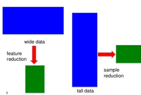
In most data mining / data science applications there are many more records (rows) than features (columns) - such data is sometimes called "tall" (or "long") data.
In some applications like genomics or bioinformatics you may have only a small number of records (patients), eg 100, but perhaps 20,000 observations for each patient. The standard methods that work for "tall" data will lead to overfitting the data, so special approaches are needed.
Fig 13. Different approaches for tall data and wide data, from presentation Sparse Screening for Exact Data Reduction, by Jieping Ye.
The problem is not just reshaping the data (here there areuseful R packages), but avoiding false positives by reducing the number of features to find most relevant ones.
Approaches for feature reduction like Lasso are well covered in Statistical Learning with Sparsity: The Lasso and Generalizations, by Hastie, Tibshirani, and Wainwright. (you can download free PDF of the book)
Q14. What method do you use to determine whether the statistics published in an article (or appeared in a newspaper or other media) are either wrong or presented to support the author's point of view, rather than correct, comprehensive factual information on a specific subject?
A simple rule, suggested by Zack Lipton, is
if some statistics are published in a newspaper, then they are wrong.
Here is a more serious answer by Anmol Rajpurohit.
Every media organization has a target audience. This choice impacts a lot of decisions such as which article to publish, how to phrase an article, what part of an article to highlight, how to tell a given story, etc.
In determining the validity of statistics published in any article, one of the first steps will be to examine the publishing agency and its target audience. Even if it is the same news story involving statistics, you will notice that it will be published very differently across Fox News vs. WSJ vs. ACM/IEEE journals. So, data scientists are smart about where to get the news from (and how much to rely on the stories based on sources!).
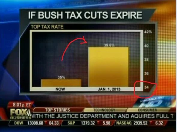
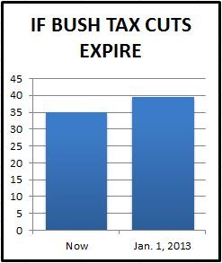
Fig 14a: Example of a very misleading bar chart that appeared on Fox News
Fig 14b: how the same data should be presented objectively, from5 Ways to Avoid Being Fooled By Statistics
Often the authors try to hide the inadequacy of their research through canny storytelling and omitting important details to jump on to enticingly presented false insights. Thus, a thumb's rule to identify articles with misleading statistical inferences is to examine whether the article includes details on the research methodology followed and any perceived limitations of the choices made related to research methodology. Look for words such as "sample size", "margin of error", etc. While there are no perfect answers as to what sample size or margin of error is appropriate, these attributes must certainly be kept in mind while reading the end results.
Another common case of erratic reporting are the situations when journalists with poor data-education pick up an insight from one or two paragraphs of a published research paper, while ignoring the rest of research paper, just in order to make their point. So, here is how you can be smart to avoid being fooled by such articles: Firstly, a reliable article must not have any unsubstantiated claims. All the assertions must be backed with reference to past research. Or otherwise, is must be clearly differentiated as an "opinion" and not an assertion. Secondly, just because an article is referring to renowned research papers, does not mean that it is using the insight from those research papers appropriately. This can be validated by reading those referred research papers "in entirety", and independently judging their relevance to the article at hand. Lastly, though the end-results might naturally seem like the most interesting part, it is often fatal to skip the details about research methodology (and spot errors, bias, etc.).
Ideally, I wish that all such articles publish their underlying research data as well as the approach. That way, the articles can achieve genuine trust as everyone is free to analyze the data and apply the research approach to see the results for themselves.
Q15. Explain Edward Tufte's concept of "chart junk."
Answer by Gregory Piatetsky:
Chartjunk refers to all visual elements in charts and graphs that are not necessary to comprehend the information represented on the graph, or that distract the viewer from this information.
The term chartjunk was coined by Edward Tufte in his 1983 book The Visual Display of Quantitative Information.
Fig 15.Tufte writes: "an unintentional Necker Illusion, as two back planes optically flip to the front. Some pyramids conceal others; and one variable (stacked depth of the stupid pyramids) has no label or scale."
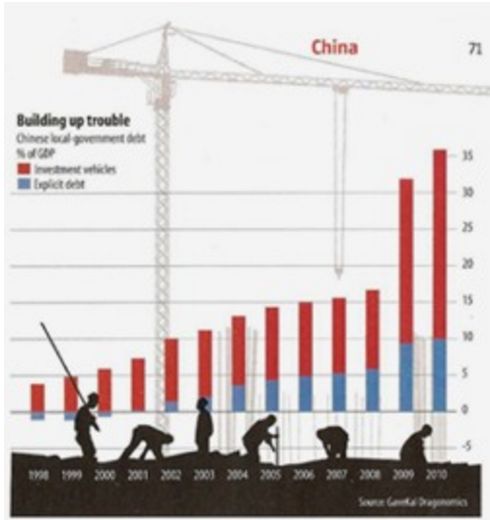
Here is a more modern example from exceluser where it is very hard to understand the column plot because of workers and cranes that obscure them.
The problem with such decorations is that they forces readers to work much harder than necessary to discover the meaning of data.
Q16. How would you screen for outliers and what should you do if you find one?
Answer by Bhavya Geethika.
Some methods to screen outliers are z-scores, modified z-score, box plots, Grubb's test, Tietjen-Moore test exponential smoothing, Kimber test for exponential distribution and moving window filter algorithm. However two of the robust methods in detail are:
Inter Quartile Range
An outlier is a point of data that lies over 1.5 IQRs below the first quartile (Q1) or above third quartile (Q3) in a given data set.
High = (Q3) + 1.5 IQR
Low = (Q1) - 1.5 IQR
Tukey Method
It uses interquartile range to filter very large or very small numbers. It is practically the same method as above except that it uses the concept of "fences". The two values of fences are:
Low outliers = Q1 - 1.5(Q3 - Q1) = Q1 - 1.5(IQR)
High outliers = Q3 + 1.5(Q3 - Q1) = Q3 + 1.5(IQR)
Anything outside of the fences is an outlier.
When you find outliers, you should not remove it without a qualitative assessment because that way you are altering the data and making it no longer pure. It is important to understand the context of analysis or importantly "The Why question - Why an outlier is different from other data points?"
This reason is critical. If outliers are attributed to error, you may throw it out but if they signify a new trend, pattern or reveal a valuable insight into the data you should retain it.
Q17. How would you use either the extreme value theory, Monte Carlo simulations or mathematical statistics (or anything else) to correctly estimate the chance of a very rare event?
Answer by Matthew Mayo.
Extreme value theory (EVT) focuses on rare events and extremes, as opposed to classical approaches to statistics which concentrate on average behaviors. EVT states that there are 3 types of distributions needed to model the the extreme data points of a collection of random observations from some distribution: the Gumble, Frechet, and Weibull distributions, also known as the Extreme Value Distributions (EVD) 1, 2, and 3, respectively.
The EVT states that, if you were to generate N data sets from a given distribution, and then create a new dataset containing only the maximum values of these N data sets, this new dataset would only be accurately described by one of the EVD distributions: Gumbel, Frechet, or Weibull. The Generalized Extreme Value Distribution (GEV) is, then, a model combining the 3 EVT models as well as the EVD model.
Knowing the models to use for modeling our data, we can then use the models to fit our data, and then evaluate. Once the best fitting model is found, analysis can be performed, including calculating possibilities.
Q18. What is a recommendation engine? How does it work?
Answer by Gregory Piatetsky:
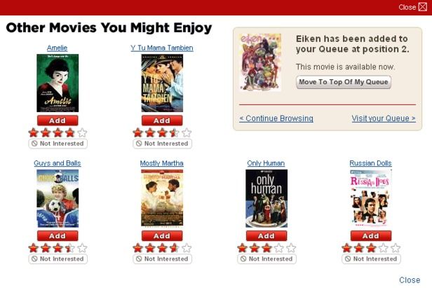
We are all familiar now with recommendations from Netflix - "Other Movies you might enjoy" or from Amazon - Customers who bought X also bought Y.,
Such systems are called recommendation engines or more broadly recommender systems.
They typically produce recommendations in one of two ways: using collaborativeorcontent-based filtering.
Collaborative filtering methods build a model based on users past behavior (items previously purchased, movies viewed and rated, etc) and use decisions made by current and other users. This model is then used to predict items (or ratings for items) that the user may be interested in.
Content-based filtering methods use features of an item to recommend additional items with similar properties. These approaches are often combined in Hybrid Recommender Systems.
Here is a comparison of these 2 approaches used in two popular music recommender systems - Last.fm and Pandora Radio. (example from Recommender System entry)
Last.fm creates a "station" of recommended songs by observing what bands and individual tracks the user has listened to on a regular basis and comparing those against the listening behavior of other users. Last.fm will play tracks that do not appear in the user's library, but are often played by other users with similar interests. As this approach leverages the behavior of users, it is an example of a collaborative filtering technique.
Pandora uses the properties of a song or artist (a subset of the 400 attributes provided by the Music Genome Project) in order to seed a "station" that plays music with similar properties. User feedback is used to refine the station's results, deemphasizing certain attributes when a user "dislikes" a particular song and emphasizing other attributes when a user "likes" a song. This is an example of a content-based approach.
Here is a good Introduction to Recommendation Engines by Dataconomy and an overview of building a Collaborative Filtering Recommendation Engine by Toptal. For latest research on recommender systems, check ACM RecSys conference.
Q19. Explain what a false positive and a false negative are. Why is it important to differentiate these from each other?
Answer by Gregory Piatetsky:
In binary classification (or medical testing), False positive is when an algorithm (or test) indicates presence of a condition, when in reality it is absent. A false negative is when an algorithm (or test) indicates absence of a condition, when in reality it is present.
In statistical hypothesis testing false positive is also called type I error and false negative - type II error.
It is obviously very important to distinguish and treat false positives and false negatives differently because the costs of such errors can be hugely different.
For example, if a test for serious disease is false positive (test says disease, but person is healthy), then an extra test will be made that will determine the correct diagnosis. However, if a test is false negative (test says healthy, but person has disease), then treatment will be done and person may die as a result.
Q20. Which tools do you use for visualization? What do you think of Tableau? R? SAS? (for graphs). How to efficiently represent 5 dimension in a chart (or in a video)?
Answer by Gregory Piatetsky:
There are many good tools for Data Visualization. R, Python, Tableau and Excel are among most commonly used by Data Scientists.
Here are useful KDnuggets resources:
Visualization and Data Mining Software
Overview of Python Visualization Tools
21 Essential Data Visualization Tools
Top 30 Social Network Analysis and Visualization Tools
Tag: Data Visualization
There are many ways to representing more than 2 dimensions in a chart. 3rd dimension can be shown with a 3D scatter plot which can be rotate. You can use color, shading, shape, size. Animation can be used effectively to show time dimension (change over time).
Here is a good example.
Fig 20a: 5-dimensional scatter plot of Iris data, with size: sepal length; color: sepal width; shape: class; x-column: petal length; y-column: petal width, from here.
For more than 5 dimensions, one approach is Parallel Coordinates, pioneered by Alfred Inselberg.
Fig 20b: Iris data in parallel coordinates
See also
Quora: What's the best way to visualize high-dimensional data? and
pioneering work of Georges Grinstein and his colleagues on High-Dimensional Visualizations.
Of course, when you have a lot of dimensions, it is best to reduce the number of dimensions or features first.


