ConstraintLayout,看完一篇真的就够了么?
本文由 GitCode8 授权投稿
原文链接:https://juejin.im/post/5d12c4146fb9a07ea33c24b7
1. 前言
最近中毒很深,经常逛掘金,看到很多优秀的文章,感谢掘金。同时也看到很多标题,看看XXXX,一篇就够了。技术一直在不停的更新迭代,看一篇永远是不够的,建议再看一遍官网的,可以看到被作者过滤掉的信息或者最新的更新。这就是我为什么会在文末放官网链接的原因,如果有的话。
2. ConstraintLayout
ConstraintLayout作为一款可以灵活调整view位置和大小的Viewgroup被Google疯狂推荐,以前创建布局,默认根元素都是LinearLayout,现在是ConstraintLayout了。ConstraintLayout能够以支持库的形式最小支持到API 9,同时也在不断的丰富ConstraintLayout的API和功能。ConstraintLayout在复杂布局中能够有效的,降低布局的层级,提高性能,使用更加灵活。
在app组件的Graldle默认都有如下依赖:
//可能版本不一样哦implementation 'com.android.support.constraint:constraint-layout:1.1.3
implementation 'com.android.support.constraint:constraint-layout:1.1.3
迫不及待想了解ConstraintLayout能在布局做点什么了。
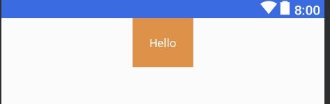
2.1 相对定位
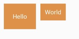
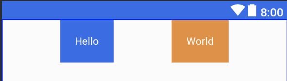
相对定位,其实这跟RelativeLayout差不多,一个View相对另外一个View的位置。
 相对布局
相对布局
通过简单的使用ConstraintLayout的属性也就可以实现以上布局。World对于Hello的右边,GitCode对位于Hello的下边
<android.support.constraint.ConstraintLayout
    ...>
    <TextView
            ...
            android:text="Hello"
            android:id="@+id/tvHello"/>

    <TextView
            ...
            android:text="World"
            app:layout_constraintLeft_toRightOf="@+id/tvHello"/>

    <TextView
            ...
            android:text="GitCode"
            app:layout_constraintTop_toBottomOf="@id/tvHello"/>
android.support.constraint.ConstraintLayout>
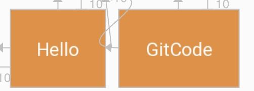
以TextView World相对位置属性layout_constraintLeft_toRightOf来说,constraintLeft表示TextView World本身的左边,一个View有四条边,因此TextView的上、右、下边分别对应着constraintTop、constraintRight、constraintBottom。toRightOf则表示位于另外一个View的右边,例如此处位于Hello的右边,因此对应还有toLeftOf、toRghtOf、toBottomOf,分别位于View Hello的左、右、下边。
总结的说,constraintXXX表示View自身约束的边,toXXXOf表示另一个View的边,而XXX的值可以是Left、Top、Right、Bottom,分别对应左,上、右、下边。layout_constraintStart_toEndOf也是类似的道理。
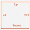
另外需要注意的是,view的位置可以相对于同层的view和parent,在相对于parent的时候toLeftOf、toTopOf、toRghtOf、toBottomOf分别表示位于parent的内部左上右下边缘。如图:红色框表示parent view。
再来看看一个特殊的场景:
此时想要Hello和World文本中间对齐怎么办?ConstraintLayout提供了
layout_constraintBaseline_toBaselineOf属性。
<TextView
    ...
    android:text="World"
    app:layout_constraintBaseline_toBaselineOf="@id/tvHello"
    app:layout_constraintLeft_toRightOf="@+id/tvHello"/>
此时界面就如愿了,比Relativelayout方便多了。

什么是baseline?贴张官网的图

2.2 边距
边距与平常使用并无太大区别,但需要先确定view的位置,边距才会生效。如:
在其他的ViewGroup,TextView的layout_marginTop和layout_marginLeft属性是会生效的,但在ConstraintLayout不会生效,因为此时TextView的位置还没确定。下面的代码才会生效。
常用属性如下:
GONE Margin
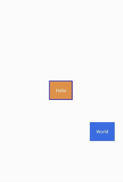
有时候,会有这种需求,在World可见的时候,GitCode与World的左边距是0,当World不见时,GitCode的左边距是某个特定的值。
World可见的效果,GitCode的左边距为0

World不可见的效果,GitCode的左边距为10
为此,ConstraintLayout提供了特殊的goneMargin属性,在目标View隐藏时,属性生效。有如下属性:
Centering positioning and bias
在RelativeLayout居中,通常是使用以下三个属性:
而在ConstraintLayout居中则采用左右上下边来约束居中。
效果图:
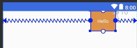
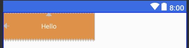
那,要是想把Hello往左挪一点,怎么办?
那很简单,使用margin呀。不不不,这里要介绍的是另外两个属性,与LinearLayout的权重类似(当然,ConstraintLayout也可以使用权重属性),但简单很多。
两个属性的取值范围在0-1。在水平偏移中,0表示最左,1表示最右;在垂直偏移,0表示最上,1表示最下;0.5表示中间。
效果:
2.3 圆形定位(Added in 1.1)
圆形定位指的是View的中心点相对于另外View中心点的位置。贴张官网图。

涉及三个属性:
吃个栗子:
<TextView
    android:text="World"
    app:layout_constraintCircle="@id/tvHello"
    app:layout_constraintCircleRadius="180dp"
    app:layout_constraintCircleAngle="135"/>
效果图:Hello中间居中,World 135角度
2.4 尺寸约束
ConstraintLayout 最大最小尺寸
ConstraintLayout的宽高设为WRAP_CONTENT时,可以通过以下熟悉设置其最大最小尺寸。
ConstraintLayout中的控件尺寸约束
在ConstraintLayout中控件可以三种方式来设置其尺寸约束。
第一二种跟平常使用没什么区别。第三种会根据约束情况重新计算控件的大小。
在ConstraintLayout中,不推荐使用MATCH_PARENT,而是推荐使用MATCH_CONSTRAINT(0dp),它们的行为是类似的。
吃个栗子吧:
android:id="@+id/tvHello"
android:gravity="center"
android:padding="20dp"
app:layout_constraintTop_toTopOf="parent"
android:textColor="@color/colorWhite"
android:background="@color/colorPrimary"
app:layout_constraintLeft_toLeftOf="parent"
app:layout_constraintRight_toRightOf="parent"
android:layout_width="0dp"
android:layout_marginRight="20dp"
android:layout_height="wrap_content"/>
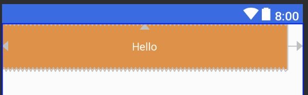
设置layout_width为0dp;layout_height为wrap_content;layout_marginRight为20dp,与parent左右对齐。
效果图:
在1.1之前的版本,控件尺寸设为WRAP_CONTENT,控件默认是由组件文本大小控制,其他约束是不生效的。可以通过以下属性设置是否生效。
控件设为MATCH_CONSTRAINT时,控件的大小会扩展所有可用空间,在1.1版本后,可以通过以下属性改变控件的行为。
吃个栗子:
将android:layout_width设为MATCH_CONSTRAINT,即0dp;将app:layout_constraintWidth_default设为percent;将app:layout_constraintWidth_percent设为0.5,表示占parent的50%,取值范围是0-1。
效果图:
比例约束
控件的宽高比,要求是宽或高至少一个设为0dp,然后设置属性layout_constraintDimensionRatio即可。
这里设置宽高比为3:1,高度为100dp,那么宽度将为300dp。

也可以在比例前加
W,
H表示是宽高比还是高宽比。如下面表示高宽比。
2.5 链
链在水平或者垂直方向提供一组类似行为。如图所示可以理解为横向链。这里需要了解一点,A与parent的左边缘约束,B与parent的右边边缘约束,A右边和B左边之间相互约束,才能使用一条链。多个元素之间也是如此,最左最右与parent约束,元素之间边相互约束。不然下面的链式永远无法生效。
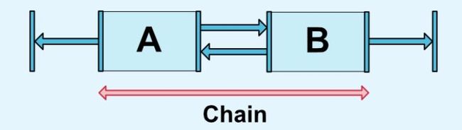
横向链最左边第一个控件,垂直链最顶边第一个控件称为链头,可以通过下面两个属性链头统一定制链的样式。
它两的值默认可以是
<android.support.constraint.ConstraintLayout
    xmlns:android="http://schemas.android.com/apk/res/android"
    xmlns:app="http://schemas.android.com/apk/res-auto"
    android:layout_width="match_parent"
    android:layout_height="match_parent">

    <TextView
            android:text="Hello"
            android:id="@+id/tvHello"
            android:gravity="center"
            android:padding="20dp"
            app:layout_constraintHorizontal_chainStyle="spread"
            app:layout_constraintLeft_toLeftOf="parent"
            app:layout_constraintRight_toLeftOf="@id/tvWorld"
            android:textColor="@color/colorWhite"
            android:background="@color/colorPrimaryDark"
            android:layout_width="wrap_content"
            android:layout_height="wrap_content"/>
    <TextView
            android:text="World"
            android:gravity="center"
            android:padding="20dp"
            android:id="@+id/tvWorld"
            app:layout_constraintLeft_toRightOf="@id/tvHello"
            app:layout_constraintRight_toRightOf="parent"
            android:textColor="@color/colorWhite"
            android:background="@color/colorPrimary"
            android:layout_width="wrap_content"
            android:layout_height="wrap_content"/>

android.support.constraint.ConstraintLayout>
效果:
在链中,剩余空余空间默认平均给各元素,但有时可以通过权重属性layout_constraintVertical_weight来指定分配空间的大小。
1.1之后的版本,在链中使用边距时,边距是相加的,也就说,假设Hello的右边距为5,World的左边距为20,那么它们之间的边距就是25。在链式,边距先从剩余空间减去的,然后再用剩余的空间在元素之间进行定位。
2.6 优化器
在1.1之后,公开了优化器,通过在app:layout_optimizationLevel来决定控件在哪方面进行优化。
3.工具类
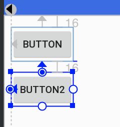
3.1 Guideline(参考线)
参考线实际上不会在界面进行显示,只是方便在ConstraintLayout布局view时候做一个参考。
通过设置Guideline的属性orientation来表示是水平方向还是垂直方向的参考线,对应值为vertical和horizontal。可以通过三种方式来定位Guideline位置。
丢个栗子:
    <android.support.constraint.Guideline
            android:layout_width="wrap_content"
            android:layout_height="wrap_content"
            android:id="@+id/guideline"
            android:orientation="vertical"
            app:layout_constraintGuide_begin="10dp"/>

    <Button android:text="Button"
            android:layout_width="wrap_content"
            android:layout_height="wrap_content"
            android:id="@+id/button"
            app:layout_constraintLeft_toLeftOf="@+id/guideline"
            android:layout_marginTop="16dp"
            app:layout_constraintTop_toTopOf="parent"/>

    <Button android:text="Button2"
            android:layout_width="wrap_content"
            android:layout_height="wrap_content"
            android:id="@+id/button2"
            app:layout_constraintLeft_toLeftOf="@+id/guideline"
            android:layout_marginTop="16dp"
            app:layout_constraintTop_toBottomOf="@id/button"/>
android.support.constraint.ConstraintLayout>
Guideline设置为垂直参考线,距离开始的位置为10dp。如下图所示,实际中需要把鼠标移到button才会显示出来哦。
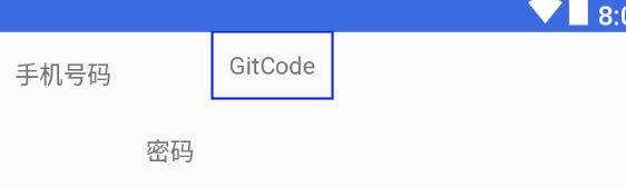
3.2 Barrier(栅栏)
Barrier有点类似Guideline,但Barrier会根据所有引用的控件尺寸的变化重新定位。例如经典的登录界面,右边的EditText总是希望与左右所有TextView的最长边缘靠齐。
如果两个TextView其中一个变得更长,EditText的位置都会跟这变化,这比使用RelativeLayout灵活很多。

代码:
    <android.support.constraint.Barrier
            android:layout_width="wrap_content"
            android:layout_height="wrap_content"
            app:barrierDirection="right"
            android:id="@+id/barrier"
            app:constraint_referenced_ids="tvPhone,tvPassword"
            />

    <TextView android:layout_width="wrap_content"
              android:text="手机号码"
              android:id="@+id/tvPhone"
              android:gravity="center_vertical|left"
              android:padding="10dp"
              android:layout_height="50dp"/>

    <TextView android:layout_width="wrap_content"
              android:text="密码"
              android:padding="10dp"
              android:gravity="center_vertical|left"
              android:id="@+id/tvPassword"
              app:layout_constraintTop_toBottomOf="@id/tvPhone"
              android:layout_height="wrap_content"/>

    <EditText android:layout_width="wrap_content"
              android:hint="输入手机号码"
              android:id="@+id/etPassword"
              app:layout_constraintLeft_toLeftOf="@id/barrier"
              android:layout_height="wrap_content"/>

    <EditText android:layout_width="wrap_content"
              android:hint="输入密码"
              app:layout_constraintTop_toBottomOf="@id/etPassword"
              app:layout_constraintLeft_toLeftOf="@id/barrier"
              android:layout_height="wrap_content"/>


android.support.constraint.ConstraintLayout>
app:barrierDirection所引用控件对齐的位置,可设置的值有:bottom、end、left、right、start、top.constraint_referenced_ids为所引用的控件,例如这里的tvPhone,tvPasswrod。
3.3 Group(组)
用来控制一组view的可见性,如果view被多个Group控制,则以最后的Group定义的可见性为主。
吃个香喷喷栗子吧:
Group默认可见时,是这样的。
设置Group的
visible属性为gone。
    <android.support.constraint.Group
            android:layout_width="wrap_content"
            android:layout_height="wrap_content"
            android:id="@+id/group"
            android:visibility="gone"
            app:constraint_referenced_ids="tvPhone,tvPassword"
            />

    <TextView android:layout_width="wrap_content"
              android:text="手机号码"
              android:id="@+id/tvPhone"
              android:gravity="center_vertical|left"
              android:padding="10dp"
              android:layout_height="50dp"/>

    <TextView android:layout_width="wrap_content"
              android:text="密码"
              android:padding="10dp"
              android:gravity="center_vertical|left"
              android:id="@+id/tvPassword"
              app:layout_constraintLeft_toRightOf="@id/tvPhone"
              app:layout_constraintTop_toBottomOf="@id/tvPhone"
              android:layout_height="wrap_content"/>

    <TextView android:layout_width="wrap_content"
              android:text="GitCode"
              android:padding="10dp"
              android:gravity="center_vertical|left"
              app:layout_constraintLeft_toRightOf="@id/tvPassword"
              android:layout_height="wrap_content"/>

android.support.constraint.ConstraintLayout>
效果就变成了这样了,tvPhone,tvPassword都被隐藏了。

3.4 Placeholder(占位符)
一个view占位的占位符,当指定Placeholder的content属性为另一个view的id时,该view会移动到Placeholder的位置。
代码中,将TextView的定位在屏幕中间,随着将id设置给Placeholder的属性后,TextView的位置就跑到Placeholder所在的地方,效果图跟上图一直。
    <android.support.constraint.Placeholder
            android:layout_width="wrap_content"
            android:layout_height="wrap_content"
            app:content="@id/tvGitCode"
              />

    <TextView android:layout_width="wrap_content"
              android:text="GitCode"
              android:id="@+id/tvGitCode"
              android:padding="10dp"
              app:layout_constraintLeft_toLeftOf="parent"
              app:layout_constraintRight_toRightOf="parent"
              android:gravity="center_vertical|left"
              android:layout_height="wrap_content"/>

android.support.constraint.ConstraintLayout>
3.5 其他
在2.0版本,为ConstraintLayout增加了ConstraintProperties、ConstraintsChangedListener等,感兴趣可以自己看看官网。
4.总结
在写本文之前,其实还不会用ConstraintLayout,写完本文之后,已经上手和喜欢上了,满足自己在实际开发中想要的效果,能够有效的减少布局的层级,从而提高性能。不知道看完本文,你会使用ConstraintLayout了没有?
欢迎访问我的github:
https://github.com/GitCode8/GitCode
推荐阅读
谈谈我最近的一些想法
Android多线程误区
2019最前沿的几个Flutter实践
编程·思维·职场
欢迎扫码关注

在看也是一种认可