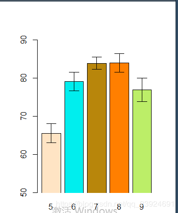
R学习笔记-可视化-带有置信区间的条形图
带有置信区间的条形图
(1)
library(gplots)
attach(airquality)
heights <- tapply(Temp,Month,mean)
lower <- tapply(Temp,Month,function(v) t.test(v)$conf.int[1])
upper <- tapply(Temp,Month,function(v) t.test(v)$conf.int[2])
barplot2(heights,plot.ci=TRUE,ci.l=lower,ci.u=upper,
           ylim=c(50,90),
           col=c("bisque1","cyan2","darkgoldenrod","darkorange1","darkolivegreen2"),
           xpd=FALSE)
           #space=0,柱子之间的间距=0
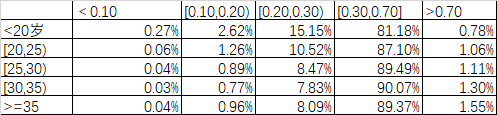
(2)
使用数据:data(np:55)
|  | |
| |
data<-read.csv("data.csv")
aa<-data[,1]
bb<-data[,2:6]
row.names(bb)<-aa
colnames(bb)<-c("<0.10","[0.10,0.20)","[0.20,0.30)","[0.30,0.70]",">0.70")
bb<-as.matrix(bb)
tem<-read.csv("loup.csv")
lower<-tem[1:5,]
upper<-tem[6:10,]
row.names(lower)<-aa
row.names(upper)<-aa
colnames(lower)<-c("<0.10","[0.10,0.20)","[0.20,0.30)","[0.30,0.70]",">0.70")
colnames(upper)<-c("<0.10","[0.10,0.20)","[0.20,0.30)","[0.30,0.70]",">0.70")
lower<-as.matrix(lower)
upper<-as.matrix(upper)
zz<-barplot2(bb,beside=T,plot.ci=TRUE, cex.names =0.8,ci.l=lower,ci.u=upper,xpd=FALSE,col = c("lightblue3", "indianred1", "darkolivegreen3","lightpink1", "mediumpurple1"), plot.grid = TRUE,border = "black")
box()
legend("topright", legend=rownames(bb), fill =c("lightblue3", "indianred1", "darkolivegreen3",                                     "lightpink1", "mediumpurple1"),text.col = "black")
mtext(side = 1, at = colMeans(zz), line = -2,text = paste("Mean", percent(colMeans(bb))), col = "red")
