RadioButton右上角带数量显示的电商框架必备
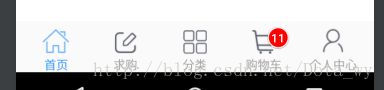
电商项目中必定会有购物车一栏,而购物车按钮的右上角又必定会有一个红色圆圈显示数量的小头标,如下图:
面对这样的界面,我们有很多中选择来搭建框架,在这里我只说2种我觉得还可以的。
第一:RadioButton+BadgeView配合显示
1、底部按钮导航栏的布局:
<RelativeLayout xmlns:android="http://schemas.android.com/apk/res/android"
    android:layout_width="match_parent"
    android:layout_height="wrap_content"
    android:background="@color/title_bg_color"
    android:orientation="vertical">

    <View
        style="@style/ViewHorizontalLine"
        android:layout_above="@+id/rg_tab_bar" />

    <RadioGroup
        android:id="@+id/rg_tab_bar"
        android:layout_width="match_parent"
        android:layout_height="wrap_content"
        android:layout_alignParentBottom="true"
        android:checkedButton="@+id/rbHome"
        android:gravity="center_vertical"
        android:orientation="horizontal"
        android:paddingLeft="6dp"
        android:paddingRight="6dp"
        android:paddingTop="6dp">

        <RadioButton
            android:id="@+id/rbHome"
            style="@style/RaidoButtonStyle"
            android:drawableTop="@drawable/btn_tabbar_home_selector"
            android:text="@string/tab_home" />

        <RadioButton
            android:id="@+id/rbBuy"
            style="@style/RaidoButtonStyle"
            android:drawableTop="@drawable/btn_tabbar_buy_selector"
            android:text="@string/tab_buy" />

        <RadioButton
            android:id="@+id/rbCategory"
            style="@style/RaidoButtonStyle"
            android:drawableTop="@drawable/btn_tabbar_category_selector"
            android:text="@string/tab_category" />

        <RadioButton
            android:id="@+id/rbCart"
            style="@style/RaidoButtonStyle"
            android:drawableTop="@drawable/btn_tabbar_cart_selector"
            android:text="@string/tab_cart" />

        <RadioButton
            android:id="@+id/rbUserCenter"
            style="@style/RaidoButtonStyle"
            android:drawableTop="@drawable/btn_tabbar_user_center_selector"
            android:text="@string/tab_user_center" />

    RadioGroup>

    <LinearLayout
        android:layout_width="match_parent"
        android:layout_height="55dp"
        android:layout_alignParentBottom="true"
        android:background="@color/transparent"
        android:numColumns="5"
        android:orientation="horizontal">

        <Button style="@style/BadgeViewButtonStyle" />

        <Button style="@style/BadgeViewButtonStyle" />

        <Button style="@style/BadgeViewButtonStyle" />

        <Button
            android:id="@+id/btn_msg"
            style="@style/BadgeViewButtonStyle" />

        <Button style="@style/BadgeViewButtonStyle" />
    LinearLayout>

RelativeLayout>
2、activity_main的布局:
<LinearLayout xmlns:android="http://schemas.android.com/apk/res/android"
    xmlns:tools="http://schemas.android.com/tools"
    android:orientation="vertical"
    android:layout_width="match_parent"
    android:layout_height="match_parent"
    tools:context=".MainActivity"
    android:clipToPadding="true"
    android:fitsSystemWindows="true">

    <FrameLayout
        android:id="@+id/fragmentContent"
        android:layout_width="match_parent"
        android:layout_height="0dp"
        android:layout_weight="1"
        android:background="@color/white" />


LinearLayout>
3、BadgeView的工具类:
import android.content.Context;
import android.content.res.Resources;
import android.graphics.Color;
import android.graphics.Typeface;
import android.graphics.drawable.ShapeDrawable;
import android.graphics.drawable.shapes.RoundRectShape;
import android.support.v7.widget.AppCompatTextView;
import android.util.AttributeSet;
import android.util.TypedValue;
import android.view.Gravity;
import android.view.View;
import android.view.ViewGroup;
import android.view.ViewGroup.LayoutParams;
import android.view.ViewParent;
import android.view.animation.AccelerateInterpolator;
import android.view.animation.AlphaAnimation;
import android.view.animation.Animation;
import android.view.animation.DecelerateInterpolator;
import android.widget.FrameLayout;
import android.widget.TabWidget;
/**
 * Description:com.mmbao.saas.util类
 * Created by Administrator on 2018/1/25.
 * Maxim:There is no smoke without fire
 */

public class BadgeView extends AppCompatTextView {

    public static final int POSITION_TOP_LEFT = 1;
    public static final int POSITION_TOP_RIGHT = 2;
    public static final int POSITION_BOTTOM_LEFT = 3;
    public static final int POSITION_BOTTOM_RIGHT = 4;
    public static final int POSITION_CENTER = 5;

    private static final int DEFAULT_MARGIN_DIP = 5;
    private static final int DEFAULT_LR_PADDING_DIP = 5;
    private static final int DEFAULT_CORNER_RADIUS_DIP = 8;
    private static final int DEFAULT_POSITION = POSITION_TOP_RIGHT;
    private static final int DEFAULT_BADGE_COLOR = Color.parseColor("#CCFF0000"); //Color.RED;
    private static final int DEFAULT_TEXT_COLOR = Color.WHITE;

    private static Animation fadeIn;
    private static Animation fadeOut;

    private Context context;
    private View target;

    private int badgePosition;
    private int badgeMarginH;
    private int badgeMarginV;
    private int badgeColor;

    private boolean isShown;

    private ShapeDrawable badgeBg;

    private int targetTabIndex;

    public BadgeView(Context context) {
        this(context, (AttributeSet) null, android.R.attr.textViewStyle);
    }

    public BadgeView(Context context, AttributeSet attrs) {
        this(context, attrs, android.R.attr.textViewStyle);
    }

    /**
     * Constructor -
     *
     * create a new BadgeView instance attached to a target {@link android.view.View}.
     *
     * @param context context for this view.
     * @param target  the View to attach the badge to.
     */
    public BadgeView(Context context, View target) {
        this(context, null, android.R.attr.textViewStyle, target, 0);
    }

    /**
     * Constructor -
     *
     * create a new BadgeView instance attached to a target {@link android.widget.TabWidget}
     * tab at a given index.
     *
     * @param context context for this view.
     * @param target  the TabWidget to attach the badge to.
     * @param index   the position of the tab within the target.
     */
    public BadgeView(Context context, TabWidget target, int index) {
        this(context, null, android.R.attr.textViewStyle, target, index);
    }

    public BadgeView(Context context, AttributeSet attrs, int defStyle) {
        this(context, attrs, defStyle, null, 0);
    }

    public BadgeView(Context context, AttributeSet attrs, int defStyle, View target, int tabIndex) {
        super(context, attrs, defStyle);
        init(context, target, tabIndex);
    }

    private void init(Context context, View target, int tabIndex) {

        this.context = context;
        this.target = target;
        this.targetTabIndex = tabIndex;

        // apply defaults
        badgePosition = DEFAULT_POSITION;
        badgeMarginH = dipToPixels(DEFAULT_MARGIN_DIP);
        badgeMarginV = badgeMarginH;
        badgeColor = DEFAULT_BADGE_COLOR;

        setTypeface(Typeface.DEFAULT_BOLD);
        int paddingPixels = dipToPixels(DEFAULT_LR_PADDING_DIP);
        setPadding(paddingPixels, 0, paddingPixels, 0);
        setTextColor(DEFAULT_TEXT_COLOR);

        fadeIn = new AlphaAnimation(0, 1);
        fadeIn.setInterpolator(new DecelerateInterpolator());
        fadeIn.setDuration(200);

        fadeOut = new AlphaAnimation(1, 0);
        fadeOut.setInterpolator(new AccelerateInterpolator());
        fadeOut.setDuration(200);

        isShown = false;

        if (this.target != null) {
            applyTo(this.target);
        } else {
            show();
        }

    }

    private void applyTo(View target) {

        LayoutParams lp = target.getLayoutParams();
        ViewParent parent = target.getParent();
        FrameLayout container = new FrameLayout(context);

        if (target instanceof TabWidget) {

            // set target to the relevant tab child container
            target = ((TabWidget) target).getChildTabViewAt(targetTabIndex);
            this.target = target;

            ((ViewGroup) target).addView(container,
                    new LayoutParams(LayoutParams.FILL_PARENT, LayoutParams.FILL_PARENT));

            this.setVisibility(View.GONE);
            container.addView(this);

        } else {

            // TODO verify that parent is indeed a ViewGroup
            ViewGroup group = (ViewGroup) parent;
            int index = group.indexOfChild(target);

            group.removeView(target);
            group.addView(container, index, lp);

            container.addView(target);

            this.setVisibility(View.GONE);
            container.addView(this);

            group.invalidate();

        }

    }

    /**
     * Make the badge visible in the UI.
     */
    public void show() {
        show(false, null);
    }

    /**
     * Make the badge visible in the UI.
     *
     * @param animate flag to apply the default fade-in animation.
     */
    public void show(boolean animate) {
        show(animate, fadeIn);
    }

    /**
     * Make the badge visible in the UI.
     *
     * @param anim Animation to apply to the view when made visible.
     */
    public void show(Animation anim) {
        show(true, anim);
    }

    /**
     * Make the badge non-visible in the UI.
     */
    public void hide() {
        hide(false, null);
    }

    /**
     * Make the badge non-visible in the UI.
     *
     * @param animate flag to apply the default fade-out animation.
     */
    public void hide(boolean animate) {
        hide(animate, fadeOut);
    }

    /**
     * Make the badge non-visible in the UI.
     *
     * @param anim Animation to apply to the view when made non-visible.
     */
    public void hide(Animation anim) {
        hide(true, anim);
    }

    /**
     * Toggle the badge visibility in the UI.
     */
    public void toggle() {
        toggle(false, null, null);
    }

    /**
     * Toggle the badge visibility in the UI.
     *
     * @param animate flag to apply the default fade-in/out animation.
     */
    public void toggle(boolean animate) {
        toggle(animate, fadeIn, fadeOut);
    }

    /**
     * Toggle the badge visibility in the UI.
     *
     * @param animIn  Animation to apply to the view when made visible.
     * @param animOut Animation to apply to the view when made non-visible.
     */
    public void toggle(Animation animIn, Animation animOut) {
        toggle(true, animIn, animOut);
    }

    private void show(boolean animate, Animation anim) {
        if (getBackground() == null) {
            if (badgeBg == null) {
                badgeBg = getDefaultBackground();
            }
            setBackgroundDrawable(badgeBg);
        }
        applyLayoutParams();

        if (animate) {
            this.startAnimation(anim);
        }
        this.setVisibility(View.VISIBLE);
        isShown = true;
    }

    private void hide(boolean animate, Animation anim) {
        this.setVisibility(View.GONE);
        if (animate) {
            this.startAnimation(anim);
        }
        isShown = false;
    }

    private void toggle(boolean animate, Animation animIn, Animation animOut) {
        if (isShown) {
            hide(animate && (animOut != null), animOut);
        } else {
            show(animate && (animIn != null), animIn);
        }
    }

    /**
     * Increment the numeric badge label. If the current badge label cannot be converted to
     * an integer value, its label will be set to "0".
     *
     * @param offset the increment offset.
     */
    public int increment(int offset) {
        CharSequence txt = getText();
        int i;
        if (txt != null) {
            try {
                i = Integer.parseInt(txt.toString());
            } catch (NumberFormatException e) {
                i = 0;
            }
        } else {
            i = 0;
        }
        i = i + offset;
        setText(String.valueOf(i));
        return i;
    }

    /**
     * Decrement the numeric badge label. If the current badge label cannot be converted to
     * an integer value, its label will be set to "0".
     *
     * @param offset the decrement offset.
     */
    public int decrement(int offset) {
        return increment(-offset);
    }

    private ShapeDrawable getDefaultBackground() {

        int r = dipToPixels(DEFAULT_CORNER_RADIUS_DIP);
        float[] outerR = new float[]{r, r, r, r, r, r, r, r};

        RoundRectShape rr = new RoundRectShape(outerR, null, null);
        ShapeDrawable drawable = new ShapeDrawable(rr);
        drawable.getPaint().setColor(badgeColor);

        return drawable;

    }

    private void applyLayoutParams() {

        FrameLayout.LayoutParams lp = new FrameLayout.LayoutParams(LayoutParams.WRAP_CONTENT, LayoutParams.WRAP_CONTENT);

        switch (badgePosition) {
            case POSITION_TOP_LEFT:
                lp.gravity = Gravity.LEFT | Gravity.TOP;
                lp.setMargins(badgeMarginH, badgeMarginV, 0, 0);
                break;
            case POSITION_TOP_RIGHT:
                lp.gravity = Gravity.RIGHT | Gravity.TOP;
                lp.setMargins(0, badgeMarginV, badgeMarginH, 0);
                break;
            case POSITION_BOTTOM_LEFT:
                lp.gravity = Gravity.LEFT | Gravity.BOTTOM;
                lp.setMargins(badgeMarginH, 0, 0, badgeMarginV);
                break;
            case POSITION_BOTTOM_RIGHT:
                lp.gravity = Gravity.RIGHT | Gravity.BOTTOM;
                lp.setMargins(0, 0, badgeMarginH, badgeMarginV);
                break;
            case POSITION_CENTER:
                lp.gravity = Gravity.CENTER;
                lp.setMargins(0, 0, 0, 0);
                break;
            default:
                break;
        }

        setLayoutParams(lp);

    }

    /**
     * Returns the target View this badge has been attached to.
     */
    public View getTarget() {
        return target;
    }

    /**
     * Is this badge currently visible in the UI?
     */
    @Override
    public boolean isShown() {
        return isShown;
    }

    /**
     * Returns the positioning of this badge.
     *
     * one of POSITION_TOP_LEFT, POSITION_TOP_RIGHT, POSITION_BOTTOM_LEFT, POSITION_BOTTOM_RIGHT, POSTION_CENTER.
     */
    public int getBadgePosition() {
        return badgePosition;
    }

    /**
     * Set the positioning of this badge.
     *
     * @param layoutPosition one of POSITION_TOP_LEFT, POSITION_TOP_RIGHT, POSITION_BOTTOM_LEFT, POSITION_BOTTOM_RIGHT, POSTION_CENTER.
     */
    public void setBadgePosition(int layoutPosition) {
        this.badgePosition = layoutPosition;
    }

    /**
     * Returns the horizontal margin from the target View that is applied to this badge.
     */
    public int getHorizontalBadgeMargin() {
        return badgeMarginH;
    }

    /**
     * Returns the vertical margin from the target View that is applied to this badge.
     */
    public int getVerticalBadgeMargin() {
        return badgeMarginV;
    }

    /**
     * Set the horizontal/vertical margin from the target View that is applied to this badge.
     *
     * @param badgeMargin the margin in pixels.
     */
    public void setBadgeMargin(int badgeMargin) {
        this.badgeMarginH = badgeMargin;
        this.badgeMarginV = badgeMargin;
    }

    /**
     * Set the horizontal/vertical margin from the target View that is applied to this badge.
     *
     * @param horizontal margin in pixels.
     * @param vertical   margin in pixels.
     */
    public void setBadgeMargin(int horizontal, int vertical) {
        this.badgeMarginH = horizontal;
        this.badgeMarginV = vertical;
    }

    /**
     * Returns the color value of the badge background.
     */
    public int getBadgeBackgroundColor() {
        return badgeColor;
    }

    /**
     * Set the color value of the badge background.
     *
     * @param badgeColor the badge background color.
     */
    public void setBadgeBackgroundColor(int badgeColor) {
        this.badgeColor = badgeColor;
        badgeBg = getDefaultBackground();
    }

    private int dipToPixels(int dip) {
        Resources r = getResources();
        float px = TypedValue.applyDimension(TypedValue.COMPLEX_UNIT_DIP, dip, r.getDisplayMetrics());
        return (int) px;
    }

}
4、当中使用到的DensityUtil工具方法:
public class DensityUtil {

    /**
     * 根据手机的分辨率从 dp 的单位 转成为 px(像素)
     */
    public static int dip2px(Context context, float dpValue) {
        final float scale = context.getResources().getDisplayMetrics().density;
        return (int) (dpValue * scale + 0.5f);
    }

    /**
     * 根据手机的分辨率从 px(像素) 的单位 转成为 dp
     */
    public static int px2dip(Context context, float pxValue) {
        final float scale = context.getResources().getDisplayMetrics().density;
        return (int) (pxValue / scale + 0.5f);
    }
}
5、MainActivity的代码实现BadgeView的数量设置和背景设置:
public class MainActivity extends AppCompatActivity {

    @BindView(R.id.fragmentContent)
    FrameLayout fragmentContent;
    @BindView(R.id.rbHome)
    RadioButton rbHome;
    @BindView(R.id.rbBuy)
    RadioButton rbBuy;
    @BindView(R.id.rbCategory)
    RadioButton rbCategory;
    @BindView(R.id.rbCart)
    RadioButton rbCart;
    @BindView(R.id.rbUserCenter)
    RadioButton rbUserCenter;

    private int count = 99;
    @Override
    protected void onCreate(Bundle savedInstanceState) {
        super.onCreate(savedInstanceState);
        setContentView(R.layout.activity_main);
        ButterKnife.bind(this);

        Button btnMsg = findViewById(R.id.btn_msg);
        setCartMsg(btnMsg);
    }

    /**
     * 显示购物车上的数量
     * @param btnMsg
     */
    private void setCartMsg(Button btnMsg) {
        BadgeView badgeView = new BadgeView(this,btnMsg);
        badgeView.setBadgePosition(BadgeView.POSITION_TOP_RIGHT);
        badgeView.setTextColor(Color.WHITE);
        badgeView.setBadgeBackgroundColor(Color.RED);
        badgeView.setTextSize(12);
        badgeView.setBadgeMargin(5);
        if (TextUtils.isEmpty(count+"")){
            badgeView.hide();
        }else {
            if (count>99){
                count = 99;
                badgeView.setText(""+count);
            }else {
                badgeView.setText(""+count);
            }
            badgeView.show();
        }
    }
}
第二:自定义RadioGroup+FrameLayout(其中嵌入RadioButton+Button)配合显示
1、activity_main的布局:
<LinearLayout xmlns:android="http://schemas.android.com/apk/res/android"
    xmlns:tools="http://schemas.android.com/tools"
    android:orientation="vertical"
    android:layout_width="match_parent"
    android:layout_height="match_parent"
    tools:context=".MainActivity"
    android:clipToPadding="true"
    android:fitsSystemWindows="true">

    <FrameLayout
        android:id="@+id/fragmentContent"
        android:layout_width="match_parent"
        android:layout_height="0dp"
        android:layout_weight="1"
        android:background="@color/white" />

    <com.mmbao.saas.custom.MyRadioGroup
        android:id="@+id/rg_tab_bar"
        android:layout_width="match_parent"
        android:layout_height="wrap_content"
        android:layout_alignParentBottom="true"
        android:checkedButton="@+id/rbHome"
        android:gravity="center_vertical"
        android:orientation="horizontal"
        android:paddingLeft="6dp"
        android:paddingRight="6dp"
        android:paddingTop="6dp">

        <FrameLayout
            android:layout_width="0dp"
            android:layout_height="match_parent"
            android:layout_gravity="center_vertical"
            android:layout_weight="1" >
            <RadioButton
                android:id="@+id/rbHome"
                android:layout_width="match_parent"
                android:layout_height="match_parent"
                android:gravity="center"
                android:layout_gravity="center_horizontal"
                android:button="@null"
                android:textSize="@dimen/bottom_menu_text_size"
                android:textColor="@color/tab_text_color"
                android:checked="true"
                android:drawableTop="@drawable/btn_tabbar_home_selector"
                android:text="@string/tab_home" />
            <Button
                android:visibility="gone"
                android:layout_gravity="top|right"
                android:layout_marginRight="10dp"
                android:layout_marginBottom="10dp"
                android:text="11"
                android:background="@null"
                android:textColor="@color/white"
                android:textSize="12sp"
                android:layout_width="21dp"
                android:layout_height="21dp" />
        FrameLayout>


        <FrameLayout
            android:layout_width="0dp"
            android:layout_height="match_parent"
            android:layout_gravity="center_vertical"
            android:layout_weight="1" >
            <RadioButton
                android:id="@+id/rbBuy"
                android:layout_width="match_parent"
                android:layout_height="match_parent"
                android:gravity="center"
                android:layout_gravity="center_horizontal"
                android:button="@null"
                android:textSize="@dimen/bottom_menu_text_size"
                android:textColor="@color/tab_text_color"
                android:drawableTop="@drawable/btn_tabbar_buy_selector"
                android:text="@string/tab_buy" />
            <Button
                android:visibility="gone"
                android:layout_gravity="top|right"
                android:layout_marginRight="10dp"
                android:layout_marginBottom="10dp"
                android:text="11"
                android:background="@null"
                android:textColor="@color/white"
                android:textSize="12sp"
                android:layout_width="21dp"
                android:layout_height="21dp" />
        FrameLayout>


        <FrameLayout
            android:layout_width="0dp"
            android:layout_height="match_parent"
            android:layout_gravity="center_vertical"
            android:layout_weight="1" >
            <RadioButton
                android:id="@+id/rbCategory"
                android:layout_width="match_parent"
                android:layout_height="match_parent"
                android:gravity="center"
                android:layout_gravity="center_horizontal"
                android:button="@null"
                android:textSize="@dimen/bottom_menu_text_size"
                android:textColor="@color/tab_text_color"
                android:drawableTop="@drawable/btn_tabbar_category_selector"
                android:text="@string/tab_category" />
            <Button
                android:visibility="gone"
                android:layout_gravity="top|right"
                android:layout_marginRight="10dp"
                android:layout_marginBottom="10dp"
                android:background="@null"
                android:textColor="@color/white"
                android:textSize="12sp"
                android:layout_width="21dp"
                android:layout_height="21dp" />
        FrameLayout>


        <FrameLayout
            android:layout_width="0dp"
            android:layout_height="match_parent"
            android:layout_gravity="center_vertical"
            android:layout_weight="1" >
            <RadioButton
                android:id="@+id/rbCart"
                android:layout_width="match_parent"
                android:layout_height="match_parent"
                android:gravity="center"
                android:layout_gravity="center_horizontal"
                android:button="@null"
                android:textSize="@dimen/bottom_menu_text_size"
                android:textColor="@color/tab_text_color"
                android:drawableTop="@drawable/btn_tabbar_cart_selector"
                android:text="@string/tab_cart" />
            <Button
                android:layout_gravity="top|right"
                android:layout_marginRight="10dp"
                android:layout_marginBottom="10dp"
                android:text="11"
                android:background="@drawable/circle_bg"
                android:textColor="@color/white"
                android:textSize="12sp"
                android:layout_width="21dp"
                android:layout_height="21dp" />
        FrameLayout>


        <FrameLayout
            android:layout_width="0dp"
            android:layout_height="match_parent"
            android:layout_gravity="center_vertical"
            android:layout_weight="1" >
            <RadioButton
                android:id="@+id/rbUserCenter"
                android:layout_width="match_parent"
                android:layout_height="match_parent"
                android:gravity="center"
                android:layout_gravity="center_horizontal"
                android:button="@null"
                android:textSize="@dimen/bottom_menu_text_size"
                android:textColor="@color/tab_text_color"
                android:drawableTop="@drawable/btn_tabbar_user_center_selector"
                android:text="@string/tab_user_center" />
            <Button
                android:visibility="gone"
                android:layout_gravity="top|right"
                android:layout_marginRight="10dp"
                android:layout_marginBottom="10dp"
                android:text="11"
                android:background="@null"
                android:textColor="@color/white"
                android:textSize="12sp"
                android:layout_width="21dp"
                android:layout_height="21dp" />
        FrameLayout>
    com.mmbao.saas.custom.MyRadioGroup>

LinearLayout>
2、自定义的 MyRadioGroup:
import android.content.Context;
import android.content.res.TypedArray;
import android.util.AttributeSet;
import android.view.View;
import android.view.ViewGroup;
import android.widget.CompoundButton;
import android.widget.LinearLayout;
import android.widget.RadioButton;

/**
 * Description:com.mmbao.saas.custom类
 * Created by Administrator on 2018/1/27.
 * Maxim:There is no smoke without fire
 */

public class MyRadioGroup extends LinearLayout {
    // holds the checked id; the selection is empty by default
    private int mCheckedId = -1;
    // tracks children radio buttons checked state
    private CompoundButton.OnCheckedChangeListener mChildOnCheckedChangeListener;
    // when true, mOnCheckedChangeListener discards events
    private boolean mProtectFromCheckedChange = false;
    private OnCheckedChangeListener mOnCheckedChangeListener;
    private PassThroughHierarchyChangeListener mPassThroughListener;
    public MyRadioGroup(Context context) {
        super(context);
        setOrientation(VERTICAL);
        init();
    }
    public MyRadioGroup(Context context, AttributeSet attrs) {
        super(context, attrs);
        init();
    }
    private void init() {
        mChildOnCheckedChangeListener = new CheckedStateTracker();
        mPassThroughListener = new PassThroughHierarchyChangeListener();
        super.setOnHierarchyChangeListener(mPassThroughListener);
    }
    @Override
    public void setOnHierarchyChangeListener(OnHierarchyChangeListener listener) {
        // the user listener is delegated to our pass-through listener
        mPassThroughListener.mOnHierarchyChangeListener = listener;
    }
    @Override
    protected void onFinishInflate() {
        super.onFinishInflate();
        // checks the appropriate radio button as requested in the XML file
        if (mCheckedId != -1) {
            mProtectFromCheckedChange = true;
            setCheckedStateForView(mCheckedId, true);
            mProtectFromCheckedChange = false;
            setCheckedId(mCheckedId);
        }
    }
    @Override
    public void addView(View child, int index, ViewGroup.LayoutParams params) {
        if (child instanceof RadioButton) {
            final RadioButton button = (RadioButton) child;
            if (button.isChecked()) {
                mProtectFromCheckedChange = true;
                if (mCheckedId != -1) {
                    setCheckedStateForView(mCheckedId, false);
                }
                mProtectFromCheckedChange = false;
                setCheckedId(button.getId());
            }
        } else if (child instanceof ViewGroup) {
            final RadioButton button = findRadioButton((ViewGroup) child);
            if (button.isChecked()) {
                mProtectFromCheckedChange = true;
                if (mCheckedId != -1) {
                    setCheckedStateForView(mCheckedId, false);
                }
                mProtectFromCheckedChange = false;
                setCheckedId(button.getId());
            }
        }
        super.addView(child, index, params);
    }
    /** 查找radioButton控件 */
    public RadioButton findRadioButton(ViewGroup group) {
        RadioButton resBtn = null;
        int len = group.getChildCount();
        for (int i = 0; i < len; i++) {
            if (group.getChildAt(i) instanceof RadioButton) {
                resBtn = (RadioButton) group.getChildAt(i);
            } else if (group.getChildAt(i) instanceof ViewGroup) {
                findRadioButton((ViewGroup) group.getChildAt(i));
            }
        }
        return resBtn;
    }
    /**
     *
     * Sets the selection to the radio button whose identifier is passed in
     * parameter. Using -1 as the selection identifier clears the selection;
     * such an operation is equivalent to invoking {@link #clearCheck()}.
     *
     *
     * @param id
     *            the unique id of the radio button to select in this group
     *
     * @see #getCheckedRadioButtonId()
     * @see #clearCheck()
     */
    public void check(int id) {
        // don't even bother
        if (id != -1 && (id == mCheckedId)) {
            return;
        }
        if (mCheckedId != -1) {
            setCheckedStateForView(mCheckedId, false);
        }
        if (id != -1) {
            setCheckedStateForView(id, true);
        }
        setCheckedId(id);
    }
    private void setCheckedId(int id) {
        mCheckedId = id;
        if (mOnCheckedChangeListener != null) {
            mOnCheckedChangeListener.onCheckedChanged(this, mCheckedId);
        }
    }
    private void setCheckedStateForView(int viewId, boolean checked) {
        View checkedView = findViewById(viewId);
        if (checkedView != null && checkedView instanceof RadioButton) {
            ((RadioButton) checkedView).setChecked(checked);
        }else if (checkedView != null && checkedView instanceof ViewGroup){
            ((RadioButton) checkedView).setChecked(checked);
        }
    }
    /**
     *
     * Returns the identifier of the selected radio button in this group. Upon
     * empty selection, the returned value is -1.
     *
     *
     * @return the unique id of the selected radio button in this group
     *
     * @see #check(int)
     * @see #clearCheck()
     */
    public int getCheckedRadioButtonId() {
        return mCheckedId;
    }
    /**
     *
     * Clears the selection. When the selection is cleared, no radio button in
     * this group is selected and {@link #getCheckedRadioButtonId()} returns
     * null.
     *
     *
     * @see #check(int)
     * @see #getCheckedRadioButtonId()
     */
    public void clearCheck() {
        check(-1);
    }
    /**
     *
     * Register a callback to be invoked when the checked radio button changes
     * in this group.
     *
     *
     * @param listener
     *            the callback to call on checked state change
     */
    public void setOnCheckedChangeListener(OnCheckedChangeListener listener) {
        mOnCheckedChangeListener = listener;
    }
    /**
     * {@inheritDoc}
     */
    @Override
    public LayoutParams generateLayoutParams(AttributeSet attrs) {
        return new MyRadioGroup.LayoutParams(getContext(), attrs);
    }
    /**
     * {@inheritDoc}
     */
    @Override
    protected boolean checkLayoutParams(ViewGroup.LayoutParams p) {
        return p instanceof MyRadioGroup.LayoutParams;
    }
    @Override
    protected LinearLayout.LayoutParams generateDefaultLayoutParams() {
        return new LayoutParams(LayoutParams.WRAP_CONTENT,
                LayoutParams.WRAP_CONTENT);
    }
    /**
     *
     * This set of layout parameters defaults the width and the height of the
     * children to {@link #WRAP_CONTENT} when they are not specified in the XML
     * file. Otherwise, this class ussed the value read from the XML file.
     *
     *
     *
     * See {@link android.R.styleable#LinearLayout_Layout LinearLayout
     * Attributes} for a list of all child view attributes that this class
     * supports.
     *
     *
     */
    public static class LayoutParams extends LinearLayout.LayoutParams {
        /**
         * {@inheritDoc}
         */
        public LayoutParams(Context c, AttributeSet attrs) {
            super(c, attrs);
        }
        /**
         * {@inheritDoc}
         */
        public LayoutParams(int w, int h) {
            super(w, h);
        }
        /**
         * {@inheritDoc}
         */
        public LayoutParams(int w, int h, float initWeight) {
            super(w, h, initWeight);
        }
        /**
         * {@inheritDoc}
         */
        public LayoutParams(ViewGroup.LayoutParams p) {
            super(p);
        }
        /**
         * {@inheritDoc}
         */
        public LayoutParams(MarginLayoutParams source) {
            super(source);
        }
        /**
         *
         * Fixes the child's width to
         * {@link android.view.ViewGroup.LayoutParams#WRAP_CONTENT} and the
         * child's height to
         * {@link android.view.ViewGroup.LayoutParams#WRAP_CONTENT} when not
         * specified in the XML file.
         *
         *
         * @param a
         *            the styled attributes set
         * @param widthAttr
         *            the width attribute to fetch
         * @param heightAttr
         *            the height attribute to fetch
         */
        @Override
        protected void setBaseAttributes(TypedArray a, int widthAttr,
                                         int heightAttr) {
            if (a.hasValue(widthAttr)) {
                width = a.getLayoutDimension(widthAttr, "layout_width");
            } else {
                width = WRAP_CONTENT;
            }
            if (a.hasValue(heightAttr)) {
                height = a.getLayoutDimension(heightAttr, "layout_height");
            } else {
                height = WRAP_CONTENT;
            }
        }
    }
    /**
     *
     * Interface definition for a callback to be invoked when the checked radio
     * button changed in this group.
     *
     */
    public interface OnCheckedChangeListener {
        /**
         *
         * Called when the checked radio button has changed. When the selection
         * is cleared, checkedId is -1.
         *
         *
         * @param group
         *            the group in which the checked radio button has changed
         * @param checkedId
         *            the unique identifier of the newly checked radio button
         */
        public void onCheckedChanged(MyRadioGroup group, int checkedId);
    }
    private class CheckedStateTracker implements
            CompoundButton.OnCheckedChangeListener {
        public void onCheckedChanged(CompoundButton buttonView,
                                     boolean isChecked) {
            // prevents from infinite recursion
            if (mProtectFromCheckedChange) {
                return;
            }
            mProtectFromCheckedChange = true;
            if (mCheckedId != -1) {
                setCheckedStateForView(mCheckedId, false);
            }
            mProtectFromCheckedChange = false;
            int id = buttonView.getId();
            setCheckedId(id);
        }
    }
    /**
     *
     * A pass-through listener acts upon the events and dispatches them to
     * another listener. This allows the table layout to set its own internal
     * hierarchy change listener without preventing the user to setup his.
     *
     */
    private class PassThroughHierarchyChangeListener implements
            ViewGroup.OnHierarchyChangeListener {
        private ViewGroup.OnHierarchyChangeListener mOnHierarchyChangeListener;
        public void onChildViewAdded(View parent, View child) {
            if (parent == MyRadioGroup.this && child instanceof RadioButton) {
                int id = child.getId();
                // generates an id if it's missing
                if (id == View.NO_ID) {
                    id = child.hashCode();
                    child.setId(id);
                }
                ((RadioButton) child)
                        .setOnCheckedChangeListener(mChildOnCheckedChangeListener);
            } else if (parent == MyRadioGroup.this
                    && child instanceof ViewGroup) {
                RadioButton btn = findRadioButton((ViewGroup) child);
                int id = btn.getId();
                // generates an id if it's missing
                if (id == View.NO_ID) {
                    id = btn.hashCode();
                    btn.setId(id);
                }
                btn.setOnCheckedChangeListener(mChildOnCheckedChangeListener);
            }
            if (mOnHierarchyChangeListener != null) {
                mOnHierarchyChangeListener.onChildViewAdded(parent, child);
            }
        }
        public void onChildViewRemoved(View parent, View child) {
            if (parent == MyRadioGroup.this && child instanceof RadioButton) {
                ((RadioButton) child).setOnCheckedChangeListener(null);
            } else if (parent == MyRadioGroup.this
                    && child instanceof ViewGroup) {
                findRadioButton((ViewGroup) child).setOnCheckedChangeListener(
                        null);
            }
            if (mOnHierarchyChangeListener != null) {
                mOnHierarchyChangeListener.onChildViewRemoved(parent, child);
            }
        }
    }
}
3、相信到这里 你已经在布局xml文件中看到效果了!
下面是我的资源整合文件:
style
--view horizontal line-->
--RadioButton bottom tab bar -->
--BadgeView bottom button -->
2、string
    <string name="app_name">MYstring>

    <string name="tab_home">首页string>
    <string name="tab_buy">求购string>
    <string name="tab_category">分类string>
    <string name="tab_cart">购物车string>
    <string name="tab_user_center">个人中心string>
3、dimens
<resources>
    <dimen name="activity_horizontal_margin">16dpdimen>
    <dimen name="activity_vertical_margin">16dpdimen>

    <dimen name="fab_margin_right">0dpdimen>
    <dimen name="fab_margin_bottom">0dpdimen>


    <dimen name="title_text_size">20spdimen>
    <dimen name="bottom_menu_text_size">12spdimen>
    <dimen name="list_live_name_size">13spdimen>
    <dimen name="list_live_title_size">13spdimen>
    <dimen name="list_live_more_size">12spdimen>
resources>
4、colors
<resources>
    <color name="colorPrimary">#3F51B5color>
    <color name="colorPrimaryDark">#303F9Fcolor>
    <color name="colorAccent">#FF4081color>
    <color name="transparent">#00000000color>

    <color name="line_bg">#CECECEcolor>
    <color name="title_bg_color">#fafafacolor>
    <color name="tab_text_color_normal">#A7A7A7color>
    <color name="tab_text_color_selected">#3d9cfccolor>

resources>
5、drawable中的selector
btn_tabbar_buy_selector.xml (改变图片选中状态,其他按钮雷同)
<selector xmlns:android="http://schemas.android.com/apk/res/android">
    <item android:state_checked="false" android:drawable="@drawable/btn_tabbar_buy_normal"/>
    <item android:state_checked="true" android:drawable="@drawable/btn_tabbar_buy_selected"/>
selector>
6、res下的color文件
tab_text-color.xml(改变文字颜色)
<selector xmlns:android="http://schemas.android.com/apk/res/android">
<item android:state_checked="false" android:color="@color/tab_text_color_normal"/>
<item android:state_checked="true" android:color="@color/tab_text_color_selected"/>
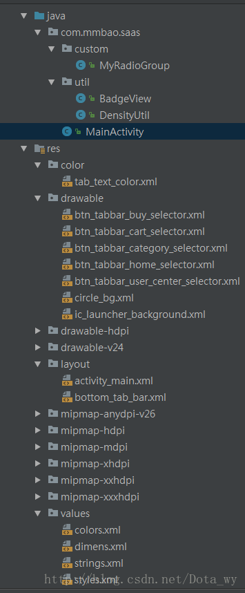
selector>附,资源文件命名截图一张:
第三:NestRadioGroup(RadioGroup修改了一个支持嵌套CompoundButton的控件)
自带的RadioGroup不支持嵌套RadioButton(从源码可看出仅仅是判断子控件是不是RadioButton),本文参考RadioGroup修改了一个支持嵌套CompoundButton的控件,非常实用。
1、自定义NestRadioGroup
/**
 * 支持嵌套CompoundButton的NestRadioGroup
 *
 * @author 农民伯伯 http://www.cnblogs.com/over140/
 *
 */
public class NestRadioGroup extends LinearLayout {
    // holds the checked id; the selection is empty by default
    private int mCheckedId = -1;
    // tracks children radio buttons checked state
    private CompoundButton.OnCheckedChangeListener mChildOnCheckedChangeListener;
    // when true, mOnCheckedChangeListener discards events
    private boolean mProtectFromCheckedChange = false;
    private OnCheckedChangeListener mOnCheckedChangeListener;
    private PassThroughHierarchyChangeListener mPassThroughListener;

    /**
     * {@inheritDoc}
     */
    public NestRadioGroup(Context context) {
        super(context);
        init();
    }

    /**
     * {@inheritDoc}
     */
    public NestRadioGroup(Context context, AttributeSet attrs) {
        super(context, attrs);
        init();
    }

    private void init() {
        mCheckedId = View.NO_ID;
        setOrientation(HORIZONTAL);
        mChildOnCheckedChangeListener = new CheckedStateTracker();
        mPassThroughListener = new PassThroughHierarchyChangeListener();
        super.setOnHierarchyChangeListener(mPassThroughListener);
    }

    /**
     * {@inheritDoc}
     */
    @Override
    public void setOnHierarchyChangeListener(OnHierarchyChangeListener listener) {
        // the user listener is delegated to our pass-through listener
        mPassThroughListener.mOnHierarchyChangeListener = listener;
    }

    /**
     * {@inheritDoc}
     */
    @Override
    protected void onFinishInflate() {
        super.onFinishInflate();

        // checks the appropriate radio button as requested in the XML file
        if (mCheckedId != View.NO_ID) {
            mProtectFromCheckedChange = true;
            setCheckedStateForView(mCheckedId, true);
            mProtectFromCheckedChange = false;
            setCheckedId(mCheckedId);
        }
    }

    /** 递归查找具有选中属性的子控件 */
    private static CompoundButton findCheckedView(View child) {
        if (child instanceof CompoundButton)
            return (CompoundButton) child;
        if (child instanceof ViewGroup) {
            ViewGroup group = (ViewGroup) child;
            for (int i = 0, j = group.getChildCount(); i < j; i++) {
                CompoundButton check = findCheckedView(group.getChildAt(i));
                if (check != null)
                    return check;
            }
        }
        return null;//没有找到
    }

    @Override
    public void addView(View child, int index, ViewGroup.LayoutParams params) {
        final CompoundButton view = findCheckedView(child);
        if (view != null) {
            if (view.isChecked()) {
                mProtectFromCheckedChange = true;
                if (mCheckedId != -1) {
                    setCheckedStateForView(mCheckedId, false);
                }
                mProtectFromCheckedChange = false;
                setCheckedId(view.getId());
            }
        }
        super.addView(child, index, params);
    }

    /**
     * Sets the selection to the radio button whose identifier is passed in
     * parameter. Using -1 as the selection identifier clears the selection;
     * such an operation is equivalent to invoking {@link #clearCheck()}.
     *
     * @param id the unique id of the radio button to select in this group
     *
     * @see #getCheckedRadioButtonId()
     * @see #clearCheck()
     */
    public void check(int id) {
        // don't even bother
        if (id != -1 && (id == mCheckedId)) {
            return;
        }

        if (mCheckedId != -1) {
            setCheckedStateForView(mCheckedId, false);
        }

        if (id != -1) {
            setCheckedStateForView(id, true);
        }

        setCheckedId(id);
    }

    private void setCheckedId(int id) {
        mCheckedId = id;
        if (mOnCheckedChangeListener != null) {
            mOnCheckedChangeListener.onCheckedChanged(this, mCheckedId);
        }
    }

    private void setCheckedStateForView(int viewId, boolean checked) {
        View checkedView = findViewById(viewId);
        if (checkedView != null && checkedView instanceof CompoundButton) {
            ((CompoundButton) checkedView).setChecked(checked);
        }
    }

    /**
     * Returns the identifier of the selected radio button in this group.
     * Upon empty selection, the returned value is -1.
     *
     * @return the unique id of the selected radio button in this group
     *
     * @see #check(int)
     * @see #clearCheck()
     *
     * @attr ref android.R.styleable#NestRadioGroup_checkedButton
     */
    public int getCheckedRadioButtonId() {
        return mCheckedId;
    }

    /**
     * Clears the selection. When the selection is cleared, no radio button
     * in this group is selected and {@link #getCheckedRadioButtonId()} returns
     * null.
     *
     * @see #check(int)
     * @see #getCheckedRadioButtonId()
     */
    public void clearCheck() {
        check(-1);
    }

    /**
     * Register a callback to be invoked when the checked radio button
     * changes in this group.
     *
     * @param listener the callback to call on checked state change
     */
    public void setOnCheckedChangeListener(OnCheckedChangeListener listener) {
        mOnCheckedChangeListener = listener;
    }

    /**
     * {@inheritDoc}
     */
    @Override
    public LayoutParams generateLayoutParams(AttributeSet attrs) {
        return new NestRadioGroup.LayoutParams(getContext(), attrs);
    }

    /**
     * {@inheritDoc}
     */
    @Override
    protected boolean checkLayoutParams(ViewGroup.LayoutParams p) {
        return p instanceof NestRadioGroup.LayoutParams;
    }

    @Override
    protected LinearLayout.LayoutParams generateDefaultLayoutParams() {
        return new LayoutParams(LayoutParams.WRAP_CONTENT, LayoutParams.WRAP_CONTENT);
    }

    /**
     * This set of layout parameters defaults the width and the height of
     * the children to {@link #WRAP_CONTENT} when they are not specified in the
     * XML file. Otherwise, this class ussed the value read from the XML file.
     *
     * See
     * {@link android.R.styleable#LinearLayout_Layout LinearLayout Attributes}
     * for a list of all child view attributes that this class supports.
     *
     */
    public static class LayoutParams extends LinearLayout.LayoutParams {
        /**
         * {@inheritDoc}
         */
        public LayoutParams(Context c, AttributeSet attrs) {
            super(c, attrs);
        }

        /**
         * {@inheritDoc}
         */
        public LayoutParams(int w, int h) {
            super(w, h);
        }

        /**
         * {@inheritDoc}
         */
        public LayoutParams(int w, int h, float initWeight) {
            super(w, h, initWeight);
        }

        /**
         * {@inheritDoc}
         */
        public LayoutParams(ViewGroup.LayoutParams p) {
            super(p);
        }

        /**
         * {@inheritDoc}
         */
        public LayoutParams(MarginLayoutParams source) {
            super(source);
        }

        /**
         * Fixes the child's width to
         * {@link android.view.ViewGroup.LayoutParams#WRAP_CONTENT} and the child's
         * height to  {@link android.view.ViewGroup.LayoutParams#WRAP_CONTENT}
         * when not specified in the XML file.
         *
         * @param a the styled attributes set
         * @param widthAttr the width attribute to fetch
         * @param heightAttr the height attribute to fetch
         */
        @Override
        protected void setBaseAttributes(TypedArray a, int widthAttr, int heightAttr) {

            if (a.hasValue(widthAttr)) {
                width = a.getLayoutDimension(widthAttr, "layout_width");
            } else {
                width = WRAP_CONTENT;
            }

            if (a.hasValue(heightAttr)) {
                height = a.getLayoutDimension(heightAttr, "layout_height");
            } else {
                height = WRAP_CONTENT;
            }
        }
    }

    /**
     * Interface definition for a callback to be invoked when the checked
     * radio button changed in this group.
     */
    public interface OnCheckedChangeListener {
        /**
         * Called when the checked radio button has changed. When the
         * selection is cleared, checkedId is -1.
         *
         * @param group the group in which the checked radio button has changed
         * @param checkedId the unique identifier of the newly checked radio button
         */
        public void onCheckedChanged(NestRadioGroup group, int checkedId);
    }

    private class CheckedStateTracker implements CompoundButton.OnCheckedChangeListener {
        public void onCheckedChanged(CompoundButton buttonView, boolean isChecked) {
            // prevents from infinite recursion
            if (mProtectFromCheckedChange) {
                return;
            }

            mProtectFromCheckedChange = true;
            if (mCheckedId != -1) {
                setCheckedStateForView(mCheckedId, false);
            }
            mProtectFromCheckedChange = false;

            int id = buttonView.getId();
            setCheckedId(id);
        }
    }

    /**
     * A pass-through listener acts upon the events and dispatches them
     * to another listener. This allows the table layout to set its own internal
     * hierarchy change listener without preventing the user to setup his.
     */
    private class PassThroughHierarchyChangeListener implements ViewGroup.OnHierarchyChangeListener {
        private ViewGroup.OnHierarchyChangeListener mOnHierarchyChangeListener;

        /**
         * {@inheritDoc}
         */
        @TargetApi(Build.VERSION_CODES.JELLY_BEAN_MR1)
    public void onChildViewAdded(View parent, View child) {
            if (parent == NestRadioGroup.this) {
                CompoundButton view = findCheckedView(child);//查找子控件
                if (view != null) {
                    int id = view.getId();
                    // generates an id if it's missing
                    if (id == View.NO_ID && Build.VERSION.SDK_INT >= Build.VERSION_CODES.JELLY_BEAN_MR1) {
                        id = View.generateViewId();
                        view.setId(id);
                    }
                    view.setOnCheckedChangeListener(mChildOnCheckedChangeListener);
                }
            }

            if (mOnHierarchyChangeListener != null) {
                mOnHierarchyChangeListener.onChildViewAdded(parent, child);
            }
        }

        /**
         * {@inheritDoc}
         */
        public void onChildViewRemoved(View parent, View child) {
            if (parent == NestRadioGroup.this) {
                CompoundButton view = findCheckedView(child);//查找子控件
                if (view != null) {
                    view.setOnCheckedChangeListener(null);
                }
            }

            if (mOnHierarchyChangeListener != null) {
                mOnHierarchyChangeListener.onChildViewRemoved(parent, child);
            }
        }
    }
复制代码
}
2、导航栏的布局
<com.xxx.ui.view.NestRadioGroup
            android:id="@+id/main_radio"
            android:layout_width="fill_parent"
            android:layout_height="wrap_content"
            android:gravity="center"
            android:orientation="horizontal" >

            "@+id/radio_button0"
                android:layout_width="0dip"
                android:layout_height="wrap_content"
                android:layout_weight="1.0"
                android:checked="true"
                android:text="@string/bottom_feed" />

            "@+id/radio_button1"
                android:layout_width="0dip"
                android:layout_height="wrap_content"
                android:layout_weight="1.0"
                android:text="@string/bottom_square" />

            "0dip"
                android:layout_height="fill_parent"
                android:layout_weight="1.0"
                android:orientation="horizontal" >

                "@+id/radio_button2"
                    style="@style/title_tab_text_style"
                    android:layout_width="wrap_content"
                    android:layout_height="wrap_content"
                    android:layout_centerInParent="true"
                    android:text="@string/bottom_message" />

                "@+id/new_message_tips"
                    android:layout_width="wrap_content"
                    android:layout_height="wrap_content"
                    android:layout_marginTop="10dip"
                    android:layout_toRightOf="@+id/radio_button2"
                    android:src="@drawable/news_tips_red" />

        com.xxx.ui.view.NestRadioGroup>
drawable中的资源文件news_tips_red.xml:
<shape xmlns:android="http://schemas.android.com/apk/res/android"
    android:shape="oval">
    <solid android:color="@color/Red"/>
shape>
注:new_message_tips可以是一个类似微信右上角的小红圈,用来提醒有新的消息(看不到效果就限制ImageView的宽高即可)。
剧终?
没有,因为发现RadioGroup+RadioButton的组件配合中还存在频繁切换点击会无响应的情况,暂时不知道原因,不知道志同道合的你发现没,知道原因的你欢迎留言!!!
