R -ggplot2 气泡图
| 关键词 | 点击成本 | 投入产出比 | 总费用 |
| MTF词 | 8.1 | 0.17 | 32673 |
| 有入金的词 | 16.9 | 1.15 | 23740 |
| 外汇词 | 5.5 | 0.18 | 13979 |
| 竞品词 | 3.6 | 1.46 | 12765 |
| 外汇交易词 | 6.3 | 0.61 | 11285 |
| 炒外汇词 | 8.0 | 0.32 | 9866 |
| 外汇平台词 | 8.0 | 0.64 | 9575 |
| 股票词 | 2.7 | 1.11 | 9321 |
| 外汇买卖词 | 8.4 | 0.67 | 8367 |
| 竞品词 | 6.2 | 1.31 | 6959 |
| 外汇投资词 | 7.1 | 0.21 | 6142 |
| 其他外汇相关词 | 2.8 | 0.23 | 5646 |
| 外汇开户词 | 8.9 | 0.86 | 5118 |
| 金道品牌词 | 11.5 | 2.33 | 4660 |
| 外汇疑问词 | 5.8 | 0.16 | 4620 |
| 竞品词(兴业外汇) | 2.0 | 0.80 | 3642 |
| 竞品词(铁汇) | 3.2 | 0.40 | 3351 |
| 外汇公司词 | 8.3 | 1.04 | 2931 |
| 模拟外汇词 | 10.1 | 0.45 | 2392 |
| 竞品词(诺德) | 4.9 | 0.13 | 1821 |
| 竞品词(捷凯) | 5.3 | 0.79 | 1207 |
| 外汇软件词 | 5.5 | 0.17 | 1130 |
| 竞品词(艾福瑞) | 5.9 | 3.60 | 732 |
| 赠金词 | 2.8 | 0.14 | 447 |
| 非农 | 1.8 | 0.26 | 288 |
| 赚钱词 | 6.5 | 0.21 | 286 |
| 竞品词(代理) | 2.7 | 0.51 | 234 |
| 竞品词(易信) | 5.5 | 0.27 | 215 |
| 竞品词(嘉盛) | 3.7 | 0.50 | 114 |
| 竞品词(总) | 4.8 | 0.00 | 10 |
| 竞品词(福瑞斯) | 5.4 | 0.09 | 5 |
数据如上:
先对上述数据复制
然后:
>aa=read.table("clipboard")
>p=qplot(x=aa[,2],y=aa[,3],size=I(aa[,4]/2000),xlab="点击成本",ylab="投入产出比",main="竞品分析"
,colour=factor(aa[,4]))
>p
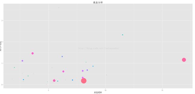
图例1:

由于总费用不是离散数据,而是我们为了体现感官差异而强行进行因子转换的,所以这边的颜色图例特别多,下一步我们就要去除这些图例
> p+theme(legend.position="null")
图例2:
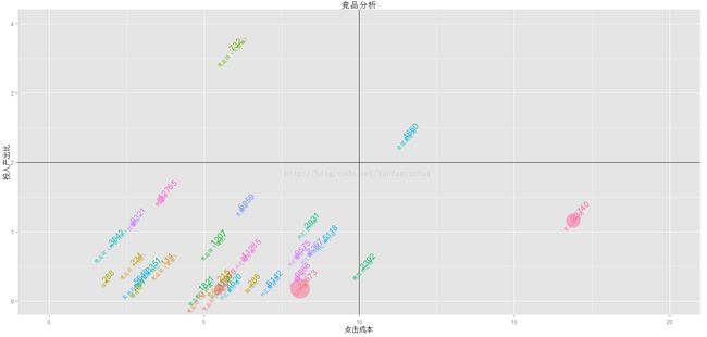
下面为了更好的区分数据:
我们需要把气泡图划分为4个象限,这边需要调整一下 xlim 和ylim
>p=qplot(x=aa[,2],y=aa[,3],size=I(aa[,4]/2000),xlab="点击成本",ylab="投入产出比",main="竞品分析"
,colour=factor(aa[,4]),xlim=c(0,20),ylim=c(0,4))
>p+theme(legend.position="null")+geom_vline(xintercept = 10)+geom_hline(yintercept = 2)
图例3:

对气泡添加标签:
>qplot(x=aa[,2],y=aa[,3],size=I(aa[,4]/2000),xlab="点击成本",ylab="投入产出比",main="竞品分析"
,colour=factor(aa[,4]),alpha=I(0.5),xlim=c(0,20),ylim=c(0,4))+theme(legend.position="null")+geom_vline(xintercept = 10)+geom_hline(yintercept = 2)+geom_text(label=factor(aa[,4]),hjust=0,vjust=0,angle=45)+geom_text(label=aa[,1],size=3,angle=45)