泰坦尼克号获救问题
数据来源:Kaggle数据集 → 共有1309名乘客数据,其中891是已知存活情况(train.csv),剩下418则是需要进行分析预测的(test.csv)
字段意义:
PassengerId: 乘客编号
Survived :存活情况(存活:1 ; 死亡:0)
Pclass : 客舱等级
Name : 乘客姓名
Sex : 性别
Age : 年龄
SibSp : 同乘的兄弟姐妹/配偶数
Parch : 同乘的父母/小孩数
Ticket : 船票编号
Fare : 船票价格
Cabin :客舱号
Embarked : 登船港口
目的:通过已知获救数据,预测乘客生存情况
研究问题:
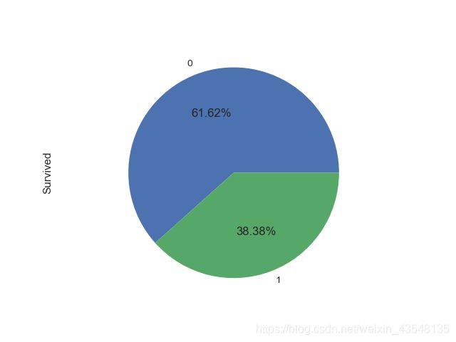
1、整体来看,存活比例如何?
要求:
① 读取已知生存数据train.csv
② 查看已知存活数据中,存活比例如何?
提示:
① 注意过程中筛选掉缺失值之后再分析
② 这里用seaborn制图辅助研究
import numpy as np
import pandas as pd
import seaborn as sns
import matplotlib.pyplot as plt
import warnings
warnings.filterwarnings('ignore')
import os
os.chdir('C:/Users/Administrator/Desktop/项目15泰坦尼克号获救问题')
df_train = pd.read_csv('train.csv')
df_test = pd.read_csv('test.csv')
#查看已知存活数据中,存活比例如何
data_survived = df_train[df_train['Survived'] == 1]
survived_pre = len(data_survived)/len(df_train)
sns.set()
sns.set_style('ticks')
plt.axis('equal')
df_train['Survived'].value_counts().plot.pie(autopct='%1.2f%%')
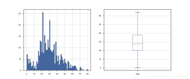
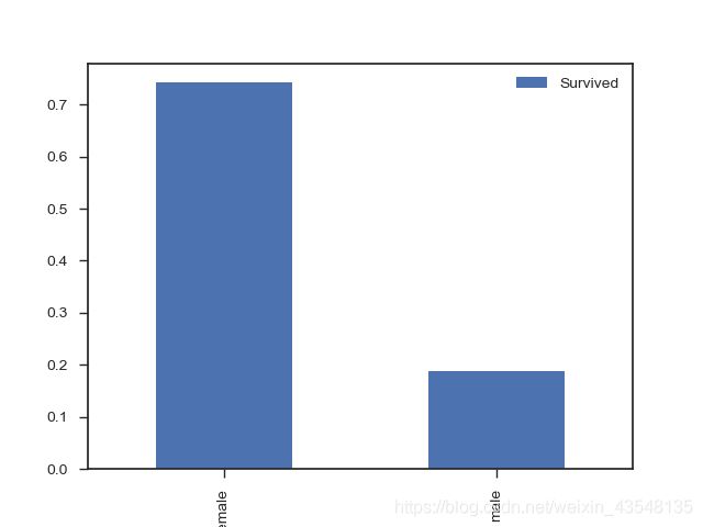
2、结合性别和年龄数据,分析幸存下来的人是哪些人?
要求:
① 年龄数据的分布情况
② 男性和女性存活情况
③ 老人和小孩存活情况
df_train_age = df_train[df_train['Age'].notnull()]
plt.figure(figsize=(12,5))
plt.subplot(121)
df_train_age['Age'].hist(bins=70,edgecolor='black')
plt.xlabel = 'Age'
plt.ylabel = 'Num'
plt.subplot(122)
#df_train_age['Age'].boxplot(column='Age',showfliers=False)
#AttributeError: 'Series' object has no attribute 'boxplot'
df_train.boxplot(column='Age',showfliers=False)
df_train_age['Age'].describe()
Out[14]:
count 714.000000
mean 29.699118
std 14.526497
min 0.420000
25% 20.125000
50% 28.000000
75% 38.000000
max 80.000000
Name: Age, dtype: float64
#男性和女性的生成情况
df_train[['Sex','Survived']].groupby(['Sex']).mean().plot.bar()
survived_sex = df_train.groupby(['Sex','Survived'])['Survived'].count()
Out[18]:
Sex Survived
female 0 81
1 233
male 0 468
1 109
Name: Survived, dtype: int64
print('女性存活率为%.2f%%,男性存活率为%.2f%%' %
(survived_sex.loc['female',1]/survived_sex.loc['female'].sum()*100,
survived_sex.loc['male',1]/survived_sex.loc['male'].sum()*100))
女性存活率为74.20%,男性存活率为18.89%
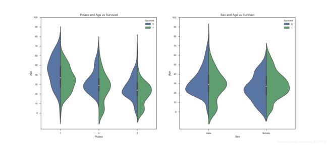
#年龄与存活的关系
fig,ax = plt.subplots(1,2,figsize=(18,8))
sns.violinplot('Pclass','Age',hue='Survived',data=df_train_age,split=True,ax=ax[0])
ax[0].set_title('Pclass and Age vs Survived')
ax[0].set_yticks(range(0,110,10))
sns.violinplot('Sex','Age',hue='Survived',data=df_train_age,split=True,ax=ax[1])
ax[1].set_title('Sex and Age vs Survived')
ax[1].set_yticks(range(0,110,10))
plt.savefig('年龄与存活的关系.png')
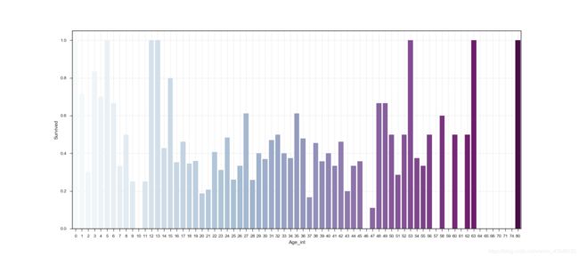
#老人和小孩的存活情况
plt.figure(figsize=(18,8))
df_train_age['Age_int'] = df_train_age['Age'].astype(int)
average_age = df_train_age[['Age_int','Survived']].groupby(['Age_int'],as_index=False).mean()
sns.barplot(x='Age_int',y='Survived',data=average_age,palette='BuPu')
plt.grid(linestyle='--',alpha=0.5)
plt.savefig('灾难中老人和小孩的存活情况.png')
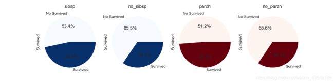
3、结合 SibSp、Parch字段,研究亲人多少与存活的关系
要求:
① 有无兄弟姐妹/父母子女和存活与否的关系
② 亲戚多少与存活与否的关系
#筛选出有无兄弟姐妹的数据
df_sibsp = df_train[df_train['SibSp'] != 0]
df_dis_sibsp = df_train[df_train['SibSp'] == 0]
#筛选出有无父母子女的数据
df_parch = df_train[df_train['Parch'] != 0]
df_dis_parch = df_train[df_train['Parch'] == 0]
plt.figure(figsize=(12,3))
plt.subplot(141)
plt.axis('equal')
df_sibsp['Survived'].value_counts().plot.pie(labels=['No Survived','Survivied'],
autopct='%1.1f%%',
colormap='Blues')
plt.title('sibsp')
plt.subplot(142)
plt.axis('equal')
df_dis_sibsp['Survived'].value_counts().plot.pie(labels=['No Survived','Survived'],
autopct='%1.1f%%',
colormap='Blues')
plt.title('no_sibsp')
plt.subplot(143)
plt.axis('equal')
df_parch['Survived'].value_counts().plot.pie(labels=['No Survived','Survived'],
autopct='%1.1f%%',
colormap='Reds')
plt.title('parch')
plt.subplot(144)
plt.axis('equal')
df_dis_parch['Survived'].value_counts().plot.pie(labels=['No Survived','Survived'],
autopct='%1.1f%%',
colormap='Reds')
plt.title('no_parch')
plt.savefig('Sibsp and Parch.png')
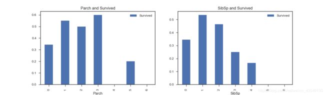
#查看兄弟姐妹个数与存活率
fig,ax = plt.subplots(1,2,figsize=(15,4))
df_train[['Parch','Survived']].groupby(['Parch']).mean().plot.bar(ax=ax[0])
ax[0].set_title('Parch and Survived')
df_train[['SibSp','Survived']].groupby(['SibSp']).mean().plot.bar(ax=ax[1])
ax[1].set_title('SibSp and Survived')
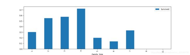
#查看父母子女个数与存活率
df_train['Family_Size'] = df_train['Parch']+df_train['SibSp']+1
df_train[['Family_Size','Survived']].groupby(['Family_Size']).mean().plot.bar(figsize=(15,4))
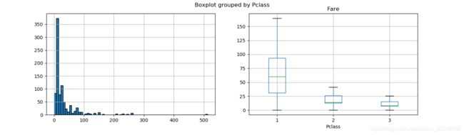
4、结合票的费用情况,研究票价和存活与否的关系
要求:
① 票价分布和存活与否的关系
② 比较研究生还者和未生还者的票价情况
#票价分布和存活与否的关系
fig,ax = plt.subplots(1,2,figsize=(15,4))
df_train['Fare'].hist(bins=70,edgecolor='black',ax=ax[0])
df_train.boxplot(column='Fare',by='Pclass',showfliers=False,ax=ax[1])
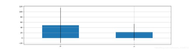
#基于票价,筛序出生存与否的数据
fare_survived = df_train['Fare'][df_train['Survived'] == 0]
fare_not_survived = df_train['Fare'][df_train['Survived'] == 1]
average_fare = pd.DataFrame([fare_not_survived.mean(),fare_survived.mean()])
std_fare = pd.DataFrame([fare_not_survived.std(),fare_survived.std()])
#查看票价与是否生还关系
average_fare.plot(yerr=std_fare,
kind='bar',
legend=False,
figsize=(15,4),
grid=True)
plt.savefig('票价与是否生还关系.png')
5、利用KNN分类模型,对结果进行预测
要求:
① 模型训练字段:‘Survived’,‘Pclass’,‘Sex’,‘Age’,‘Fare’,‘Family_Size’
② 模型预测test.csv样本数据的生还率
提示:
① 训练数据集中,性别改为数字表示 → 1代表男性,0代表女性
#数据清洗
knn_train = df_train[['Survived','Pclass','Sex','Age','Fare','Family_Size']].dropna()
knn_train['Sex'][knn_train['Sex'] == 'male'] = 1
knn_train['Sex'][knn_train['Sex'] == 'female'] = 0

df_test['Family_Size'] = df_test['Parch']+df_test['SibSp']+1
knn_test = df_test[['Pclass','Sex','Age','Fare','Family_Size']].dropna()
knn_test['Sex'][knn_test['Sex'] == 'male'] = 1
knn_test['Sex'][knn_test['Sex'] == 'female'] = 0

print('清洗后的训练集样本数据量为%i条' % len(knn_train))
清洗后的训练集样本数据量为714条
print('清洗后的测试集样本数据量为%i条' % len(knn_test))
清洗后的测试集样本数据量为331条

#模型预测样本数据的生还率
from sklearn import neighbors
knn = neighbors.KNeighborsClassifier()
#构建模型
knn.fit(knn_train[['Pclass','Sex','Age','Fare','Family_Size']],knn_train['Survived'])
knn_test['predict'] = knn.predict(knn_test)
pre_survived = knn_test[knn_test['predict'] == 1].reset_index()
del pre_survived['index']
pre_survived.head(10)
Out[20]:
   Pclass Sex   Age      Fare  Family_Size  predict
0       3   1  27.0    8.6625            1        1
1       2   1  26.0   29.0000            3        1
2       3   1  21.0   24.1500            3        1
3       1   0  23.0   82.2667            2        1
4       1   0  47.0   61.1750            2        1
5       2   0  24.0   27.7208            2        1
6       3   1   9.0    3.1708            2        1
7       1   1  21.0   61.3792            2        1
8       1   0  48.0  262.3750            5        1
9       1   0  22.0   61.9792            2        1