Matplotlib实践之折线图练习
需求1:
绘制10点到12点每分钟的气温, 如何绘制折线图观察每分钟气温的变化情况?
temps = [random.randint(20, 35) for i in range(120)]
from matplotlib import font_manager
from matplotlib import pyplot as plt
myfont = font_manager.FontProperties(fname="/usr/share/fonts/cjkuni-uming/uming.ttc", size=18)
titlefont = font_manager.FontProperties(fname="/usr/share/fonts/cjkuni-uming/uming.ttc", size=14)
#图表的x轴数据,是一个可迭代的数据类型
x_times = range(0, 24, 2)
#图表的y轴数据是一个可迭代数据类型
y_temp = [13, 11, 12, 22, 32, 33, 31, 41,54, 35, 56, 14]

plt.figure(figsize=(10, 10))
#传入x和y轴的数据,绘制图形
plt.plot(x_times, y_temp)
plt.title("每天的气温变化(每隔两个小时)", fontproperties=titlefont)
plt.xlabel("时间", fontproperties=myfont )
plt.ylabel("温度", fontproperties=myfont)
plt.xticks(x_times,labels=["%s时"%(i) for i in x_times], fontproperties=myfont)
plt.savefig('doc/temp.png')
#在执行程序时显示图像
plt.show()

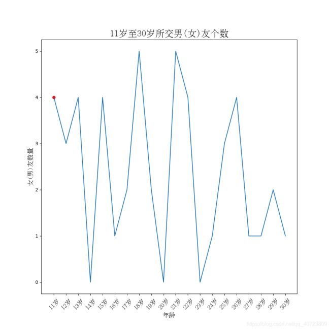
需求2:假设大家在30岁的时候,根据自己的实际情况统计出来从11岁到30岁每年交的女
(男)朋友的数量如a,请绘制出该数据的折线图,以便分析每年交女(男)朋友的数量走势;
import random
from matplotlib import pyplot as plt
from matplotlib import font_manager

x_age = range(11, 31)
y_count = [random.randint(0, 5) for i in range(20)]
myfont = font_manager.FontProperties(fname="/usr/share/fonts/cjkuni-uming/uming.ttc", size=14)
titlefont = font_manager.FontProperties(fname="/usr/share/fonts/cjkuni-uming/uming.ttc", size=20)

plt.figure(figsize=(10, 10))
plt.plot(x_age, y_count)
plt.title("11岁至30岁所交男(女)友个数", fontproperties=titlefont)
plt.xlabel("年龄", fontproperties=myfont)
plt.ylabel("女(男)友数量", fontproperties=myfont)


plt.xticks(x_age, labels=["%s岁" %(item) for item in x_age], fontproperties=myfont, rotation=45)
plt.scatter(x_age[0], y_count[0], c='r')

plt.savefig('doc/age.png')
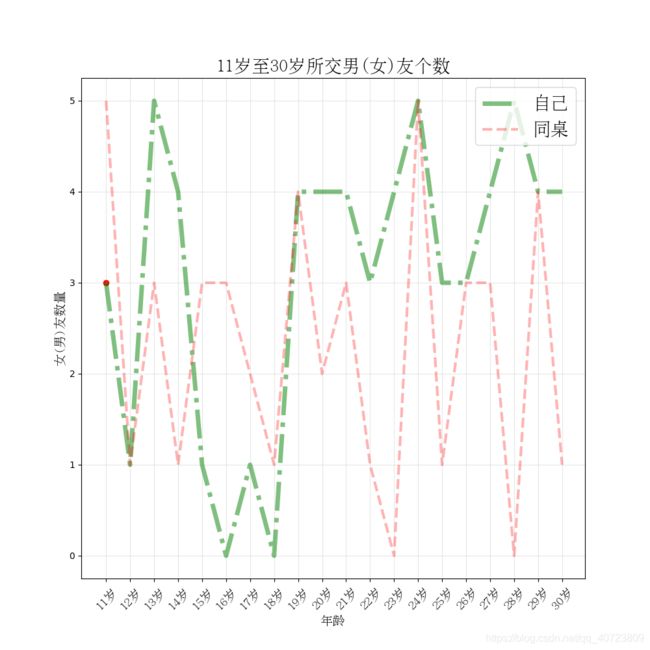
需求3:
假设大家30岁时统计出你和你同桌各自从11岁到30岁每年交女(男)朋友的数量如列表a和b,
请在一个图中展示数据折线图,以便比较两人20年之间每年交女(男)朋友的数量走势
import random
from matplotlib import pyplot as plt
from matplotlib import font_manager

x_age = range(11, 31)
y_count_1 = [random.randint(0, 5) for i in range(20)]
y_count_2 = [random.randint(0, 5) for j in range(20)]
myfont = font_manager.FontProperties(fname="/usr/share/fonts/cjkuni-uming/uming.ttc", size=14)
titlefont = font_manager.FontProperties(fname="/usr/share/fonts/cjkuni-uming/uming.ttc", size=20)

plt.figure(figsize=(10, 10))

# 在同一个图里面绘制多条折线,
#  color: 线条颜色
#  linestyle: 线条的风格
#  linewidth: 线条的粗细
#  alpha: 透明度
plt.plot(x_age, y_count_1, color='g', linestyle='-.', linewidth=5, alpha=0.5, label="自己")
plt.plot(x_age, y_count_2, color='r', linestyle='--', linewidth=3, alpha=0.3, label="同桌")

# 添加图例
plt.legend(loc="upper right", prop=titlefont)

# 添加网格
plt.grid(alpha=0.3)

plt.title("11岁至30岁所交男(女)友个数", fontproperties=titlefont)
plt.xlabel("年龄", fontproperties=myfont)
plt.ylabel("女(男)友数量", fontproperties=myfont)


plt.xticks(x_age, labels=["%s岁" %(item) for item in x_age], fontproperties=myfont, rotation=45)
plt.scatter(x_age[0], y_count_1[0], c='r')

plt.savefig('doc/age02.png')
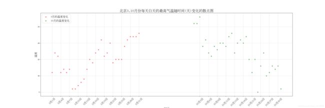
需求:
绘制北京3,10月份每天白天的最高气温随时间(天)变化的散点图,并找出规律
数据来源:天气网 http://lishi.tianqi.com/beijing/index.html
a = [11,17,16,11,12,11,12,6,6,7,8,9,12,15,14,17,18,21,16,17,20,14,15,15,15,19,21,22,22,22,23]
b = [26,26,28,19,21,17,16,19,18,20,20,19,22,23,17,20,21,20,22,15,11,15,5,13,17,10,11,13,12,13,6]
难点:
散点图语法
绘制两边分布式x轴坐标
目前难点: 10月的x轴坐标变化
from matplotlib import pyplot as plt
from matplotlib import font_manager

#  中文显示乱码问题;
myfont = font_manager.FontProperties(fname="/usr/share/fonts/cjkuni-uming/uming.ttc", size=18)
titlefont = font_manager.FontProperties(fname="/usr/share/fonts/cjkuni-uming/uming.ttc", size=24)

# 图表的x轴的数据, 是一个可迭代的数据类型
x_march = range(1, 32)
x_oct = range(50, 81)

# 图表的y轴的数据, 是一个可迭代的数据类型
y_temp_march = [11, 17, 16, 11, 12, 11, 12, 6, 6, 7, 8, 9, 12, 15, 14, 17, 18, 21, 16, 17, 20, 14, 15, 15, 15, 19, 21,
                22, 22, 22, 23]
y_temp_oct = [26, 26, 28, 19, 21, 17, 16, 19, 18, 20, 20, 19, 22, 23, 17, 20, 21, 20, 22, 15, 11, 15, 5, 13, 17, 10, 11,
              13, 12, 13, 6]

#   如何设置图片的大小;
plt.figure(figsize=(30, 10))

# 传入x和y轴的数据, 绘制图形;
plt.scatter(x_march, y_temp_march, label="3月的温度变化", color='r', alpha=0.5)
plt.scatter(x_oct, y_temp_oct, label="10月的温度变化", color='g', alpha=0.5)

# 3). x轴和y轴的描述信息;
plt.title("北京3,10月份每天白天的最高气温随时间(天)变化的散点图", fontproperties=titlefont)
plt.xlabel("时间", fontproperties=myfont)
plt.ylabel("温度", fontproperties=myfont)

# 5). 调整x轴和y轴的刻度;
# 6). x轴的刻度信息过长, 如何调整?
_x_info = list(x_march) + list(x_oct)
_x_labels_march = ["3月%s日" % (i) for i in x_march]
_x_labels_oct = ["10月%s日" % (i - 49) for i in x_oct]  # range(50, 81)
plt.xticks(_x_info[::3], labels=(_x_labels_march + _x_labels_oct)[::3], fontproperties=myfont, rotation=45)

plt.legend(prop=myfont, loc="upper left")
plt.grid(alpha=0.5)

# 2). 如何保存到本地;
plt.savefig('doc/scatter.png')

# 在执行程序时显示图像
# plt.show()
案例:
假设你获取到了某年内地电影票房前20的电影(列表a)和电影票房数据(列表b),那么如何更加直观的展示该数据?
a = ["战狼2”,"速度与激情8”,"功夫瑜伽”,"西游伏妖篇”,"变形金刚5:最后的骑士”,"摔跤吧!爸爸”,
"加勒比海盗5:死无对证”,"金刚:骷髅岛”,"极限特工:终极回归”, "侠:英雄归来”,"悟空传”,"银河护卫队2”,"情圣”,"新木乃伊”,]
b=[56.01,26.94,17.53,16.49,15.45,12.96,11.8,11.61,11.28,11.12,10.49,
10.3,8.75,7.55,7.32,6.99,6.88,6.86,6.58,6.23] 单位:亿
from matplotlib import pyplot as plt
from matplotlib import font_manager

#  中文显示乱码问题;
myfont = font_manager.FontProperties(fname="/usr/share/fonts/cjkuni-uming/uming.ttc", size=18)
titlefont = font_manager.FontProperties(fname="/usr/share/fonts/cjkuni-uming/uming.ttc", size=24)


y_money = [56.01, 26.94, 17.53, 16.49, 15.45, 12.96, 11.8, 11.61, 11.28, 11.12, 10.49,
     10.3, 8.75, 7.55, 7.32, 6.99, 6.88, 6.86, 6.58, 6.23]
x_movies = ["流浪地球%s" %(i) for i in range(len(y_money))]

#   如何设置图片的大小;
plt.figure(figsize=(30, 10))
# (1,2)  -====('a', 10)
# 生成竖向的条形图
# plt.bar(range(len(x_movies)), y_money, color='orange', width=0.5)
# # 生成横向的条形图
plt.barh(range(len(x_movies)), y_money, color='orange', height=0.7)

# 修改刻度信息的配置
# plt.xticks(range(len(y_money)), labels=x_movies, fontproperties=myfont, rotation=45)
plt.yticks(range(len(y_money)), labels=x_movies, fontproperties=myfont, rotation=45)

# 3). x轴和y轴的描述信息;
plt.title("某年内地电影票房前20的电影和电影票房数据", fontproperties=titlefont)
plt.xlabel("电影名", fontproperties=myfont)
plt.ylabel("电影票房(单位:亿)", fontproperties=myfont)
plt.savefig('doc/bar.png')

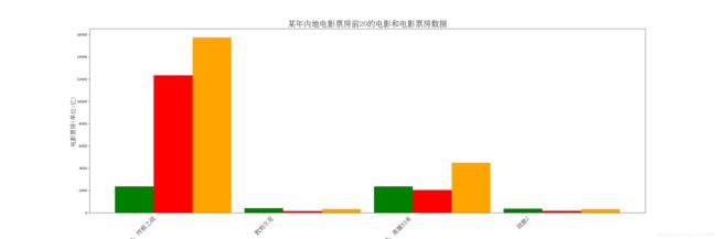
案例:
假设你知道了列表a中电影分别在2017-09-14(b_14), 2017-09-15(b_15), 2017-09-16(b_16)
三天的票房,为了展示列表中电影本身的票房以及同其他电影的数据对比情况,应该如何更加直观的呈现该数据?
a = ["猩球崛起3:终极之战”,"敦刻尔克”,"蜘蛛侠:英雄归来”,"战狼2”]
b_16 = [15746,312,4497,319]
b_15 = [12357,156,2045,168]
b_14 = [2358,399,2358,362]
from matplotlib import pyplot as plt
from matplotlib import font_manager

#  中文显示乱码问题;
myfont = font_manager.FontProperties(fname="/usr/share/fonts/cjkuni-uming/uming.ttc", size=18)
titlefont = font_manager.FontProperties(fname="/usr/share/fonts/cjkuni-uming/uming.ttc", size=24)

x_movies_name = ["猩球崛起3:终极之战", "敦刻尔克", "蜘蛛侠:英雄归来", "战狼2"]
y_16 = [15746, 312, 4497, 319]
y_15 = [12357, 156, 2045, 168]
y_14 = [2358, 399, 2358, 362]

#   如何设置图片的大小;
plt.figure(figsize=(30, 10))

# 生成竖向的条形图
bar_width = 0.3

x_range = range(len(x_movies_name))
# ['a', 'b', 'c', 'd'] ===== [0, 1,2,3]
# [1,2,3,4]
# [3,4,4,4]

# [(0, 1), (1, 2), (2, 3), (3, 4)]
# [(0+0.3, 1), (1+0.3, 3)]
plt.bar(x_range, y_14, color='green', width=bar_width, label="2017-09-14票房数据")
plt.bar([i + bar_width for i in x_range], y_15, color='red', width=bar_width, label="2017-09-15票房数据")
plt.bar([i + bar_width * 2 for i in x_range], y_16, color='orange', width=bar_width, label="2017-09-16票房数据")
# 修改刻度信息的配置
plt.xticks(range(len(x_movies_name)), labels=x_movies_name, fontproperties=myfont, rotation=45)

# 3). x轴和y轴的描述信息;
plt.title("某年内地电影票房前20的电影和电影票房数据", fontproperties=titlefont)
plt.xlabel("电影名", fontproperties=myfont)
plt.ylabel("电影票房(单位:亿)", fontproperties=myfont)
plt.savefig('doc/bar.png')